
Dialogs
AlertDialog
Intro
Dialogs are a type of modal that are used to provide high priority information, display critical information, or ask for specific user action or decisions. It prompts the user to react and it interrupts the process of the application.
Alert Dialog
Prompts the user by displaying urgent information, detail, or actions.
Simple Dialog
Displays a list that requires a selection that will take immediate effect.
Confirmation Dialog
Confirms a choice, requiring the user to accept or dismiss.
Full-Screen Dialog
Uses the entire screen with a series of tasks to complete, like a form.
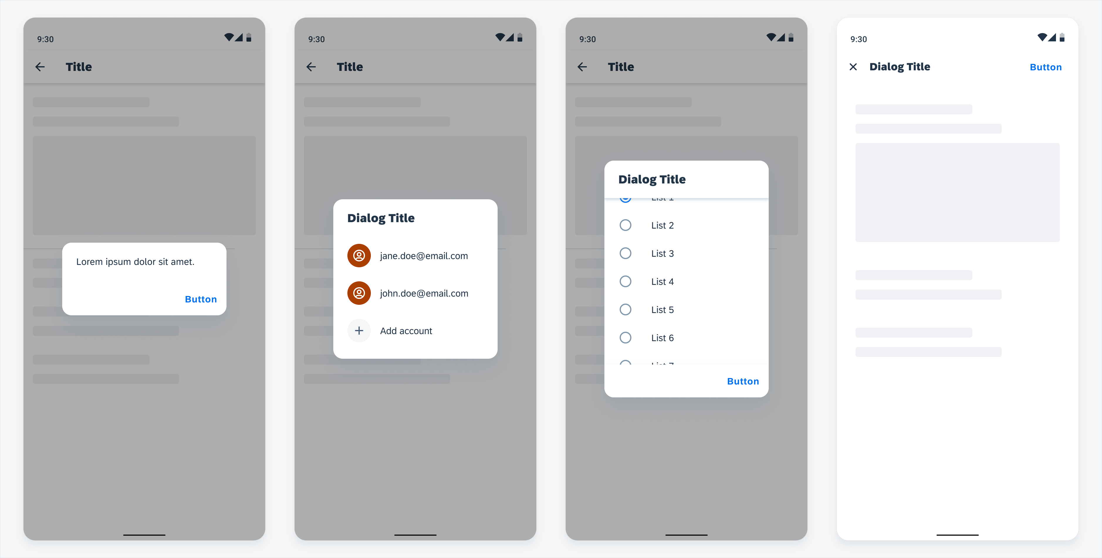
Alert dialog (first), simple dialog (second), confirmation dialog (third), full-screen dialog (fourth)
Usage
Use a dialog for important or critical information that requires a specific user action, decision, dismissal, or acknowledgement.
- Don’t place more than two actions on a dialog.
- Don’t use a dialog if you want to display a simple message where there’s no action to take, use the snackbar instead.
Anatomy
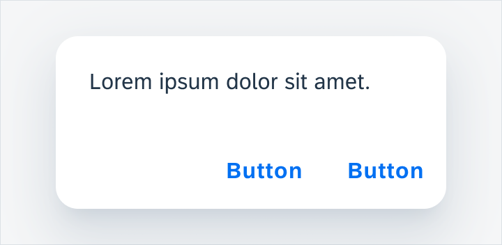
Alert Dialog
A. Text
Describes the action and prompts the user to take action.
B. Footer Bar
The footer bar houses the buttons for the user to take action.
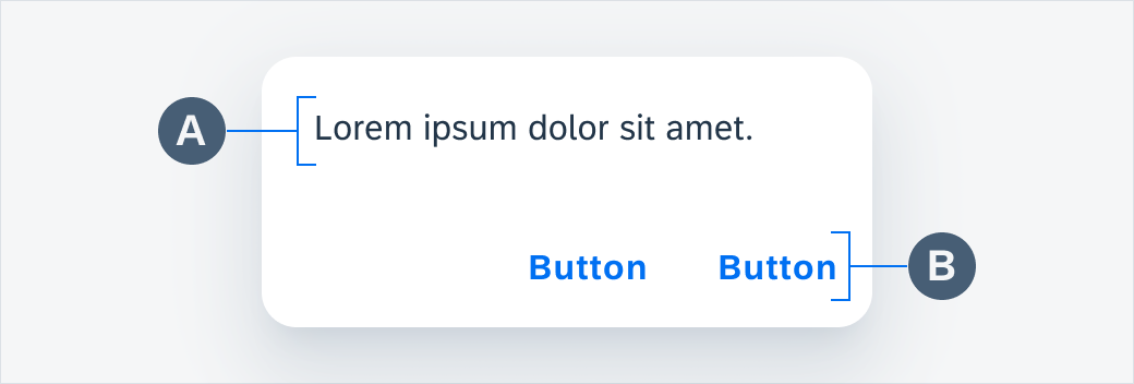
Alert dialog anatomy
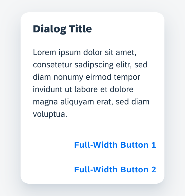
Full-Width Button Dialog
A. Title
Summarizes the dialog’s purpose.
B. Description
Describes what action needs to be taken in a clear and concise manner so that the user knows what to do.
C. Footer Bar
The footer bar houses the buttons for the user to take action.
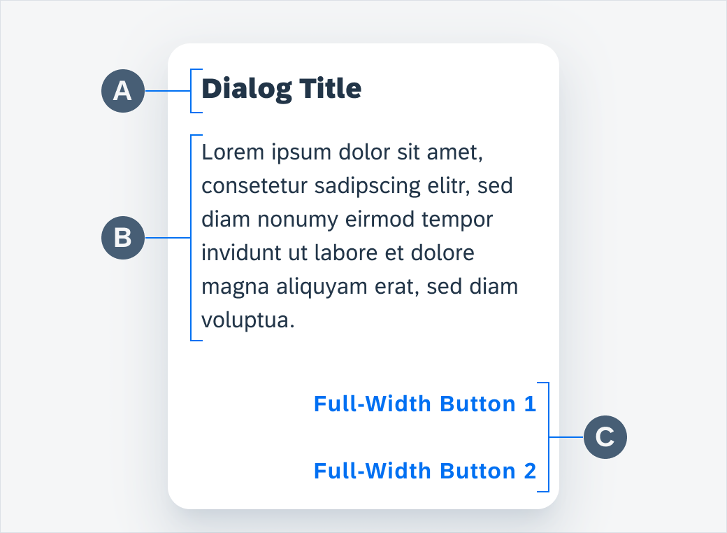
Full-width button dialog anatomy
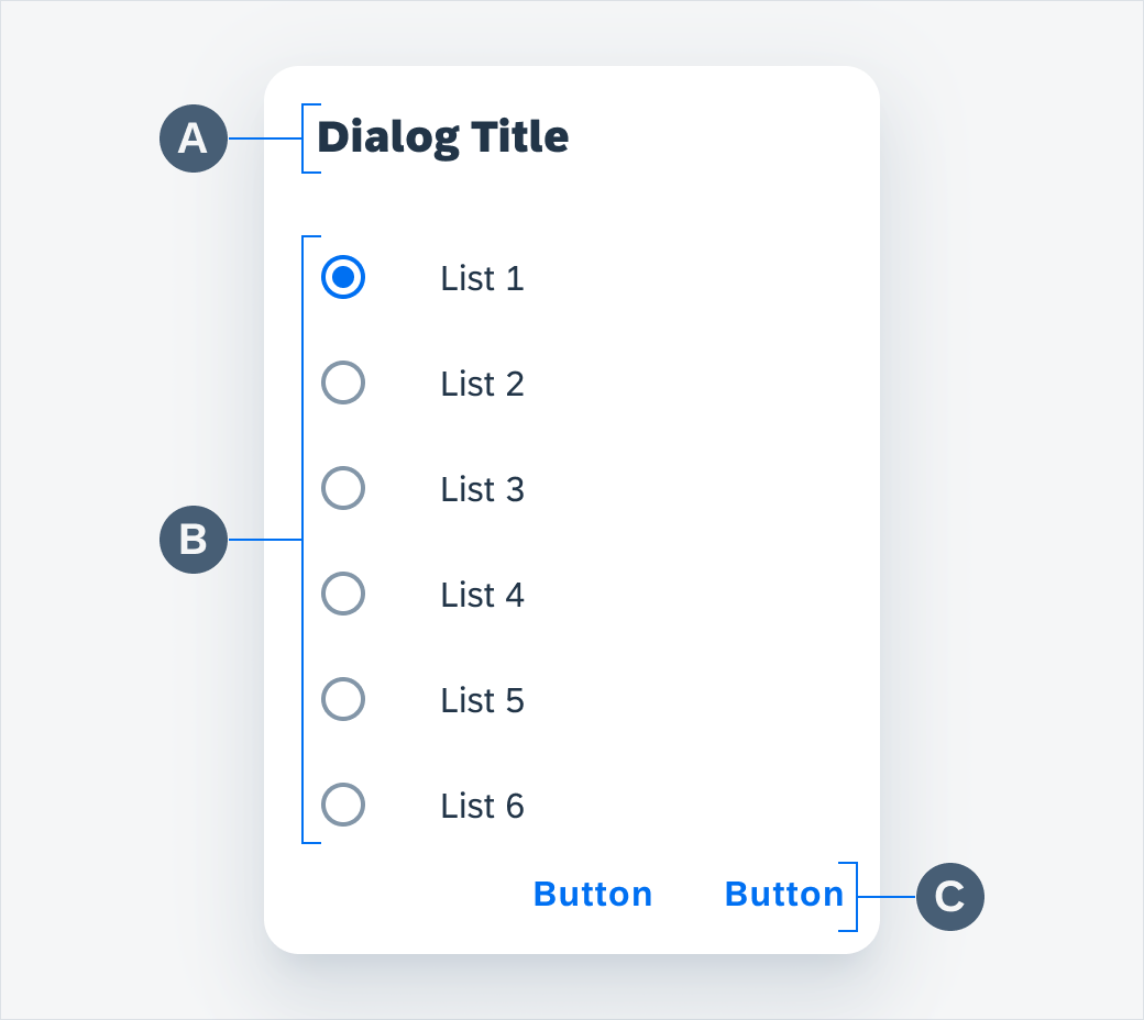
Simple Dialog
A. Title
Summarizes the dialog’s purpose.
B. Selection List
Lists the possible options that the user may choose from.
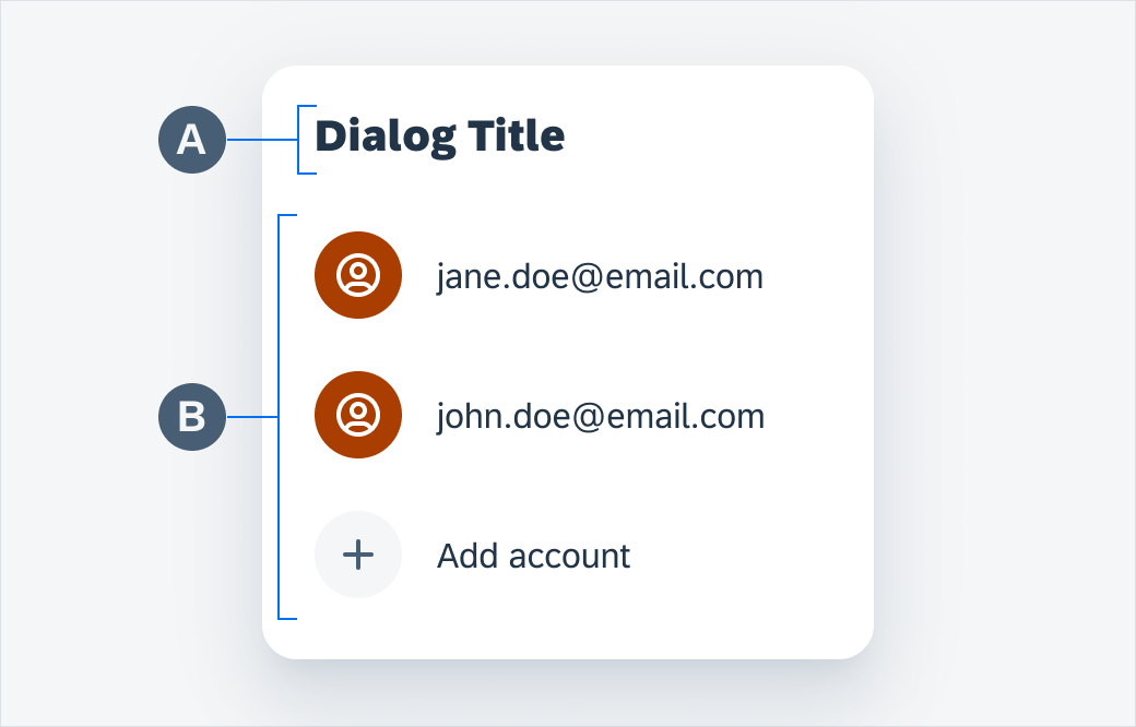
Simple dialog anatomy
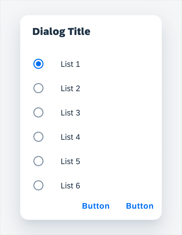
Confirmation Dialog
A. Title
Summarizes the dialog’s purpose.
B. Selection List
Lists the possible options that the user may choose from.
C. Footer Bar
The footer bar houses the buttons for the user to take action.
Confirmation dialog anatomy
Full-Screen Dialog
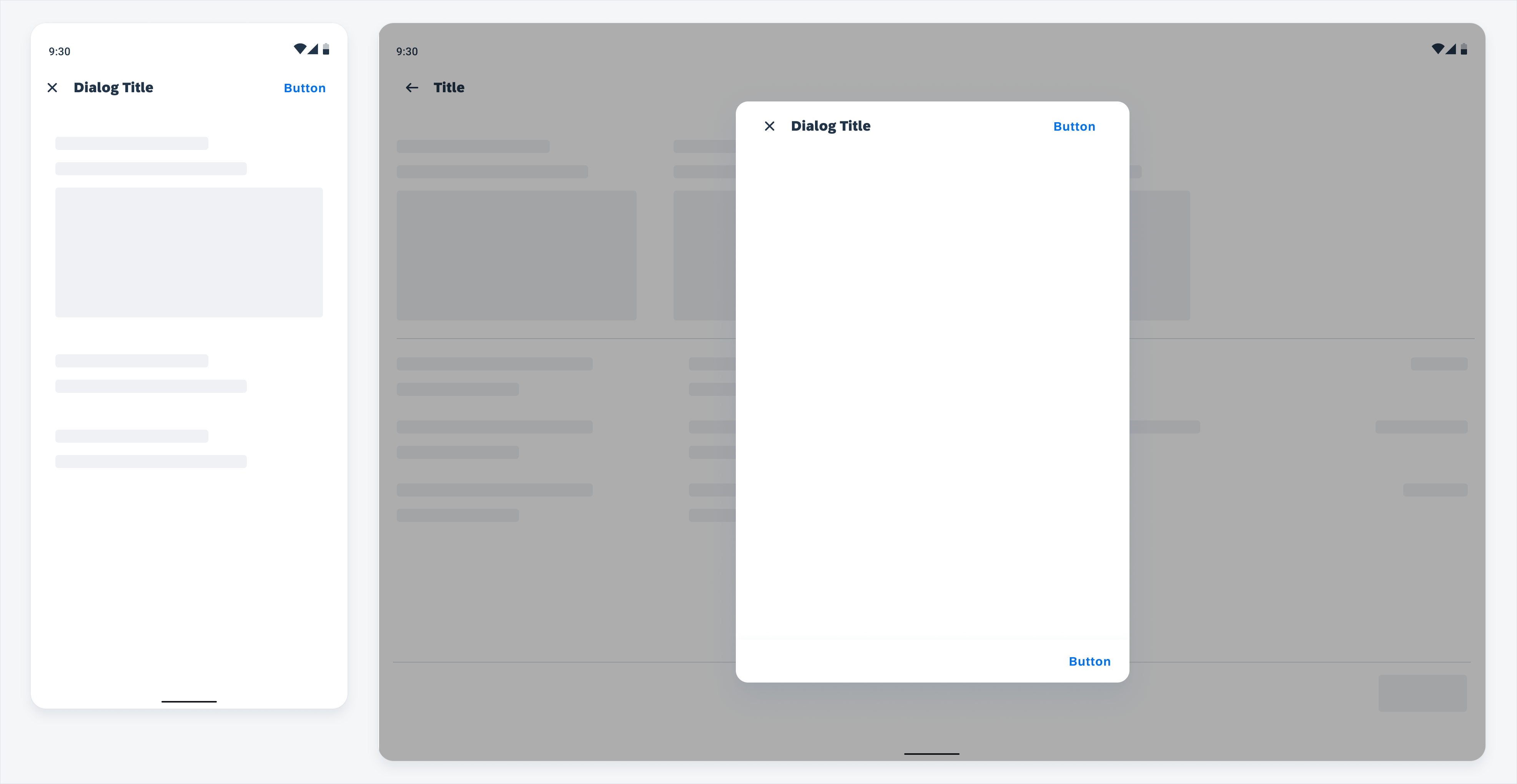
The full-screen dialog has an app bar at the top, and content displayed inside a dialog area.
For a modal dialog on tablet, a scrim covers the content underneath the dialog.
A. App Bar
Contains a discard action button on the left, and a confirmation action button on the right. The “close” icon is used by default for discard action. Unsaved changes trigger a confirmation dialog when users tap on the “Close” icon. The title should indicate the task performed by this dialog (for example “Create Work Order”).
Users can drill down within a full-screen dialog with a push navigation. In the drill down page, a back arrow icon replaces the “Close” icon for users to navigate back. Changes in the drill down page are reflected once users navigate back.
B. Content Area
All types of controls and form cells can be used in full-screen dialog to fulfill the task. See Filter and Create.
C. Scrim
The scrim for the modal dialog is #000000 with 32% opacity.
When a second dialog appears on the screen, such as a confirmation dialog / date-time picker launched from an existing dialog, remove the existing scrim and apply a darker scrim (#000000 with 60% opacity) on top of the first dialog. This darker scrim applies focus on the new modal. It pushes the new dialog to the foreground and all other content gets pushed to the background.
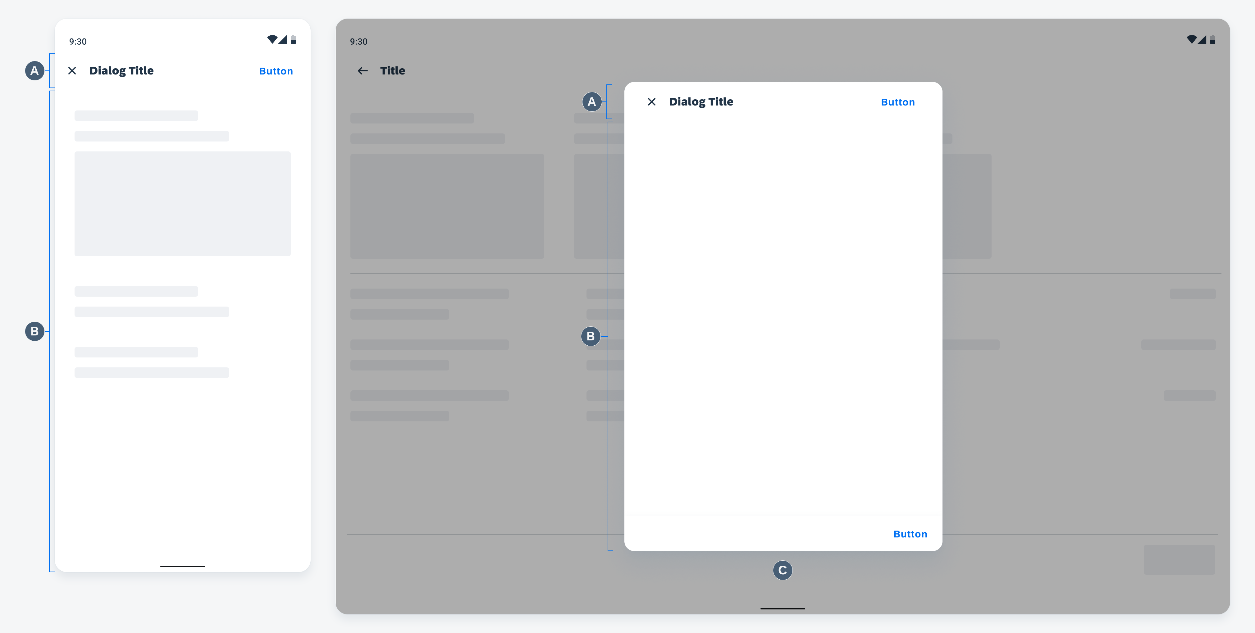
Full-screen dialog anatomy: mobile (left), tablet (right)
Adaptive Design
Alert, Simple and Confirmation Dialog
Mobile
For mobile, the recommended dialog width is 280dp.
For dialogs that have a selection list, the maximum height for the list is set to six list cells. Since each list cell is 48dp in height, this means the maximum height for the list is 336dp. If it exceeds six items, the list area is scrollable to see the other options.
Tablet
For tablet, the dialog width depends on the content, but it needs to be a multiple of 56 with a maximum width of 560dp.
Full-Screen Dialog
Mobile
On mobile, the full-screen dialog covers the whole screen.
Tablet
On tablet, the modal is center aligned horizontally and vertically. The modal dialog does not have a set of width or height. Below are some recommended rules. You can adjust it based on your specific device or use case:
Height:
- The dialog height depends on the content height.
- We recommend a minimum modal dialog height of half the screen height in landscape mode.
- The maximum height of a dialog starts from 24dp from the top of the screen (right below status bar), to the bottom of the screen content area (above the bottom navigation bar).
- When content exceeds the maximum height, it scrolls vertically inside the dialog. The dialog may grow taller when the device is rotated from landscape to portrait mode to reveal more content.
Width:
- We recommend a dialog width of 512dp.
- Keep the dialog width the same on both landscape and portrait mode to reduce distracting transitions.
- The maximum width is 560dp.
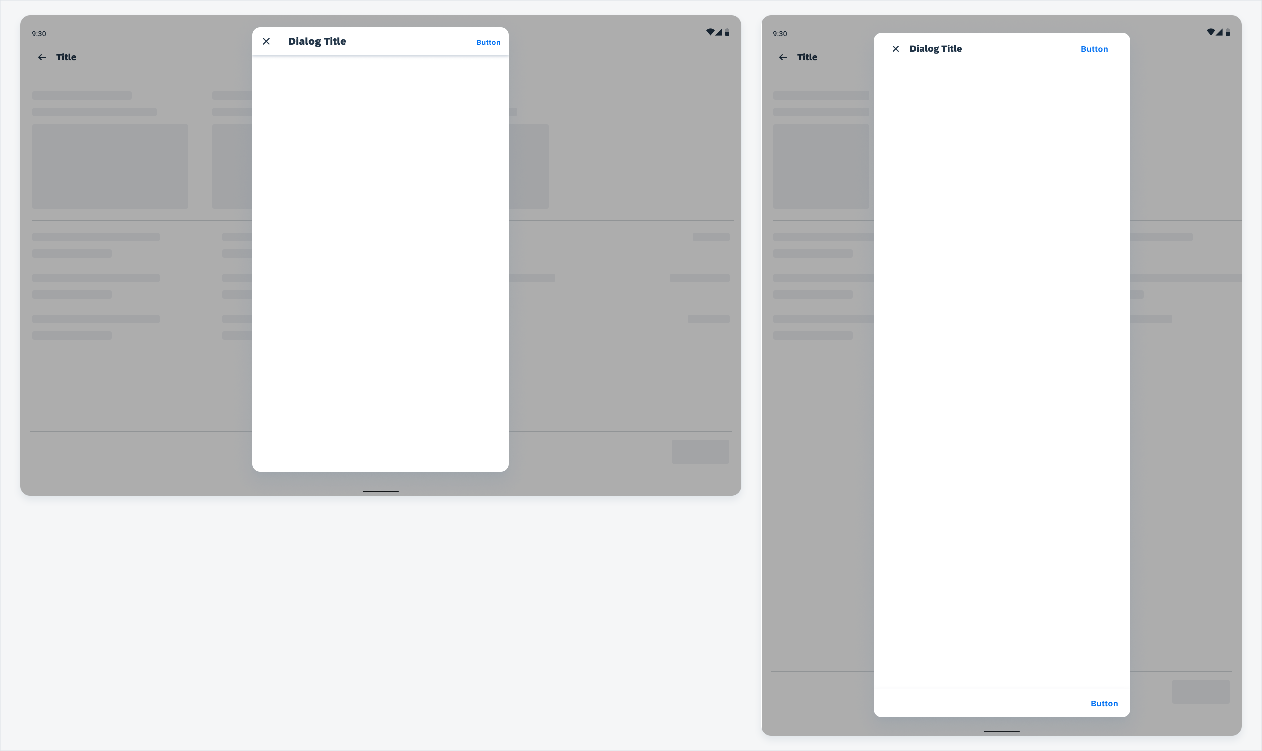
Modal dialog with maximum height: landscape mode (left) and portrait mode (right)
By default, dialog height should be determined by the content in the initial screen (parent).
When navigating to the next screen inside the dialog, for example, drilling down to a list of checkbox cells from a list picker form cell, consider the following recommendations:
- If the child screen has less content than the parent screen, use the same dialog height as the parent screen to avoid disruptive transitions.
- If the child screen has more content than the parent screen, increase the screen height to accommodate more content (until it reaches the maximum height allowed by the device).
In summary, the child screen can be equal to or taller than the parent screen.
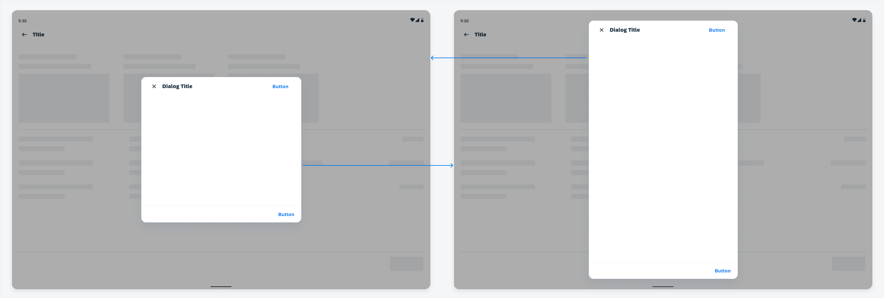
Dialog's height changes based on content length
Variations
Alert Dialog
Alert dialogs prompt the user by displaying urgent information, detail, or actions. The dialog cannot be dismissed or closed until the user selects one of the actions.
The action must describe what the selection will do. Avoid using “Yes” or “No” choices. Instead, be more explicit by using descriptive verbs such as “Cancel” or “Delete”.
Unlike other dialogs, the alert dialog does not have a title.
Alert dialog
Full-Width Button Dialog
There is also a stacked full-width button dialog which could be used if the buttons require longer text.
Stacked full-width button dialogs can be used for alert and confirmation dialogs.
Full-width button dialog
Simple Dialog
Simple dialogs display a list that requires a selection that will take immediate effect. Due to its interruptive nature, a non-dialog option for providing options would be a dropdown menu.
Users have the following options to interact with the simple dialog:
- Tapping one of the actions in the list, which closes the dialog.
- Tapping outside of the dialog to close the dialog without a selection.
Do not use buttons with simple dialogs as choosing one of the selections is the affirmative action and tapping outside of the dialog will close it without a selection.
Simple dialog
Confirmation Dialog
Confirmation dialogs are used to confirm a choice and requires the user to accept or dismiss. It allows the user to commit to their choice before it’s applied. Unlike the simple dialog, the confirmation dialog uses buttons so that the user can change their selection as many times as needed before affirming.
There are two ways to interact with the confirmation dialog:
- Tap the confirmation button and it will apply the action that was selected.
- Tap the dismissive action and the action will be canceled.
Do not provide one single action, you must provide an option for confirming and dismissing.
To confirm a choice, the user taps a confirmation action.
Confirmation dialog
Full-Screen Dialog
Full-screen dialog covers the whole screen to maximize available screen space for relatively complicated tasks such as create. Use a full-screen dialog only on mobile devices. On tablet, where a lot more screen real estate is available, it becomes a modal dialog (do not cover the whole screen). There is one exception: use full-screen dialog instead of modal on tablet when editing an existing object. This is to prevent users from editing the copy of attributes that can be seen under the semi-transparent scrim.
Full-screen dialogs are the only dialogs that allow other dialogs to appear on top.
Full-screen dialog on mobile (left) and tablet (right)
Resources
Development: AlertDialog, MaterialAlertDialogBuilder
SAP Fiori for iOS: Modals
Material Design: Dialogs
 Your feedback has been sent to the SAP Fiori design team.