
Accessibility
Intro
The SAP Fiori for Android design system is designed to be compliant with accessibility standards. Our components are flexible, readable, and adaptable for usage by a wide range of users, providing an optimal and user-friendly experience for everyone, including individuals with visual, motor, auditory, speech, or cognitive impairments.
Color Contrast Ratio
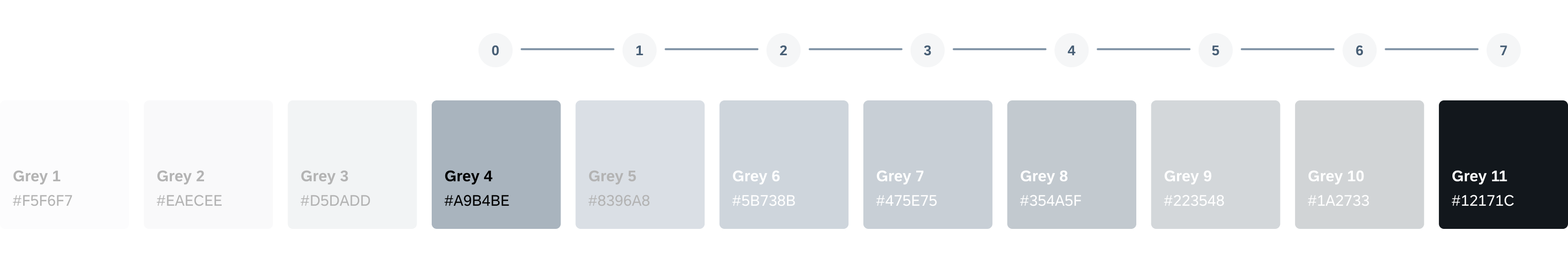
Color contrast is the ratio measuring the difference between the color of the foreground element against the color of the background. Achieving the minimum contrast ratio ensures that all text and visual elements in our design system are legible to all users including visually impaired and/or color-blind users. If the color appears faint against the background, it may be a sign that the color has insufficient color contrast. First, determine its current contrast ratio, second, determine the target contrast ratio of the UI element (e.g., 3:1, 4.5:1, 7:1), and lastly, follow our color pairing system. To validate this, use a color contrast calculator.
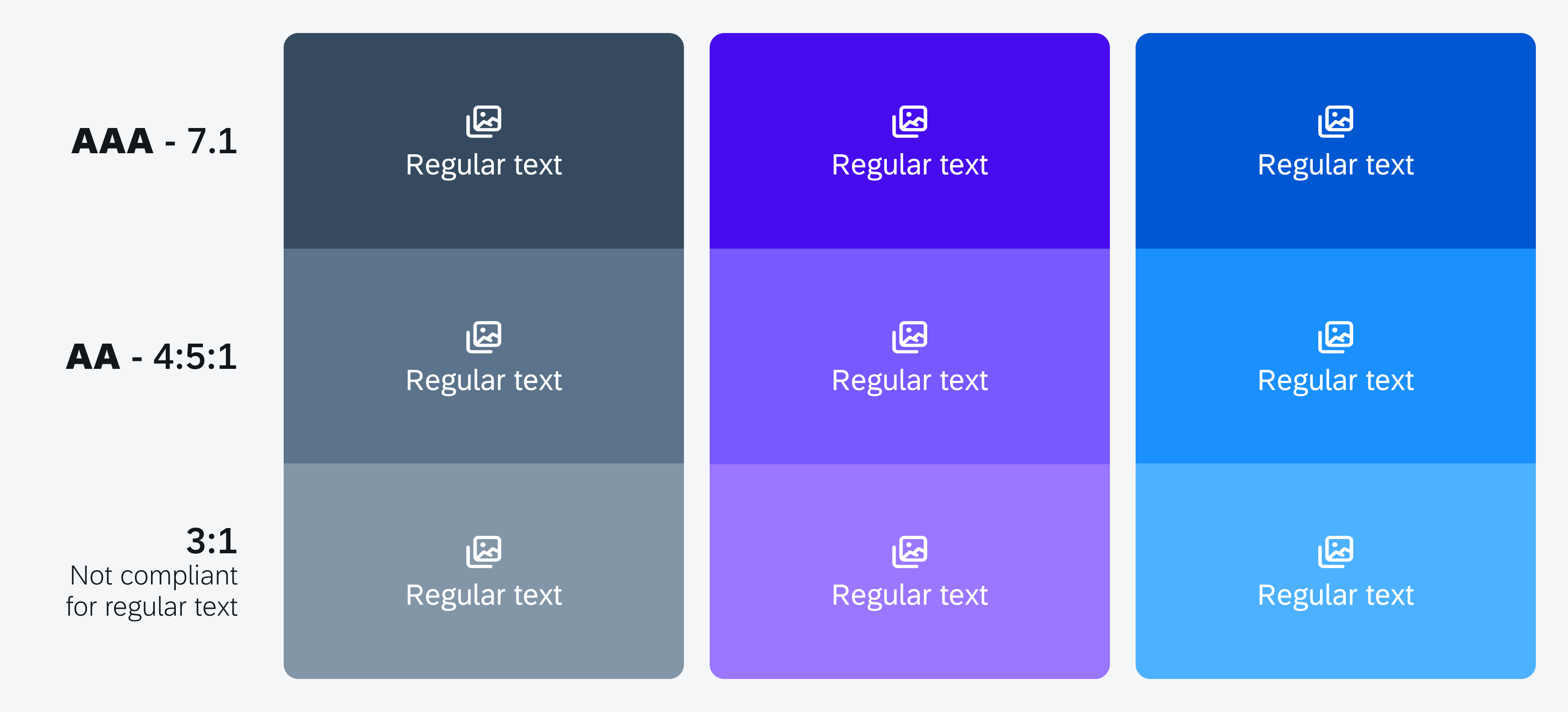
Color contrast ratio examples
Color Pairings
The horizon color palette has been designed to comply with WCAG accessibility standards with a color pairing system that allows designers and developers to easily pair color combinations. Following the color pairing combinations allow you to achieve your desired color contrast.
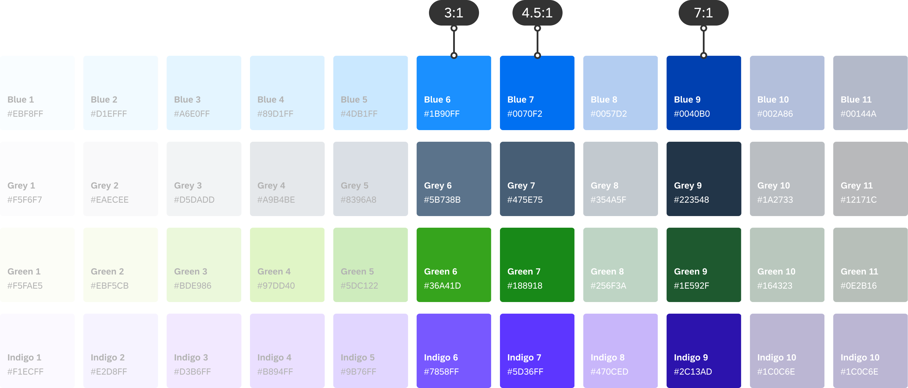
Example of color pairings for 3:1, 4.5:1, and 7:1 color contrast ratios
Color Pairing for 4.5:1 Contrast (Default)
To ensure the minimum color contrast ratio of 4.5:1 for small text (below 18 point regular or 14 point bold) is met, pairing any color that is five steps apart will achieve this. For example, pairing the fourth color with the ninth color ensures that the minimum color contrast for normal text is met. For a minimum color contrast ratio for text and content, we recommend a 4.5:1 color contrast ratio.
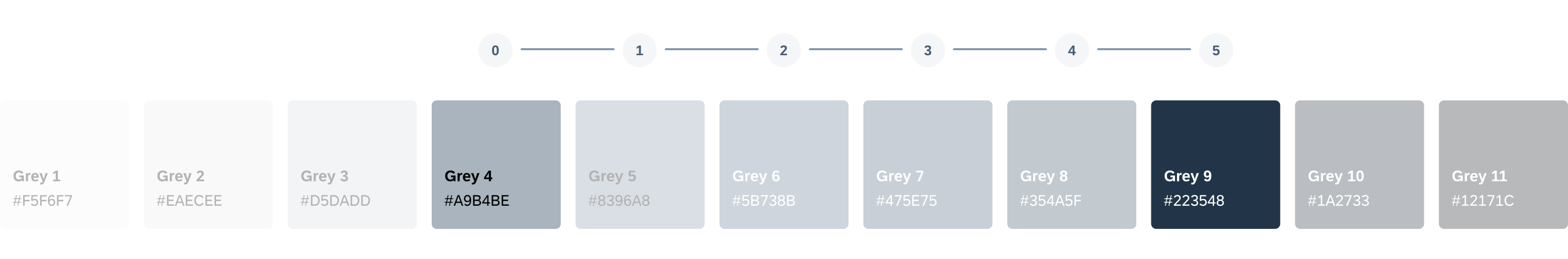
Achieving 4.5:1 color contrast
Color Pairing for 3:1 Contrast
To ensure a minimum of 3:1 color contrast ratio for large text (18 point and above regular or 14 point and above bold) and decorative elements are met, pairing any color that is four steps apart will achieve this. For example, pairing the fourth color with the eighth color in the spectrum ensures that the minimum color contrast ratio for large text, bold text, graphical objects, and user interface components is met. graphical elements we recommend a 3:1 color contrast ratio.
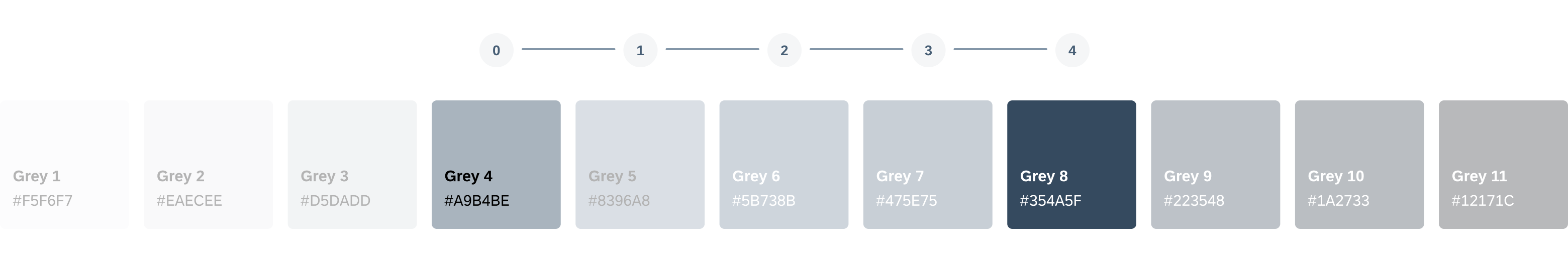
Achieving 3:1 color contrast
Color Pairing for 7:1 Contrast
To ensure the minimum color contrast ratio of 7:1 is met, pairing any color that is seven steps apart will achieve this. For example, pairing the fourth color with the eleventh color ensures that the minimum color contrast for a high-contrast theme is met.
Achieving 7:1 color contrast
High Contrast Text
If users require an additional increased level of color contrast, they can activate their device’s high-contrast text. Activating this mode will change the text color to either black or white, depending on the original text color.
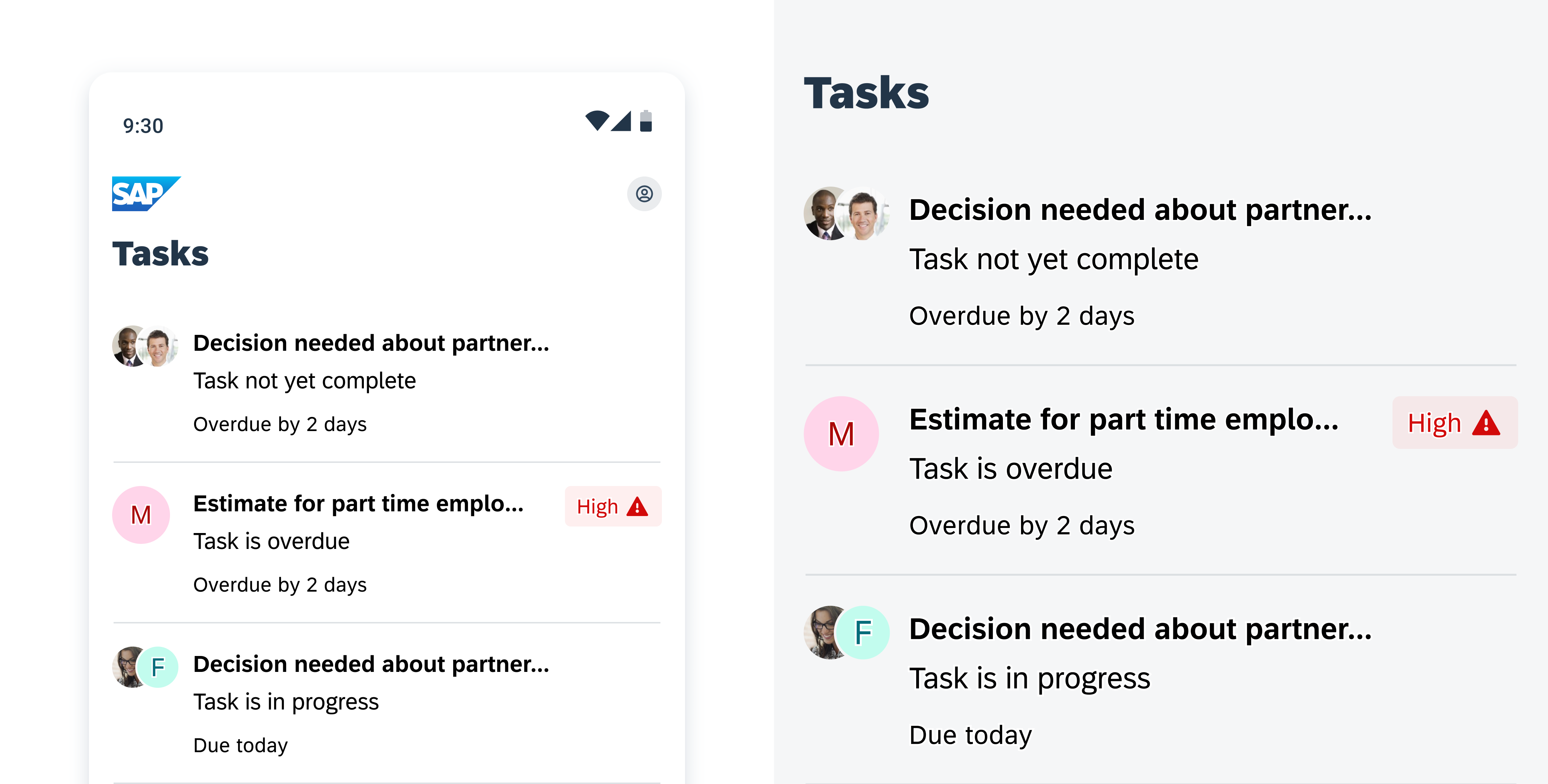
Example of high contrast text (left) scaled up version (right)
Text Scaling
If users have difficulty reading small text, they can increase their font size by accessing their device’s Font Size Accessibility Settings. Toggling this mode allows users to fine-tune their font to their preferred size by increasing or decreasing the font size.
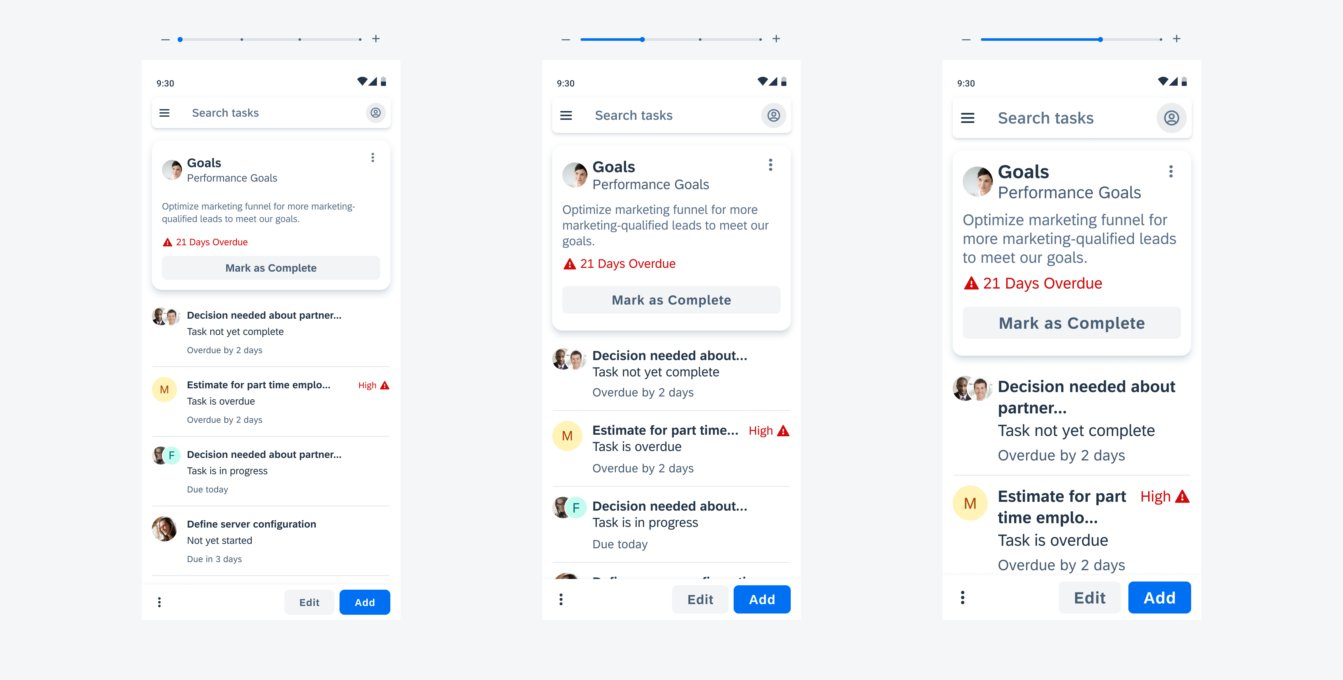
Image showing text scaling and wrapping
Android Accessibility Features
In addition to color contrast ratio, increase contrast and dynamic type, there are more ways to ensure that your app is accessible to everyone. IOS/Android provides guidance on how to enable accessibility features such as voice-over, reading support, switch control, dictation, increase contrast, and more. See (Accessibility on iOS / Accessibility on Android) for more information.
See Accessibility on Android for more information.
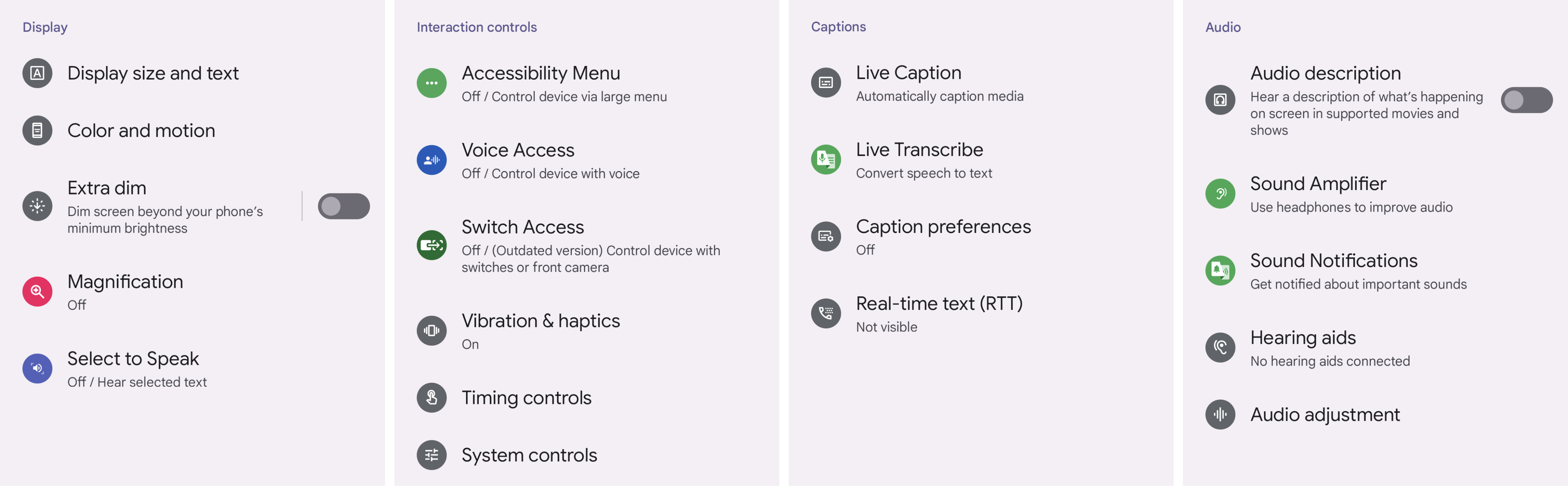
Android accessibility features
Resources
SAP Fiori for iOS: Accessibility
Accessibility at SAP: Guidelines
Material Design: Accessibility
Related Foundations: Colors, Typography
 Your feedback has been sent to the SAP Fiori design team.