
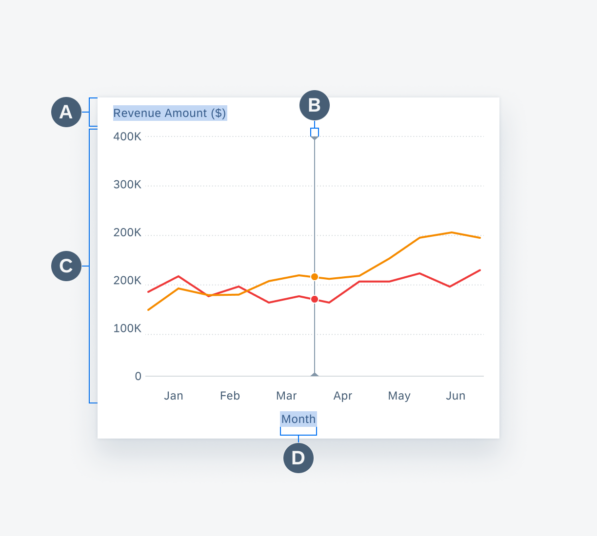
Chart Overview
Intro
A chart represents data in certain graphical patterns, which gives users visual insights of the data set(s). A full-width chart page allows users to view the trend of data, check specific data points, or compare different data sets. To see the specific details of different chart types, see chart types.
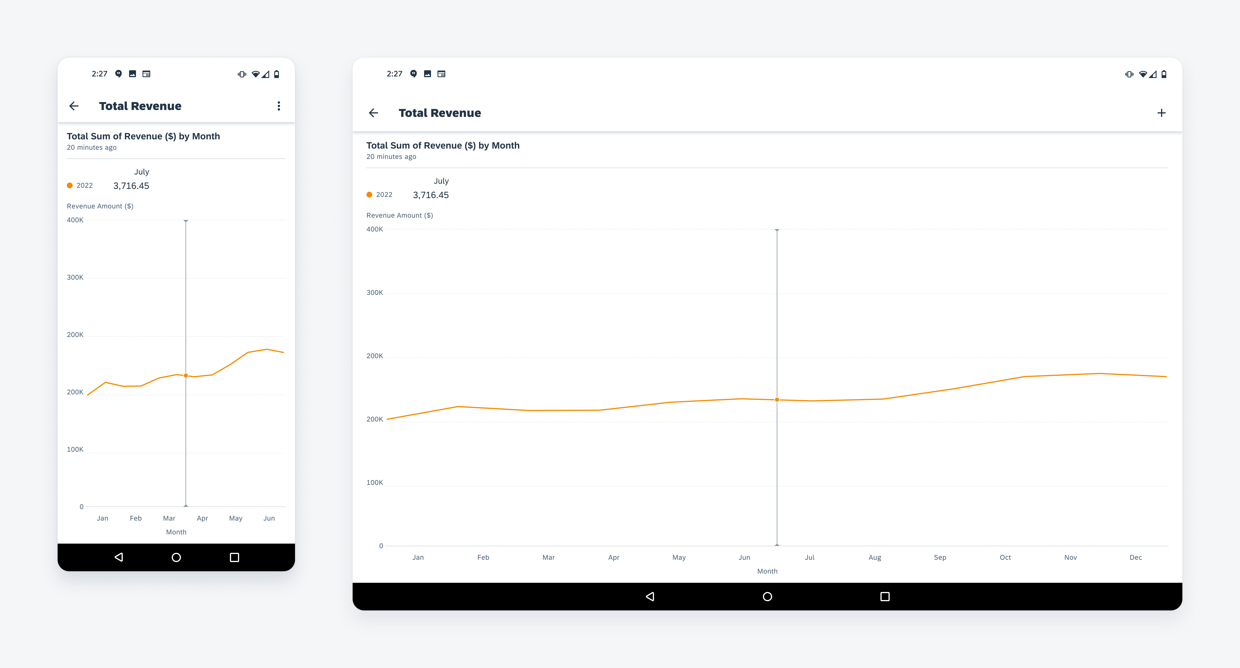
Line chart in mobile (left) and tablet (right)
Anatomy
A. Chart Title
The chart title displays the name of the chart with a timestamp. The name should communicate the content of the chart, so users know what to expect from this chart. The timestamp shows when the chart was updated or refreshed.
B. Chart Summary and Legend
The chart summary area starts with the legend of the chart, followed by a customizable summary of the chart data. When one data point is selected in the chart plot, the value of selected data is shown in the summary area.
C. Chart Plot
The chart plot displays the chart x and y-axes as well as the visual representation of the data points, for example, bars, columns, lines, and so on.
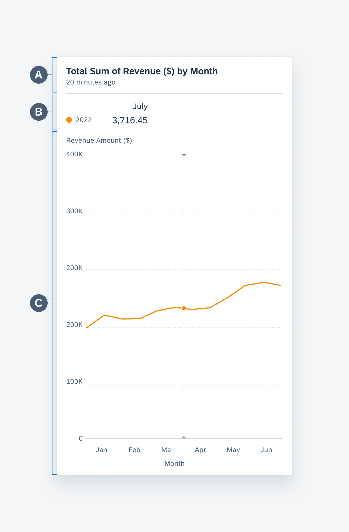
Anatomy of a chart floorplan
Chart Title
The chart title displays the name of the chart and an optional timestamp for the chart data. By default, the chart summary provides high-level details from the chart data – for instance, total sales in dollars ($) for the year. The following content types are found in the chart title section:
A. Title
The chart title should reflect the quantitative (measure) and categorical (dimension) criteria data being displayed with the chart — for example, “Total Sales ($) by Month”. The chart title is updated when the user changes the options in the filter menu and when the user drills into or out of the chart plot.
B. Time Stamp
The time stamp label can be included to indicate the last time the chart was updated.
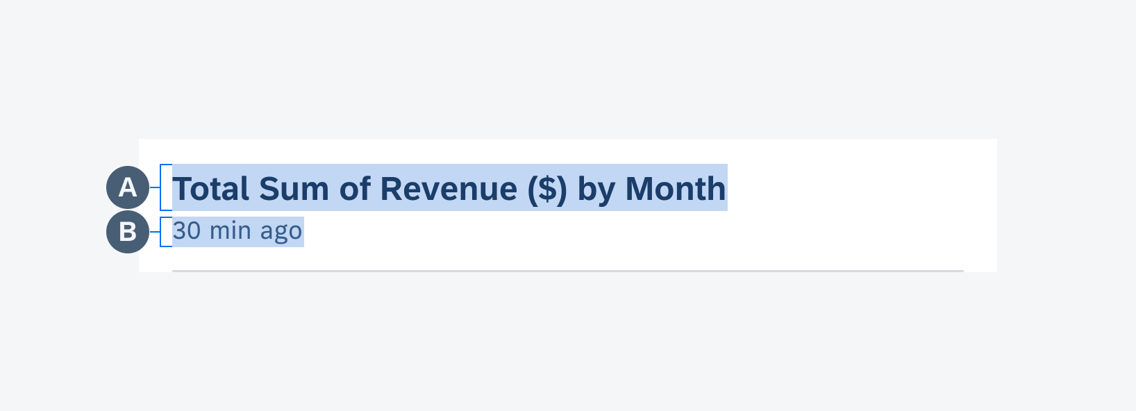
Anatomy of the chart title
Chart Summary and Legend
The chart summary contains summary information for the chart data series. It also serves as the legend for multiple series of data. Charts can display up to four data series at one time; if the data set contains more than four series, the user should be able to select which series to display using the filter menu.
A. Summary Title
The summary title should be concise yet descriptive, including the unit(s) of measure if applicable, for example, $, °C. When users drill into their data, the summary name acts as a visual reference to reinforce the user’s location within the data set. For example, if a user drills down from a 12-month view for 2018 to explore data for April, the summary section title would change from “YTD ($)” to “April Total ($)”.
B. Legend Item
The legend item consists of colored nodes and text that explains the meaning of the data points found in the chart plot. When there are two or more series, the legend items vertically stack from most recent to least recent.
C. Data Summary
The data summary displays the average value by default. When a data point is selected, its values is displayed to the right of the average values. If a range is selected, the summary displays the values for that range. The alignment of summary title and data summary can be configured based on data type. We recommend right alignment for numeric data.
D. Trend (Optional)
The trend is identified by an up/down icon, text, and the use of semantic colors that is displayed next to the summary value as the user selects a range.
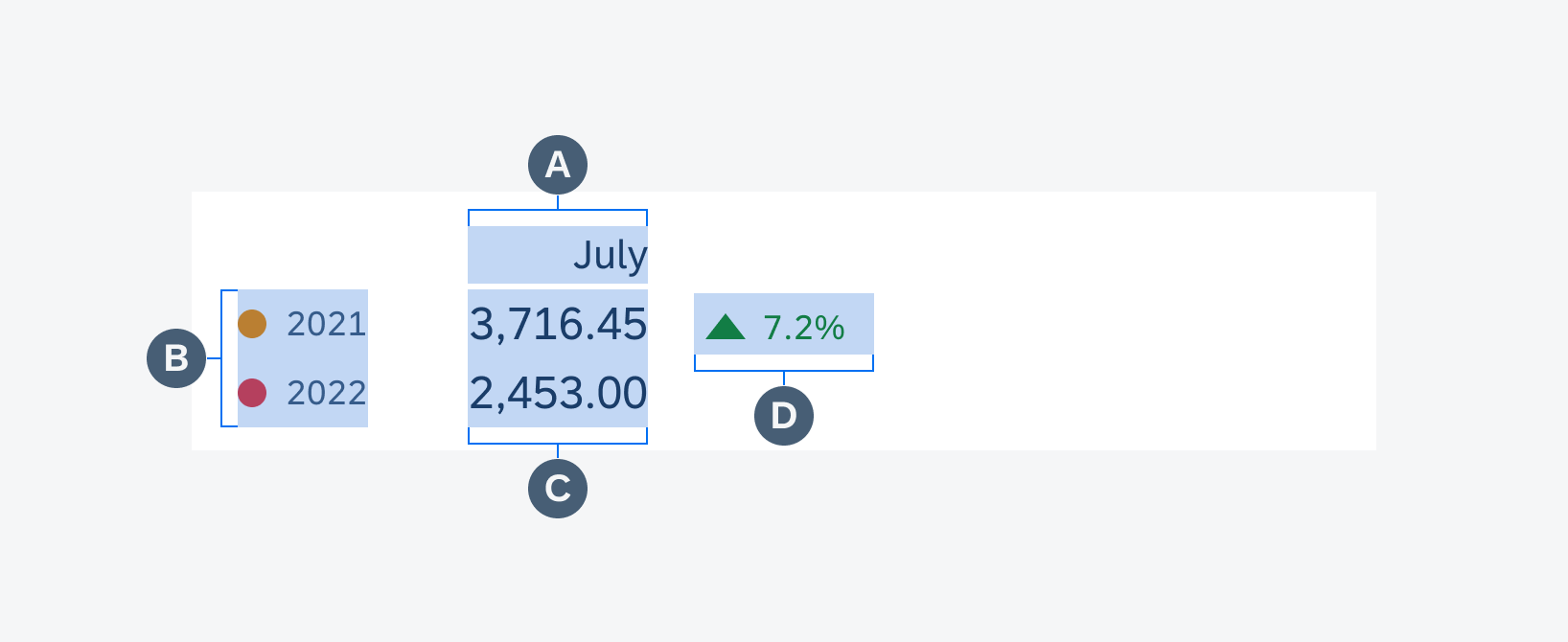
Anatomy of summary and legend
Chart Plot
This contains the visual representation of the chart data, including the chart items , such as lines, columns, bars, etc., x and y axes, title, labels, and gridlines. Users can select data points by tapping on the chart plot area and they can horizontally scroll to view more of the data set. See chart types for the specific behaviors of each chart type. The chart plot should always include the following:
A. Y-Axis Title
The y-axis title is placed at the top of the chart plot and is left-aligned with the y-labels. The title should be clear and concise.
B. Ruler (for Line Chart)
The ruler is a vertical axis that appears when the user selects a point on the chart to better illustrate a point’s x and y location.
C. Grid Lines
The grid lines refer to the horizontal lines that run across the width of the chart plot area and are used to indicate the y-position of a data set. There are two types of grid lines: the base line (the minimum value in a data set) and the standard line (any value above or below the baseline). Both lines types are distinguished by their visual treatment, baselines are solid and standard lines are dotted.
D. X-Axis Title
The x-axis title is placed at the bottom of the chart plot and is center-aligned with the device screen. The title should be clear and concise.
Anatomy of a chart plot
Empty State
The empty state for charts is a way to provide guidance, context, and delight during moments where the user may experience connectivity issues or if the app displays an empty data set. The illustration works along with a solution-oriented message to express SAP Fiori’s brand identity. The empty state consists of the following:
A. Image
The image section displays an image provided by SAP Fiori Moments that expresses our brand values. Visit SAP Fiori Moments’ Guidelines to download illustration assets.
B. Title
The title is a single line of text to help the user understand the empty state. Keep the messaging clear and concise and the voice and tone consistent with SAP Fiori Moments’ guidelines.
C. Description
The description is a small multi-line text that provides more detail than the title. The description allows for more text but the message should be concise.
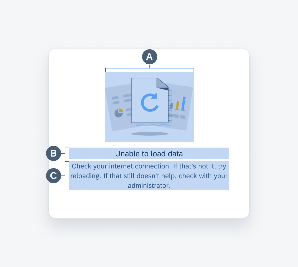
Anatomy of the chart empty state
Adaptive Design
The chart empty state utilizes a responsive layout to scale the empty state view at different widths. The content is reduced or added according to the size of the view. For example, the chart header and chart card display a single-line title, whereas the full-screen chart displays an illustration, title, and description. This is to reduce visual noise in instances where there are multiple charts on the same page without data.

Different types of chart empty states
Resources
Related Components/Patterns: Chart Types, Chart Card
SAP Fiori for iOS: Chart Overview
Development: Line Chart, Column Chart, Horizontal Bar Chart, Donut Chart, Scatter Chart
 Your feedback has been sent to the SAP Fiori design team.