
Illustrated Message
FioriIllustratedMessage
Intro
The illustrated message communicates empty, error, and success states through a combination of solution-oriented messages, engaging illustrations, and a conversational tone. The illustrated message turns a situation, even a negative one, into a better experience for your users, while ensuring consistency.
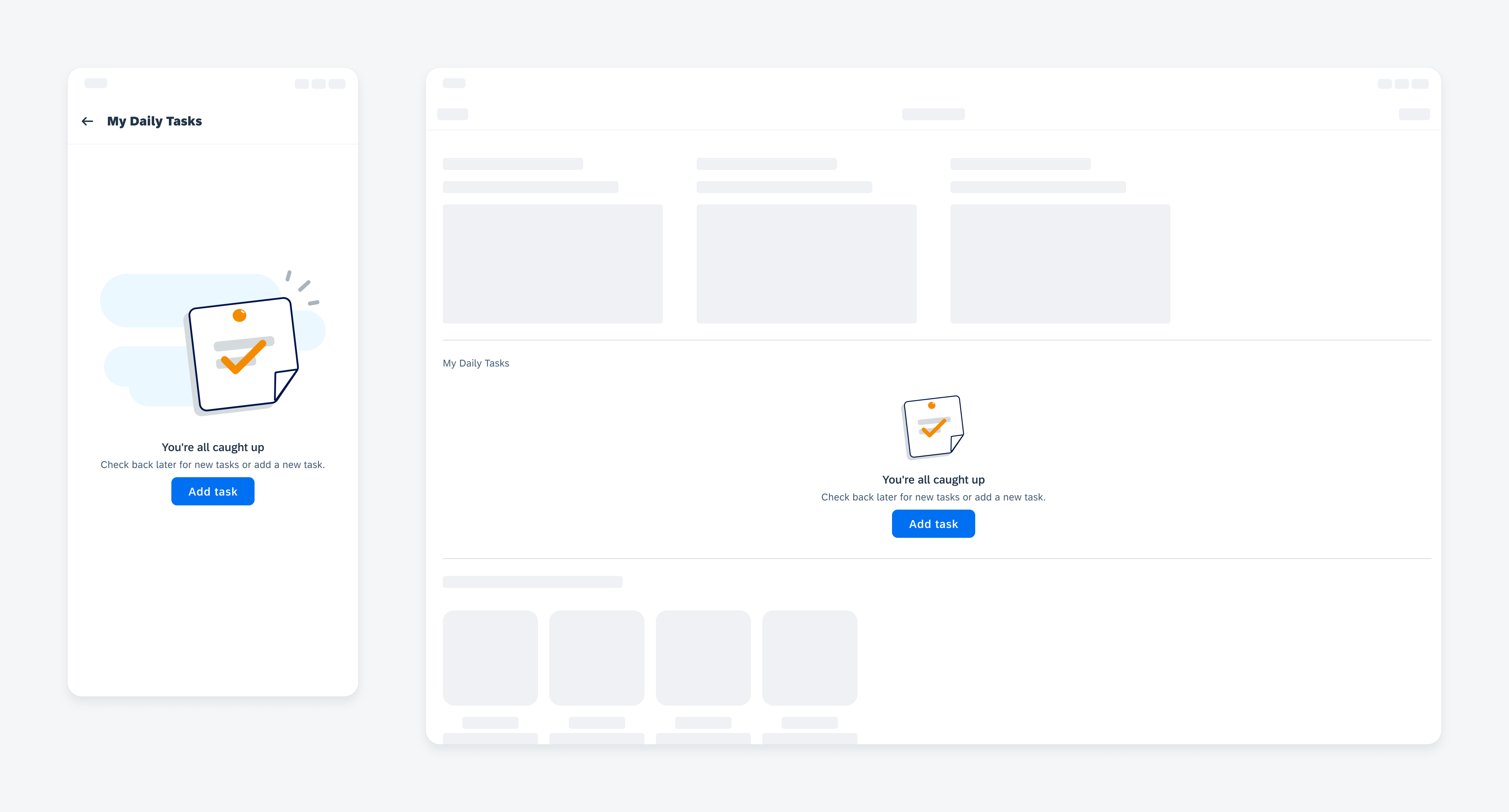
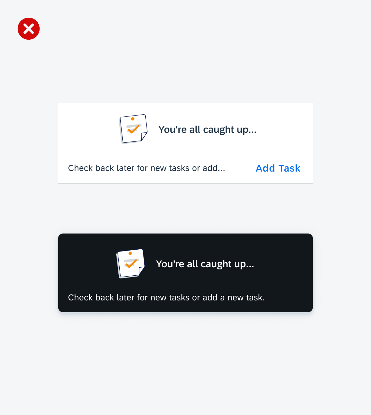
General empty state example
Usage
Use the illustrated message when you want to improve the user experience for one or more message states in your application. The illustrated message’s content should be concise but prioritize clear messaging.
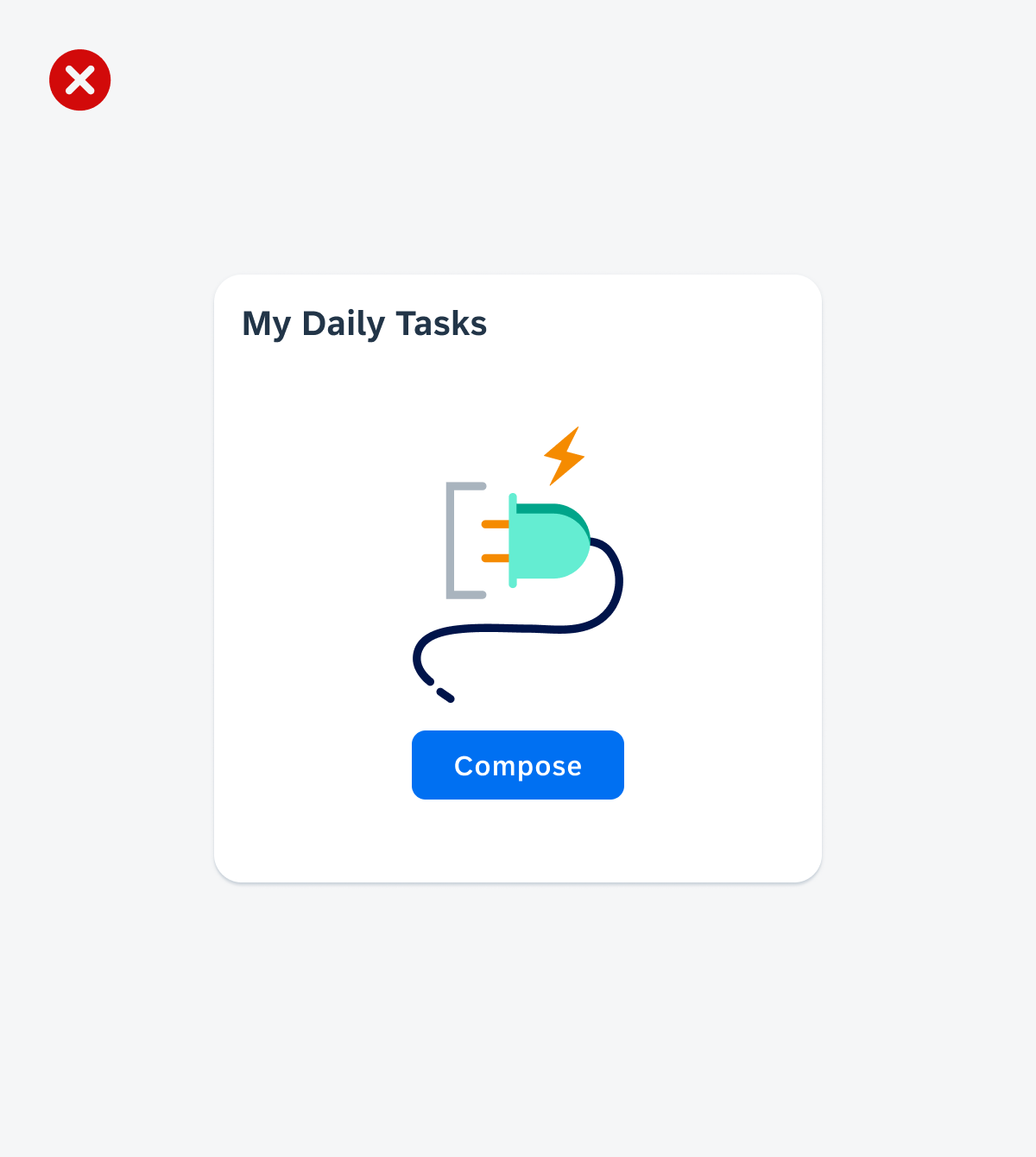
Turn a negative event into a positive one
Take time to design and write a solution-oriented message. Be precise in your wording and use appropriate illustrations.
Ideally, a negative event in a software product doesn’t generate negative emotions. A well-designed illustrated message that leaves users feeling understood and valued can result in a neutral or even positive feeling. Remember that users will benefit from thoughtfully crafted illustrated messages every time they encounter them – perhaps even daily.
An illustrated message that has positive messaging and cohesive imagery
An illustrated message that has a problem-oriented message and displays an icon rather than an illustration
Always write a coherent, solution-oriented message
Make sure that the illustration, message, and call to action work together as one to clarify the situation. Always provide a message. Never use an illustration without a message. A message combined with an illustration is more powerful than a message alone.
An illustrated message that has solution-oriented messaging with a related illustration and call to action
An illustrated message without the message and an illustration unrelated to the call to action
Tailor your message to your use case
Always ensure that the default text fits in the context. If not, replace it or make it more precise.
Example:
Default text: No results found / Try changing your search criteria.
Adapted text (supplier table used with a filter bar): No suppliers found / Try adjusting your filter settings.
We recommend replacing generic terms such as “data” and “object” with your specific business object.
Example:
Default text: There’s no data yet / When there is, you’ll see it here.
Adapted text: There are no orders yet / When there are, you’ll see them here.
An illustrated message that has enhanced the message to utilize use case-specific terms
An illustrated message displaying a general message without contextual information
Use the illustrated message to communicate high-priority information
Place the illustrated message in dialogs, cards, and at a page level rather than a snackbar or a banner to indicate high-priority empty, error, and success states.
An illustrated message placed in a full-screen page
An illustrated message placed in a banner (top) and snackbar (bottom)
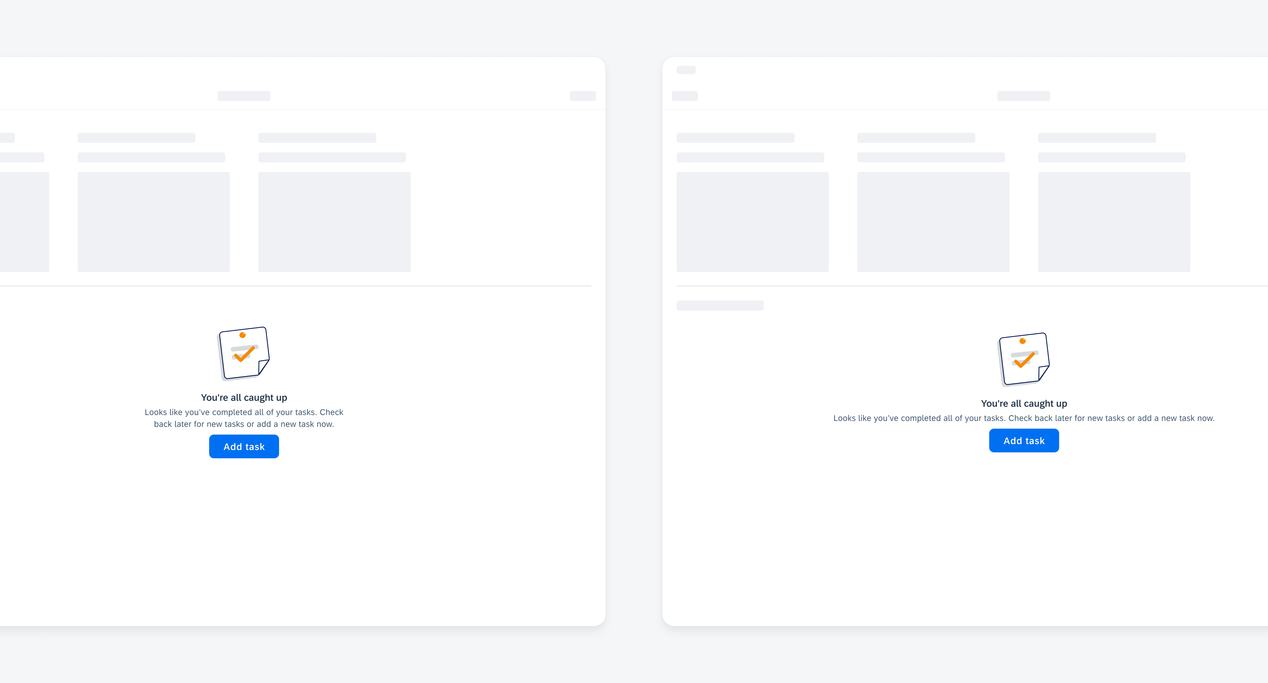
Prioritize the message over the illustration
When the illustrated message is placed in a container that does not fit all the elements, we recommend removing the illustration so that the user can read the entire message.
An illustrated message that prioritizes the content over the illustration so the most important information can fit in the container
An illustrated message including all elements that do not fit within the container’s available space
Anatomy
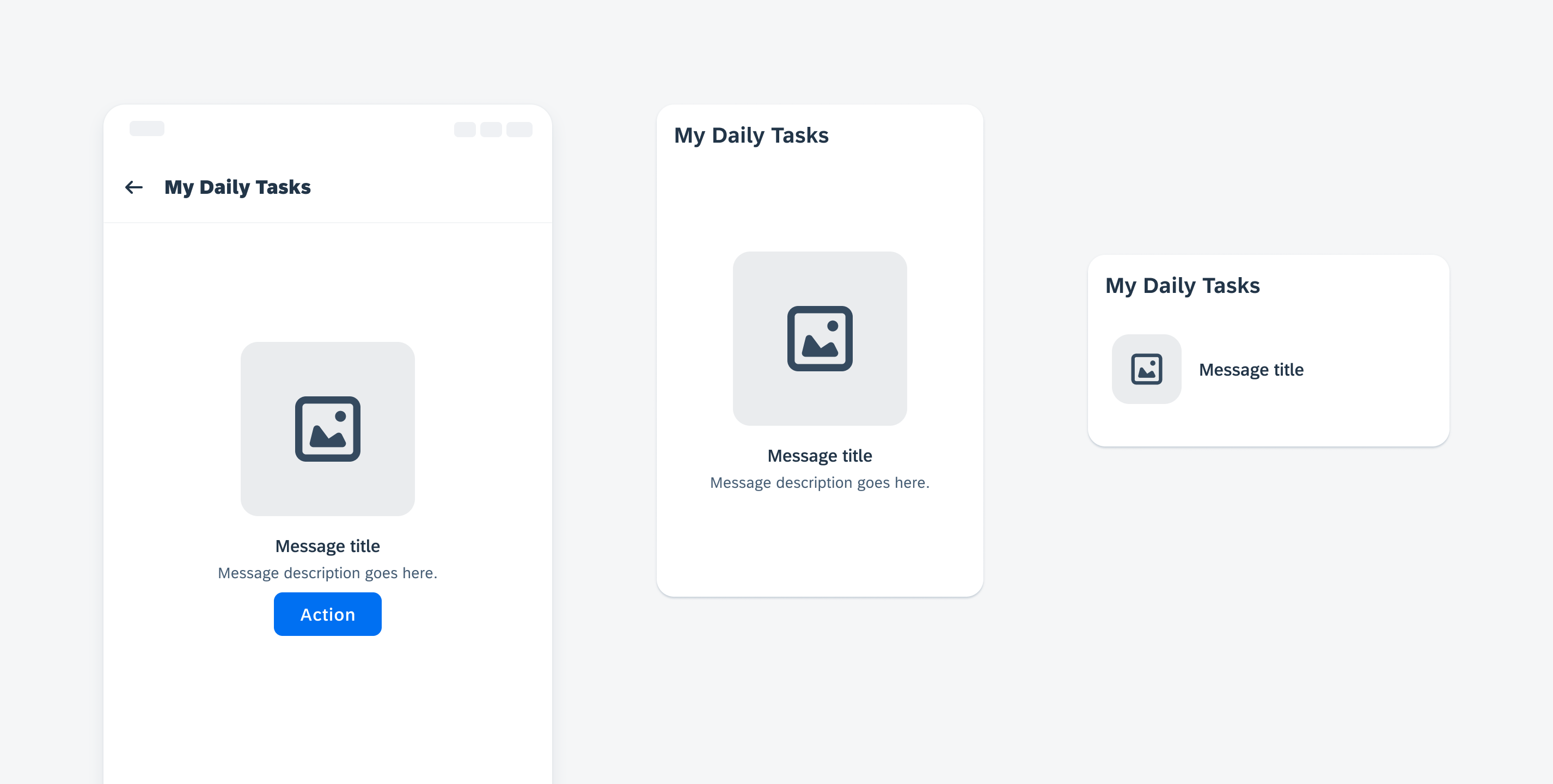
A. Illustration (Optional)
Use the illustration to help clarify the situation and add personality. The illustration should be appropriate for the use case and the container being used, such as a dialog or card, and that similar use cases are handled consistently.
This section can display an illustration from an app-specific library, or one provided by the core design team’s illustration library.
B. Title
The title explains the reason for the specific state, preferably in a single line. Use the title to convey the essence of your message in simple language. We recommend writing the title in sentence case.
If you are using one of the standard use cases, you can refine the default text and customize it to the precise use case.
C. Description (Optional)
Use the description to add details and prompt the user what to do next, preferably in two sentences or less. Like the title, the description’s default text can also be customized to fit a specific use case.
D. Call to Action (Optional)
If there is a clear next step, include a maximum of one call to action button.
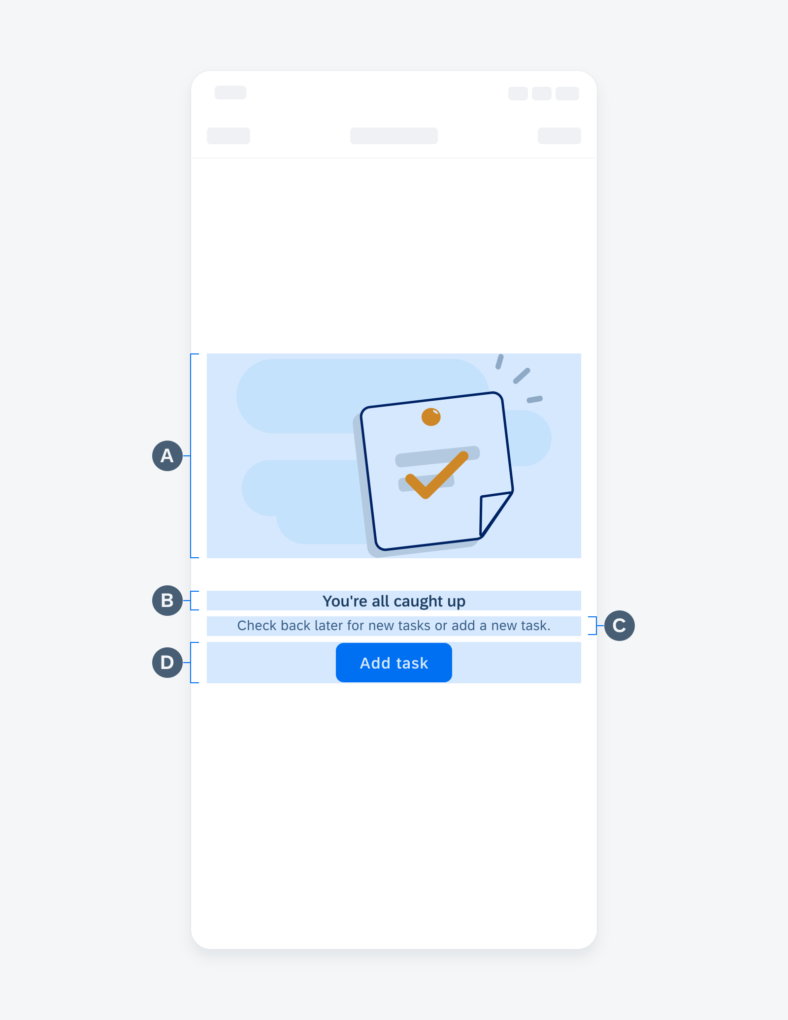
Illustrated message anatomy
Adaptive Design
Illustration Sizes
We recommended using the following fixed mobile illustration sizes for the following containers:
A. Size XL (320×240)
Full-screen page, full-screen dialog
B. Size L (160×160)
Page section, larger dialogs, large cards (2×3, 2×2)
C. Size M (92×92)
Page section, smaller dialogs, medium card (2×1)
D. Size S (64×64)
Smaller dialogs, small card (1×1)
E. Size XS (48×48)
Smaller dialogs, small card (1×1)
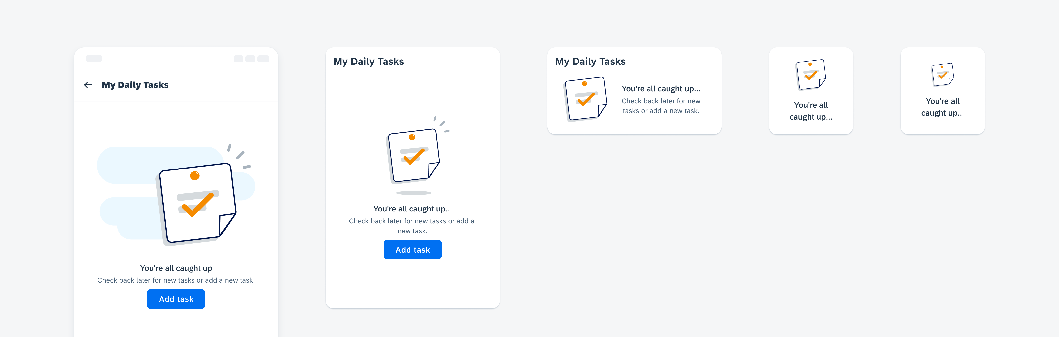
Illustration set with all five illustration sizes
Message Width Adaptiveness
Depending on the container in which the illustrated message is placed, the message content can stretch to fill the maximum width of the container. Alternatively, the message container can be set to a fixed width to maintain cohesiveness between a set of illustrated messages.
An illustrated message description with a fixed width (left) and a description that stretches to fill the available space (right)
Variations
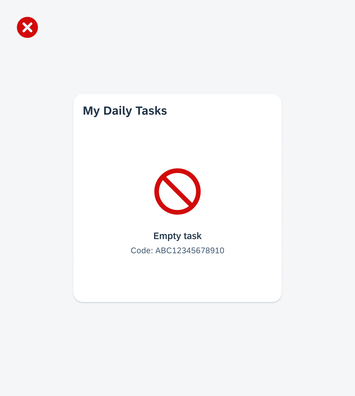
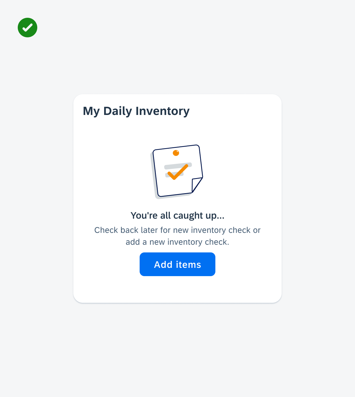
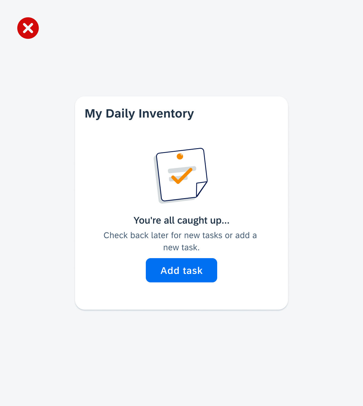
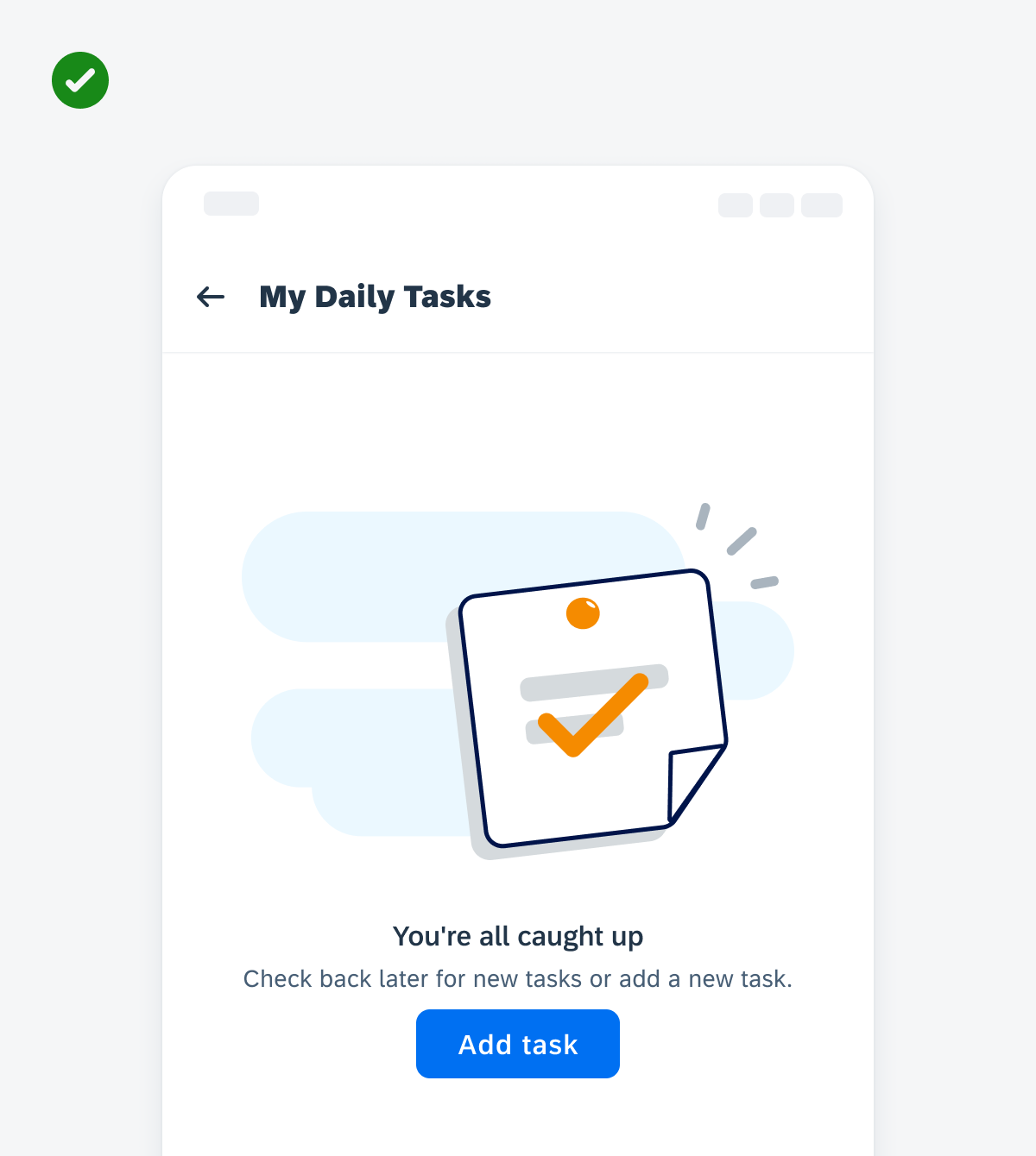
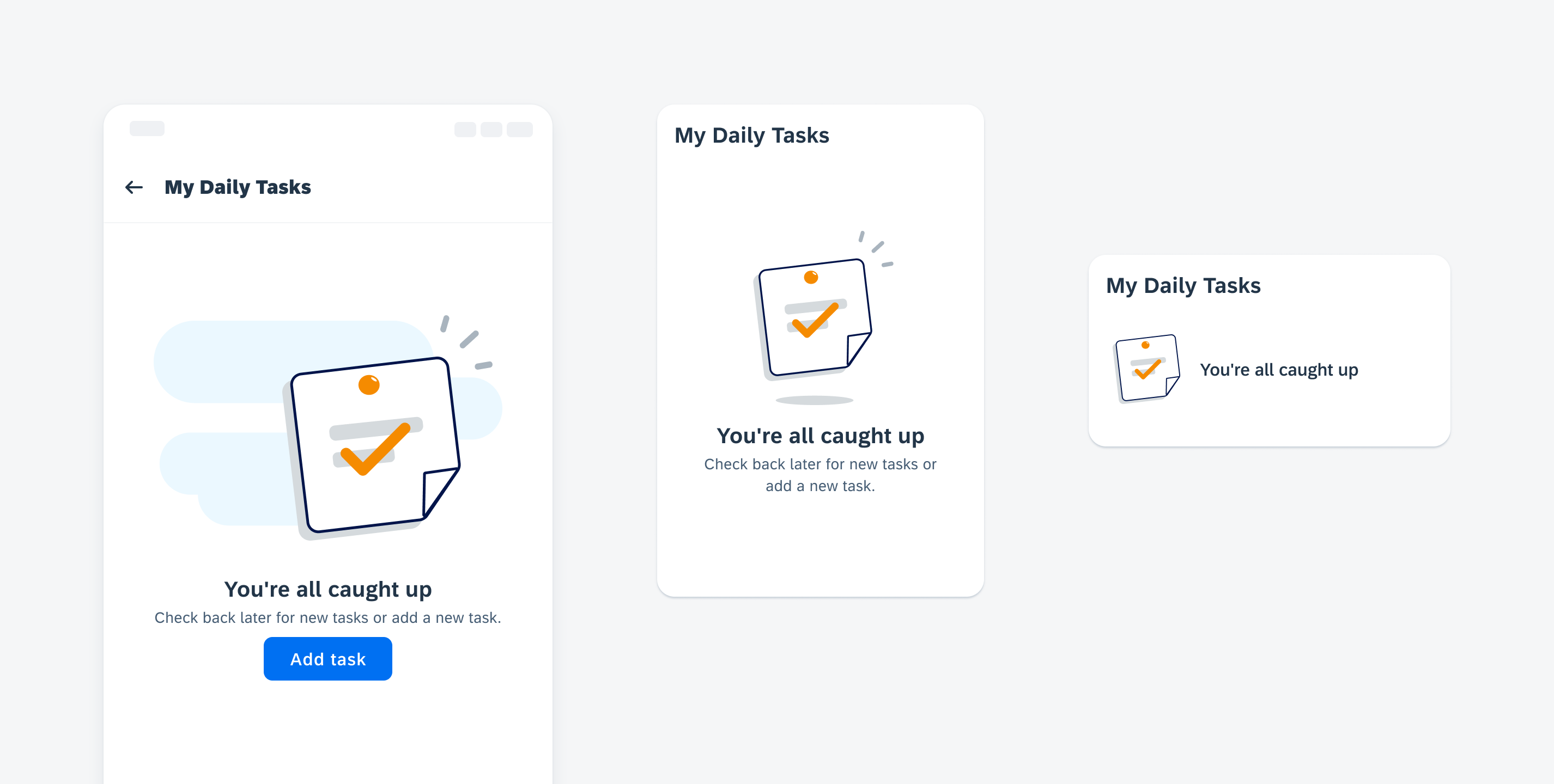
Empty State
An empty state is a moment in the user experience when there is no content to display. Some common use cases include:
- Empty list, table, or inbox
- No notifications or planned activities
- Before search
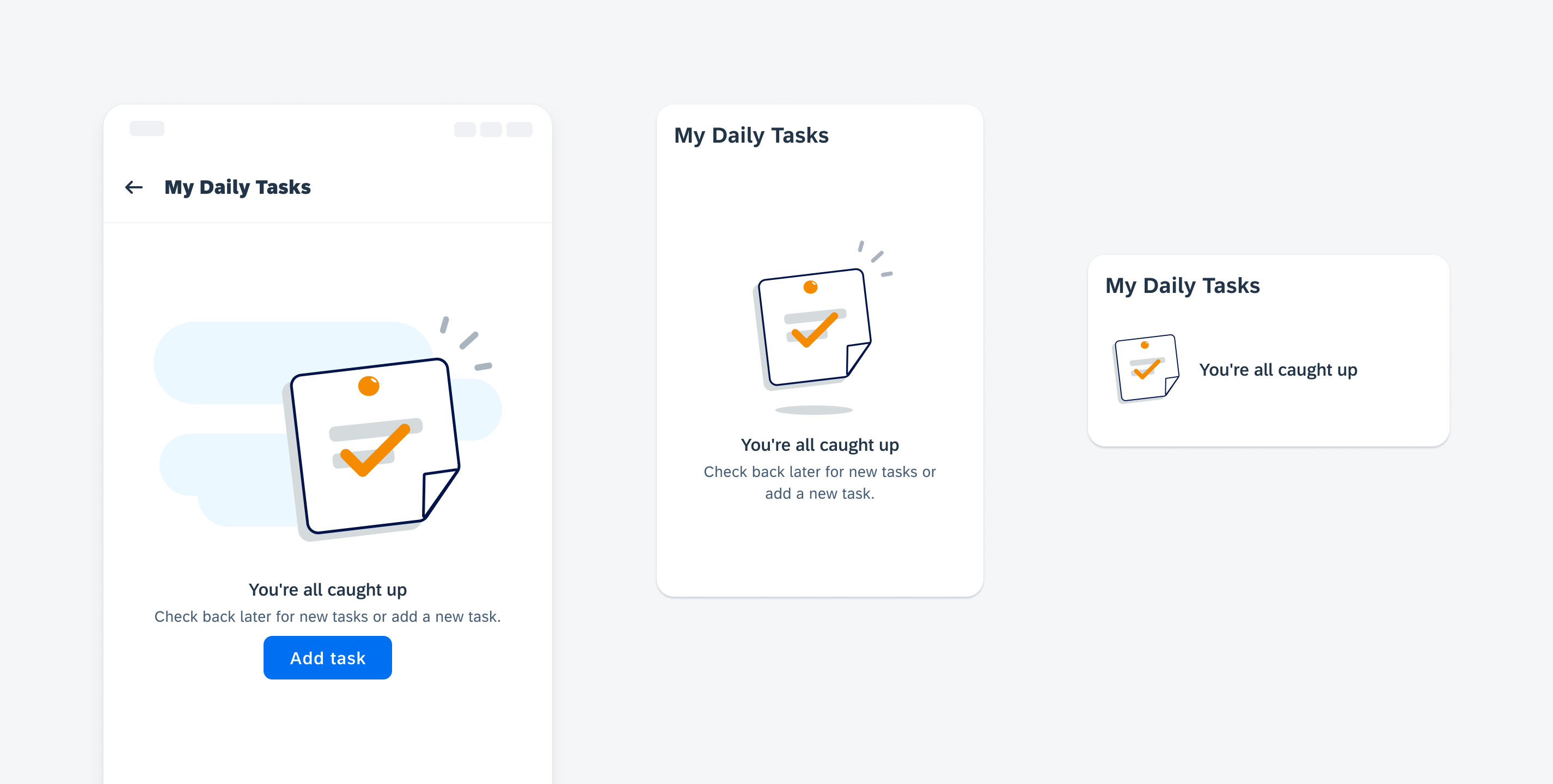
“No task” empty state example
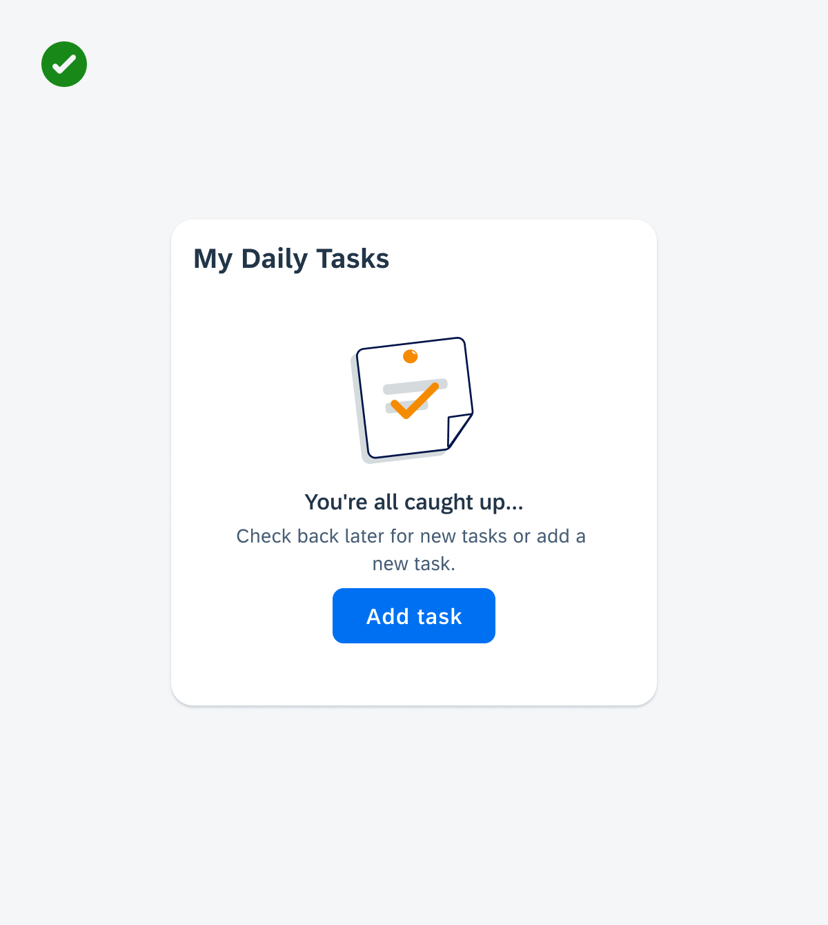
Error State
An error state is caused by missing permissions, incorrect configuration, or a system issue. Some common use cases include:
- Unable to load, upload, or connect
- No search results found
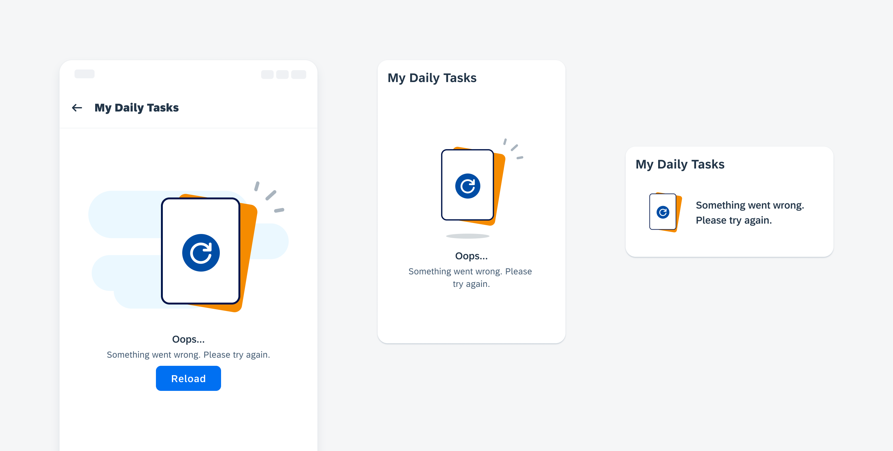
“Unable to load” error state example
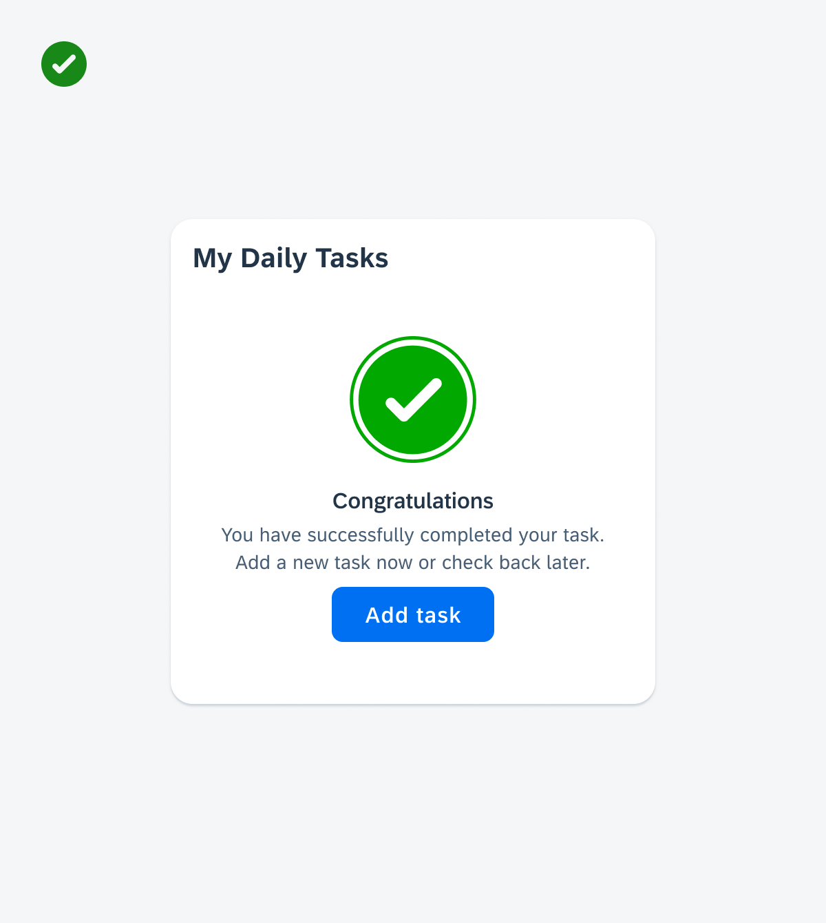
Success State
A success state is when an action has been performed without errors or warnings, meaning that the user has achieved a certain task or milestone. Some common use cases include:
- Reaching a daily goal or target
- Completing a work task
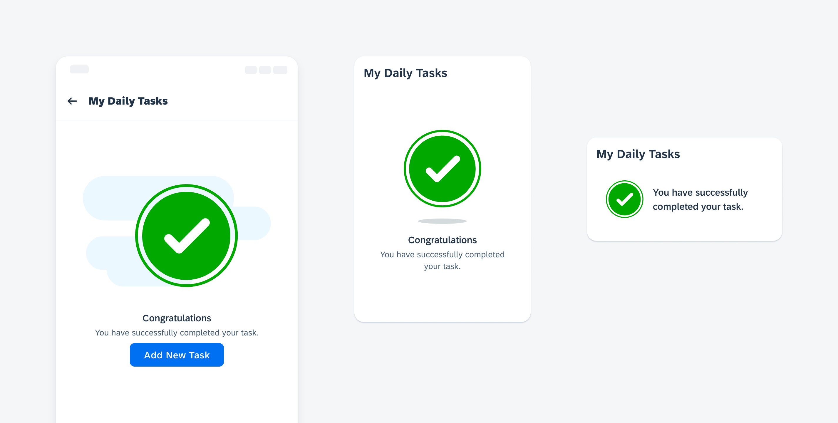
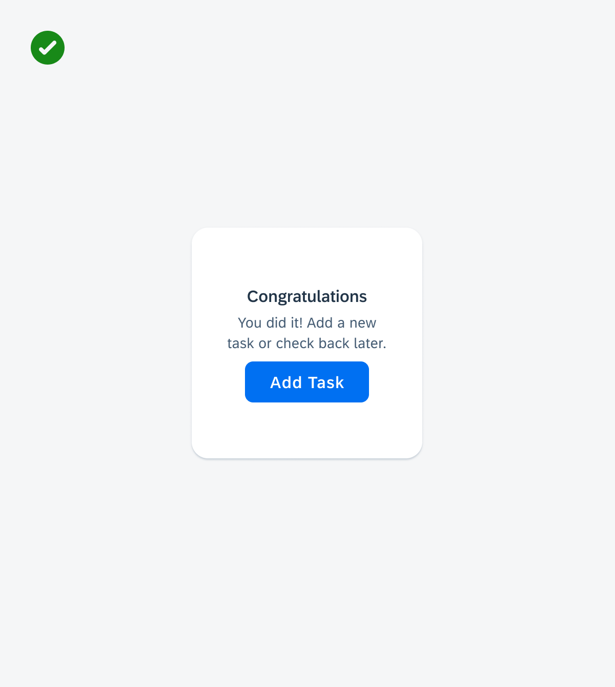
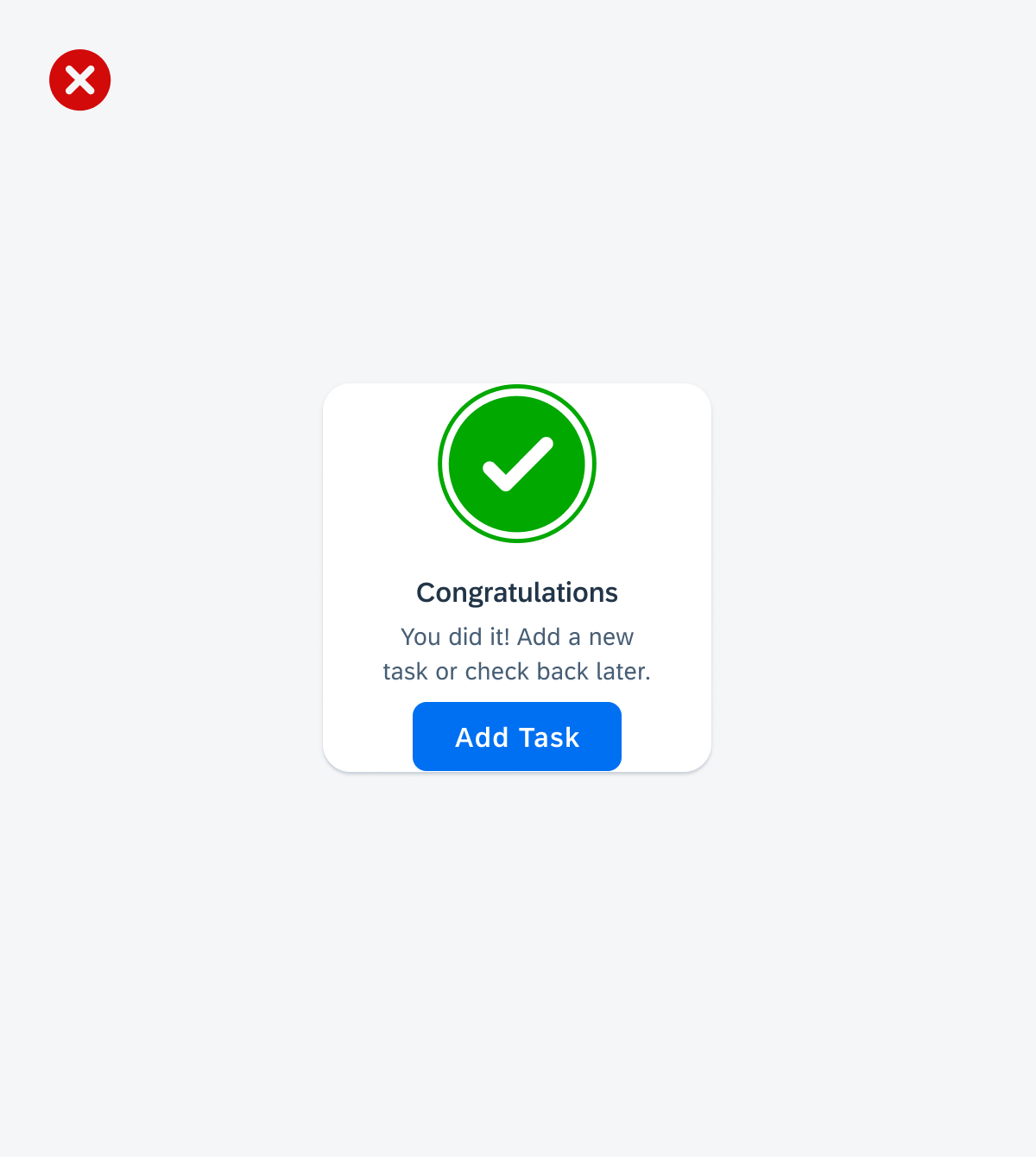
“Task complete” success state example
Custom States
The illustrated message component was designed to be flexible enough to handle custom use cases. Along with altering the actual text content (title, description, or call-to-action label), you can also use your own custom illustrations if they conform to the preset dimensions of the different available illustration/image sizes mentioned in the above adaptive design section.
An illustrated message with custom text content and illustration that aligns with the set mobile illustration sizes
Message Title Variations
The illustrated message title has a default font size of 16pt (Subtitle 2) and a larger title variation of 20pt (Header 6) to emphasize the state’s main headline. While choosing the large title variation is optional, we recommend using it in scenarios where the illustrated message is placed in a larger container with ample space. When the illustrated message is placed in a full-page section, large dialog, or large card, it could be beneficial to utilize the large title variation, so the headline is more noticeable to the user.
An illustrated message using the large title variation (left and center) and the default title variation (right)
Resources
Development: Illustrated Message
SAP Fiori for iOS: Empty State View
SAP Fiori for Web: Illustrated Message
 Your feedback has been sent to the SAP Fiori design team.