
Chips
FioriChip
Intro
Chips are interactive elements that provide users with a set of options. Users can tap a chip to make selections. Chips can be used for single and multiple selection. A single selection chip is an alternative for a radio button and a multiple selection chip is an alternative for a checkbox.
Chips form cell on mobile (left) and on tablet (right)
Usage
- Use chips when you need to help users quickly to choose between at least two clearly distinct choices.
- Use chips to optimize screen space when the text of value is short.
- Don’t use chips when the number of options is more than eight, use a list picker form cell.
- Don’t use chips when the text of value is very long, even if the number of options is no more than eight. Use a list picker form cell instead.
Anatomy
Chip Form Cell
A. Label
Describes the intent of the chip form cell.
B. Chips
Displays a list of chips for users to select.
C. Helper Text
Provides additional information about the form cell.
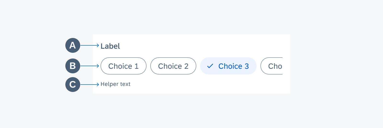
Chips form cell anatomy
Chip
A. Container
A chip container defines the boundary of each chip. All chip elements are wrapped in a chip container. The width of the container depends on the length of its content. Each container is a touch target.
B. Text Label
A text label describes what each chip stands for. Text labels should be concise.
C. Check Mark
A check mark appears when a filter chip is selected and disappears when it’s deselected.

Chips anatomy
Variations
Single Selection
Single selection chips provide users with a set of mutually exclusive options. The user taps on a chip to activate the option. Tapping a different chip transfers activation to that option. Therefore, only one chip can be selected in a group of single selection chips. Single selection chips can be an alternative for radio buttons.
When selected, a check mark appears in front of the text label and pushes the text to the right. The chip container expands horizontally to accommodate the check mark. The check mark disappears when the chip is deselected. The text label shifts left and the chip container returns to its original size.
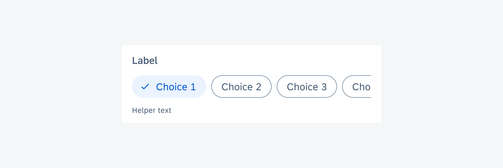
Single selection chips
Multiple Selection
Multiple selection chips allow users to select multiple options from a set of values. Each chip toggles between selected and unselected. Multiple selection chips can be an alternative for checkboxes.
When selected, a check mark appears in front of the text label and pushes the text to the right. The chip container expands horizontally to accommodate the check mark. The check mark disappears when the chip is deselected. The text label shifts left and the chip container returns to its original size.
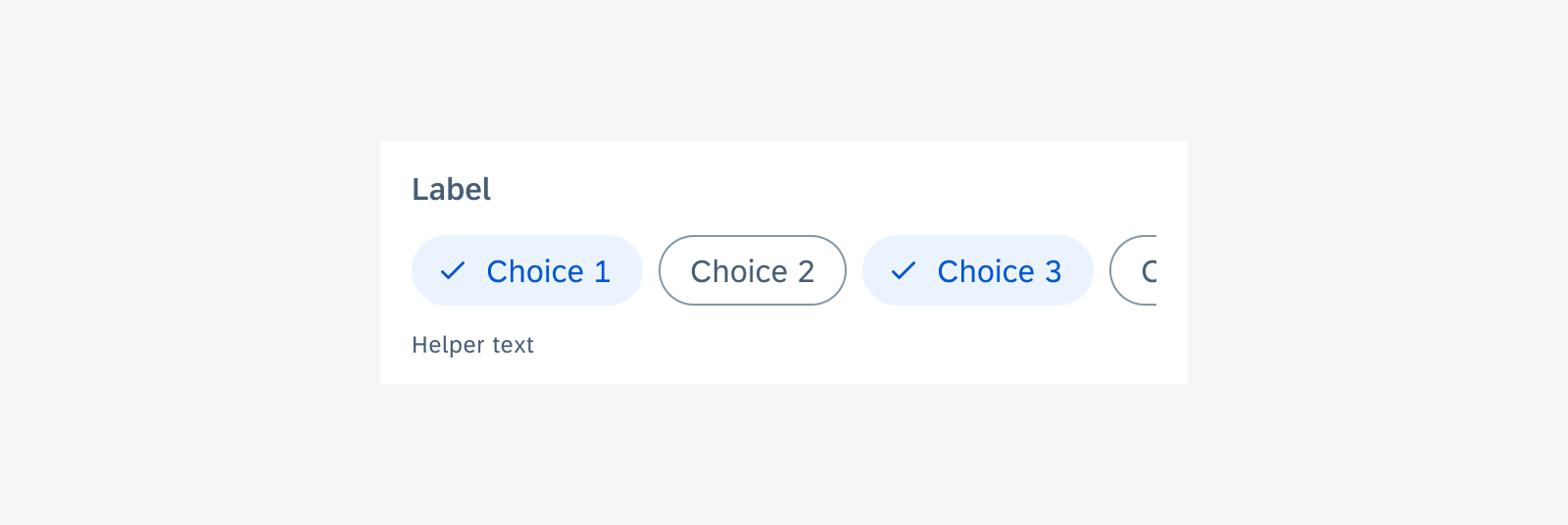
Multiple selection chips
Chip with Leading Icon
Chips with a leading icon can be used for single and multiple selection. When selected, no check mark will appear.
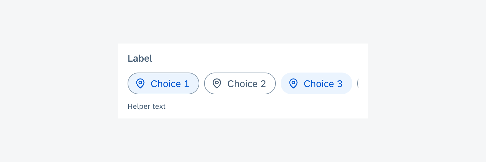
Chips with a leading icon
Wrapped
A group of chips is typically displayed horizontally under the title. The title describes the meaning or purpose of the group. More than one row of chips can be wrapped to the next row, or overflow to the right with horizontal scroll to show more. Choose the layout that provides the best readability for your use case.
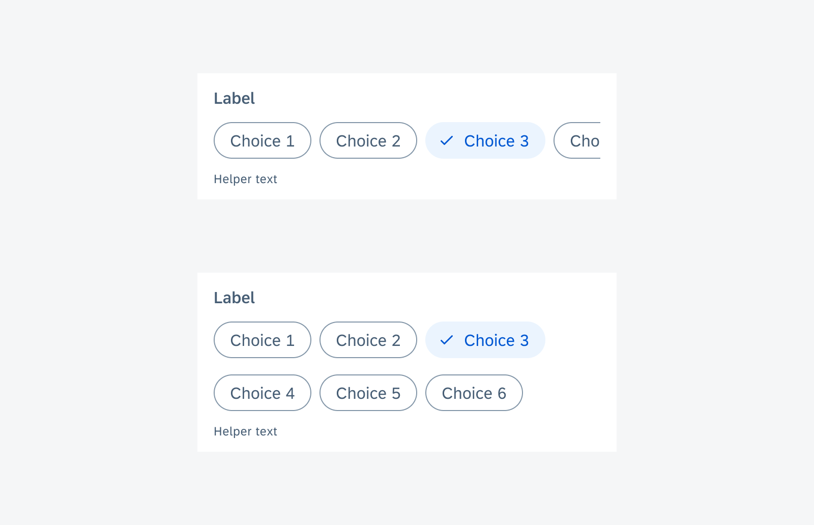
Chip form cell with horizontal scroll (top) and wrapped (bottom)
Behavior and Interaction
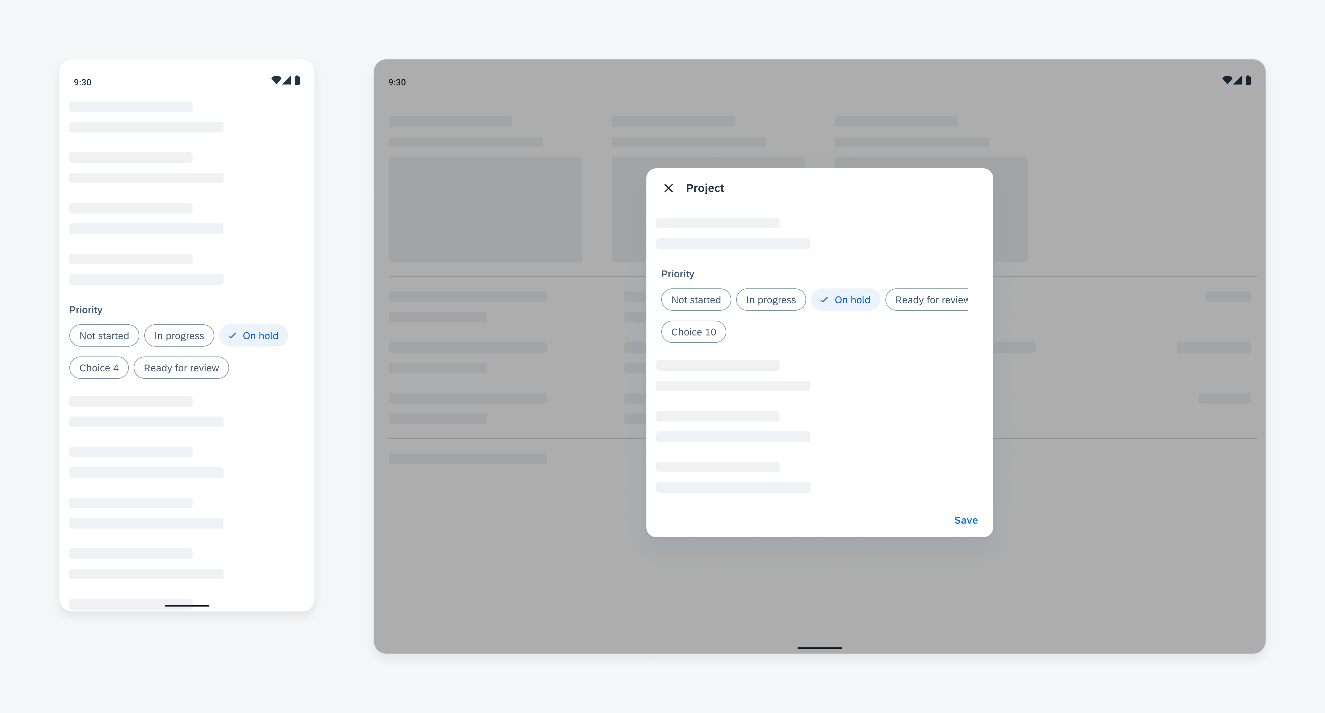
Error State
Use validation message only when necessary: to show an error message or direct feedback of this control. Don’t distract users with unimportant information. For page level feedback, use a snackbar instead.
The validation message should be concise. One line of text is recommended for the validation message.
By default, there is no validation message. When the validation message is triggered, insert the message with padding after the last row of chips before the divider line if used. The content under it will be pushed down.
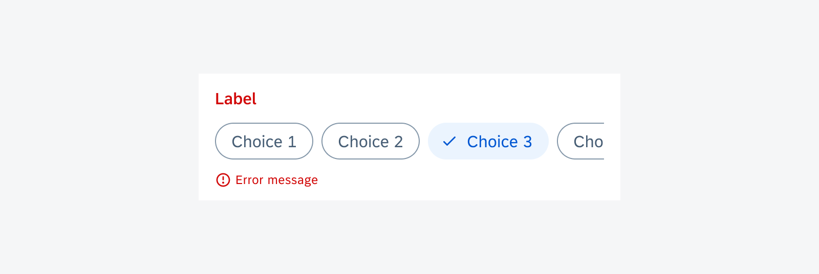
Chip form cell in error state with error message
Resources
Development: FilterChip, FilterChipFormCell
SAP Fiori for iOS: Filter Form Cell, Segmented Form Cell
Material Design: Filter Chip
 Your feedback has been sent to the SAP Fiori design team.