
Rating Control
FioriRating
Intro
The rating control can be used in various contexts to provide insight regarding the opinions and preferences of an object.
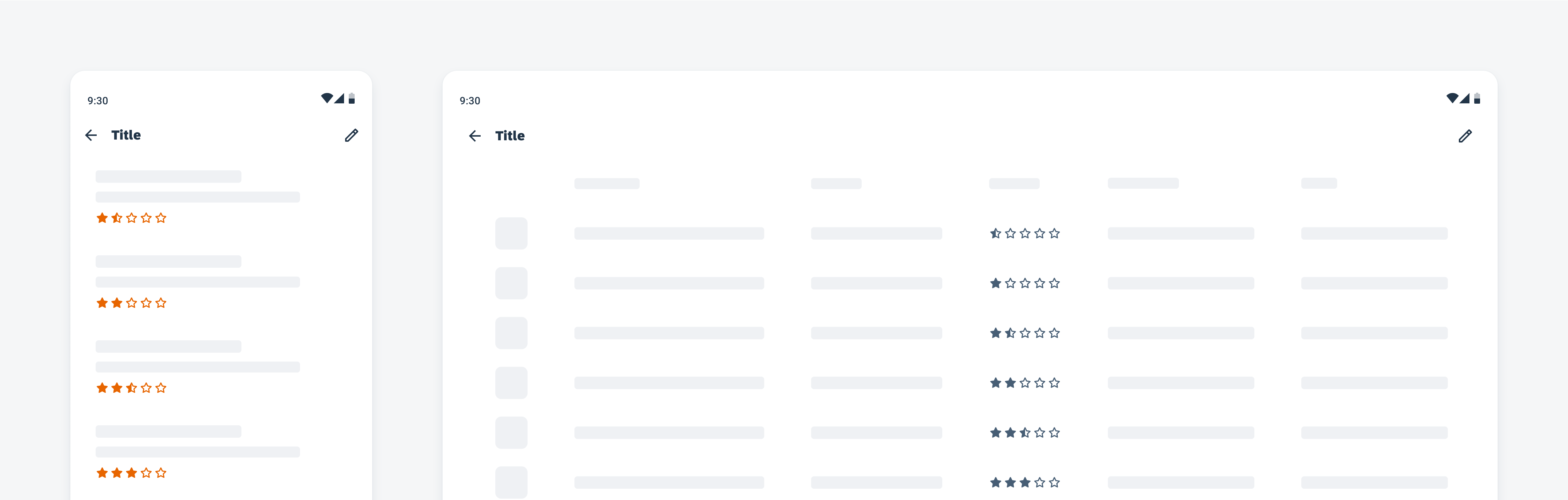
Rating control on mobile (left) and tablet (right)
Anatomy
A. Icon
The icons represent the average object rating value through several states: on, off, and half. The states of these icons depict a rating from a scale of one to five.
B. Counter/Label
The counter or label supplements the rating. It can be used to display the number of ratings, the exact rating value, and more.
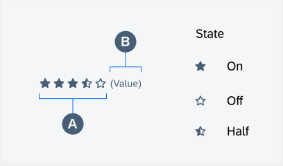
Anatomy of rating control and icon states
Behavior and Interaction
The rating control is currently display-only.
Variations
Size
Small vs. Large
The rating control can be displayed in a small or large format depending on the fit to context.
Counter/Label
Without vs. With
The counter or label for the rating can be hidden as needed.
Color
Default vs. Accent
The accent color for the icons can provide a unique variation when needed.
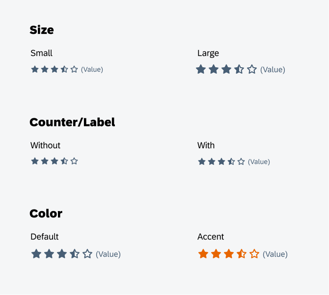
Rating control size (top), counter/label (middle), and color (bottom)
Resources
Development: Rating Control, FioriRating
SAP Fiori for iOS: Rating Control
SAP Fiori for Web: Rating Indicator
 Your feedback has been sent to the SAP Fiori design team.