
Contact Cell
Fiori: ContactCell
Intro
A contact cell, commonly found in an object detail, gives quick access to the various methods of communicating with a contact. A contact cell consists of an image, labels (headline, subheadline), description, and contact actions.
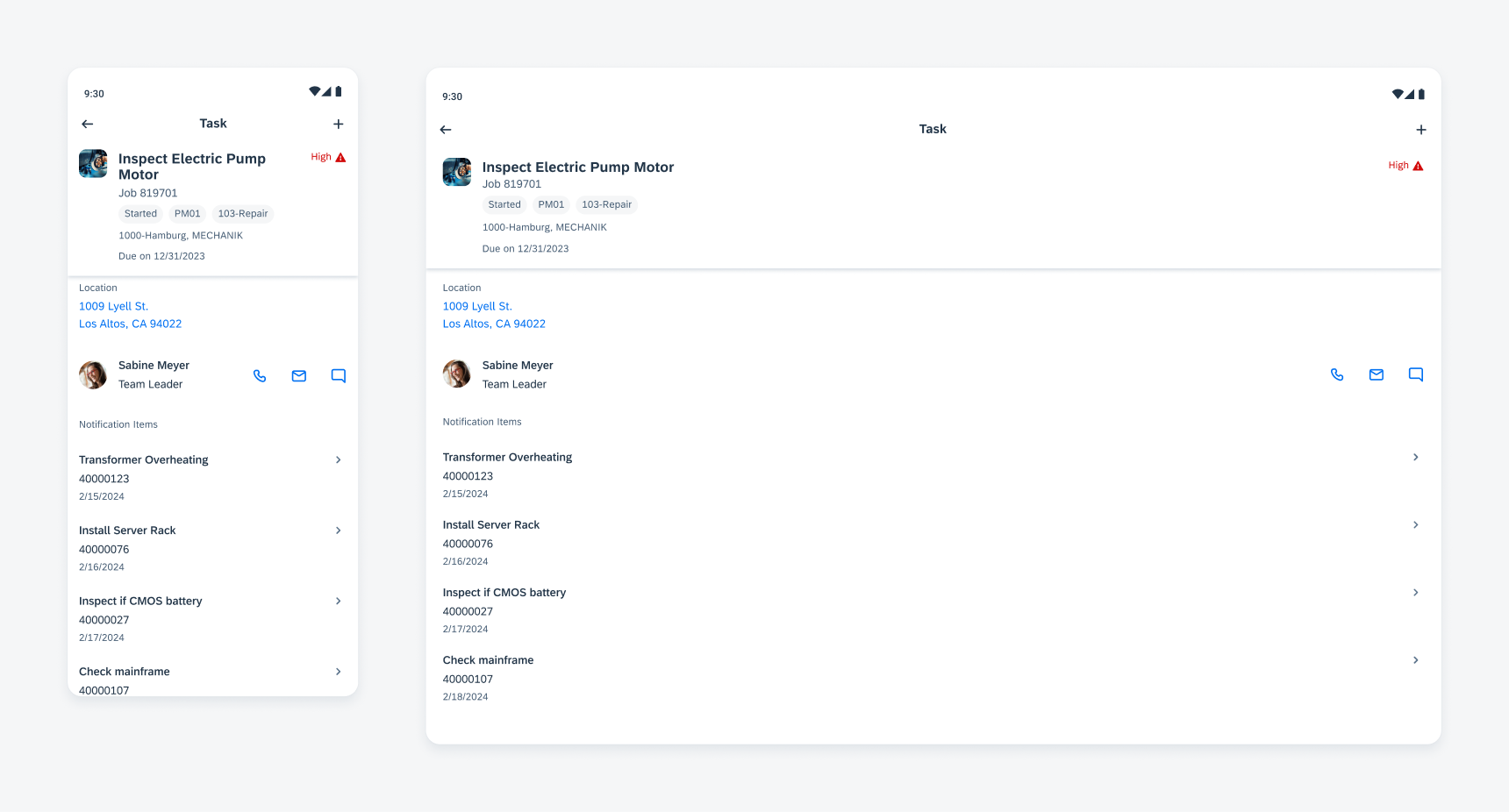
Contact cell on mobile (left) and tablet (right)
Anatomy
A. Detail Image (Optional)
A rounded frame that displays an image of a contact. If no image is available, an initial is displayed.
B. Headline
Used for the name of the contact.
C. Subheadline (Optional)
Can be used to add further information about the contact, such as a job role.
D. Actions
You can set four different actions – calling, video calling, messaging, and emailing.
On phones, there is a maximum of three actions, on tablets, a maximum of four.
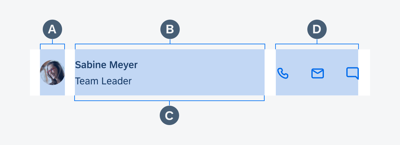
Contact cell anatomy
Behavior and Interaction
Contact Cell
Tapping on the contact cell itself navigates the user to the profile detail screen of the contact.
Call Action
Tapping on the call icon triggers an alert prompting the user to confirm whether they want to make the call.
Video Action
Tapping on the video icon triggers an alert prompting the user to confirm whether they want to make the video call.
Message Action
Tapping on the message icon triggers a modal where the message can immediately be drafted and sent.
Email Action
Tapping on the email icon triggers a modal where the email can immediately be drafted and sent.
Adaptive Design
The contact cell is supported on both phone and tablet devices. The width of the name and title container is flexible and can be set by you.
You can use up to four actions, however, if four actions are used, a profile image can’t be used.
 Your feedback has been sent to the SAP Fiori design team.