
Staggered Layout
FioriMobileCard
Intro
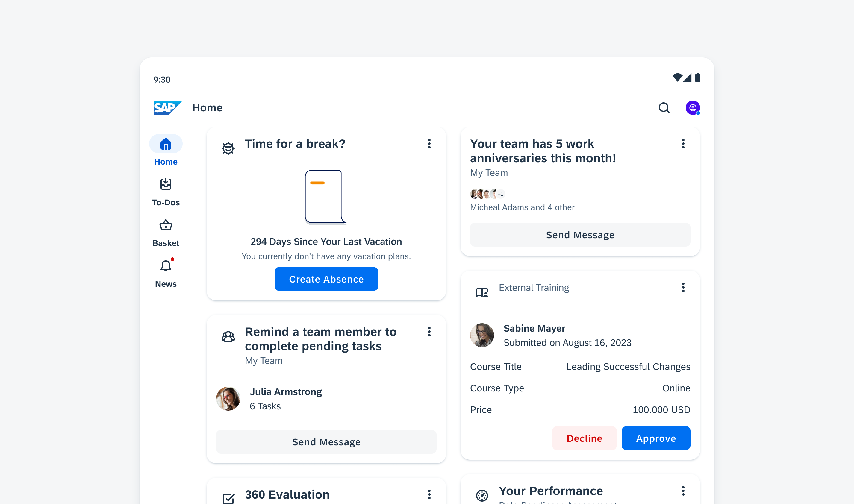
The staggered layout for cards is a design pattern where cards are arranged in a flexible, grid-like structure, with each card adapting to the available space while maintaining alignment with adjacent cards. It optimizes space usage and provides an aesthetically pleasing visual layout.
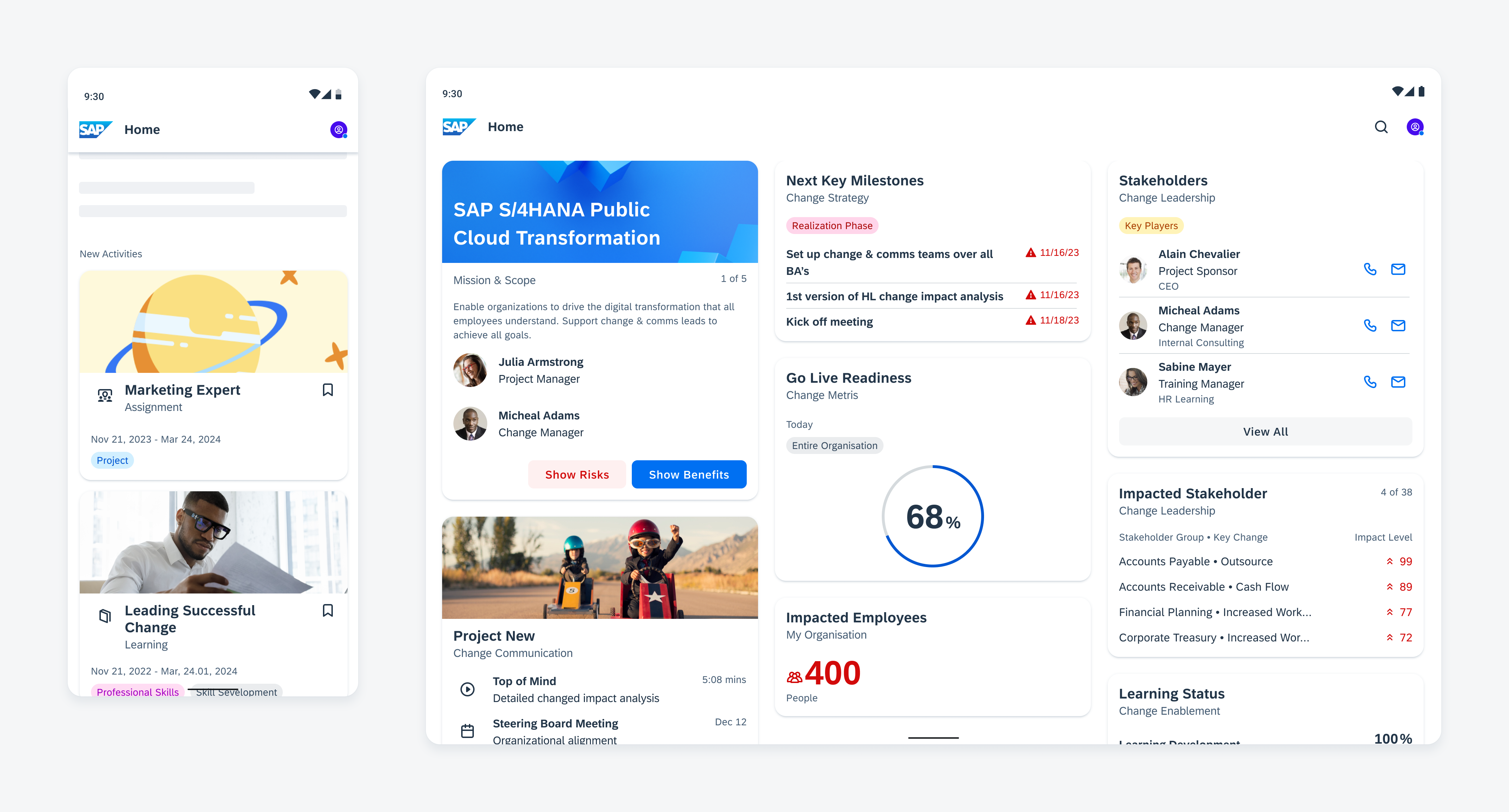
Cards displayed in a list (left) and staggered layout (right)
Usage
- Ensure that cards in the staggered layout contain related content.
- If your app includes multiple card layouts, such as a carousel, add an optional title to your staggered layout container.
Don’t use a staggered layout for your tablet app when you have only a few cards.
Anatomy
Container with Cards
The cards have a consistent width, which is based on the number of columns determined by the window size class. The height of each card can vary depending on the content, resulting in an asymmetric view.
Margins
Margins are the spacings between the content and the outer edges of the window area. Margin widths are defined using fixed values for each window size class and change at different breakpoints to better fit the screen size.
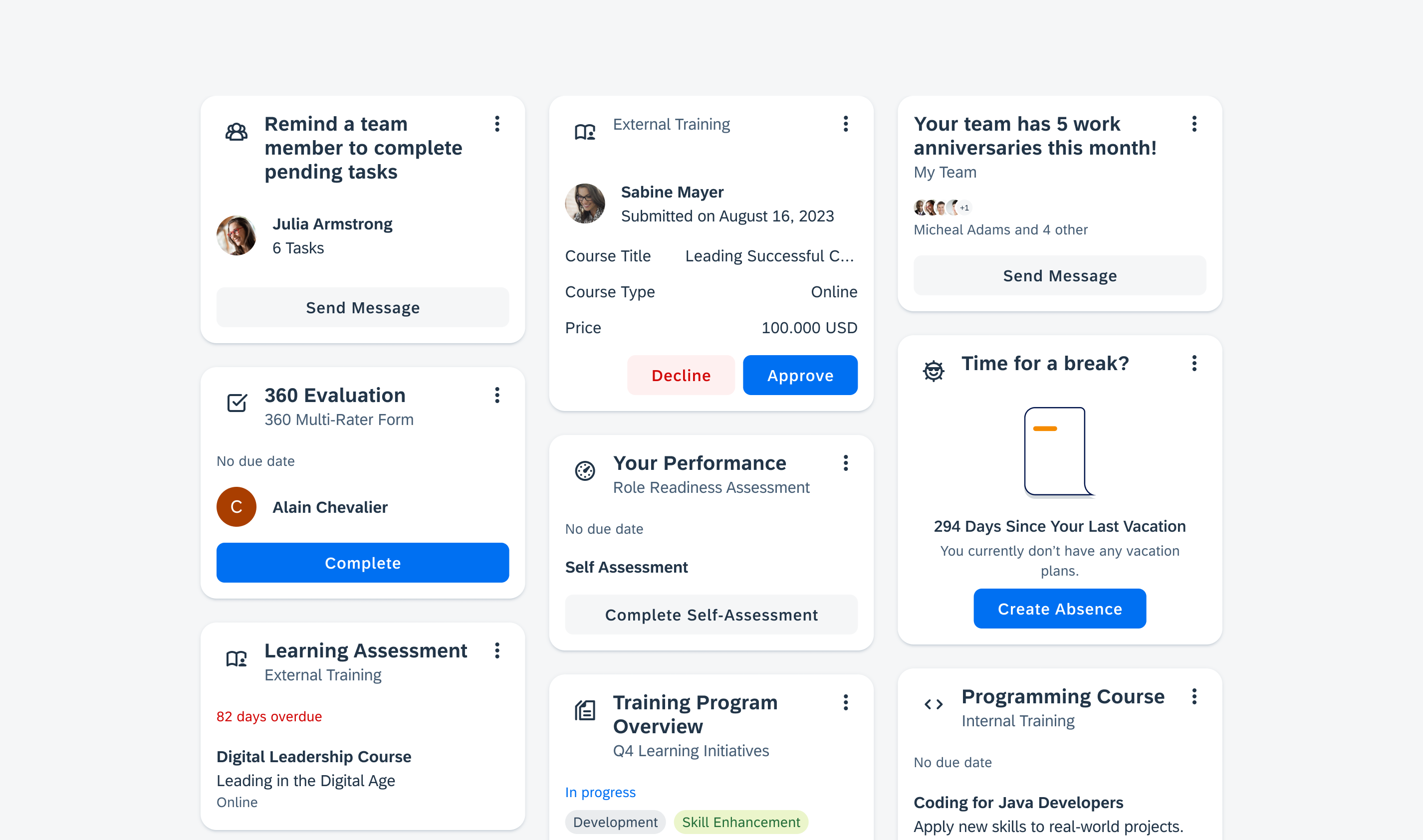
Staggered layout with different card heights
Behavior and Interaction
Scrolling
Cards scroll vertically in a list and staggered layout.

Vertical scrolling in a staggered layout
Empty States
If there is no card in the list, it is important to use an empty state indicator in the layout container to communicate this information. This indicator serves as an informative message for users to let them know that no information or data is currently available or that some information needs to be created.
Illustrated message to indicate an empty state
Adaptive Design
The number of columns may increase based on the screen width, allowing more cards to be shown side by side, resulting in a grid-like look that enhances readability.
For compact window size classes, cards are arranged in a vertical list, which span across the entire width of the screen and provide a high density of information.
For medium and extended window size classes, the layout changes to a staggered layout, with cards placed at the top and then left-most position. This ensures a seamless layout without gaps.
Staggered layout showing top-most and left-most card placement
If there is a navigation rail or navigation drawer, the number of columns is reduced and adapts to the remaining screen width.
Staggered layout with cards and with navigation rail (right)
Additionally, you can also combine layouts. However, if a staggered and a carousel layout are used on the same page, it creates visual imbalance of the card spacing caused by the outer margins of the different layouts.
Resources
Development: Card System
SAP Fiori for iOS: Masonry Layout
SAP Fiori for Web: Overview Page
Related Components/Patterns: Cards Overview, Carousel Layout
 Your feedback has been sent to the SAP Fiori design team.