
Navigation Drawer
FioriNavigationDrawer
Intro
The navigation drawer provides access to different destinations in an app.
Navigation drawers can be permanently visible or opened and closed by tapping a menu icon.
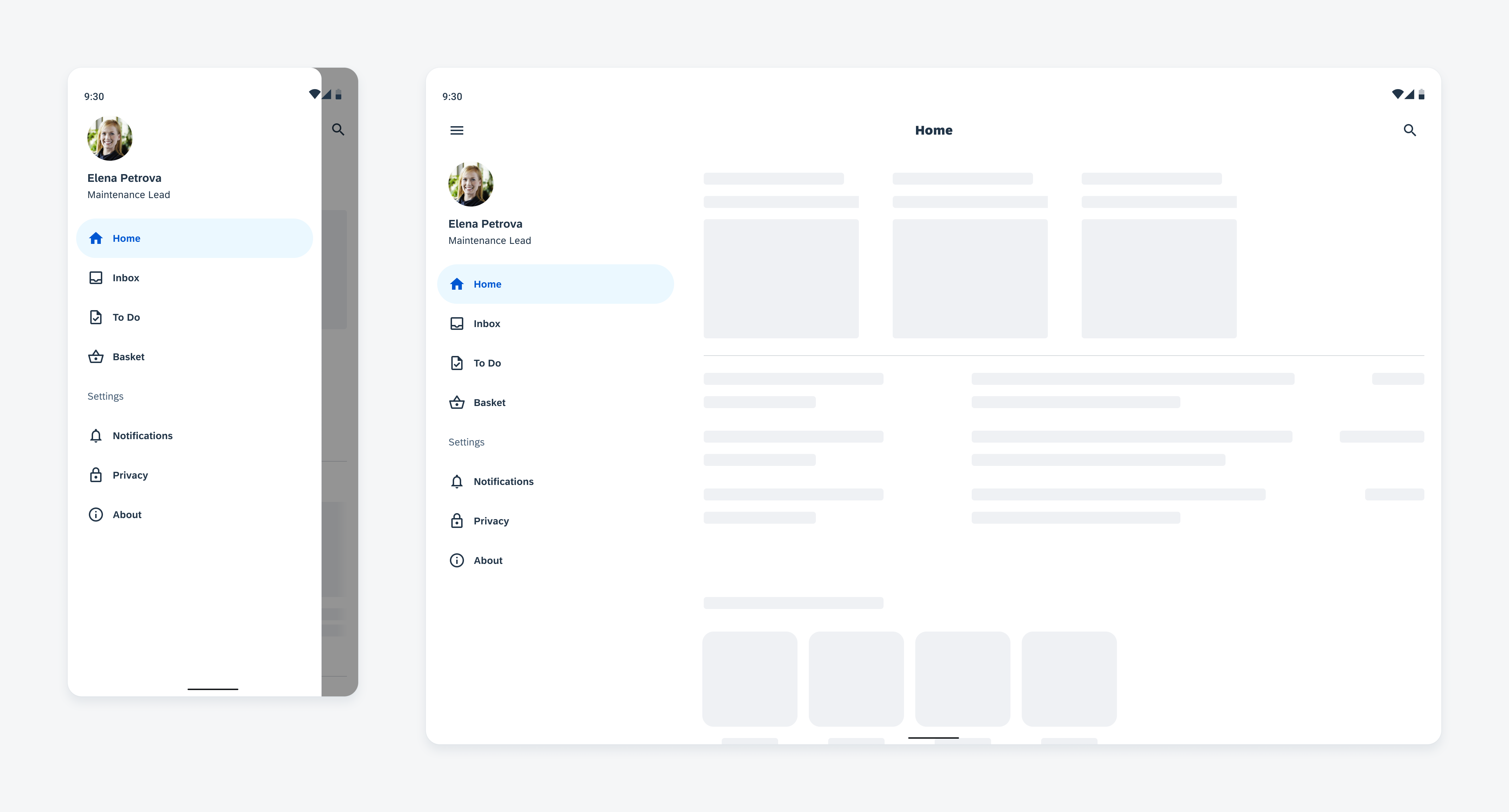
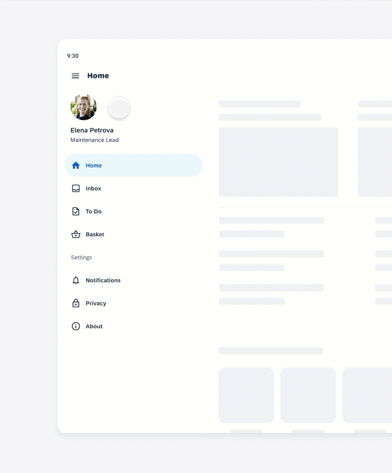
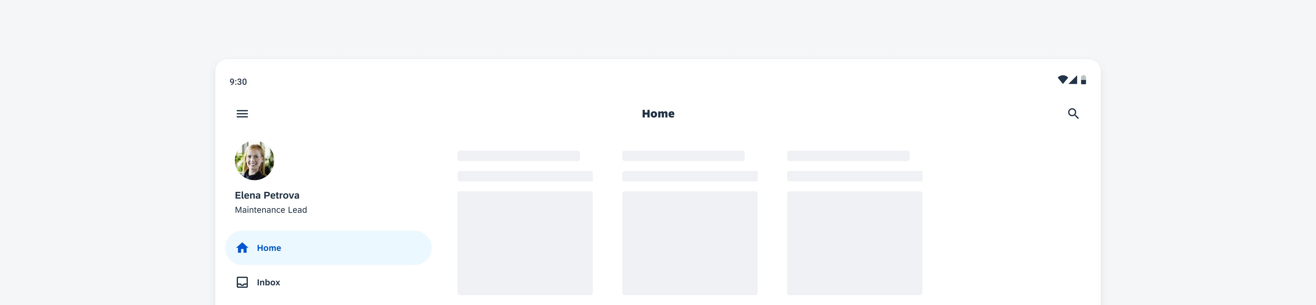
Modal navigation drawer (left) and standard navigation drawer (right)
Usage
- Use the navigation drawer for five or more destinations.
- Use the modal navigation drawer primarily on mobile
- Use the standard navigation drawer on larger screens, such as tablets.
- Replace the navigation rail or bar on large screens with the navigation drawer.
- Keep the title of destinations short and concise.
- Don’t use the navigation drawer for fewer than five destinations on mobile devices, use the navigation bar instead.
- Try to avoid wrapping text into more than two lines.
- Don’t truncate or shrink text.
Anatomy
A. Container
The container includes all destinations including icons, labels, active indicator, and an optional profile.
B. Profile/Avatar/Initials (Optional)
We recommend using an image so that the user can quickly identify the person the profile belongs to. Images of people should always be in a circle.
C. Name Text (Optional)
The name must include the first and last name of the person.
D. Details Text (Optional)
The details text is optional and can contain secondary information about the person, such as their job title or location.
E. Headline (Optional)
The headline can be used for a parent heading.
F. Section Header
The section header can be used to group related destinations.
G. Icon (Optional)
Meaningful icons visualize the app destinations. Use filled icons for the selected destinations and unfilled icons for unselected destinations.
H. Active Indicator
The active indicator highlights the selected destination.
I. Label Text
The label text provides a short and concise description of the destination.
J. Badge Value (Optional)
The badge value shows a number for status changes.
K. Divider (Optional)
The divider allows to create related groups of destinations.
L. Scrim (Only Available for Modal Navigation Drawer)
The scrim prevents the interaction with the rest of the app content and is displayed behind the modal navigation drawer.
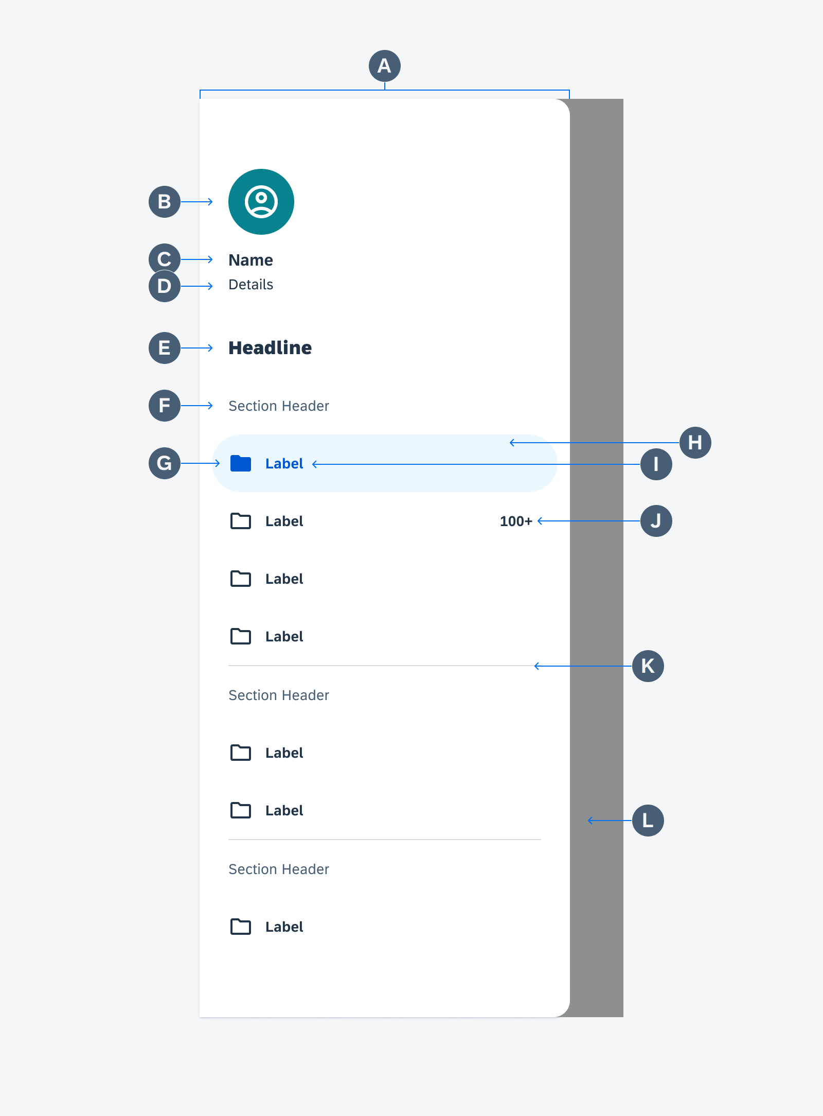
Navigation drawer anatomy
Behavior and Interaction
The navigation drawer is placed on the edge of the screen. On the left side for left-to-right languages and on the right side for right-to-left languages.
When the user taps on a destination, the user is directed to the navigation destination. The selected destination is visually highlighted with the active indicator and a filled icon.
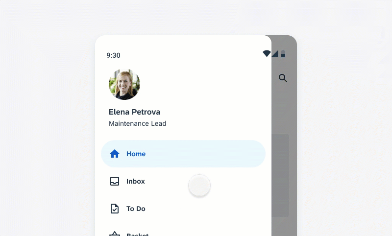
Selecting another navigation destination in the modal navigation drawer
If there is more content than fitting in the drawer, the drawer can be scrolled vertically.
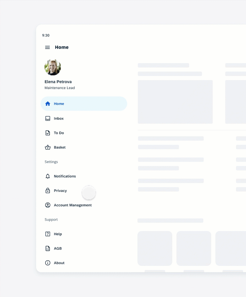
Horizontal scrolling in the standard navigation drawer
Adaptive Design
Use the modal navigation drawer on mobile screens, however, also consider the navigation bar if there are fewer than five navigation destinations.
For medium sized screens switch to a collapsible standard navigation drawer or to a navigation rail.
On large screen sizes, use the permanently visible standard navigation drawer.
Use the modal navigation drawer in combination with the navigation rail when there are secondary destinations or actions that don’t belong in the navigation rail. The modal navigation drawer can repeat the navigation destinations from the navigation rail and can include additional navigation destinations, such as secondary destinations or settings. The user can open and close the modal navigation drawer by tapping the menu icon.
Combination of a navigation rail with a navigation drawer
Variations
Modal Navigation Drawer
The modal navigation drawer has a scrim to prevent the interaction with the app content. It is mainly used on mobile devices. On tablet devices, replace the modal navigation drawer with the standard navigation drawer.
The user can open the modal navigation drawer by tapping the menu icon.
The user can close the modal navigation drawer by selecting a destination, tapping on the scrim, or swiping to the drawer’s anchoring edge. If there is a “Back” button on the navigation bar, the user can also close the drawer with this button.
Opening and closing the modal navigation drawer
Standard Navigation Drawer
The standard navigation drawer is located next to the app’s content and can be permanently on screen, which is best used when users frequently have to switch between destinations. If users should focus more on the app content, they can close and open the standard navigation drawer by tapping a menu icon.
Use the standard navigation drawer only on tablet devices. For mobile devices, use the modal navigation drawer instead.
 Your feedback has been sent to the SAP Fiori design team.