
Text Inputs
FioriSimpleTextField, FioriNoteTextField
Intro
Text input controls are used to request a text entry from the user. They are usually found in the create or edit pattern.
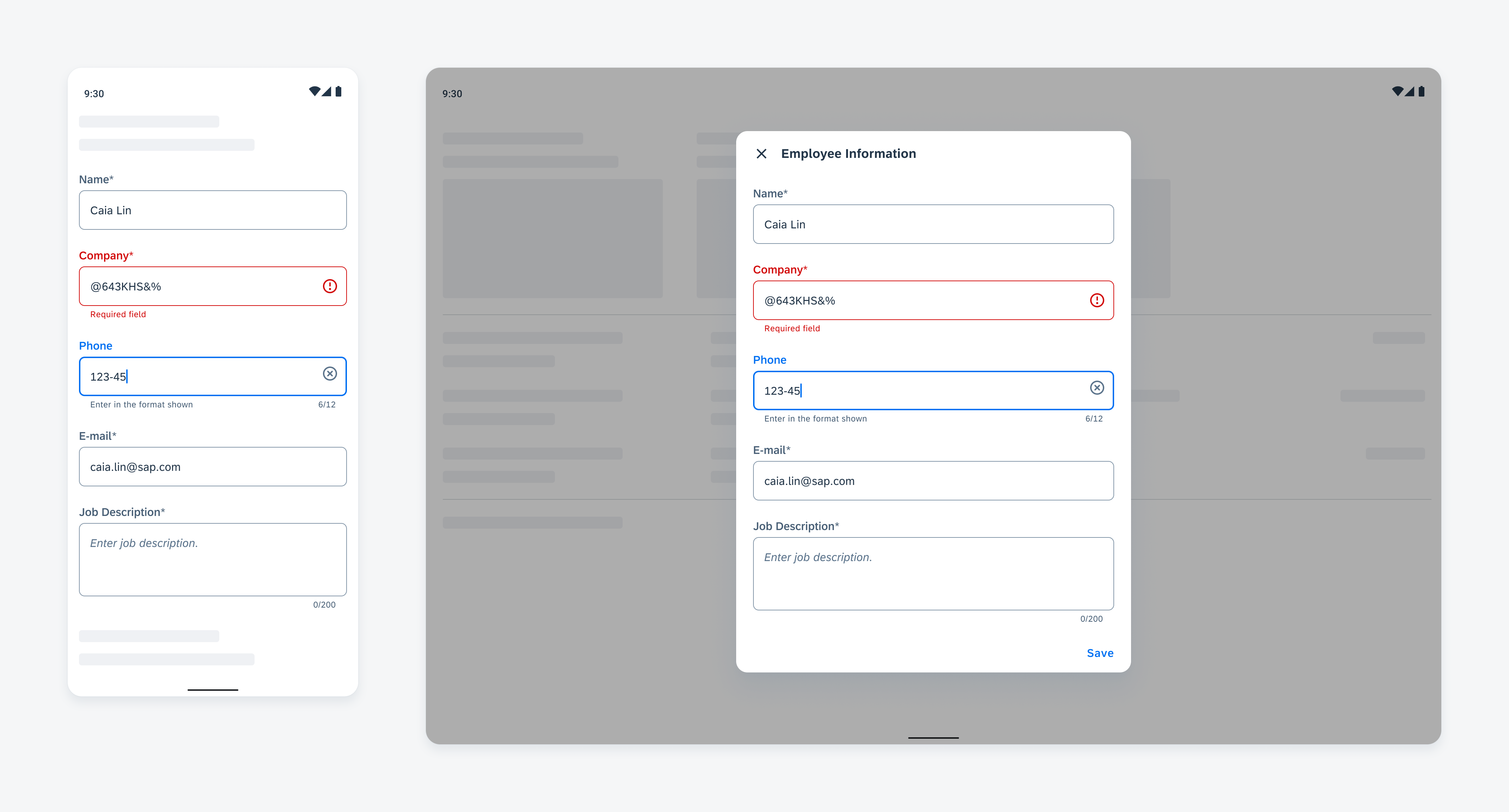
Text input controls on mobile (left) and tablet (right)
Usage
- Use capital case for labels.
- Use an asterisk next to the label to indicate it is a required input.
- Use sentence case for placeholder text, helper text, and error messages.
- Use note form cells for text input that requires more text input.
- An error message should tell the user clearly how to fix the error.
Don’t show both helper text and error text.
Anatomy
A. Label
Describes the intent of the text input form cell.
B. Input Area
Indicates tappable area where input values are displayed.
C. Helper Text
Provides additional information about the form cell.
If the cell is read-only, we recommend displaying “Read-only field” as hint text.
D. Right Accessory Icon (Optional)
In certain use cases, a barcode scanner may be used to populate the input field with information.
E. Character Counter (Optional)
Displays the number of input characters in real-time over the total character limit.
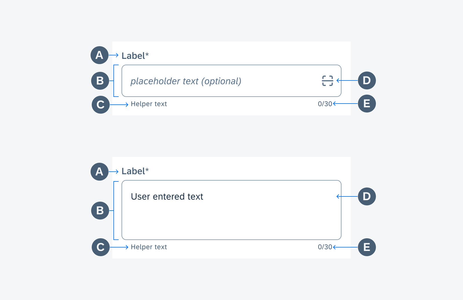
Anatomy of a text input form cell
Variations
Simple Property Form Cell
A simple property form cell consists of a label (property key) and a text field (user input text). It is used for collecting short input. The label is required for the simple property form cell. It helps users to identify the purpose of the text entry.
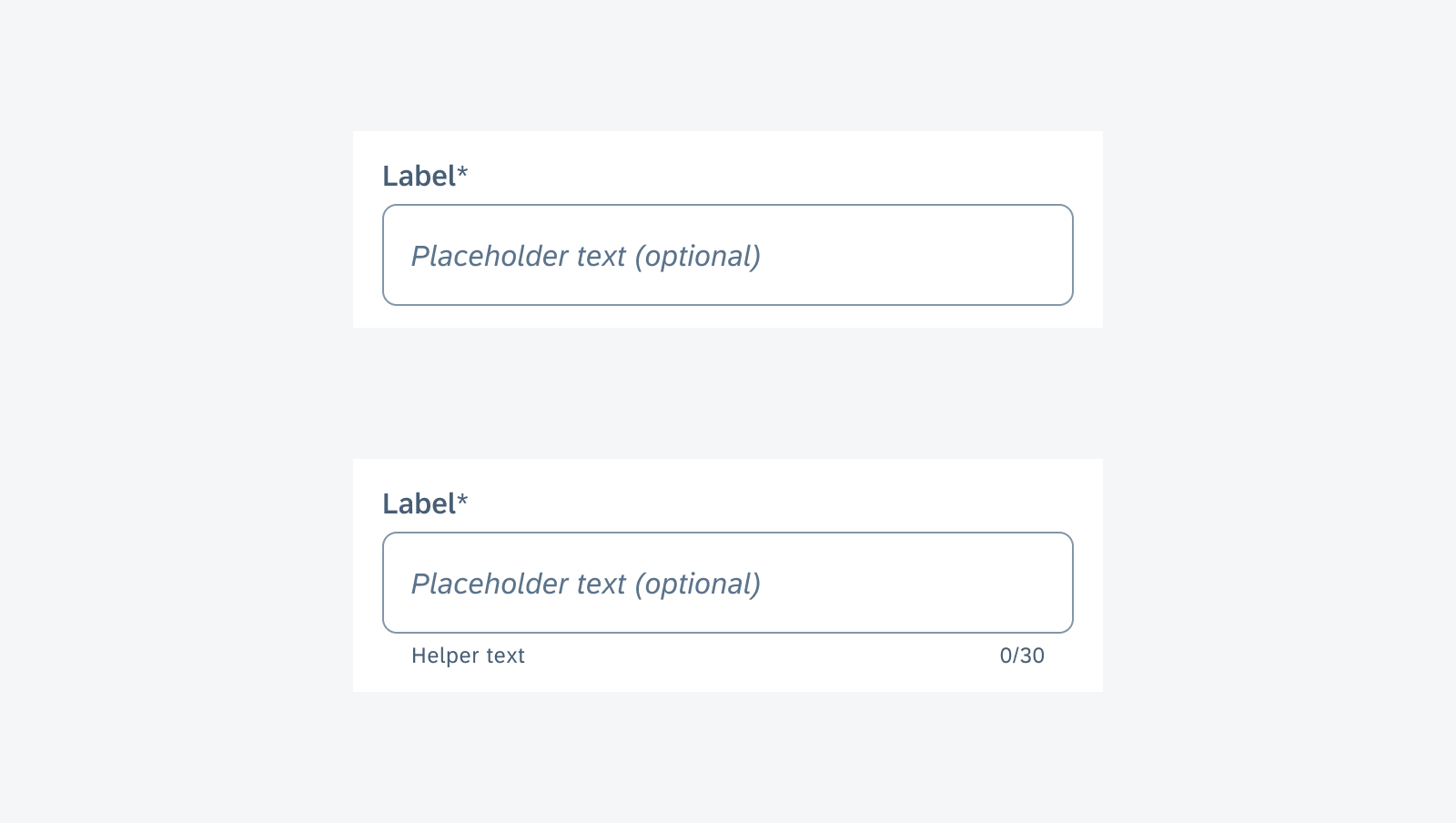
Simple property form cell
Simple Property Form Cell with Scan
A secondary action can be added to a simple property form cell to provide input methods besides typing. Currently, the SDK supports getting a text value through barcode or QR code scan. A scan icon is used to indicate the feature. A helper text can be used to explain the feature to the user.
A scanner is launched when the user taps on the scan icon. The user may scan a barcode or QR code of an object to get the property specified in the cell. The value is filled in the simple property cell. If needed, the user may edit the value directly.
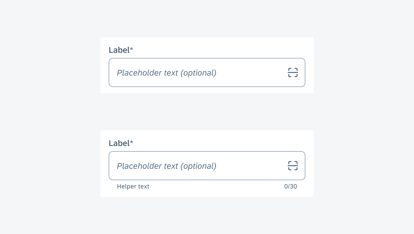
Simple property form cell with scan
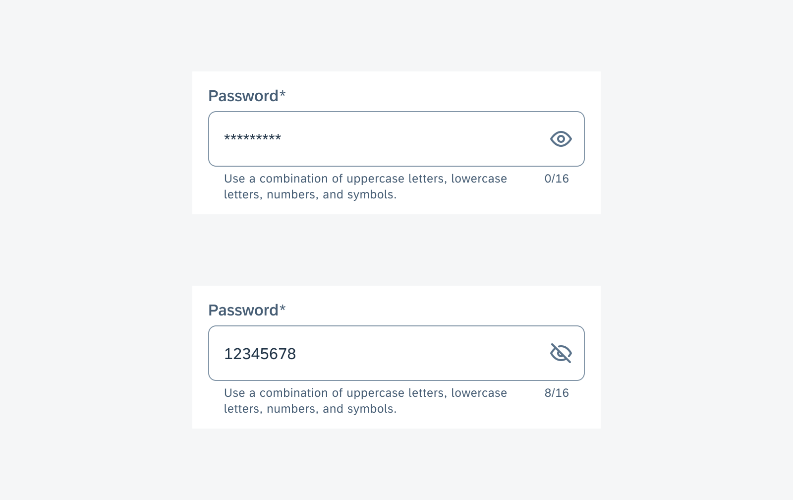
Simple Property Form Cell with Show/Hide Password
For password entry, special secondary action is added to the simple property form cell. By default, password entry is displayed in an encrypted format. The user can tap on the eye icon to toggle password visibility.
Simple property form cell in read-only state (top) and disabled state (bottom)
Note Form Cell
The note form cell is best used for collecting long user input, such as a note, comment, or description.
Note form cell
Behavior and Interaction
States
Enabled State
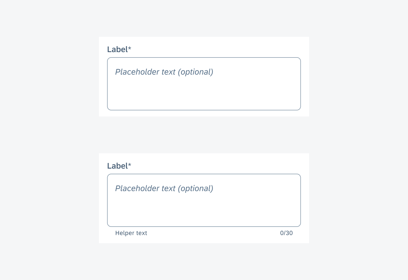
An optional placeholder text can be used to display a correct input value when the field is empty. It explicitly shows the user the expected text entry. Don’t use placeholder text for instructions because it disappears once the user starts typing. Instead, use helper text for instructions.
An optional helper text can be used to provide additional instructions. Helper text should be short and precise. Avoid wrapping to two lines.
The default state of the note form cell has a taller text field compared to the simple property form cell. This encourages users to enter more input.
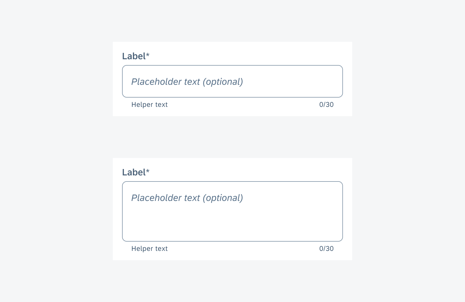
Text input in a simple property form cell in enabled state (top) and text input in a note form cell in enabled state (bottom)
Error State
When the user-entered value does not pass validation, the simple property form cell enters an error state. An error icon appears, indicating that this cell has an error, and a message appears below the text input to provide instructions on how to fix the error. Do NOT display both helper text and an error message at the same time. Replace the helper text with the error message when the field is in an error state.
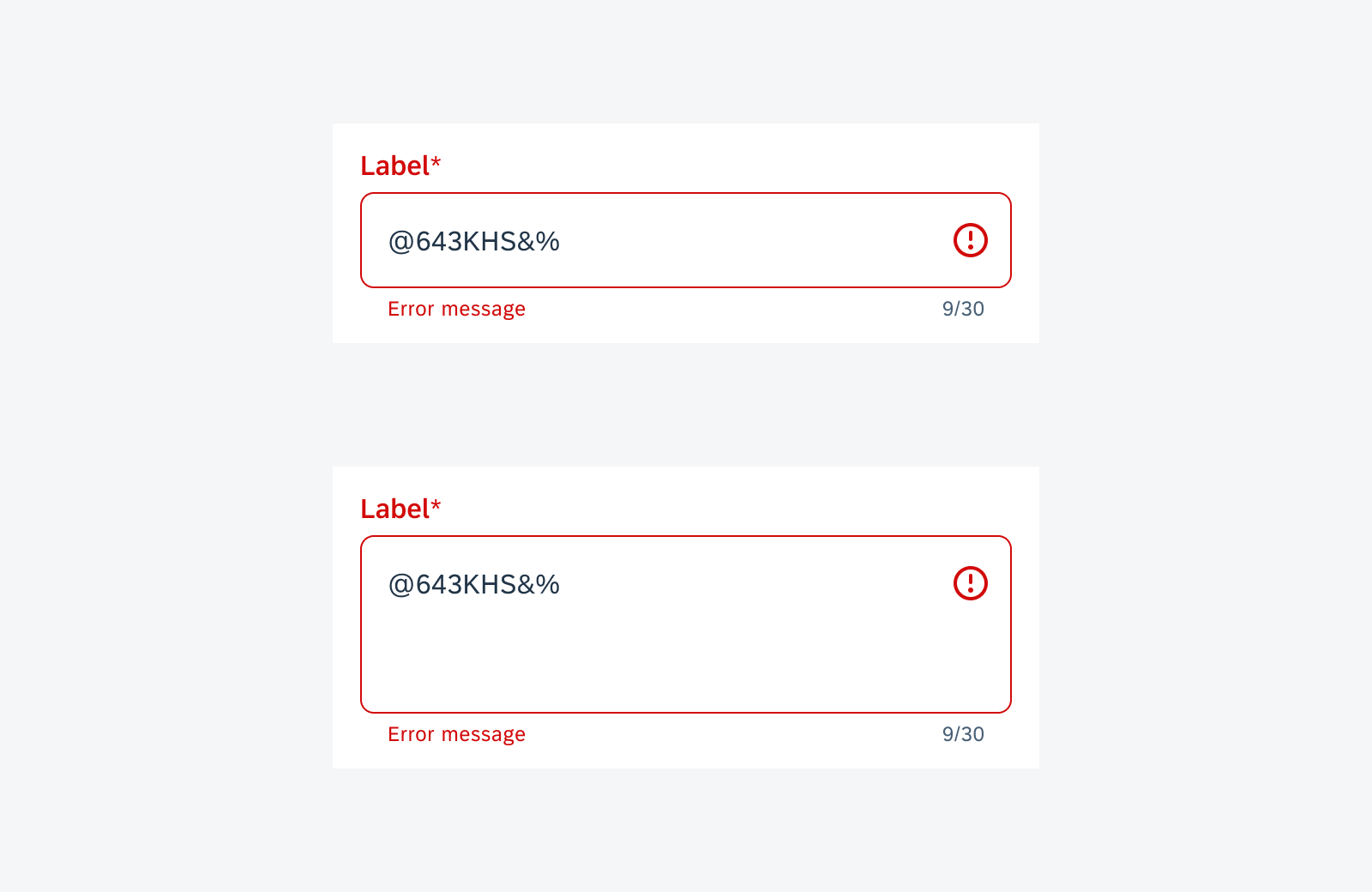
Text input in a simple property form cell in error state (top) and text input in a note form cell in error state (bottom)
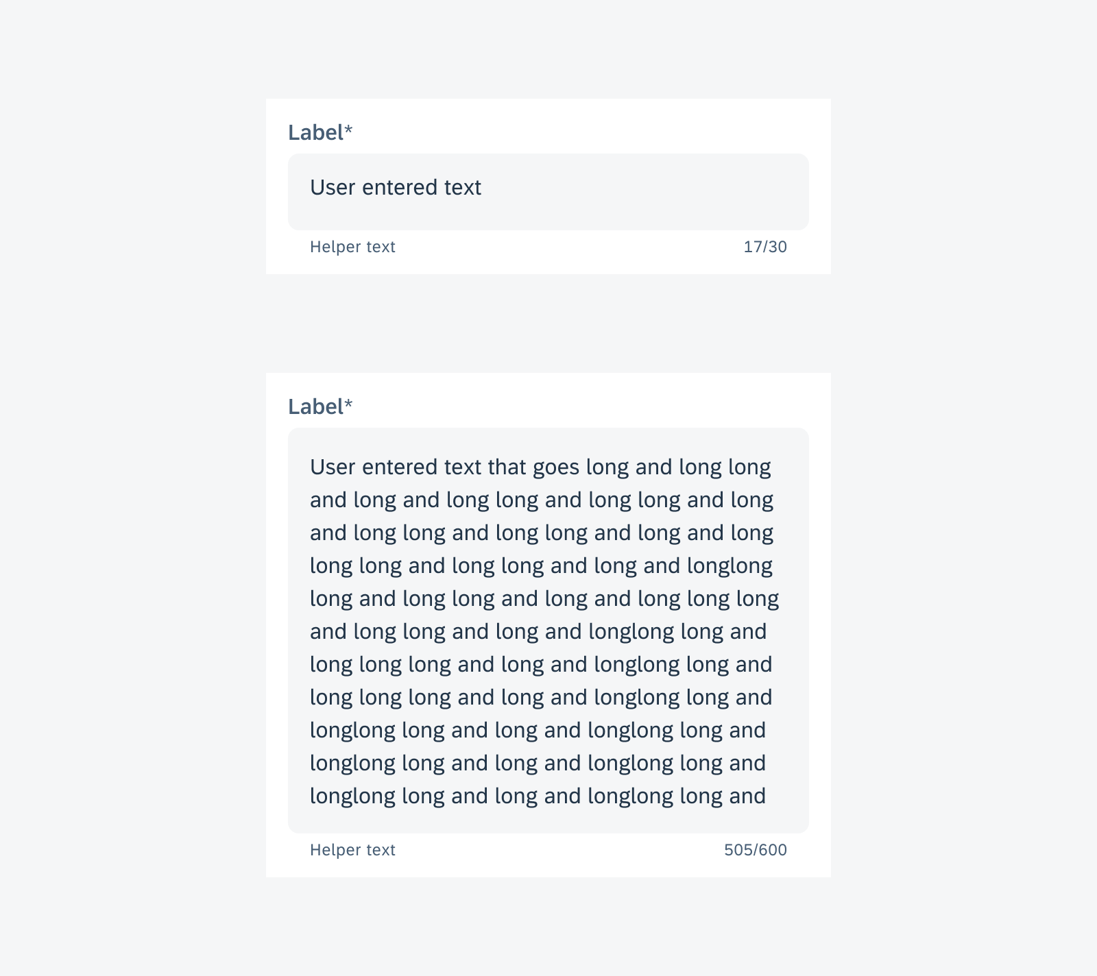
Active Typing State
When the user is actively typing, a clear icon appears at the right end of the text field. The user can tap the “Clear” icon to delete all input. Generally, simple property form cells are used to collect short user inputs.
For simple property form cells, the height of the field is fixed. The text overflows to the left if the user types more than one line.
The note form cell text field can display three lines of text. As the user keeps typing, the text field can expand to a maximum height of six lines of text. This prevents the note form cell from covering the whole screen. After reaching the maximum height, the cell stops expanding. The content would scroll vertically inside the text field area as the text continues to wrap to a new line.
Text input in a simple property form cell in typing state (top) and text input in a note form cell in typing state (bottom)
Read-Only State
Read-only state indicates the current user role does not have the authorization to edit this field while the information in the field is relevant to fulfill the task. The text field changes to a gray background to hint this is non-interactive, with a helper text below saying “Read-only field”. The user can select and copy the existing value text, but cannot activate the text field.
When in read-only state, the text field can expand to exceed the maximum height so that the text value is visible without scrolling inside the text field. The user can select and copy the existing text entry, but can’t change the text in the field.
Text input in a simple property form cell in read-only state (top) and text input in a note form cell in read-only state (bottom)
Disabled State
If a text input form cell is disabled, the input in this field (if any) does not affect the task of the user. The disabled cell has an opacity of 50% to reduce distraction.
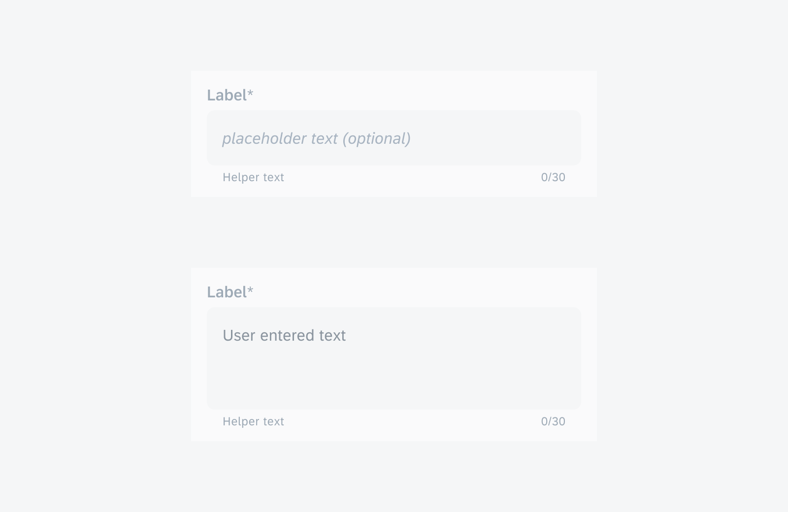
Text input in a simple property form cell in disabled state (top) and text input in note form cell in disabled state (bottom)
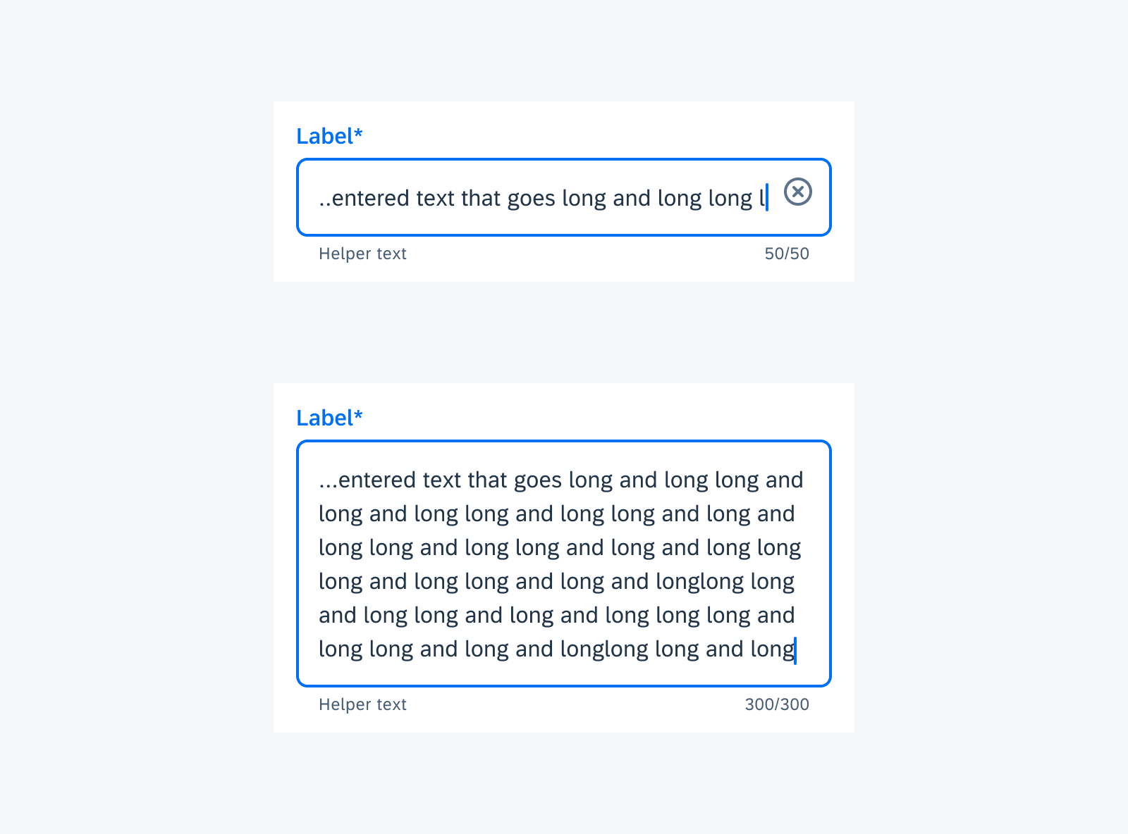
Character Counter
Default – Allow user to continue typing over the character maximum
In use cases where a user can continue typing over the character limit, the component displays an error once the user’s input surpasses the limit. The real-time counter turns red and the helper text appears or changes to “Reduce the number of characters”. The error state persists until the user’s input is shortened to within the character limit.
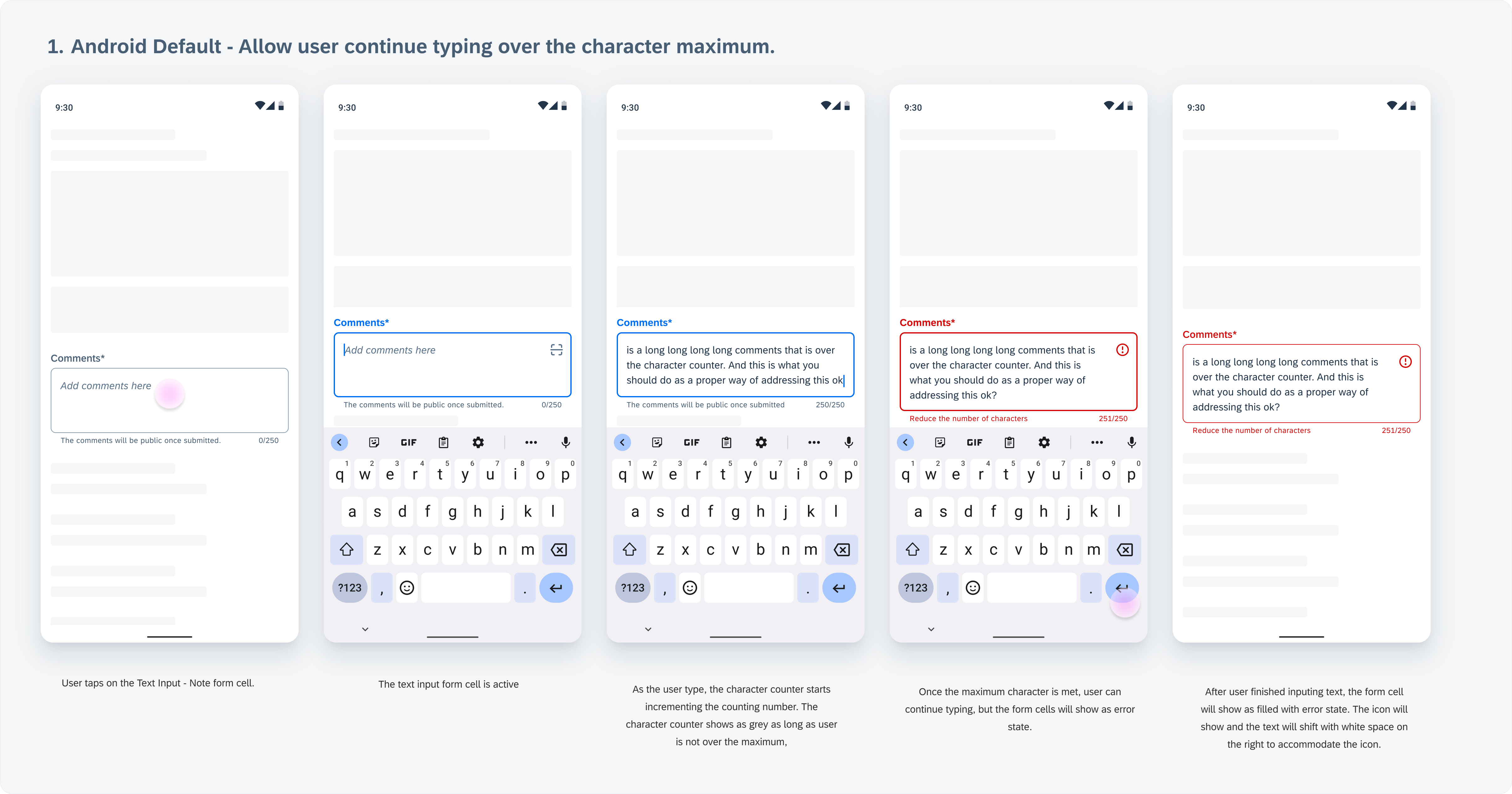
Character counter flow example: user input is allowed over limit and becomes an error
Stop user from typing once the character maximum is met
In use cases where a user is restricted from typing over the character limit, the user’s input is automatically stopped once they reach the limit. The helper text appears or changes to “Character limit reached”.
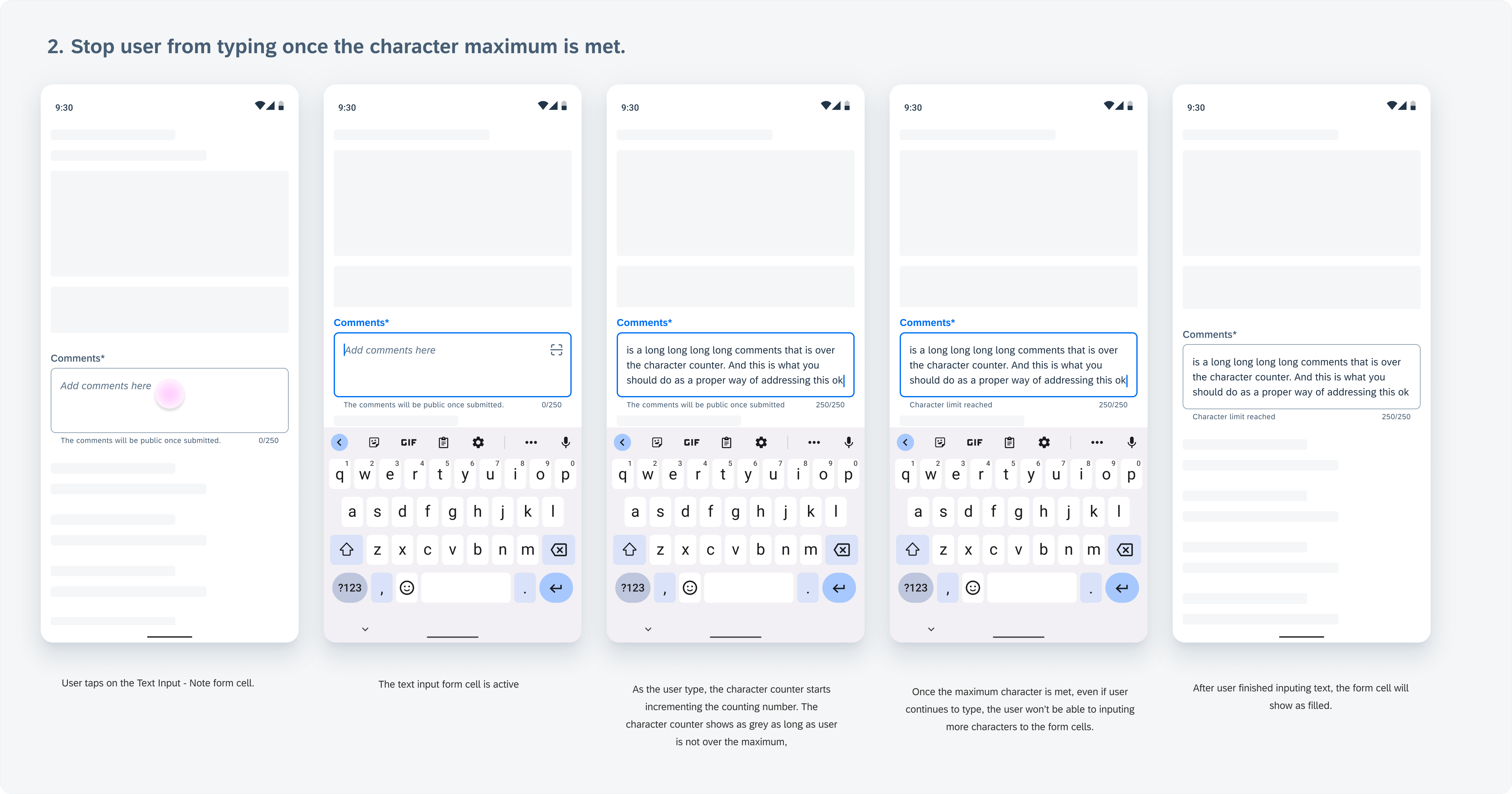
Character counter flow example: user input is automatically stopped when limit reached
Resources
Development: FioriSimpleTextField, FioriNoteTextField, SimplePropertyFormCell, NoteFormCell
SAP Fiori for iOS: Text Input Form Cell
Material Design: Text Fields
 Your feedback has been sent to the SAP Fiori design team.