
Widgets
Intro
Android widgets provide a quick overview of key information across the user’s home screens. They retain simplicity by showing only the most valuable information and functionality from the application first, guiding users to access more complex data and actions within the app. While the widget’s content focuses on one subject, users can still adjust the amount of content displayed by resizing the widget, if supported.
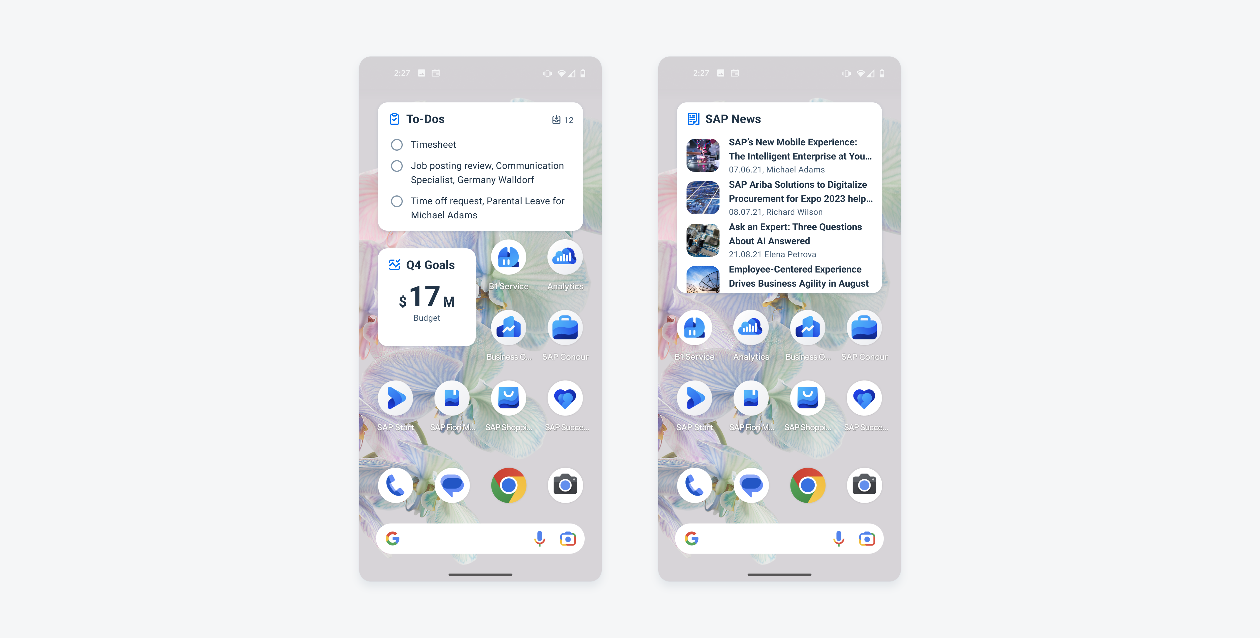
Widgets on an Android device
Usage
Creating Content
- Display curated and dynamic information for a single idea that relates to the most valuable application information and functionality.
- Keep the information concise, and if more is needed, the user can navigate to additional details.
- Offer widgets in multiple sizes when it adds direct value to the user.
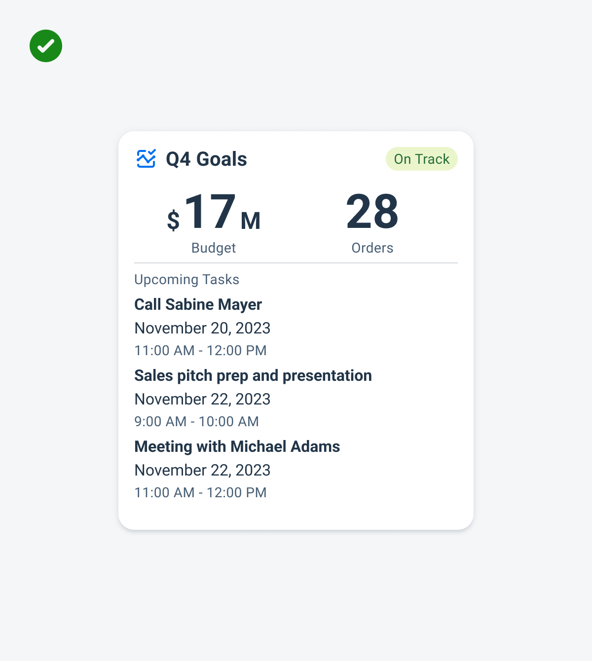
A widget that provides the most important and cohesive information first
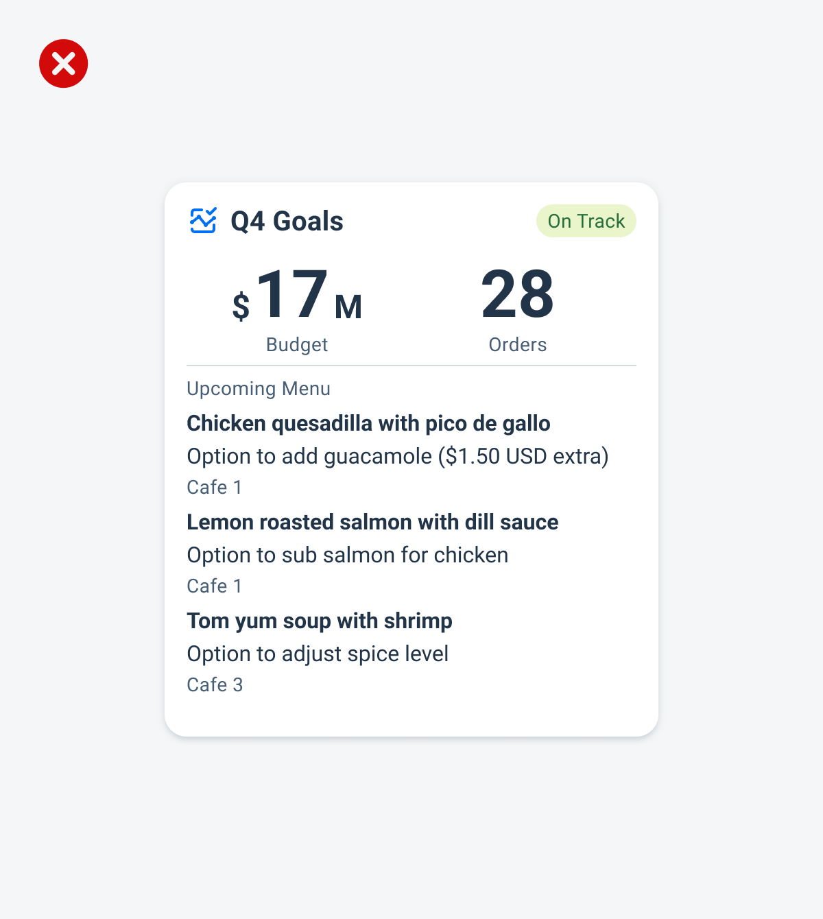
A widget that displays unrelated information, not displaying the most important information on the widget
Aligning Interaction
- Offer specific functionality without the user needing to launch the application.
- Include multiple touch targets if the user can perform different actions on the widget.
- Ensure the interaction opens the application at the right location.
A widget that utilizes the opportunity to have quick actions right from the widget that are specific to the widget’s topic
A widget that omits quick actions and uses generic wording to interact with the widget
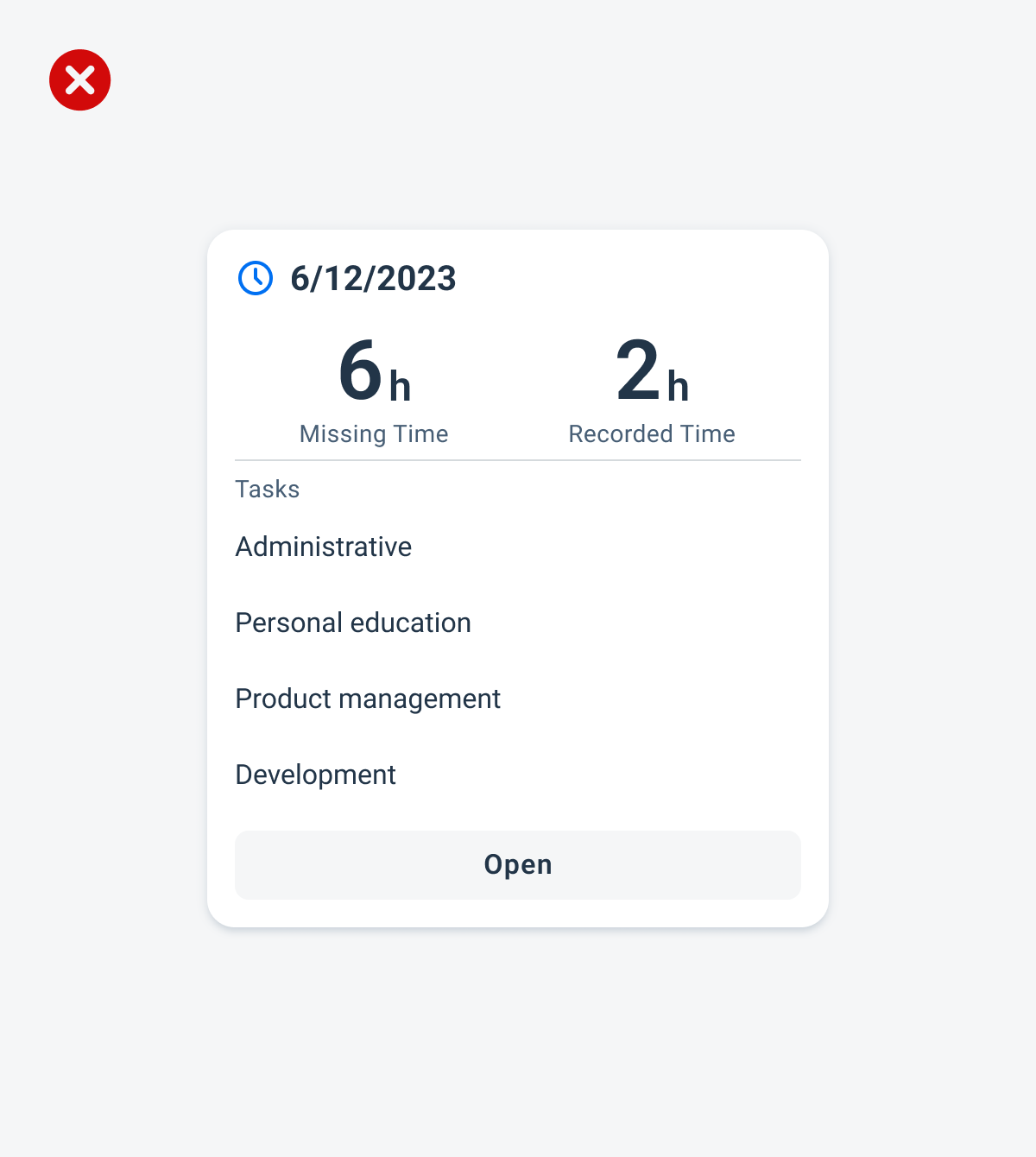
Handling Authentication
- Inform the user when authentication adds value, prompting them to continue in-app.
- Return an error state for unauthorized users if authorized users permit the application to show data in widgets.
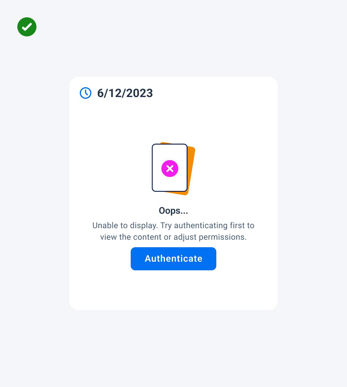
A widget that prompts the user to authenticate when needed
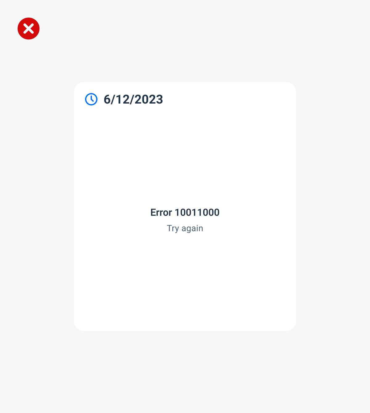
A widget that is problem-oriented, not prompting the user to authenticate to solve the issue
Anatomy
While the header, the body, and the footer are optional to have, we recommend including at least one of the sections.
Across each section, the text fields display the device’s system font in place of the 72 font style, as they are not supported yet for Android widgets. The only exception to using the 72 font style is if the application is drawing directly onto a canvas rather than implementing the widget using a text view.
A. Header
The header provides the user context for the widget’s single subject. It is recommended to only use SAP icons in the header area unless the application creates its own content.
B. Body
The body is comprised of one or multiple SAP BTP SDK for Android components of a single type.
For example, widgets built using Glance support checkboxes, radio buttons, and switches in the body area.
C. Footer
In the footer area, users can access and perform select actions. We recommend a maximum of two actions, in the form of icon or text buttons.
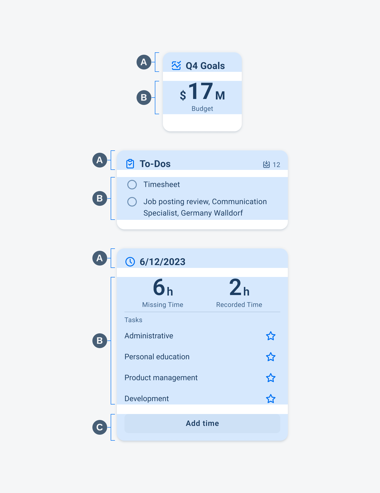
Widgets anatomy
Adaptive Design
Widgets can come in multiple sizes as they adapt to fit the available screen size. Create additional sizes only if they add direct value to the user, such as introducing an additional set of information that can be used to inform the user’s actions.
Users can place widgets on their Android home screen’s available grid space. This grid can vary by device. To determine the widget’s size, view this Android Developer article for more information.
Examples of widgets in a small (left), medium (center), and large (right) size
Variations
Information Widgets
Information widgets track and display crucial data over time. Some common use cases include:
- Monitoring sales performance
- Checking in on daily fitness goals
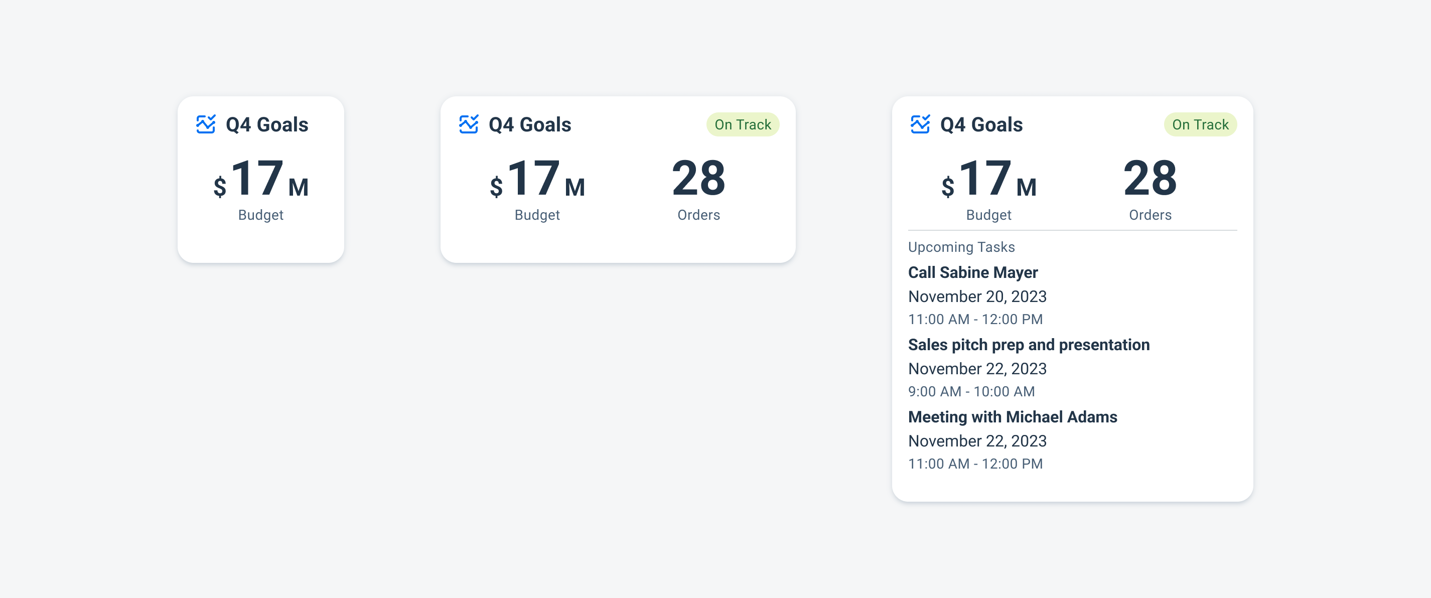
Information widgets example
Collection Widgets
Collection widgets display multiple of the same element, often in the form of a list. If building widgets with Glance, the collection widget can have vertical scroll. Some common use cases include:
- Browsing news articles
- Scrolling through a list of pending approvals
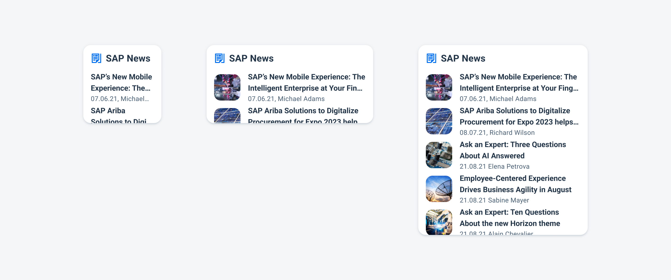
Collection widgets example
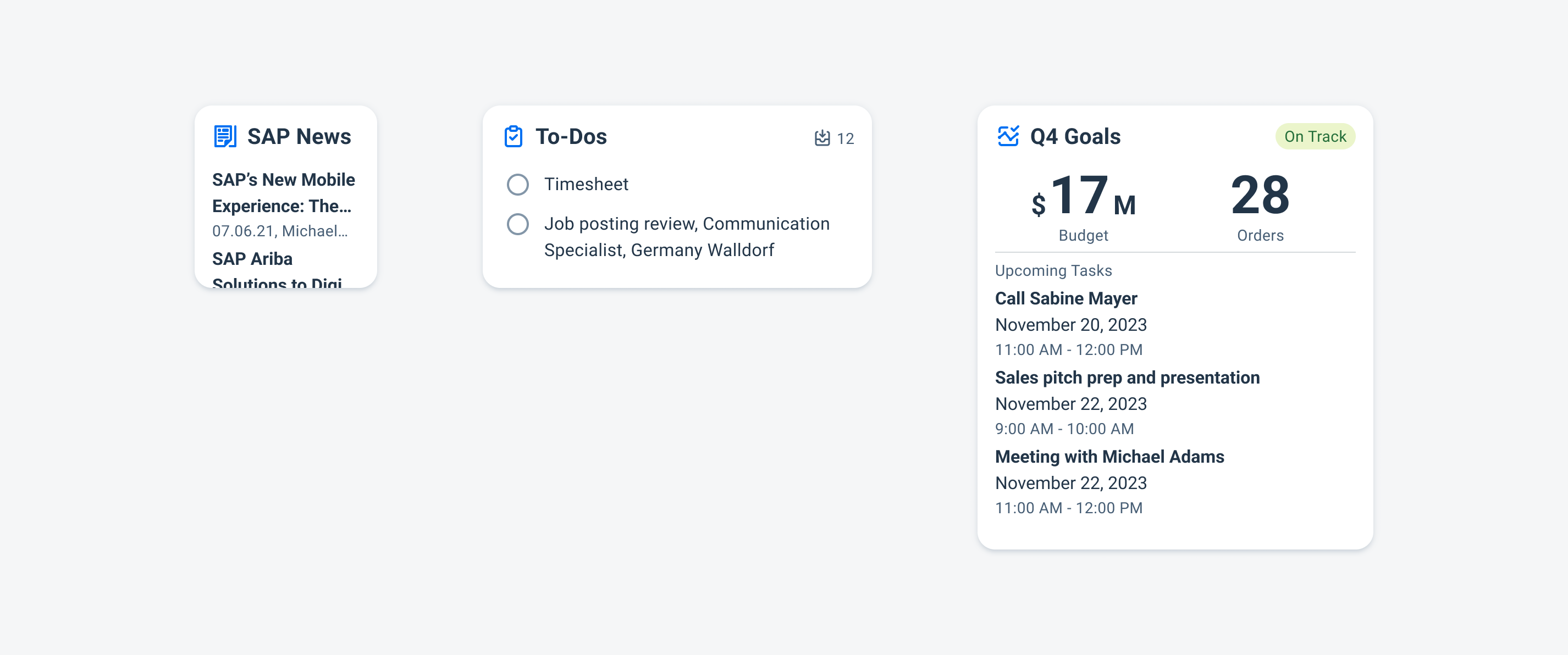
Control Widgets
Control widgets display frequently used functions. Some common use cases include:
- Marking a to-do item as complete
- Checking off a pre-meeting reminder
Control widgets example
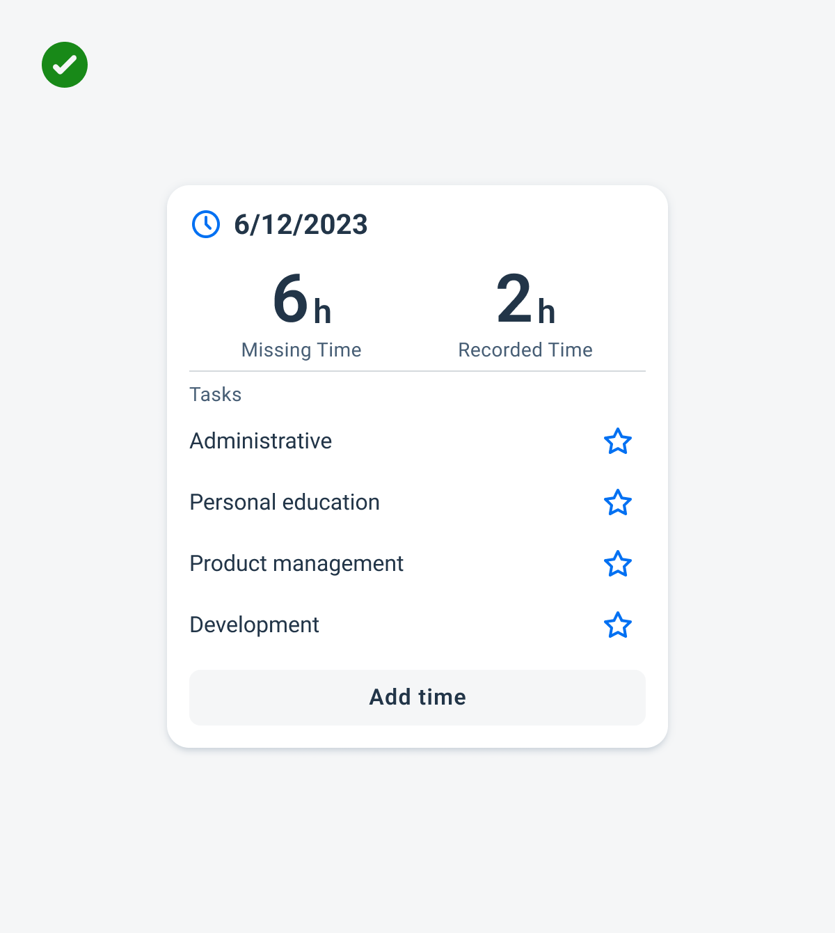
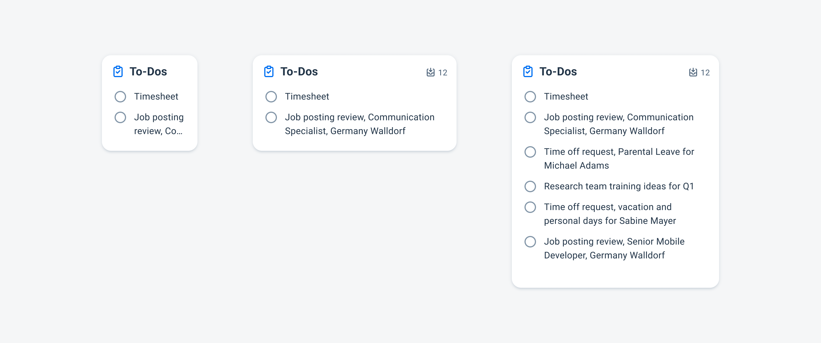
Hybrid Widgets
Hybrid widgets combine elements of different widget types. For example, a widget could be both an information and a control widget. Some common use cases include:
- Tracking and adding time to timesheet
- Displaying and playing media
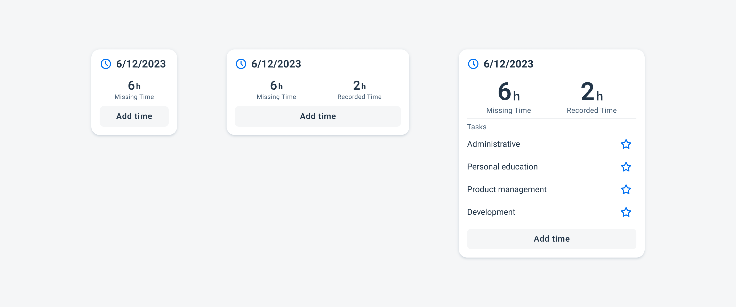
Hybrid widgets example
Resources
SAP Fiori for iOS: Widgets
Android Developer: App Widgets Overview
 Your feedback has been sent to the SAP Fiori design team.