
Cards Overview
FioriMobileCard
Intro
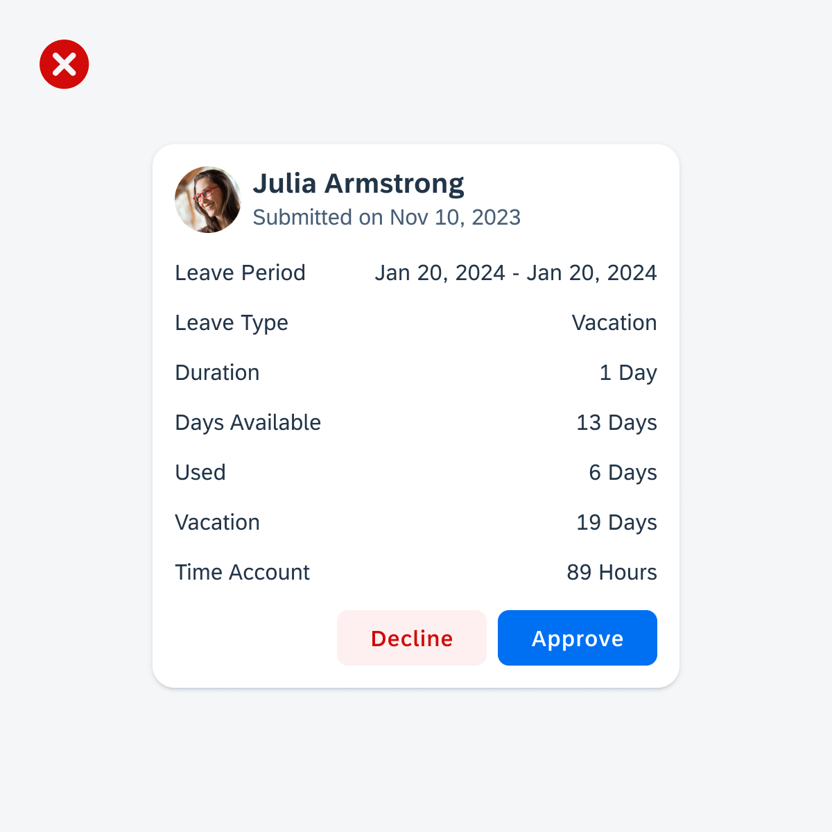
A card provides brief, related pieces of information and serves as an entry point, teaser, or preview to more detailed content. By pressing on the card, users can select the card and navigate to a dedicated page with more detailed information.
SAP Fiori for Android Cards
Usage
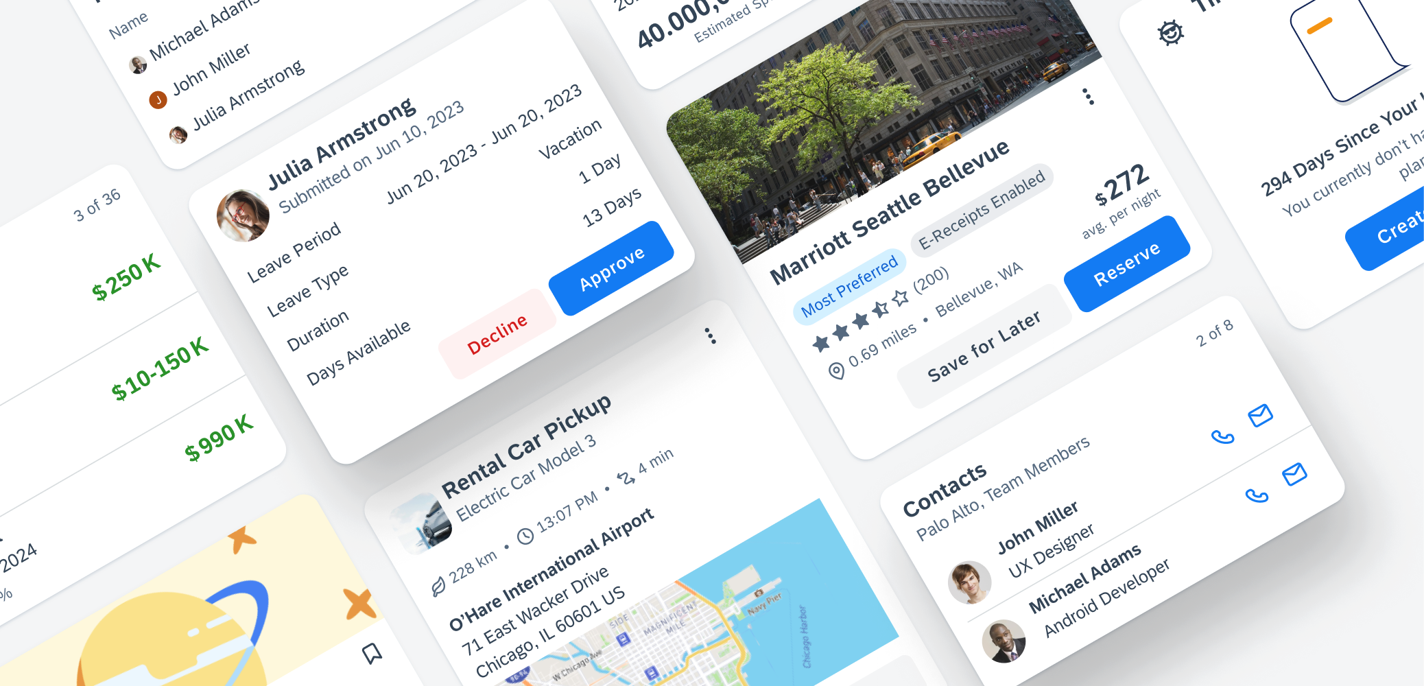
The card system for SAP Fiori for Android provides an advanced approach to utilizing cards, which offer a convenient way for your app to display content from various sources. It consists of a toolkit of nested components that enable the creation of diverse cards to meet the requirements of SAP products. These nested components encompass a wide range of functionalities, such as data table, key value cell, KPIs, and more. Additionally, the card system provides enhanced customization and flexibility, along with adaptable sizing options to accommodate different form factors and layouts, such as list, staggered, or carousel layout for cards. When incorporating cards into your app, it is crucial to keep the following aspects in mind:
- A card should focus on a single topic and be coherent in itself.
- A card should serve as an entry point, teaser, or preview to more detailed content.
- A card should be a short representation of a conceptual unit.
- A card should present information in a compact and easily scannable format.
- Incorporate cards into your app design to provide users with a quick overview of various information.
- Ensure that there is a clear indication on the card when a user selects it and an external app is launched, for example, by incorporating an icon that indicates an external app is launched.
- When designing your layout, don’t group components in a container with round corners. This style does not automatically transform a component into a card.
- Don’t place unrelated elements within a card.
- Don’t overload the user by including an excessive number of UI elements within a card.
Cards should focus on one topic
Don’t place elements within a card that do not relate to the same topic
Cards should display information in a compact format
Don’t include too many UI elements within a card
Anatomy
The content of a card is organized in so-called blocks. The height of a card is determined by its content. However, it’s crucial to keep in mind the maximum permitted height of 520dp.
A. Card Container
The card container is the element that holds the header, body, and footer of the card.
B. Header
The card header, the card’s uppermost part, contains essential information about the card and its associated detail page content. It provides a quick overview of fundamental details such as the title, subtitle, and status of the card. More information on the header can be found in the Card Header article.
C. Body
The card body is the central part of a card that is used to provide additional information alongside the content shown in the card header. This allows for the presentation of in-depth details, data, or graphics relevant to the card’s context. More information on the body can be found in the Card Body article.
D. Footer
The card footer, located at the bottom of the card, is used for important or routine actions that directly impact the card’s functionality, such as “Approve’ or “Submit” actions. More information on the footer can be found in the Card Footer article.
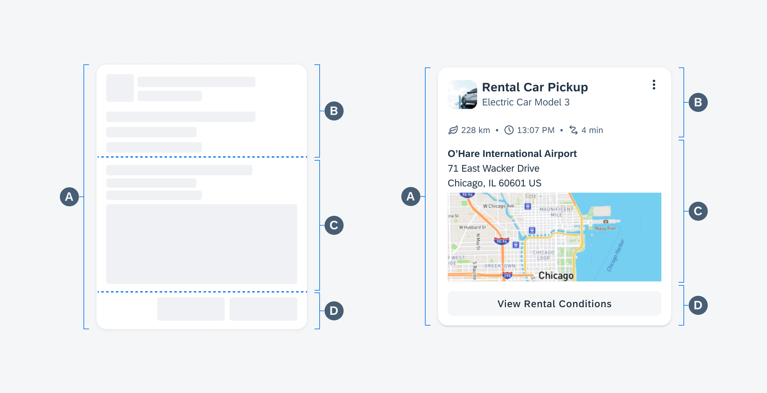
Schematic card anatomy (left) and anatomy of an example card (right)
Behavior and Interaction
Interaction States
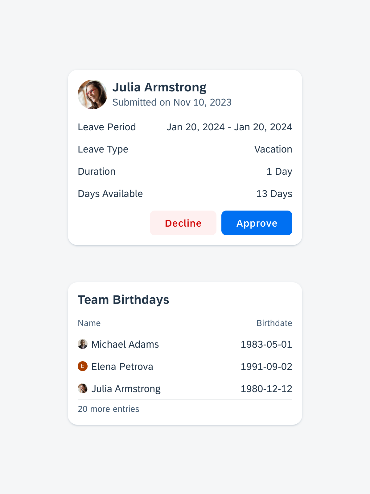
Selecting a Card
When a user presses a card, the ripple effect serves as a clear and immediate feedback to indicate their selection.
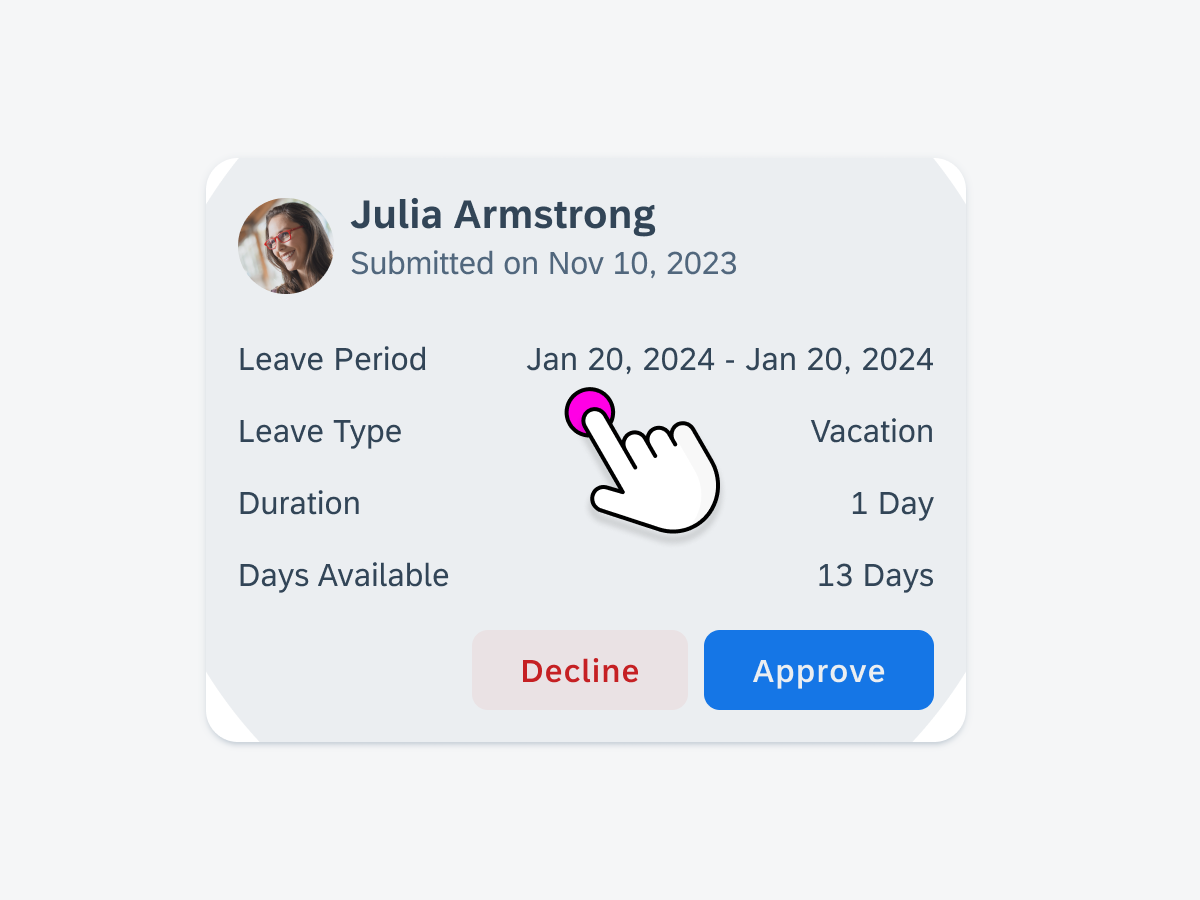
When the whole card is selected, the ripple appears as an indicator
Selecting an Interactive Element
When a specific element within the card, such as a card cell, is designed to be interactive, it is visually indicated by a ripple effect.
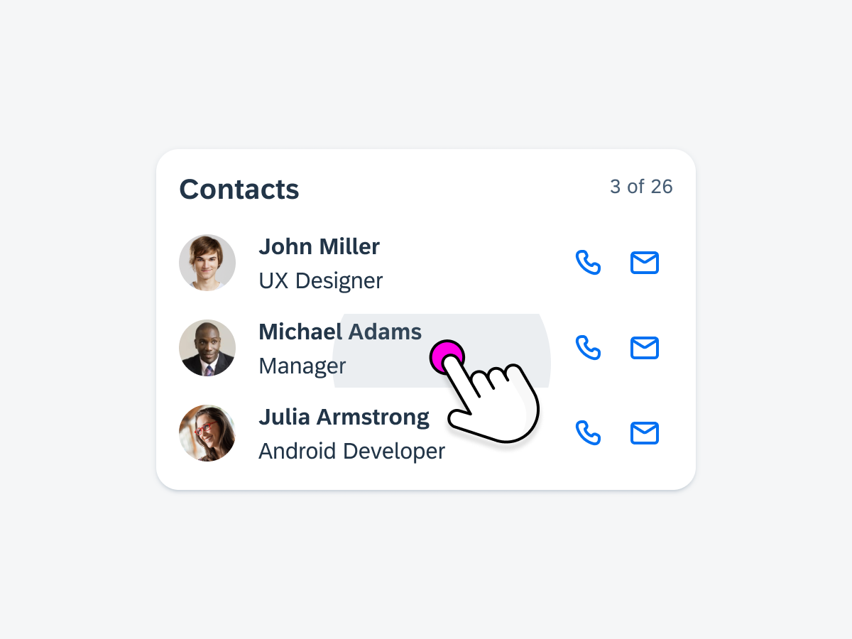
When an interactive item is selected within the card
When an interactive element is selected within the card
Navigation
When a card is selected, it triggers navigation to a designated page that provides more details, such as a list report page or an object details page.
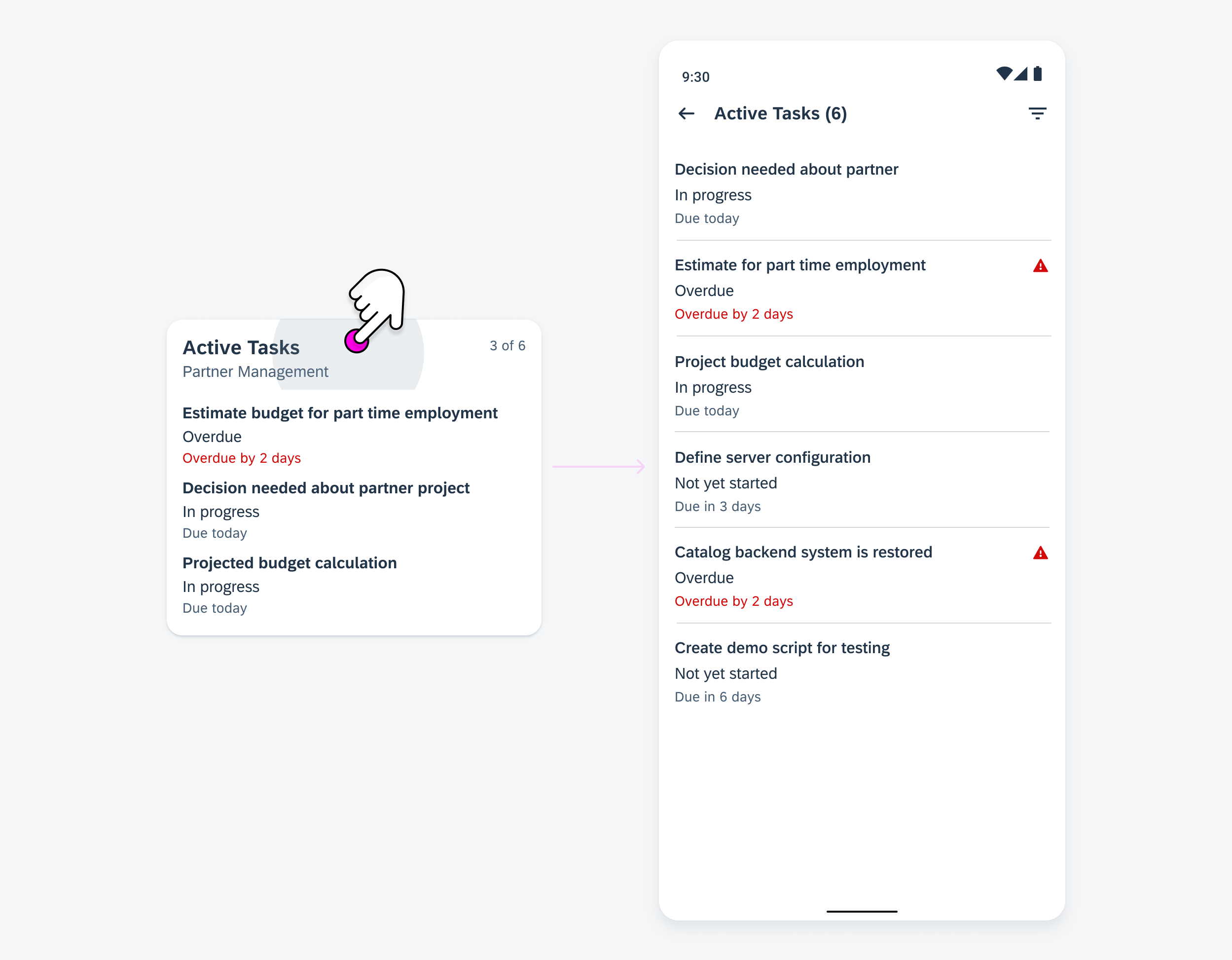
By selecting the card, the user is redirected to a list report with more details
When users engage with an interactive element within the card, such as an object cell, it triggers navigation to a dedicated details page that corresponds to the specific subject of that element.
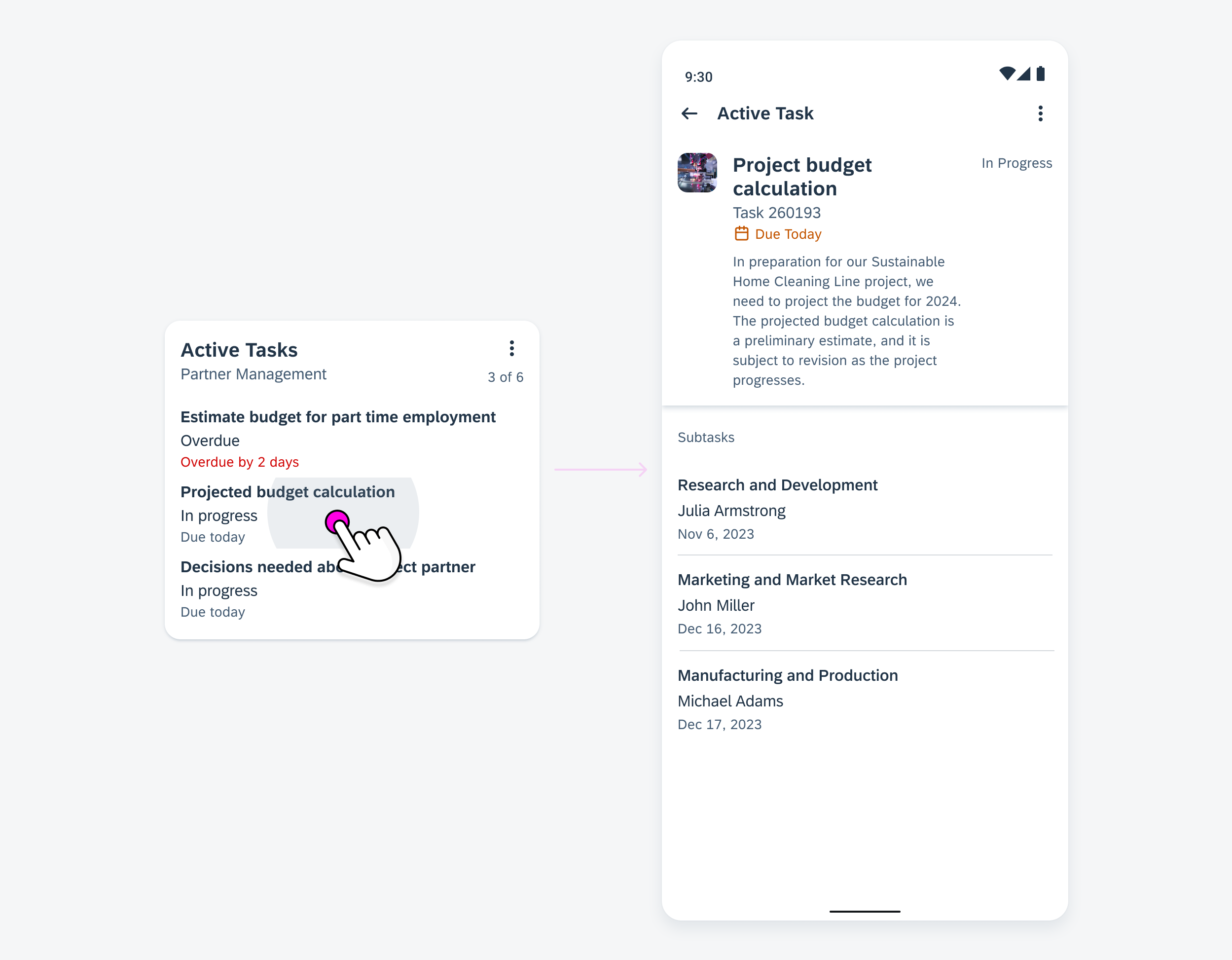
By selecting an element within the card, the user is redirected to an object details page with more details
Empty States
When there is no relevant content or data to display, it is important to include an empty state indicator within a card. This indicator serves as an informative message for users, letting them know that there is no information or data available at the moment or that new data needs to be created or uploaded.
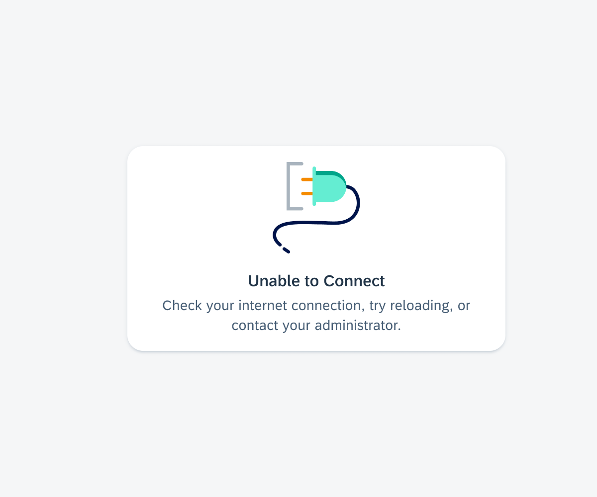
Empty state if the entire card content fails to load
If a component within the card fails to load, an empty state indicator is displayed in the body container.
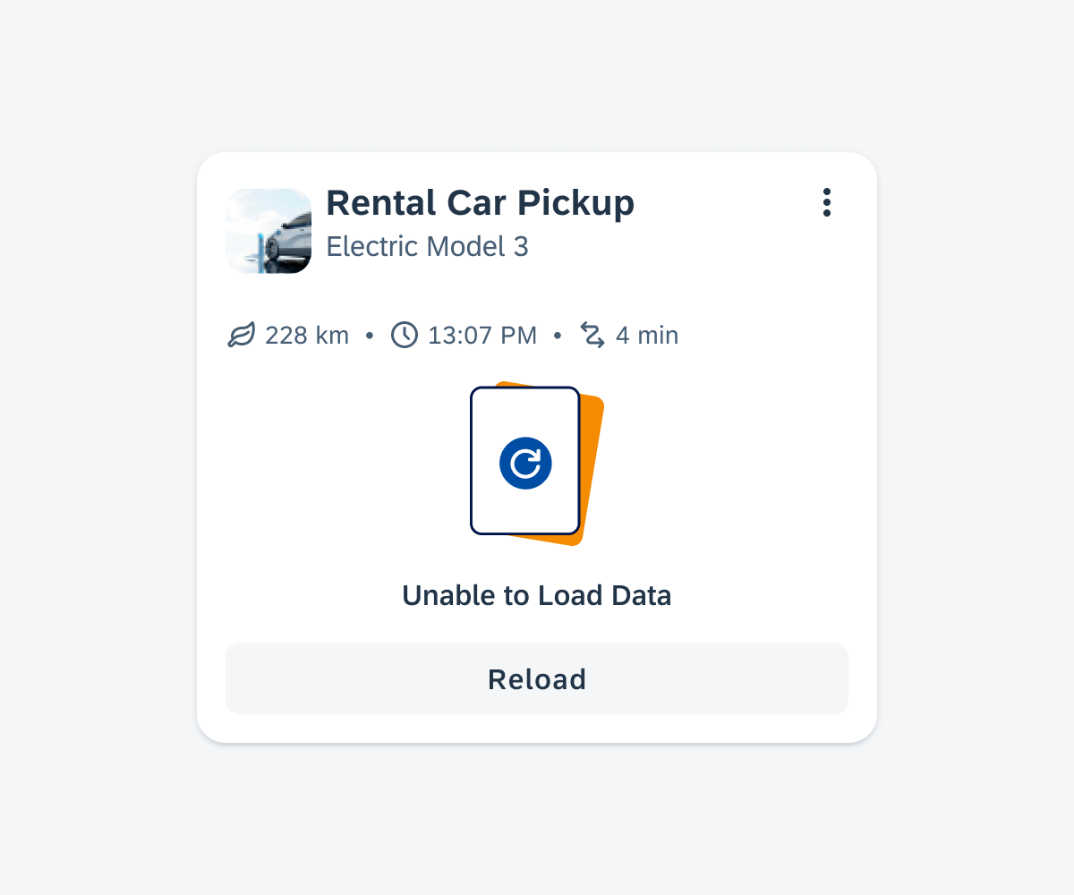
Empty state if only the card body fails to load
Skeleton Loading
Skeleton loading is a design technique where a simplified and placeholder version of content is displayed to users while the actual data is being fetched or loaded. It provides users with a visual cue that content is on its way and improves the perceived performance of the interface.
There are three sizes based on the card blocks. This approach allows you to select a card size that approximately reflects the loaded card size.
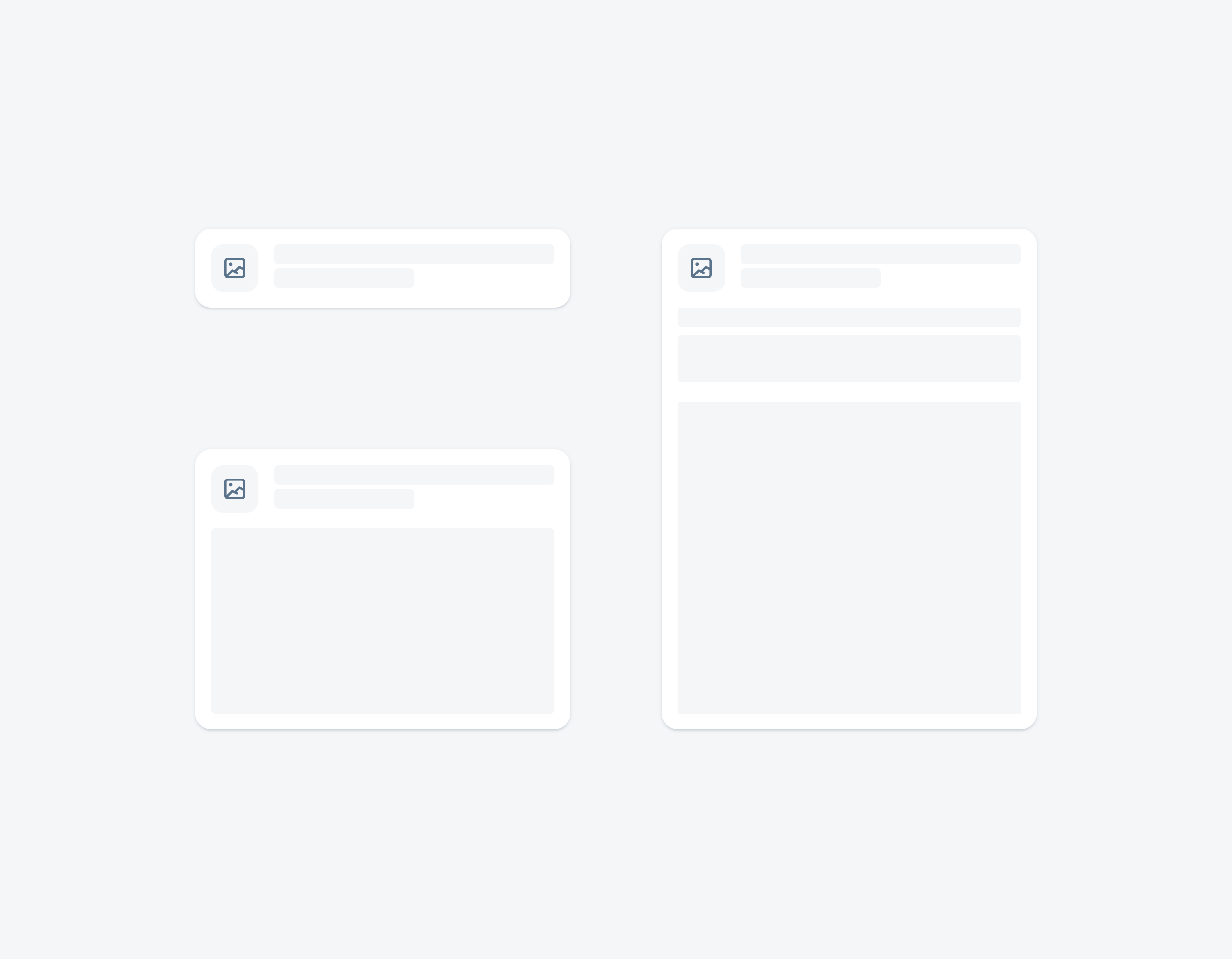
Skeleton loading on a small, medium, and large card
Adaptive Design
The card system ensures that cards adjust seamlessly to different screen sizes and orientations. For compact window size classes, cards are designed to be narrower to accommodate the limited screen width of phones, making efficient use of the available space in a portrait orientation.
For medium and expanded window size classes, cards can have a wider layout to take advantage of the increased screen real estate, resulting in a more spacious and visually appealing presentation of content. More information about adaptive design can be found in carousel layout and staggered layout.
Variations
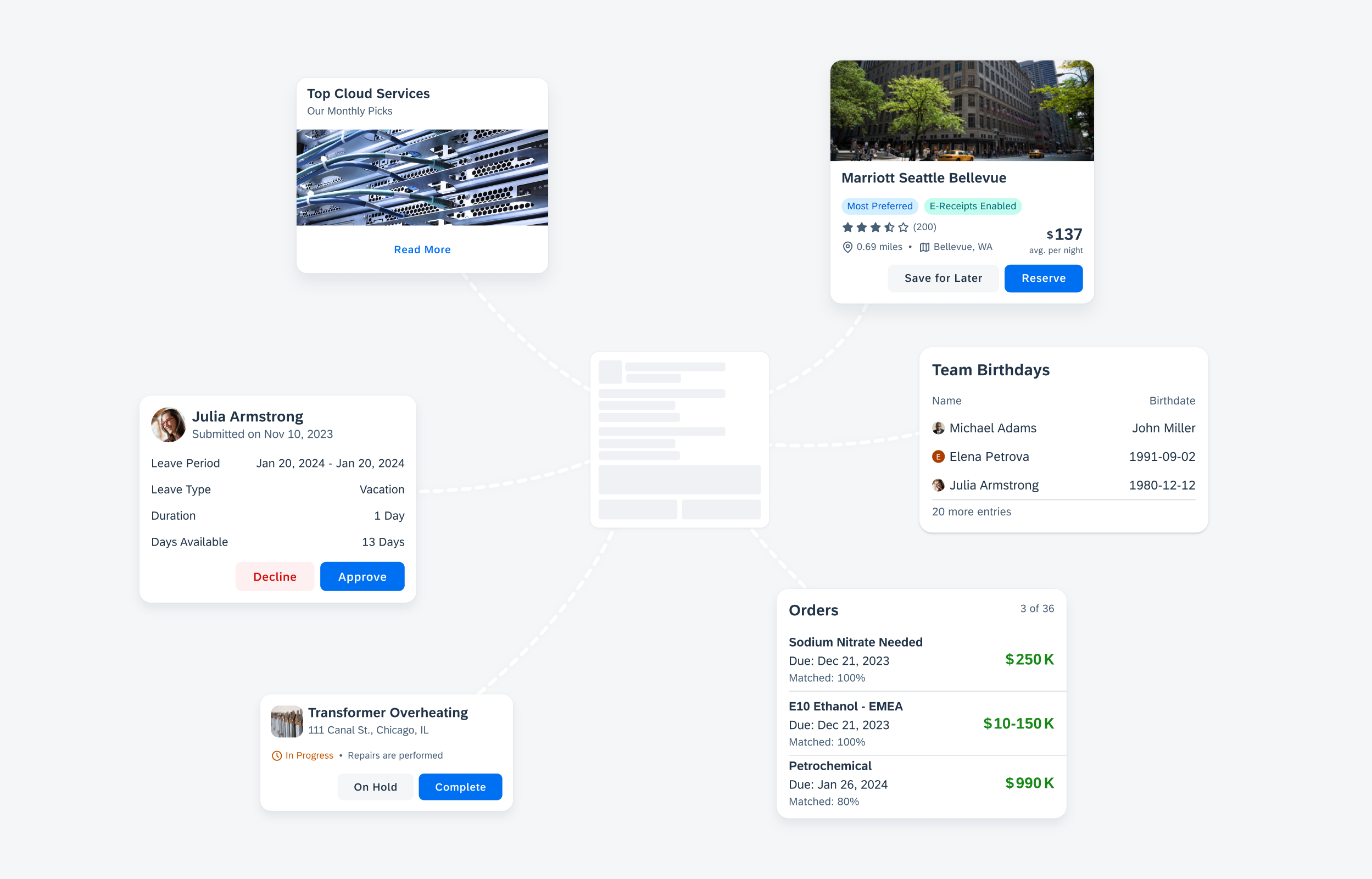
The flexible card container allows a variety of cards to be created for any use case
Data Table Card
Create a data table card to display key data points about an object in a two-column format.
Data table card featuring the card header (with main header), card body (with data table) and card footer
List Card
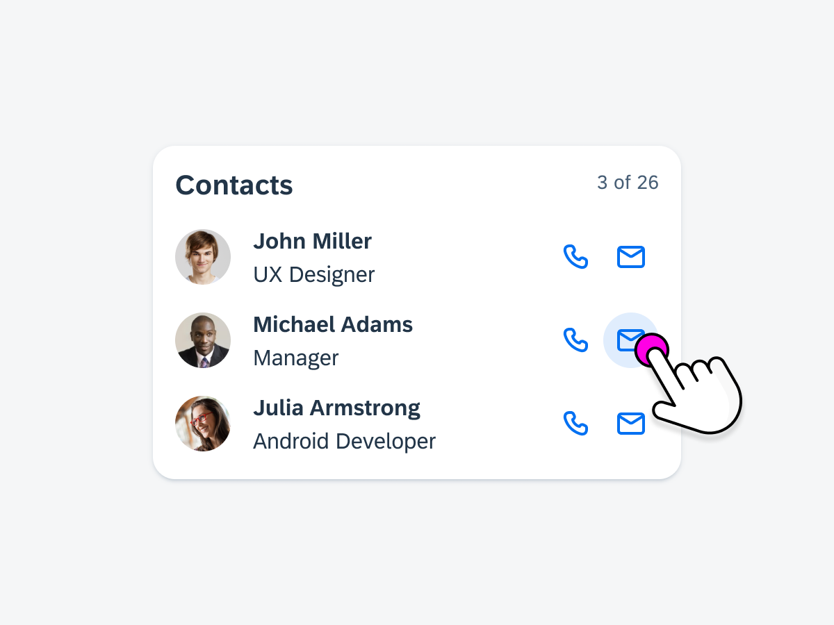
Create a list card to display a preview of a set of items or objects in a vertical list format.
List cards featuring the card header (with main header) and card body (with card cell and divider or white space components).
Object Card
Create an object card to display a preview of an object.
Top object card featuring the card header (with header image, main header, extended header), and card footer. Bottom object card featuring the card header (with main header and extended header) and card body (with key value cell, divider/space and KPI).
Resources
Development: Card System
SAP Fiori for iOS: Cards Overview
SAP Fiori for Web: Cards (SAPUI5), Cards (Web Component)
Related Components/Patterns: Card Header, Card Body, Card Footer, Carousel Layout, Staggered Layout
 Your feedback has been sent to the SAP Fiori design team.