
Calendar
FioriCalendar
Intro
The calendar view provides a visual overview of a week, a month, or multiple months. It can filter and display different types of content, such as events, agendas, or schedules, based on the time dimension.
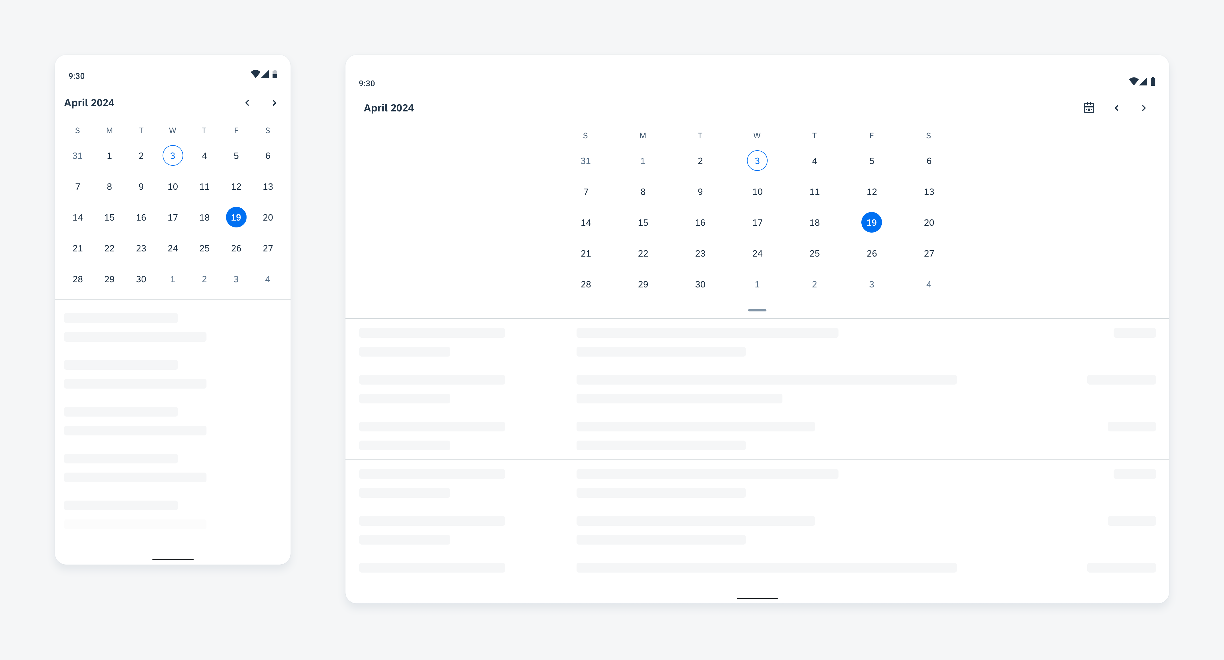
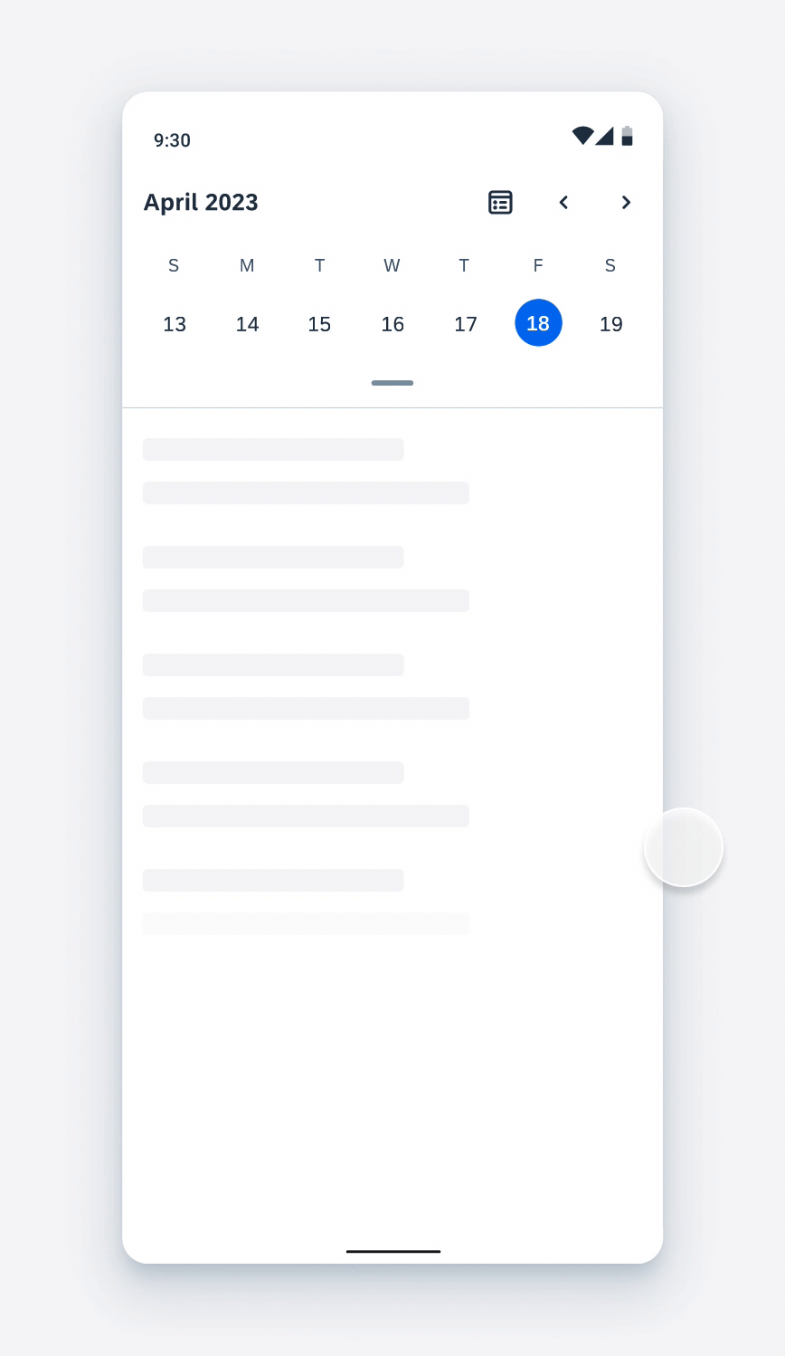
Example of calendar view on compact (left) and expanded screen (right)
Usage
- Use calendar view to display a visual overview of a week or a month.
- Use calendar view to filter the information based on days. For example, events, tasks, and deadlines.
- Don’t use calendar view for date selection or multiple date selection in forms. Use pickers instead.
- Don’t use calendar view when the available screen space is limited and displaying the calendar permanently would take up too much space.
Anatomy
The structure is composed of four parts: calendar header (optional), week label container, date label container, and dragging handle (optional).
The space below the calendar view container is available for different configurations. for instance, using object cells as an agenda or timeline as a timesheet.
A. Calendar Header
The calendar header includes the title, subtitle (optional), and buttons.
B. Week Label Container
The week label container displays the seven days of a week. You can customize the format to match your local preference.
C. Date Label Container
The date label container shows all the days of the month/week in a grid view.
D. Dragging Handle (Optional)
The dragging handle provides a visual cue on the dragging behavior to expand the week view and collapse the month view.
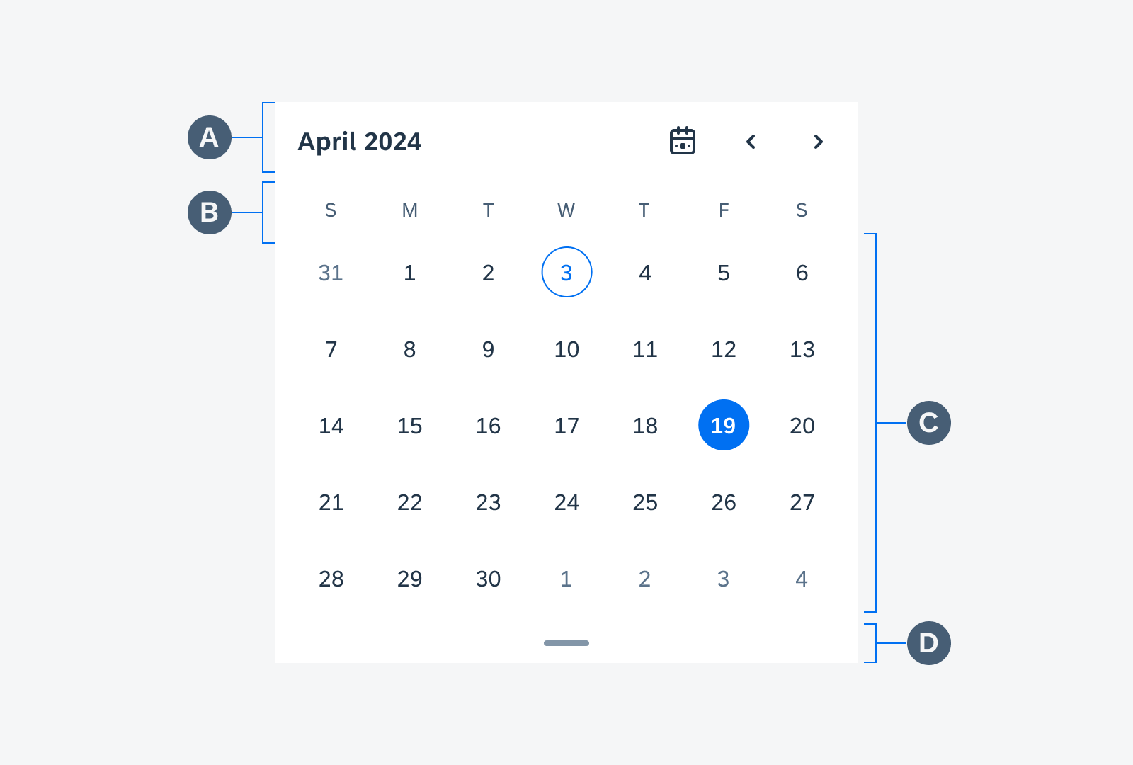
Anatomy of a calendar
Behavior and Interaction
Navigate
To navigate between months/weeks, users can use swiping gestures or tap on buttons. To ensure accessibility, it is important to provide visible navigation buttons that support all input channels such as touch screen, keyboard, and mouse. The buttons can be customized to your preference, for example, icon buttons or text buttons.
User interaction of navigating via swiping and tapping buttons
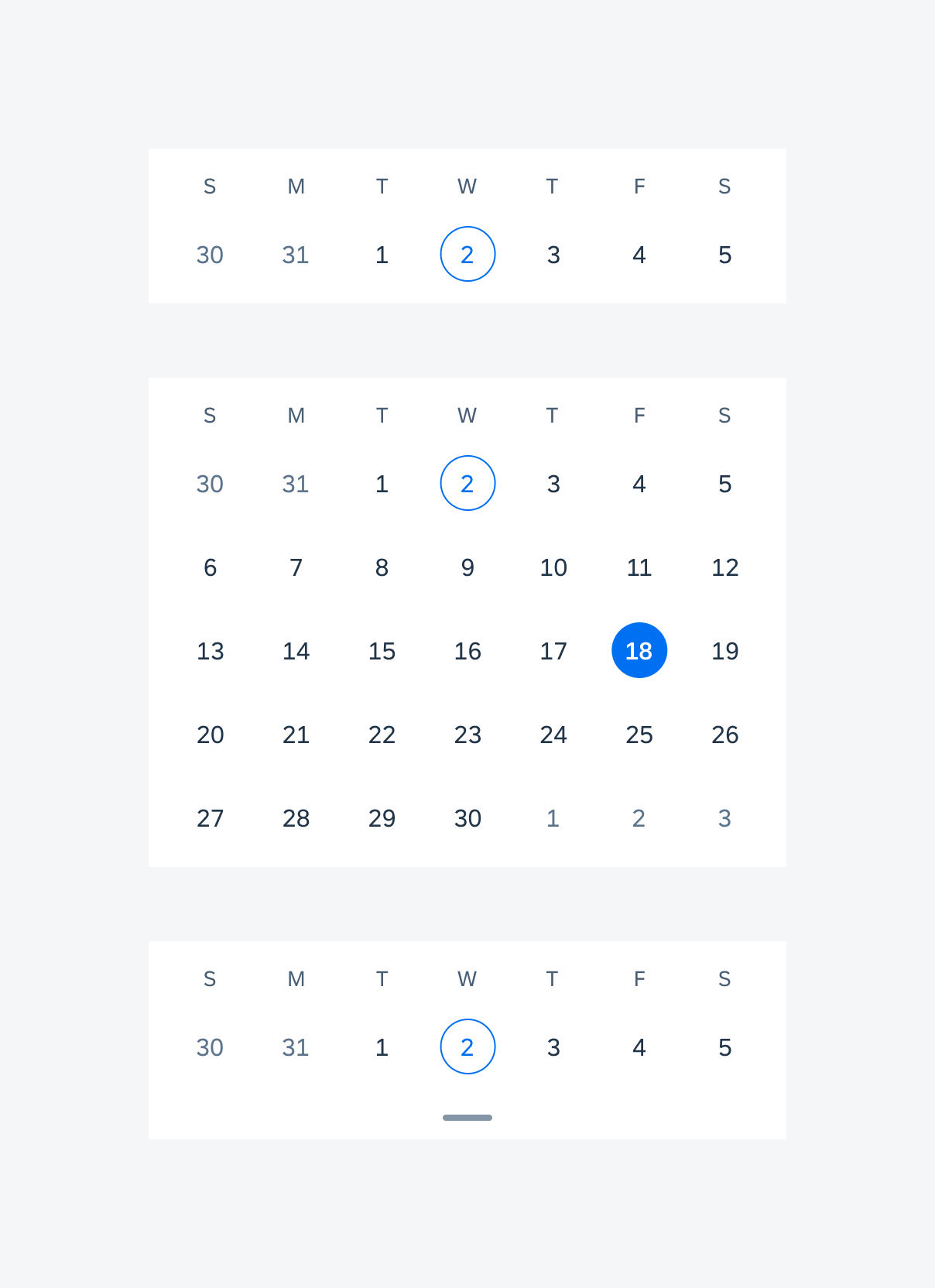
Expand and Collapse
If the calendar has a dragging handle (optional), users can expand it from week view to month view by swiping down. Similarly, they can collapse it from month view to week view by swiping up.
User interaction of dragging to expand and collapse
Back to Today
If the calendar includes a “back to today” button, the user can return to the current month/week by tapping on the button.
User interaction of returning to today
Variations
Calendar Views
There are different types of calendar views. Select the one that best suits the purpose of your app and start designing from there.
- Month View (Default)
- Week View
- Expandable View – Users can switch from the default week view to month view by swiping up on the dragging handle.
Types of calendar view containers (from top to bottom): week view, month view, and expandable view
Calendar Header
The calendar header provides the following layouts:
- Left-Aligned
The title is left-aligned. A leading button or icon and a maximum of three trailing buttons are supported.
- Center-Aligned
The title is center-aligned. A leading button or icon and a maximum of two trailing buttons are recommended.
The header also supports the following types of titles:
- Single-Line Title
It can be used to show the displayed month and year, or the topic of the calendar.
- Double-Line Title
It can be used to show the main title together with a subtitle for additional information.
- Large Title
The title is emphasized by using a larger font size and white space. This design can be applied when showing a calendar on the home screen or at the top of the page.
The text contents can be customized to reflect the month/week on display.
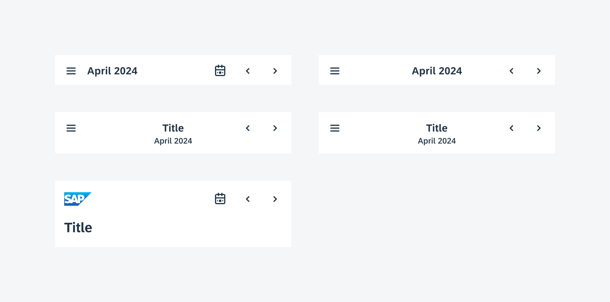
From left to right: left-aligned title, center-aligned title; from top to bottom: single-line title, double-line title, large title
Calendar Week Labels
The format of the calendar week labels can be customized to match your local preference. Besides, the calendar provides the following types of start day of the week:
- Sunday (Default) – US Standard
- Monday – Europe, Asia, Oceania Standard
- Saturday – Middle East Standard
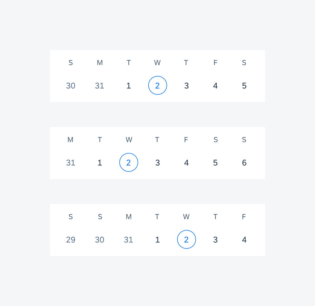
Week label starting from Sunday (top), Monday (middle), and Saturday (bottom)
Calendar Day Labels
The calendar supports the following states:
- Default – days of the month/week being displayed
- Today – the current system date
- Selected – the selected date
- Today + Selected – only appears when the selected date is today
- Out of Month – days in the previous or next month/week
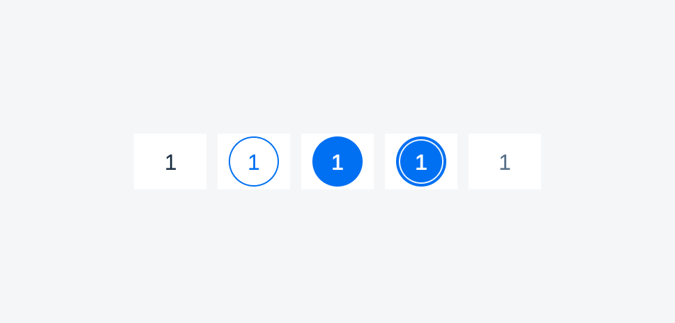
Date label states from left to right: default, today, selected, today and selected, out of month
Status Indicators
The calendar can display status information via status indicators, which should be a set of simple icons that are easy to recognize. A legend row is required to ensure that the status meanings are accessible.
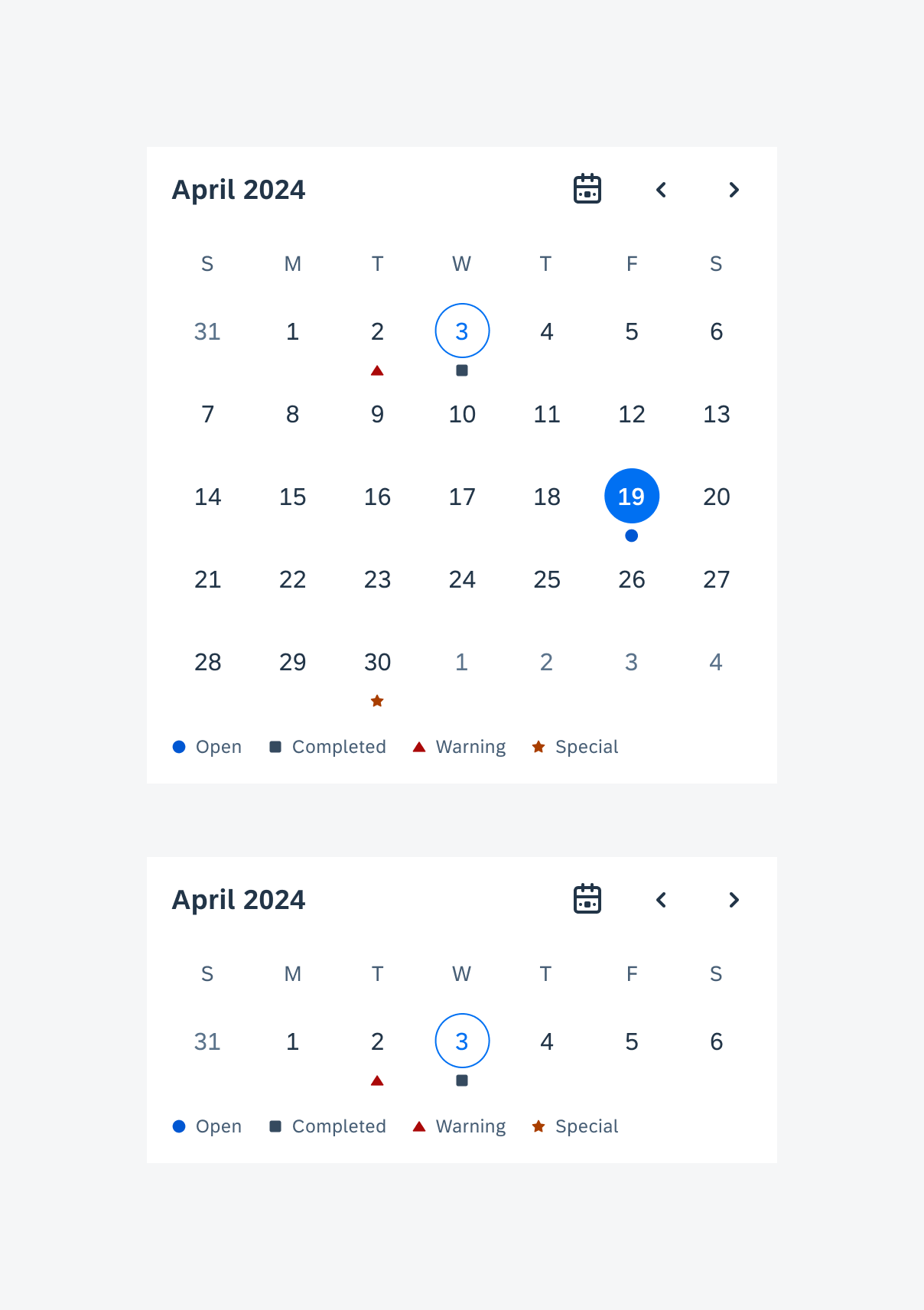
Calendars with status indicators: month view (top), week view (bottom)
Alternate Calendar
The calendar can show two calendar types on the same frame. The alternate calendar date label is displayed below the primary calendar date label, and the year and month are shown on the subtitle as a default. Below are the available calendar types for both the primary and the secondary calendar:
- Gregorian (default primary calendar)
- Chinese
- Hebrew
- Islamic
- Japanese
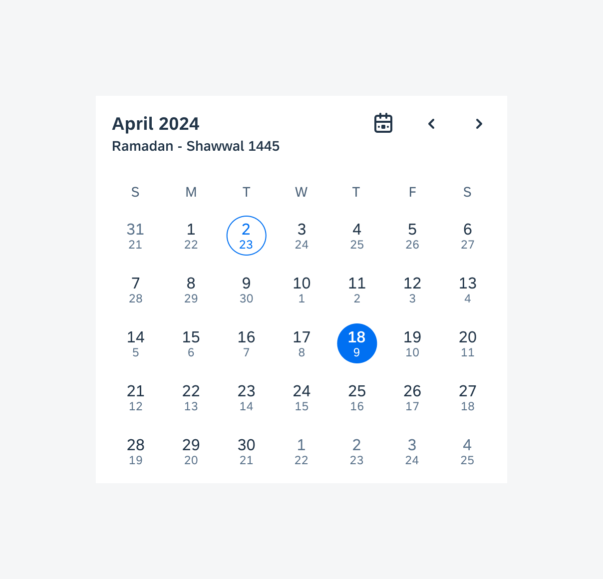
Calendar with alternate calendar labels
Adaptive Design
The calendar view adapts to different window sizes.
In compact windows, the width of the week labels and date labels expand to full width.
In medium windows, the week labels and date labels are fixed to 72dp.
In expanded windows, the week labels and date labels are fixed to 100dp.
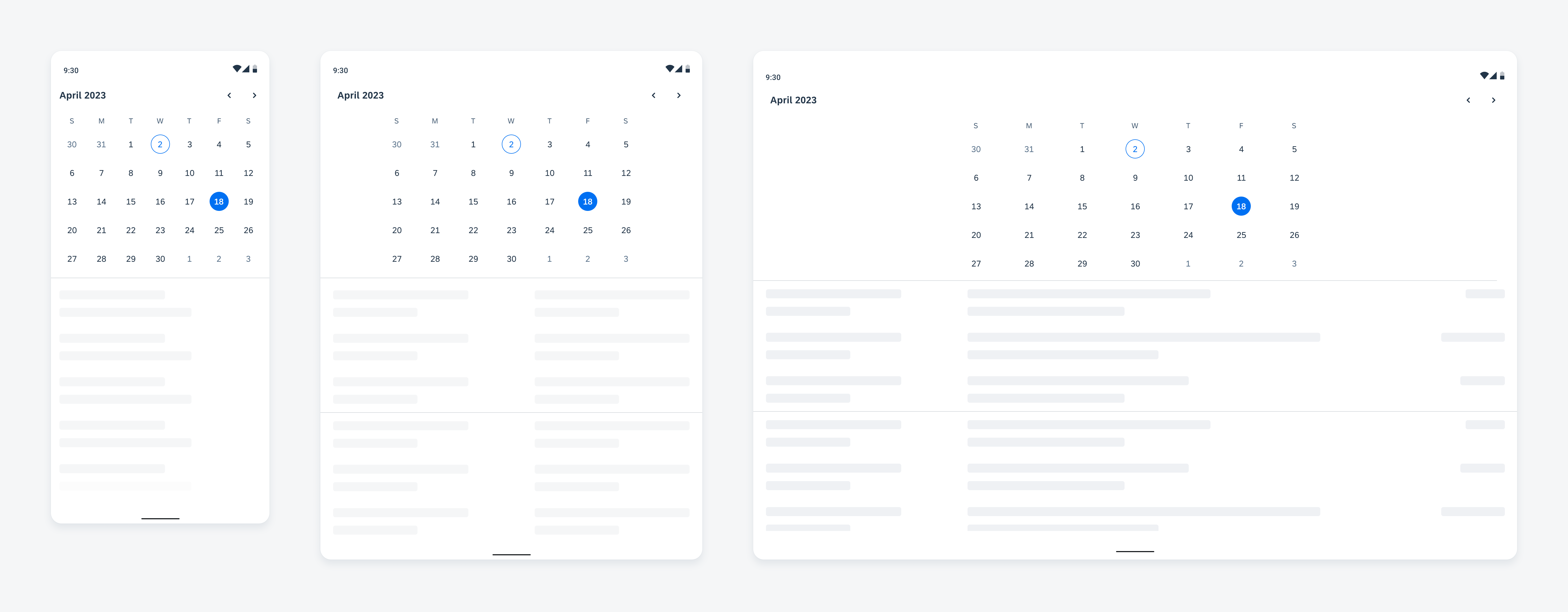
Calendar view adapting to compact (left), medium (middle), and expanded windows (right)
Resources
Development: FioriCalendar
SAP Fiori for iOS: Calendar
Related Components/Patterns: Pickers, Object Cell, Timeline View
 Your feedback has been sent to the SAP Fiori design team.