
Banners
Fiori: Banner
Intro
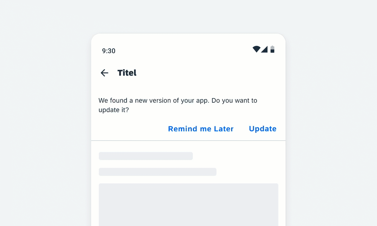
Banners show a short and concise message that displays at the top of the screen. It allows the user to take action or ignore it at any time. Apps may choose to use it for communicating internet connectivity, errors, synchronization statuses, or in-app notifications.
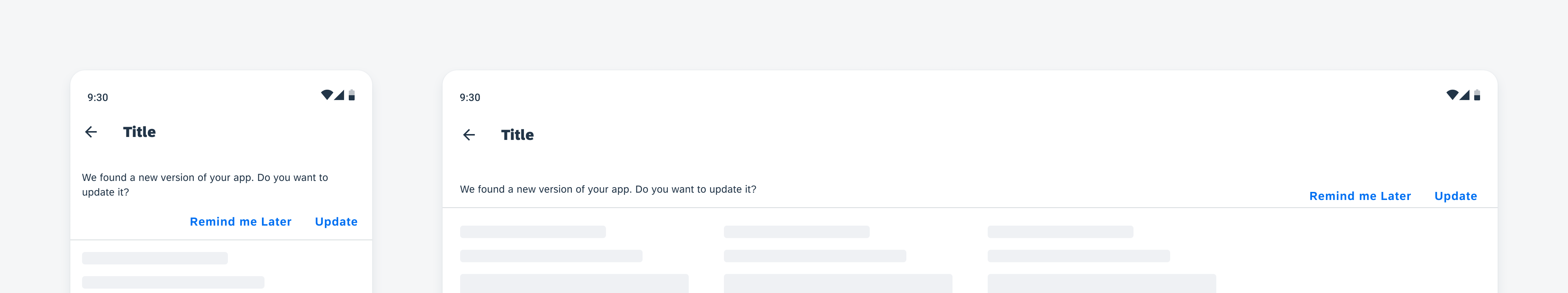
Banner on mobile (left) and on tablet (right)
Usage
- Banners must remain on screen until dismissed by the user.
- Only show one banner at a time.
- Only use a text button for actions.
- Optionally, you can add icons or images.
- Don’t place more than two actions on a banner.
- Don’t use more than three lines of text on mobile.
- Don’t use more than two lines of text on tablet.
Anatomy
A. Icon or Image (Optional)
B. Text
The text can be one to three lines on mobile and one or two lines on tablet.
C. Buttons
A banner can provide up to two actions, which can be displayed as text button only.
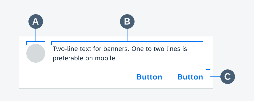
Banner anatomy
Behavior and Interaction
Banners typically appear when a screen loads content and remain on screen until dismissed by the user.
Banner appearing and dismissing
Banner behavior with scrolling content
Variations
One-Line Text
A. One-line text with one action
B. Icon or image and one-line text with two actions
C. One-line text with two actions
D. Error state one-line text
E. Error state one-line text with action
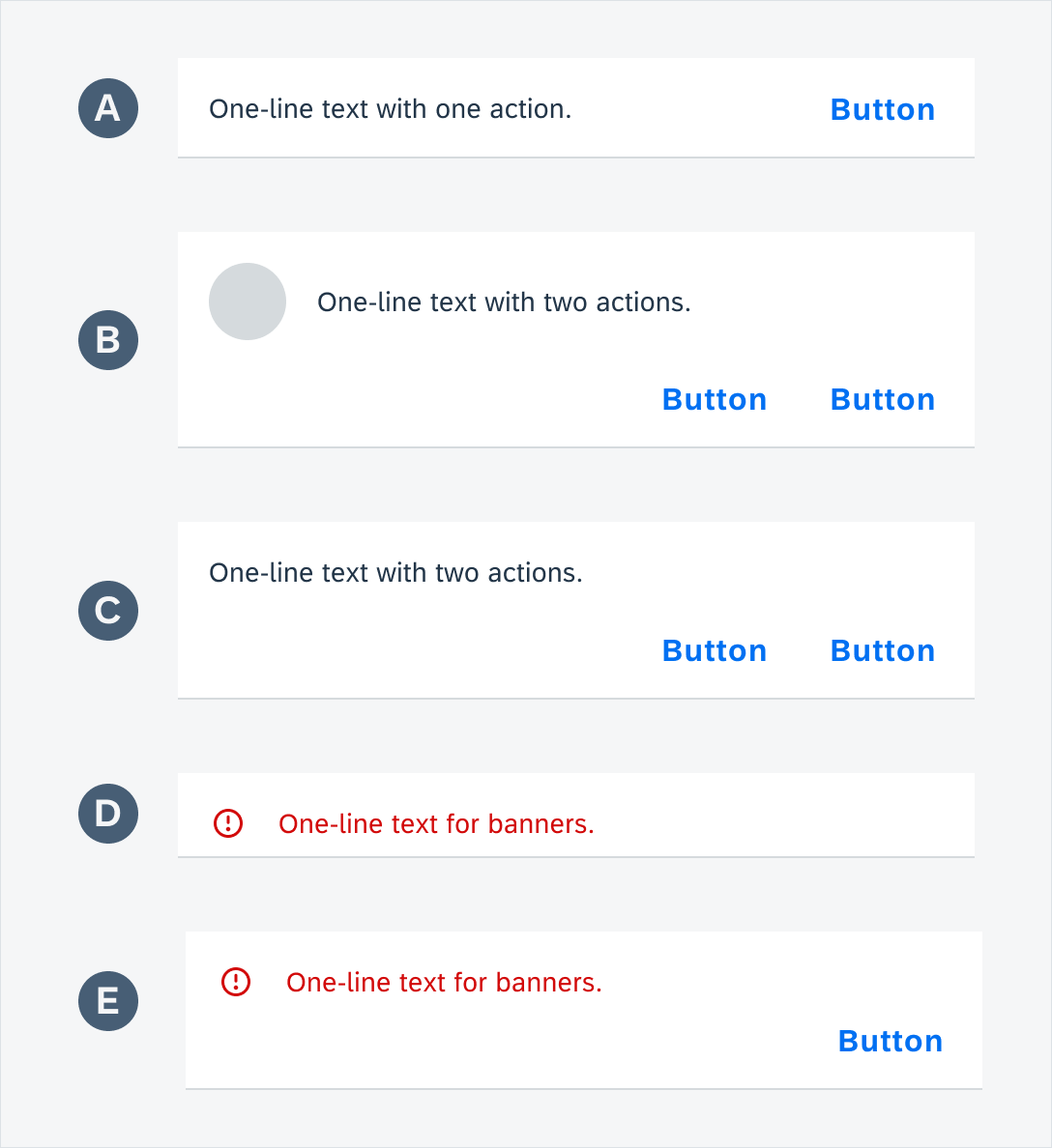
Banner with one-line text
Two-Line Text
A. Two-line text with two actions
B. Icon or image and two-line text with two actions
C. Error state two-line text with action
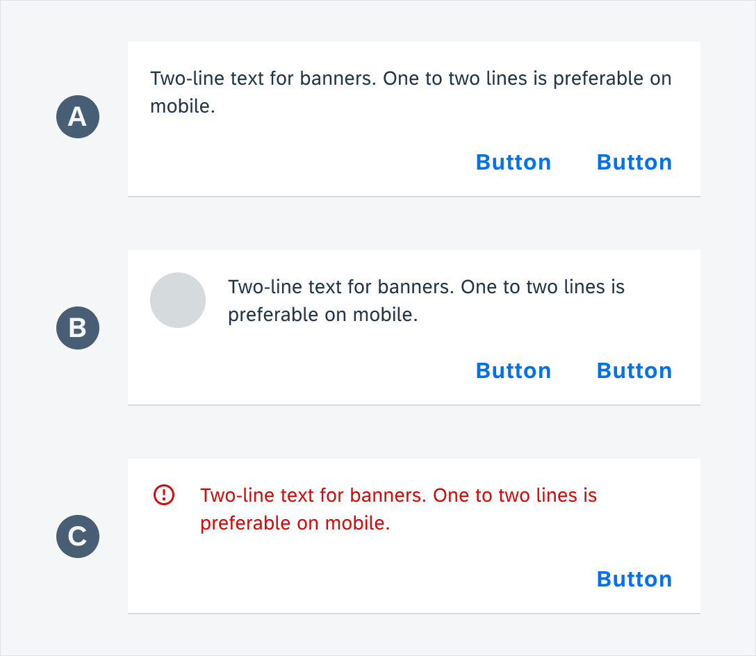
Banner with two-line text
Three-Line Text (Only for Mobile)
Three-line text with two actions (only for mobile)
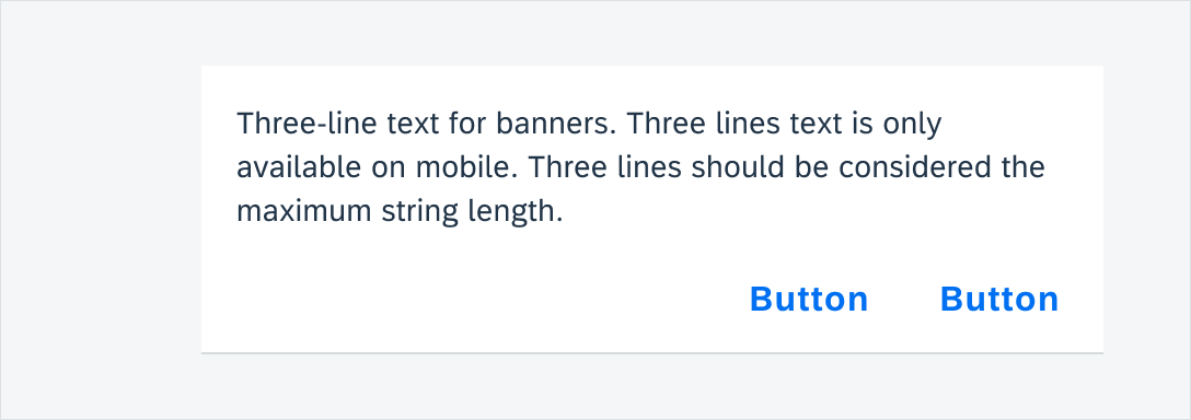
Banner with three-line text (mobile only)
Resources
Development: Banner Messages
SAP Fiori for iOS: Banners
 Your feedback has been sent to the SAP Fiori design team.