
Top App Bar
FioriTopAppBar
Intro
The top app bar contains actions and content based on the current screen in an app.
This includes navigation, title, and actions. The elements in the top app bar are specific to the current screen, but the top app bar can also contain consistent elements across an app.
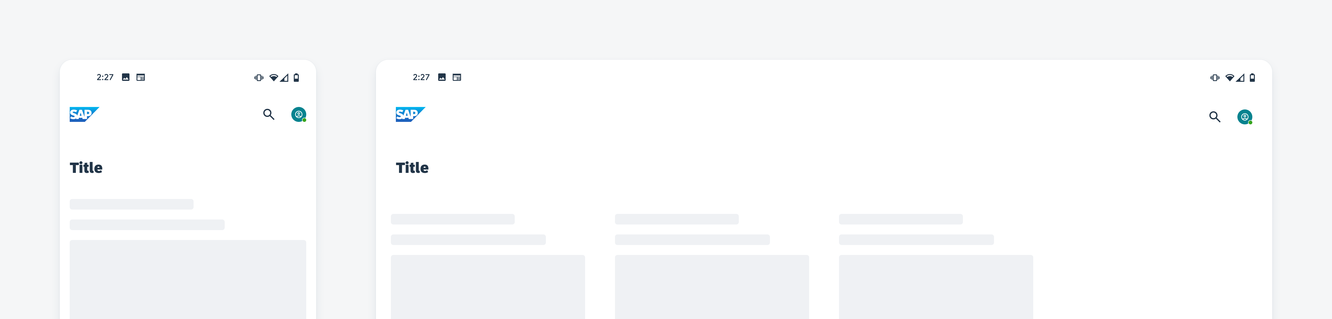
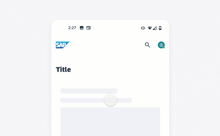
Top app bar on mobile (left) and tablet (right)
Usage
- Use an overflow menu if there are more than three icon buttons on mobile and four icon buttons on tablet.
- Ensure consistency of the position of the close/cancel and back icons. Generally, they are on the left side of the navigation bar.
- Keep the title text short and concise.
- For the collapsing layout, combine the large bar and the small bar with the left-aligned title.
- Try to use icon buttons due to limited space.
- Don’t use the profile and overflow menu together.
- Don’t provide multiple similar actions on the navigation bar. For example, if a back icon and a save button trigger the same action, one action element is enough.
- Don’t manipulate the height of the top app bar, use the default sizes.
- Try to avoid truncation or shrinking of the title text.
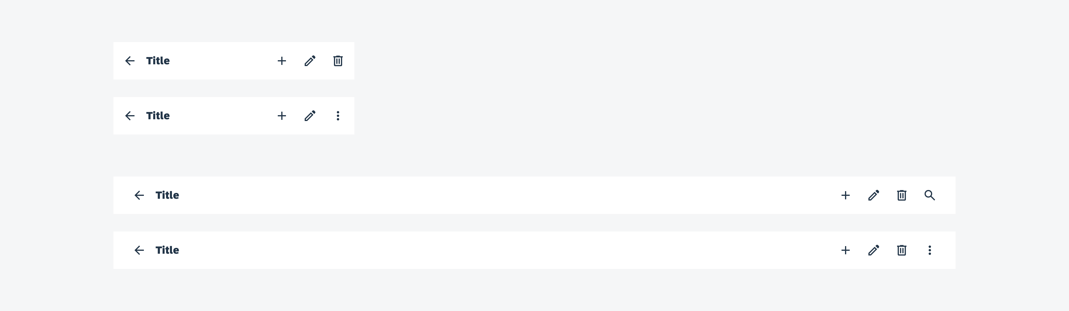
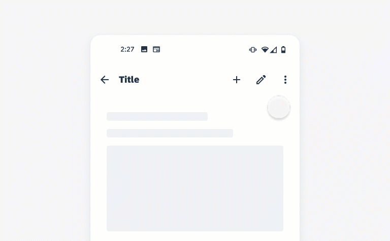
Anatomy
A. Leading Elements (Optional)
The optional leading element can hold a logo or a navigation icon. The navigation icon can be, for example, a back, close/cancel, or menu icon. The recommended maximum size of the logo is 24dp height and 112dp width. The leading element is aligned on the left side of the top app bar.
B. Title
The title should be concise and fit into the top app bar. Try to avoid truncation or shrinking of text. If the title is long, use the large top app bar. When using the object/profile header, the title/subtitle area in the top app bar needs to be empty to avoid redundant titles. Scrolling down the title of the object/profile header, moves to the top app bar.
C. Subtitle (Optional)
An optional subtitle can be included into the small app bar. Try to keep the subtitle short and concise.
D. Trailing Elements (Optional)
On the right side of the of the bar, you can place up to three trailing elements on mobile and up to four elements on tablet. Trailing icons can be action icons, buttons, and an overflow menu or a profile.
Arrange the action icons in order of importance from left to right. Less important or secondary actions can be included into the overflow.
E. Container
The container includes the leading elements, title, subtitle, and trailing elements of the top app bar.
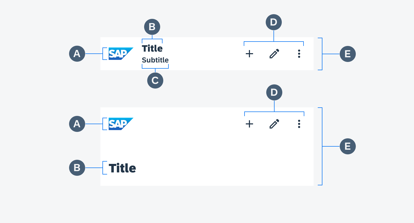
Anatomy of small (top) and large (bottom) top app bar
Behavior and Interaction
Scrolling
For the small top app bar, the following scrolling interactions are available:
- Pinned (default)
- Scroll-off screen
Small Top App Bar
When the small top app bar is pinned, the bar remains at the top of the screen. On scrolling, an elevation is added to the app bar and the content scrolls underneath the bar.
Animation of pinned small top app bar
Using the scroll-off screen interaction, the top app bar applies a compress effect and scrolls off-screen with the content and returns when the user reverse scrolls. In addition, upon scroll, the app bar increases elevation and lets content scroll behind it.
Animation of scroll-off screen small top app bar
Large Top App Bar
The large top app bar uses the collapsing layout. If a collapsing layout is used for the top app bar, the large bar is the initial state, and when scrolling up, the large bar transforms into the small top app bar. This is only available for the small app bar with a left aligned title.
Upon scrolling, the app bar increases elevation and lets the content scroll behind it. At the same time, the collapsing large top app bar transforms into a small top app bar. The app bar follows the behavior of the small top app bar (see pinned and scroll-off screen interaction above).
When the user scrolls back to the top of the screen, the app bar expands back to the large bar.
For the title, you can choose the following transitions:
-
Fade mode
The large title fades out and translates, and the small title fades in.
-
Scale mode
The large title continuously scales and translates into the position in the small bar.
Animation of collapsing layout from the large to small top app bar
Contextual Action Bar
Contextual action bars provide actions for selected items or tasks. A top app bar can transform into a contextual action bar, remaining active until an action is taken or dismissed.
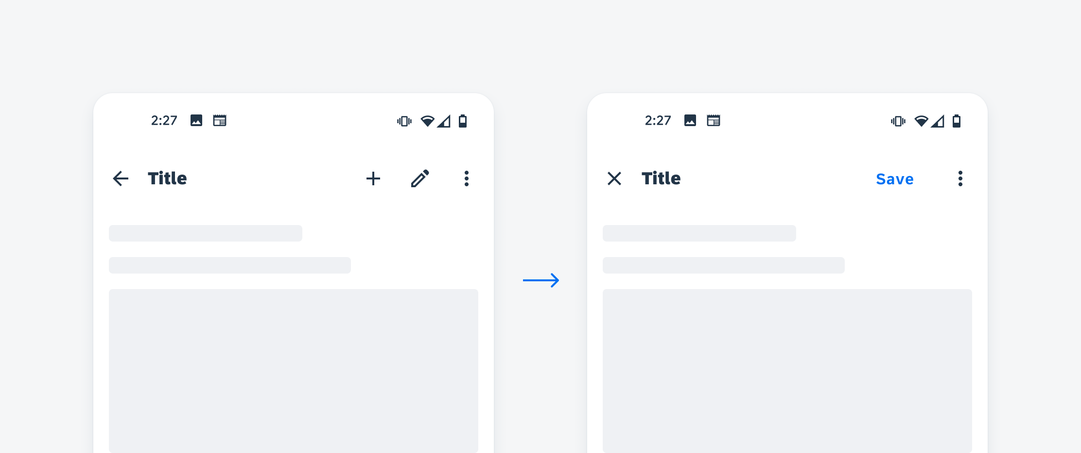
Top app bar (left) transforms into contextual action bar (right)
Nested Actions
Trailing Elements
You can place up to three trailing elements on mobile and up to four elements on tablet on the right side of the app bar. The following trailing elements are available:
- Profile
- Icon
- Button
The profile can be combined with one icon or one button on mobile. On tablet, you can combine the profile with two icons or one button. We recommend placing a profile with a limited number of actions on the main home page in an app. The actions are placed on the left side next to the profile. Note that you can’t combine the overflow with a profile.
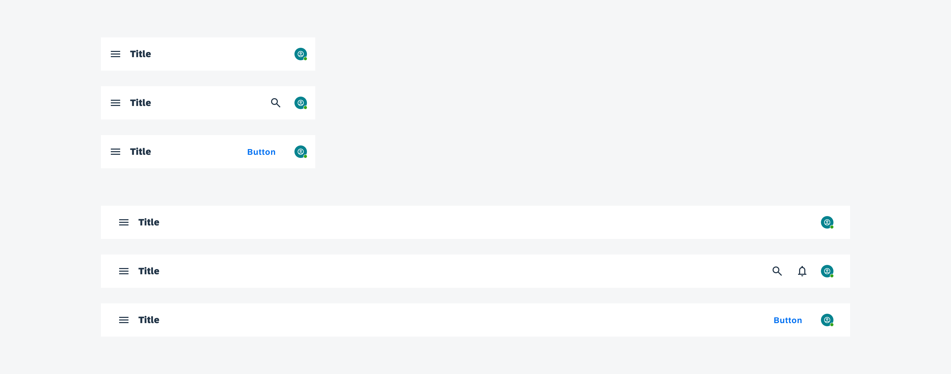
Profile as trailing element in top app bar on mobile (top) and tablet (bottom)
You can place up to three icons on mobile and up to four icons on tablet. If there are more icons, the remaining actions must be placed into the overflow.
Sort the icons regarding their priority from left to right. The most used icon should always be placed on the left. Also consider placing less important or secondary actions in the overflow.
Icons as trailing elements in top app bar on mobile (top) and tablet (bottom)
You can place one button in the app bar on mobile and two on tablet. If there are more actions, the remaining are placed into the overflow.
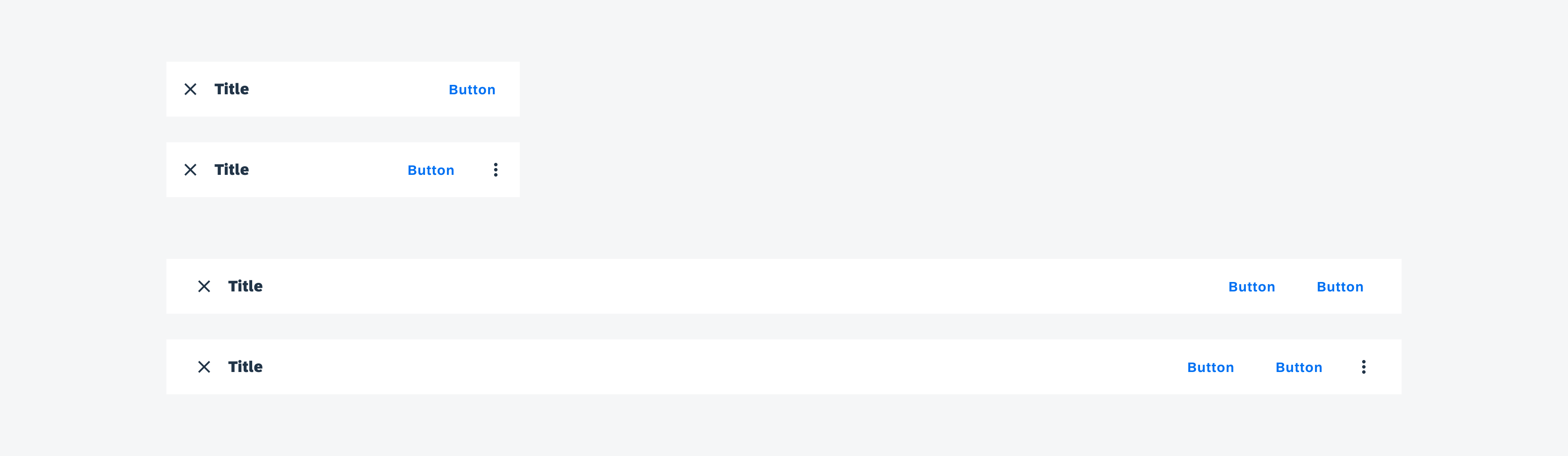
Button as trailing element in top app bar on mobile (top) and tablet (bottom)
Overflow
By clicking on the overflow icon, the overflow menu opens. The user can close the menu by clicking outside the menu.
Animation of opening the overflow menu in the top app bar
Adaptive Design
The top app bar uses 100% of the screen width and adapts to the width of the view or device.
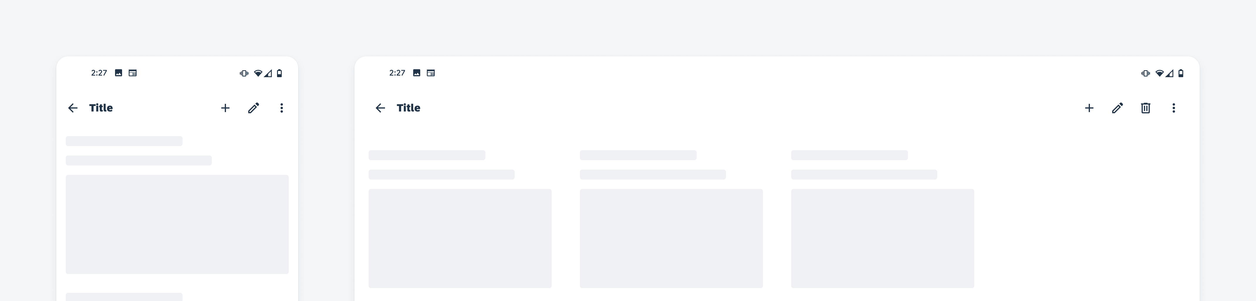
The container occupies 100% of the screen width on mobile (left) and tablet (right)
Variations
Small with Left-Aligned Title
The small top app bar with a left-aligned title is used for subpages that require back navigation or close/cancel and multiple actions. Avoid displaying the profile on a subpage.
Small with Centered Title
The small top app bar with centered title is used for the main/landing/home page in an app. It displays the app name, page headline, logo, and profile image.
Large with Left-Aligned Title
Collapsing layout is the initial state of the small top app bar before scrolling. It is used to emphasize the headline or to display a headline with a long text.
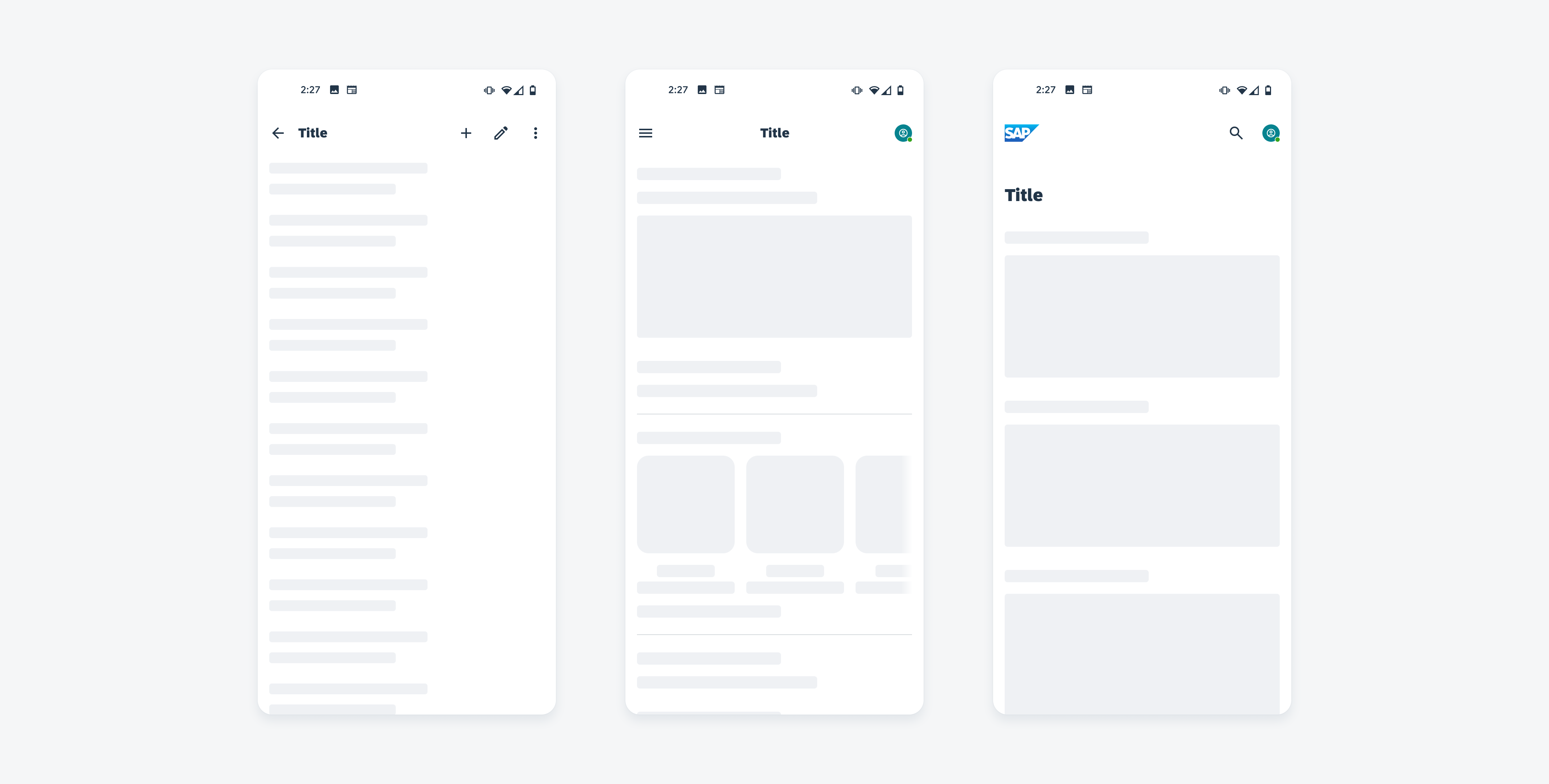
Small bar with left-aligned title (left), with centered title (middle) and large bar with left-aligned title (right)
Resources
Development: FioriTopAppBar, FioriToolbar
SAP Fiori for iOS: Navigation Bar
Material Design: Top App Bar
 Your feedback has been sent to the SAP Fiori design team.