
Chart Card
Fiori: ChartCardView
Intro
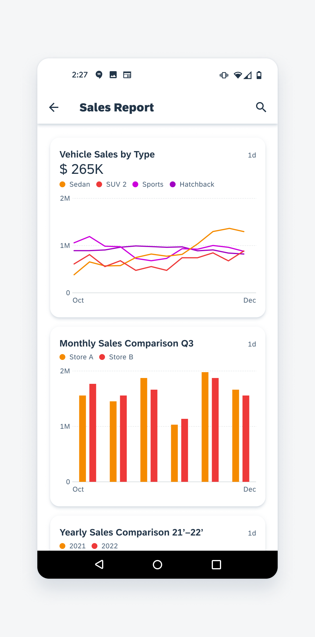
Chart cards display a preview and key information of the full screen chart. Users can tap to navigate to the full interactive card view.
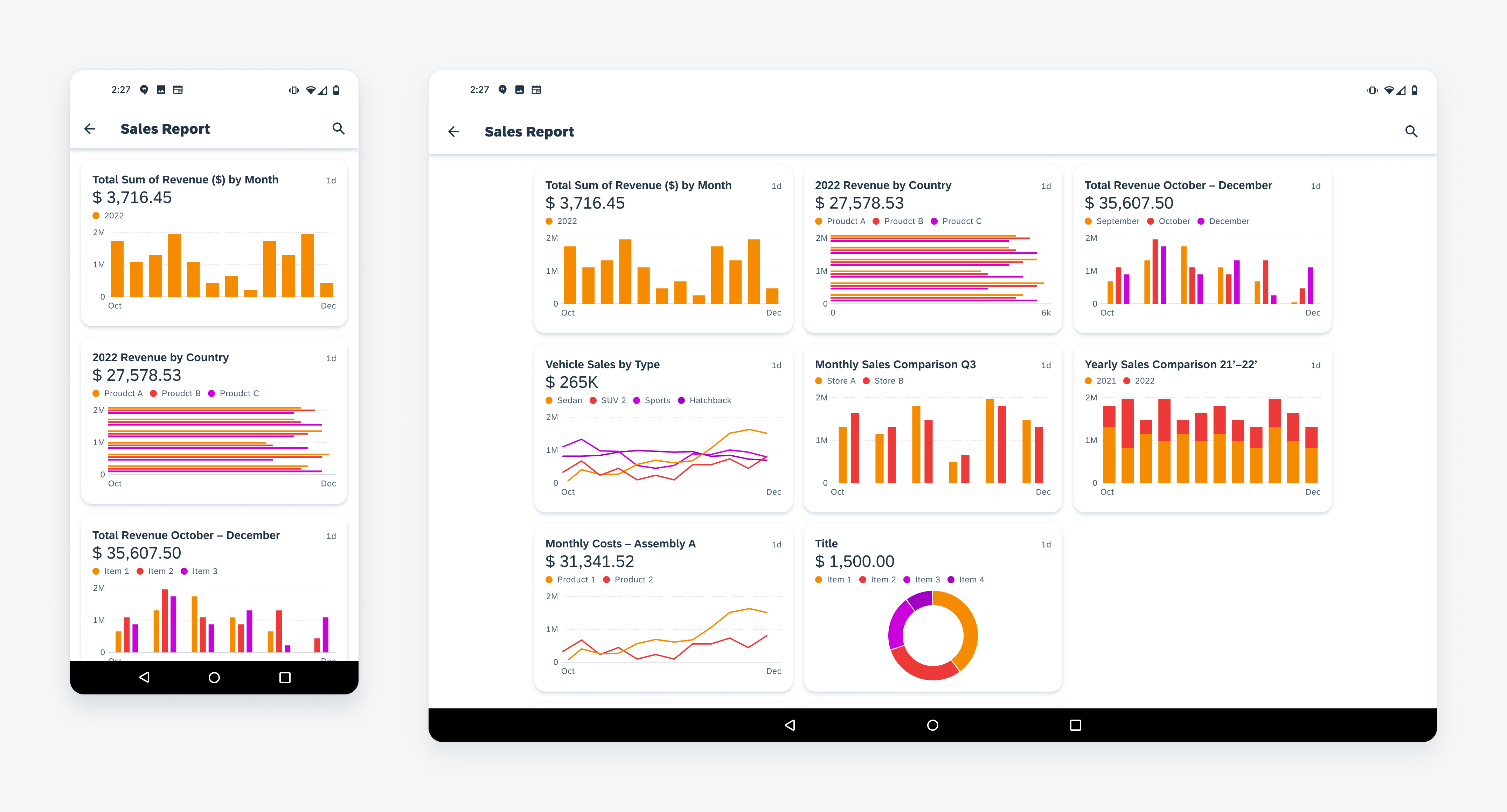
Chart cards in mobile (left) and tablet (right)
Usage
Use the chart card if you want to provide users with an entry point to the full chart view.
Do not use the chart card to navigate to other content types unrelated to the full chart view.
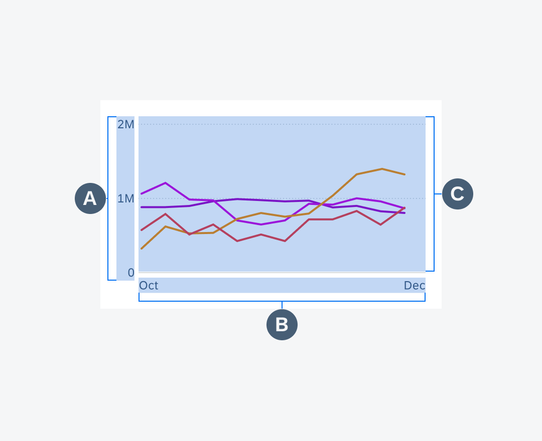
Anatomy
The chart card includes all of the following content. The content shown may vary depending on what is being previewed from the chart overview.
A. Header
The header prominently displays the card title, value label, and timestamp.
B. Legend
The legend provides an explanation about the data in the chart plot.
C. Chart Plot Preview
The chart plot preview displays a minimized view of the data from the full chart view.
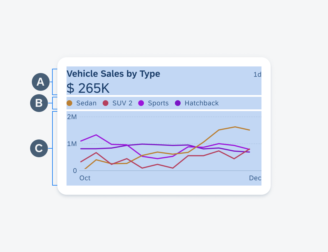
Anatomy of a chart card
Header
The header is located at the beginning of the card. The following content types are found in the header section:
A. Title
The title should provide a concise summary of the chart’s data.
B. Time Stamp
The timestamp indicates the chart card’s latest update. For timestamps, we recommend using the appropriate time unit abbreviation (e.g. hours “h”, days “d”, months “m”) to reduce screen real estate usage.
C. Value Label
The value label displays the aggregate, averages, or a selected data point from the data. For value label, you can choose between several symbol units (e.g. Euros “€”, Thousands “K”, degrees Celsius “°C”) that may be placed left and/or right of the label value.
D. Trend Label
The trend label signals the upward or downward trend of a data set by using the semantic colors found in the SAP Fiori color style guide. You are encouraged to choose the appropriate semantic color to comply with their cultural and/or regional needs. Refer to the SAP Fiori colors style guide for more information regarding semantic colors.
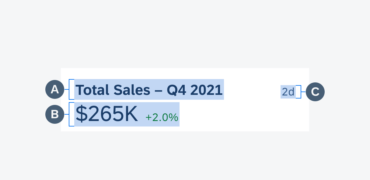
Anatomy of a chart card header
Legend
The legend is located below the header section and consists of legend items that can wrap up to two lines.
Legend Item
The color nodes and labels are used to easily identify the data points in the chart plot. Legend items can extend to the margins of the card in which case the label would truncate. Subsequent legend items can wrap to a second line.
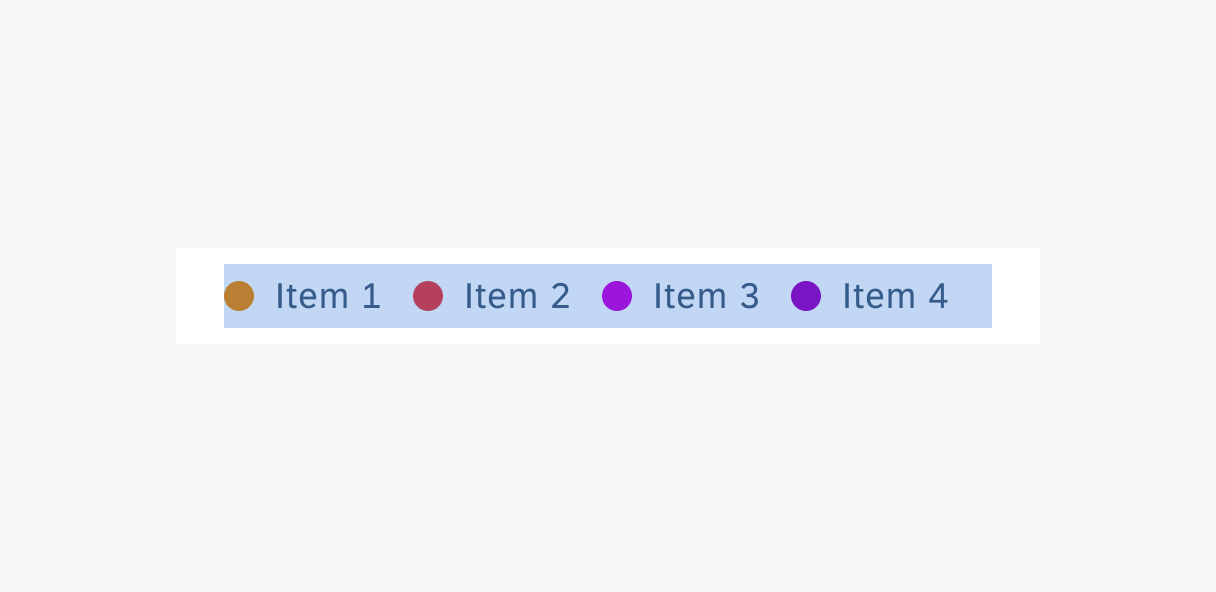
Anatomy of a legend
Chart Plot Preview
The chart plot preview is located at the bottom of the card and its height adjusts according to the header and legend height. The following elements make up the chart plot preview:
A. Y-Axis
The y-axis often represents a dependent variable or range from the smallest to largest values used to measure the dependent variable. Up to a maximum of three y-labels may be displayed in chart plot preview.
B. X-Axis
The x-axis represents an independent variable. such as time, temperature, location, type of tractor, etc. Up to a maximum of twelve variables may be displayed in the chart plot preview.
C. Chart Plot
The chart plot should show the most accurate, relevant, and reliable data in order to inform the user’s decision making. The chart plot can display line, column, or horizontal bar chart data.
Anatomy of a chart plot preview
Layout
There are two card layouts: base card and card collection view. Your specific use case determines which card mode to use.
Base Card View
The card collection view is a horizontally scrollable array of inline aligned cards. Place this view within an overview page or detail page as an entry point to a detail page or to a base card view.
Vertically scrolling base card view
Card Collection View
The card collection view is a horizontally scrollable array of inline aligned cards. Place this view within an overview page or detail page as an entry point to a detail page or to a base card view.
Horizontally scrolling card collection view
Behavior and Interaction
The chart card serves as the entry point to help users navigate to the full-screen chart. When tapped, the card should display a ripple effect as a visual indication that the card has been tapped.
Navigating from chart card to full-screen chart
Adaptive Design
Mobile displays a single column vertically stacked layout. The tablet displays a two or three column grid layout.
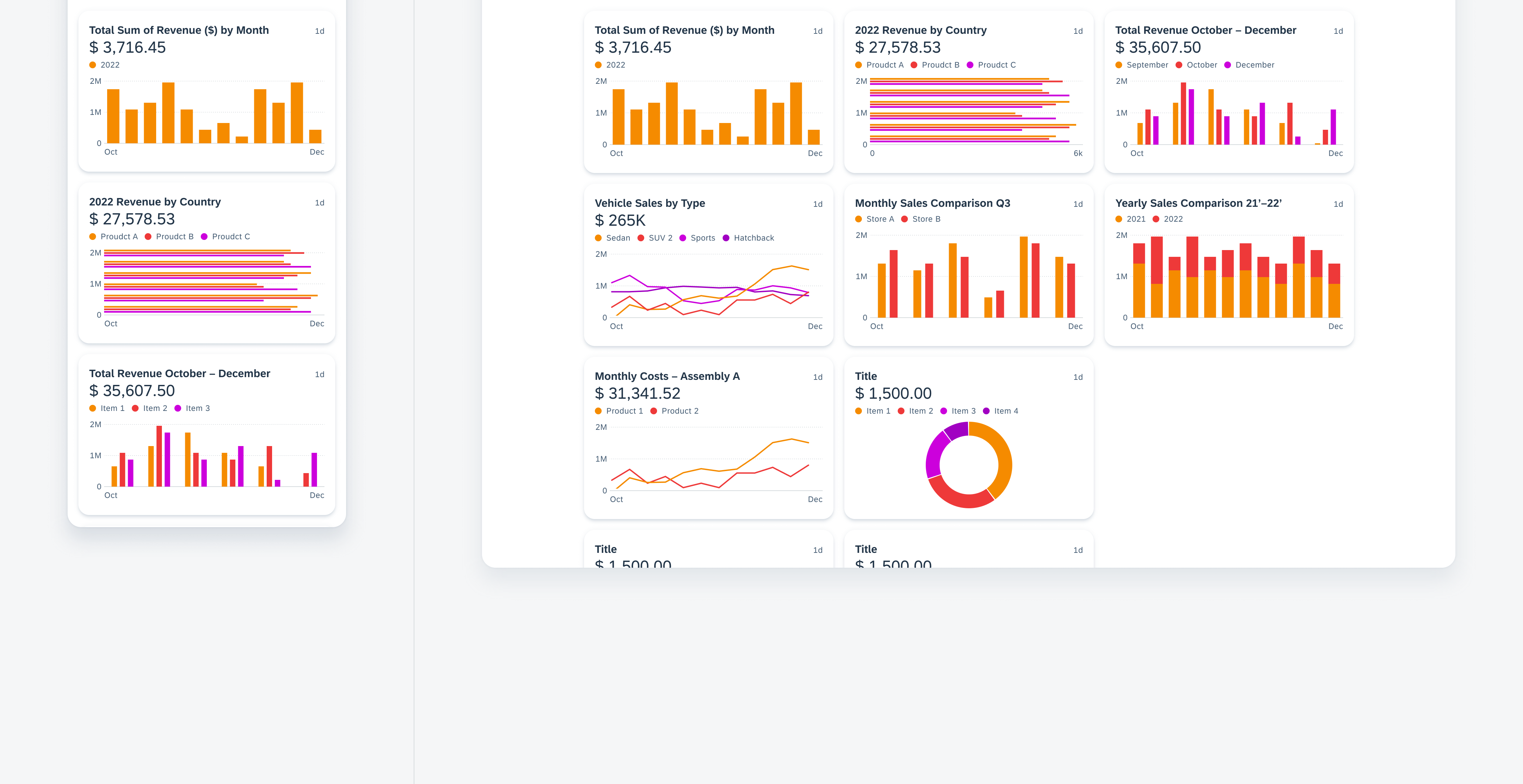
Chart card in mobile (left) and tablet (right)
Resources
Development: ChartCardView
SAP Fiori for iOS: Chart Cards
Related Components/Patterns: Chart Overview, Chart Card
 Your feedback has been sent to the SAP Fiori design team.