
Status Info Label
FioriStatusInfoLabel
Intro
The status info label component can be used to provide complementary bits of information.
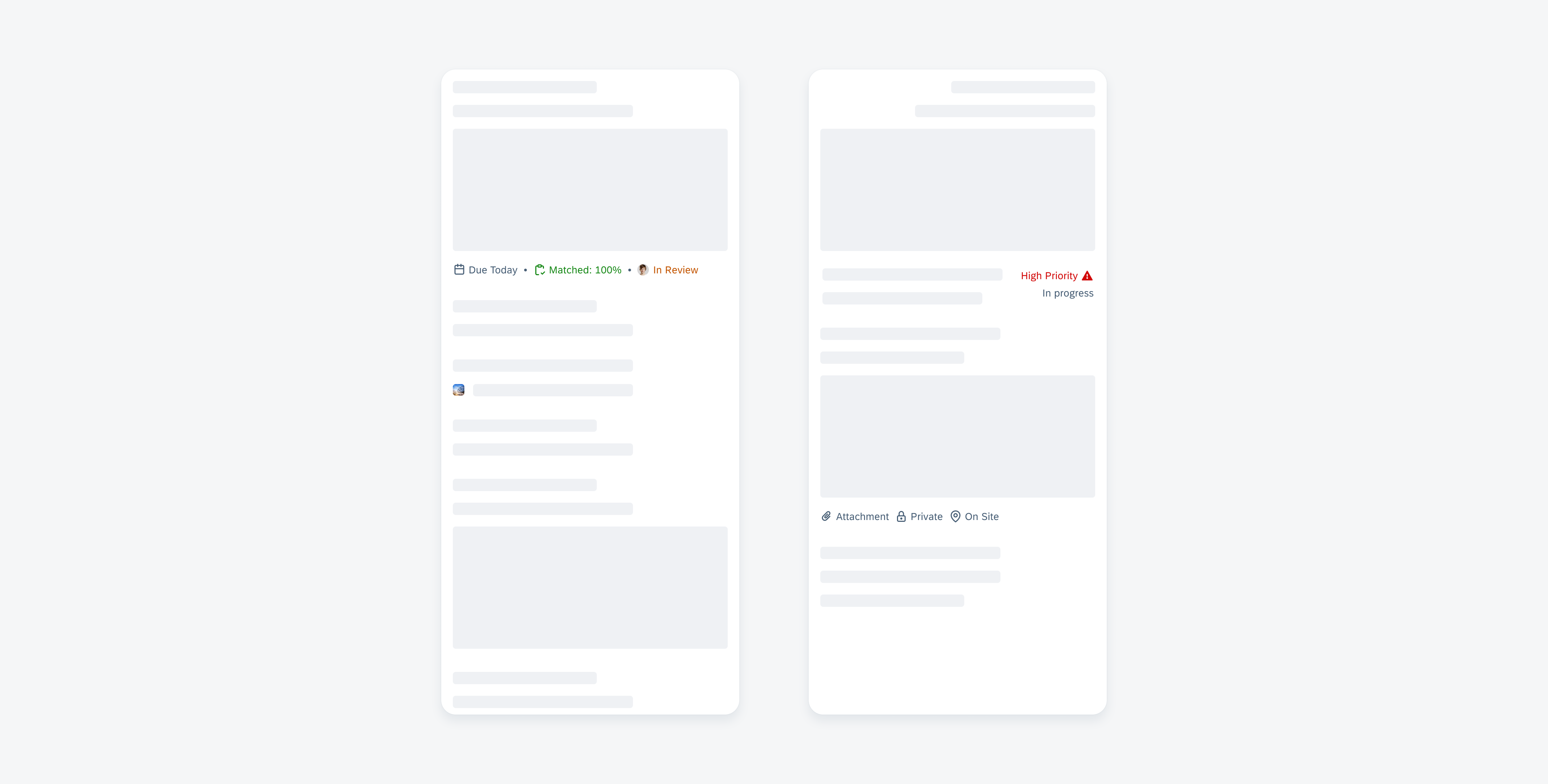
Status info label displayed in a horizontal and stacked layout
Usage
The status info label displays complementary information that relates to the object. It is a flexible combination of a text value and an icon. When incorporating a status info label into your app, it is crucial to keep the following aspects in mind:
- Keep text values concise.
- Customize icon and label layout based on your needs.
- Don’t use complete sentences within a status info label item.
- Don’t include links. Status info label items are not interactive.
- Don’t overload the user by including an excessive number of status info label items within a row or a stack.
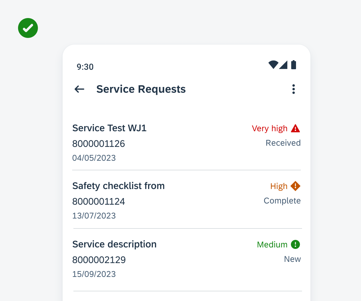
Positive example for using a status info label row
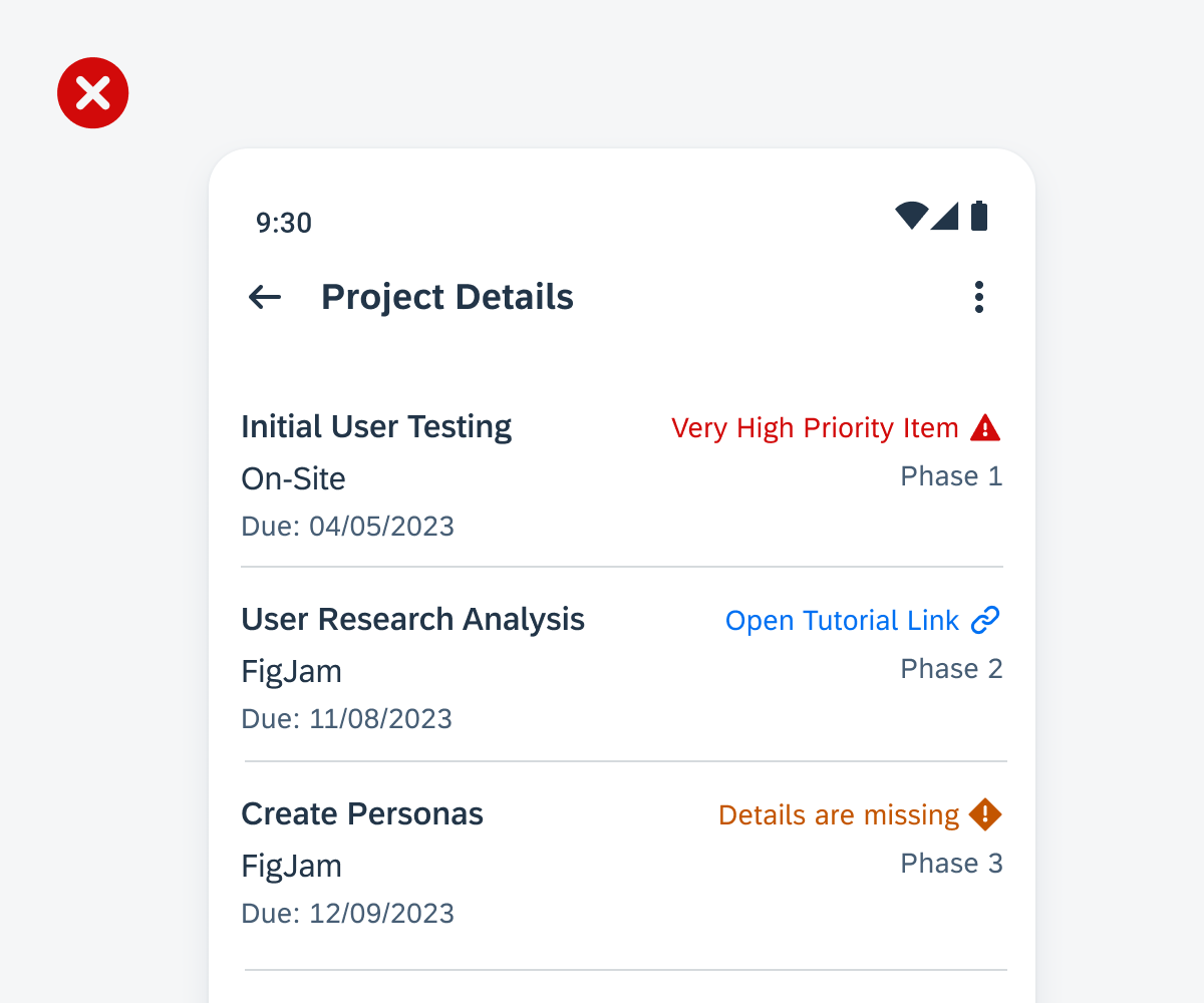
Negative example of using very long text values and including links
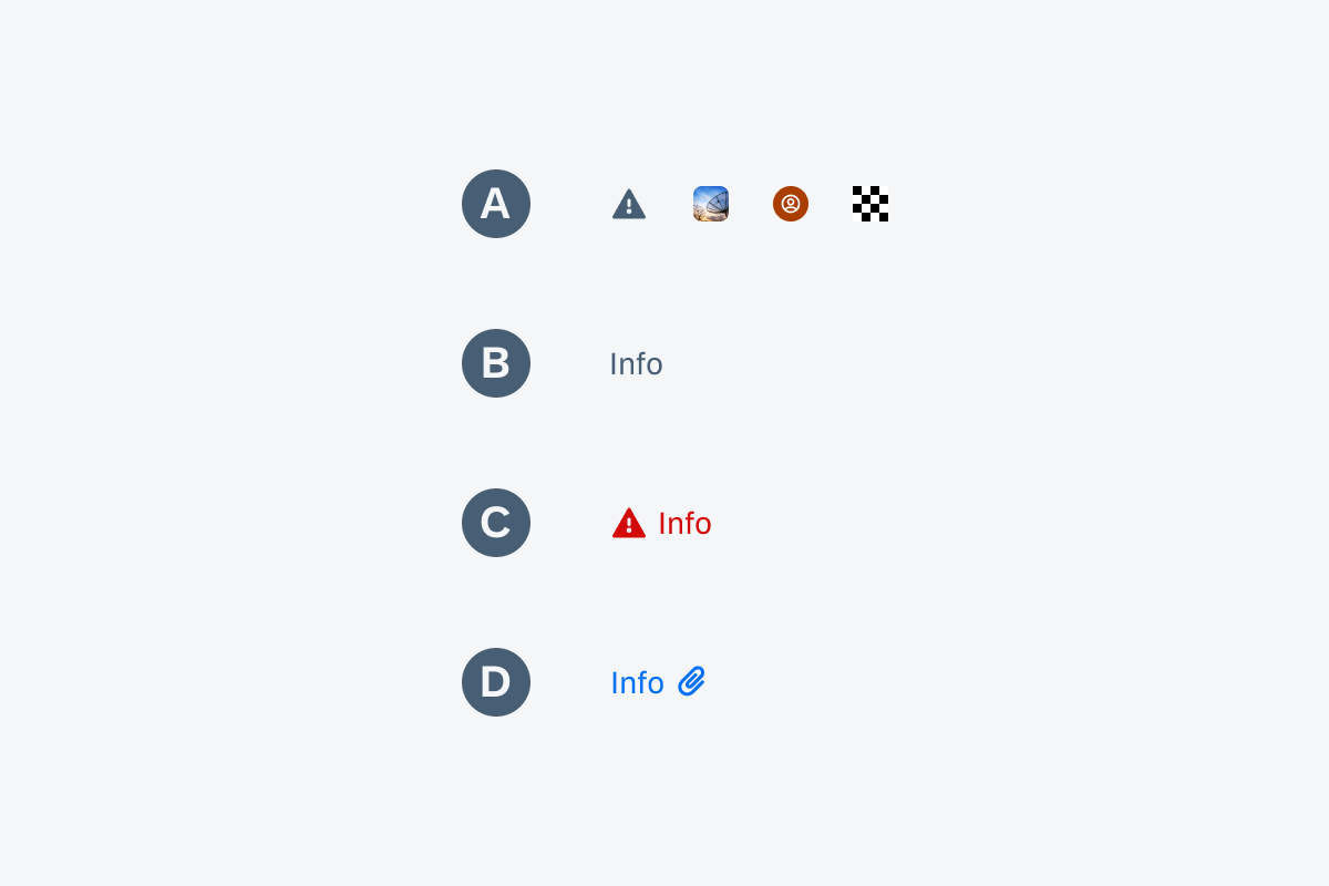
Anatomy
A. Icon (Optional)
The icon is a visual illustration that can complement the text value or be used independently. If it is combined with a label, it can be placed as a leading or trailing element.
B. Label (Optional)
The label indicates short information bits such as keywords, categories, or status. The text value can be used independently or combined with an icon.
C. Dot (Optional)
A dot can be used to separate status info label items in a horizontal alignment.
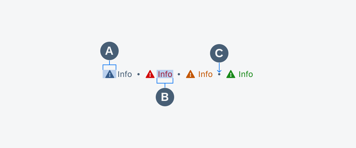
Anatomy of a status info label row
Behavior and Interaction
Status info label items are not interactive. If there is more than one status info label item, they may either line up in a horizontal layout one after the other or be stacked under each other. A stacked column can be either left or right-aligned.
Variations
Components
A. Icon Only
Shows visual information such as an icon, image, logo, or avatar.
B. Label Only
Text value that implies a brief description, for example, it can show the priority or urgency of the object’s status. Maintain wording to a maximum of two words.
C. Leading Icon
A leading icon is placed in front of the label.
D. Trailing Icon
A trailing icon follows the label.
Variations of status info label components
Layout
Horizontal vs. Stacked
Status info label items can be arranged horizontally, optionally dividing them with a dot, and can either be wrapped to the next line or be stacked vertically.
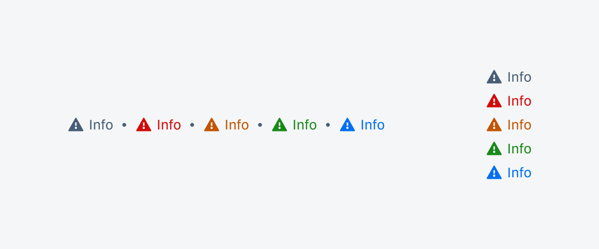
Status info label row (left) and status info label stack (right)
Color
Default vs. Semantic
The default tag color is grey, but status info label items can also be displayed in many different colors of the semantic color palette.
Resources
Development: FioriStatusInfoLabel
Related Components/Patterns: Cards Overview, Object Header, Object Cell
 Your feedback has been sent to the SAP Fiori design team.