
Skeleton Loading
SkeletonLoading
Intro
Skeleton loading is a progress indicator that is used when a screen is loading. It is best used when the structure and layout of a container are known, such as a page or card, and the system requires time to fetch and display the actual data.
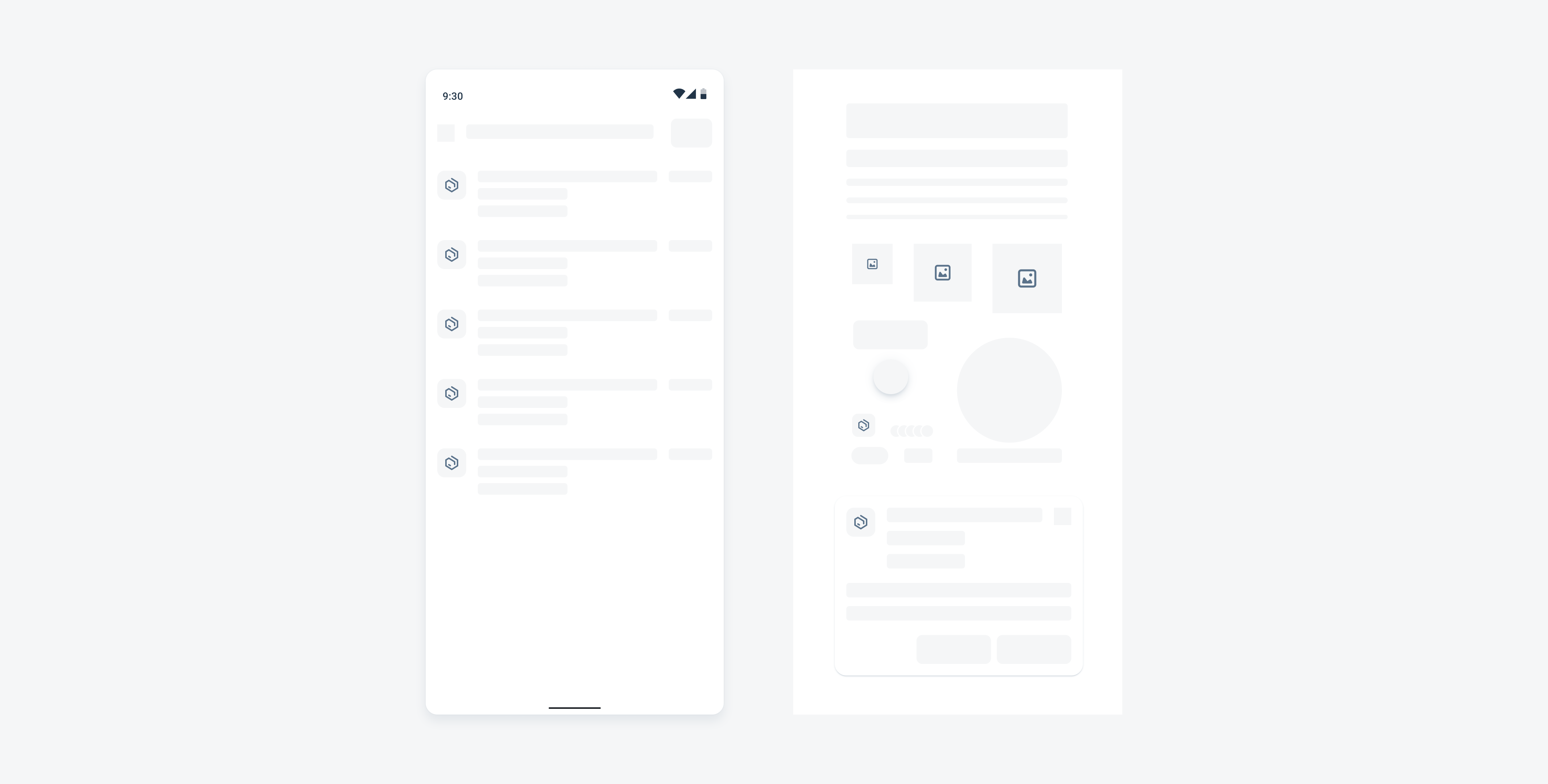
Skeleton loading example (left) and basic placeholders (right)
Usage
- Use it when the data is loading for the first time, or the entire page needs a reload.
- Only use when the target structure and layout are known so that users can anticipate what the content is about.
- We recommend using it when the entire page needs to be loaded.
- Use when the loading time exceeds 1 second.
- Use generic cell or generic card placeholders or build customized placeholders with basic placeholders if needed. Keep the page simple and generic.
- Provide users with feedback (snackbar or banner) when the loading time is longer than expected or when data retrieval fails.
- Don’t use placeholder types that don’t match the target type.
- Don’t get too detailed with customized placeholders, as it can distract the user.
- Don’t combine multiple types of progress indicators with skeleton loading.
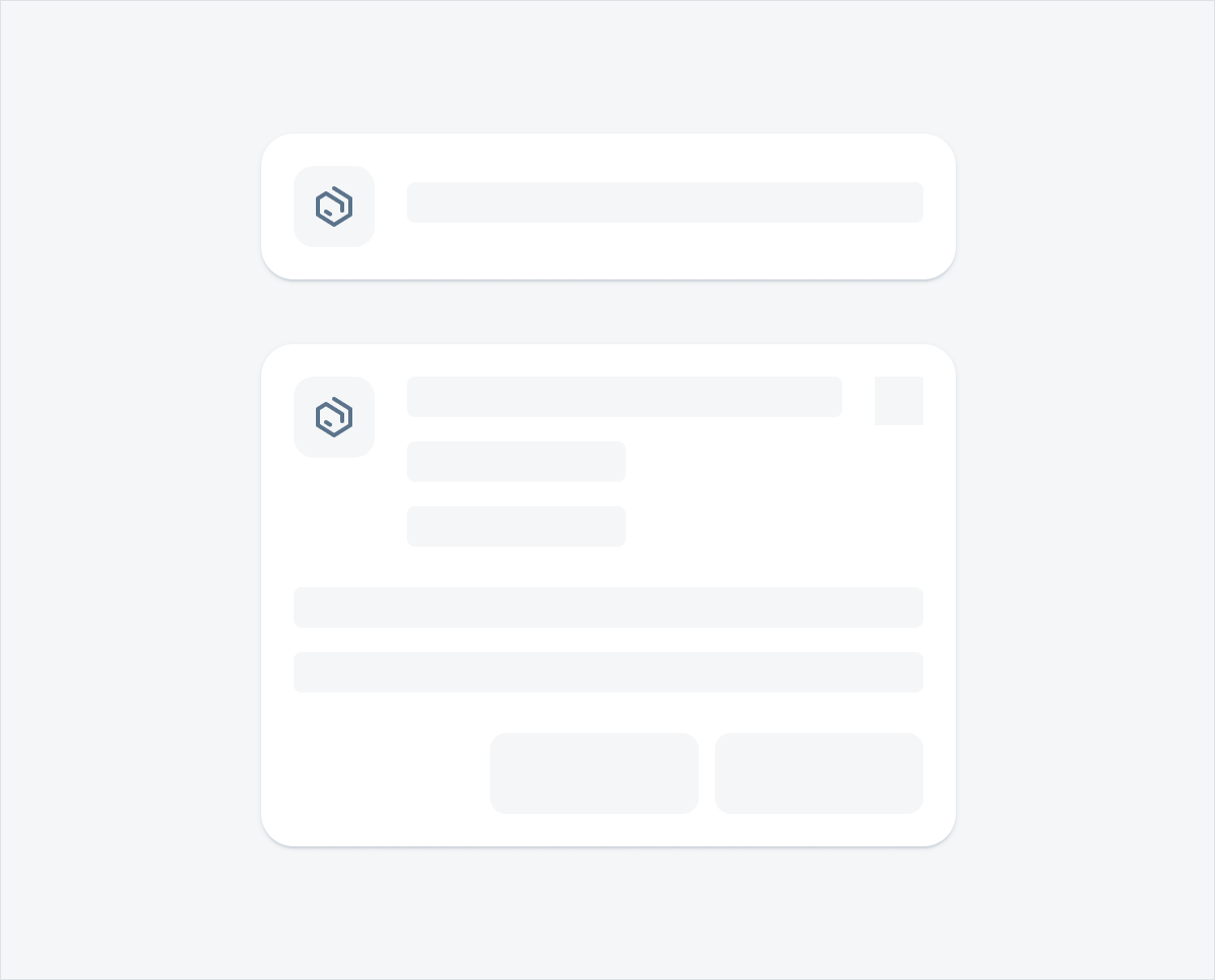
Anatomy
A. Basic Placeholder
The placeholder is used to replace the actual content during skeleton loading. Ideally, the placeholder should correspond to the content in terms of type, layout, and size. If specific details can’t be defined, make sure the type of placeholder aligns with the content.
B. Container
All cells, cards, or page placeholders should stay within a container. The container has fixed lines, paddings, and margins, so there may be variations in size between the placeholder container and the actual content container.
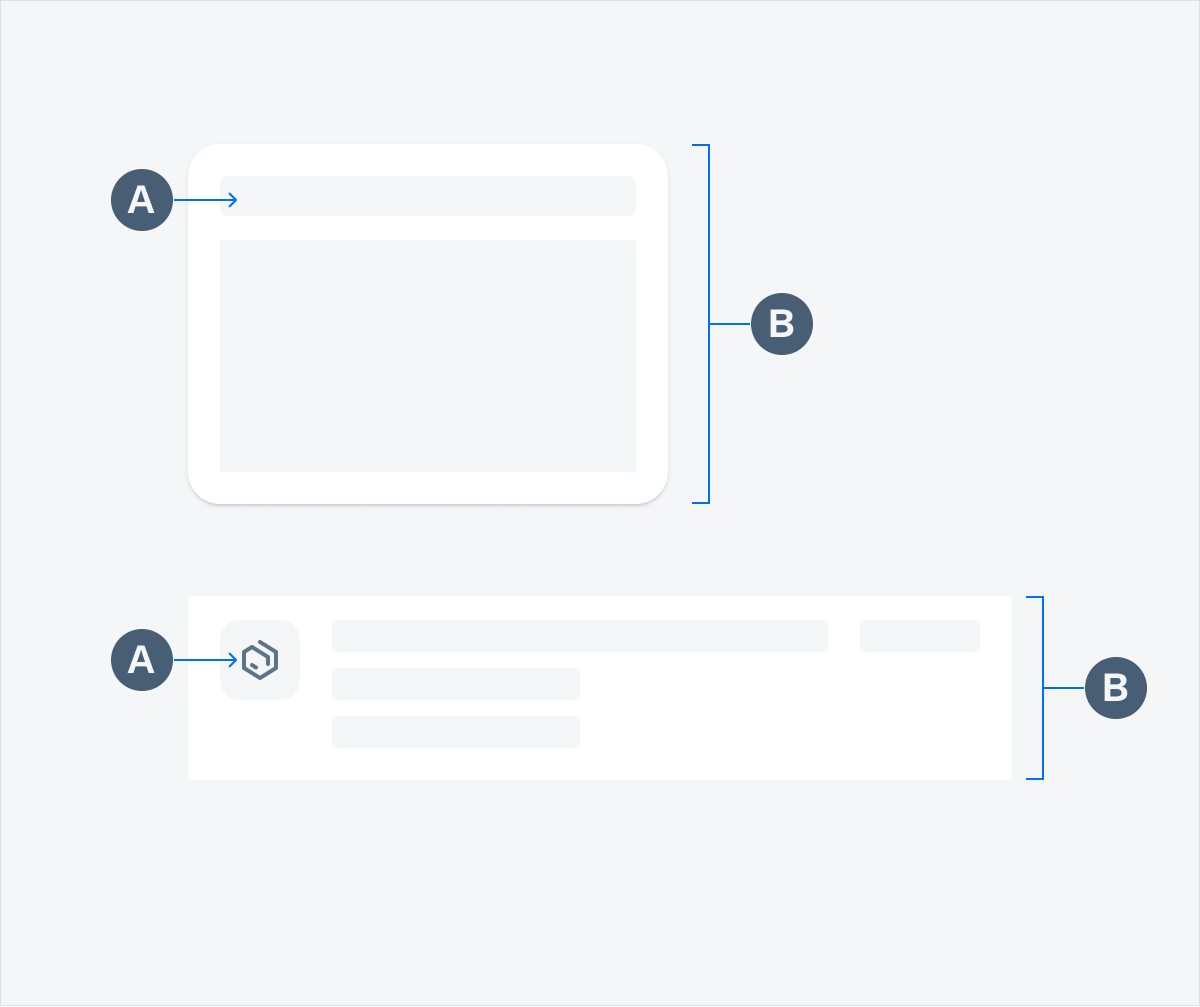
Anatomy of a generic card (top) and an object cell placeholder (bottom)
Behavior and Interaction
Transition to Content
Skeleton loading is best used for loading time that exceeds 1 second. It automatically transitions to the actual content once the data fetching process is complete.
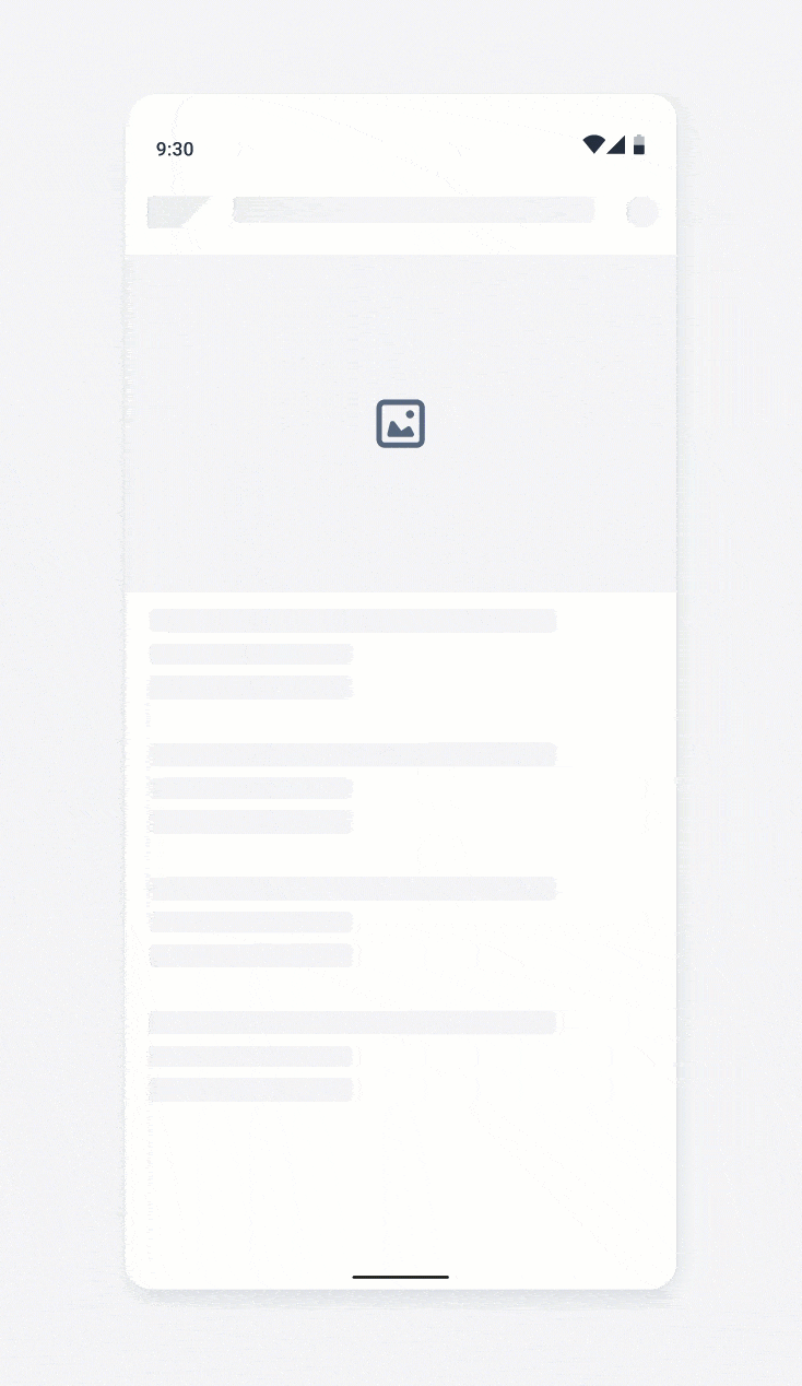
Skeleton loading transition animation
Loading Fail
If the loading is taking too long or fails to show content, use a snackbar or empty page to inform users.
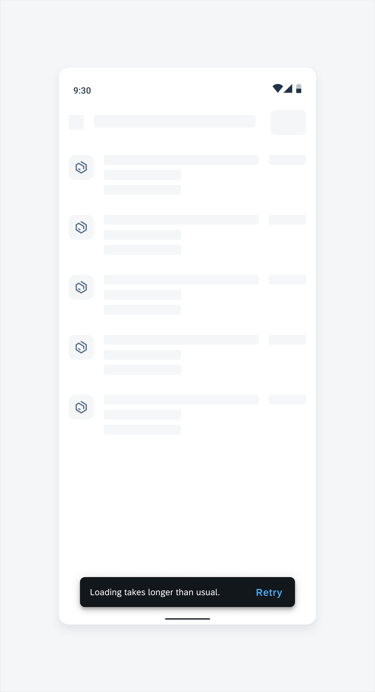
Inform users about a failure state via a snackbar
Variations
Basic Placeholders
Basic placeholders are the fundamental of skeleton loading. They can also be used to build customized placeholders.
Text Placeholders
There are five height options for text placeholders with adjustable width. We recommend using these options for the following font sizes:
- 12dp: Overline, Caption 1, Caption 2
- 16dp: Subtitle 1, Subtitle 2, Subtitle 3, Body1, Body2, Placeholder, Button
- 20dp: H4, H4L, H5, H5B, H6, H7
- 48dp: H2, H3, H3L
- 96dp: H1

Text placeholders in 12dp, 16dp, 20dp, 48dp, and 96dp (top to bottom)
Avatar Placeholders
The avatar placeholder comes with multiple fixed size options and can be used to replace avatars for a profile, product, or photo.
Placeholders for an avatar profile (left), avatar product (middle), and avatar photo (right)
Buttons and More
Button placeholders can be used to replace regular buttons. There are also placeholders to replace an icon, a tag, an avatar row, and a label.

Placeholders for a button, a FAB, an icon, a tag, an avatar row, and a label (left to right)
Chart
Chart placeholders can be used to replace charts. The icon at the center can be replaced by any icon that best represents the chart type.

Placeholder for a chart
KPI
The KPI placeholders come with two types: KPI circle and KPI digit. Use the one that is closest to the size and the type of your KPI.

Placeholders for KPI digit (left) and KPI circle (right)
Compound Placeholders
Compound placeholders are assembled with the basic placeholders. The basic placeholders are laid out the way that best reflects the original components.
Object Cell Placeholder
Object cell placeholders can be used to replace one-line or multi-line object cells.

Placeholders for a one-row object cell (top) and a multi-line object cell (bottom)
Card Placeholder
Card placeholders are used for skeleton loading at card level. If the card type can’t be defined, use the generic card placeholder.
Placeholders for a single-line card (top) and full content card (bottom)
Object Header Placeholder
Object header placeholders are used for skeleton loading for object headers.

Placeholder for an object header
Generic Placeholders
Generic placeholders include a generic card and generic object cell. Use a generic placeholder when the content is undefined. Generic placeholders can be used together with other placeholders on the same page.

Generic cell placeholder (top) and generic card placeholder (bottom)
Adaptive Design
The skeleton loading feature aligns with the original component layouts of the Android size classes (compact and expanded screens) and therefore adapts to any Android device and their respective containers.
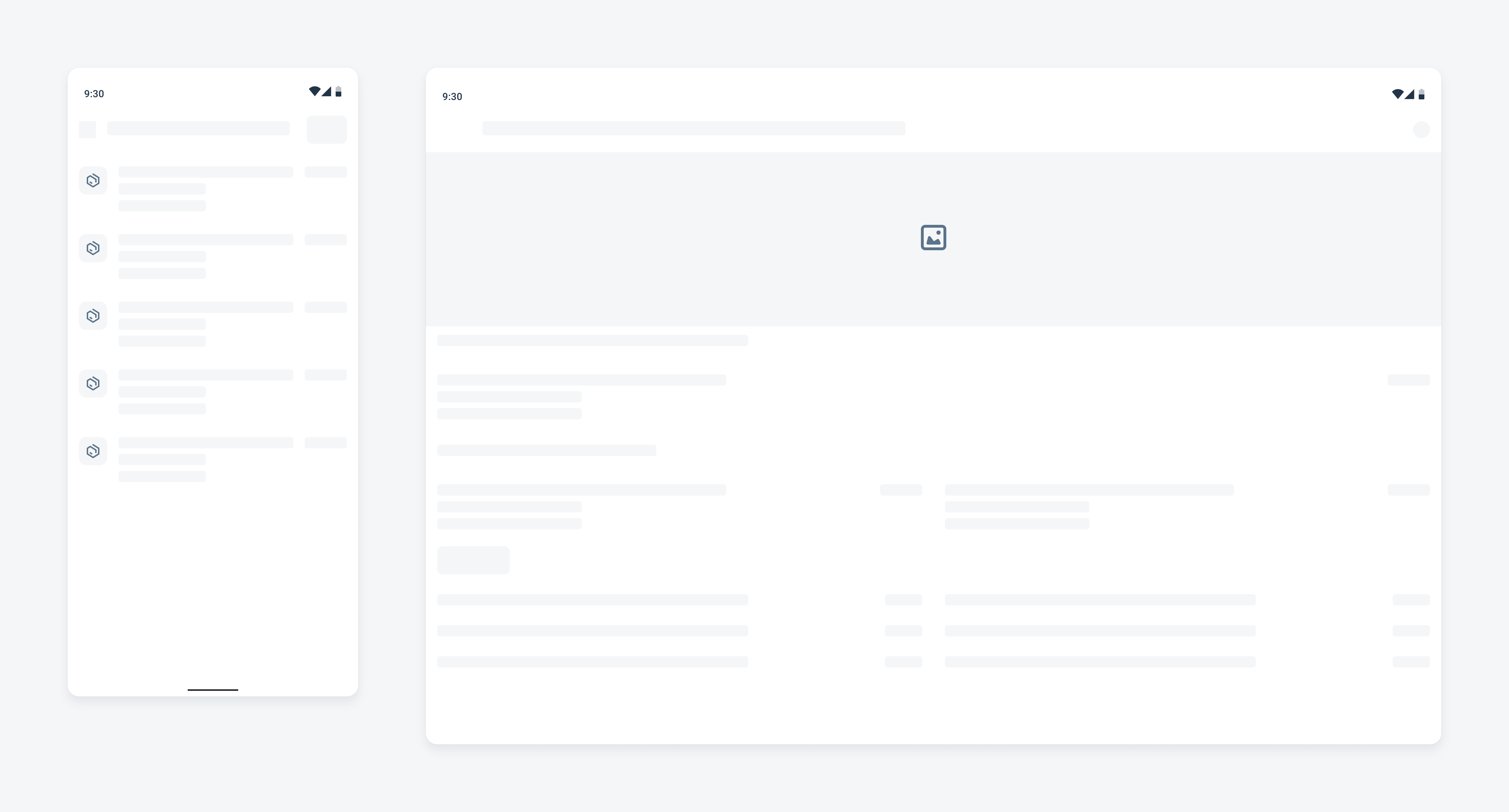
Skeleton loading on a compact (left) and expanded screen (right)
Resources
Development: Skeleton Loading
SAP Fiori for iOS: Skeleton Loading
SAP Fiori for Web: Placeholder Loading
Related Components/Patterns: Buttons, Object Cell, Object Card, Object Header
 Your feedback has been sent to the SAP Fiori design team.