
Snackbar
Snackbar
Intro
A snackbar provides a brief message about the performance of a process at the bottom of the screen.
Snackbar
Usage
A snackbar provides updates of a process that an app has performed or will perform. They appear temporarily, towards the bottom of the screen and disappears on without requiring the user’s dismissal.
- Create text labels that are short and clear.
- Distinguish the action from the text label.
- Use the third line to display actions with longer text.
- Use different colors for the text label and the text button.
- Don’t use icons in snackbar.
- Don’t add more than one text button.
- Don’t use a contained button
- Avoid stacking snackbars on top of one another.
Variations
Snackbar with Text Label
The message on the snackbar directly relates to the process being performed, for example, files have been moved, item added to cart. The text label can have one or two lines of text.
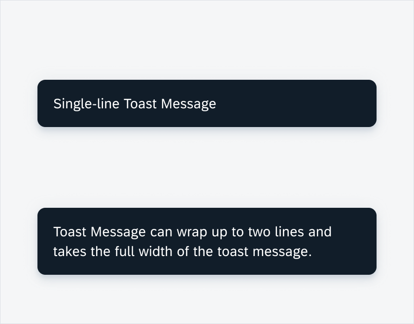
Snackbar containing a one-line message (top) and two lines message (bottom)
Snackbar with Action
Snackbars can display a single text button that allows users to take action on a process performed by the app. To distinguish the action from the text label, the action text should be tinted.
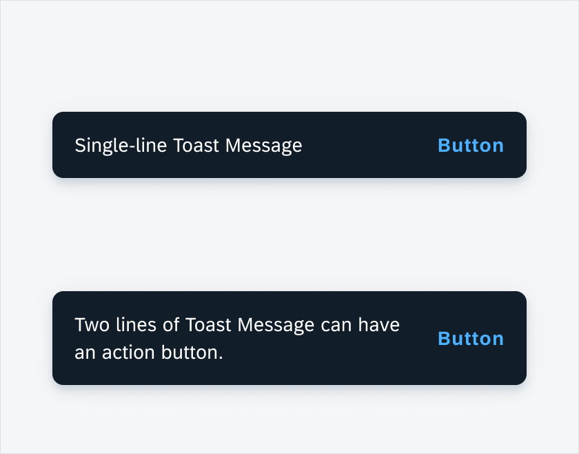
Snackbar with button
Behavior and Interaction
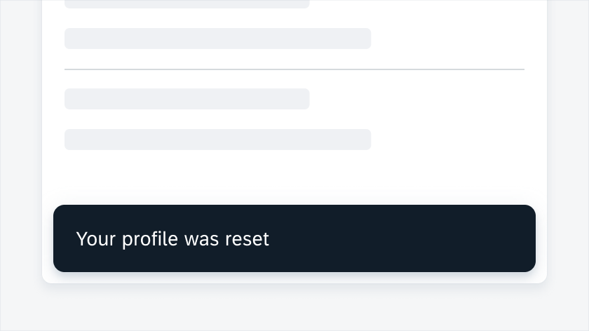
A snackbar appears at the bottom of the screen and does not require the user’s dismissal. It appears momentarily and dismisses itself after 4-10 seconds.
Consecutive Snackbars
When multiple app updates are necessary, snackbars should appear one at a time.
User interaction with snackbar
Resources
Development: Snackbar, Snackbar
SAP Fiori for iOS: Toast Message
Material Design: Snackbars
 Your feedback has been sent to the SAP Fiori design team.