
Date & Time Picker Form Cell
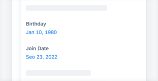
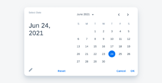
The time picker form cell is used for selecting time-based data types. Time picker form cells on mobile (left) and on tablet (right) Anatomy A. Property Name The property name describes what property this cell is defining. B. Value This is the value selected by the user. It can be a specific time or a [...]
Category: UI Components
Type: -
 Your feedback has been sent to the SAP Fiori design team.