
Carousel Layout
FioriMobileCard
Intro
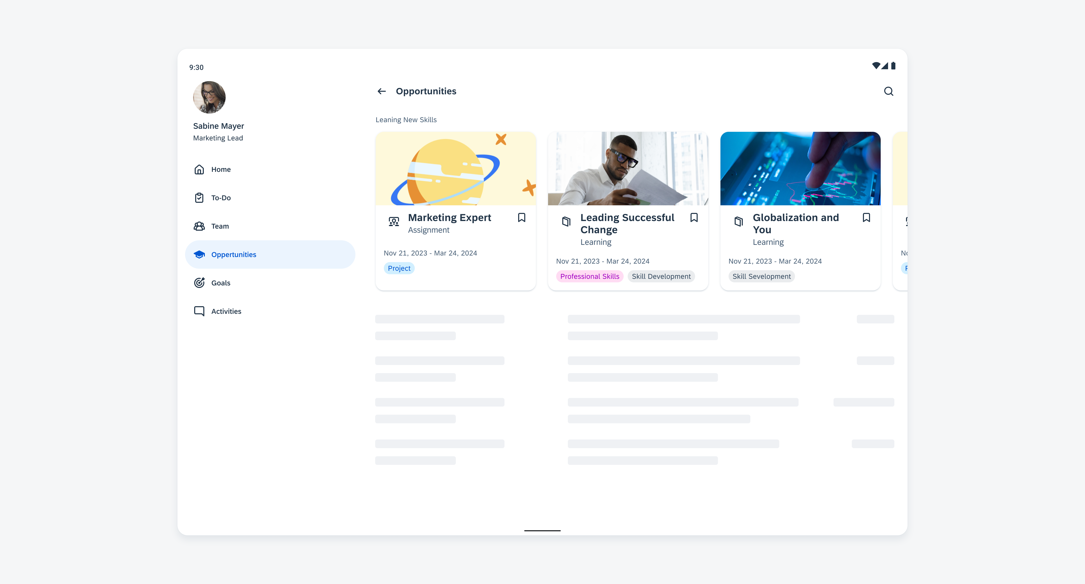
A carousel layout is a design pattern that displays multiple cards horizontally, one after the other, with a glimpse of the next card visible on the edge of the screen. This partial visibility encourages users to swipe or scroll left or right to reveal more cards.
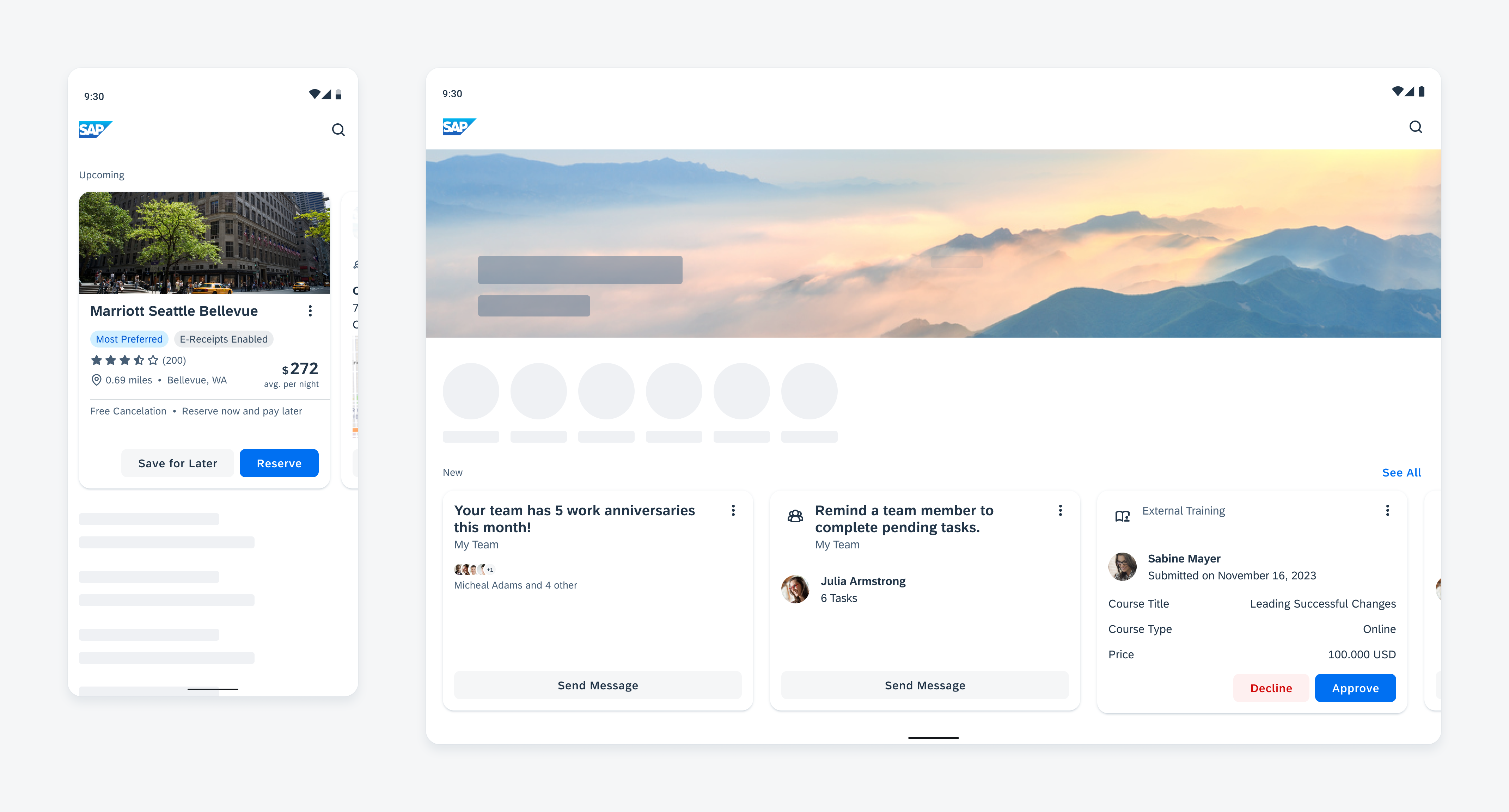
Carousel with cards compact window size class (left) and expanded size class (right)
Usage
Use a carousel to maximize the amount of information displayed and preserve the context without making the user scroll further down the page. The cards in the carousel should be closely related to each other, allowing users to anticipate the kind of content they will discover when interacting with the carousel.
For compact window size classes, we recommend displaying a maximum of five cards, as users are unlikely to engage with more than that. For medium and extended window size classes, more cards can be added, and their width is automatically adjusted. When using a carousel, consider the following aspects:
- For compact window size classes, we recommend displaying a maximum of five cards.
- For medium and extended window size classes, you can show up to eight cards.
- Ensure that the cards have related content.
- Keep the height of the cards compact to avoid additional vertical scrolling.
- Make sure the carousel container is fully visible on the screen.
Don’t use a carousel if there are multiple types of cards. Use a staggered layout instead or add a section header with action to a deeper navigation to show all elements.
Anatomy
A. Container with Cards
The height of the carousel container is determined by the card with the most content that is currently visible to the user. All cards have the same height and cards with less content are stretched to match the height of the tallest card and align with the carousel container. This can lead to white space between the body and the footer, which is why the content of a card should always be compact and concise. The footer of the card is always aligned to the bottom edge. For more information, refer to cards overview.
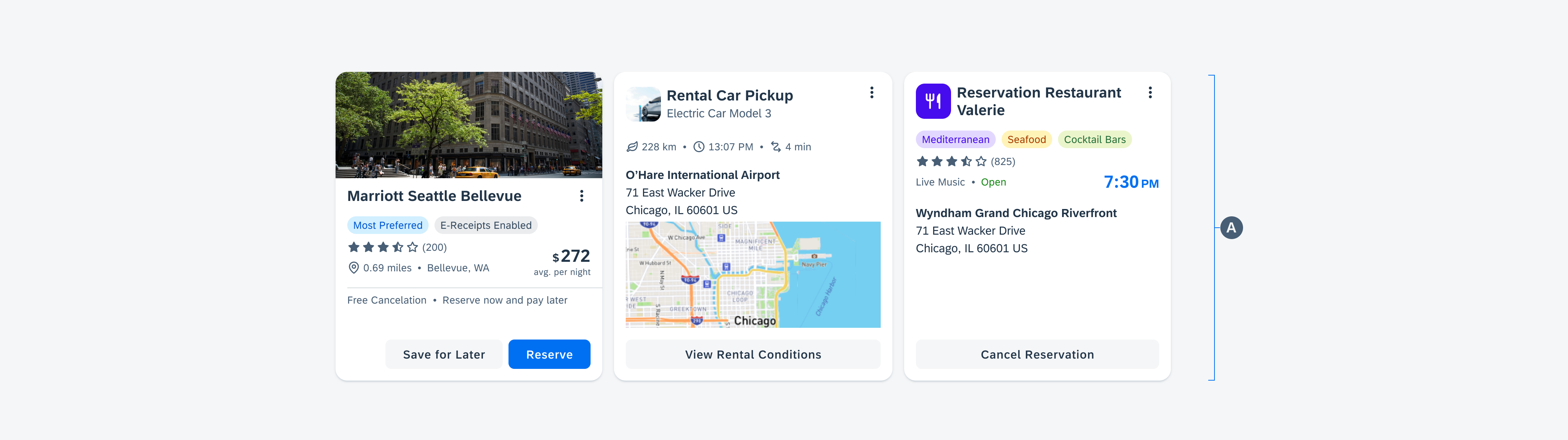
Carousel with different card content
B. Margin
Margins are the spaces between the content and the left and right edge of a window area. Margin widths are defined using fixed values for each window size class and change at different breakpoints to better fit the screen size. In a carousel, the margins on the left and right are not equal to cut the card at the right side of the screen.
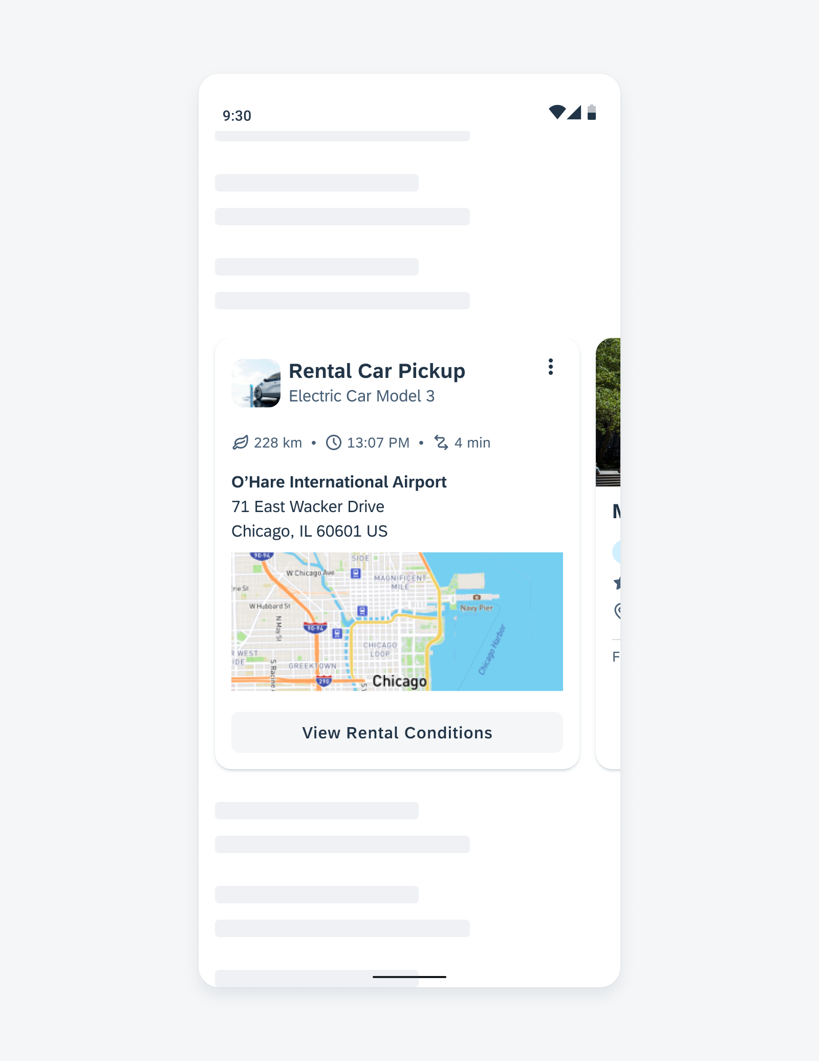
Carousel showing a glimpse of the next card
Behavior and Interaction
Scroll Snapping
Scroll snapping refers to the effect of cards always snapping into place at specific, predefined positions during scrolling, rather than scrolling freely.
This gives the user a sense of precision and makes scrolling more pleasant.
Horizontal scrolling in a carousel
Navigation
If there are too many cards in a carousel, you can add a header with a “See All” interaction. Tapping on “See All” navigates the user to a page that displays all cards from the carousel group in a list or staggered layout, depending on the window size class.
Empty States
If there is no card, it is important to display an indicator for an empty state in the carousel. This indicator serves as an information message for users to let them know that no information or data is currently available or that some information needs to be created.
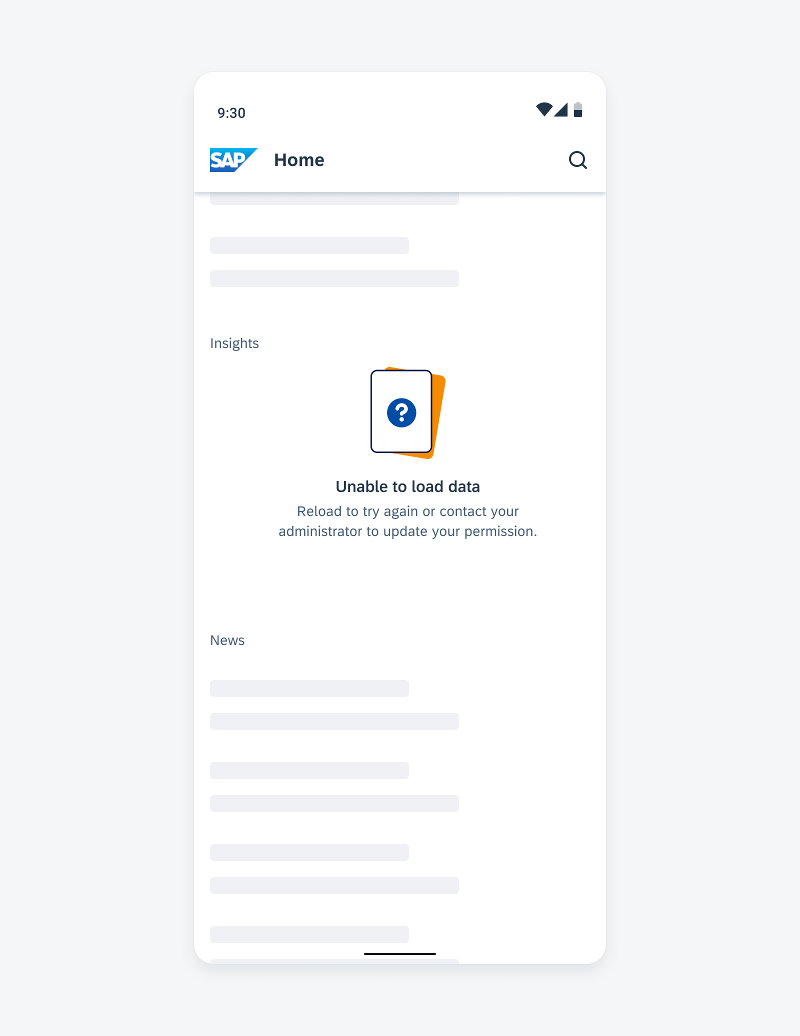
Illustrated message to indicate an empty state
Adaptive Design
A carousel shows fewer cards for a compact size class, while a medium and expanded window size class shows more, as there is more space available on the page. The height of a carousel container should be fully visible on the screen, regardless of the screen size.
If there is a navigation rail or navigation drawer, the number of columns is reduced and adapts to the remaining screen width.
Carousel with cards expanded size class with navigation drawer (right)
You can also combine layouts. However, if a carousel and a staggered layout are used on the same page, it creates a visual imbalance of the card spacing caused by the outer margins of the different layouts.
Resources
Development: Card System
SAP Fiori for iOS: Carousel Layout
SAP Fiori for Web: Carousel (SAPUI5), Carousel (Web Component)
Related Components/Patterns: Layouts Overview, Staggered Layout, Cards Overview
 Your feedback has been sent to the SAP Fiori design team.