
Layout
Intro
When designing for small screens, it is important to keep content within the layout legible, aligned, organized, and accessible. The following article presents some best practices that offer guidance for the design of a smartwatch layout, such as rules for handling different screen shapes, margins, text alignment, and touch targets.
Screen Shapes
Smartwatches on which Wear OS can run come with differently shaped displays, such as round, rectangular, and square. When you are designing the layout, optimize it according to the different screen shapes.
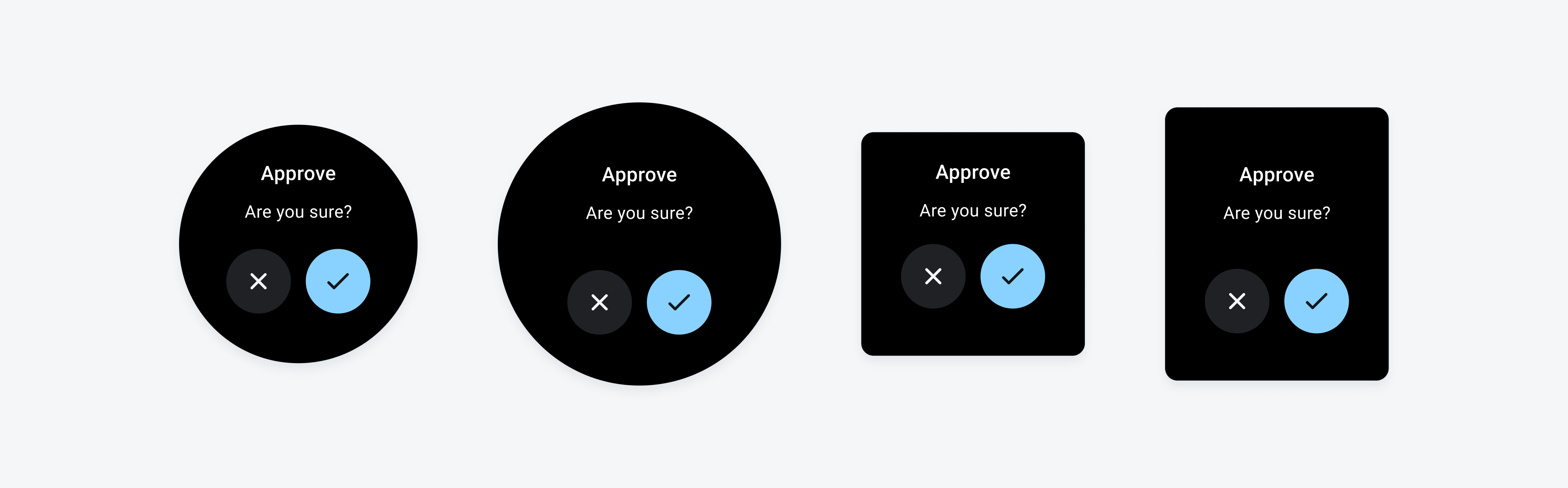
Screen shapes from left to right: small round, large round, square, and rectangular
Usage
- Always start designing with the smallest round screen shape. Then, optimize your design for rectangular and square layouts.
- To be able to scale the outer margins proportionally on a round screen, use percentages for the outer margins.
- Don’t start designing for larger screen shapes.
- Don’t use absolute values for outer margins.
Margins
To optimize the space without cropping elements, margins on rectangular screens can be smaller than on round screens. Use percentages for the margins so that the outer margins on the different smartwatch devices can be scaled proportionally. The minimum margins for rectangular screens are 2,5 % and 5,2 % of the total device size for round screens.
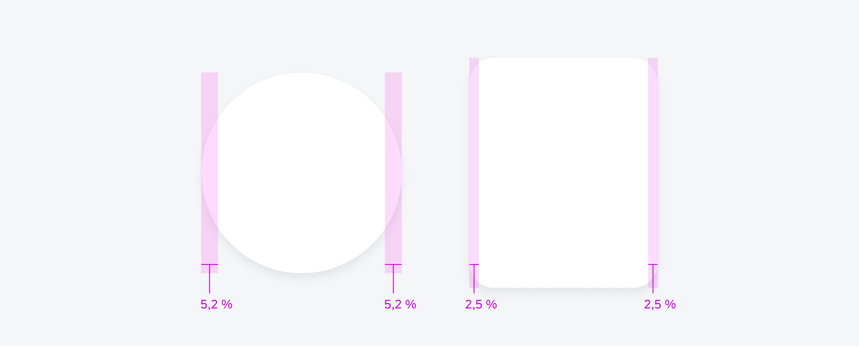
Minimum margin for round screens (left) and rectangular screens (right)
Text Alignment
Centered text appears more visually balanced on a round screen and should be used when the text is short. Left aligned text improves the readability and should be used for long text.
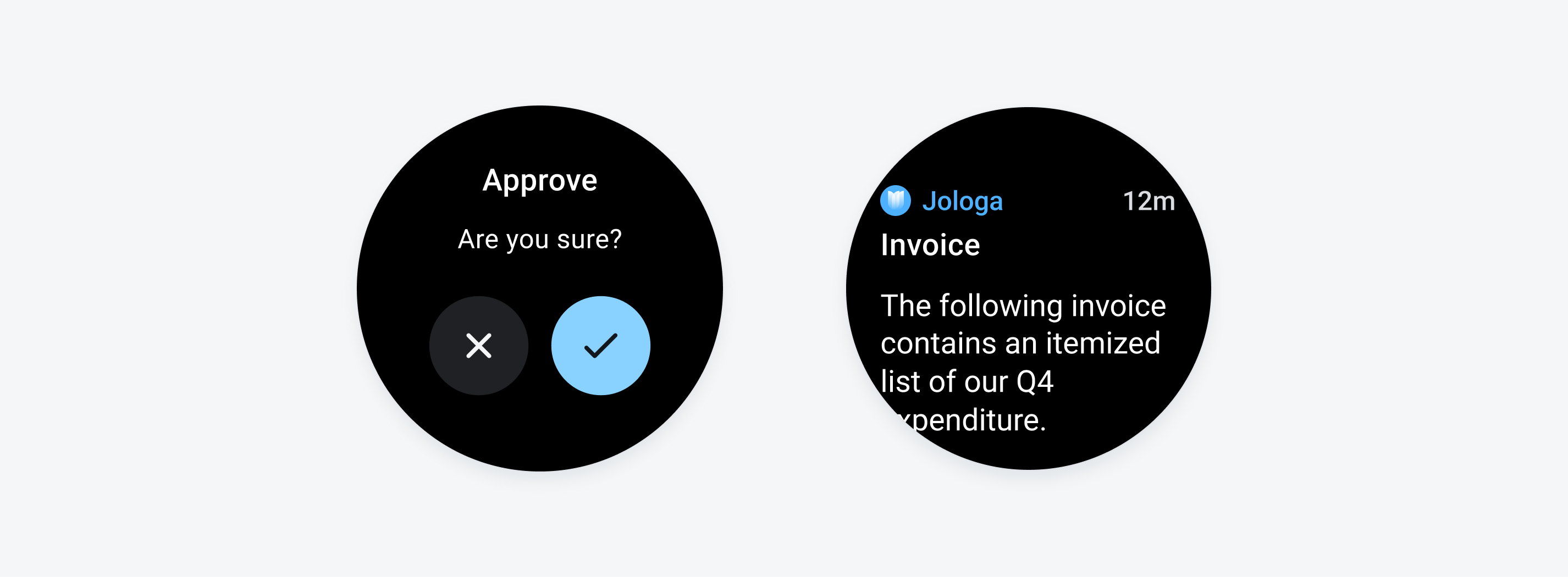
Short text aligned in the center in a dialog (left) and long text aligned on the left in a notification (right)
Touch Target
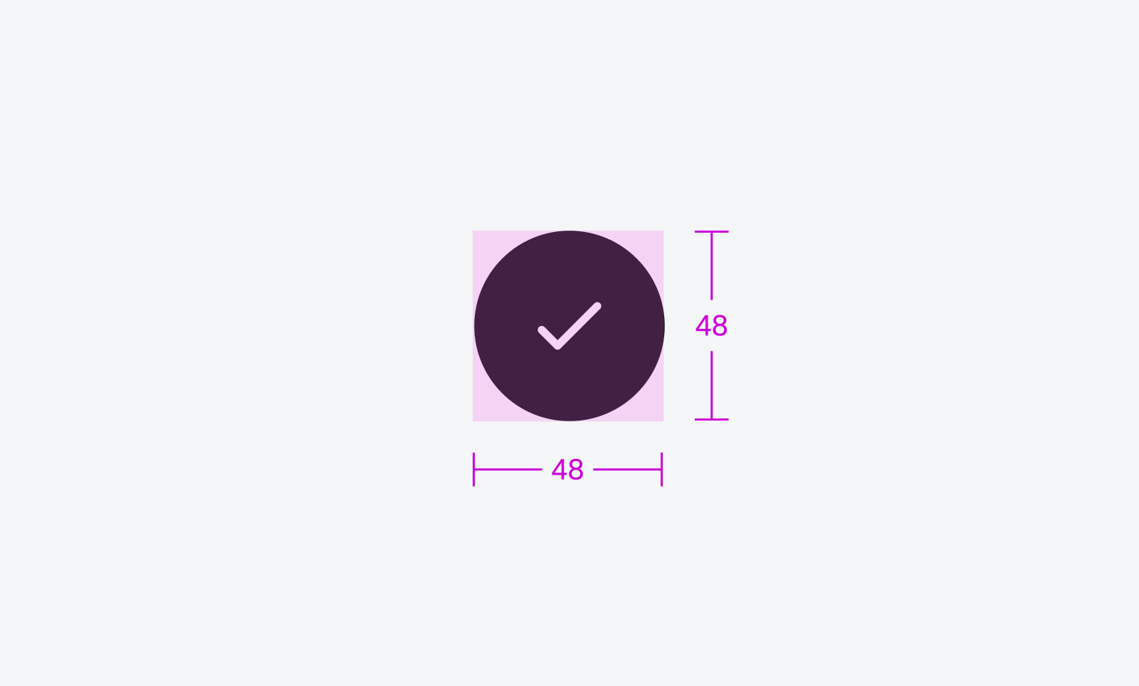
Consider accessibility when designing the spacing of interactive elements. On small screens like smartwatches, it can be more difficult to select the desired UI element, so the touch target for interactive elements must be at least 48dp by 48dp.
 Your feedback has been sent to the SAP Fiori design team.