
Card Footer
FioriMobileCard
Intro
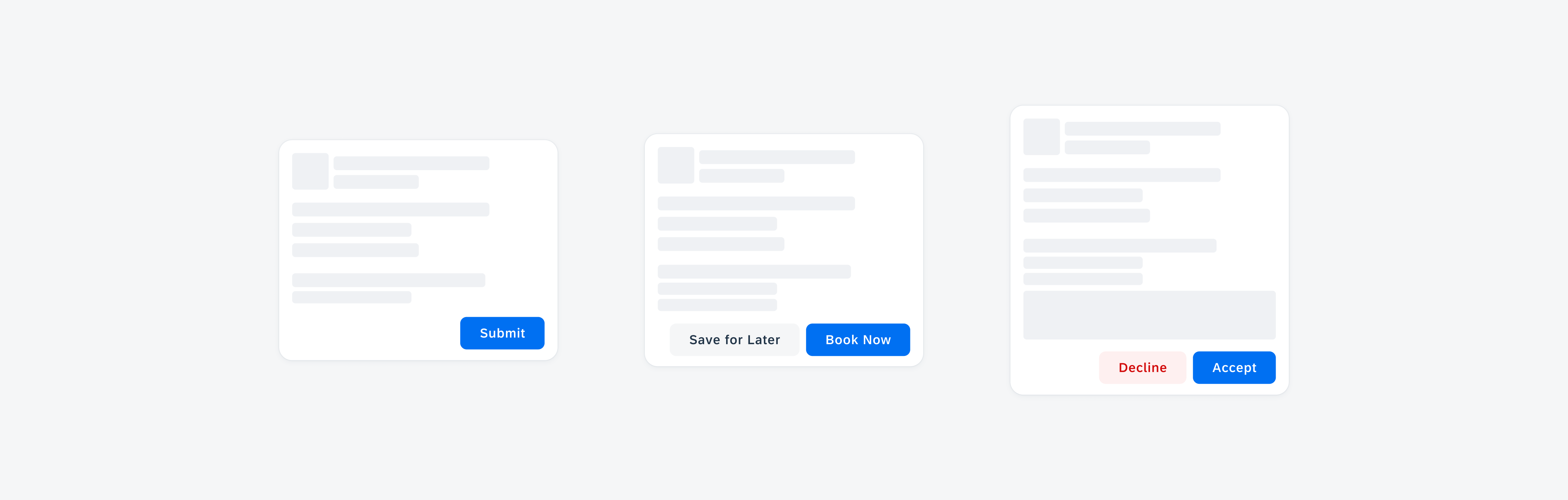
The card footer is the bottom part of a card that contains important or routine actions that directly impact the card, such as “Approve” or “Submit”. The footer can accommodate a maximum of two action buttons.
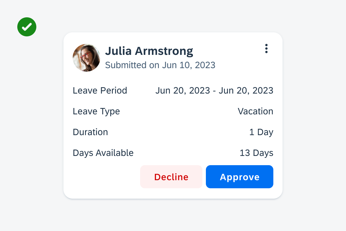
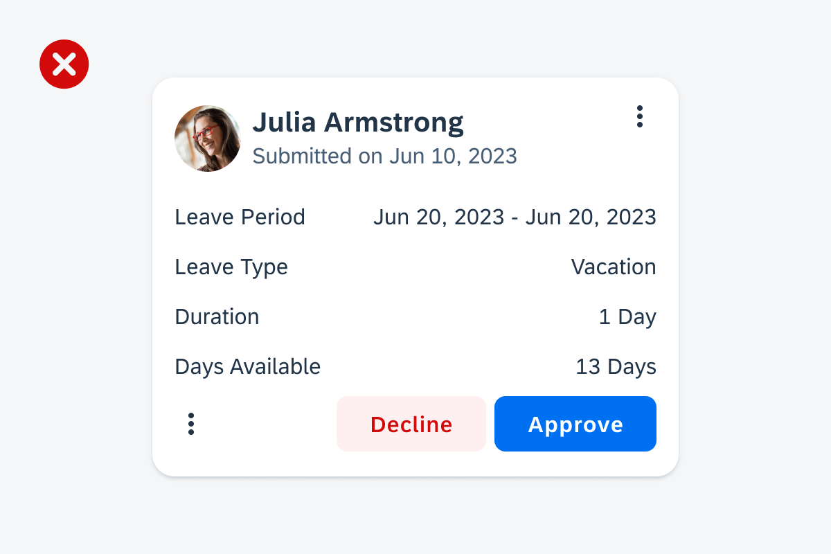
Card with a highlighted card footer
Usage
When using the card footer to integrate important user actions related to the content or functionality of the card, consider the following aspects:
- Include only one or two of the most important and routine actions in the card footer.
- If two buttons are used, always place the primary action on the right side of the footer.
- If two buttons are used, place the less important and secondary action on the left side of the footer.
- Ensure that the button’s wording reflects the action that will be performed after tapping on the button.
- Use short and concise button labels.
- Don’t include more than two buttons in the card footer.
- Don’t place an overflow button in the card footer. Having overflow buttons in both the footer and header might lead to visual ambiguity, as they would look identical.
- Don’t use long button labels. If the button label needs to be very long, use icon buttons or only one button.
Card footer with a maximum of two buttons
Footer with an overflow button
Anatomy
A. Card Footer Container
The card footer container holds one button that is right-aligned by default or set to full width, or two buttons that are right-aligned within the card footer container.
B. Primary Action Button
The contained action button is used to highlight the most important action. Only use one primary action in a card. We recommend using the contained button style for actions that trigger or complete a task.
C. Secondary Action Button
The tonal action button is used for actions that are not the primary action. If the card doesn’t have a clear primary action or if the displayed actions are equally relevant, the card footer can include only tonal or text buttons. If the action is destructive, use the tonal negative style to warn users about taking extra precautions before performing an action.
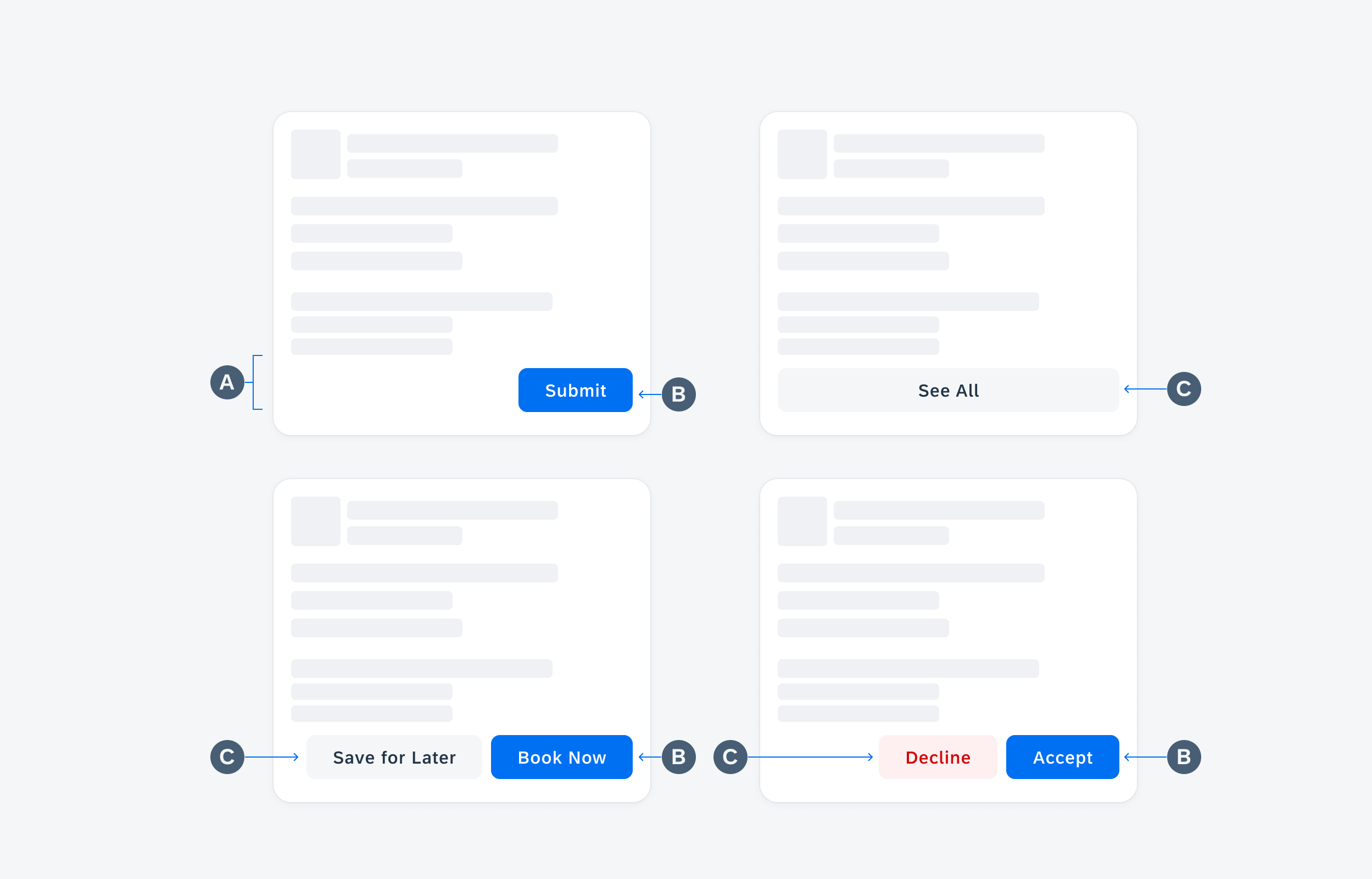
Card footer anatomy with one contained button (top left), one tonal button full width (top right), one contained and one tonal button (bottom left), and one tonal negative button and one contained button (bottom right)
Behavior and Interaction
Tapping on the button in the card footer performs the indicated action.
User-Triggered Feedback Indicator
A user-triggered feedback indicator (progress indicator) refers to a visual element or cue on the card that provides feedback to the user as they perform the action. This indicator is triggered by the user’s actions and is designed to provide a response or confirmation. The overlay informs the user of the affected area that the content is not actionable during the process. Users can still navigate and take actions on other items that are not affected.
Depending on the use case, consider using a short, clear message (see snackbar) about the processes that have been performed to ensure that the user is informed.

Overlay progress indicator on a card
Resources
Development: Card System
SAP Fiori for iOS: Card Footer
Related Components/Patterns: Card Overview, Card Header, Card Body, Buttons
 Your feedback has been sent to the SAP Fiori design team.