
Tags
Intro
Tags are used to display quick and useful bits of information to the user, such as keywords, labels, categories, or statuses.
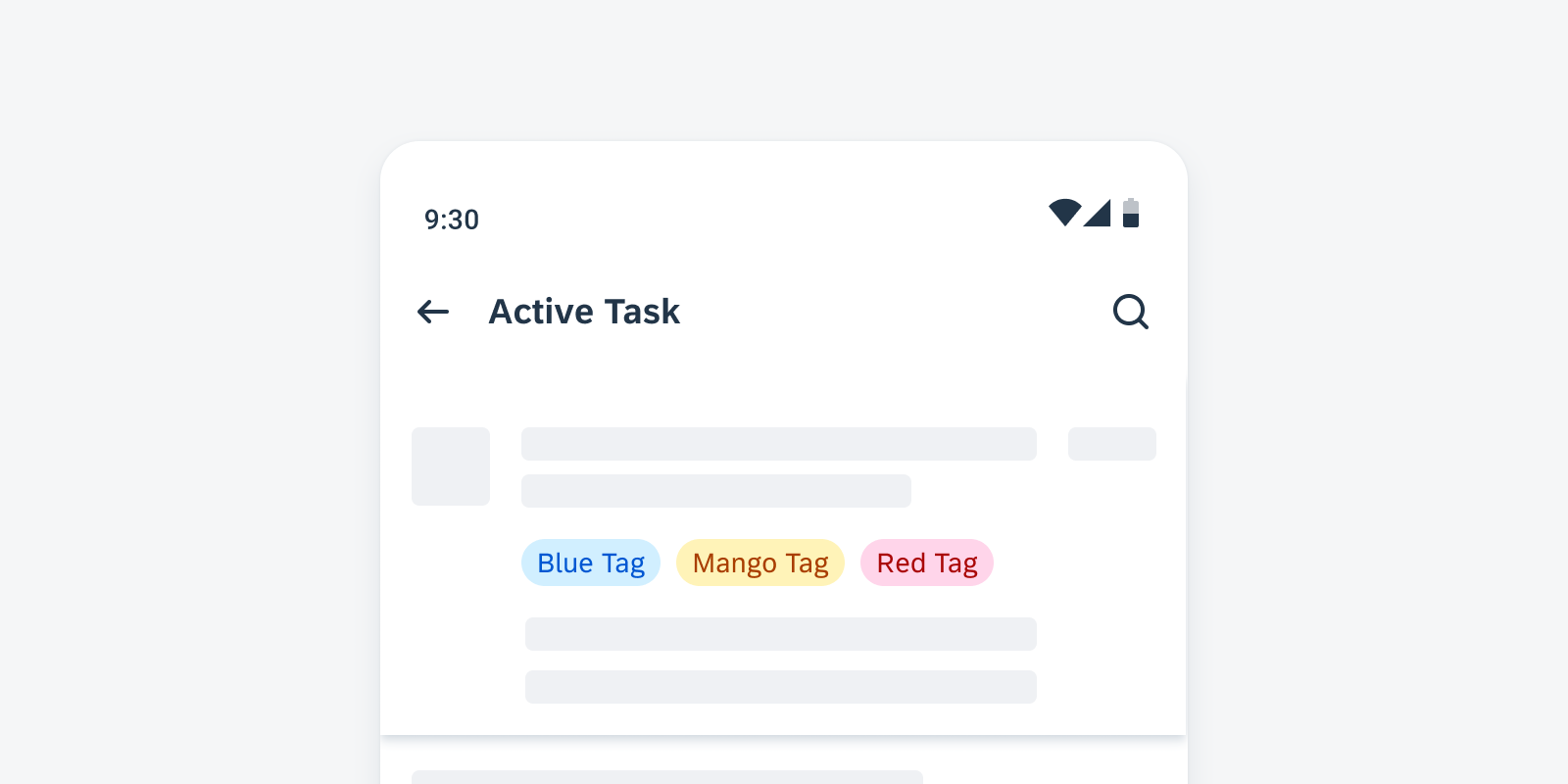
Tags displayed in a row
Usage
Tags display complementary information that relates to the object. They use a different visual representation than plain text and serve as independent bits of information. When incorporating tags into your app, it is crucial to keep the following aspects in mind:
- Keep tag labels concise.
- It is recommended to maintain wording to a maximum of two words per tag.
- Don’t write full sentences within a tag.
- Don’t place icons or images within a tag.
- Don’t overload the user by including an excessive number of tags or very long text values.
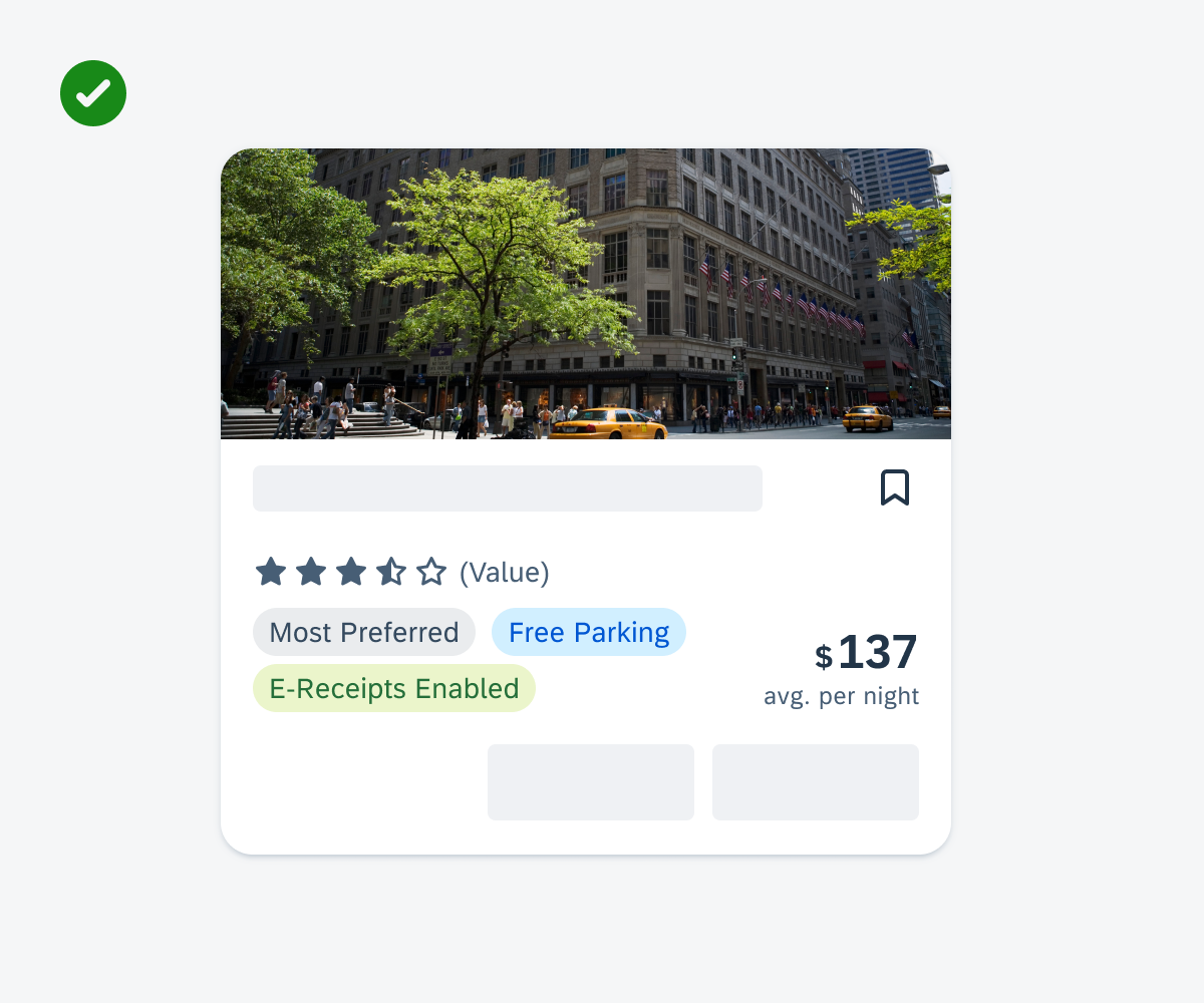
Positive example for showing concise tags in a tag row in a card
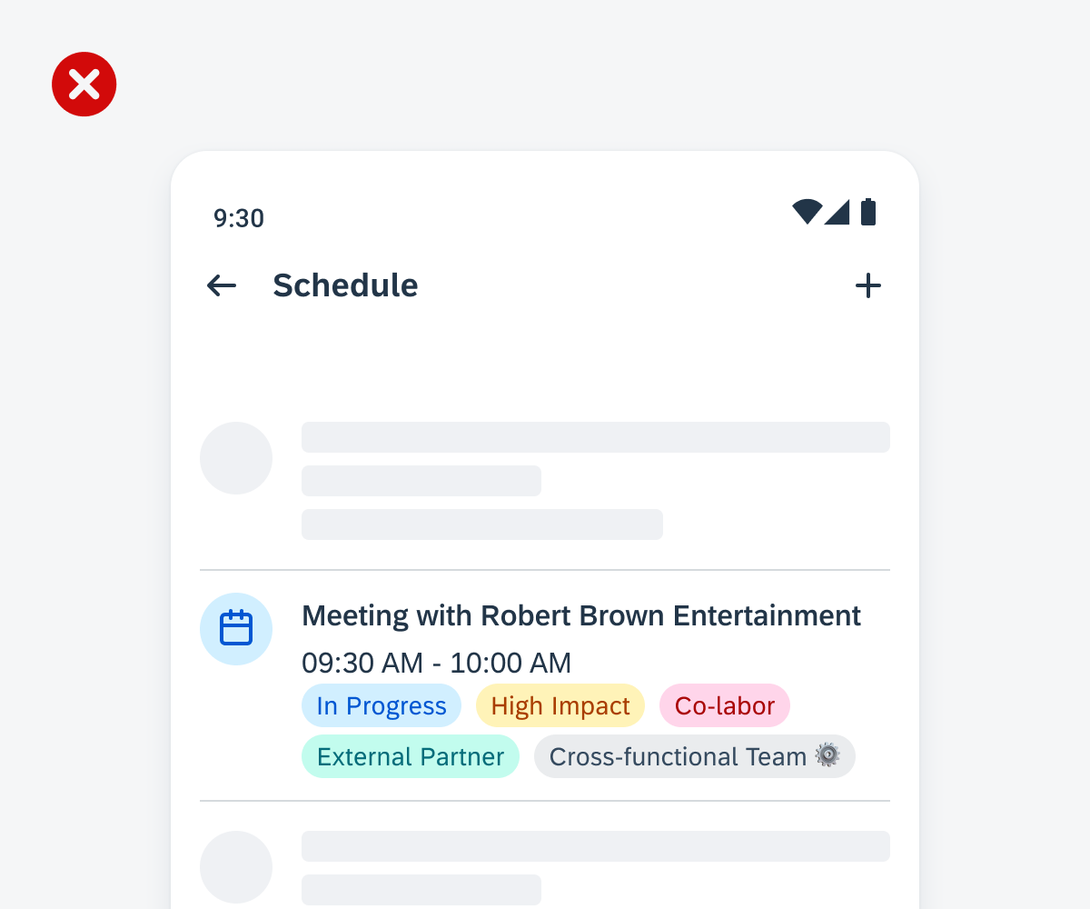
Negative example for listing an excessive number of tags in an object cell and placing icons in a tag
Anatomy
A. Container
The are two styles available for containers: filled and outlined.
B. Label
The label indicates keywords or other bits of information.

Anatomy of a tag
Behavior and Interaction
Tags are not interactive. If there is more than one tag, they line up in a horizontal layout one after the other. The tag row can be configured to wrap to the next line depending on the parent container.
Variations
Color
Default vs. Accent
The default tag color is grey, but it can also be displayed in many different colors of the accent color palette.
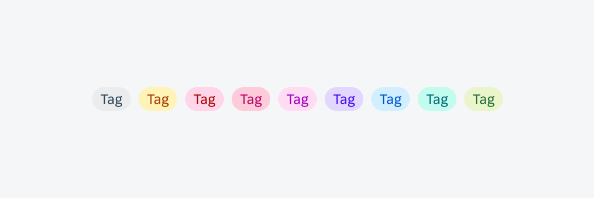
Tag variations
Resources
SAP Fiori for iOS: Tags
Related Components/Patterns: Cards Overview, Object Header, Object Cell
 Your feedback has been sent to the SAP Fiori design team.