
Colors
Intro
The right choice of colors is an important aspect that should be considered in smartwatch apps. It communicates the meaning and relationship of content, providing users with guidance to help them complete their tasks.
Horizon Reference Colors
The color palette for SAP Fiori for Wear OS is based on the color parameters from the Horizon visual theme. The colors displayed below are the main reference colors.
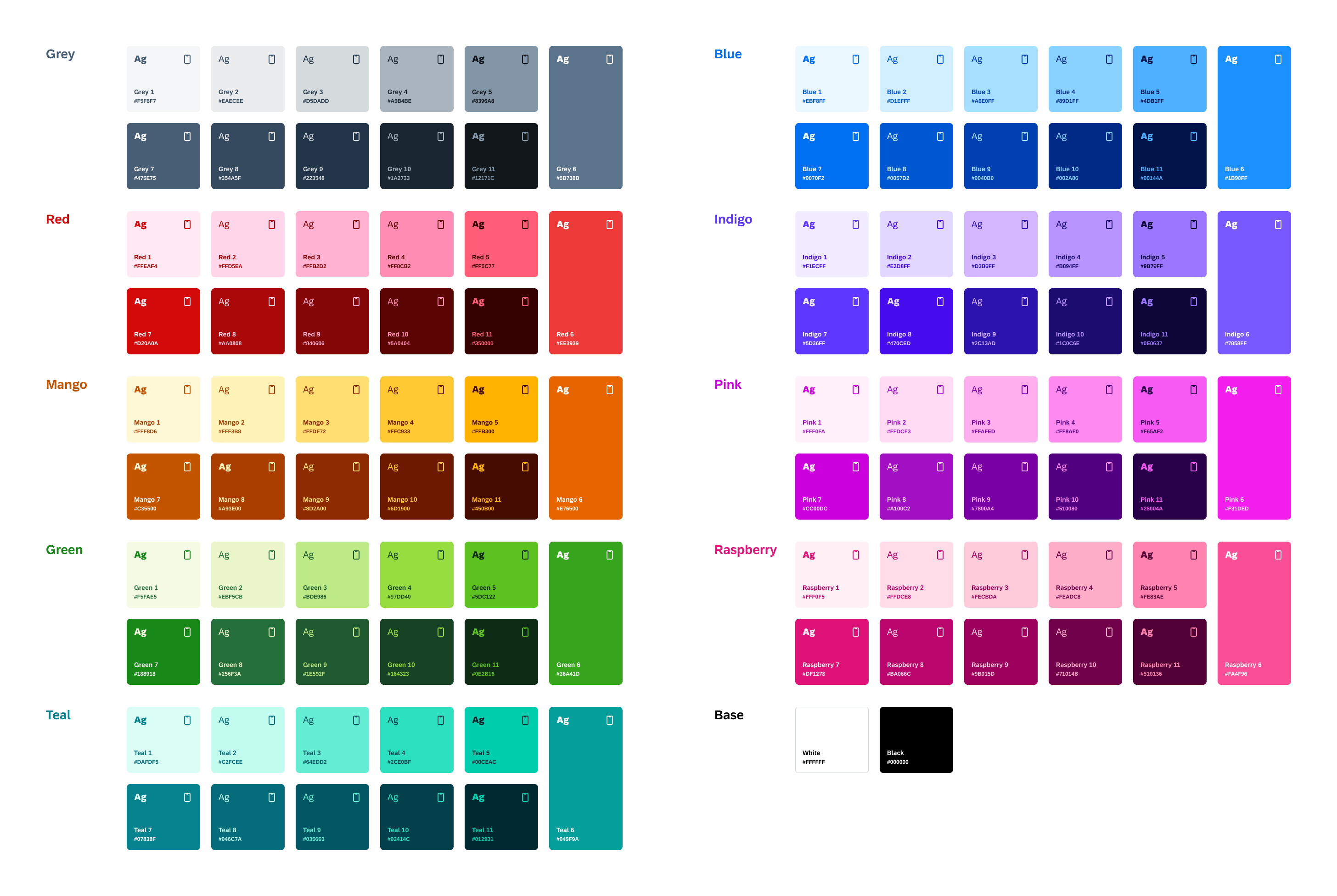
Horizon color palette
UI Colors
Compared to mobile apps, colors in smartwatch apps are generally brighter and less saturated. Additionally, smartwatch apps are only available in dark mode to save battery life and accommodate different light conditions, such as low light or direct sunlight.
We recommend using the dedicated color palette to provide optimal readability and accessibility for users – which is even more important in critical situations due to the smaller screen size and rather short looks at glanceable content on smartwatches.
From the Horizon color palette, we have added a semantic name layer to help you decide which colors to use. UI colors are grouped according to their usage into the following categories:
- Surface colors
- Text colors
- Borders colors
- Semantic colors
- Accent colors
Surface Colors
Surface colors are applied to the background of components, such as chips, buttons, and cards. To provide a sense of hierarchy, surface colors are identified by the first letter S followed by a number sequence (e.g., S0, S1, S2).
| Dark Mode | Name | Usage | |
|
Base Dark
#000000 |
S0-Background | Main App Background |
Base Dark 2
#202124 |
S1-Primary | Surfaces |
|
Blue 4
#89D1FF |
S2-Secondary | Interactive Background | |
Text Colors
Text colors are applied to the text and icons of all components. Text colors are identified by the first letter T followed by a number sequence (e.g., T1, T2, T3).
| Dark Mode | Name | Usage | |
|
Grey 1
#F5F6F7 |
T1-Primary | Titles, Subtitles |
Grey 3
#D5DADD |
T2-Secondary | Body Text, Caption |
|
Grey 11
#12171C |
T3-Main on Secondary | Body Text, Caption | |
|
Blue 4
#89D1FF |
T4-CTA on Primary | Interactive Elements | |
Border Colors
Border colors are applied to linear elements, such as divider lines. Border colors are identified by the first letter B followed by a number sequence (e.g., B1, B2, B3).
| Dark Mode | Name | Usage | |
|
Grey 6
#5B738B, 50% |
B1-Section Divider | Divider Lines |
Grey 5
#8396A8 |
B2-Default Border | Text Field Borders |
Semantic Colors
Semantic colors are applied to any UI element that conveys an important status, state, or level of priority. Semantic colors can be identified by the following naming (e.g., negative, critical, and positive status).
| Dark Mode | Name | Usage | |
|
Red 5
#FF5C77 |
Negative Label | Negative meaning, Error |
Mango 4
#FFC933 |
B2-Critical Label | Alert, Warning |
Green 3
#BDE986 |
Positive Label | Positive Meaning, Success |
Accent Colors
Accent colors provide an additional level of color luminance and are used to accent areas of the UI, such as avatars, icons, and data visualizations. Accent colors are identified by the word “Accent” followed by a number sequence (e.g., Accent 1, Accent 2, Accent 3).
| Dark Mode | Name | Usage | |
|
Mango 4 #FFC933 |
Accent 1 | Categorical avatars or Icons |
Red 5
#FF5C77 |
Accent 2 | Categorical avatars or Icons |
Indigo 4
#B894FF |
Accent 3 | Categorical avatars or Icons |
Blue 5 #4DB1FF |
Accent 4 | Categorical avatars or Icons |
Teal 3
#64EDD2 |
Accent 5 | Categorical avatars or Icons |
Green 3
#BDE986 |
Accent 6 | Categorical avatars or Icons |
Pink 4
#FF8AF0 |
Accent 7 | Categorical avatars or Icons |
Raspberry 4
#FEADC8 |
Accent 8 | Categorical avatars or Icons |
Grey 4
#A9B4BE |
Accent 9 | Categorical avatars or Icons |
Resources
SAP Fiori for watchOS: Colors
Material Design: Wear OS Colors
 Your feedback has been sent to the SAP Fiori design team.