
Card Body
FioriMobileCard
Intro
The card body is the central part of the card that is used to display additional information alongside the content shown in the card header. By using the card body, several components from the SAP BTP SDK for Android can be integrated into a card, enabling the recreation of card types such as object cards, list cards, and many more.
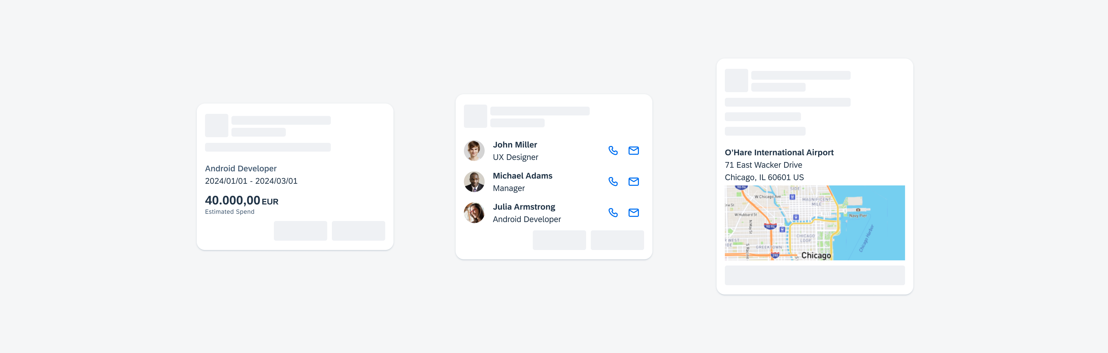
Card body examples
Usage
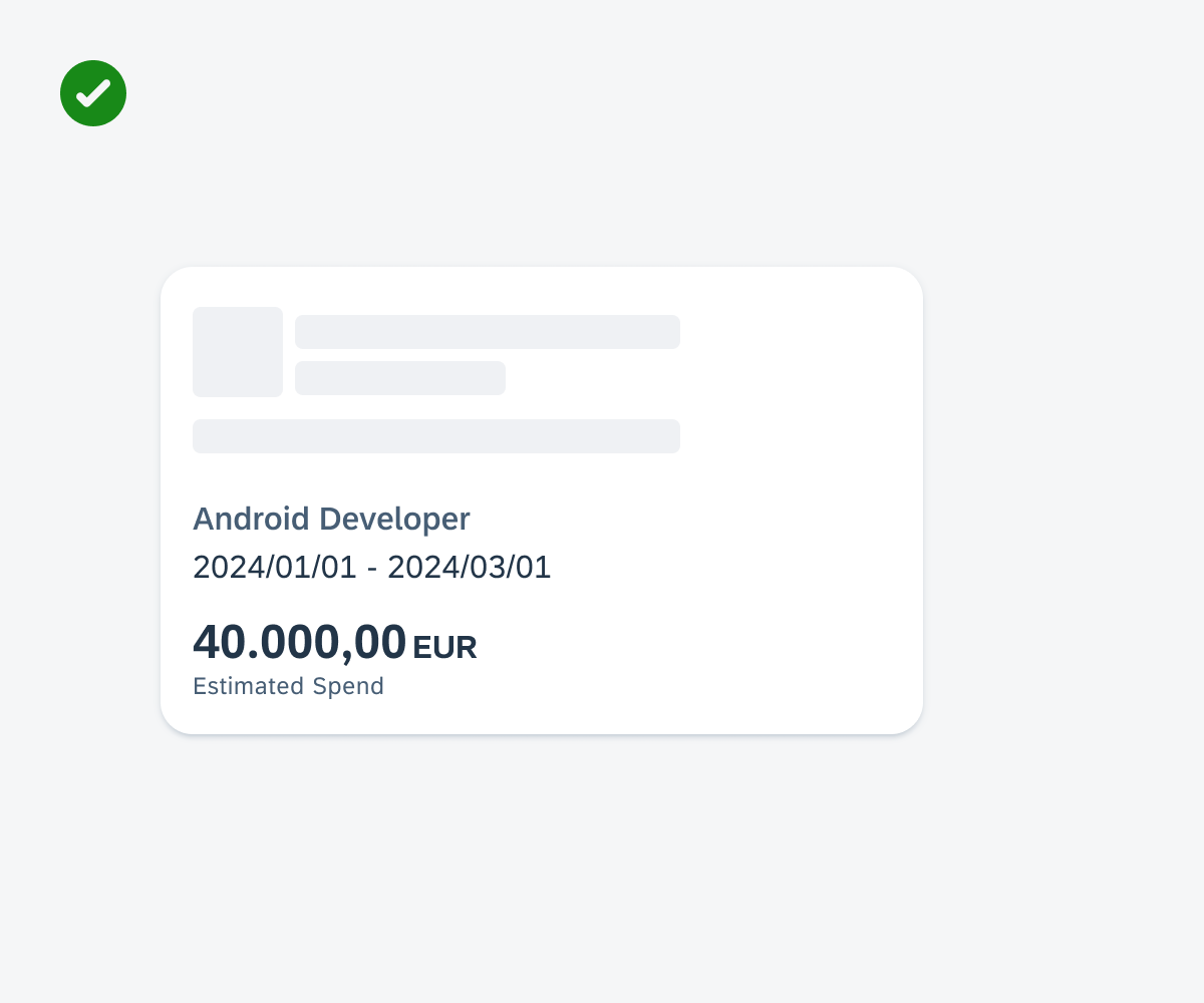
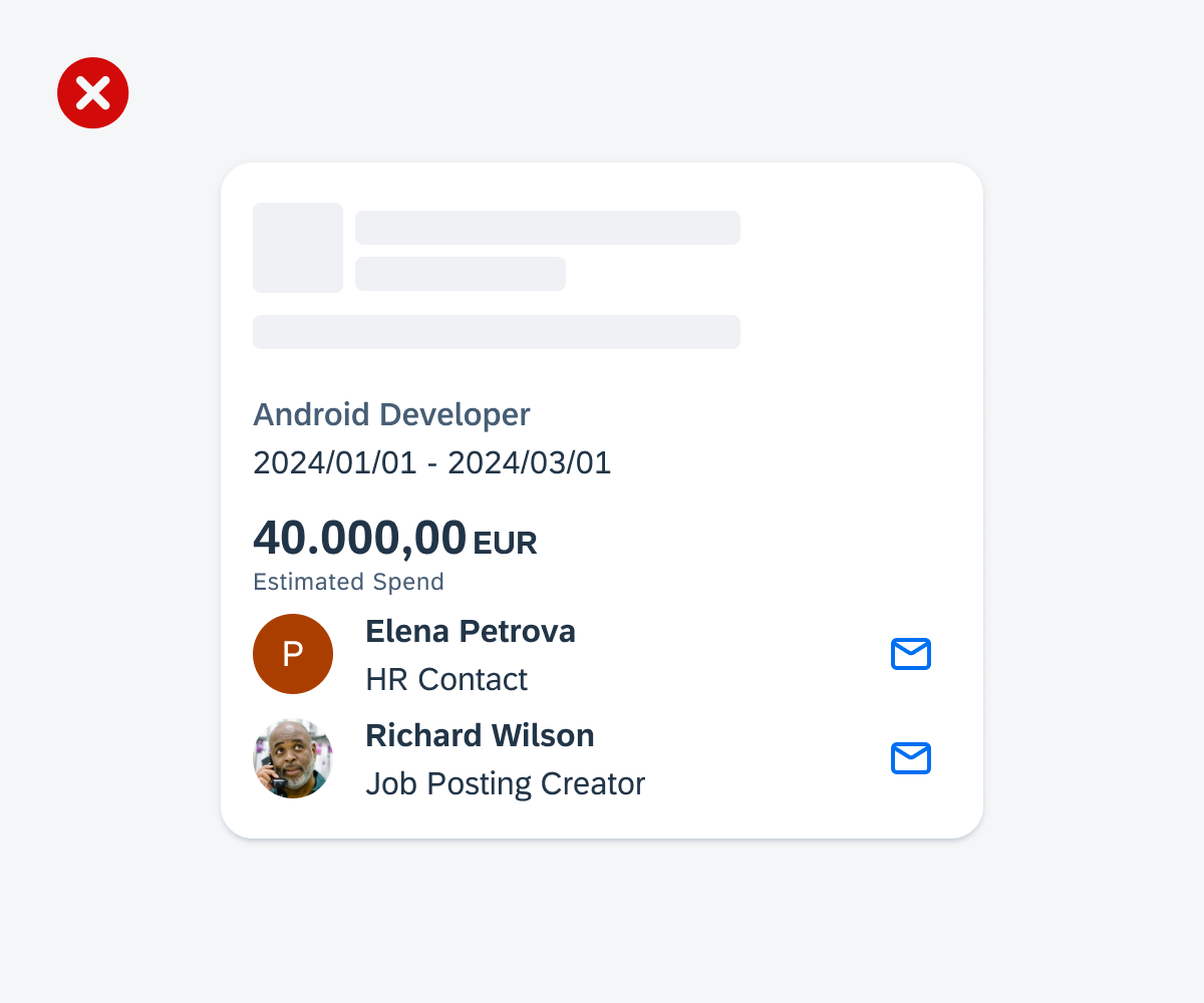
While the card body is optional, it can be used for different use cases. To improve user comprehension, we recommend including additional details. Avoid using the card body for complex tasks; instead, provide additional functionality and detailed information on a subsequent details page that users can access by pressing the card.
To maintain compact card sizes, be mindful of not overcrowding the card body with too many components. Additionally, consider the following aspects when adding components to the body:
- Limit the number of components in the card body.
- Use components that are relevant to the context of the card.
- Only use components that are listed below in the Variations section or variants of components that have been adapted for cards.
- Make sure that the placement of the components within the card body is consistent throughout your app. For example, a KPI is placed in the body and centered aligned, other cards in your app should follow the same pattern.
- Don’t include any components in the card body that are not listed below.
- Don’t overcrowd the card body with too many elements.
- Don’t add additional components such as a status or tags to the card body. Use the card header for that.
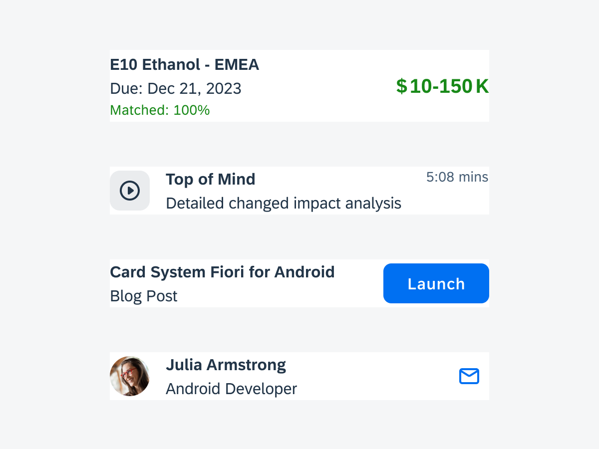
Cards with different components
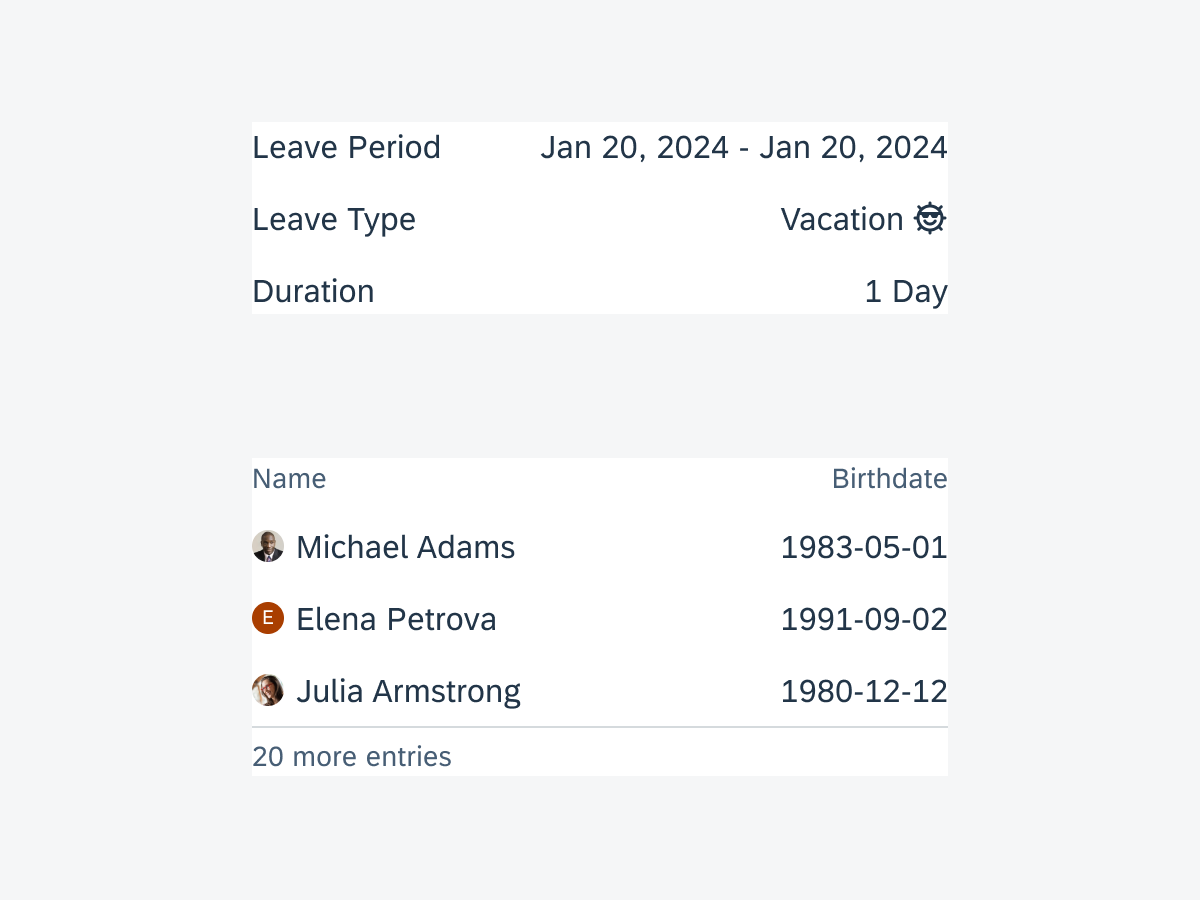
Don’t put too many components into the card body
Anatomy
The card body is a single container that can hold various components. The container is flexible in height to accommodate a reasonable number of UI components until the maximum height of the entire card is reached.
Variations
In addition to the SAP Fiori for Android components that can be added to the card body, the card system also offers variants. These variants are specifically tailored to seamlessly fit within a card. The reduced horizontal and vertical spacing of the variants compared to the default components, ensuring a concise card design.
You can include the following components in the card body:
Existing Components
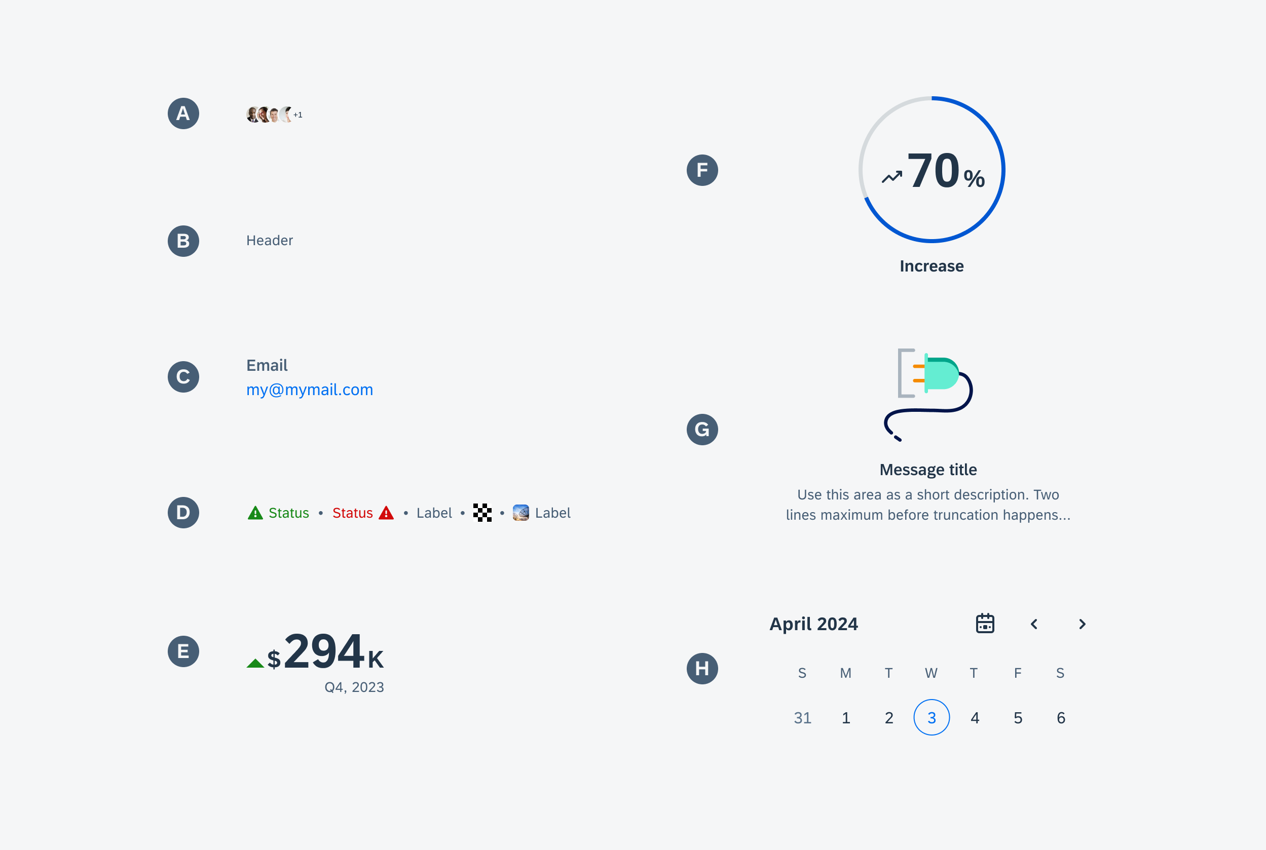
Variants for Cards
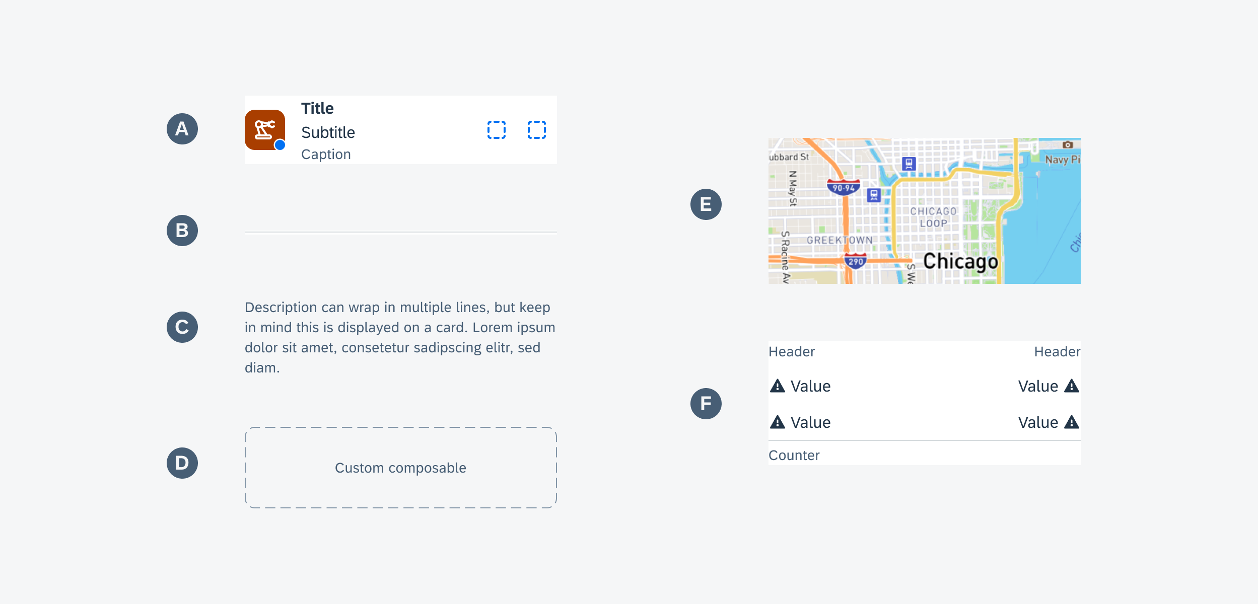
Selection of card body components
A. Card Cell
The card cell component is a simplified version of the object cell, featuring a thumbnail, title, subtitle, footnote, and right accessories. There are a few variations for the right accessories such as a small KPI, status info label, two icon buttons, or a single button.
Card cell component
B. Divider/Spacing
The divider can be placed between elements to better separate them visually or by hiding the divider a white space can be applied.

Divider and white space component
C. Text
The text component can be used to add a short description on the card. The description should provide additional information related to the content. Keep the description short and precise to prevent it from wrapping into multiple lines.
D. Custom Composable
The custom composable allows custom components to be integrated into the body container. It provides flexibility in cases where the existing components included in the body do not support the use case. For example, a diagram or “live” map can be integrated.
E. Image
You can use an image in the card body to highlight information, such as an address of a hotel.
F. Data Table
The data table provides a title for each of the two available columns. You can have up to three entries. To accommodate various use cases, you can configure entries to adjust the text color, icon, and placement of an icon. You can choose to display a divider below the table, along with a text indicating that there are more items in the data set.
Data table component
Behavior and Interaction
The default component used in the card determines the general interaction and navigation behavior. For example, if a key value cell is placed in the body, it inherits the interaction behavior and can either be displayed only or made clickable to trigger a call or other actions.

Card cell with icon buttons
States
Use a suitable illustrated message to communicate different states.
For example, when there is no relevant content or data to be displayed in the body, include an empty state indicator. This indicator serves as an informational message for users, notifying them that there is currently no information or data available, or that new data or information needs to be generated.
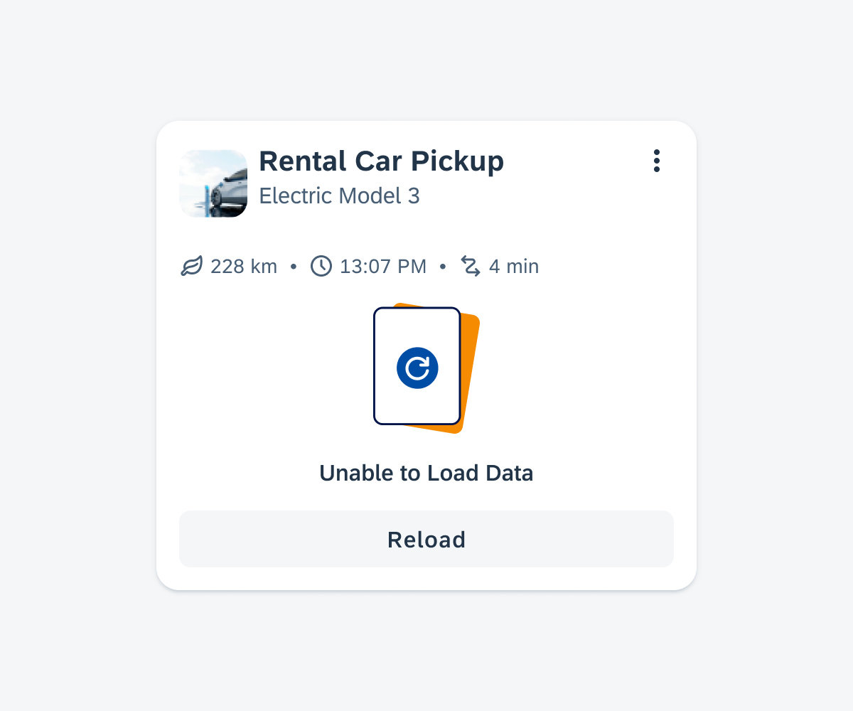
Card body with an empty list
Resources
Development: Card System, Card Cell
SAP Fiori for iOS: Card Body
SAP Fiori for Web: Card Content
Related Components/Patterns: Cards Overview, Card Header, Card Footer
 Your feedback has been sent to the SAP Fiori design team.