
Map
FioriMapView
Intro
The map displays business objects on a map. It can also be used to show points of interest, optimized routing based on business criteria, and other quantitative location-based data.
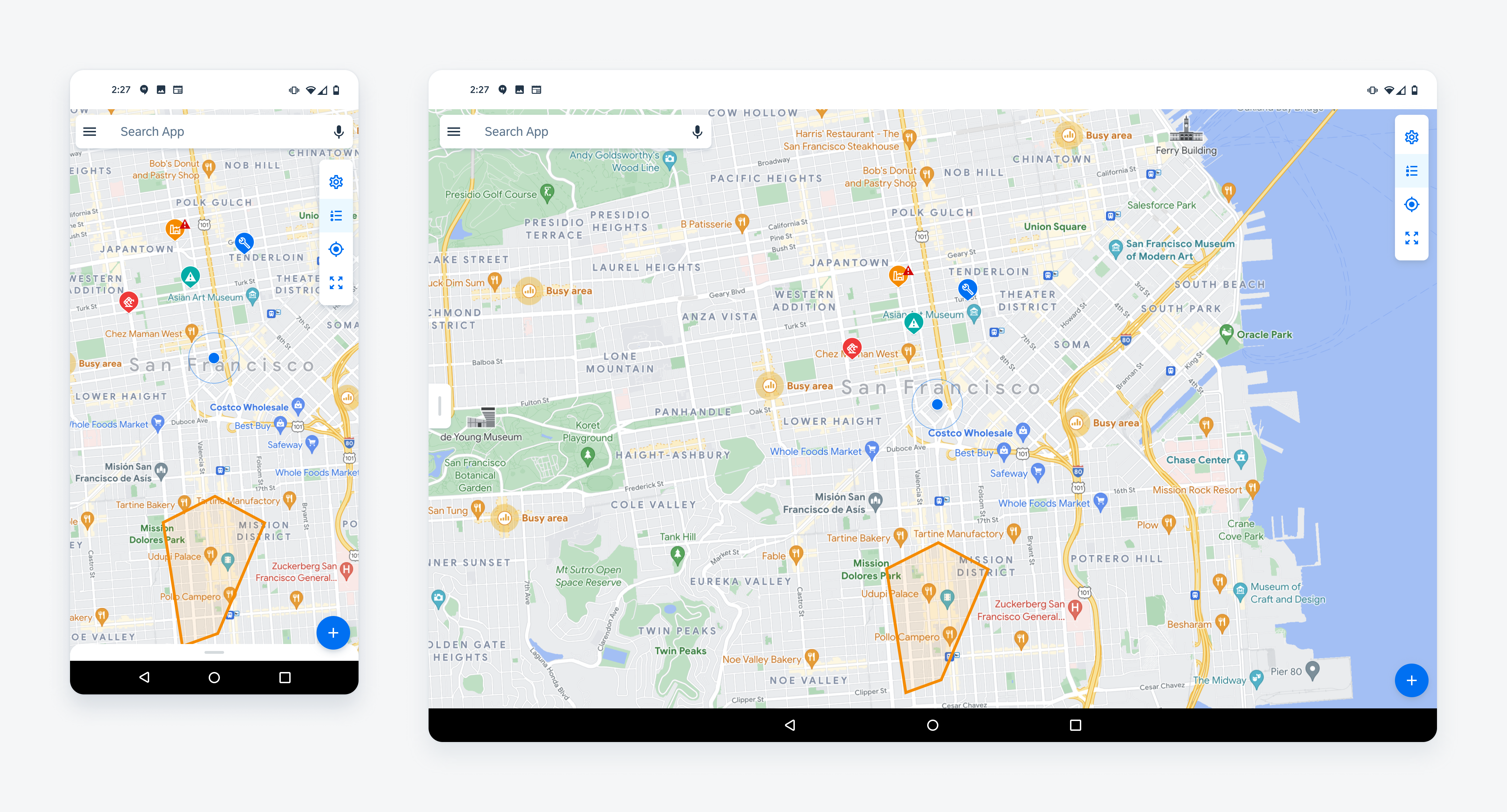
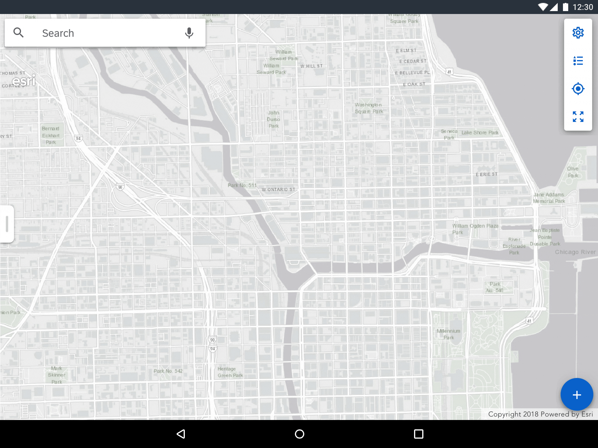
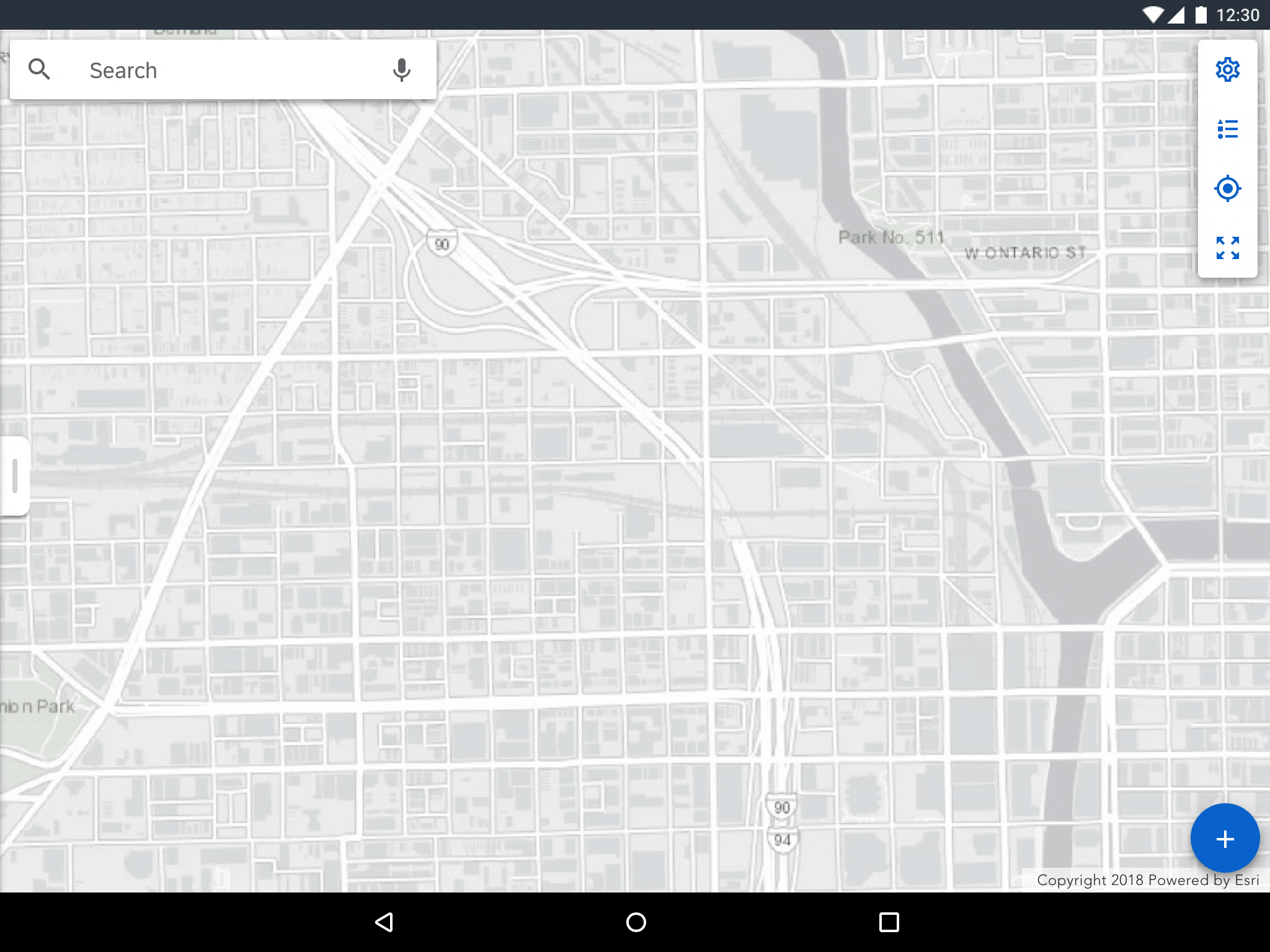
Map on mobile (left) and tablet (right)
Usage
Use the map if you have a location-based dataset where the user needs to access tracking or routing information, monitor business objects, or visualize relationships between business objects.
- Do not use the map when solely providing a map preview within an application.
- Do not use the map for non-location-based objects; use a list instead.
- Do not use the map when the primary goal of a screen is to complete a task, rather than looking at the locations of multiple objects.
Anatomy
The map consists of a map view, a panel, a toolbar and an “Add” button. The panel may display a list by default, an object detail if an object is selected, or editing controls if the edit mode is active.
A. Map View
The map view displays the user’s current location and annotations.
B. Panel
The panel displays a variety of content types.
C. Toolbar
The toolbar contains the actions that allows users to control the map.
D. Add Button
The “Add” button allows users to access the edit mode and to add a point or a set of points.
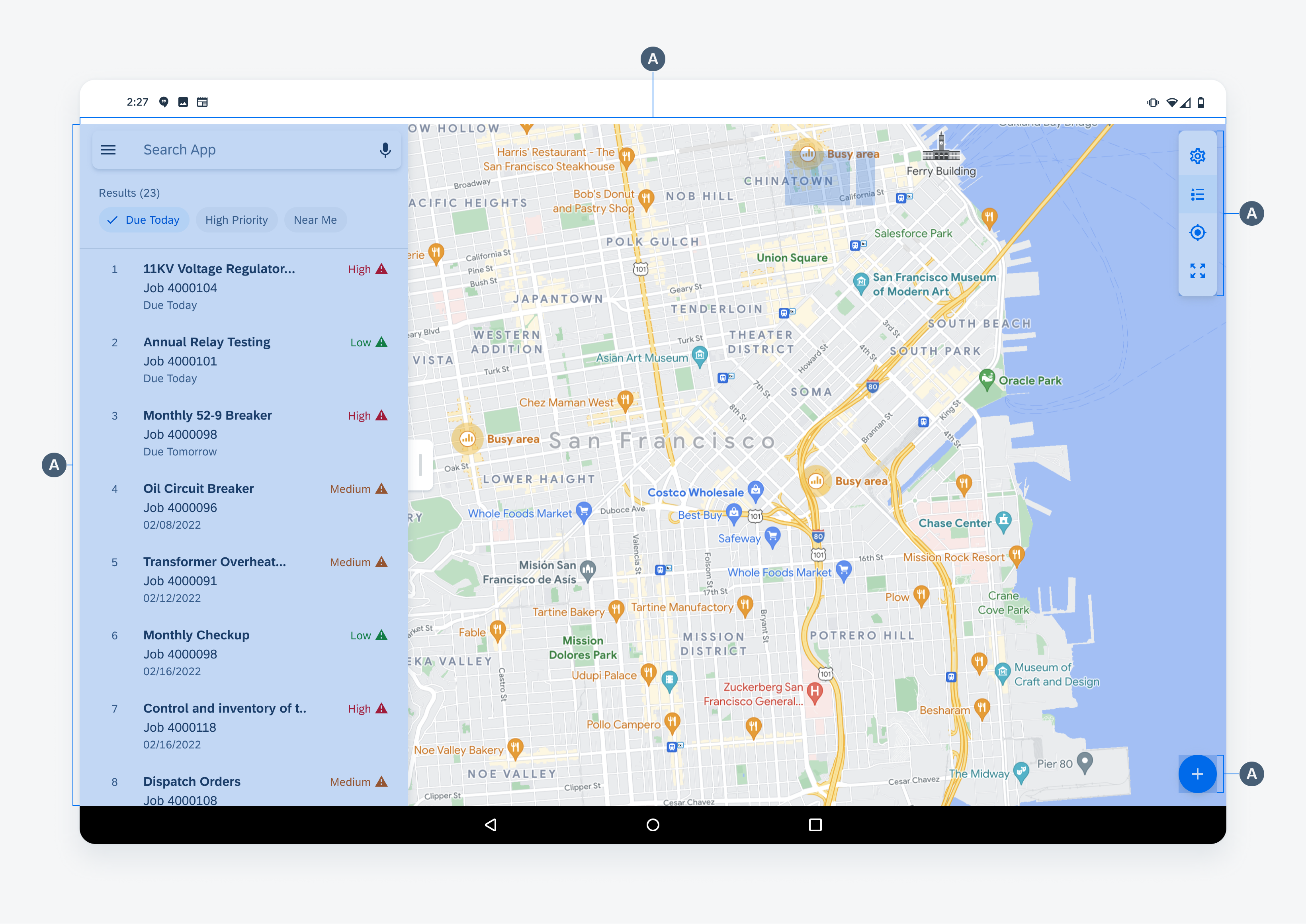
Anatomy of map
Map View
The map view displays all location-based objects such as the user’s location and annotations related to the user. The following annotation types are used in the map view.
A. Current Location
A marker that indicates the user’s current location. This marker is composed of a blue dot and a radius that occurs at regular intervals.
B. Marker
A marker is used to represent the location of one or more business objects. Use markers to represent jobs, assets, functional locations, or workers in the field. If there are many markers on the map, enable clustering to simplify the map interface.
C. Polylines
A polyline is a series of points that represents a linear path. Use polylines to represent linear assets such as roads, gas lines or utility lines. Different polyline types can be identified by their color and stroke treatment.
D. Polygons
A polygon is a series of points and paths that represent an enclosed area. Use polygons to represent areas such as a construction site or maintenance area. Different polygon types can be identified by their color and stroke treatment.
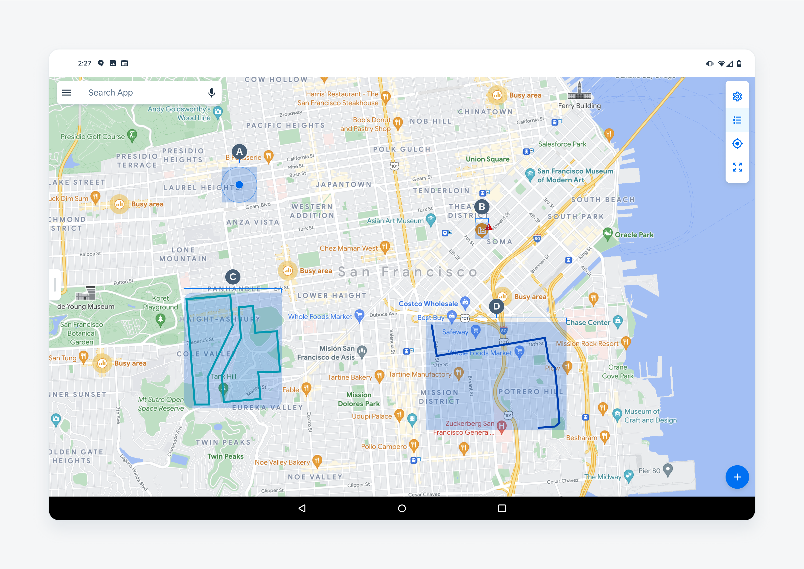
Map annotation types
Map Panel
The map panel displays a variety of content such as an object cell list, an object detail preview, and an edit panel. The following are content types that may be displayed in the panel.
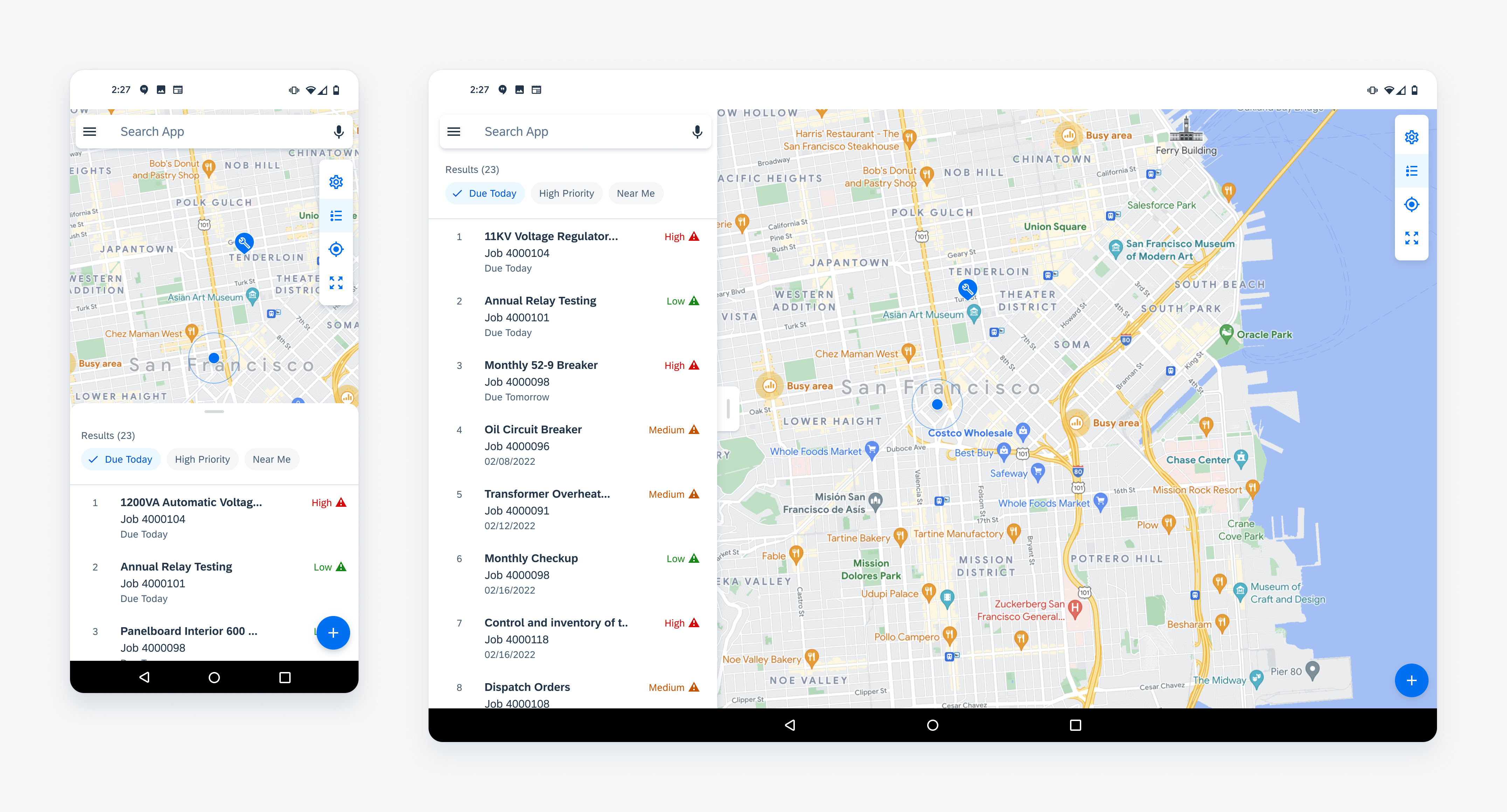
A. List
As the first level of information, the panel should display a list of object cells and filters that allow the user to access the detail preview of the object. When designing a list in the panel, follow the content hierarchy defined below:
1) Search – Narrows down the list to matches that are based on the user query. When using the search with the list, use a persistent search on top of the list and make it prominent.
2) Filter Chips – Represent values based on time, attribute, and location that filter down the list when selected.
3) Object Cell List – Presents all objects in a list format and allows users to scroll through and drill-down to an object’s detail page.
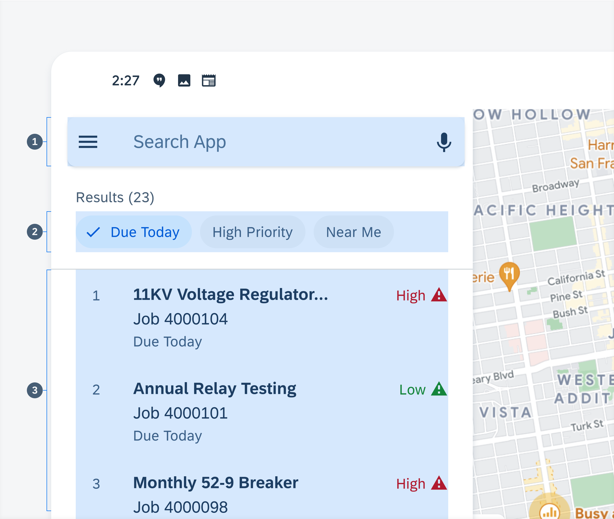
Anatomy of list
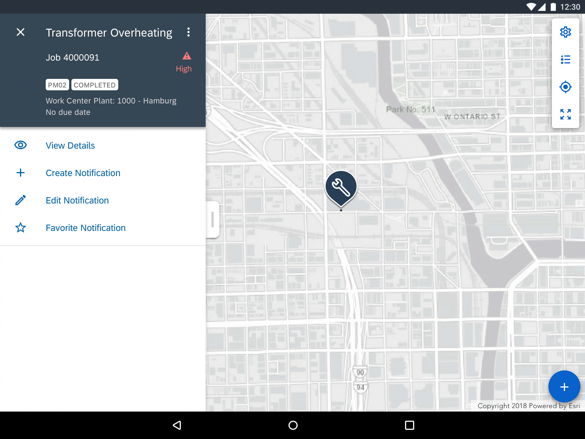
B. Object Detail
After selecting an object cell from a list or a marker on the map, an object detail preview is displayed. The detail page should follow the section hierarchy defined below:
1. Object Header – Contains the object title, a navigation icon as well as an optional object name, a subheading, tags, and menu icons. The title can accommodate up to three lines of text after which the text is truncated.
2. Directions Button – Uses Google maps or Esri maps to navigate to an object’s location.
3. Actions Cell – Action cells are quick actions that are related to the object and allow users to view details and create or edit an object.
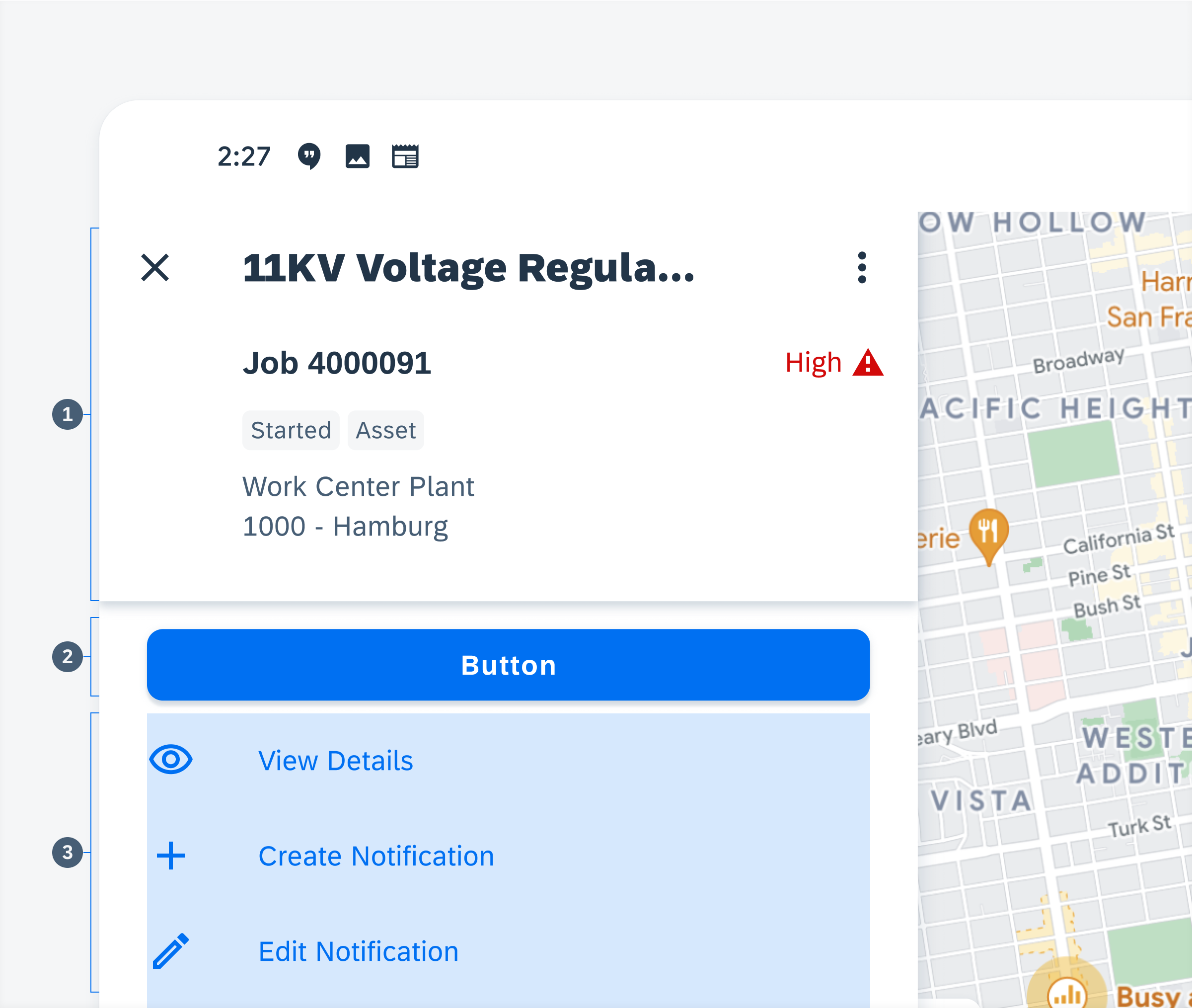
Anatomy of object detail
C. Edit
The edit mode allows users to create and control annotations by setting a single point or series of points. The edit mode can be accessed in two ways: tapping the “Add” button on the map view, or the “Edit” action cell on the object detail preview. The edit mode panel displays the controls for adding, deleting, and reordering points. The edit panel follows the following section hierarchy:
1. App Bar – Contains the “Close” icon used to exit the edit mode. The title informs the user that they are in edit mode while the “Save” button allows the user to save their annotations.
2. Choice chips – Represent different types of annotations such as points, polylines, or polygons. Selecting each one changes the type of annotation that the user is applying to the map.
3. Reorder Cell – Displays a point’s precise address or location. To change a cell’s sequence within a list, drag and drop the cell to the desired position on the list. Cells can be deleted from the list by tapping the “Close” icon on the right.
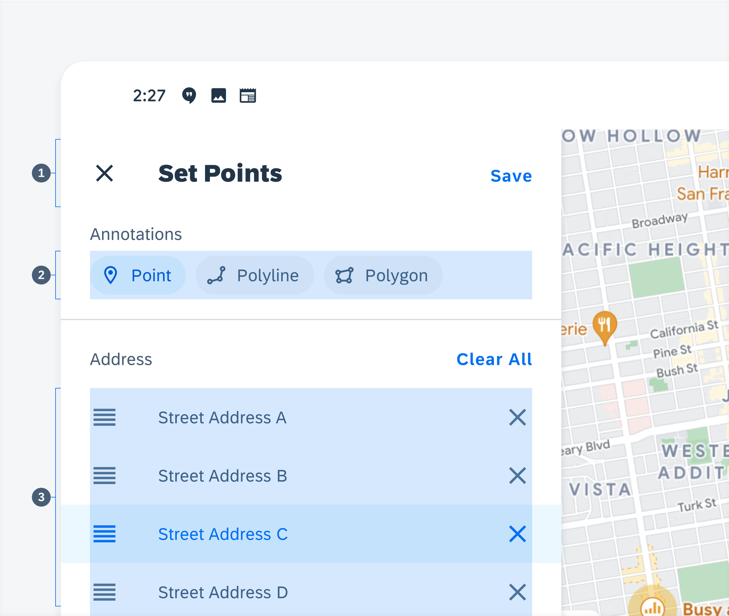
Anatomy of edit mode
Toolbar
Depending on the user’s needs, the toolbar can be a single action or can be made up of several vertically stacked actions. When in edit mode the toolbar can include up to five actions. By default, the toolbar provides the following four options:
A. Settings
The settings is a dialog modal with a set of controls. These controls allow users to change the map type, show or hide certain objects on the map, as well as change the units of measurement and the user’s distance.
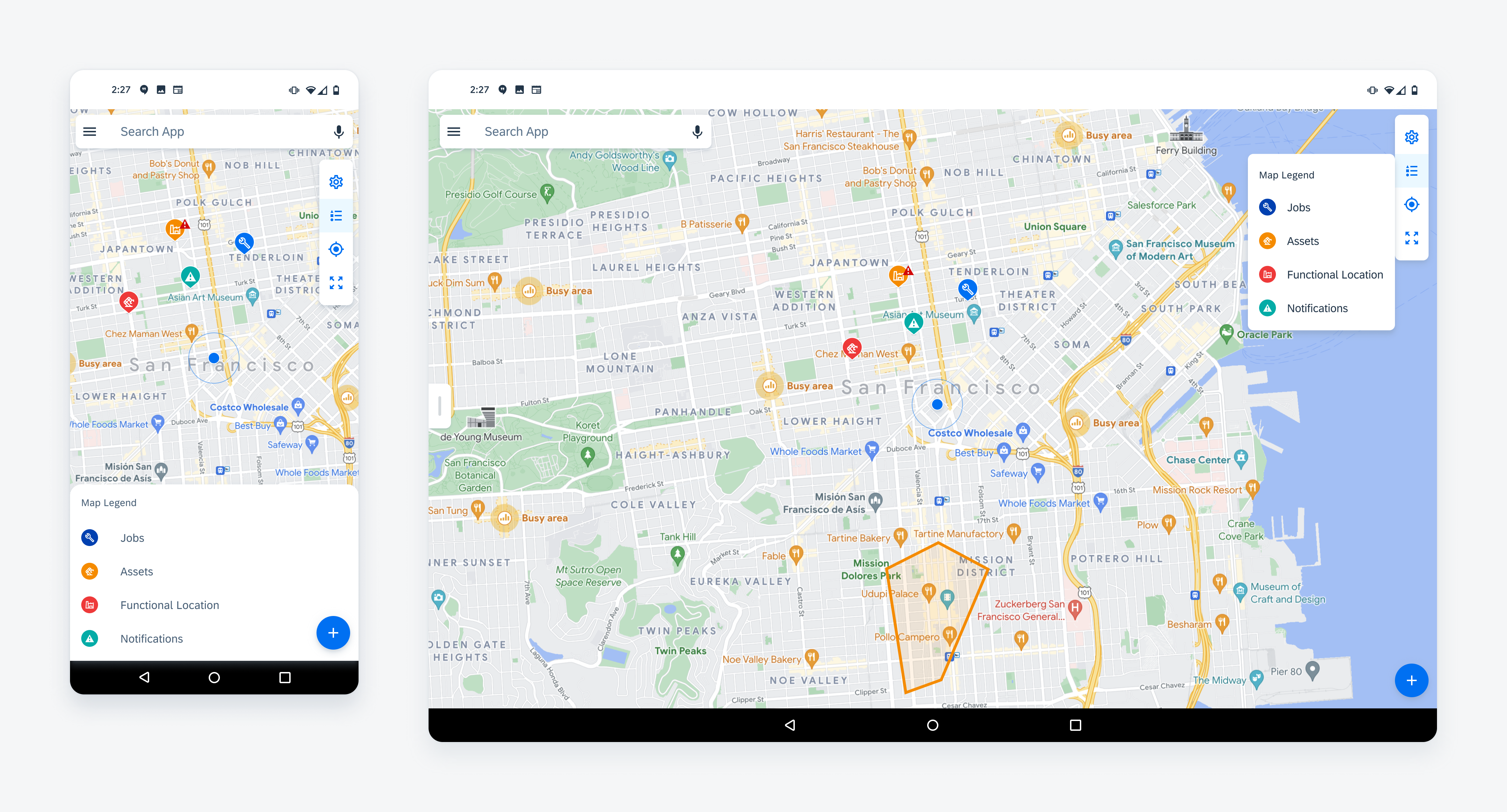
B. Map Legend
Tapping on the map legend provides detailed information about the symbols and visual elements that appear on the map view.
C. Current Position
Tapping on the current position readjusts the zoom level to show the user’s current location.
D. Zoom Extent
Tapping on the zoom extent readjusts the map zoom level to show all map markers on the screen at once.
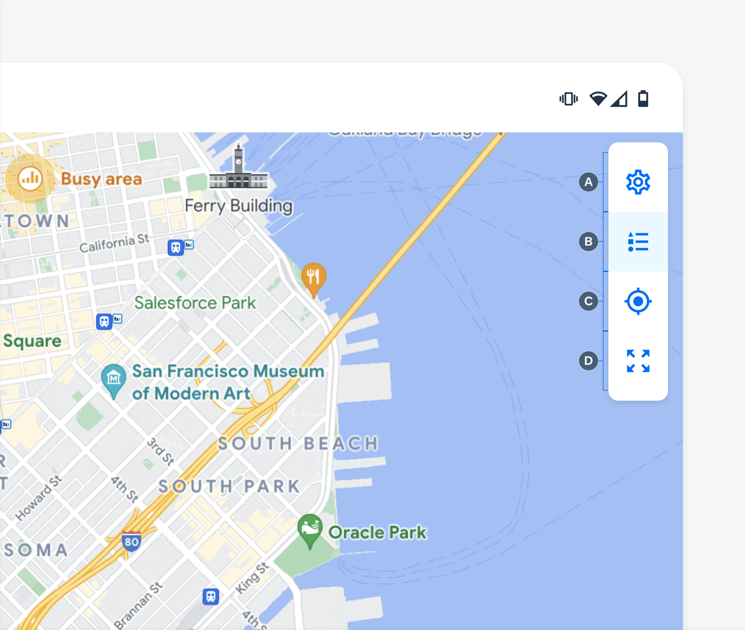
Anatomy of the map toolbar
Add Button
The “Add” button allows users to create a point or annotation by going into the create/edit mode. Tapping on the “Add” button may trigger a menu where the user can select from multiple different object types. If there is only one object type, do not use a menu and simply enable the create/edit mode directly after the users taps on the “Add” button.
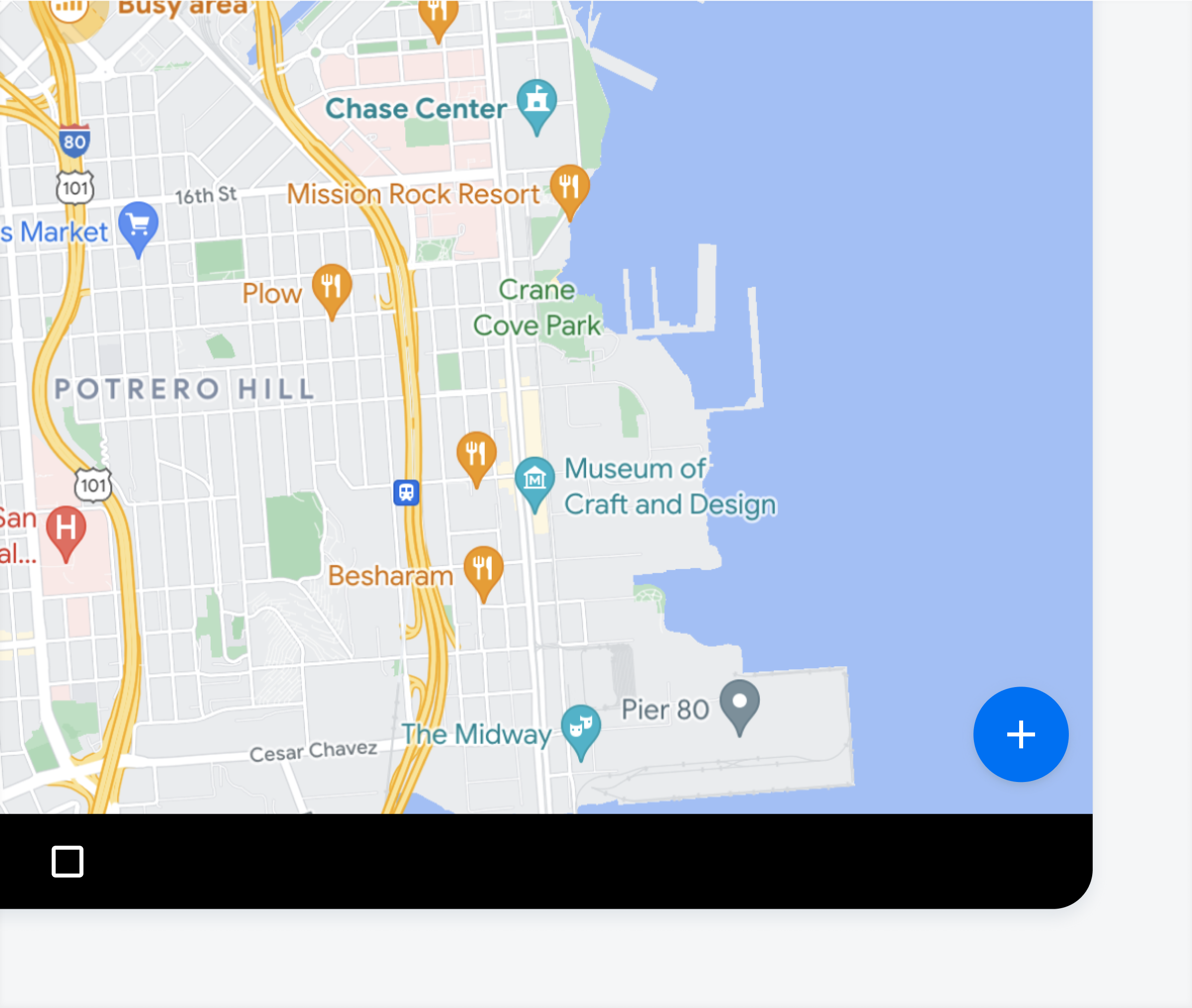
Floating action button on bottom right of map view
Behavior and Interaction
The map has several interactions that help the user navigate through and perform certain tasks.
Map Zoom
Pinch-to-zoom allows the user to increase or decrease the scale of the map.
Zooming into a map
Map Pan
Panning or dragging allows the user to move the map up, down, and sideways without changing the scale of the map.
Panning to navigate around the map
Marker Selection
Selecting annotations such as markers, polylines, polygons, displays that object’s detail preview. A selected marker doubles in size from its default size to indicate that the object has been selected. The stroke of selected polylines and polygons doubles in size to indicate that they have been selected.
Selecting a map marker displays an object detail
Marker Clustering
Clustering is a way to control the number of markers by grouping when the user zooms out and dispersing when the user is zooms back in. Objects that share one single geometry (location) are displayed as a single marker with a number count. If objects in a cluster are of different types, the marker should be set to a neutral color. If objects in a cluster are of the same type, the marker should reflect the color set for that specific object type.
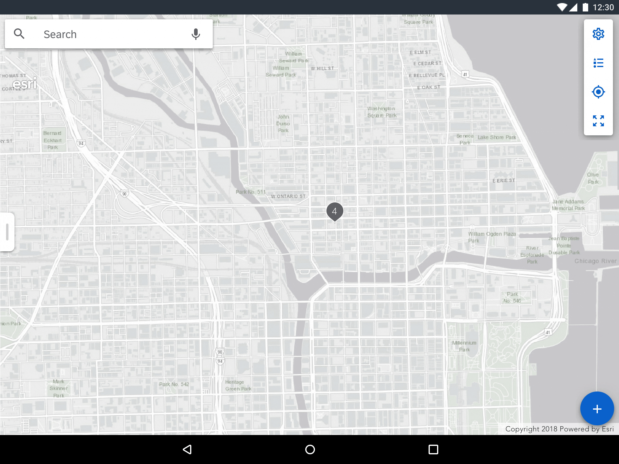
Map markers cluster at higher zoom levels
Panel Dragging
Dragging collapses or expands the panel enabling users to hide or reveal more content. Allow for the top of the panel to be partially visible so that users can expand to half-view. Users can further expand to full view by dragging up.
Reveal or hide the map panel by dragging
Adaptive Design
Map Settings
Map settings in tablet are displayed as a modal dialog. On mobile, the settings are displayed as a full-screen dialog.
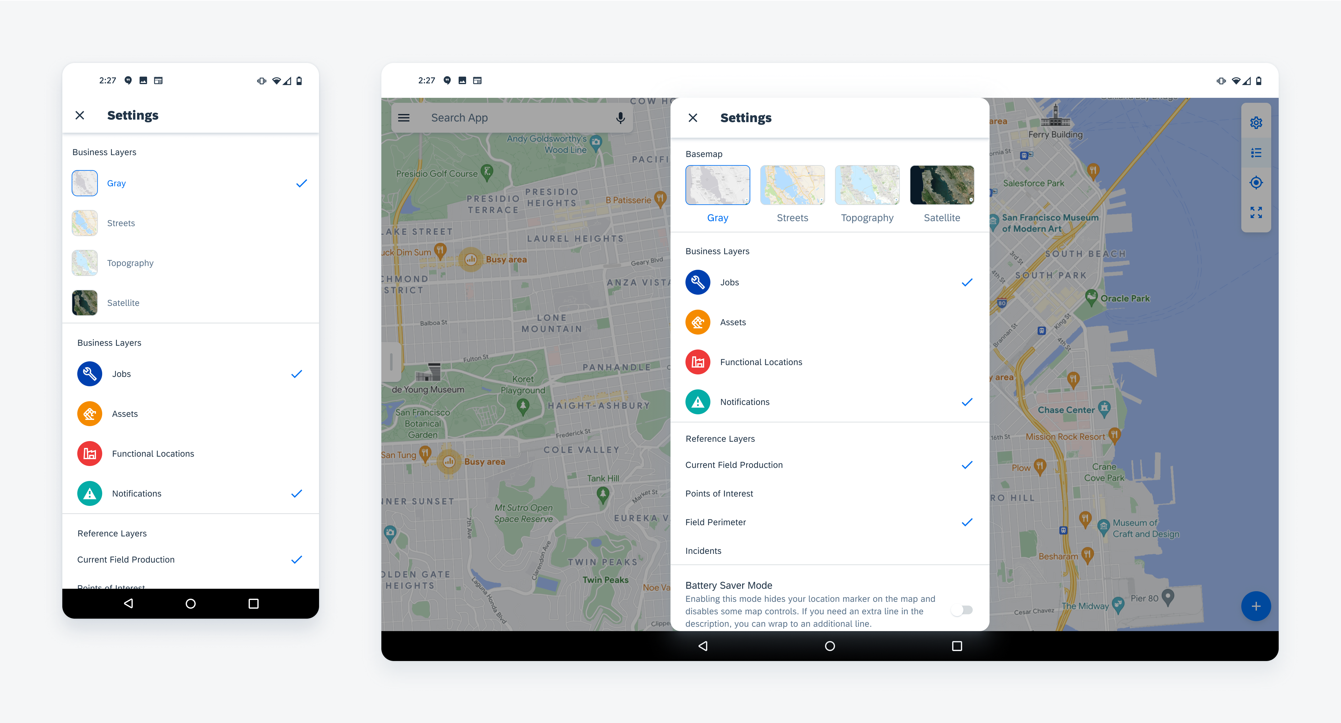
Map settings in mobile (left) and tablet (right)
Map Legend
The map legend on tablet is displayed as a simple dialog anchored to the map toolbar. On mobile, the map legend is displayed on the map panel.
Map Legend as a bottom sheet (left) and as a menu (right)
Map Panel
The map panel slides up from the left on tablet landscape and up from the bottom in portrait. On mobile, the panel slides up from the bottom of the screen.
Map panel as a bottom sheet (left) and as a side sheet (right)
Resources
Development: FioriMapView
SAP Fiori for iOS: Map
Related Components/Patterns: Search, Timeline, Object Header, Profile Header, Chips
 Your feedback has been sent to the SAP Fiori design team.