Design Adaptive Apps
Intro
Optimizing your app for all window size classes requires a clear understanding of its structure and the relationships between screens. In compact mode, users navigate through screens hierarchically, whereas in larger window size classes, multiple panes can be displayed side by side on one screen.
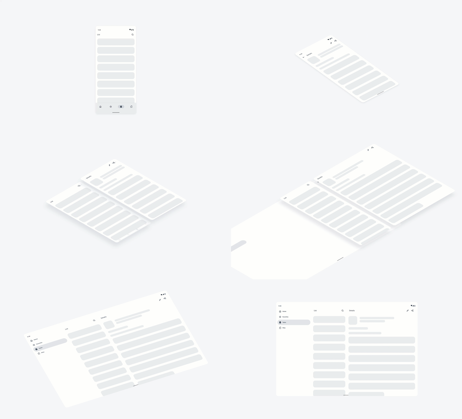
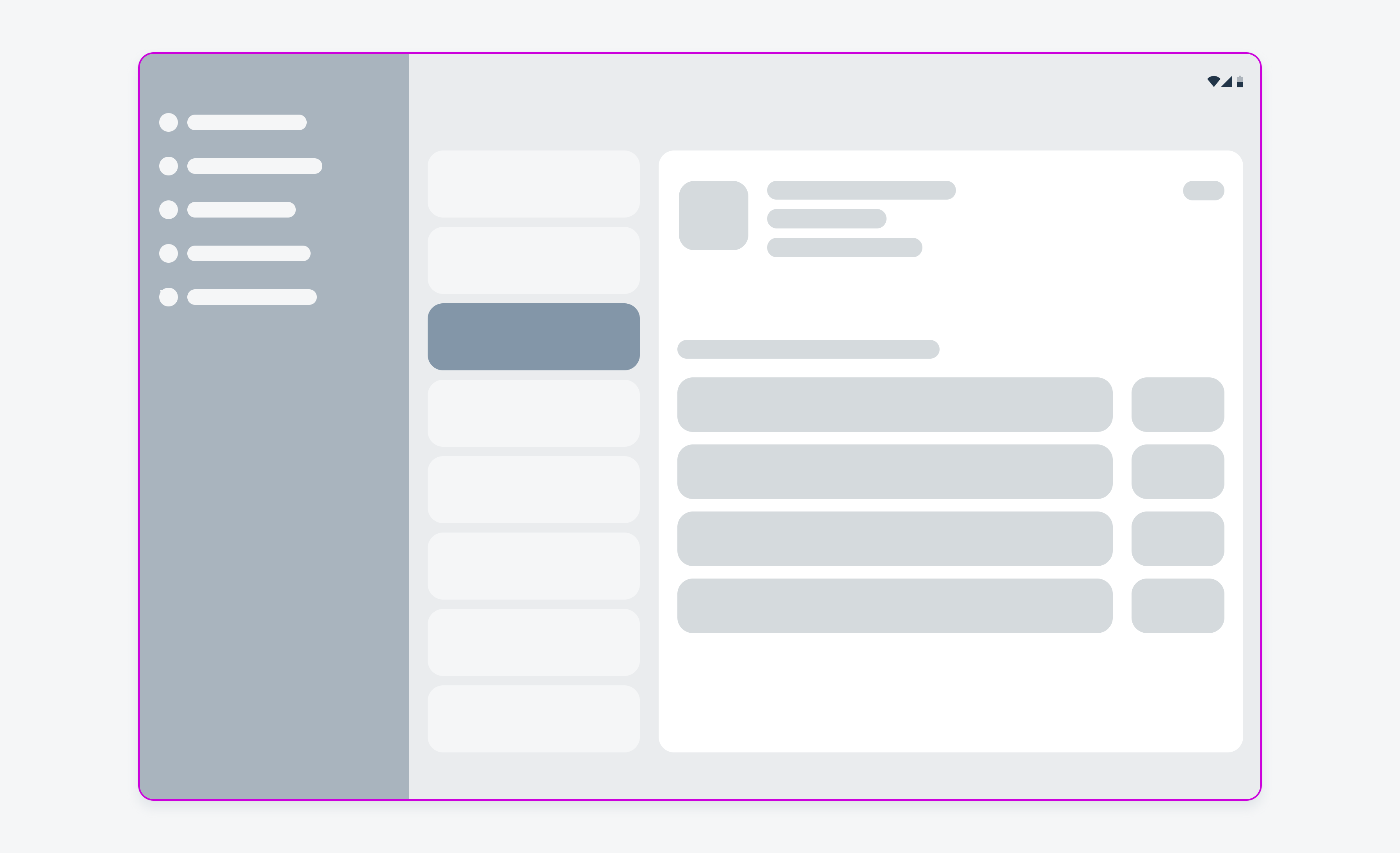
Transformation from compact to an expanded window size class
Starting with One Window Size Class
Begin by designing your app for a specific window size class, such as compact, and make sure its layout is responsive and adaptive.
Creating an Information Architecture
Develop a hierarchical model that illustrates the structure of your app.
Identifying Related Screens
Look for screens that are closely related in the information architecture, such as a list screen and its detail view. These screens typically interact directly with each other.
Merging Related Screens into Panes
For larger screens, integrate related screens into a single display using multiple panes. For example, one pane could show the list, while another shows the detail view.
Adjusting Designs for Different Window Sizes Classes
Tailor your design for various window sizes by considering the following questions:
- What needs to be displayed? Ensure that all essential details available on large and medium screens are available on compact screens, even if it requires an additional tap to view certain elements. For example, a filter might be shown beside a list on a large screen but open on a new screen after a tap in compact mode.
- How should the screen be divided? Determine the best way to split content across panes for different screens.
- What size adjustments are necessary? Adjust element sizes to fit different window sizes appropriately to make your app’s layout responsive and adaptive while maintaining visual coherence across devices.
- What needs to be relocated? Some components might need to be moved. For example, the bottom navigation bar in compact mode might transition to a navigation rail or drawer on medium and large screens.
- Which components should be exchanged? Replace certain elements better suited for specific window sizes. For example, a navigation bar in compact size could be swapped for a navigation rail or drawer on larger screens.
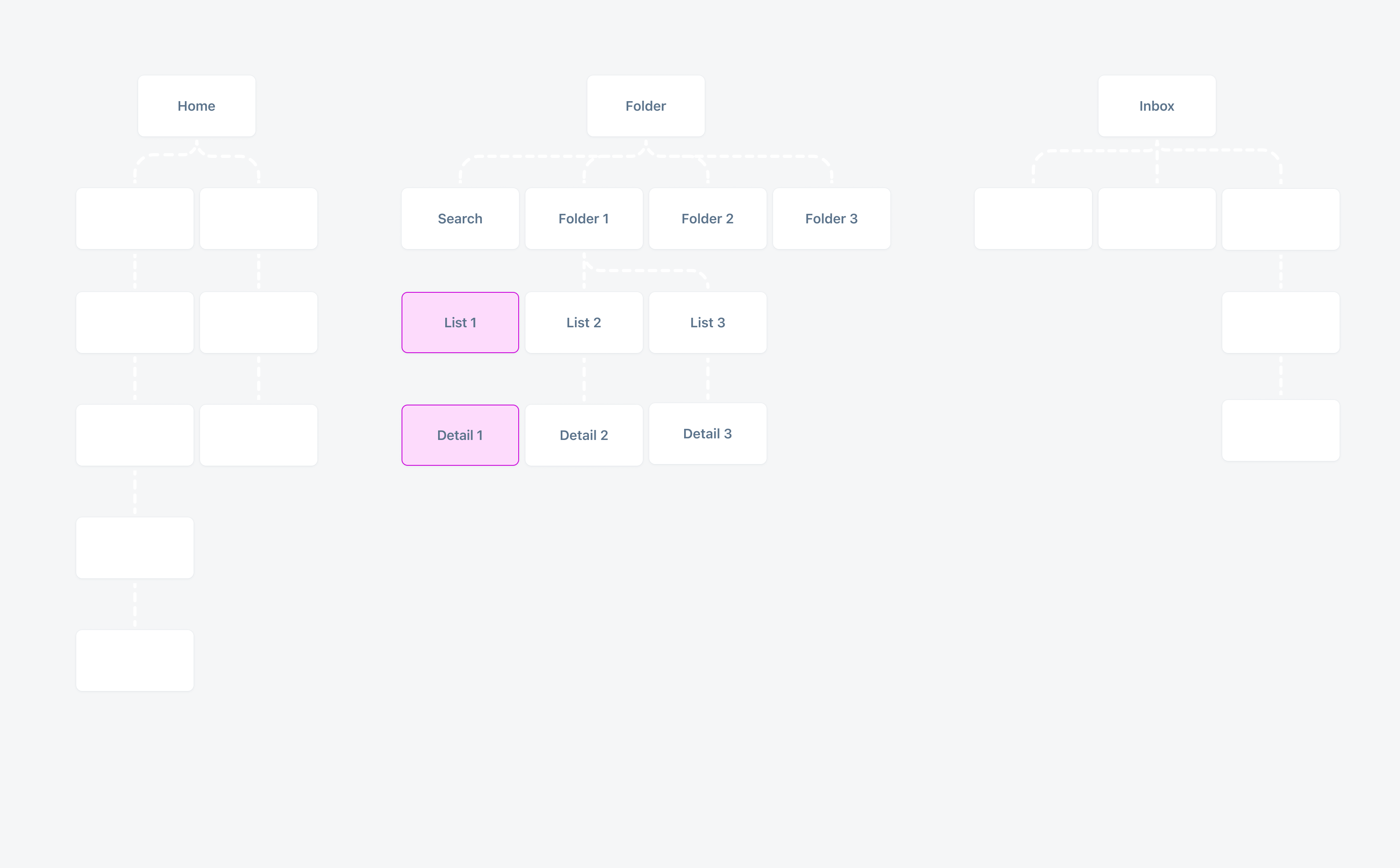
Information architecture of an app in a compact window size class
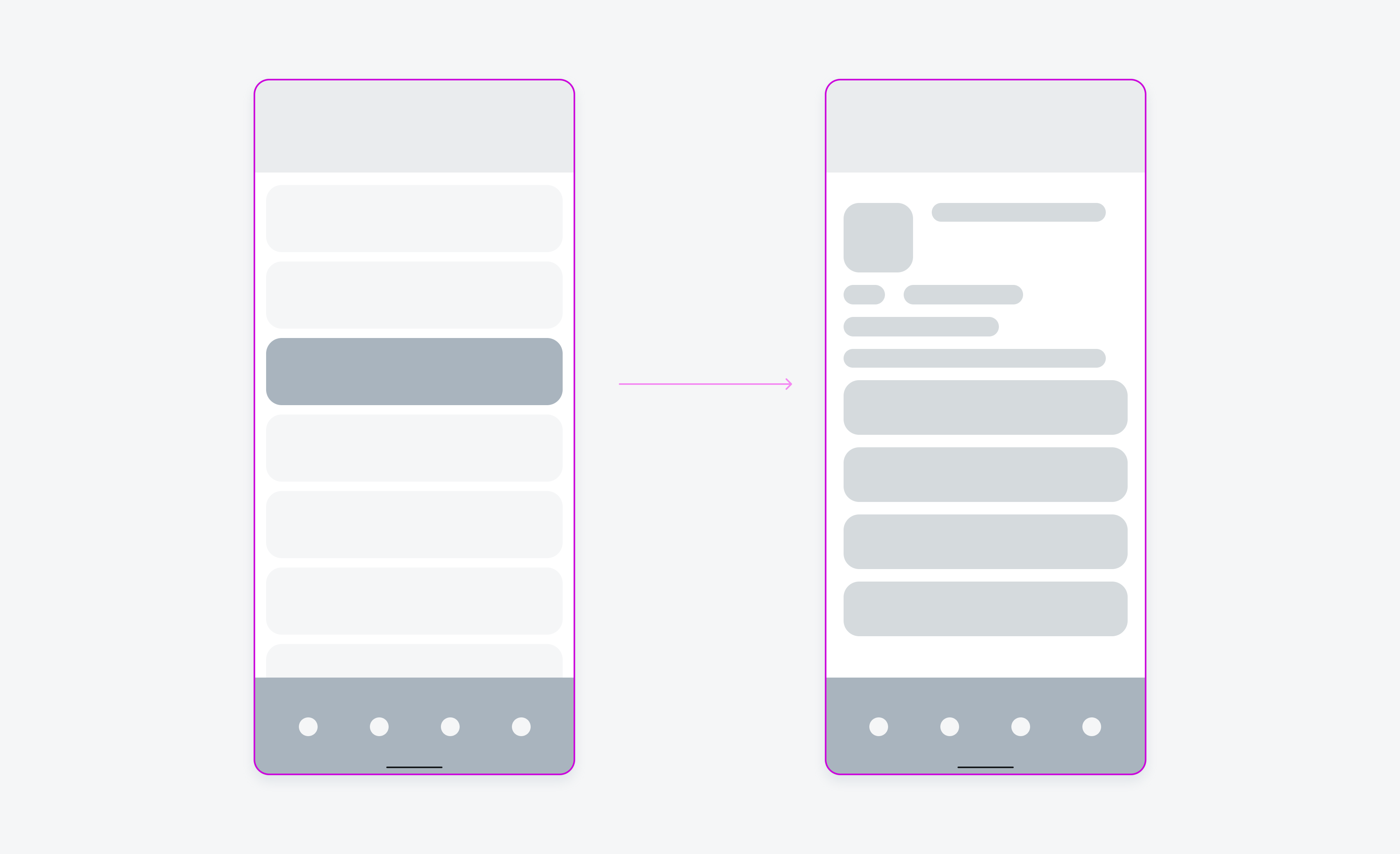
List and detail screen in compact window size classes
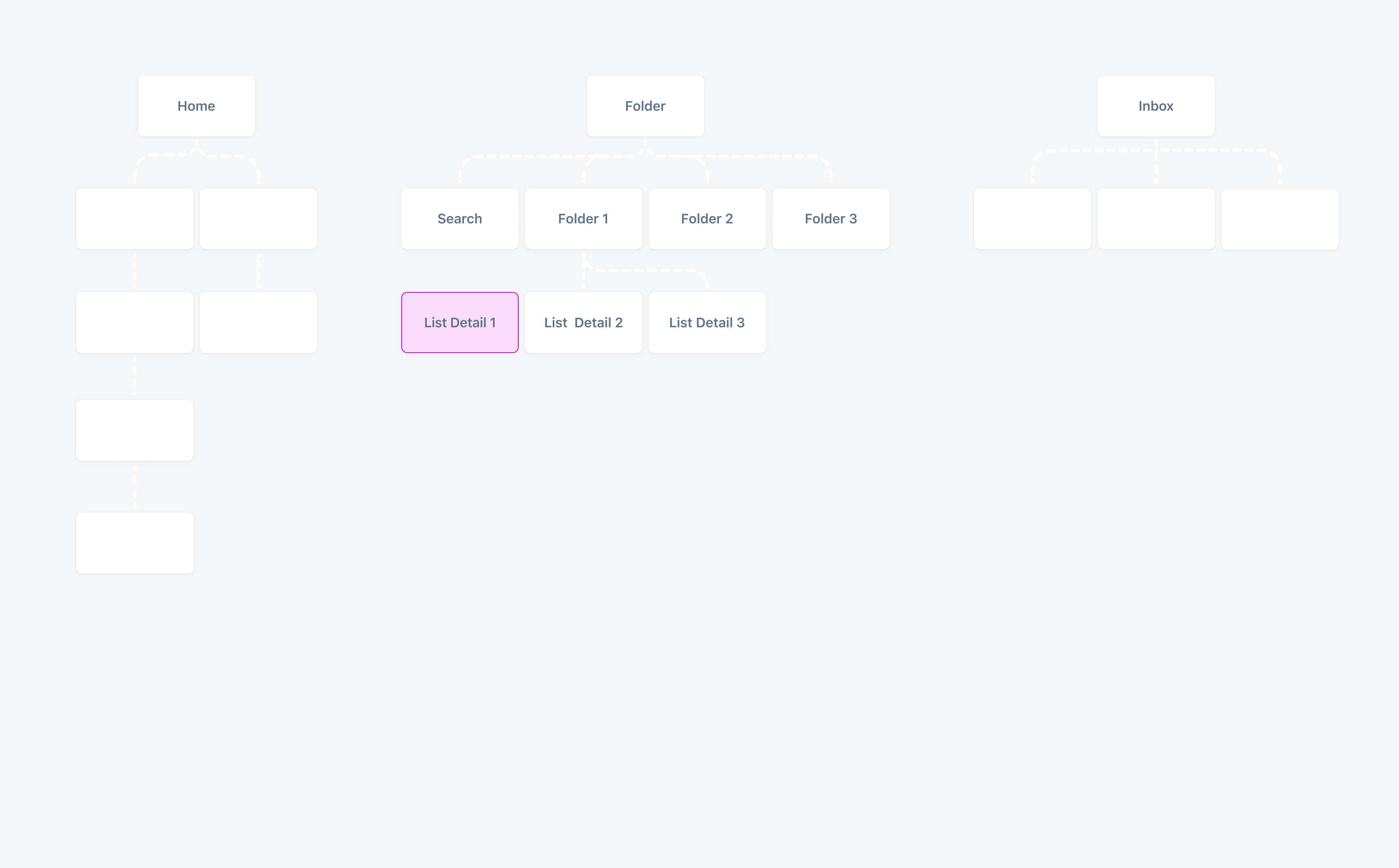
Information architecture of an app in expanded window size class with fewer levels as several screens from compact are combined into one

 Your feedback has been sent to the SAP Fiori design team.