Adaptive Behavior and Navigation
Intro
Navigation Components
The navigation region holds the primary navigation components such as:
- Navigation Bar
- Navigation Rail
- Navigation Drawer
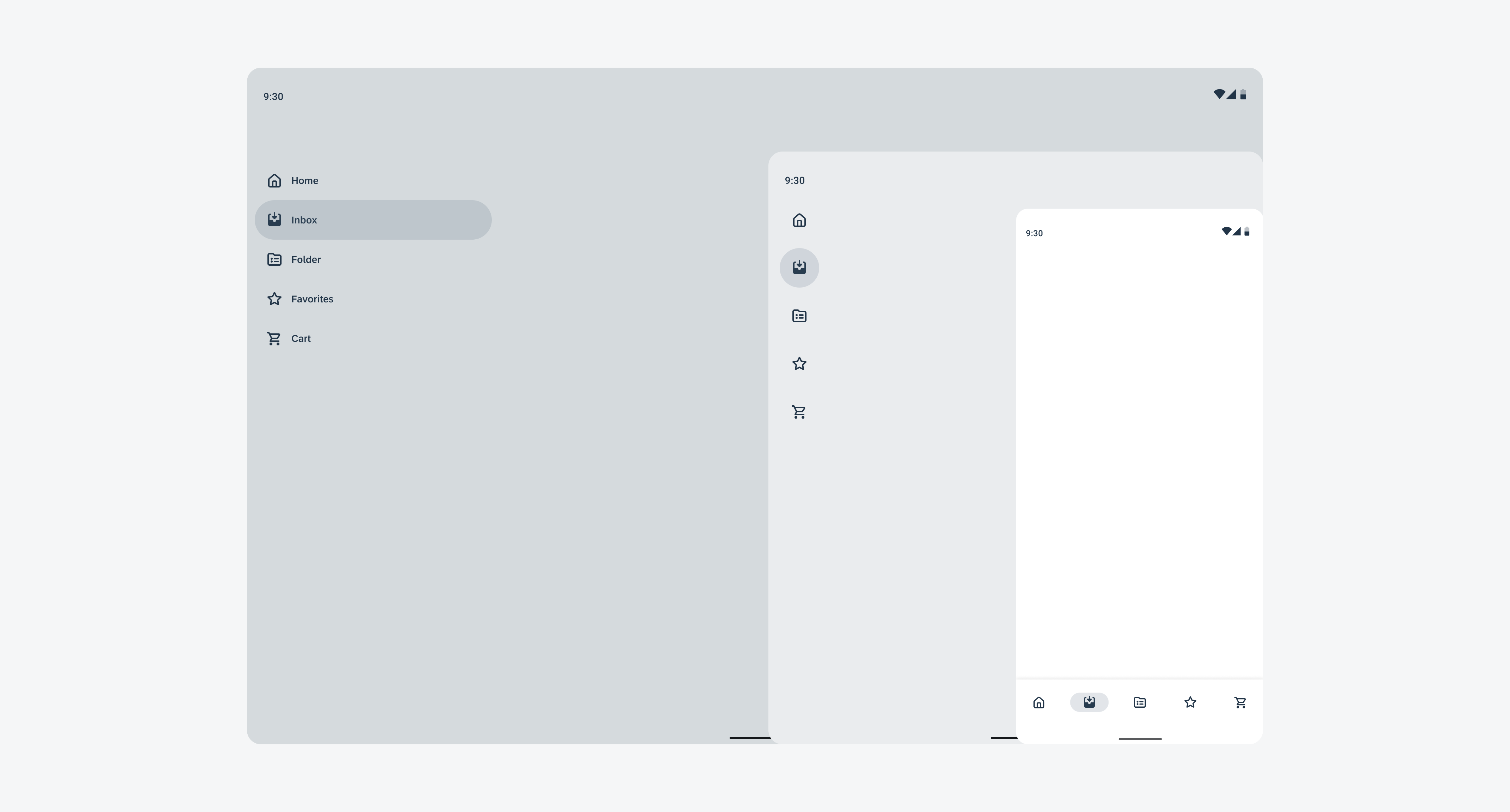
These components help users to navigate between destinations within the app and access important actions. The adaptive navigation feature dynamically swaps out navigation components during runtime as the window sizes change. The scaffolding automation provided by Android automatically adjusts the standard M3 navigation components to fit the relevant breakpoints.

Schematics illustrating the swapping behavior of the navigation components
Profile and Setting
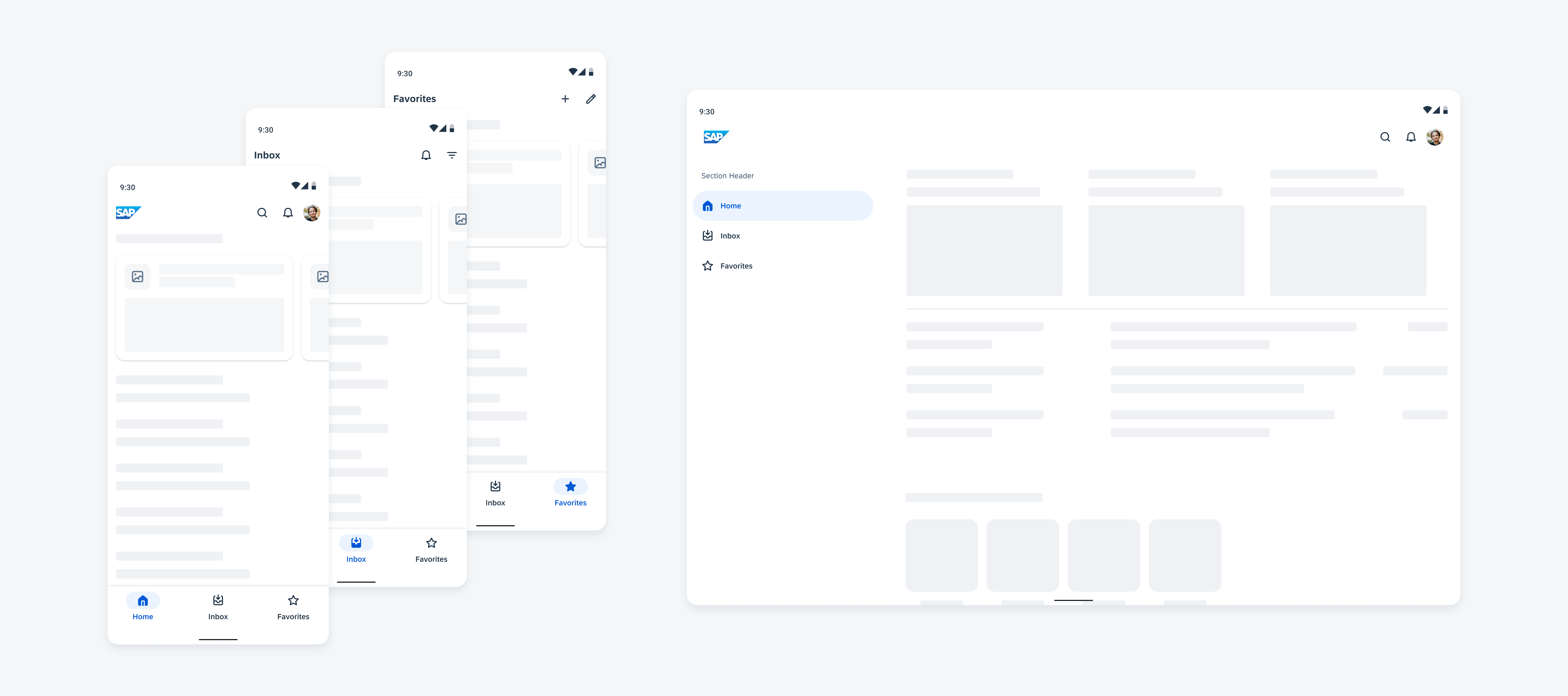
To maintain consistency across all SAP products, the entry point for the user profile and settings is located on the right side in the top app bar. It’s recommended to place the user profile on the home screen only.

Profile placement on compact and expanded window size classes
Dialogs
Dialogs are a type of modal that are used to provide high priority information, display critical information, or ask for specific user actions or decisions. They prompt the user to react and interrupt the process of the application. It is recommended that dialogs have a clear and specific purpose, such as confirming an action or communicating critical details to the user. Dialogs should only be implemented when necessary to avoid disrupting the user experience. Additionally, dialogs should be responsive, adapting to different screen sizes and orientations to provide a consistent experience across devices.
Resources
Development: About Adaptive layouts, Design for Large Screens, Get Started with Large Screens
Material Design: Layouts

 Your feedback has been sent to the SAP Fiori design team.