Layout Basics
Density-Independent Pixels (dp)
SAP Fiori for Android uses a system of pixel units (dp) that allows for a design to scale to screens with different pixel densities. The UI therefore adapts to various device displays regardless of pixel density.
Increment System
SAP Fiori for Android layouts are designed in increments of 4dp and 8dp for smaller elements for scalability purposes. Using an incremental system allows for all measurements in a design to be predictable and easier to scale when designing on multiple devices.

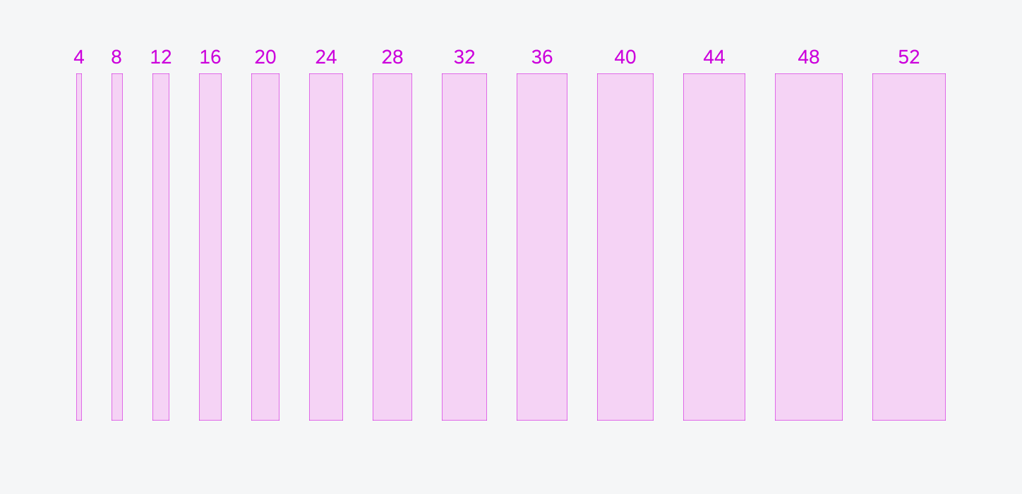
The 4dp/8dp incremental system enables a variety of spacing options from 4dp to 52dp
Spacing
Margins and Padding
Margins are the spaces between the left/right window edge and the component. Typically, these margins are set to 16dp or 24dp, depending on the window size. For larger window size classes, margins can be adjusted more flexibly to improve legibility, similar to the design element of letterboxing.
Padding is the horizontal or vertical space between elements within a component. Padding ensures consistency and allows for easy scalability.
The padding between elements within a component should add up to an increment of 4dp. This height affects the overall vertical layout.

Compact screen size with 16dp margins (left) and medium/expanded screen size with 24dp margins (right)
Spacers
In a layout, a spacer is the space between two panes. Spacers are 24dp wide and can have a drag handle to adjust the size and position of the panes. The touch target of the handle slightly extends over the panes.

Medium/expanded size with a spacer of 24dp to separate the panes
Parts of Layout
For a seamless transition between different window size classes and to provide the user with better orientation, three regions play an important part:
- App Bar
- Body
- Navigation

Schematics illustrating the three main UI regions: app bar (A), body (B), and navigation (C)
Touch Target
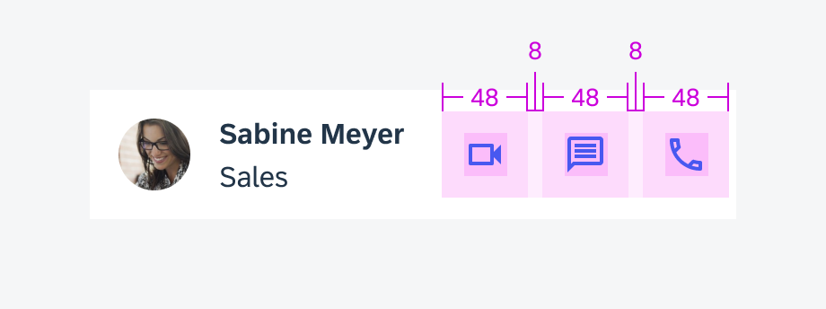
Accessibility is key when designing the spacing of interactive elements. It’s essential to provide sufficient space to place elements, aiming for a minimum touch target size of 48dp x 48dp with 8dp padding between multiple touch targets.

48dp x 48dp touch targets
Resources
Material Design 3: Understanding Layout, Applying Layout

 Your feedback has been sent to the SAP Fiori design team.