
Step Progress Indicator
StepperProgress
Intro
The step progress indicator is a progress indicator for tracking and displaying a user’s state in a user flow. It allows the user to navigate to another step in both the horizontal view and the vertical “All Steps” view.
A step can be displayed as either a regular step or a dynamic step.
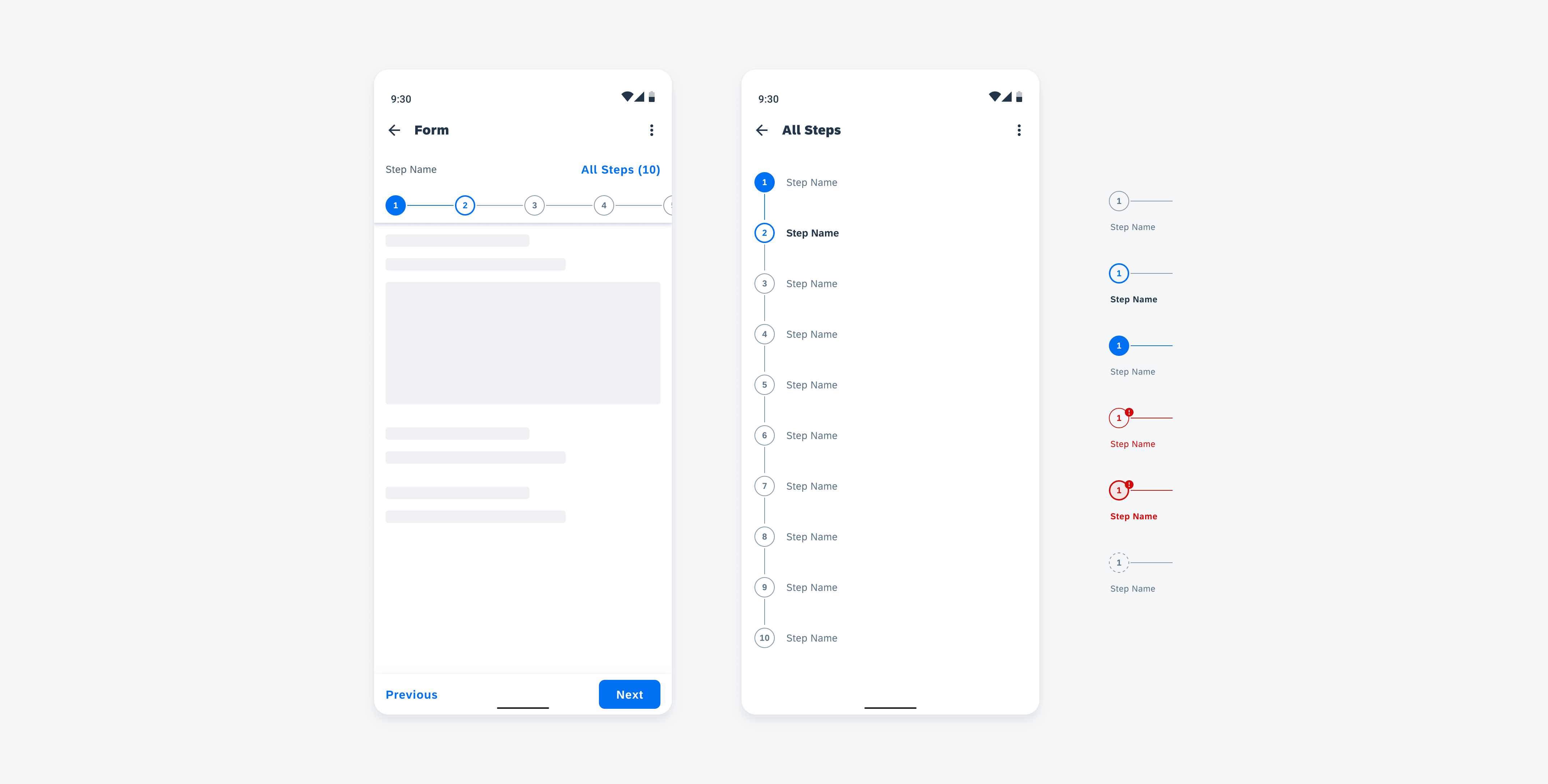
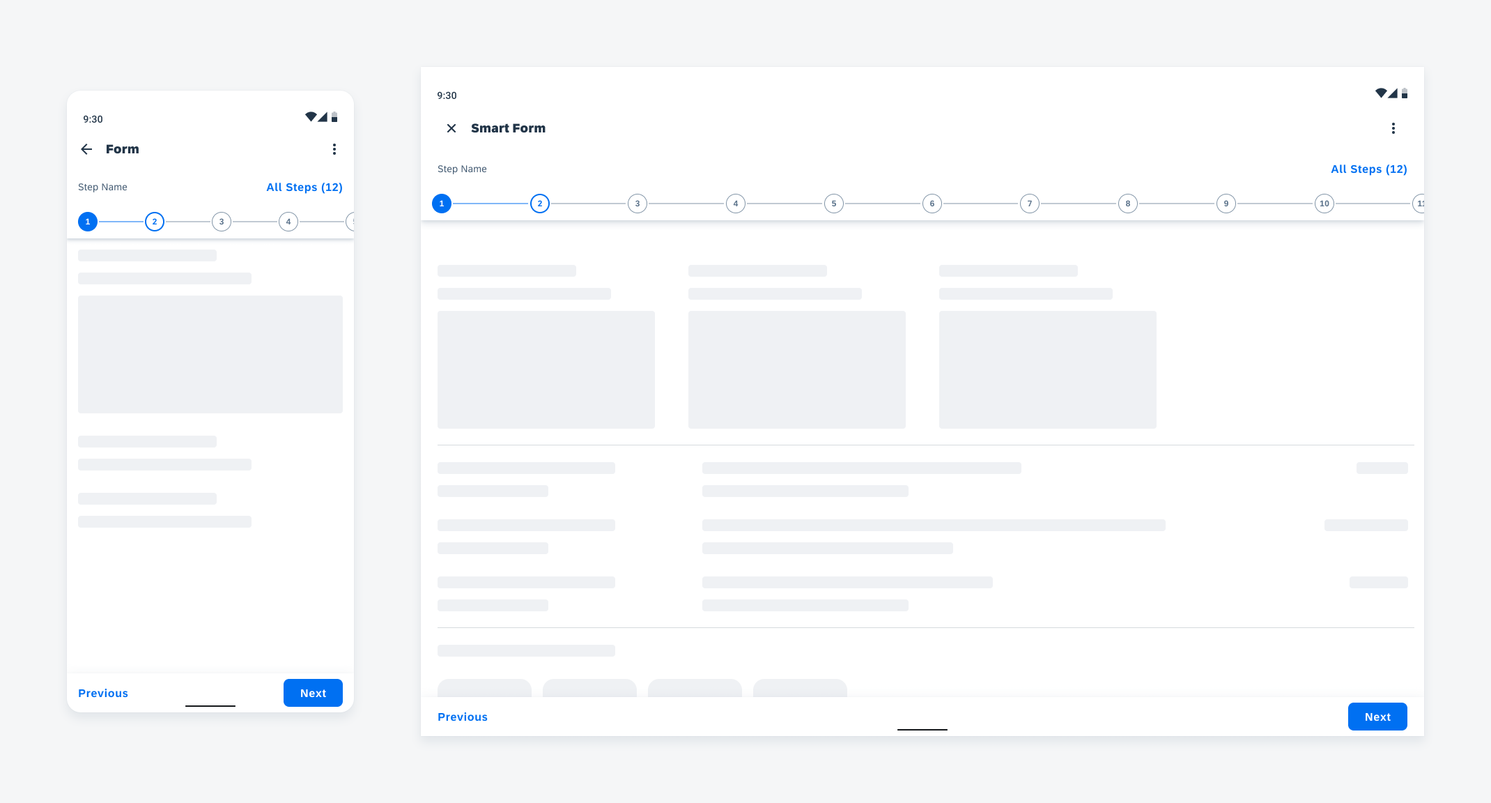
Step progress indicator in horizontal view (left), vertical “All Steps” view (middle), and different states (right)
Usage
- A step progress indicator should at least show two steps.
- Use dynamic steps for sub-steps and steps which are dependent on default steps.
- Displaying a partial view of the last step on the screen for a scrollable step progress indicator is highly recommended.
- Keep step names short – we recommend no more than two lines of text.
- Try to avoid showing both header and step names under step nodes. If the flow is short, try not to use the “All Step” button. Display the full step names in the horizontal view.
- Don’t count dynamic steps in the total number of steps.
- Don’t show a partial view of a step on the screen if the step progress indicator is not scrollable.
Display a partial view of the last step on the screen to indicator more steps
Try not to cut off the edge of the last step on the screen
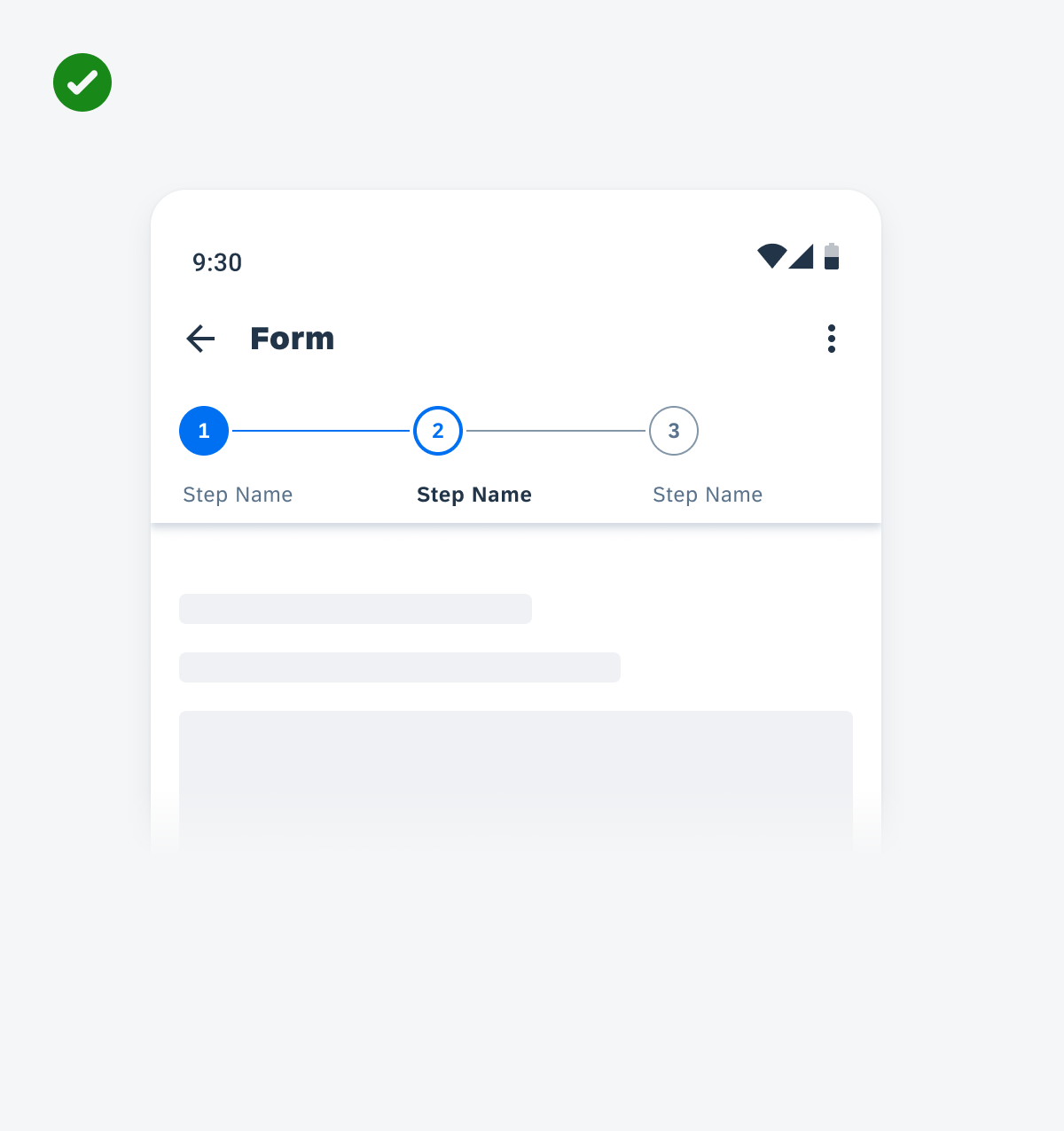
If the flow is short, hide the header and the “All Steps” button. Display the full step names in the horizontal view
Try to avoid showing both header and step names under step nodes. If the flow is short, try not to use the “All Steps” button.
Anatomy
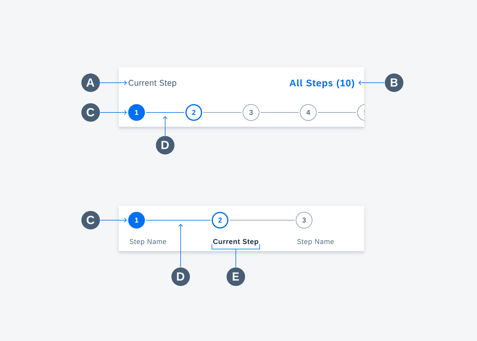
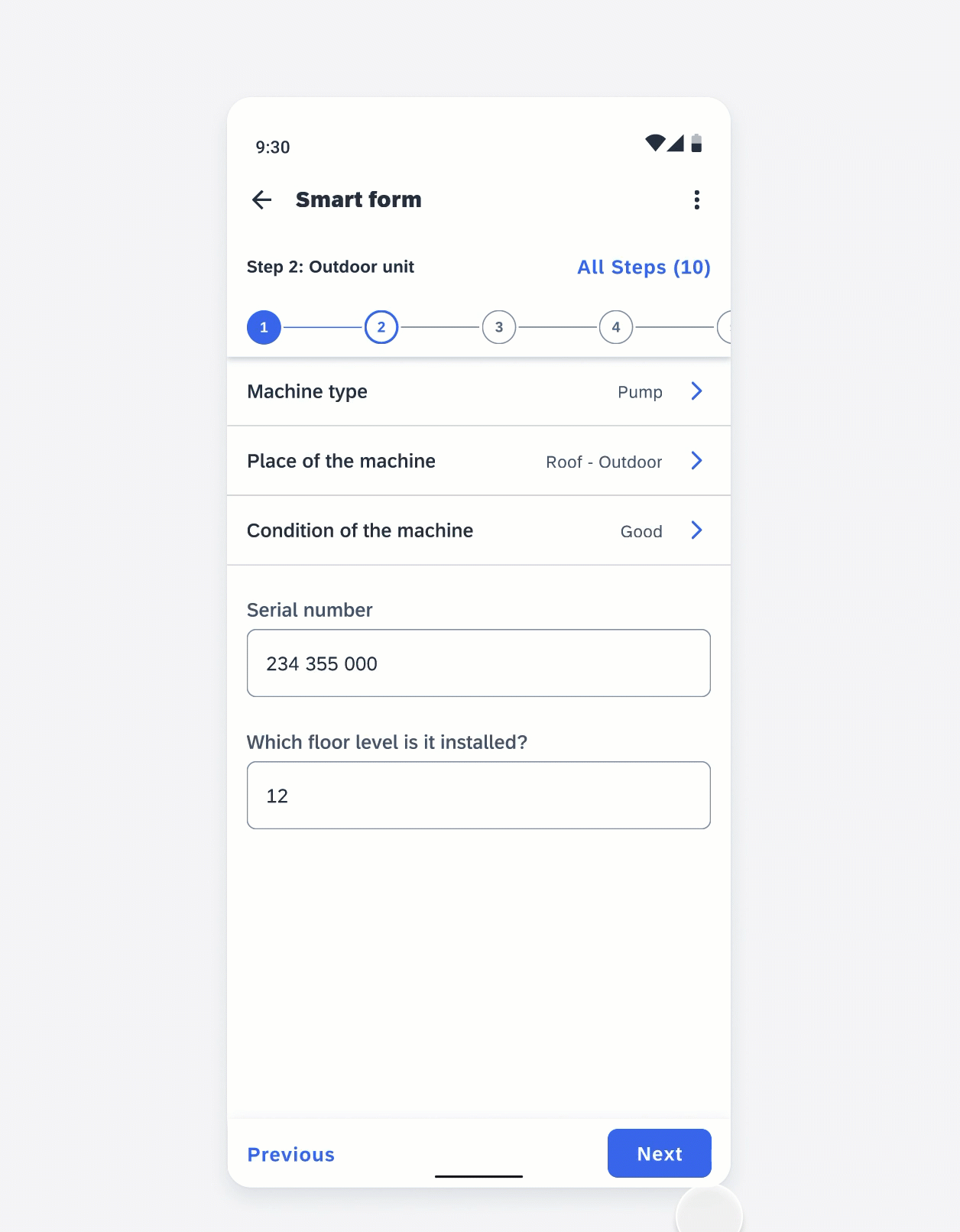
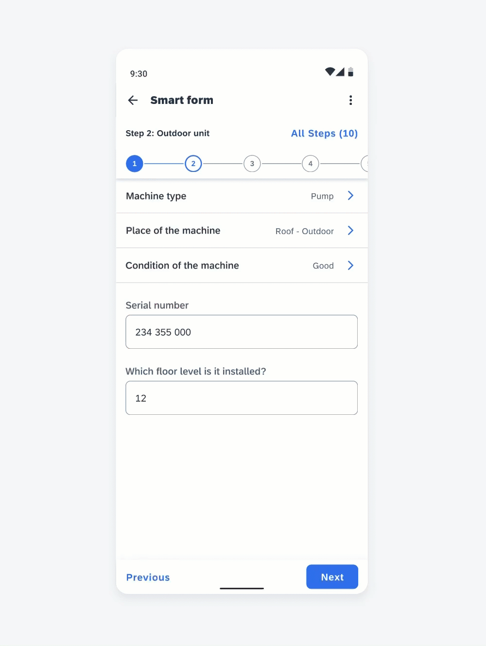
Horizontal View
A. Current Step Name (Optional)
Name of the selected step. Show the current step name in the header if no step names are displayed under the step nodes.
B. “All Steps” Button (Optional)
The “All Steps” button shows the total number of steps and directs users to an overview page of the steps. Show the “All Steps” button when the flow is long.
C. Step Node
The step node is a numeric circle that indicates the sequence of the flow. It also indicates the state of the step. You can also use letters or other simples to replace the number.
D. Line
A line is used to connect the nodes. Don’t use a line after the last node.
E. Step Name (Optional)
The step name of each step is shown below the step node. Only show step names when the header of the current step name is disabled.
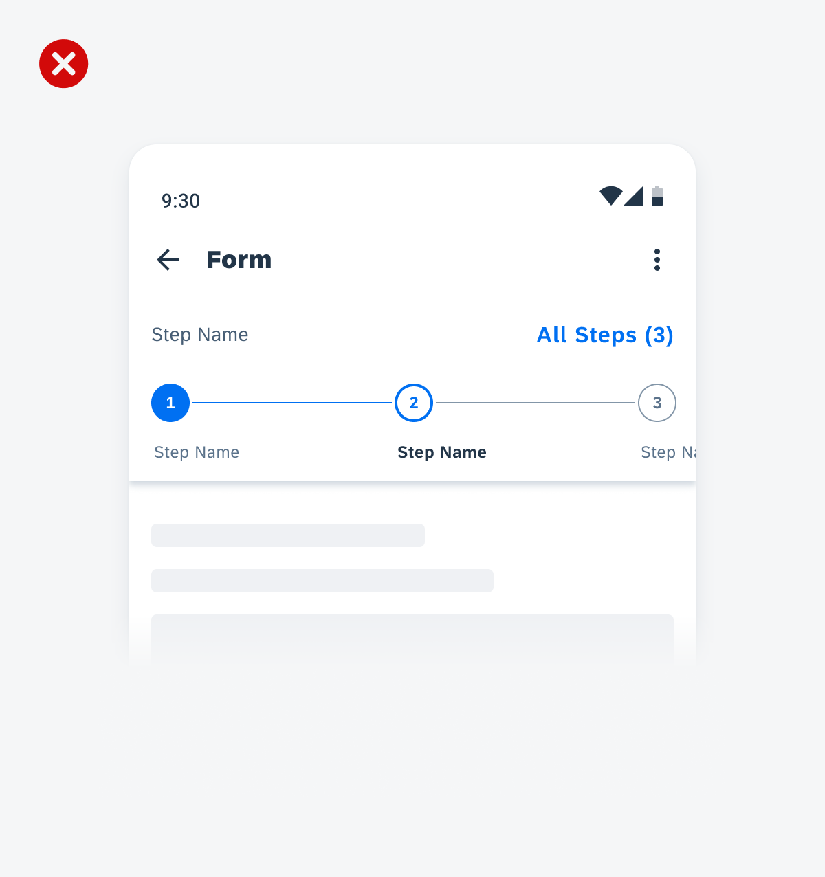
Step progress indicator with a header (top) and without a header (bottom)
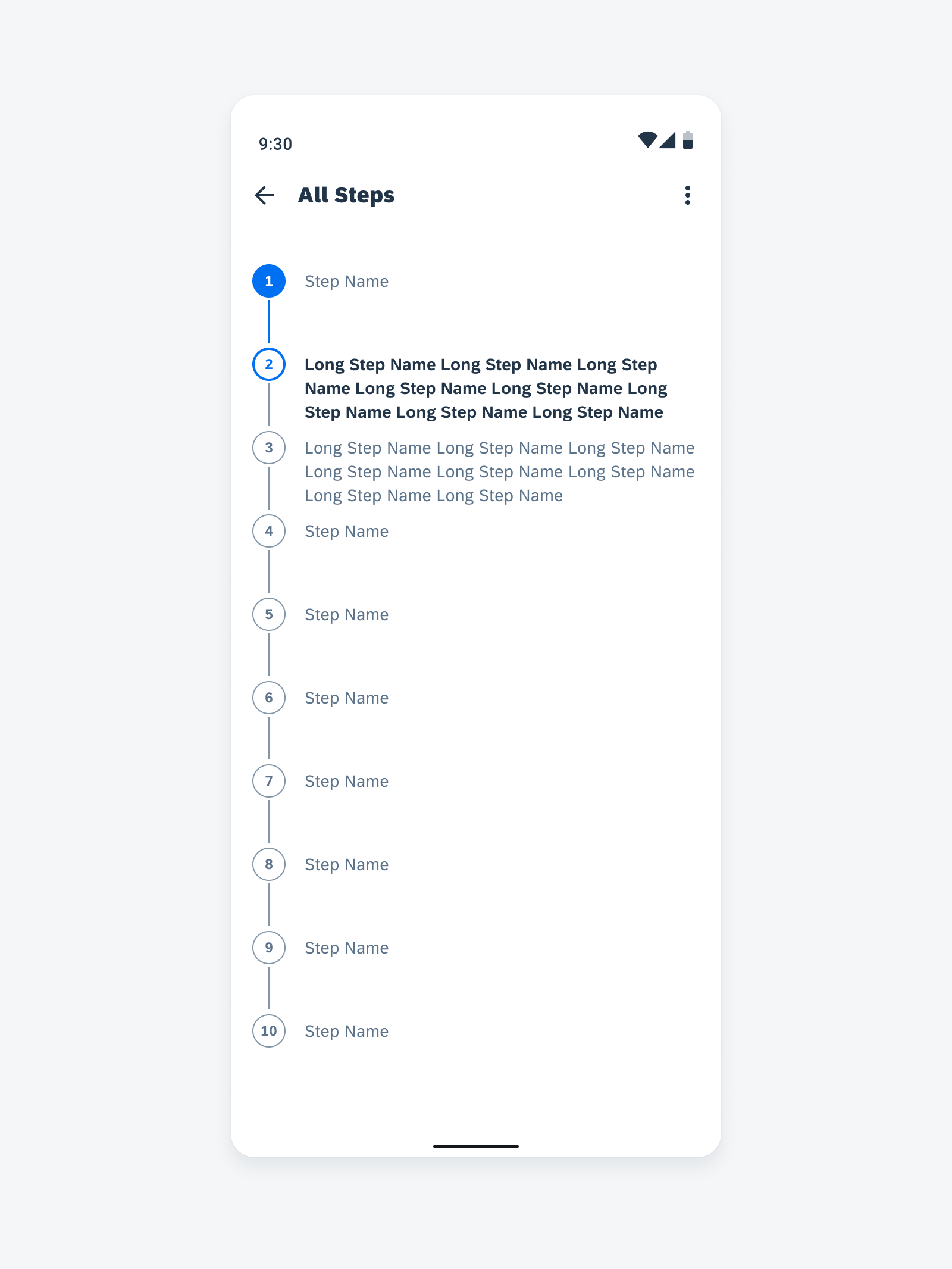
Vertical View
A. Step Node
The step node is a numeric circle that indicates the sequence of the flow. It also indicates the state of the step. You can also use letters or other simples to replace the number.
B. Line
A line is used to connect the nodes. Don’t use a line after the last node. In the vertical view, the length of the line is dependent on the step name text.
C. Step Name
The step name of each step is shown next to the step node. In the vertical view, show the full text of the step name.
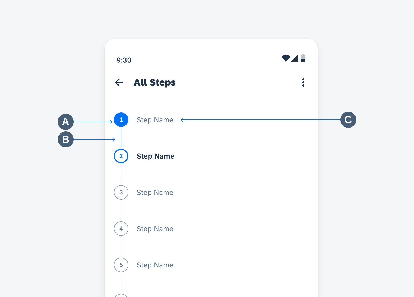
Step progress indicators in a vertical view
Behavior and Interaction
Text Wrapping
In the horizontal view, a step name allows truncation. In a vertical view, a step name allows text wrapping to show the full text. Always try to be concise for the names. Otherwise, it may distract users when they are focusing on the task on the screen.
The current step name truncates after one line. Full text is available in “All Steps” view.
A step name can wrap up to two lines. Adjust the width of the line to allow more space for the text. If any step name is longer than two lines, use the “All Steps” button to allow users to view the full text
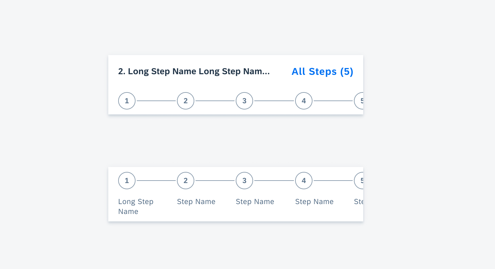
The current step name truncates if it’s two long (top) and the step name under the step node truncates after two lines (bottom).
Show full text of the step name in the vertical view
Value States
Default
Idle state of an enabled step.

Default state of a horizontal step (left) and a vertical step (right)
Active
Selected state of a step.

Active state of a horizontal step (left) and a vertical step (right)
Complete
Triggered when required actions are complete and users have navigated to another step.

Complete state of a horizontal step (left) and a vertical step (right)
Error
Triggered when users already navigated to another step but required actions of this step are incomplete.

Error state of a horizontal step (left) and a vertical step (right)
Error Active
Triggered when users tap on a step that has incomplete required actions.

Error active state of a horizontal step (left) and a vertical step (right)
Read-Only
A read-only step is a step that is not tappable.

Read-only state of a horizontal step (left) and a vertical step (right)
Navigation and Interaction
Tap on the Node
When users tap on a step indicator node, they are navigated to this specific step.
If the step is already on the screen, the step node stays without moving.
If the user scrolls to tap a step beyond what was on the screen, the selected step is displayed as the first step in the indicator.

When users tap on a step indicator node, they are navigated to this specific step
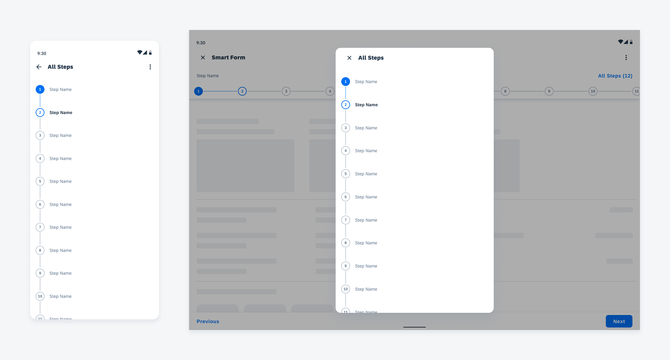
View All Steps
Users can tap on the “All Steps” button to view all steps vertically on a new screen.
If the user taps on a step from the “All Steps” list, they are navigated to the selected step. The selected step is displayed as the first step in the indicator.
Users can tap on the “All Steps” button to view all steps vertically on a new screen
Scrolling
Users can press and scroll left or right on the step progress indicator to view steps that are outside the screen. The indicator automatically comes back to the active step when users tap anywhere on the screen.
Users can scroll left or right on the step progress indicator to navigate to another step
Variations
Dynamic Steps
Dynamic steps are used to indicate a sub-step or an indeterminate step. Same as regular steps, dynamic steps also have different value states: default, active, error, error active, and read-only.
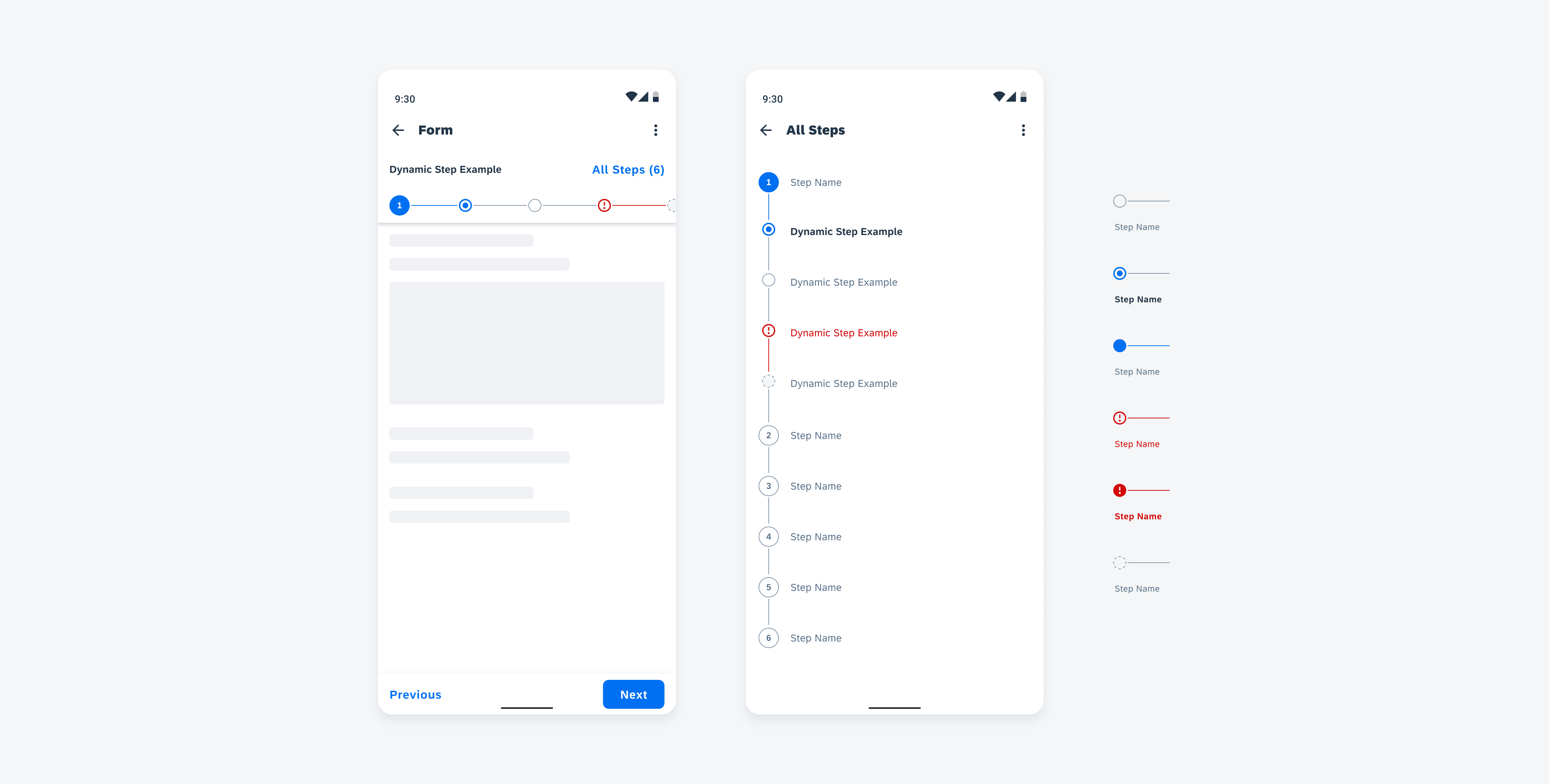
From left to right: dynamic steps in horizontal view, dynamic steps in vertical view, and dynamic steps in different states
Adaptive Design
A step progress indicator can adapt to both mobile and tablet sizes. For the tablet version, the horizontal step progress bar can have broader width for each step than the mobile version, and the “All Steps” view is displayed in a dialog window.
Horizontal view on mobile (left) and tablet (right)
"All Steps” view on mobile (left) and tablet (right)
Resources
Development: StepperProgress
SAP Fiori for iOS: Step Progress Indicator
SAP Fiori for Web: Wizard Floorplan
Related Components/Patterns: Header, Persistent Footer, Dialog
 Your feedback has been sent to the SAP Fiori design team.