
What’s New
This article provides an overview of the topics that have been added or changed based on the controls available in the SAP BTP SDK for Android.
SAP BTP SDK for Android 24.8
UI Components
Attachment Form Cell
Feature Enhancements! The attachment form cell now supports disabling upload when the user has reached the allowed number of attachments, disabling deleting a specific attachment when the user does not have permission and an optional footer.
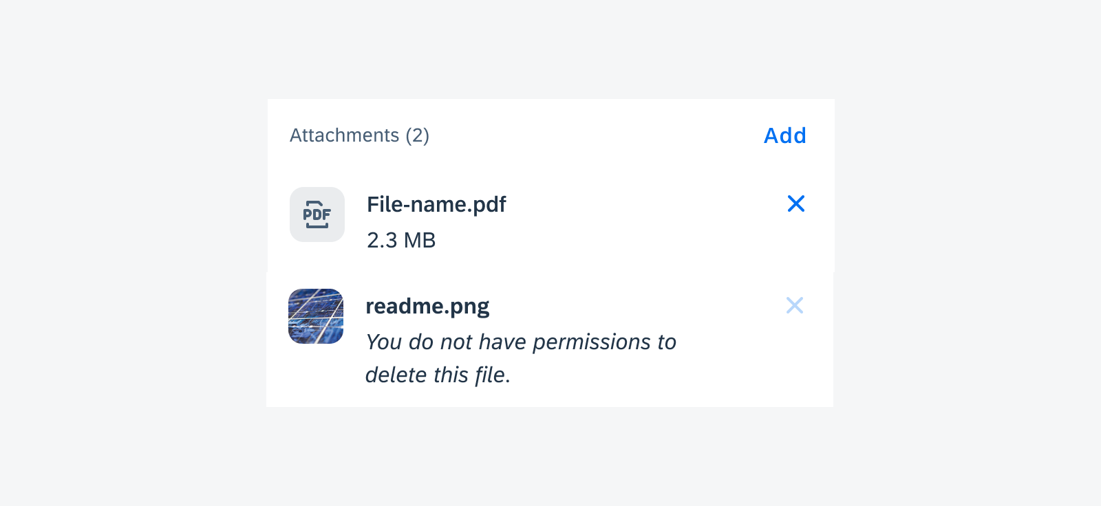
Disabled “Delete” icon with hint text in attachment form cell
Card Footer
Feature Enhancements! The card footer now allows using an overflow button if there are more than two buttons or when the buttons do not fit into the footer’s width. Tapping on the overflow button shows the user the additional buttons in a menu.
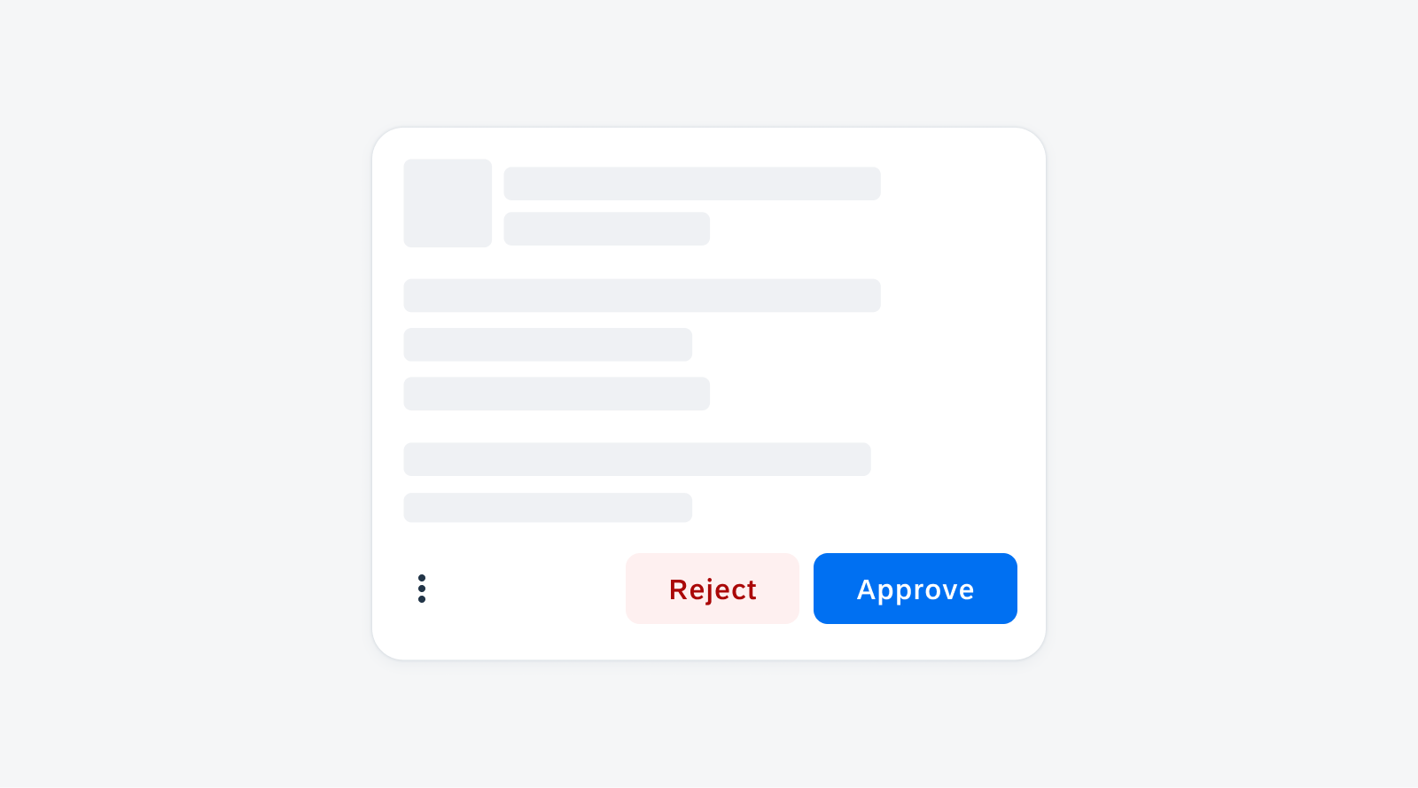
Card footer with an overflow button
Date & Time Picker Form Cell
Feature Enhancements! The date time picker form cell has been visually redesigned to display unique icons for the different picker form cell types. These icons help the user quickly understand which value can be selected. In the date and time picker form cell variant, the date value and time value can be set separately. Additionally, a required field indicator has been added.
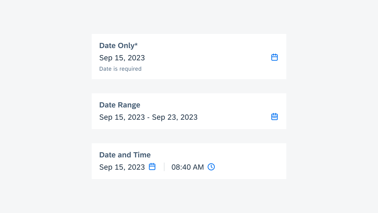
Date and time form cell variants
FAB (Floating Action Button)
New Component! The floating action button or FAB is a button variant that displays the most prominent action on screen. It is typically placed on the bottom corner of the screen, but it can also be placed in the center and remains persistent as users scroll through content.
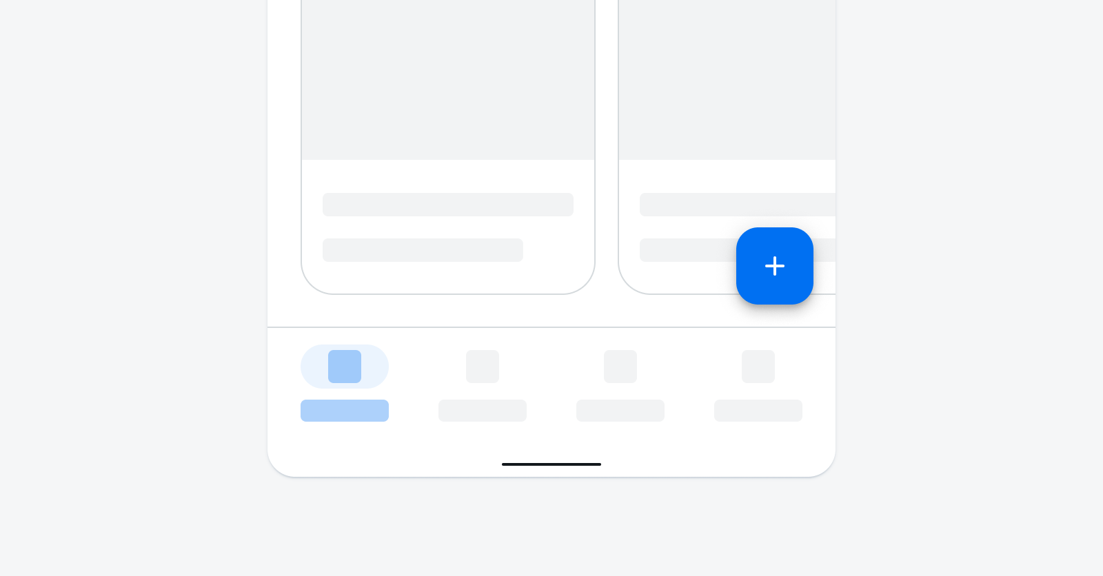
FAB in compact screen size
List Picker Form Cell & Signature Form Cell
Feature Enhancements! An asterisk in the form cell label can be used to indicate the field is required. If the user does not enter or select a value, an error state will be triggered.
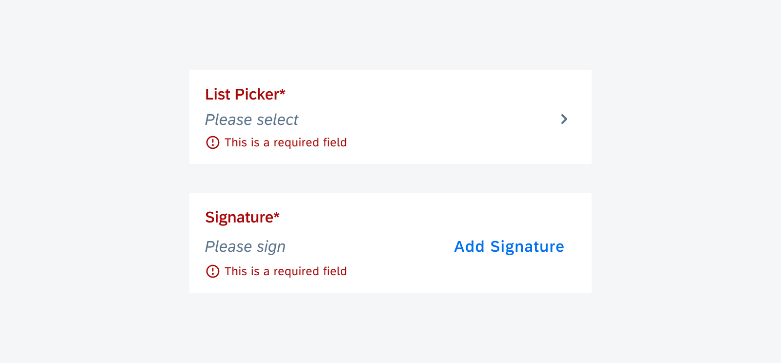
Required list picker form cell and signature form cell in error state for null value
Patterns
Illustrated Message
Feature Enhancements! A second action button can be used in the illustrated message. The button type(s) can be chosen from the existing SDK buttons.
llustrated message with two action buttons
Resources
SAP Fiori for Android
Design Kit 24.8
Updated Figma Design Kit with new components and enhancements for this release, including:
- New Updates page documenting release updates in the Design Kit
- Dark Theme example screens added to each component page
SAP BTP SDK for Android 24.4
Updates to Guidelines & Design Kit
New Release Naming Convention
Starting in 2024, the SAP BTP SDKs for Android and iOS have changed their release naming from “Major.Minor.Patch” format to “Year.Month.Patch” format. For example, a release in April 2024 is called 24.4.0. The first patch for this release will be named 24.4.1, the second will be named 24.4.2, and so on. If the release gets delayed by a month to May, it will be named 24.5.0.
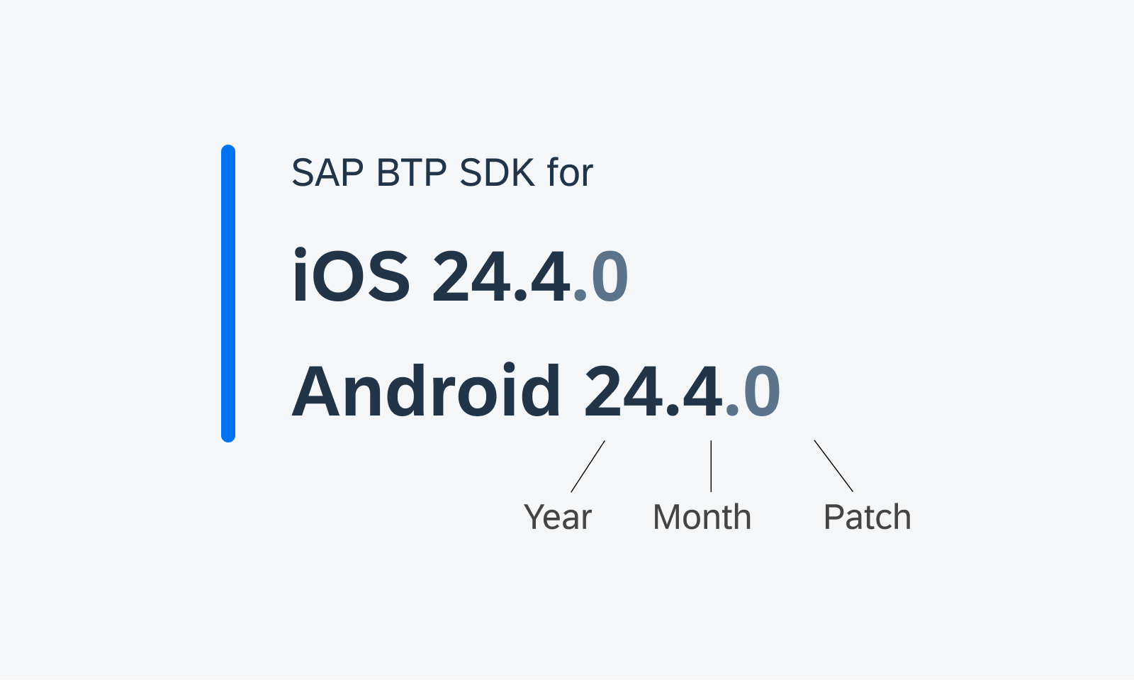
New naming convention for SDK versions
Design Kit Revamp
Updated Design Kit! The SAP Fiori for Android 24.4 Design Kit (formerly known as “UI Kit”) has undergone significant changes, including variables, page hierarchy, in-page layout, and component enhancement.
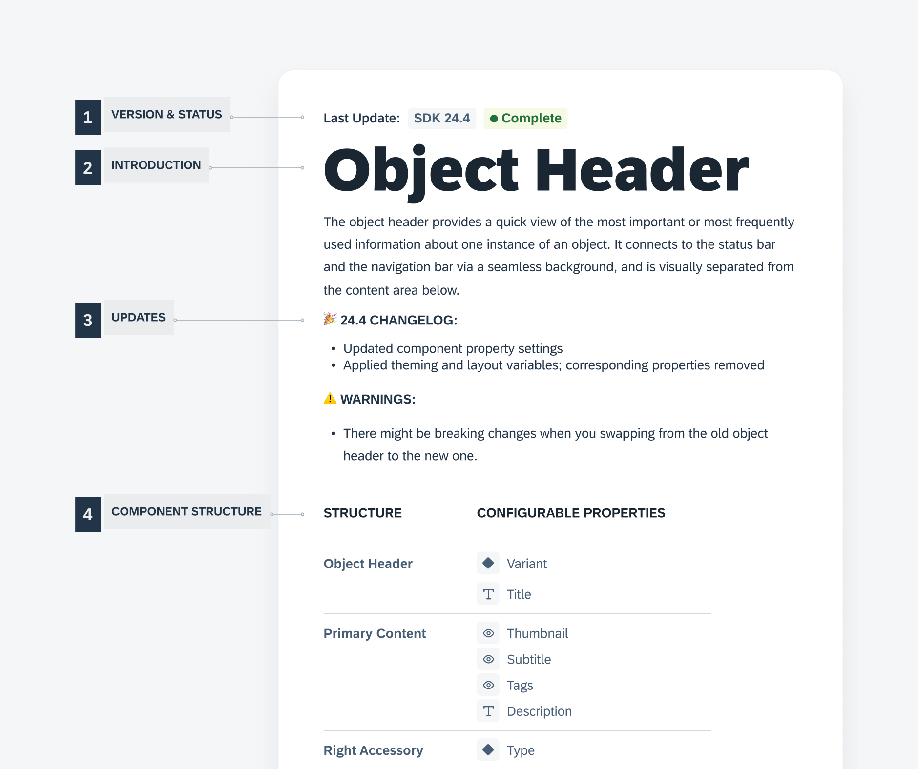
Enhanced Design Kit
Foundation
Layout – Window Size Classes
New! Following the M3 update, we introduced window size classes to the SAP BTP SDK for SAP Fiori for Android. Window size classes are recommended breakpoints that provide universal responsiveness regardless of the device types and sizes.
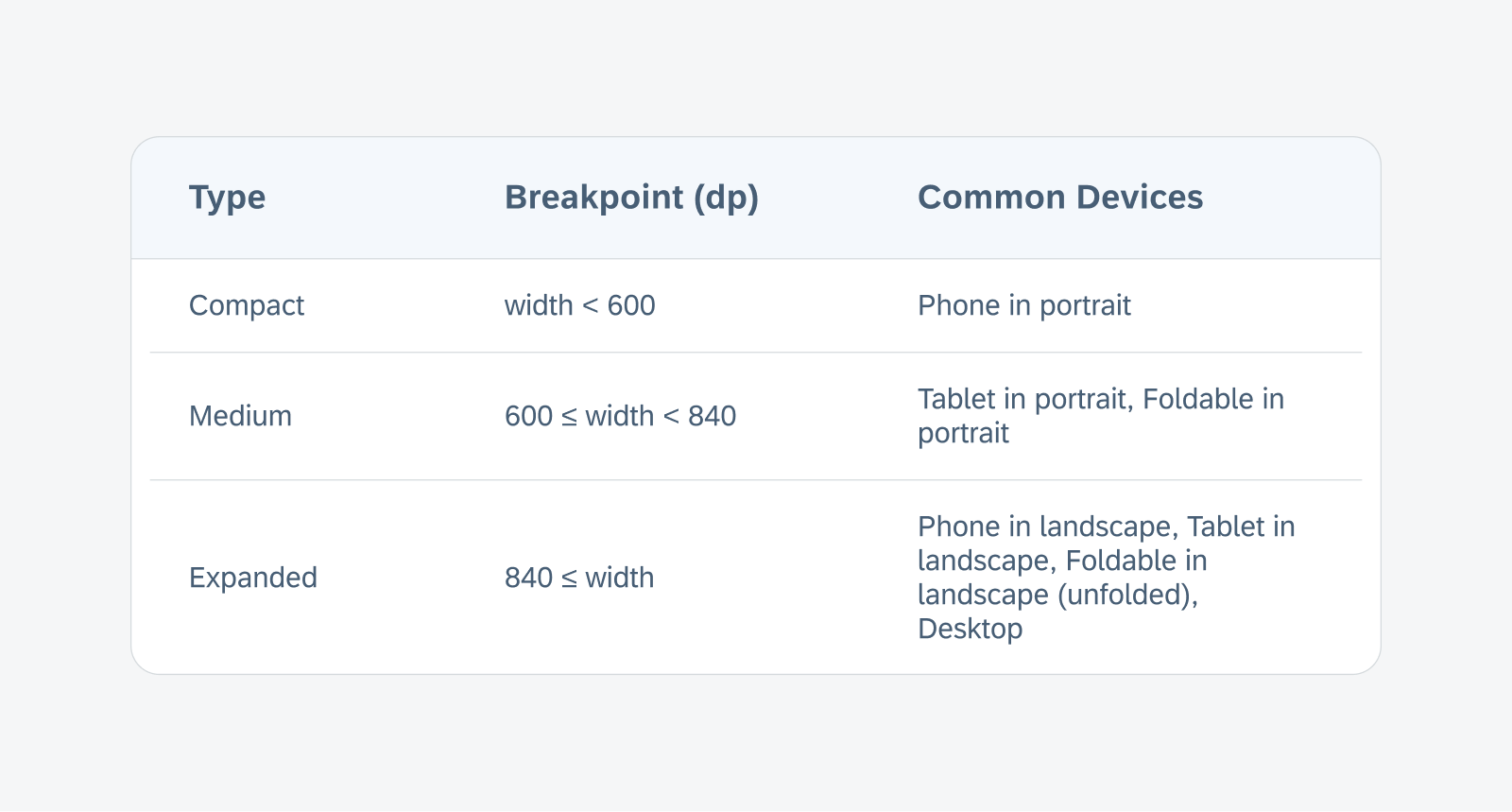
The breakpoints of the window size classes based on the window width
UI Components
Attachment Form Cell
Redesigned Component! The attachment form cell, formerly known as attach, has a redesigned attachment grid view to support additional file information and attribute text below the thumbnail. The enhanced list view now also supports a second line of text for additional file information and attribute label to the right.
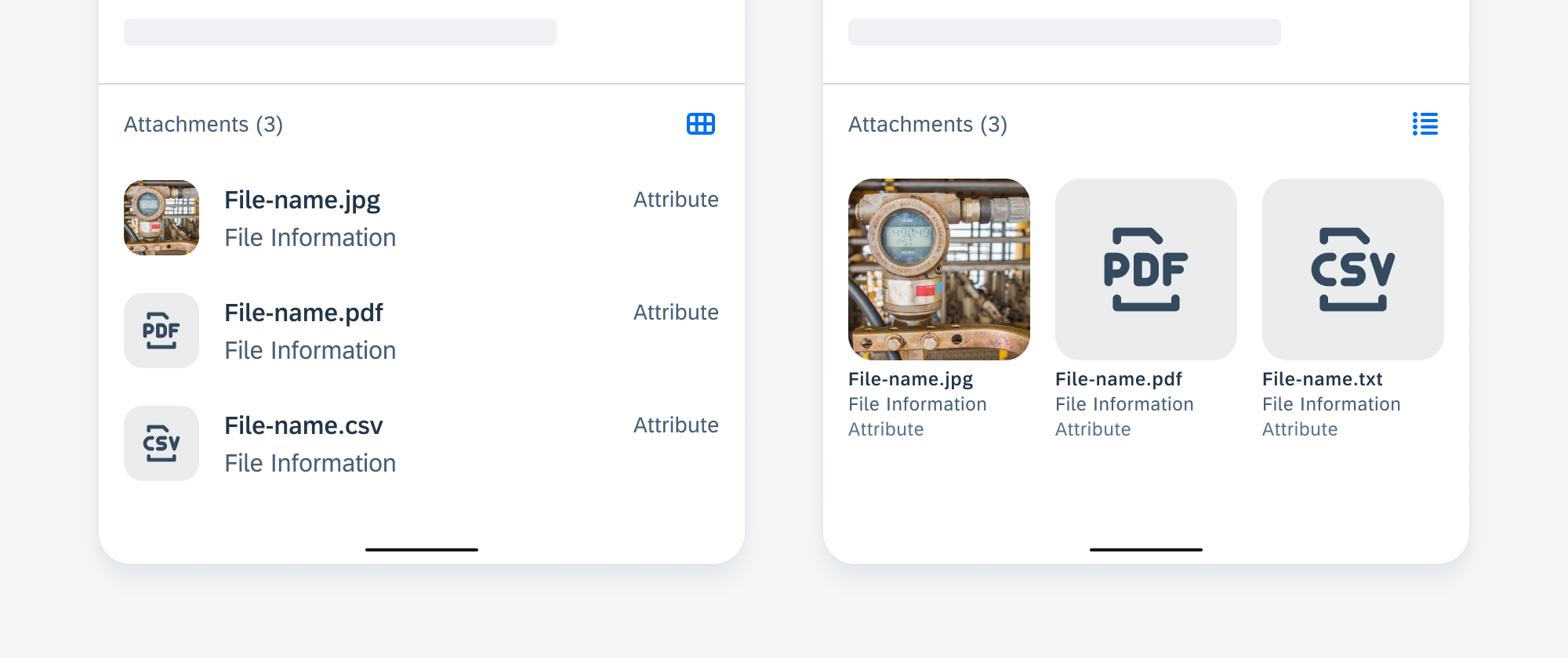
List view (left) and grid view (right)
Calendar
Feature Enhancements! The calendar component now comes with two new features: status indicators and alternate calendar. Status indicators paired with a legend can be used to indicate dates with specific events or a status. An alternate calendar can be displayed with the primary calendar on the same frame. See Status Indicators and Alternate Calendar for more details.
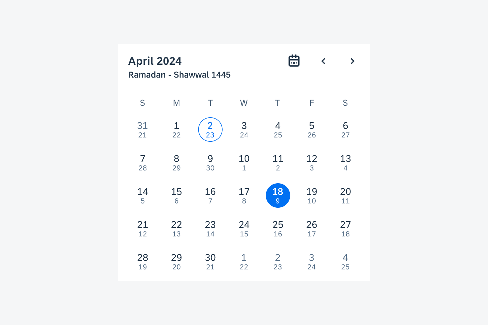
Sample calendar view with alternate calendar
Cards & Layouts
Feature Enhancements! Skeleton loading is now available for cards. There are three sizes based on the card blocks, allowing you to select a card size that approximately reflects the loaded card size. See Skeleton Loading.
To provide better user feedback, a user-triggered feedback indicator (progress indicator) has been added, which provides a response or confirmation after a user takes an action on the card. See User-Triggered Feedback Indicator.
Additionally, we have added scroll snapping behavior to the carousel layout, where cards always snap into place at specific, predefined positions during scrolling, rather than scrolling freely. See Scroll Snapping.
Skeleton loading on a small (top left) and medium card (bottom left), and user-triggered feedback indicator on card (right)
Circular Progress Indicator – Checkout Use Case
Feature Enhancements! Checkout use cases are processing states triggered by user actions. It can be either a full screen loading or partial loading. An indeterminate circular progress indicator and overlay are used to prevent further user actions on the loading content.

Partial loading example with a circular progress indicator on top of a card
Filter Feedback Bar
Feature Enhancements! The filter feedback bar has undergone a major redesign, with updated chip style and functionalities. An optional filter counter chip can be used to indicate the total number of active filters. A filter chip with a down-arrow trailing icon indicates that an extended action is available.
Sample filter feedback bar with new features
KPIs
Updated Component! The value section can support two values with a combination of numbers, prefixes, and suffixes, such as “15hr12mins”.
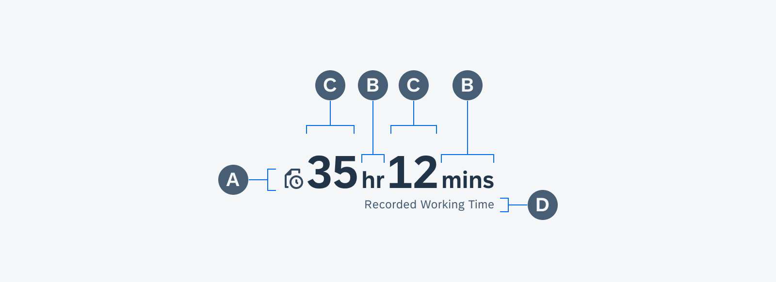
Anatomy of a KPI with icon and two values combined with suffixes
List Picker Form Cell
Feature Enhancements! A reset button can be used to revert the selection to a default value in the list picker selection view. The enhanced section header and button allow for customized actions.
Multiple value lists with custom sections
Patterns
Skeleton Loading
New Pattern! Skeleton loading is a progress indicator that is used when a screen is loading. It is best used when the structure and layout of a container are known, such as a page or card, and when the system requires time to fetch and display the actual data.
Skeleton loading example for a list
Sort and Filter
Updated Pattern! The updated sort and filter dialog has a new button arrangement that is more consistent with iOS design, with the “Reset” action moved to the top right, and the “Show N Results” button at the bottom left. A subtitle in the top app bar can be used to indicate the number of results based on current filter settings.
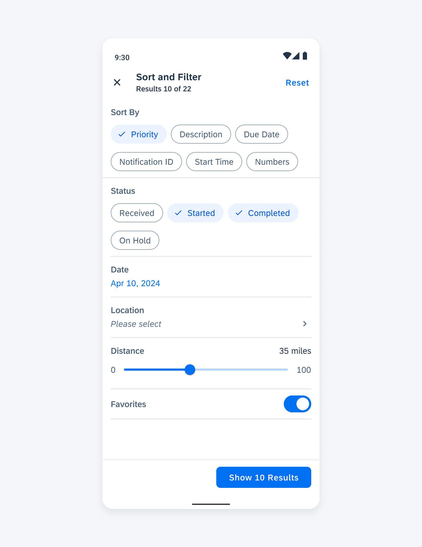
Sample sort and filter dialog with updated features
Resources
SAP Fiori for Android
Design Kit 24.4
Updated Figma Design Kit with new components and enhancements for this release, including:
- UI Kit renaming to Design Kit
- Major revamp of Design Kit with enhanced page layout hierarchy, more detailed in-page layouts, improved configurability of component properties, new variables for switching color modes, semantic colors, and accent colors
 Your feedback has been sent to the SAP Fiori design team.