
What’s New
This article provides an overview of the topics that have been added or changed based on the controls available in the SAP BTP SDK for Android.
SAP BTP SDK for Android 24.12
Design Kit
New Updates via Branches
Updated Design Kit! We’ve transitioned from creating new versions as separate files to updating within the same file using branches. This change ensures a single source of truth, improves collaboration, and simplifies version control by keeping all updates centralized and organized in one place.
SAP Fiori for Android Design Kit
Foundation
Color System – Elevation
New! The Elevation article goes into the details, visual cues, examples, and usage of the elevation system.
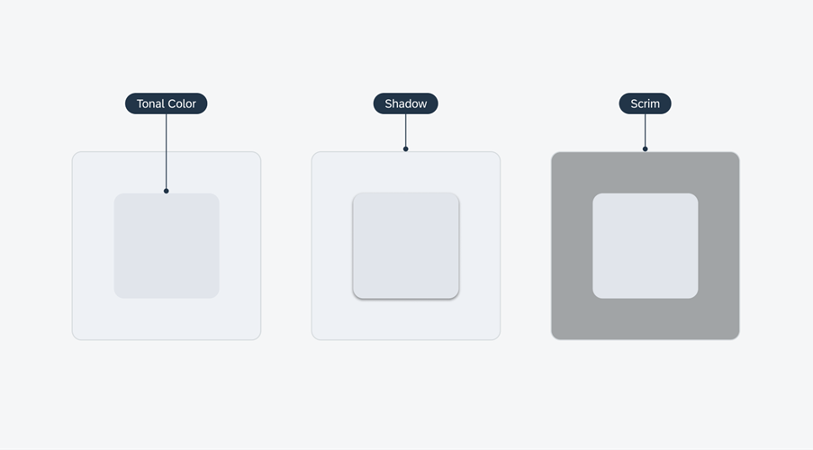
Elevation techniques: tonal color, shadow, and scrim
UI Components
AI Button
Guideline Enhancements! The AI Button guideline article now includes best practices for using the icon-only AI button variant.
Icon-only AI button placed in object cells
AI Acknowledgement
Guideline Enhancements! The guideline now includes best practices for using the AI Acknowledgement in an onboarding and in-app service update scenario.
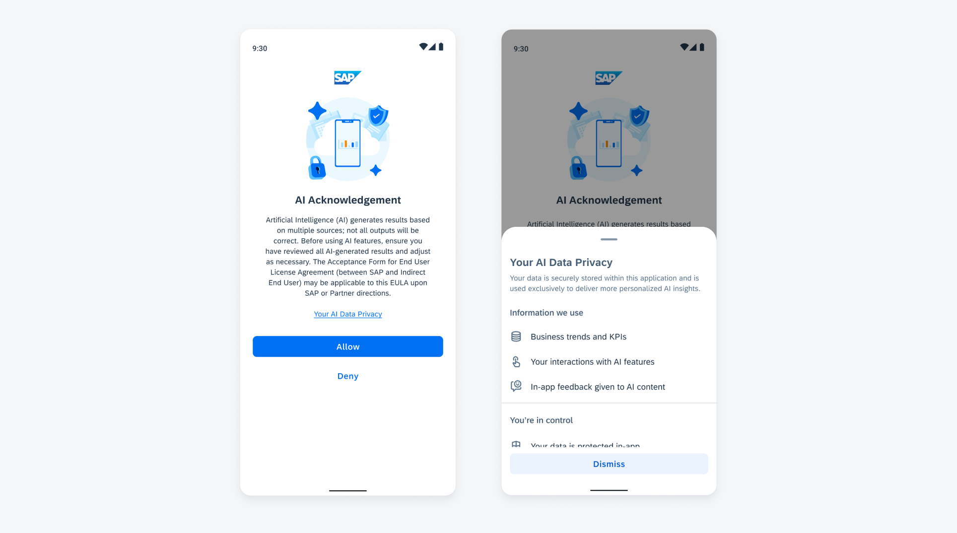
AI Acknowledgement in onboarding
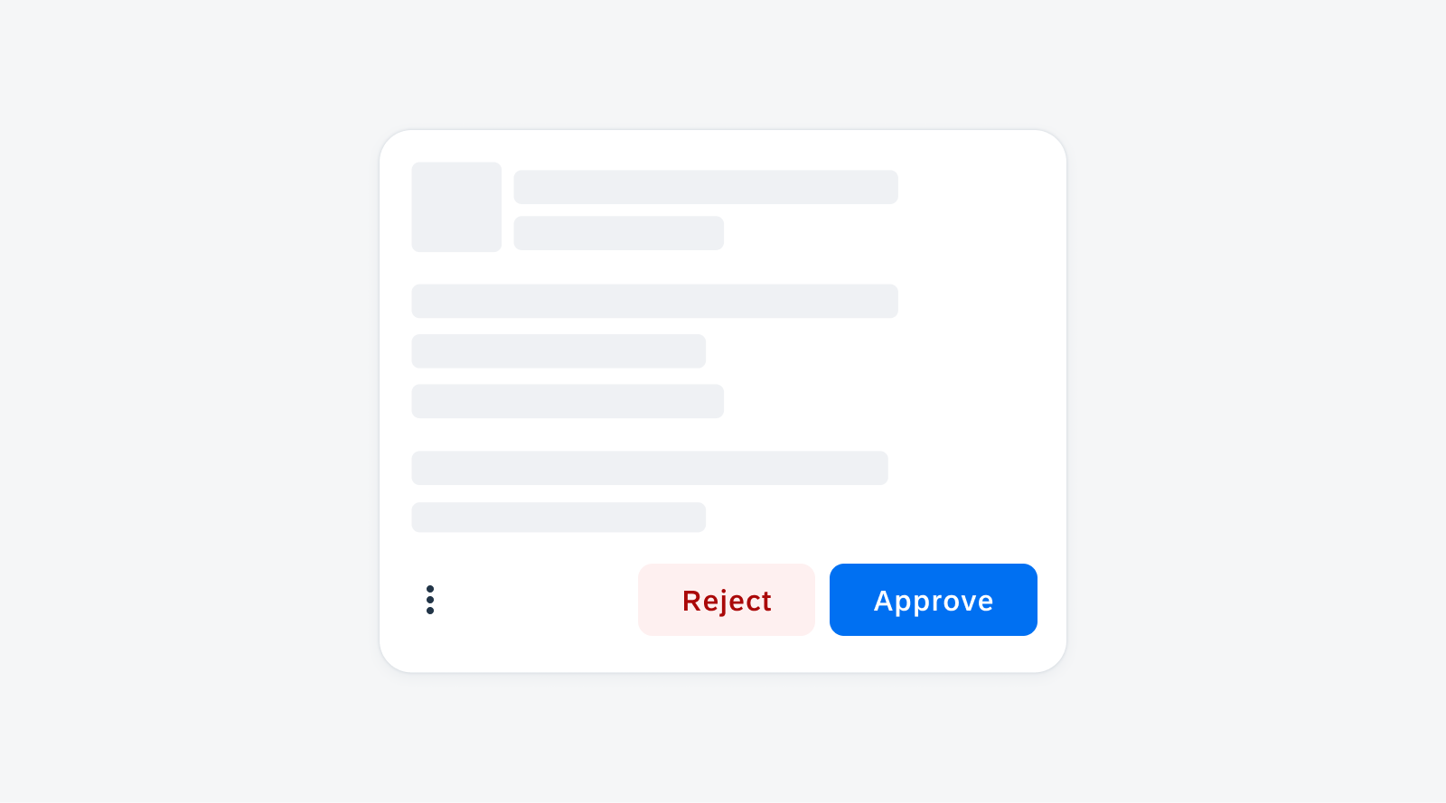
Attachment Form Cell
Feature Enhancements! The attachment form cell can now indicate mandatory fields with an asterisk. If the user doesn’t upload a file, the attachment form cell displays an error state. An optional helper text has also been introduced.
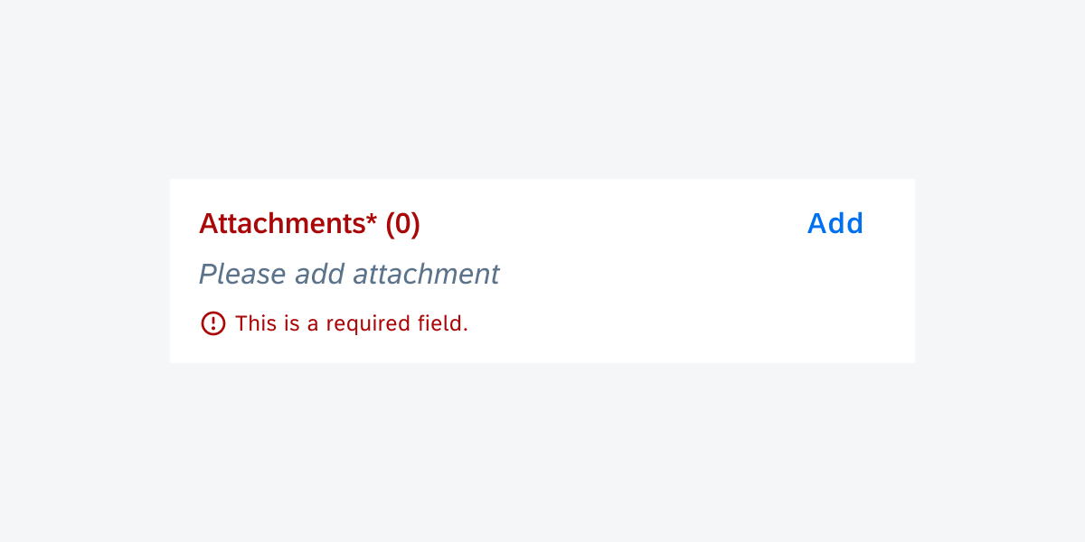
Attachment form cell in error state
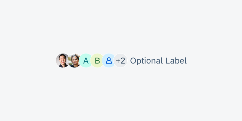
Avatar and Avatar Group
Feature Enhancements! A short label can now be displayed together with the avatar group to provide descriptive information. For better visibility, the avatar group now also offers avatars with a size of 24dp in addition to the default 16dp.
Avatar group with trailing label
Buttons
Feature Enhancements! The loading state can be applied to a button when a user-triggered non-disruptive progress is being processed. The original icon and/or text is replaced with an activity indicator and/or loading message.
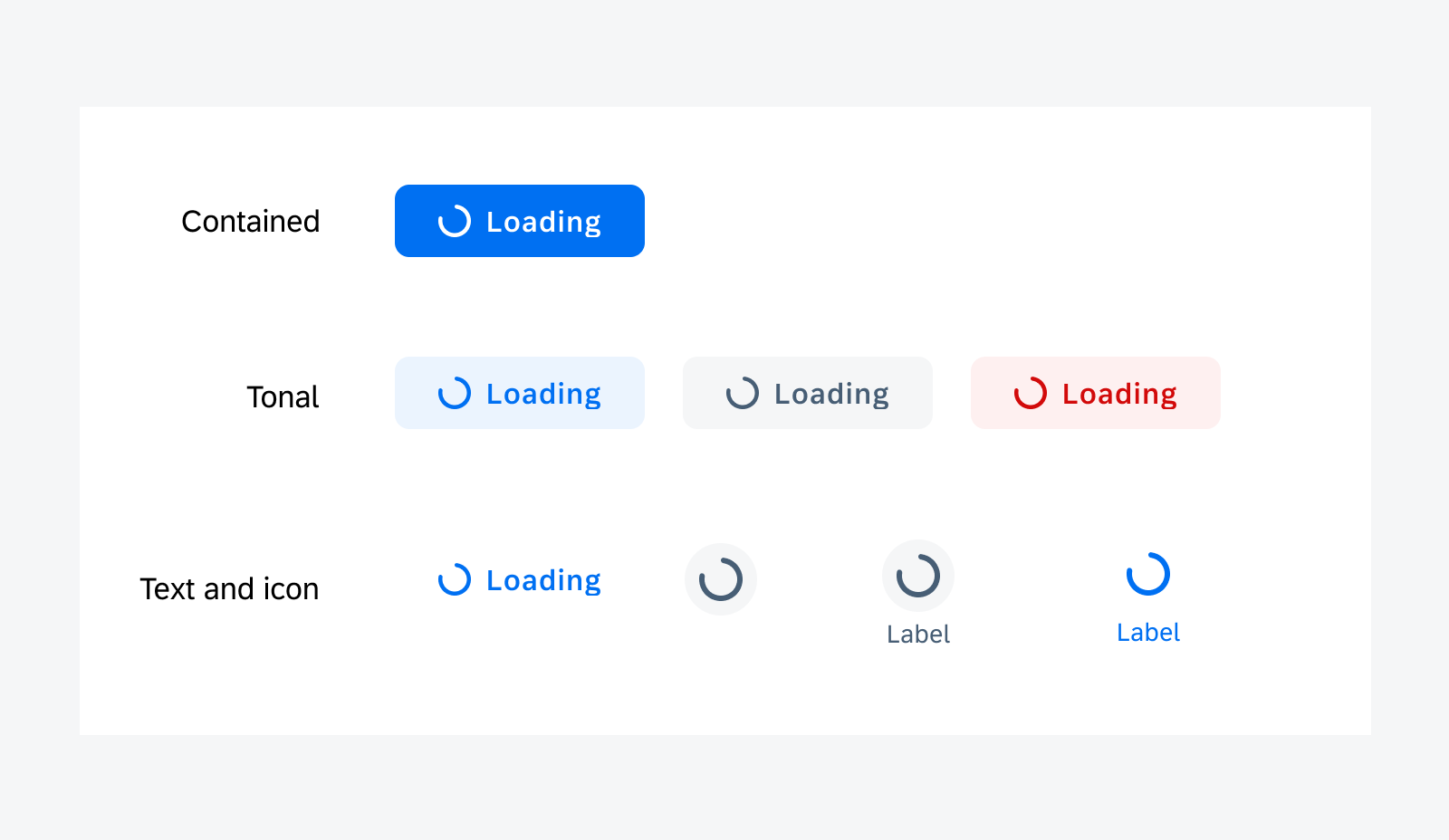
Loading buttons
Chips
Feature Enhancements! The chip form cell now supports adding a mandatory field indicator.
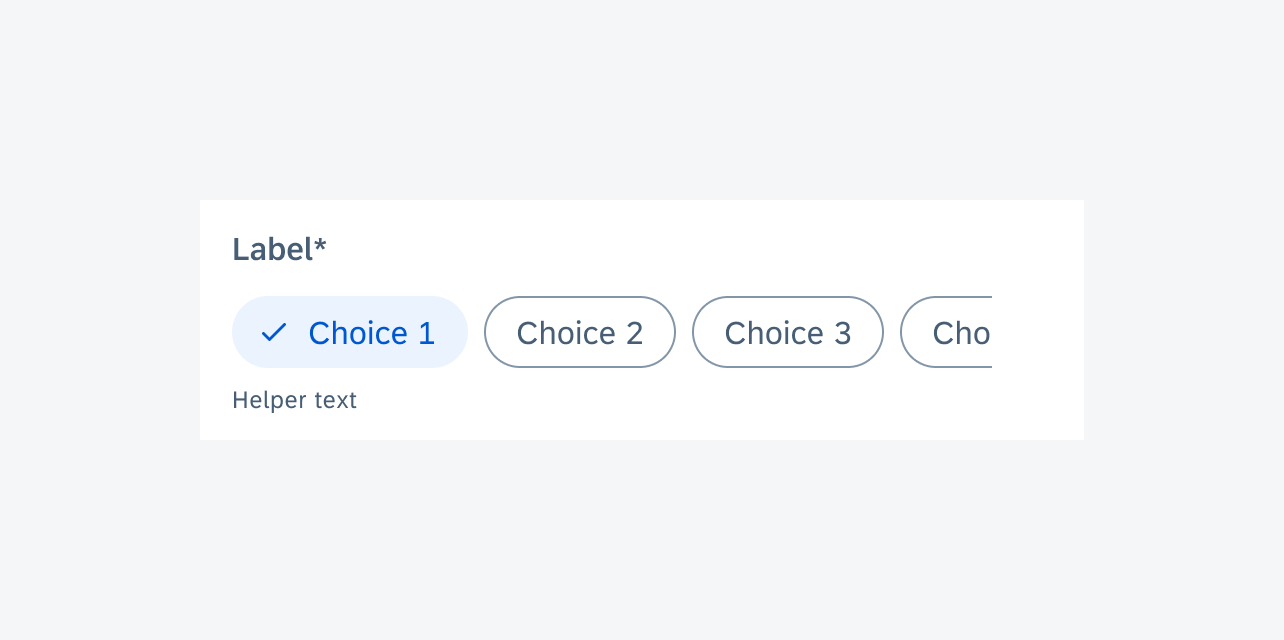
Chip form cell with required field
Circular and Linear Progress Indicator
Updated to M3 Style! The circular progress indicator and linear progress indicator components have been updated to integrate the lasted Material 3 styles. This update enhanced the accessibility for both components.
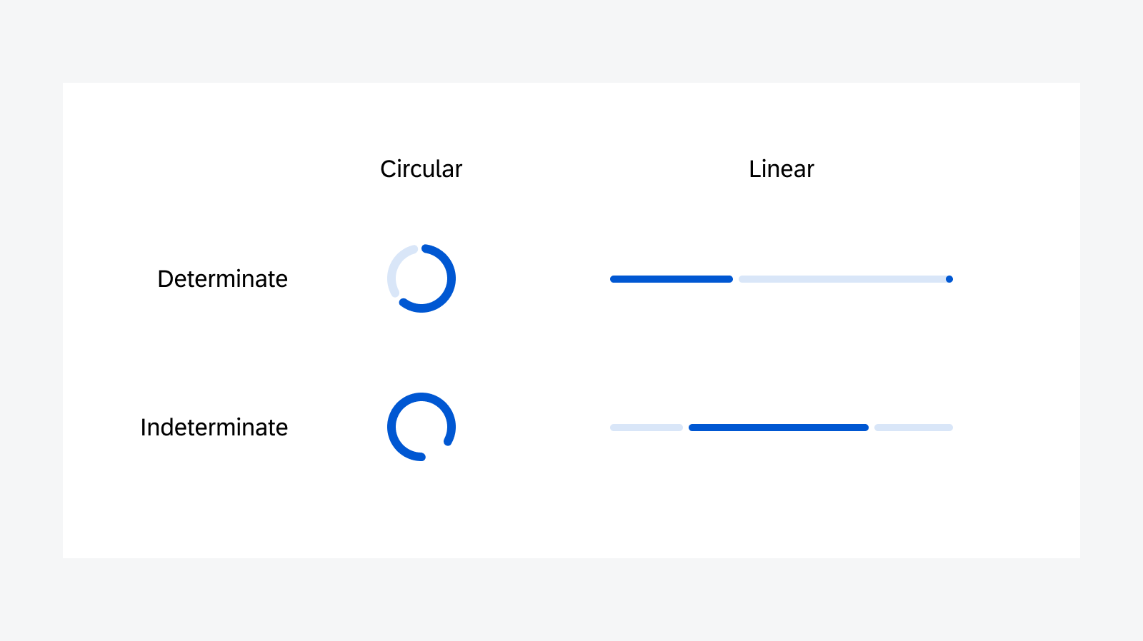
Progress indicators
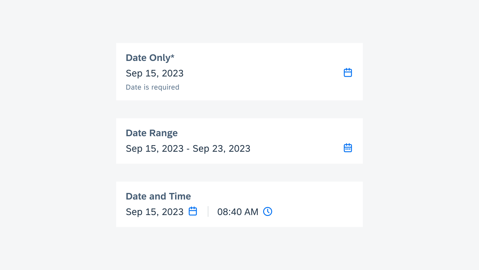
Date and Duration Picker
Feature Enhancements! The date and range pickers now enable a few features provided by View-Based Android picker. The date and range picker dates may now show a disabled date, and a minimum and/or maximum date may now be set. The date picker may now show status indicators.
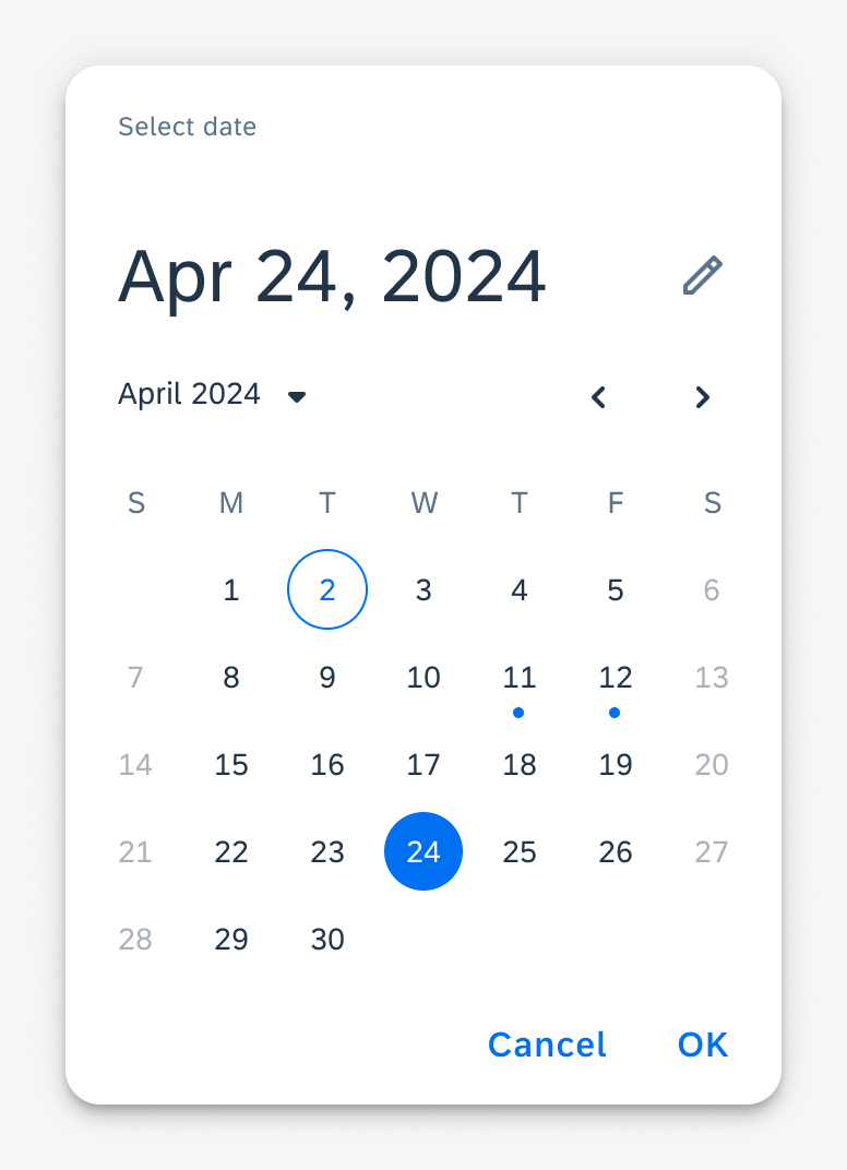
Date picker showing disabled states and status indicators
Document Scanner
New Component! The document scanner offers both automatic and manual scanning modes for single or multiple documents, along with border detection. Editing options are also available in the gallery view.
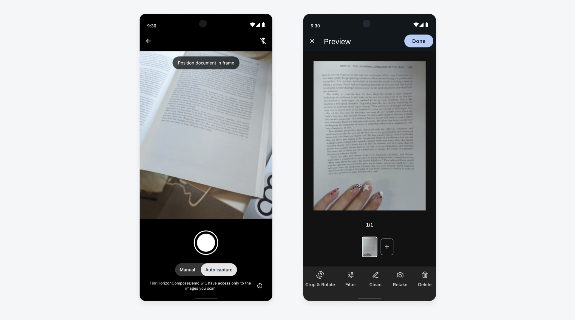
Document scanner camera view (left) and gallery view (right)
Section Header/Footer
Feature Enhancements! The section footer provides additional actions or information at the bottom of a group section. It supports various layouts, including a left-aligned button, right-aligned button, two opposite buttons, and text only, with flexible positioning to adapt to different use cases.
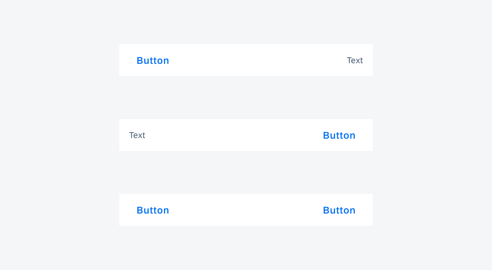
Section footer variants
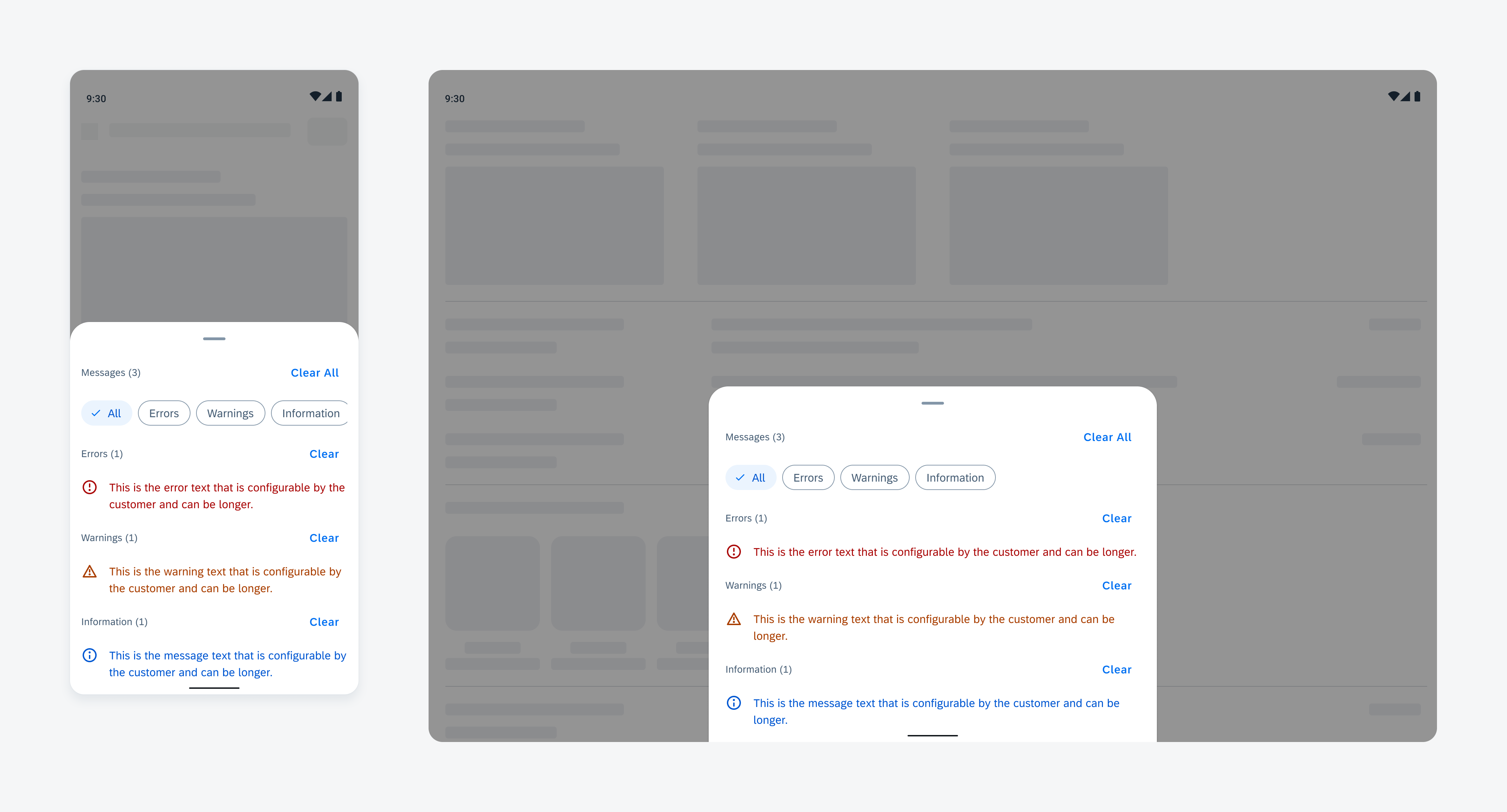
Multi-Message Handling
New Component! Multi-message handling helps users manage multiple messages within an app, making it easy for users to take action. Multi-message handling follows the basic structure of a bottom sheet, prioritizing message components based on their importance.
Multi-message handling
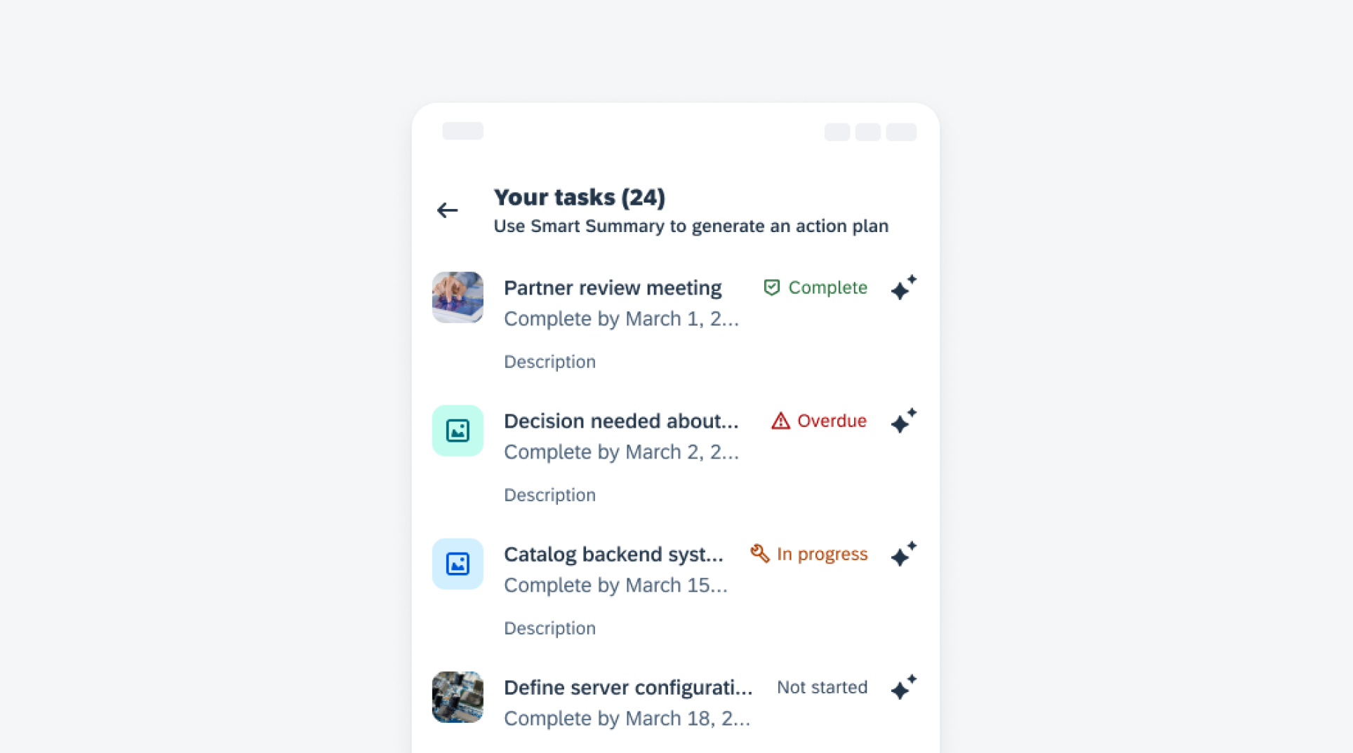
Object Cell
Feature Enhancements! The object cell has been enhanced to support more nested components, including rating controls and menus. Options to include text buttons, icon buttons, and KPI, and new combinations for the right accessory have also been added. Additionally, rows can be swapped for increased flexibility.
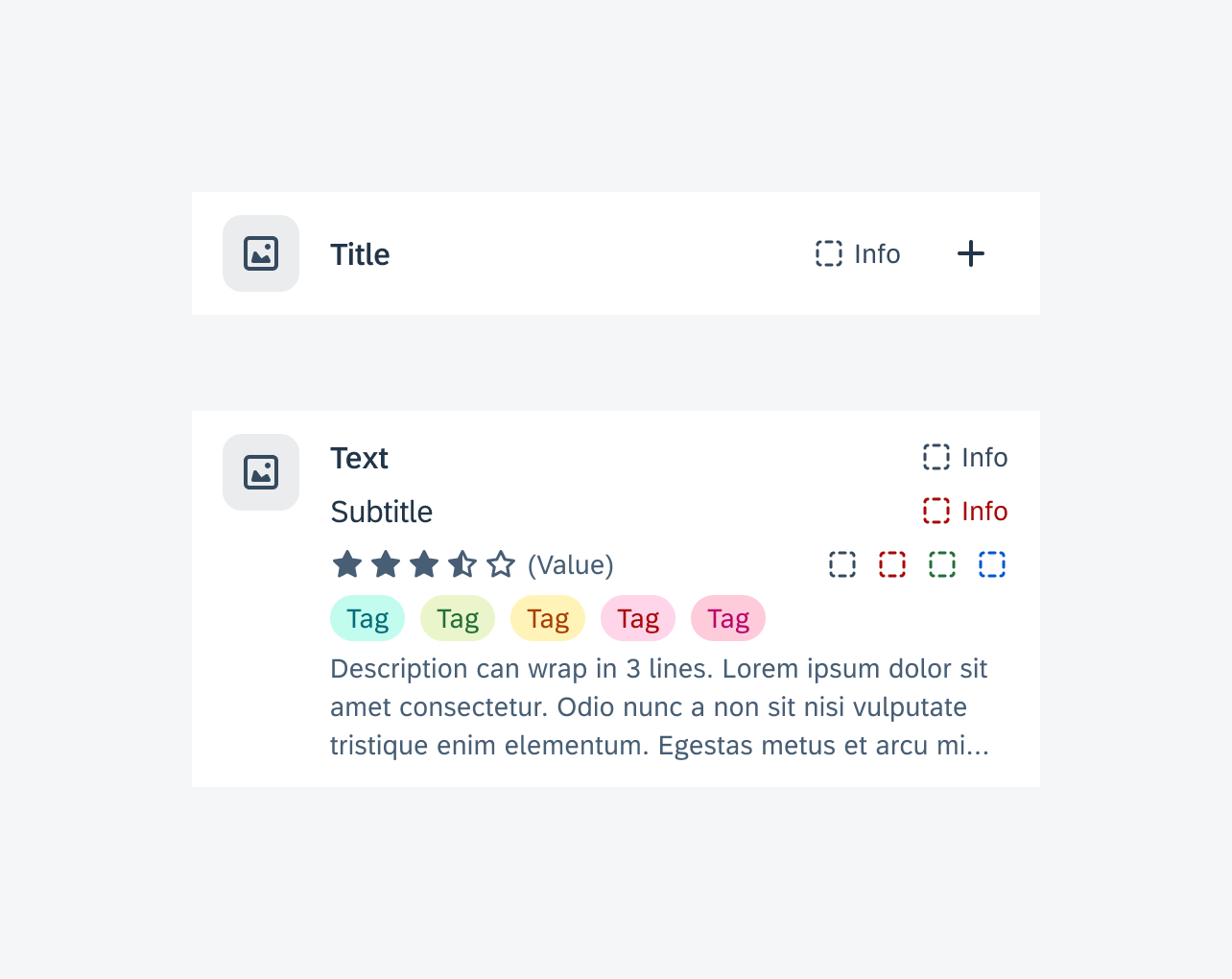
Object cell on compact screen (top) and expanded screen (bottom)
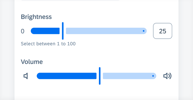
Slider
Updated to M3 Style! The slider and slider form cell have been visually updated to align with the latest Material 3 design guidelines. Updates include wider active and inactive tracks, a stop indicator at the end of the inactive track, and the redesigned handle.
Slider form cell
SAP BTP SDK for Android 24.8
UI Components
Attachment Form Cell
Feature Enhancements! The attachment form cell now supports disabling upload when the user has reached the allowed number of attachments, disabling deleting a specific attachment when the user does not have permission and an optional footer.
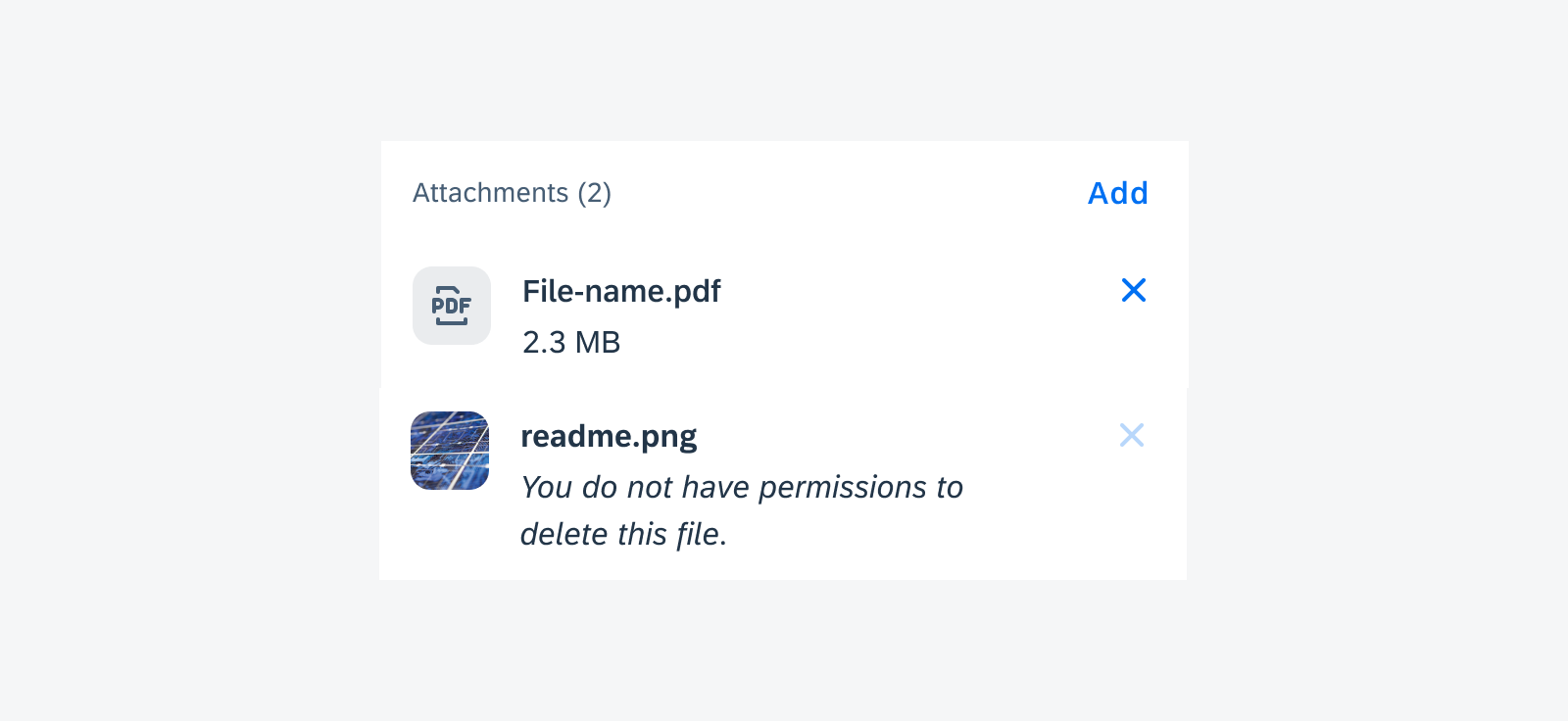
Disabled “Delete” icon with hint text in attachment form cell
Card Footer
Feature Enhancements! The card footer now allows using an overflow button if there are more than two buttons or when the buttons do not fit into the footer’s width. Tapping on the overflow button shows the user the additional buttons in a menu.
Card footer with an overflow button
Date & Time Picker Form Cell
Feature Enhancements! The date time picker form cell has been visually redesigned to display unique icons for the different picker form cell types. These icons help the user quickly understand which value can be selected. In the date and time picker form cell variant, the date value and time value can be set separately. Additionally, a required field indicator has been added.
Date and time form cell variants
FAB (Floating Action Button)
New Component! The floating action button or FAB is a button variant that displays the most prominent action on screen. It is typically placed on the bottom corner of the screen, but it can also be placed in the center and remains persistent as users scroll through content.
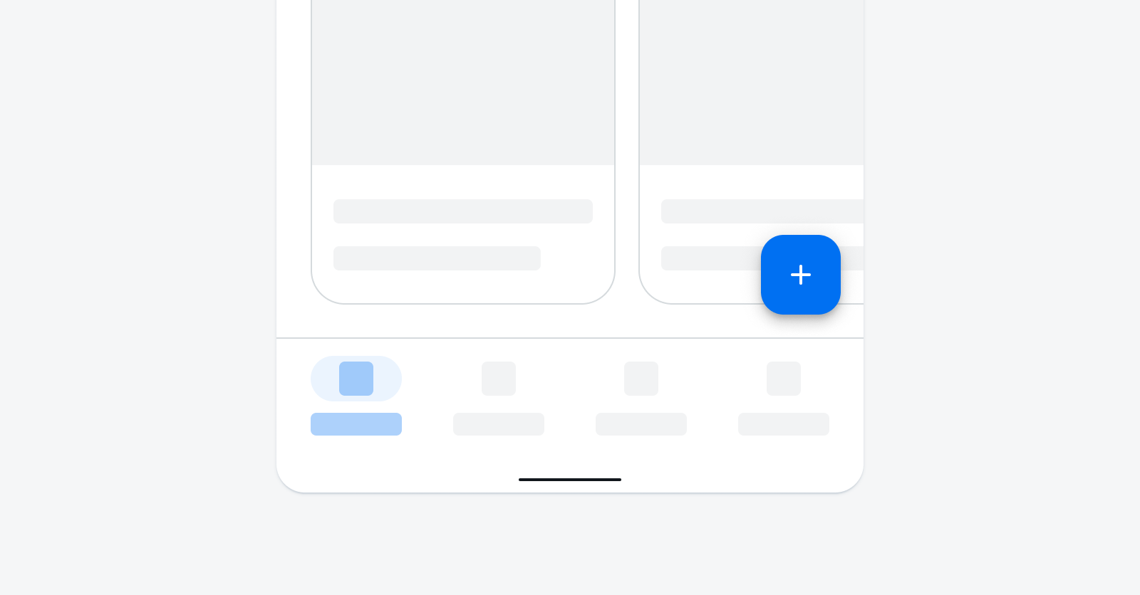
FAB in compact screen size
List Picker Form Cell & Signature Form Cell
Feature Enhancements! An asterisk in the form cell label can be used to indicate the field is required. If the user does not enter or select a value, an error state will be triggered.
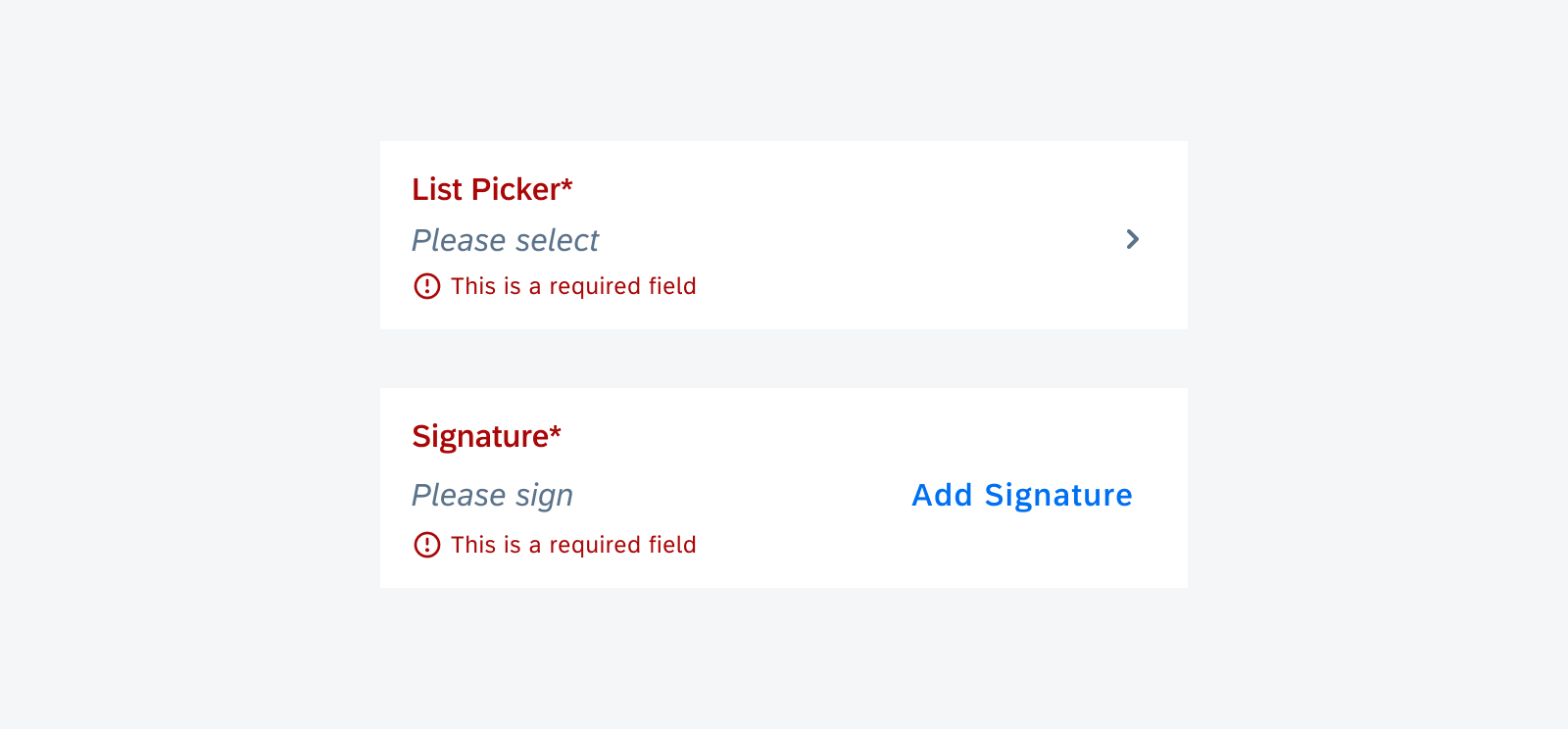
Required list picker form cell and signature form cell in error state for null value
Patterns
Illustrated Message
Feature Enhancements! A second action button can be used in the illustrated message. The button type(s) can be chosen from the existing SDK buttons.

 Your feedback has been sent to the SAP Fiori design team.