
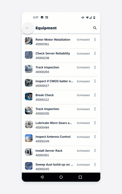
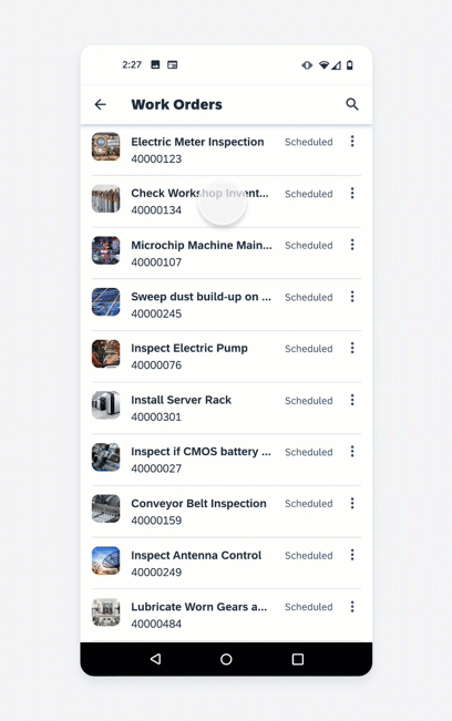
Sort and Filter
Sorting and filtering are two ways of refining the results from a long list of objects. These two features help users navigate through a big amount of data and find the specific data they want to focus on easier.
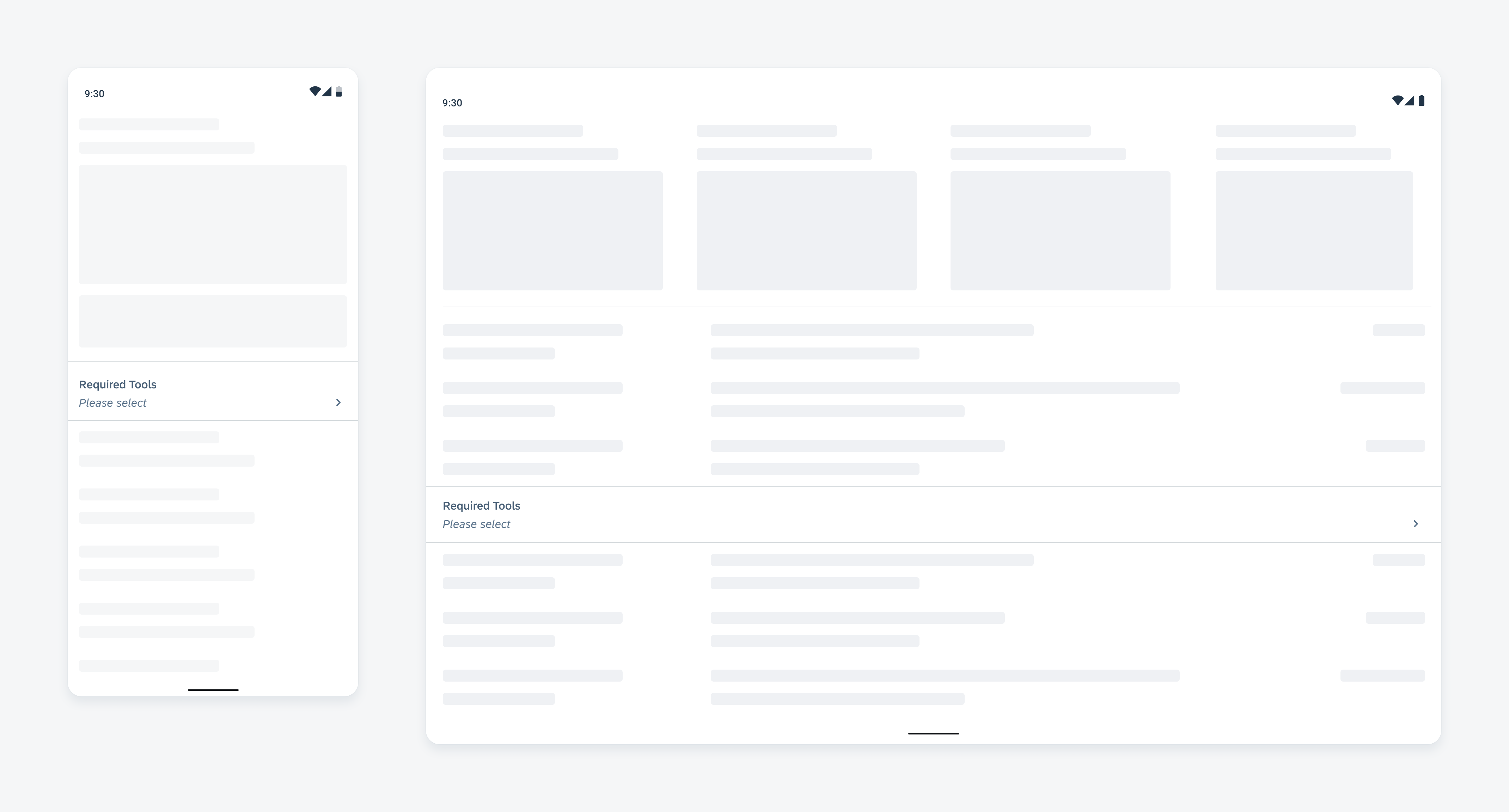
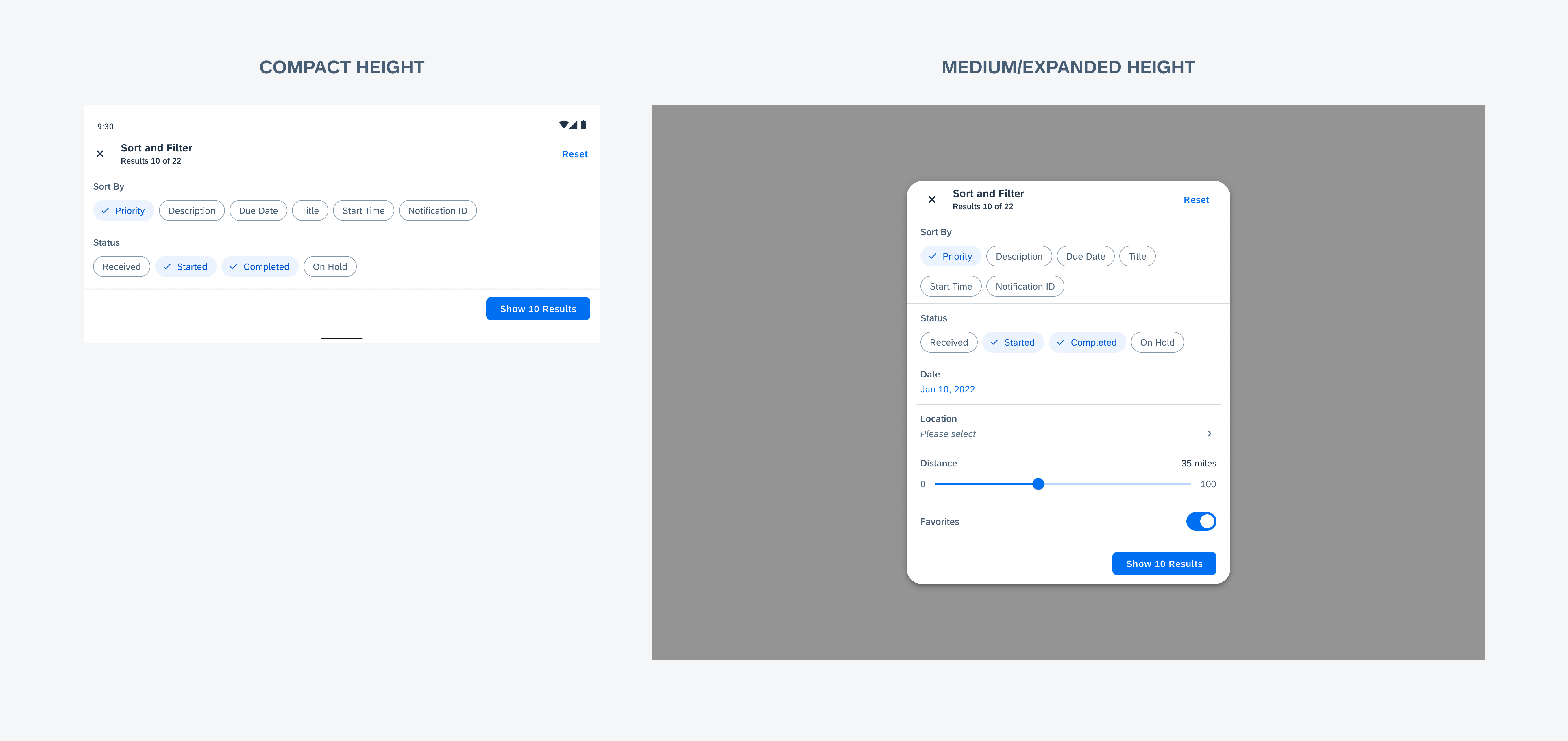
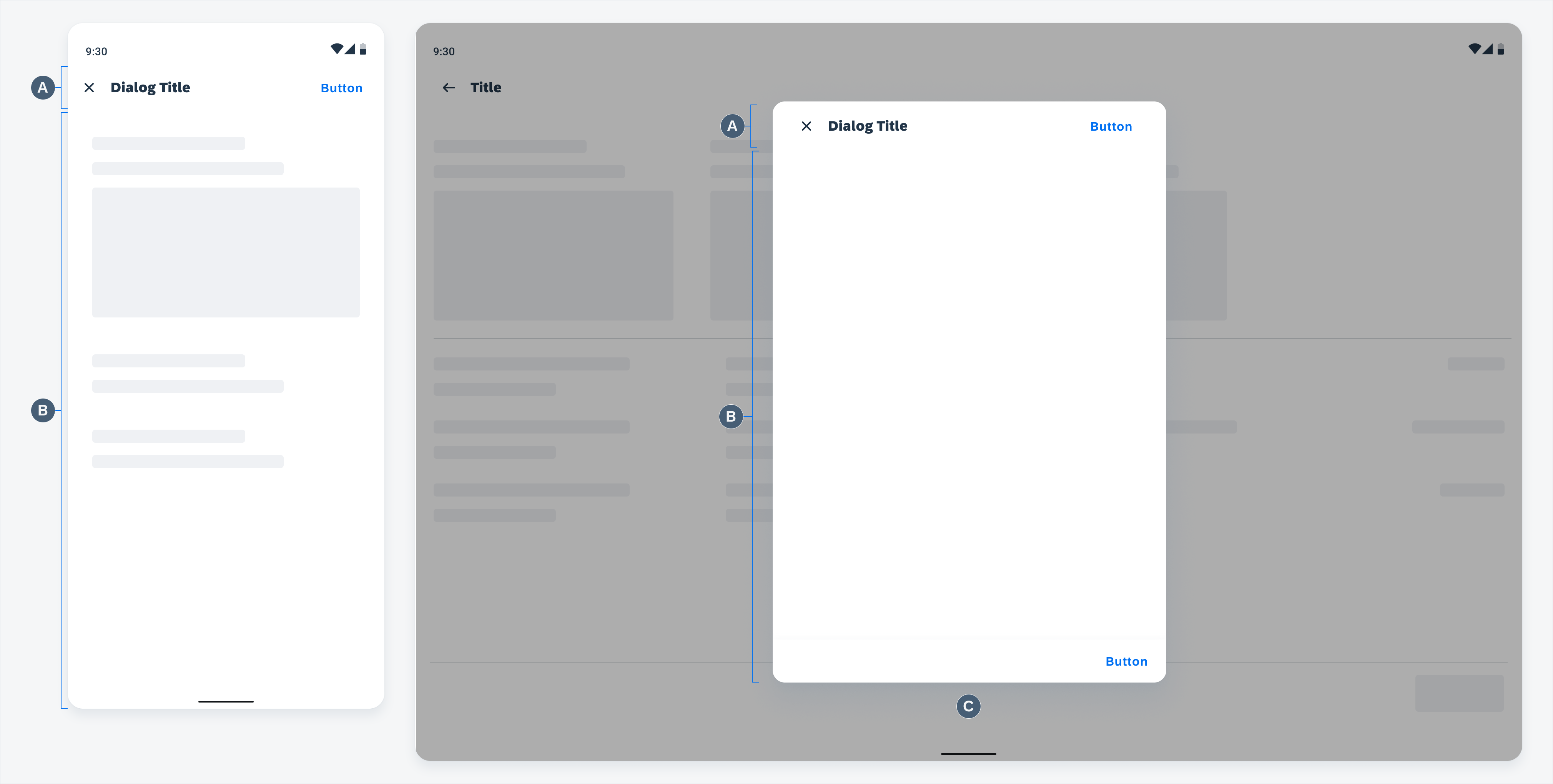
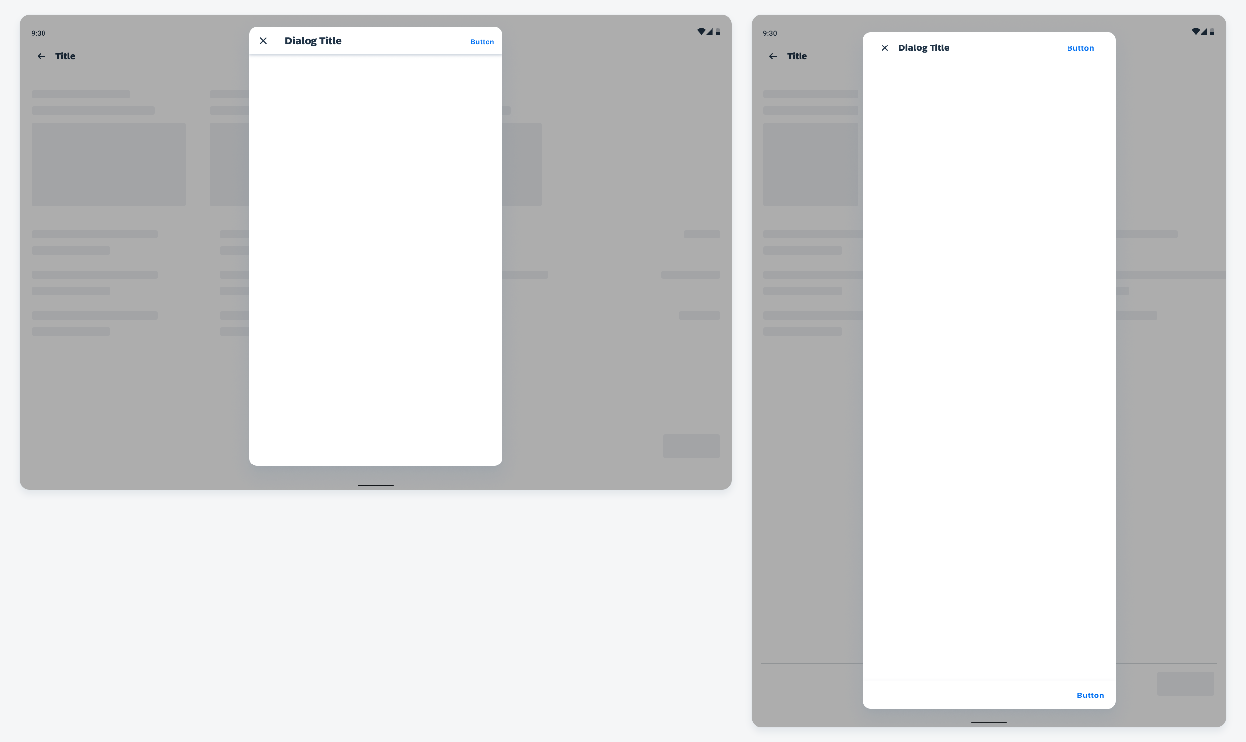
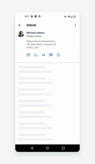
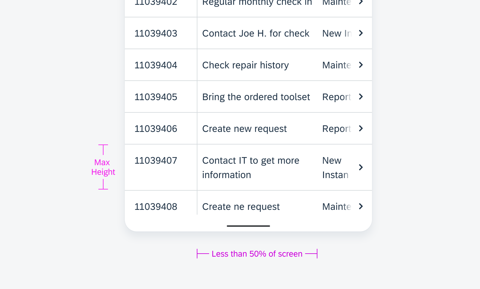
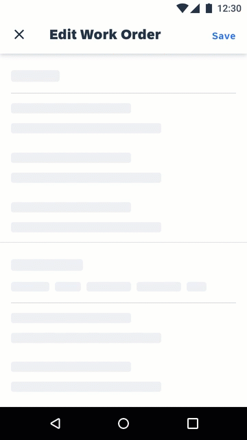
Typically, a full-screen dialog on compact or a modal dialog for medium and expanded screens is used to display all filter controls. Sorting and filtering are integrated when both features are available. Users can tap on “Reset” to go back to the complete list of results in default order.
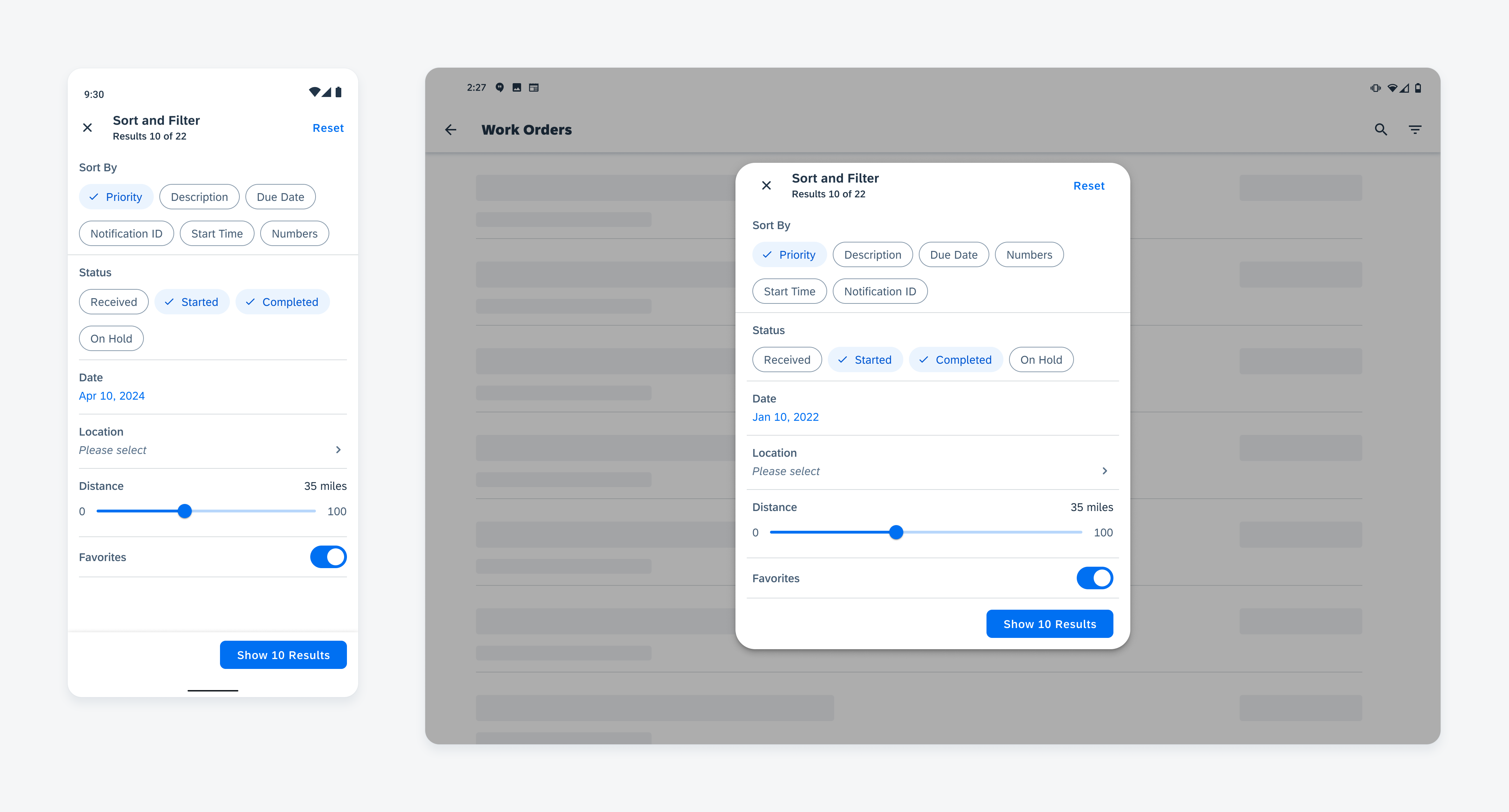
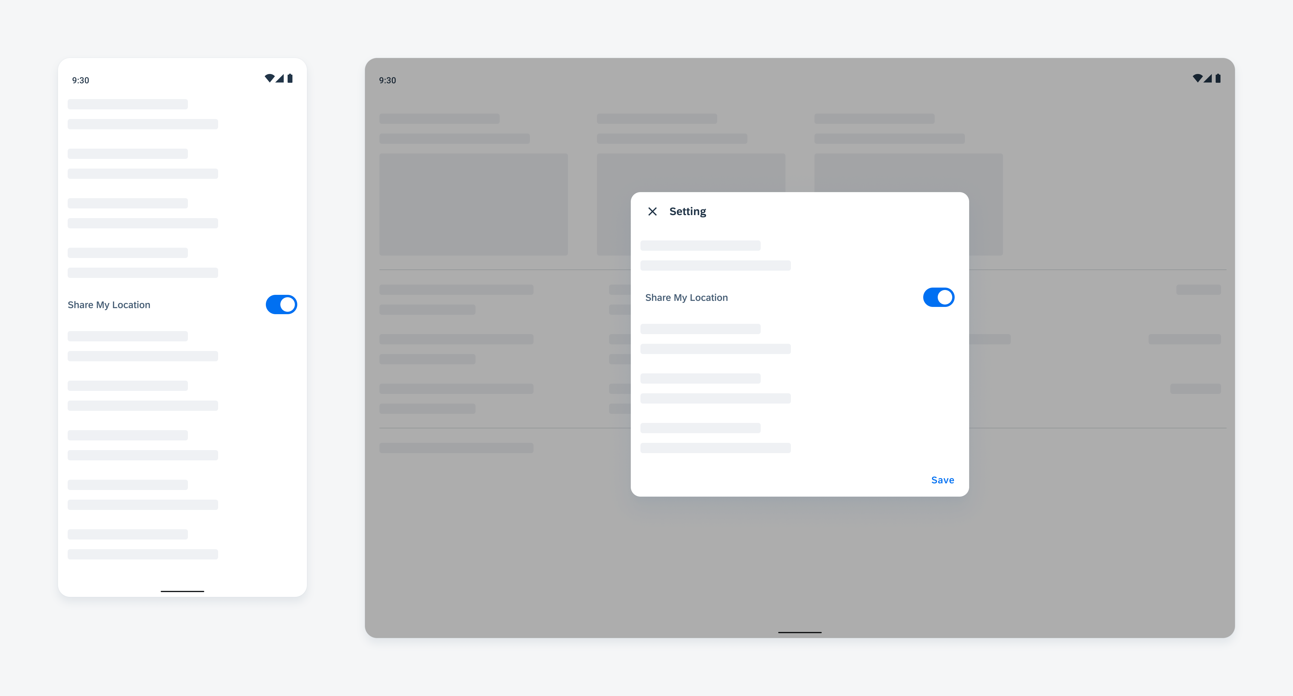
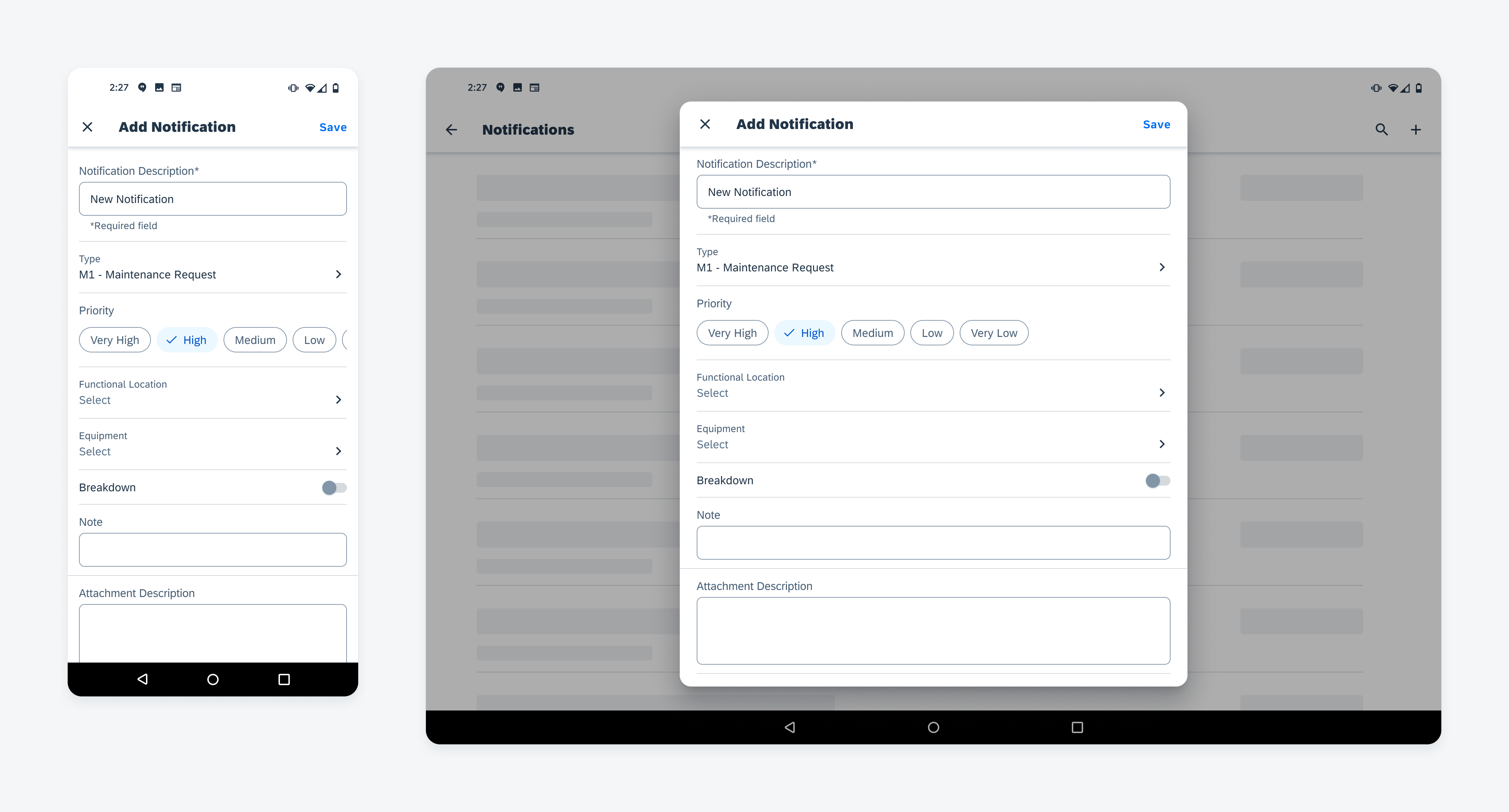
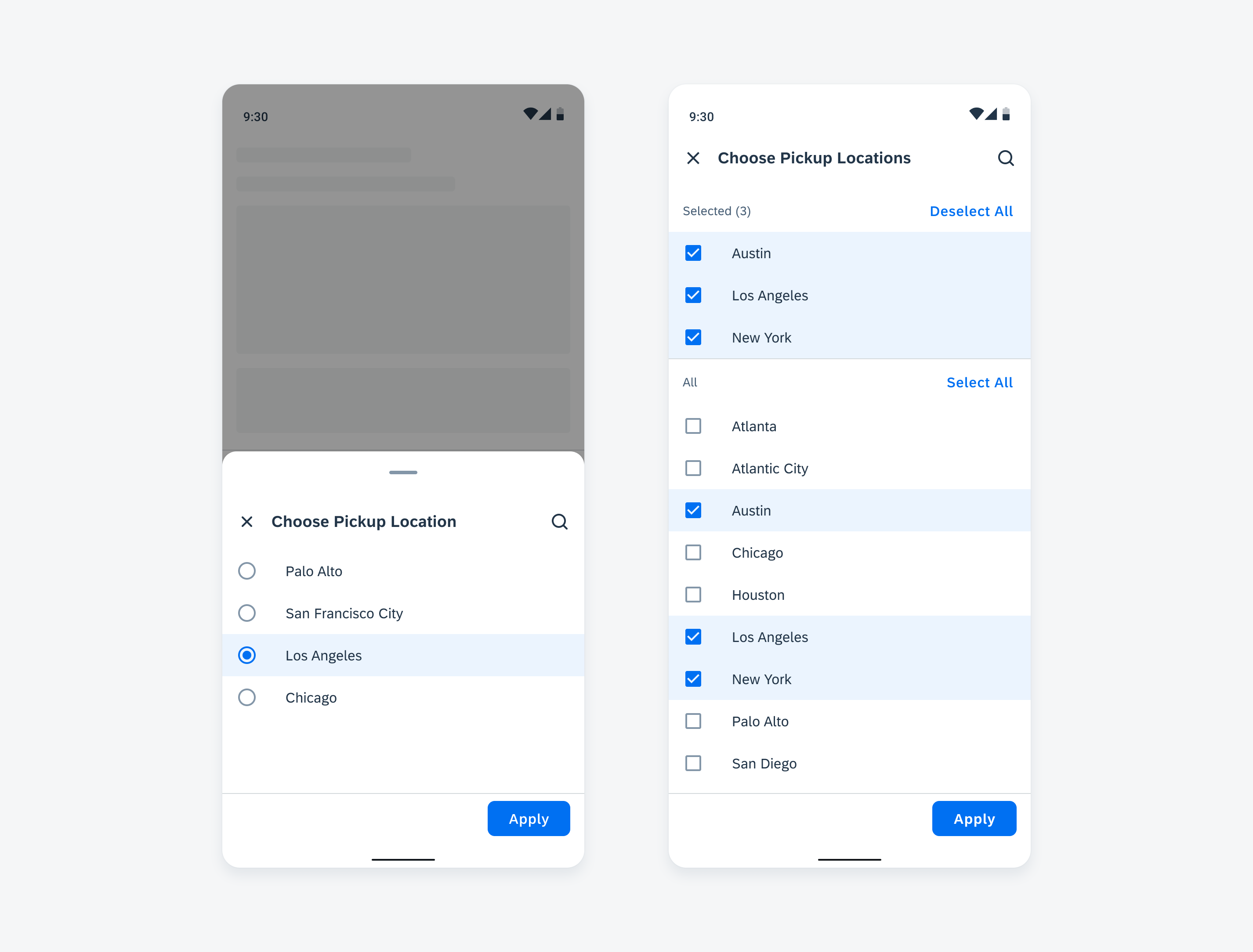
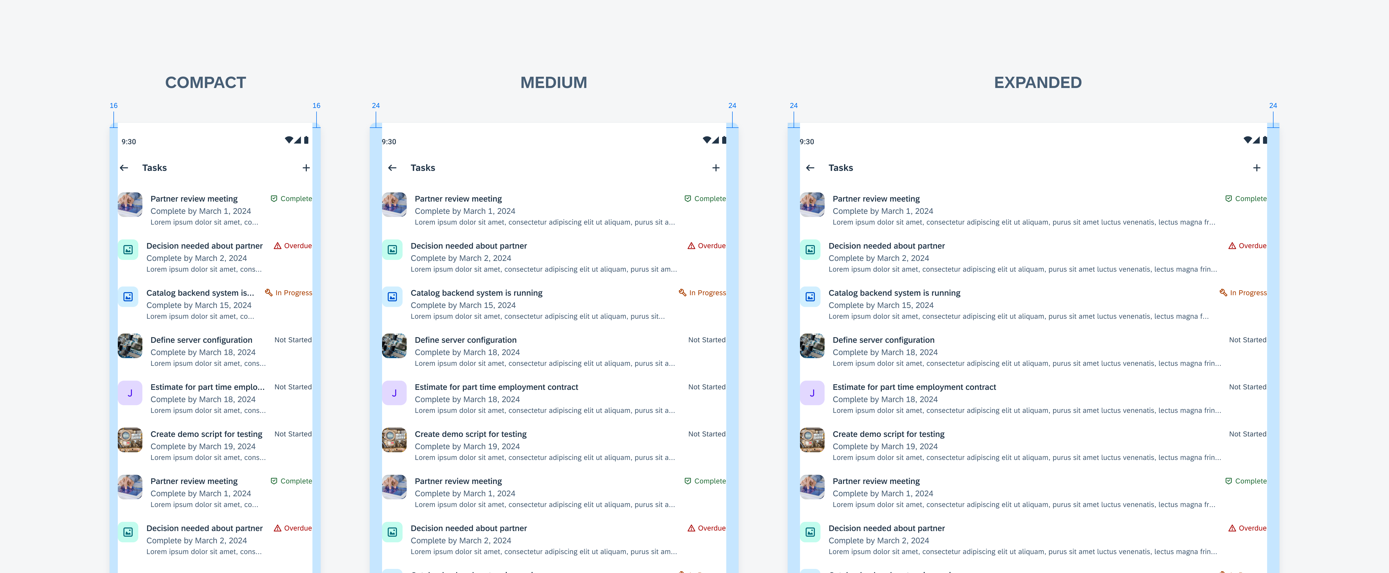
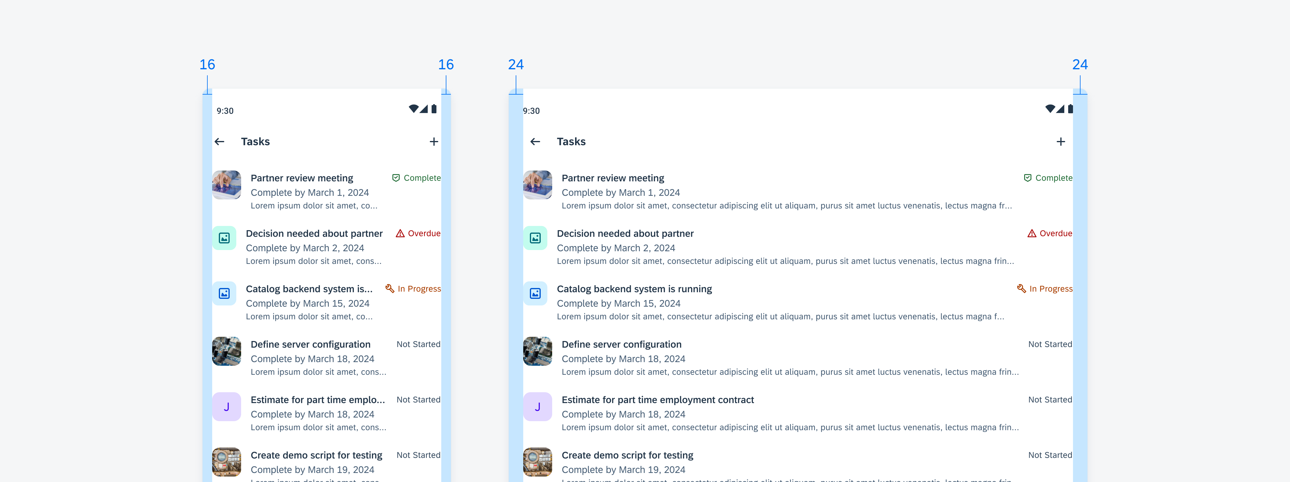
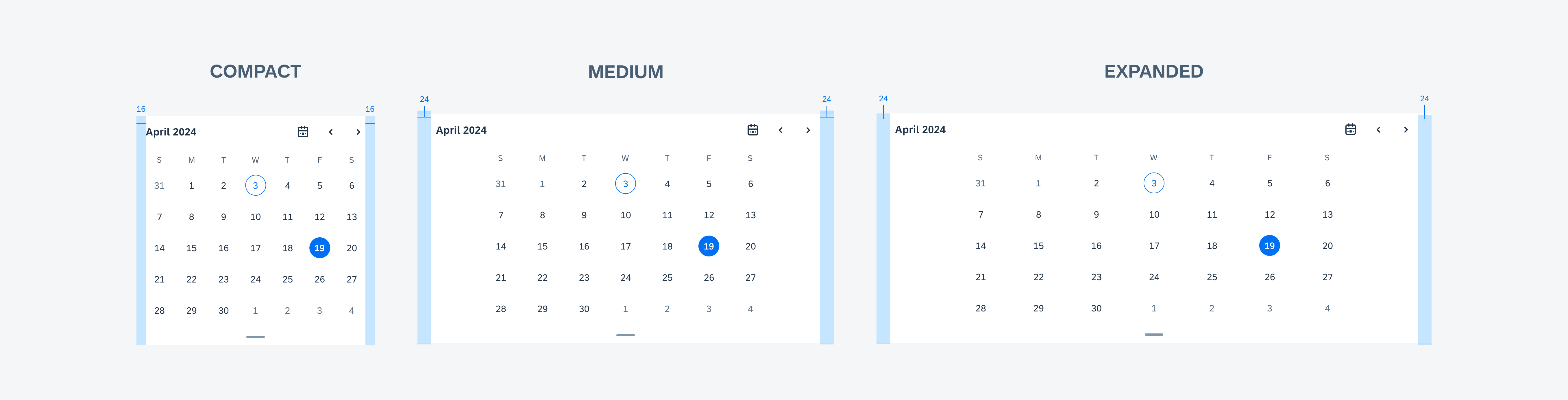
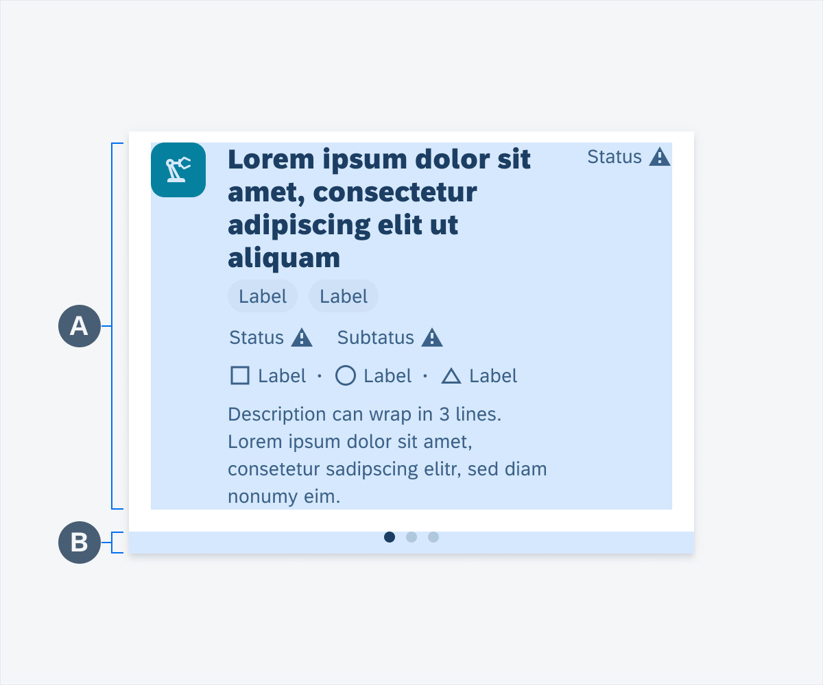
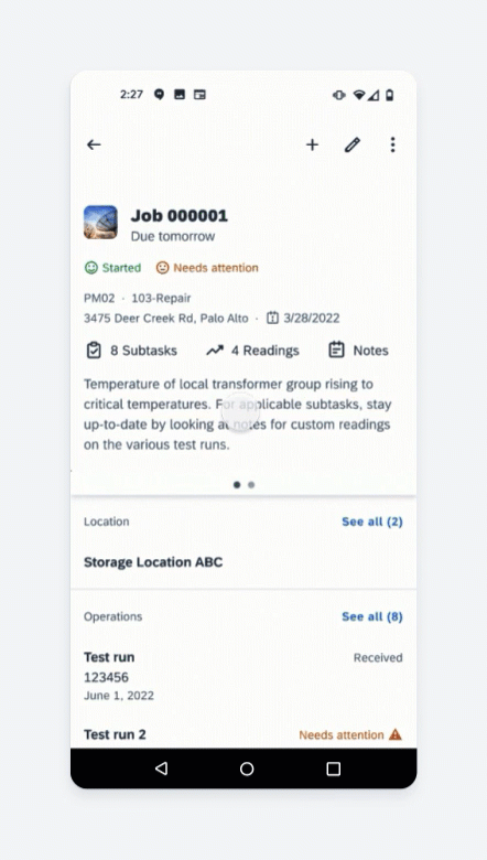
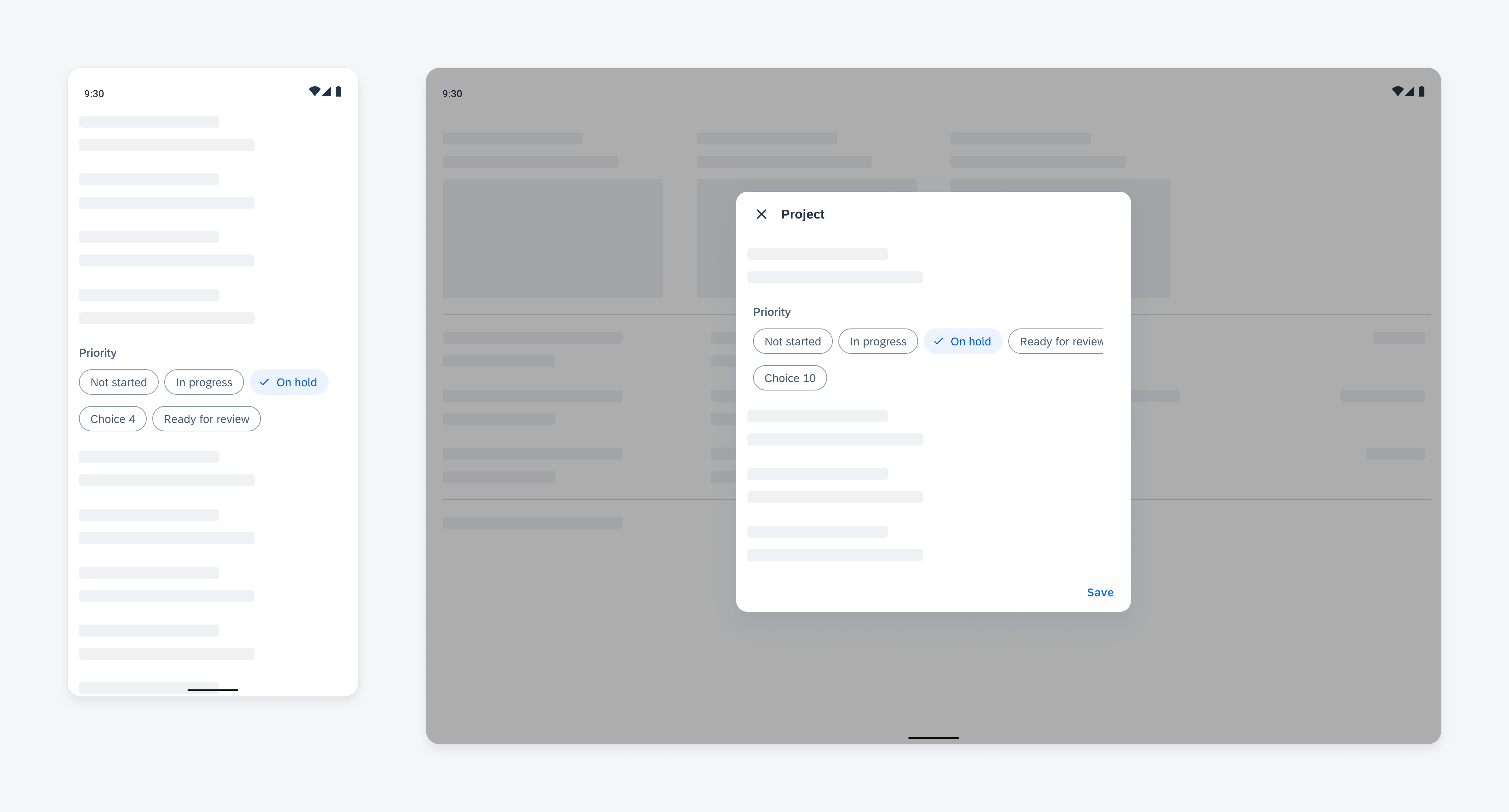
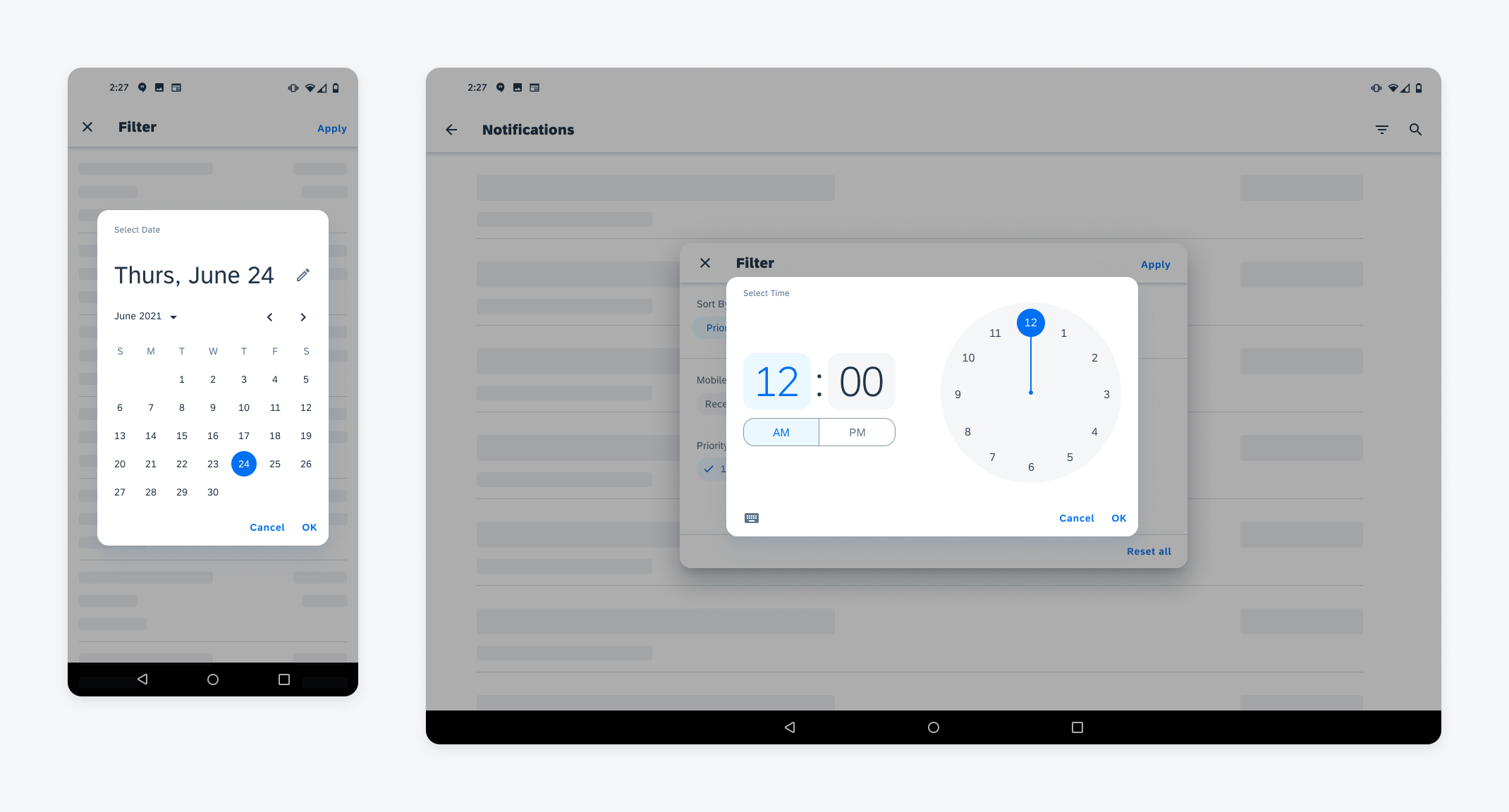
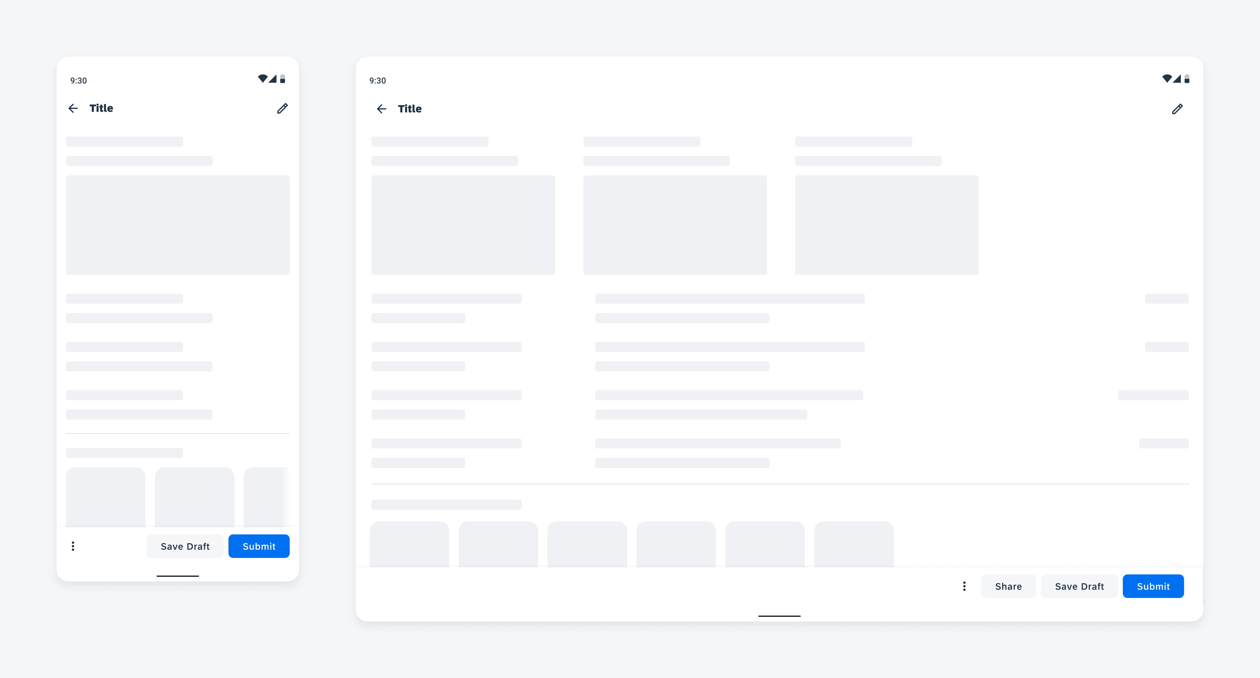
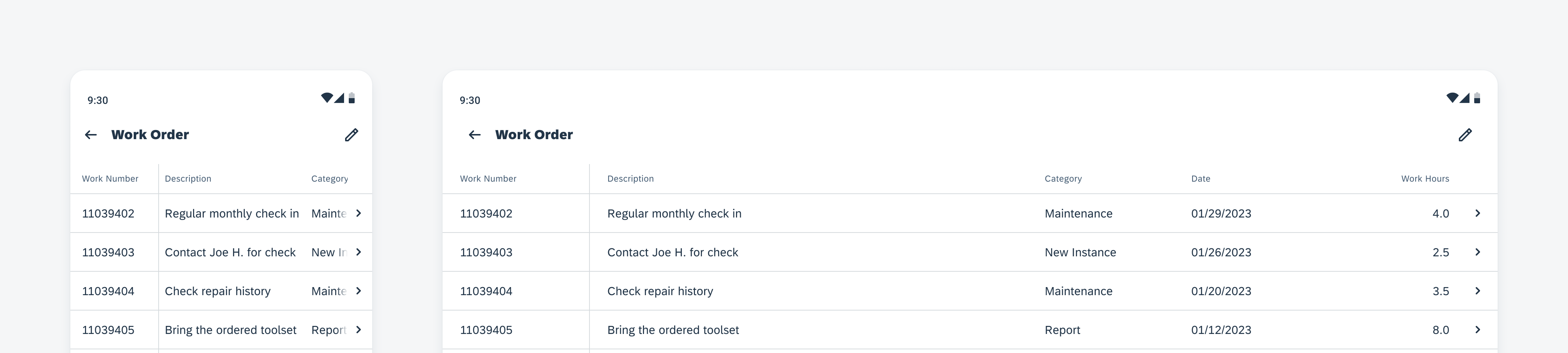
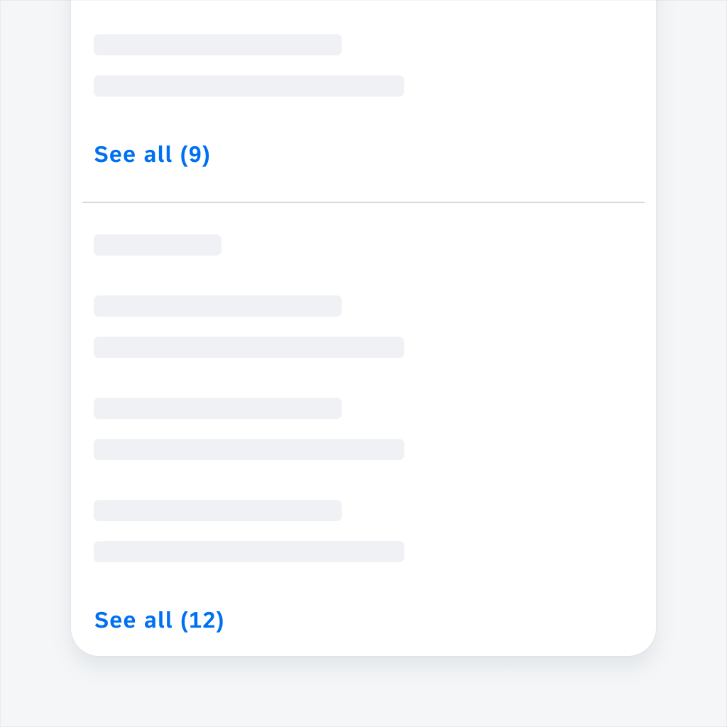
Filter controls on a compact (left) and expanded screen (right)
Usage
Use a filter when there is a long list of data with several properties and users want to see part of the list by narrowing down the properties.
Don’t use a filter when the list of data has just one type of property.
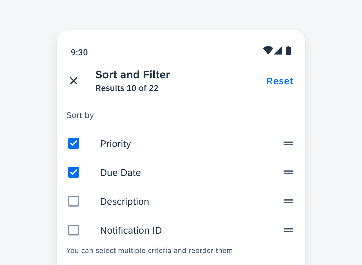
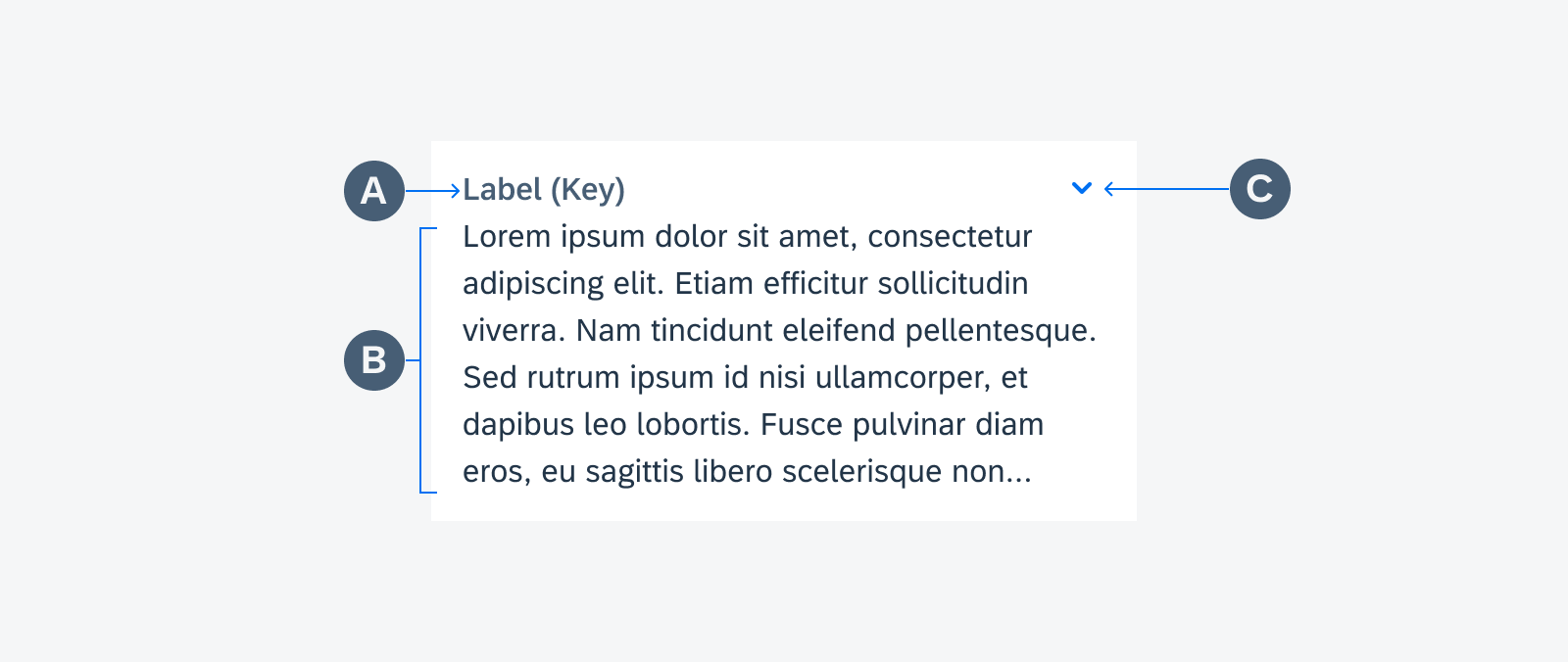
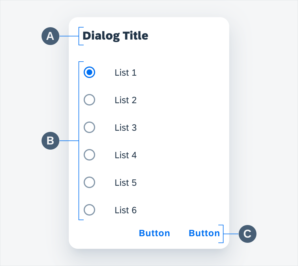
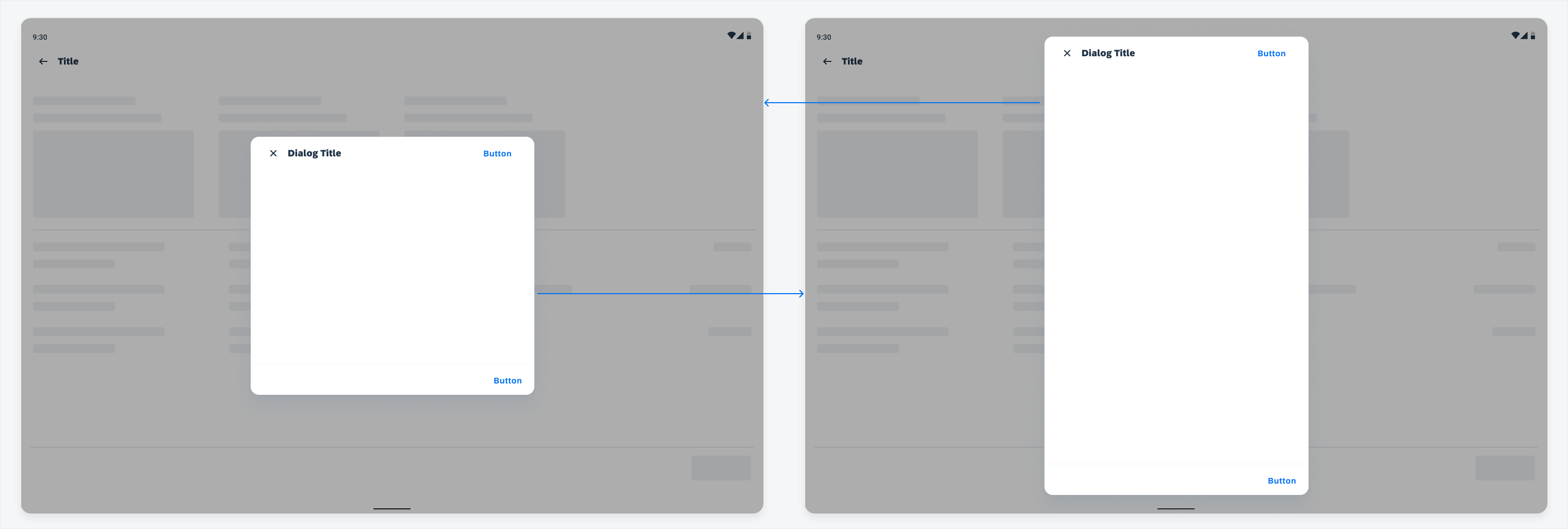
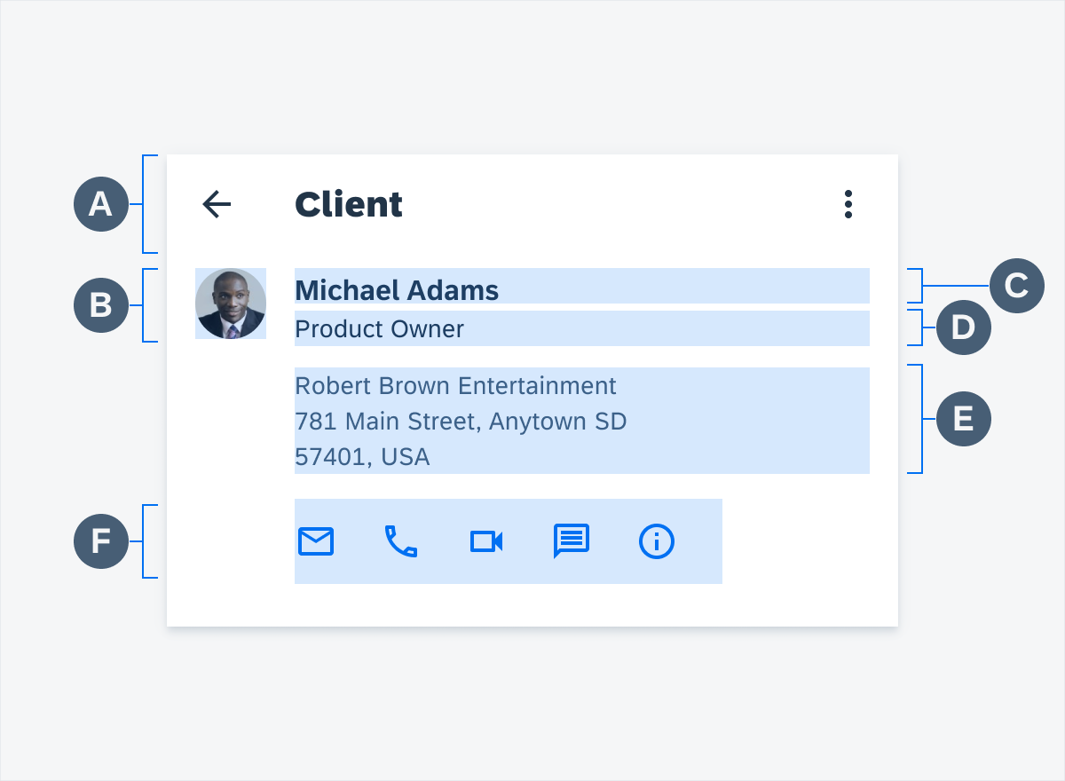
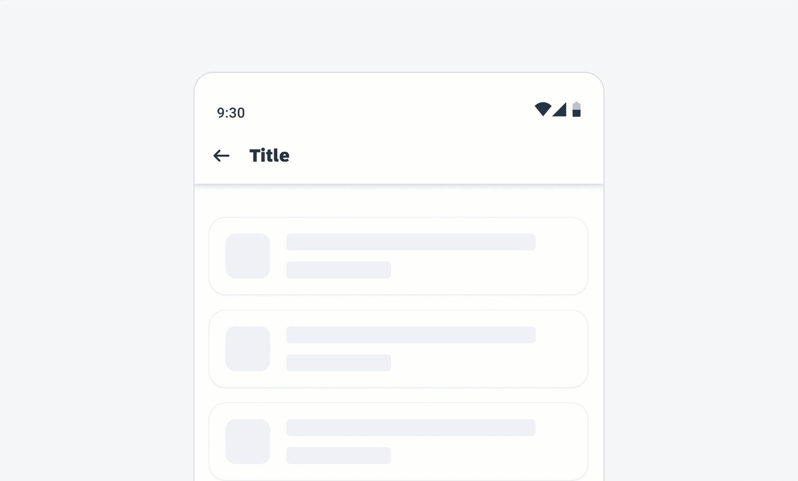
Anatomy
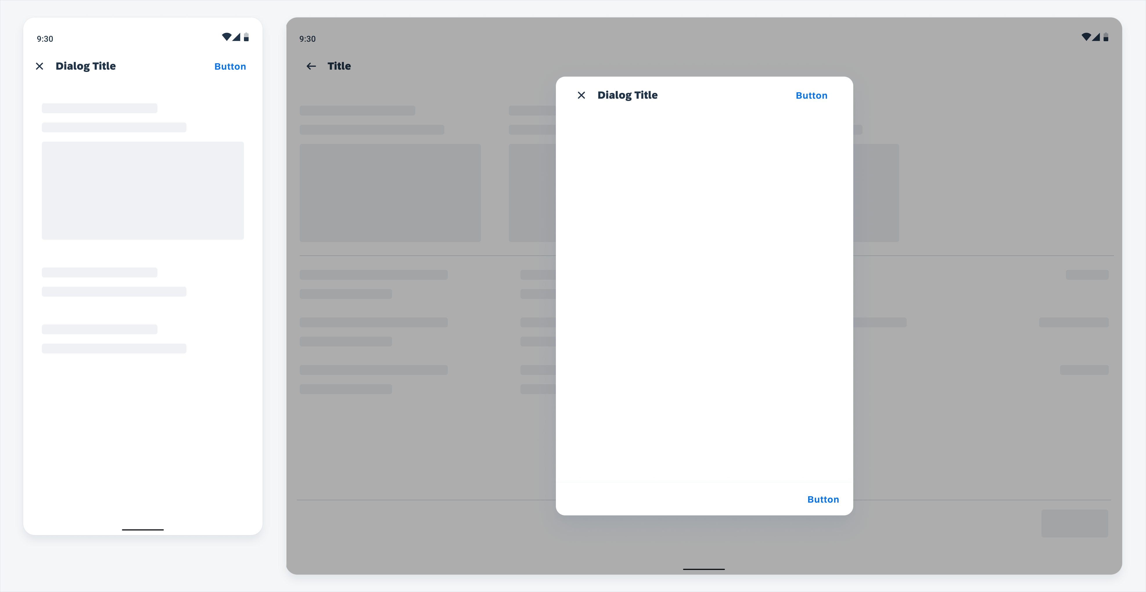
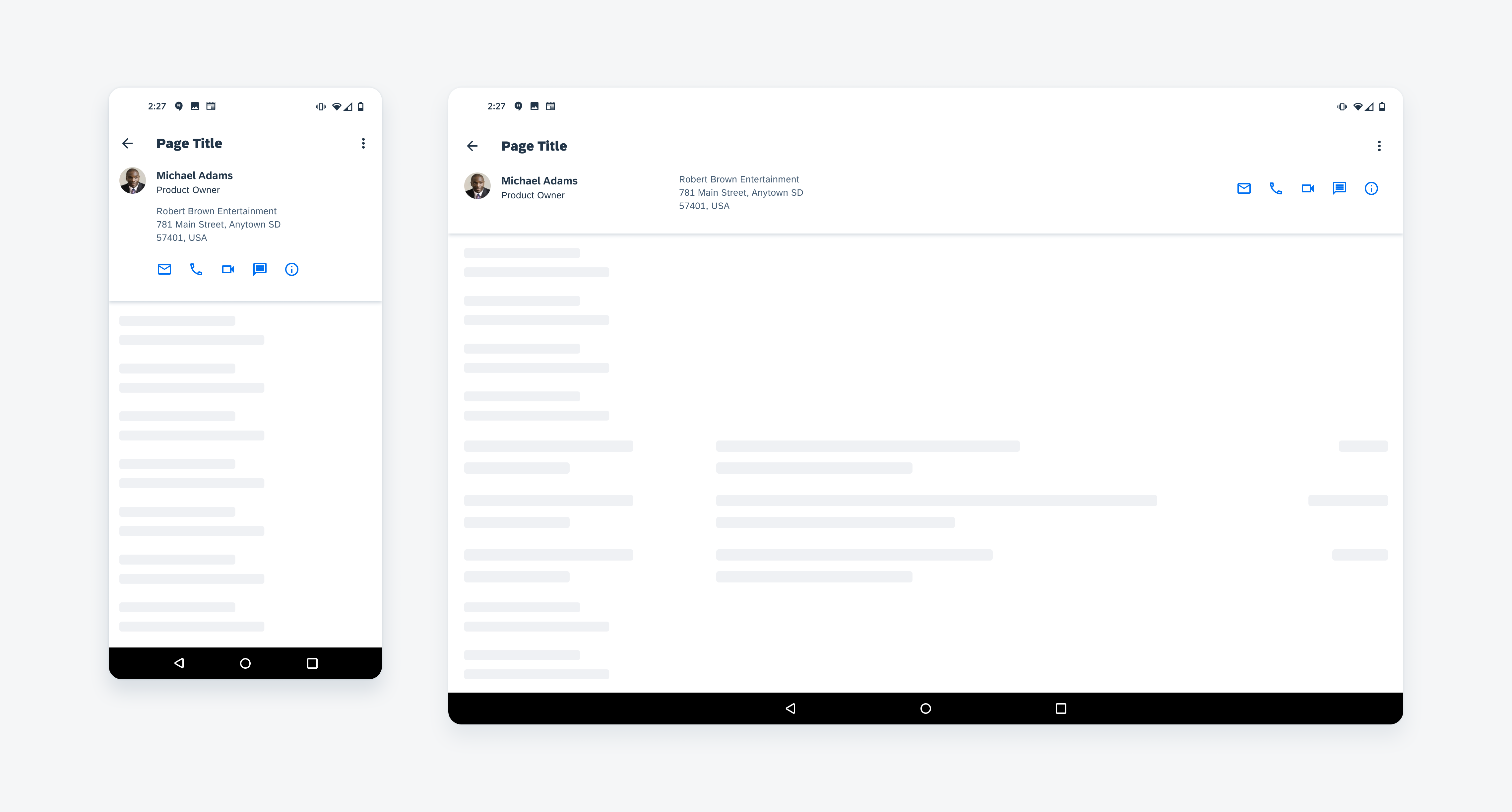
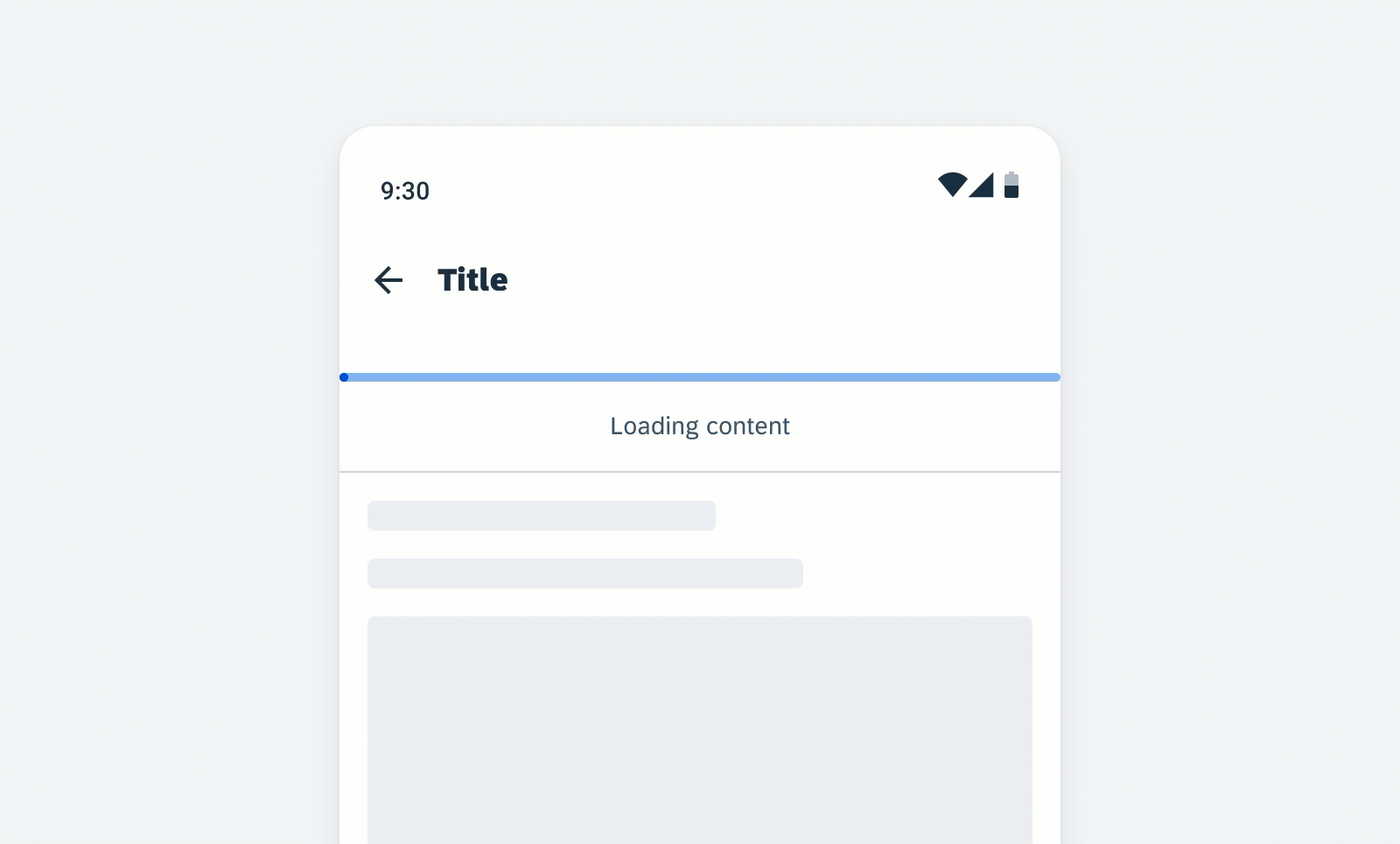
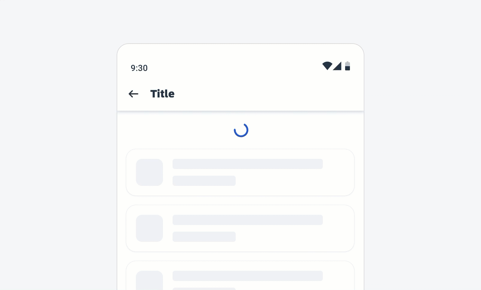
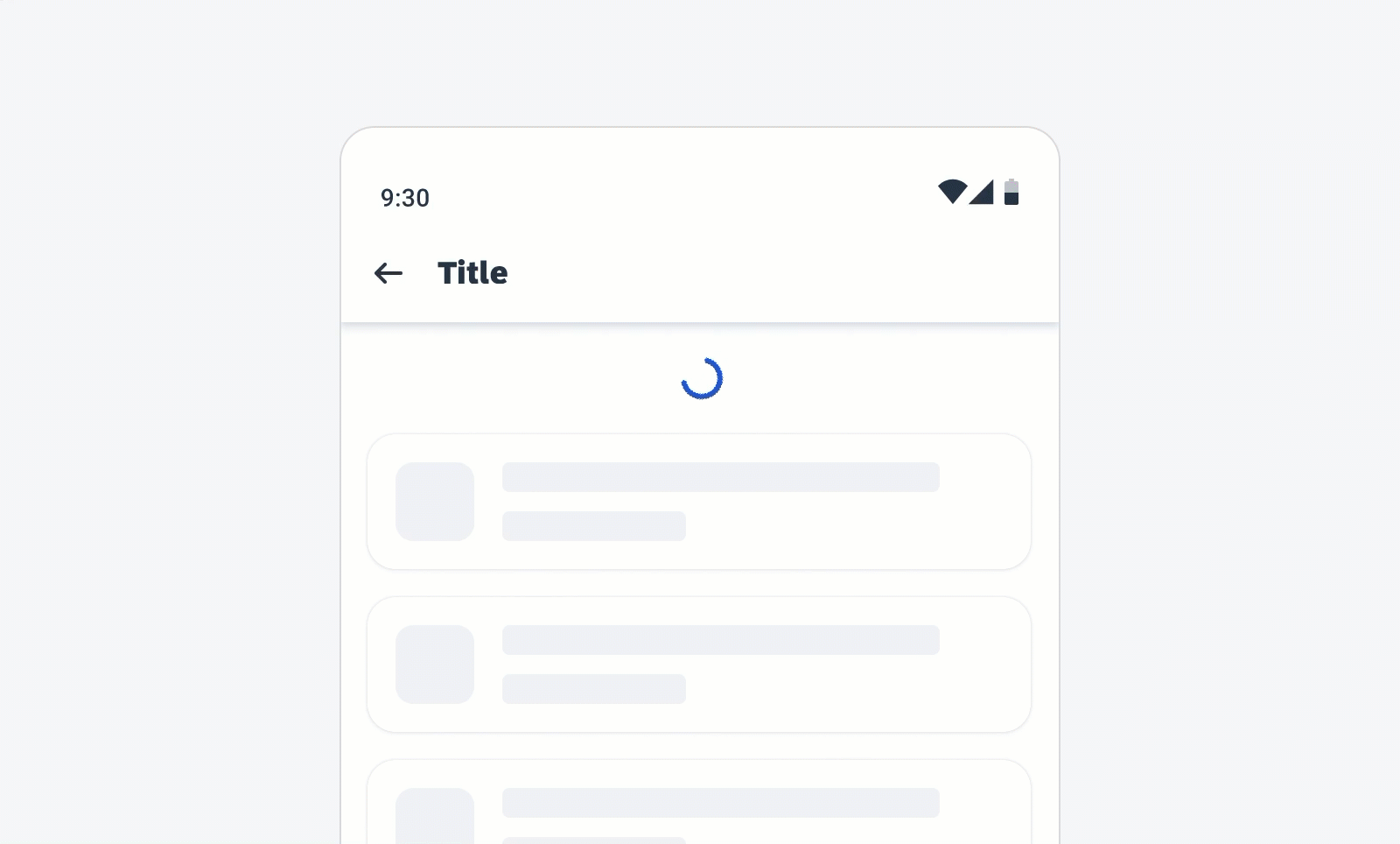
On compact screens, a full-screen dialog is used to display the sort and filter pattern.
On medium and expanded screens, such as tablets, a modal dialog is used instead of a full-screen dialog.
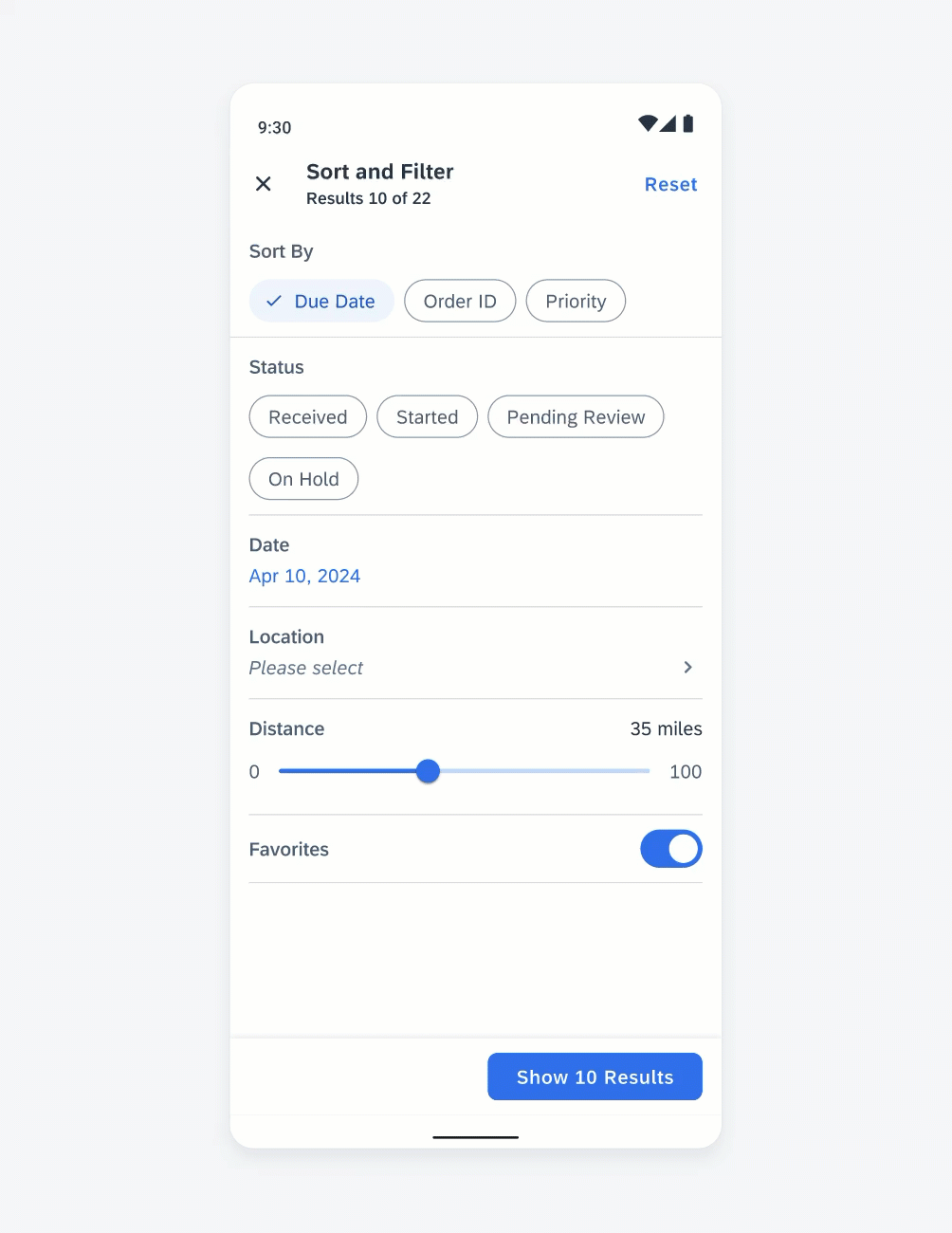
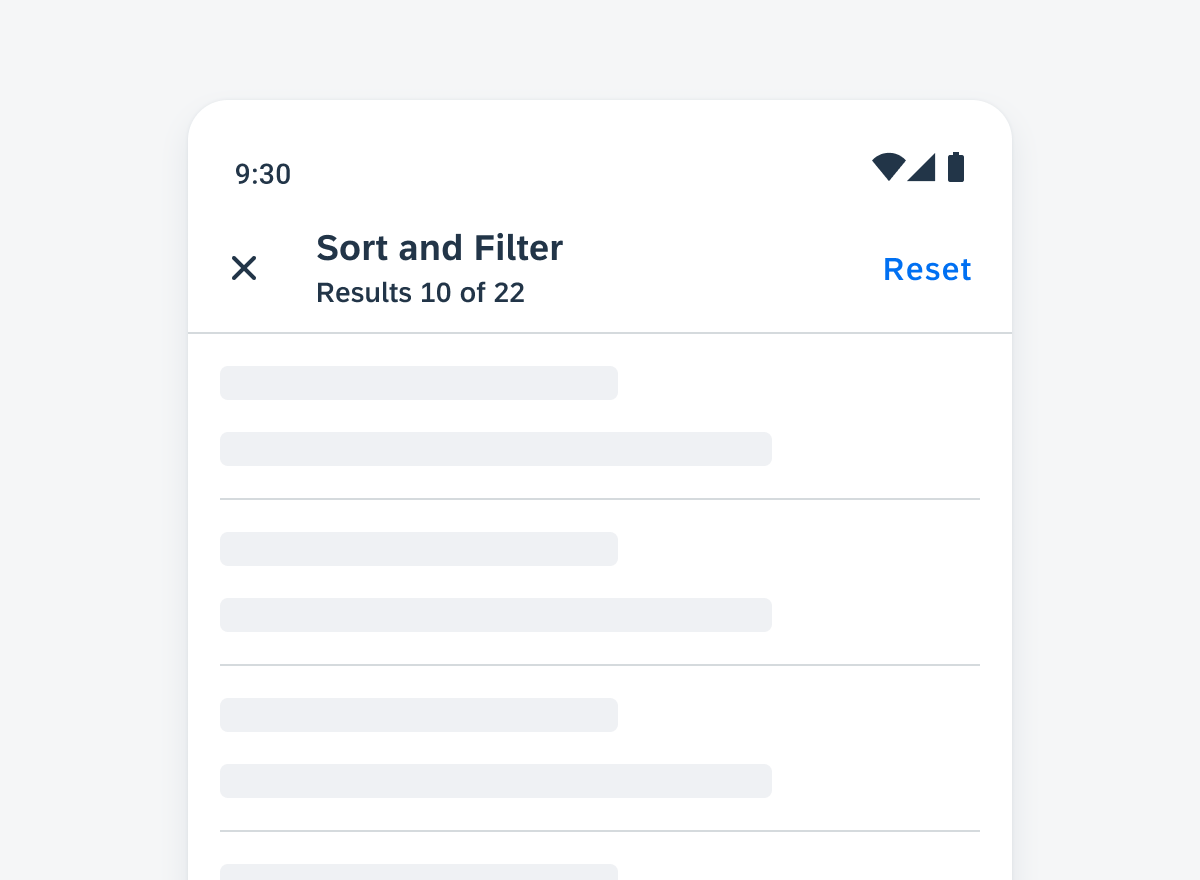
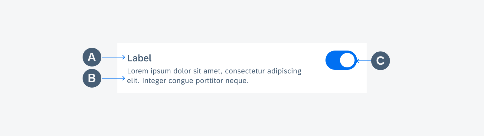
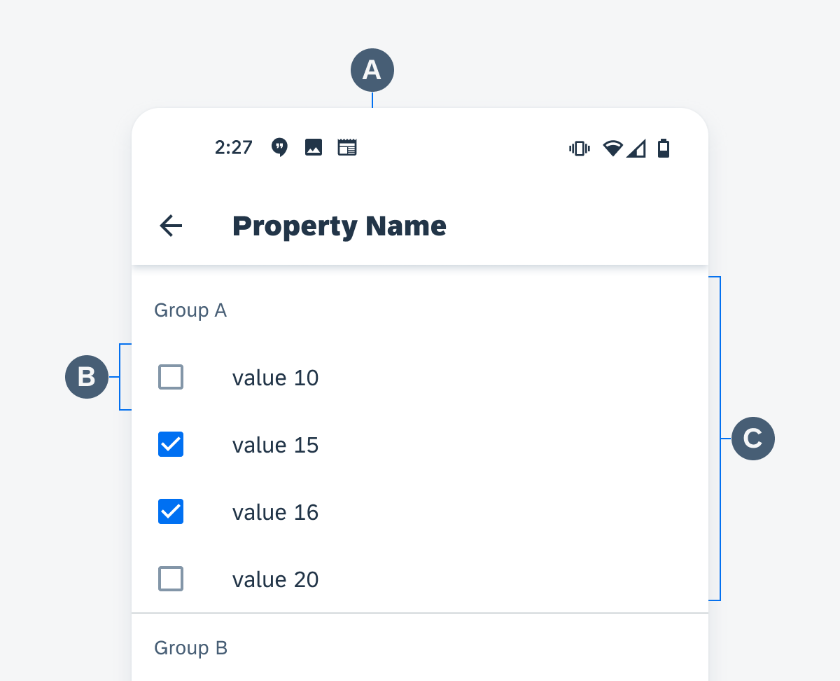
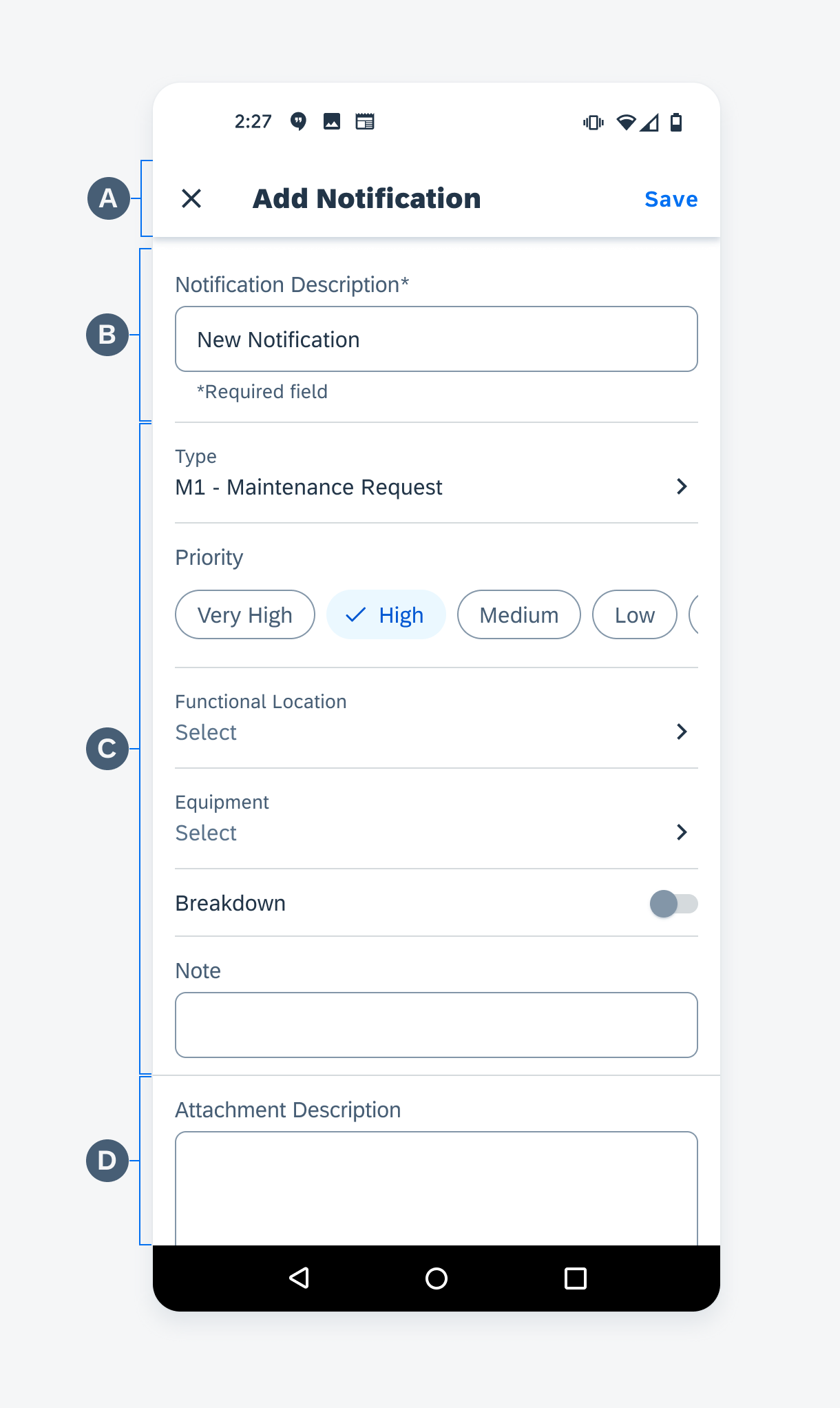
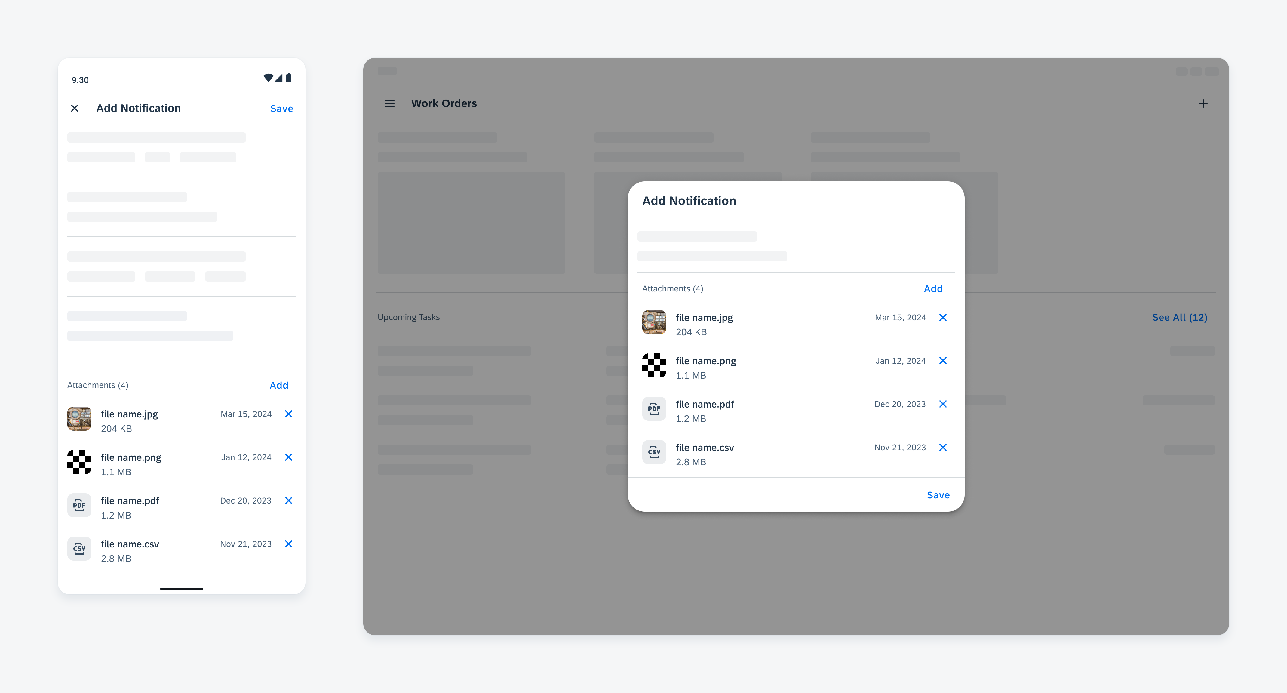
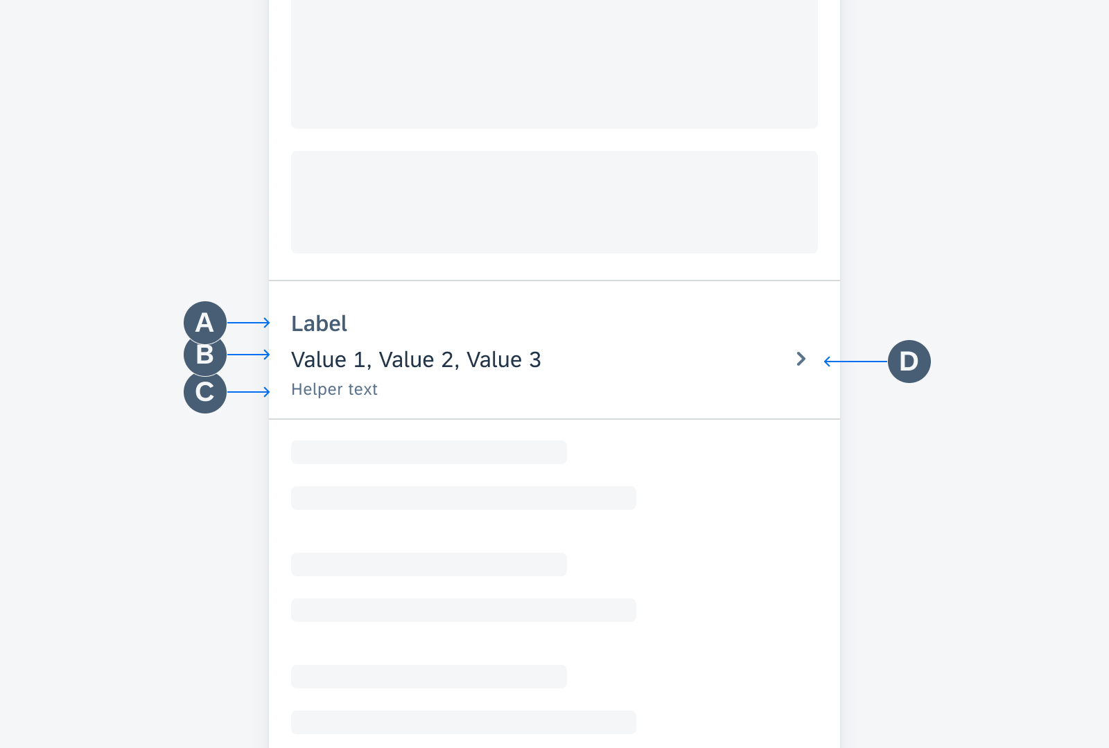
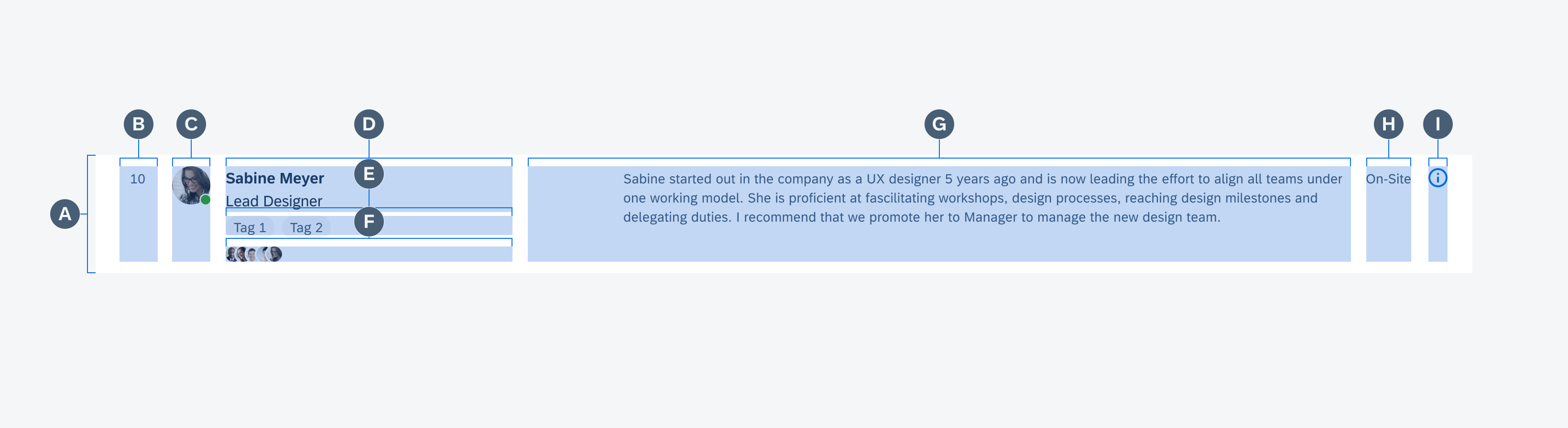
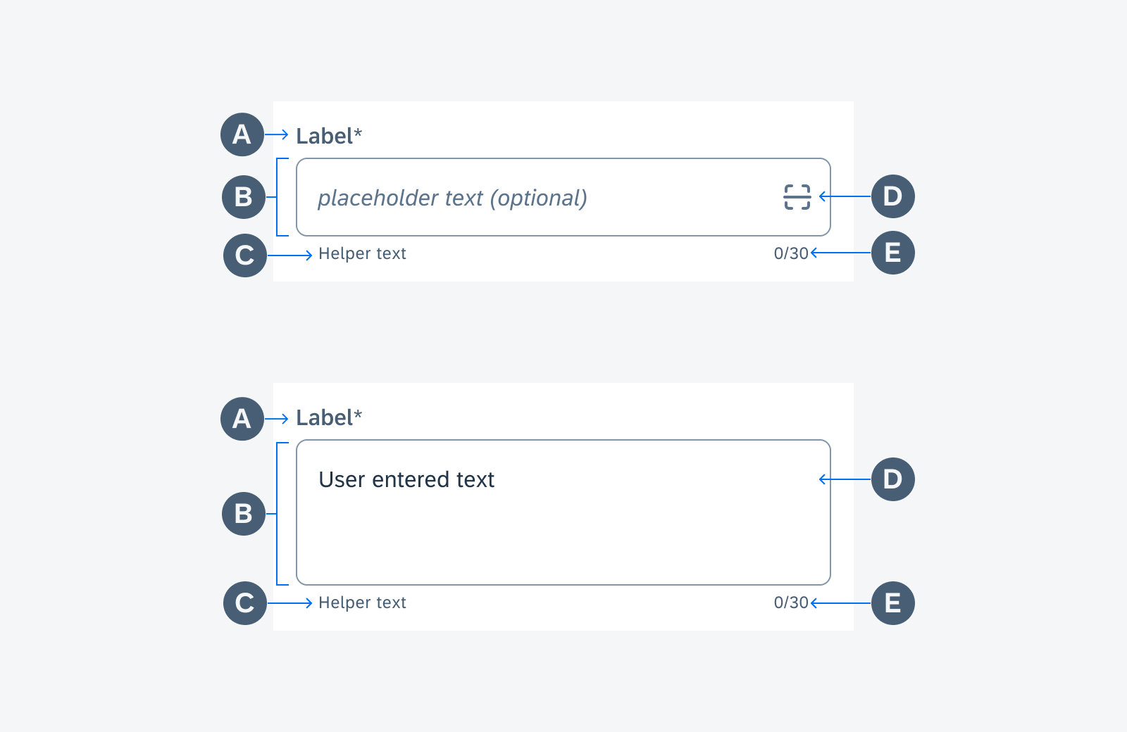
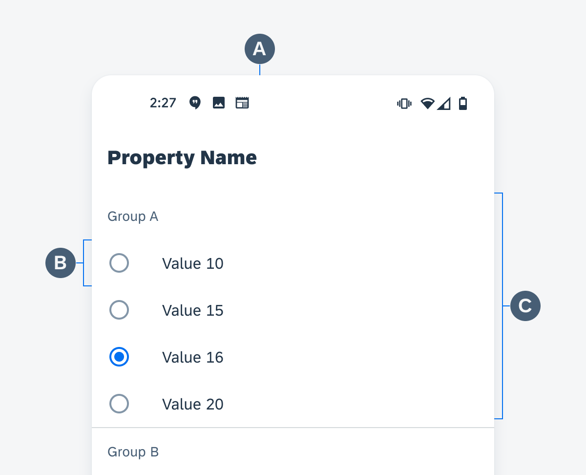
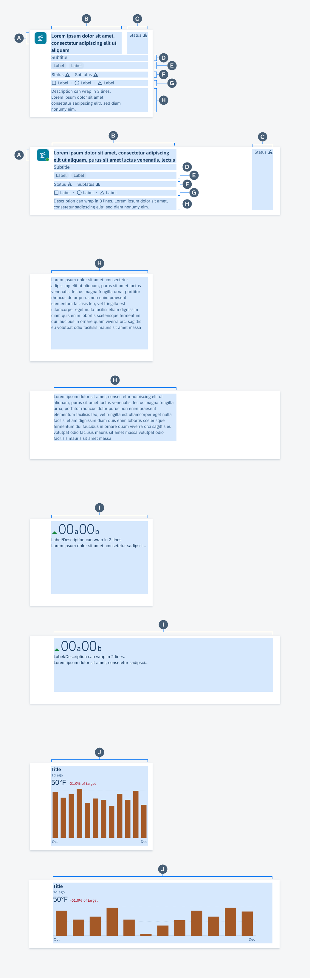
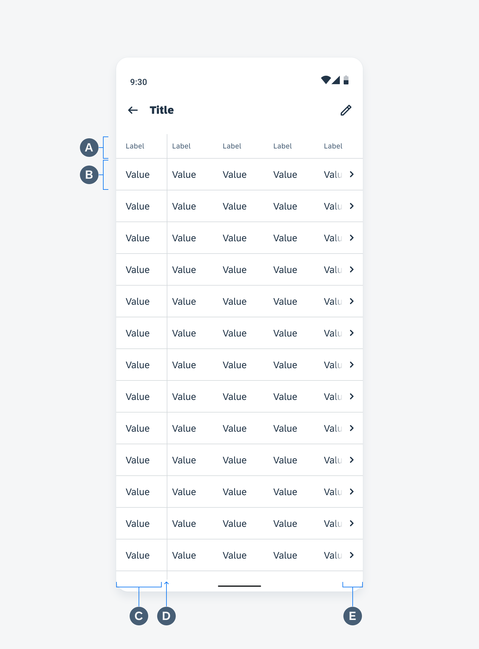
The sort and filter dialog is made up of reusable and modular sections. Each section consists of different types of controls or form cells.
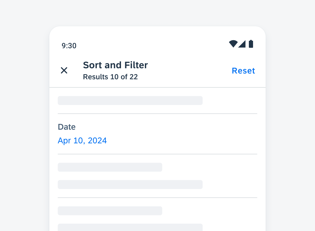
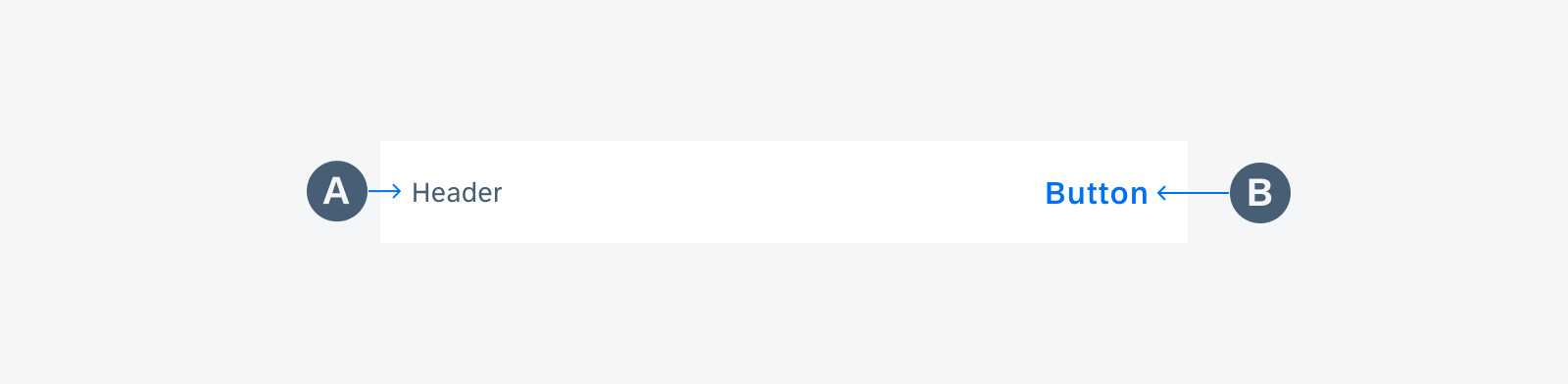
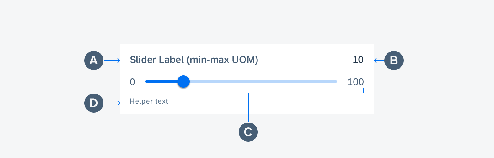
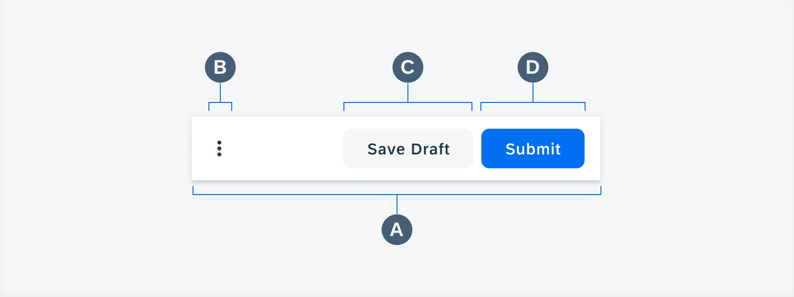
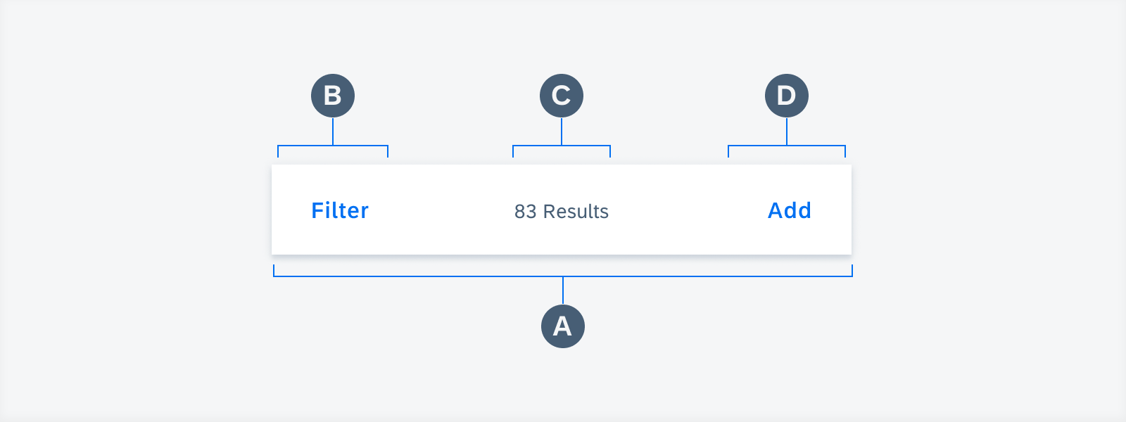
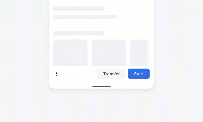
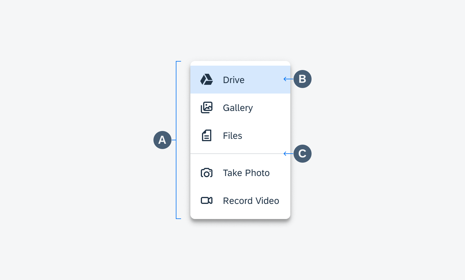
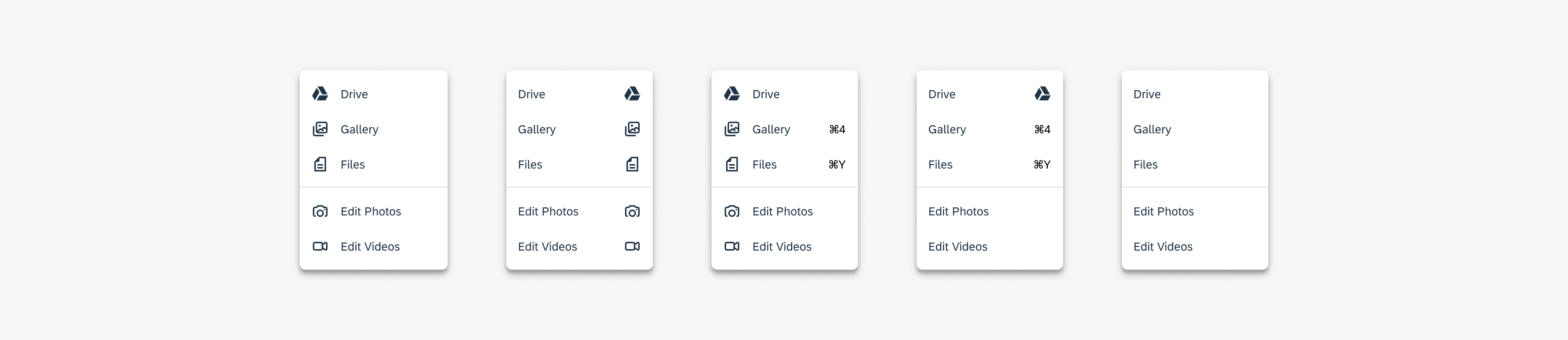
A. App Bar
The app bar contains a page title and actions related to the page. In a filter dialog, the page title is usually a filter or sort and filter. The “Close” icon on the left closes the dialog without applying changes. By tapping on “Reset,” users can undo any changes made to the filter and restore the default setting of the selected filter or sort option.
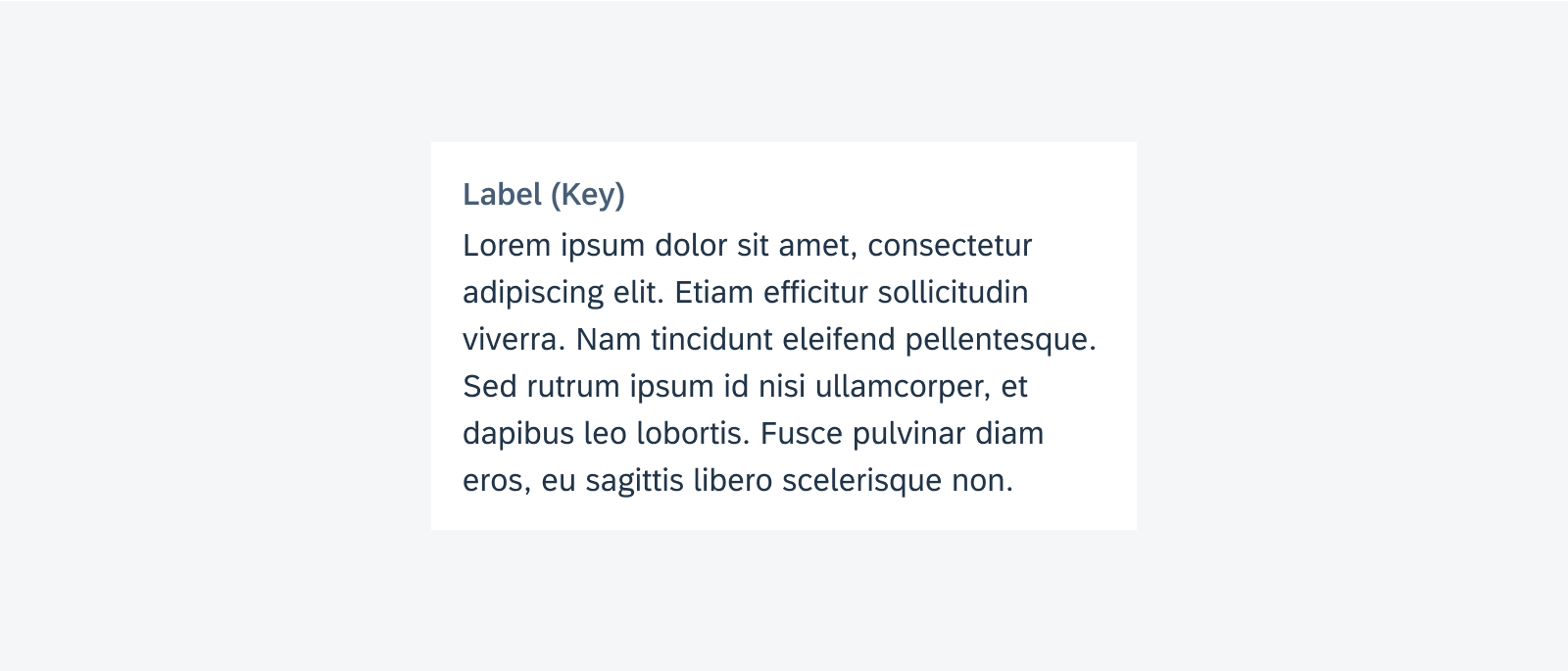
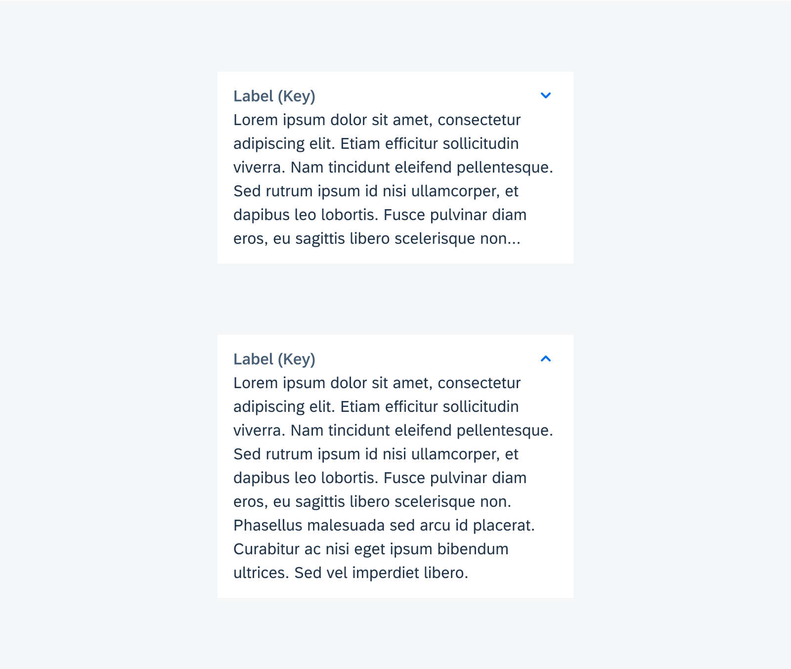
B. Sort Section (Optional)
When a sort feature is available, it appears as the first section in the dialog. The sort by section is used for sorting the results by a certain logic. The default sorting method is preselected.
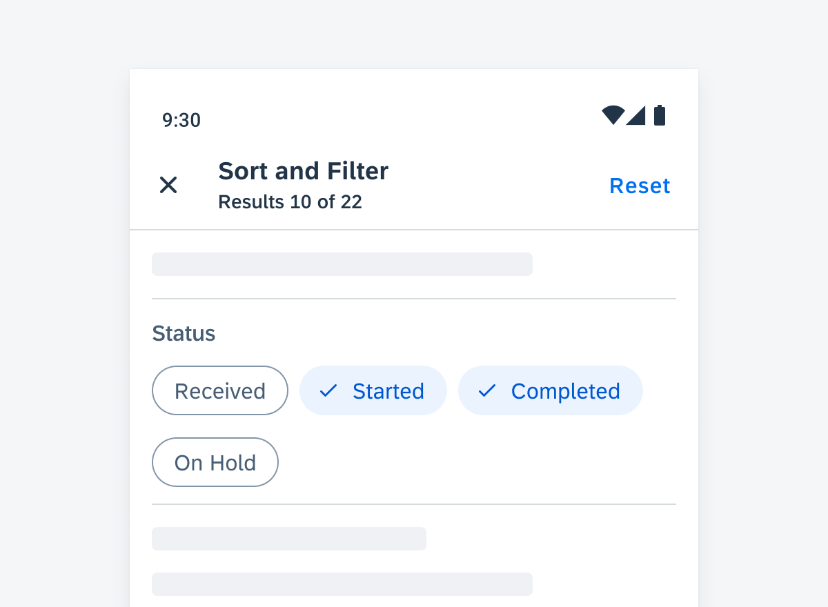
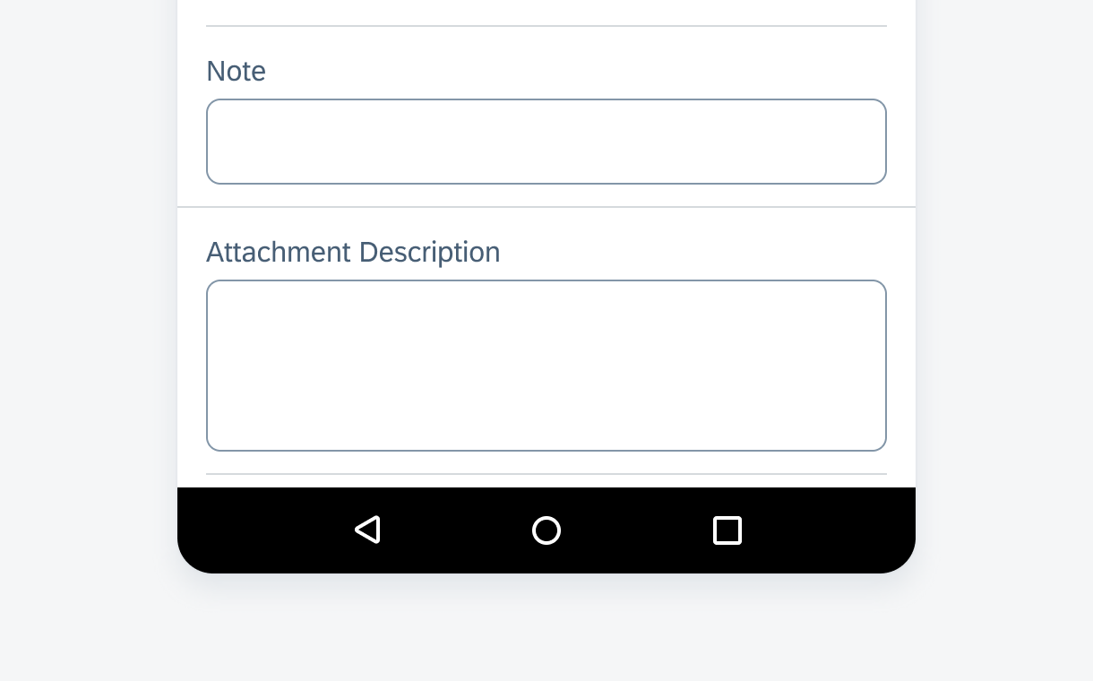
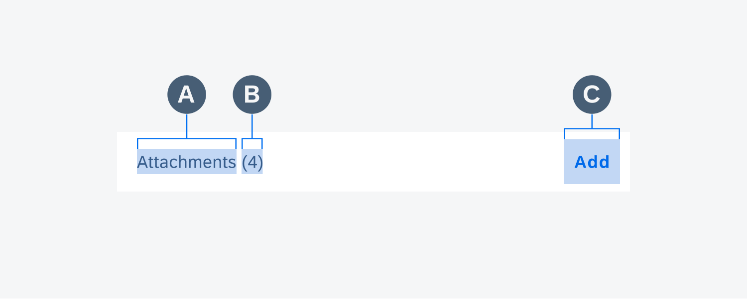
C. Filter Section
The filter section provides controls for users to set up filtering criteria. Types of controls include chips, selection controls, sliders, etc.
D. Footer Section
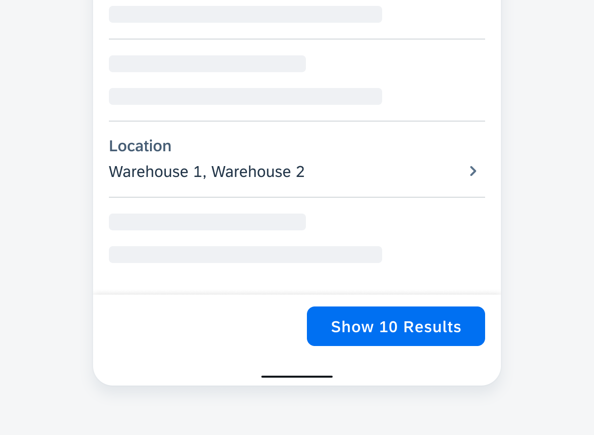
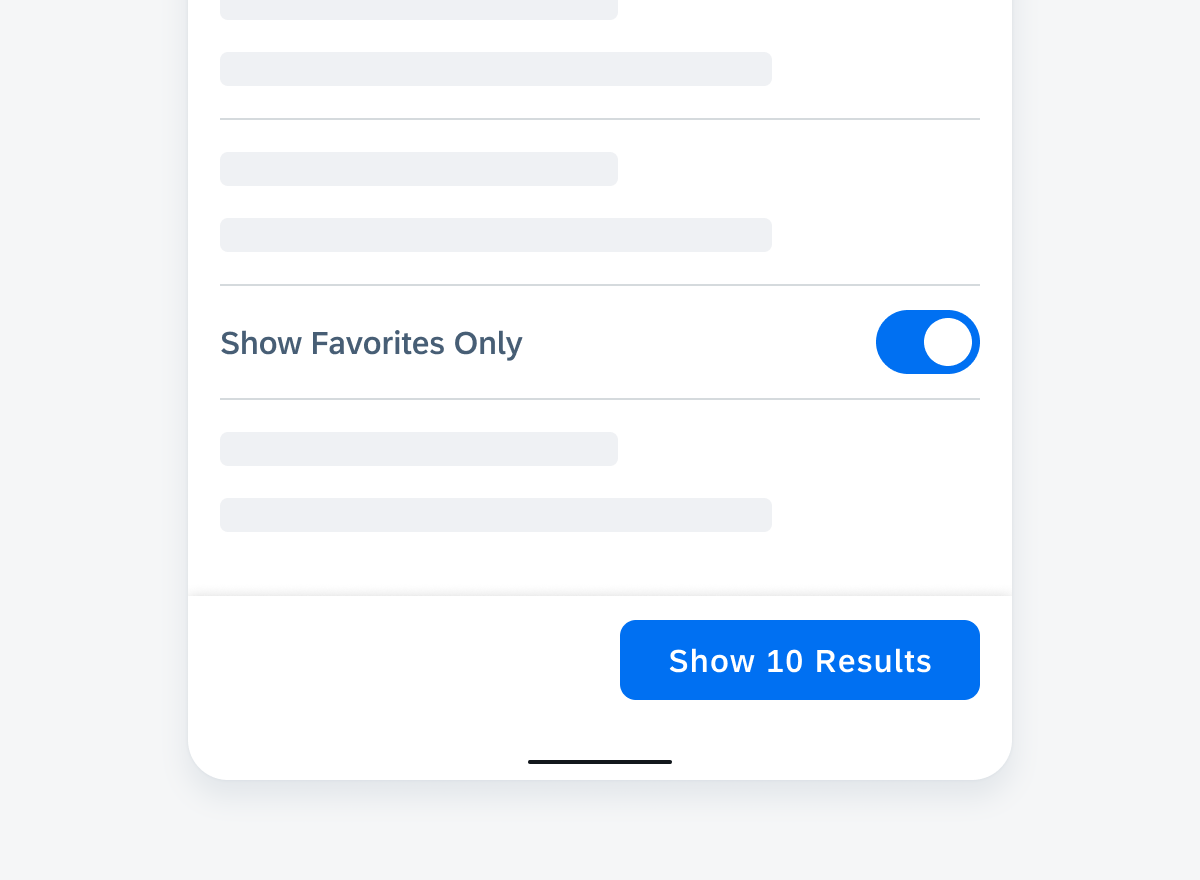
The footer area contains the “Show n Results” button. The n indicates the number of items with the selected filters applied.
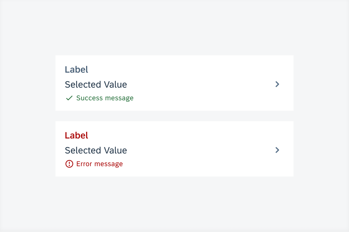
E. Filter Feedback (Optional)
The filter feedback bar can be used to provide more context to the filtered results, and allow users to quickly modify the filter options on screen.
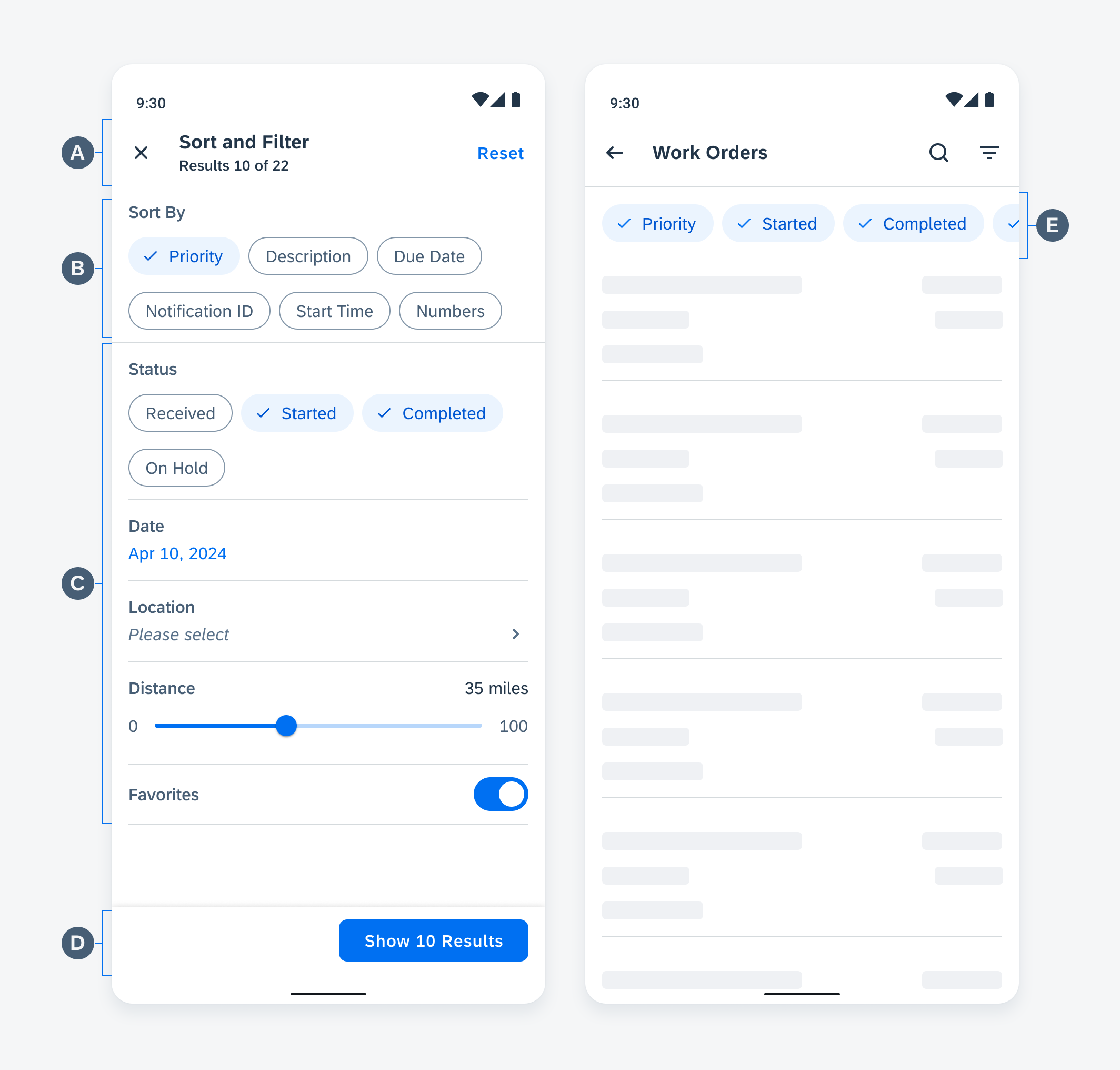
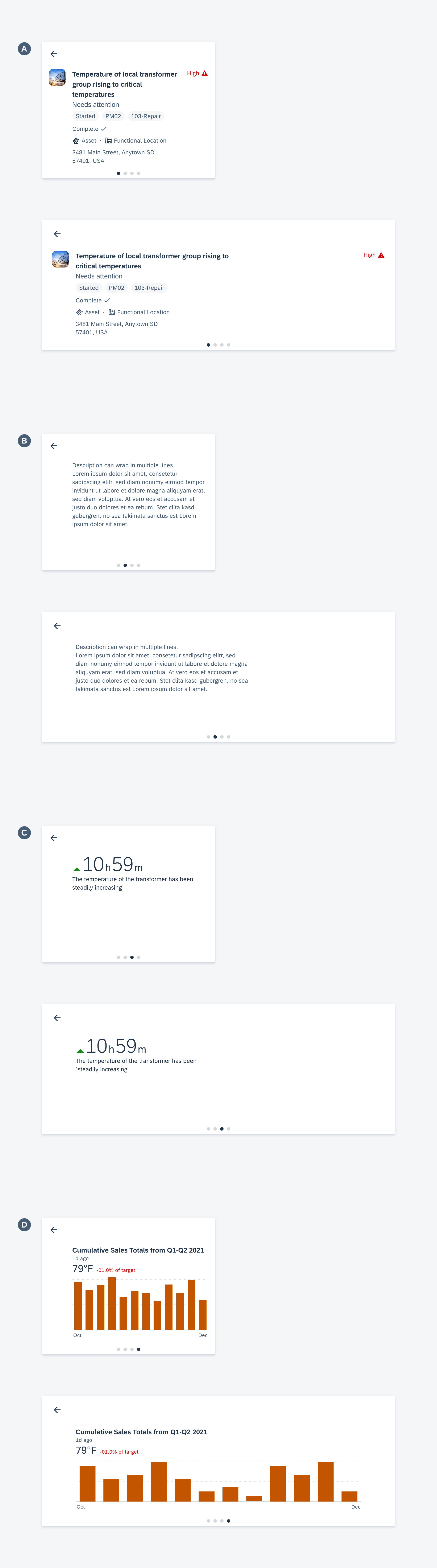
Anatomy of sort and filter dialog
Behavior and Interaction
Sort and Filter
Sort
Sort allows users to view the results in the order they desire.
Sort interaction
Filter
Filter allows users to narrow down the results according to certain criteria.
Filter interaction
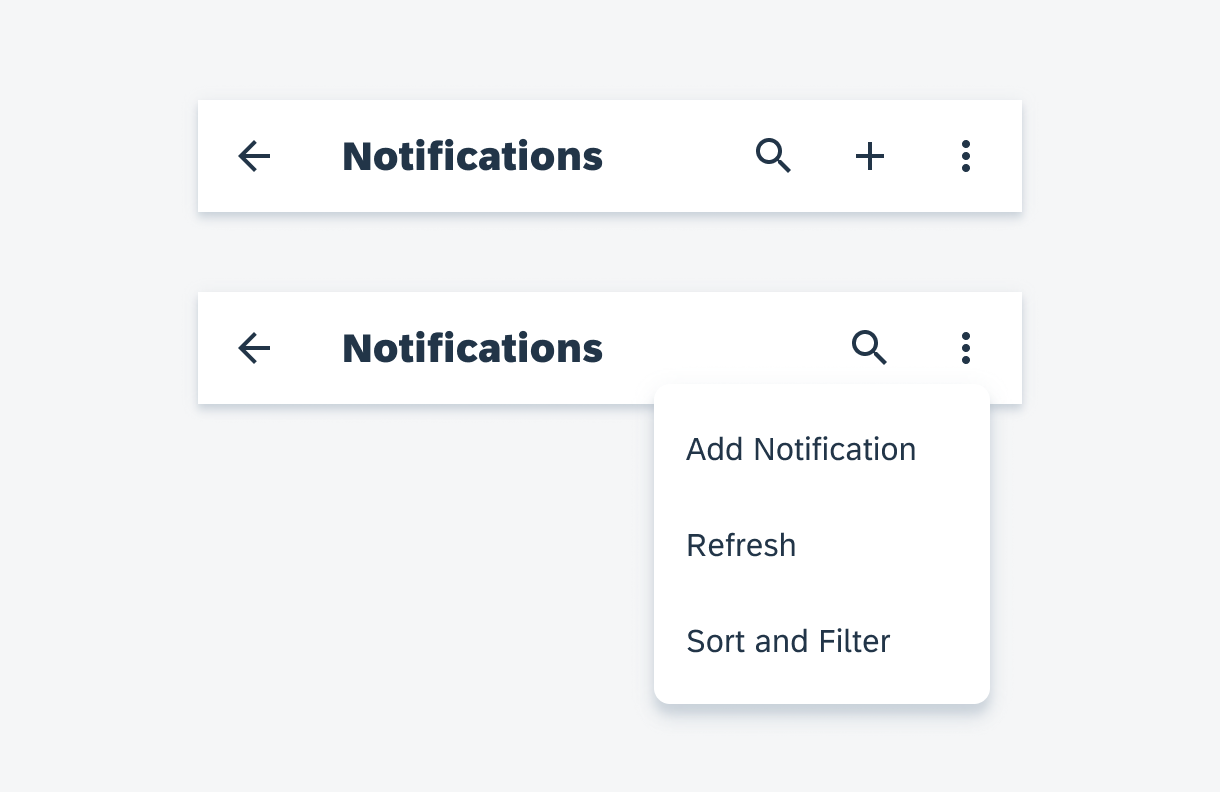
Trigger
The filter dialog is triggered by tapping on the filter icon on the app bar. Based on the priority of actions, if there is no space in the app bar, the filter can be placed in the “More” menu on mobile. On tablet, it should be visible from the app bar.
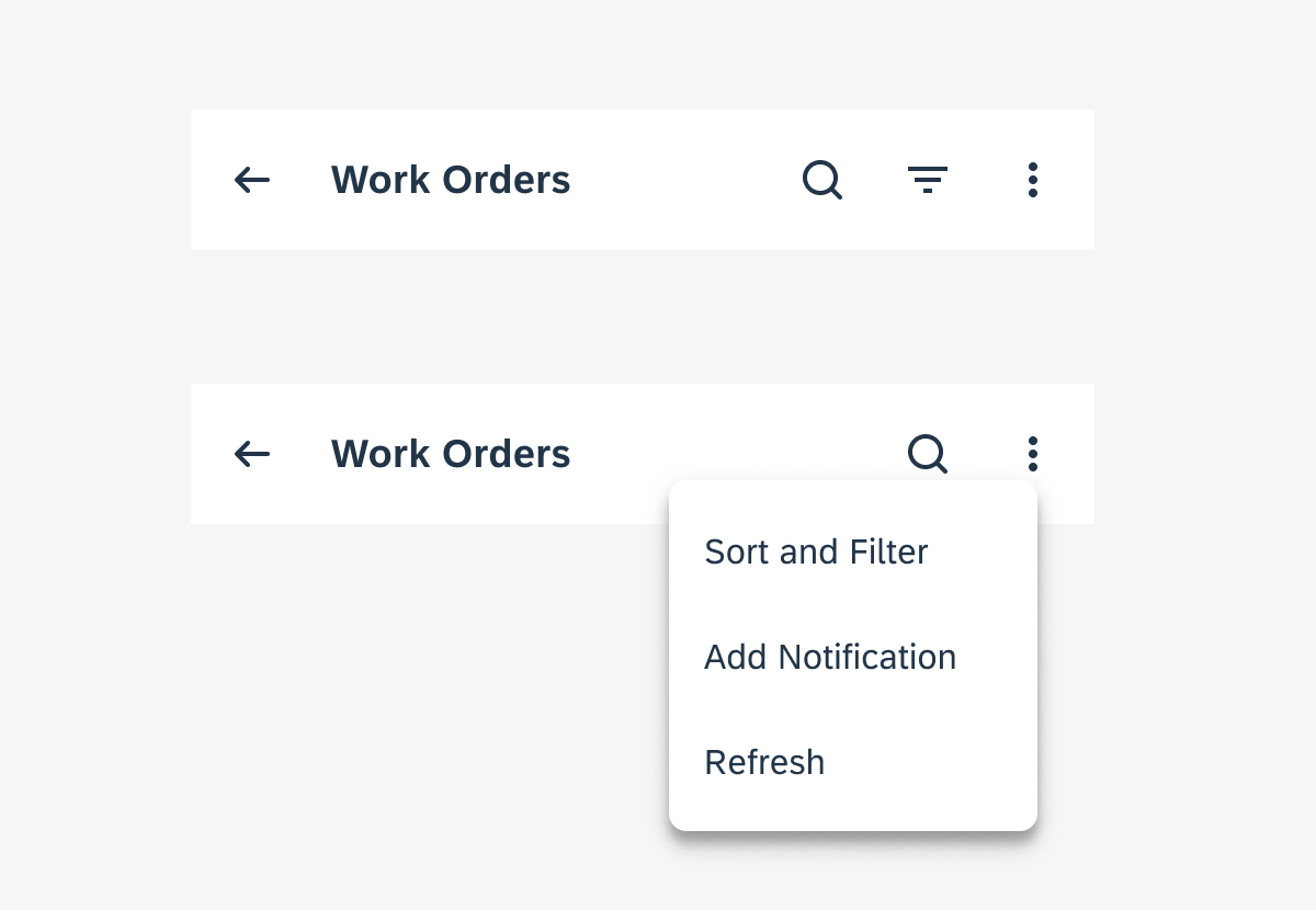
Sort and filter placed in more menu
Actions
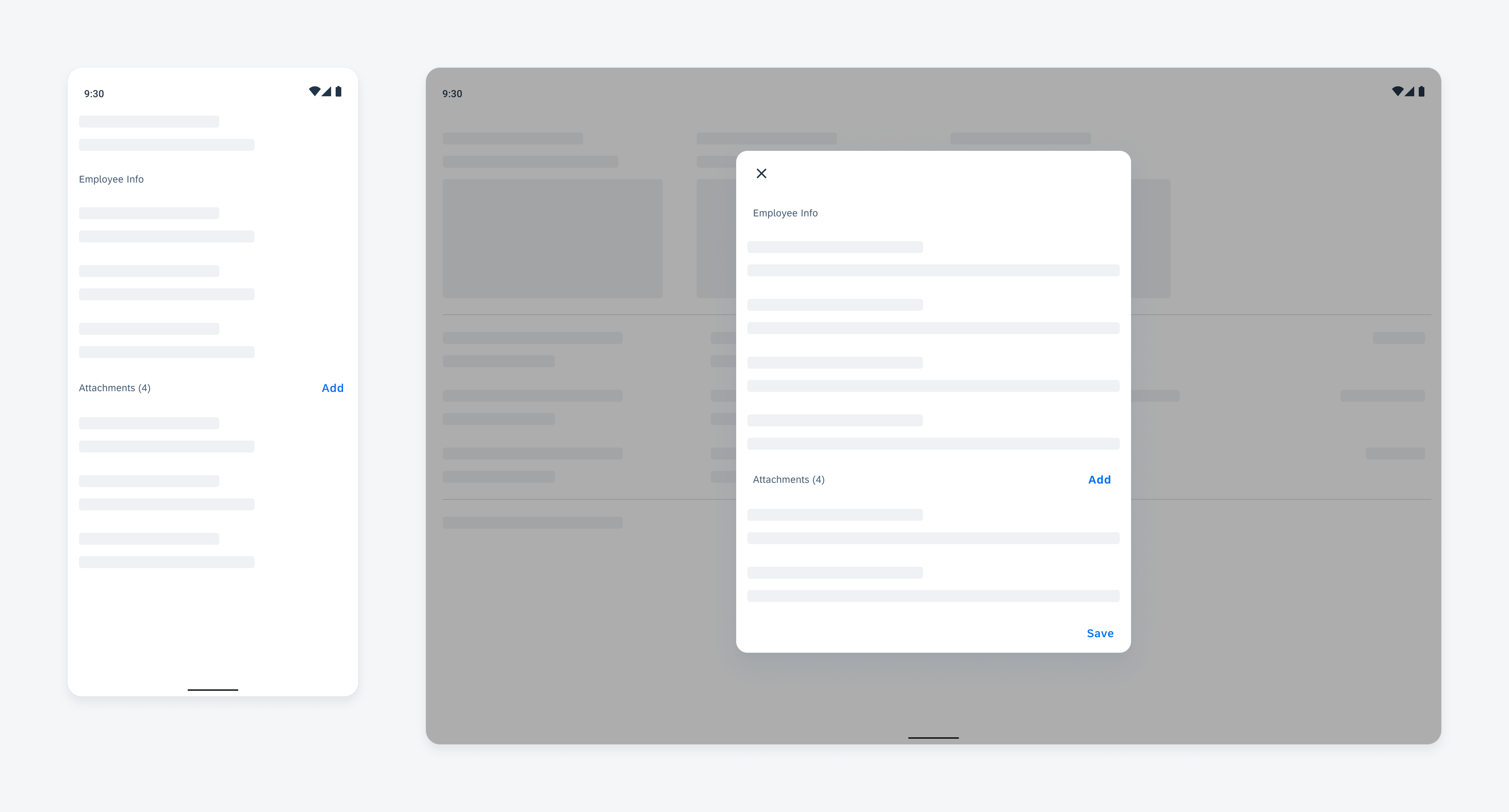
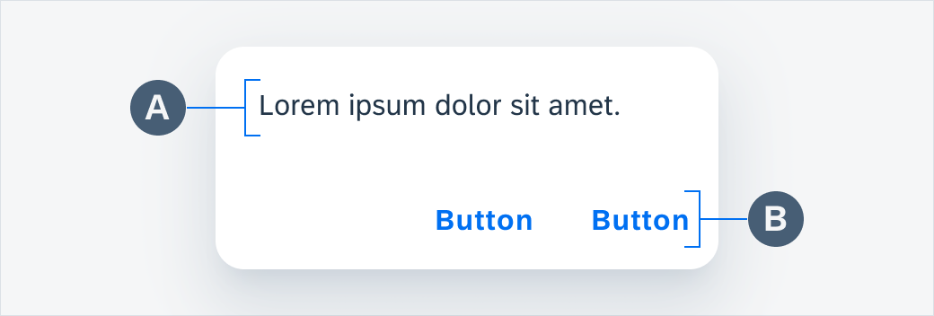
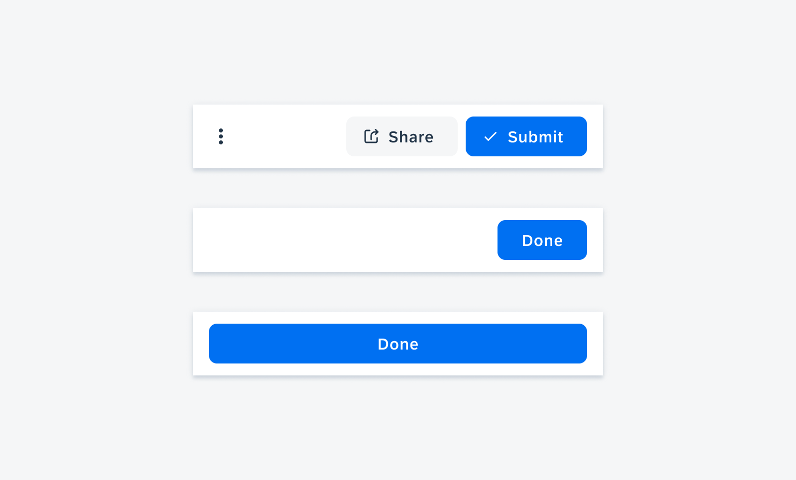
The filter dialog follows the standard full-screen dialog structure: a discard action on the left, and a confirmation action on the right.
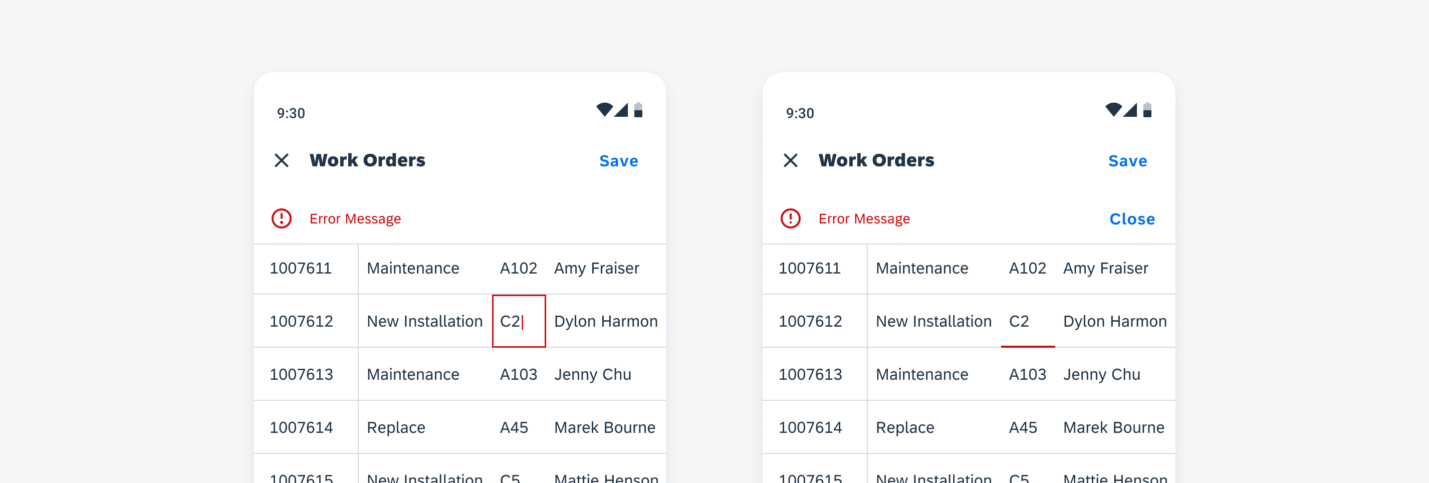
Close Icon
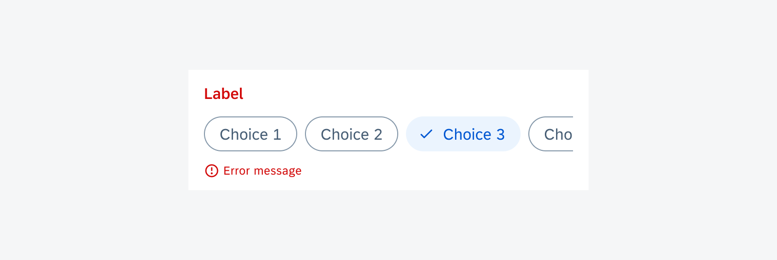
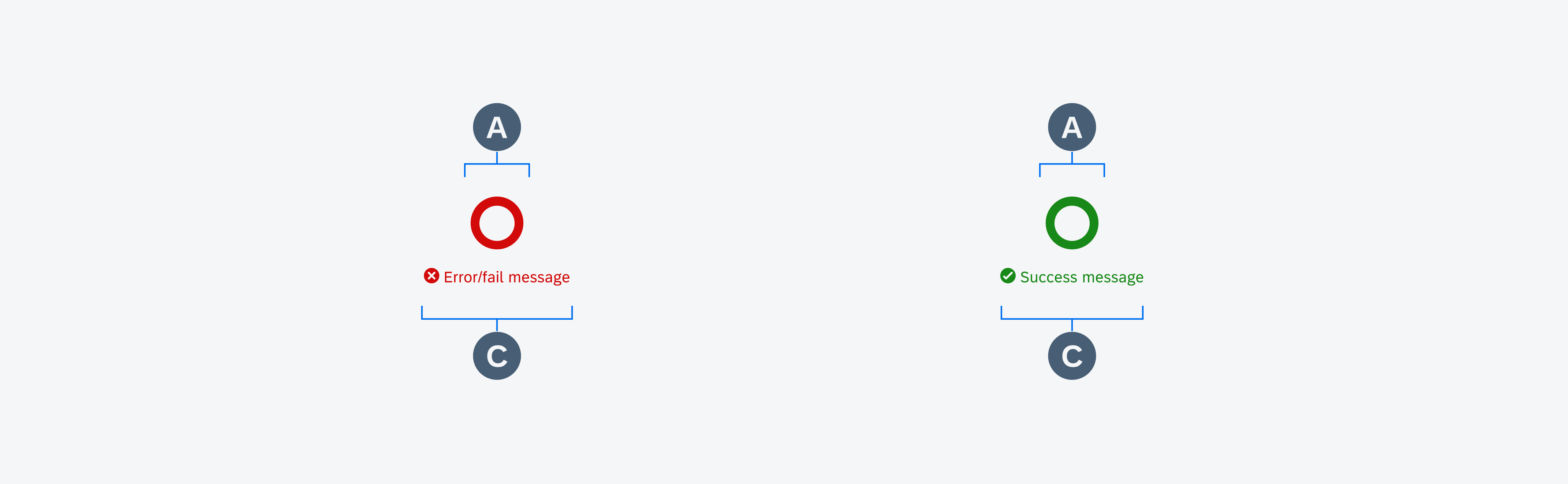
The “Close” icon closes the dialog without having to commit. When nothing has been entered by the user, the dialog is closed directly. If there is unsaved input, a confirmation dialog pops up asking users to confirm their action.
“Show n Results” Button
The “Show n Results” button confirms the selections users have made and closes the dialog. The list is refreshed with the new filter settings.
Close interaction with confirmation dialog
Navigation
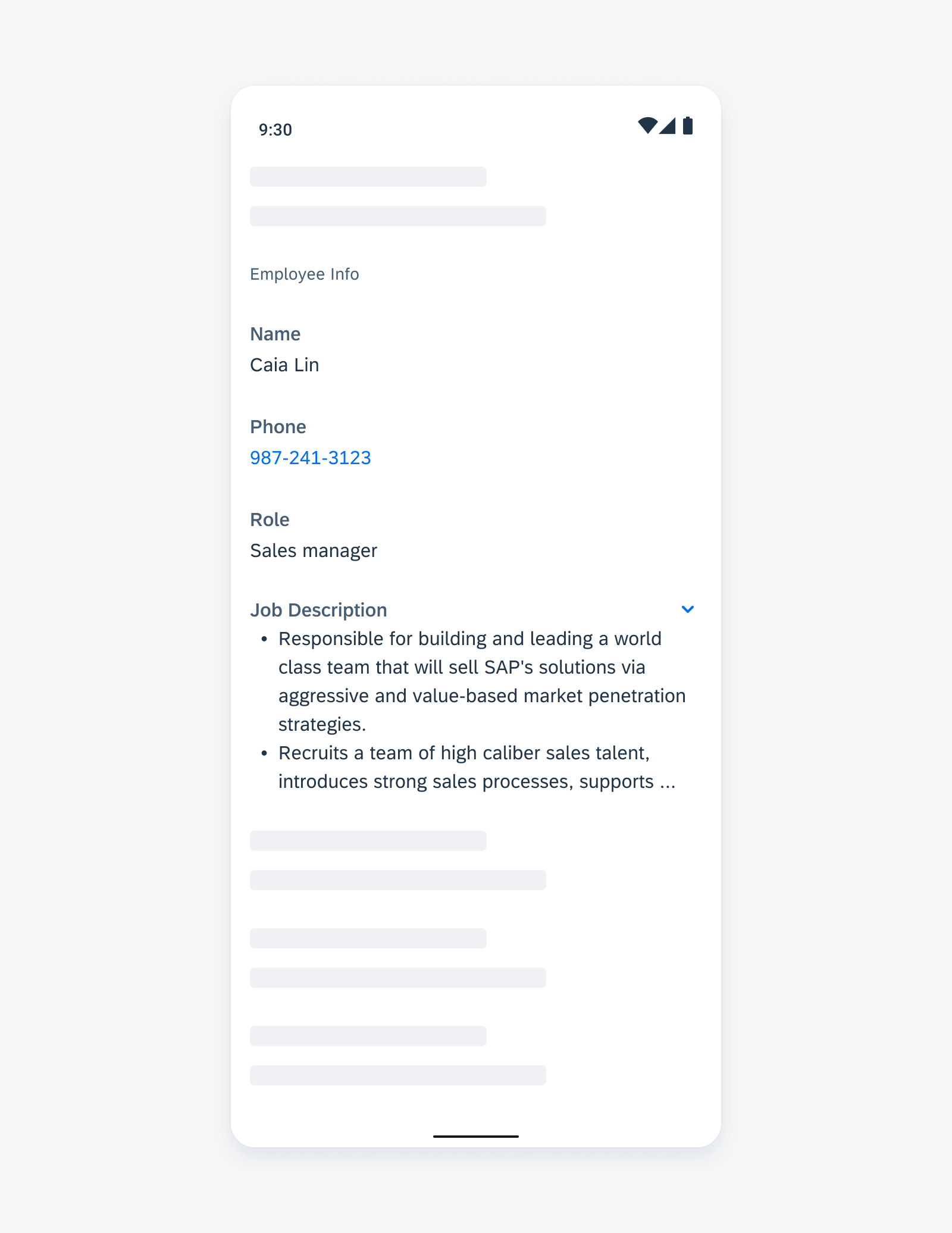
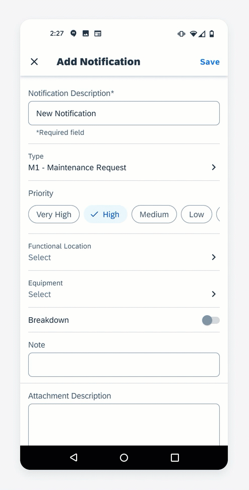
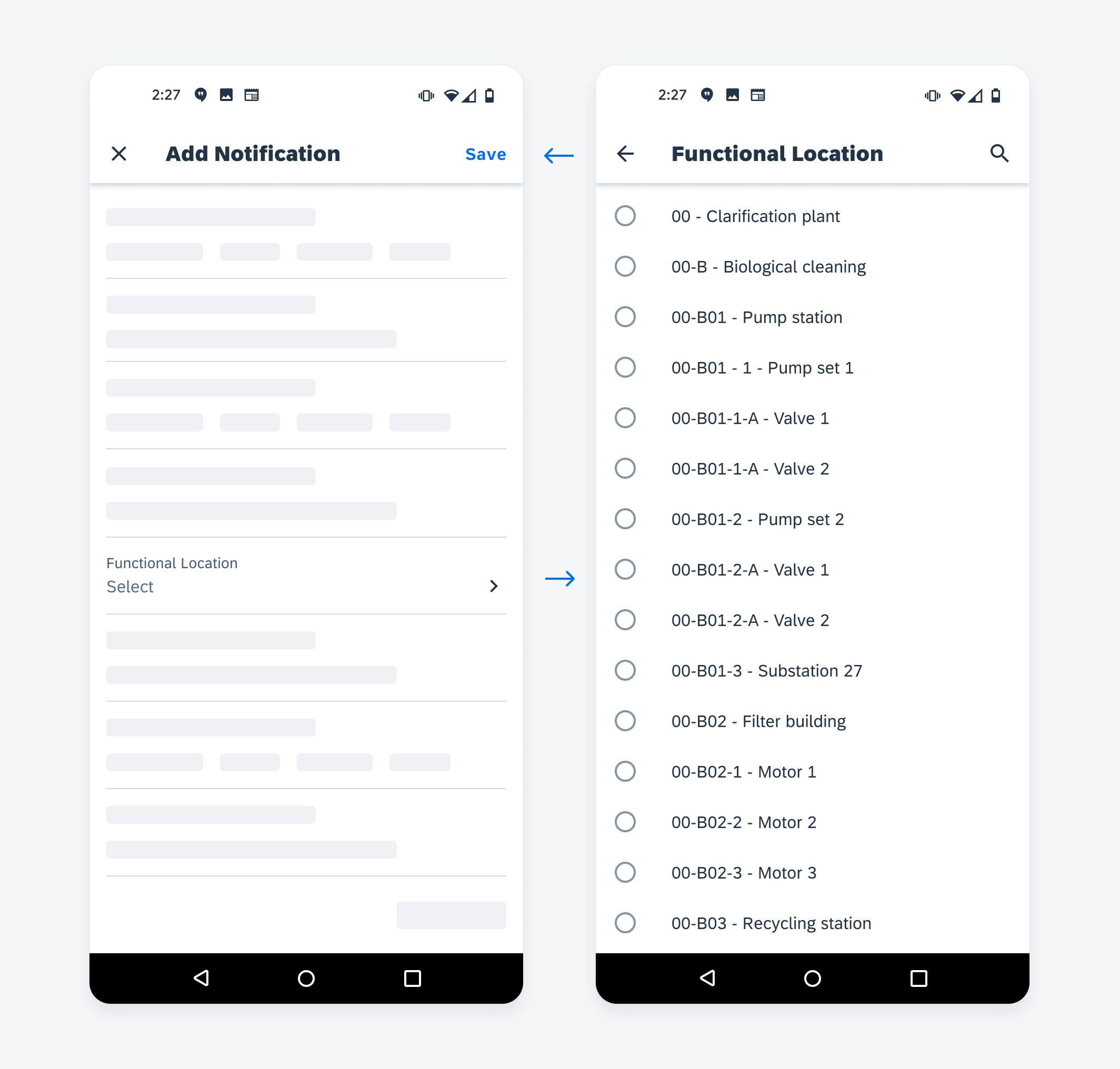
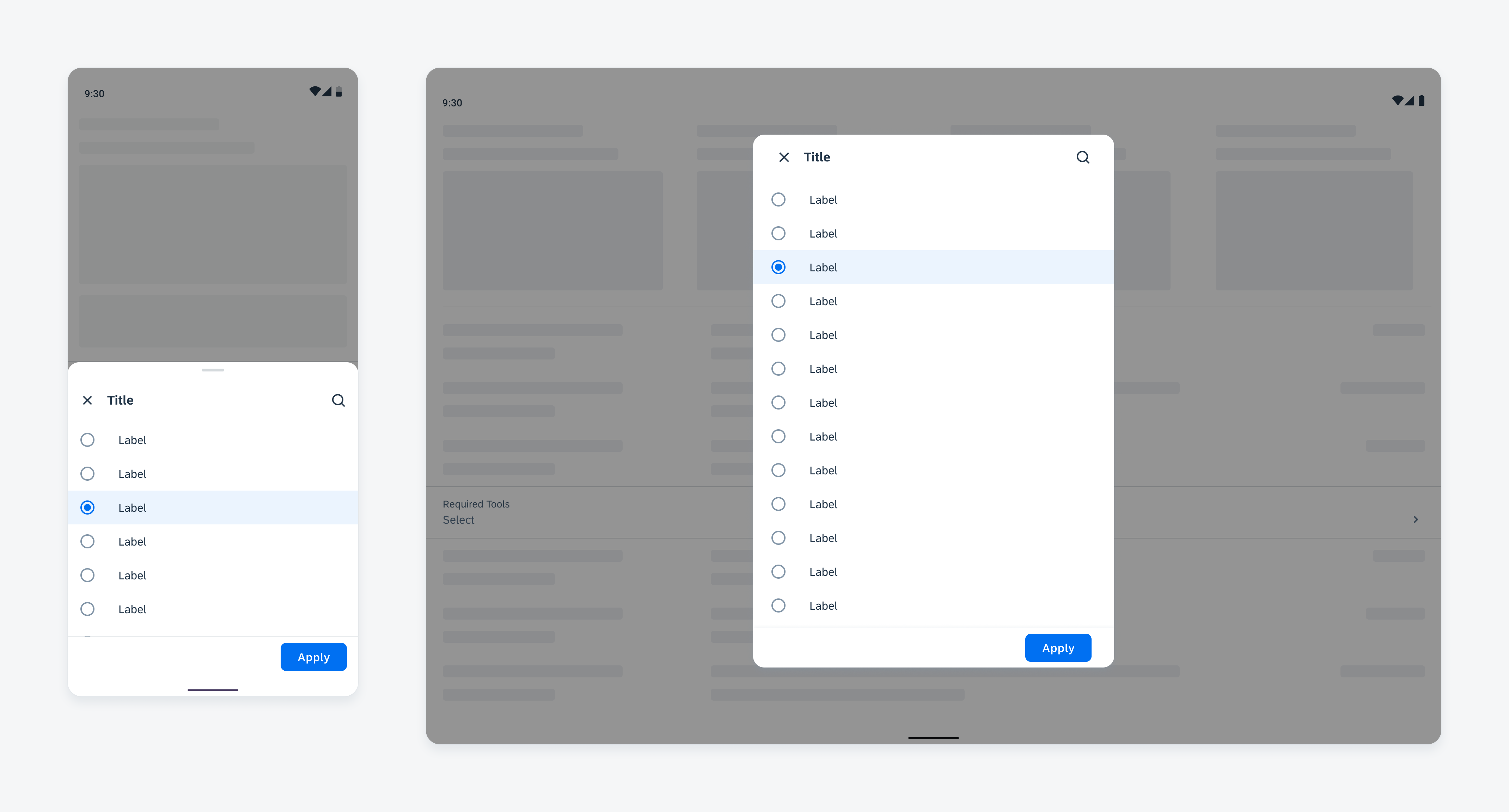
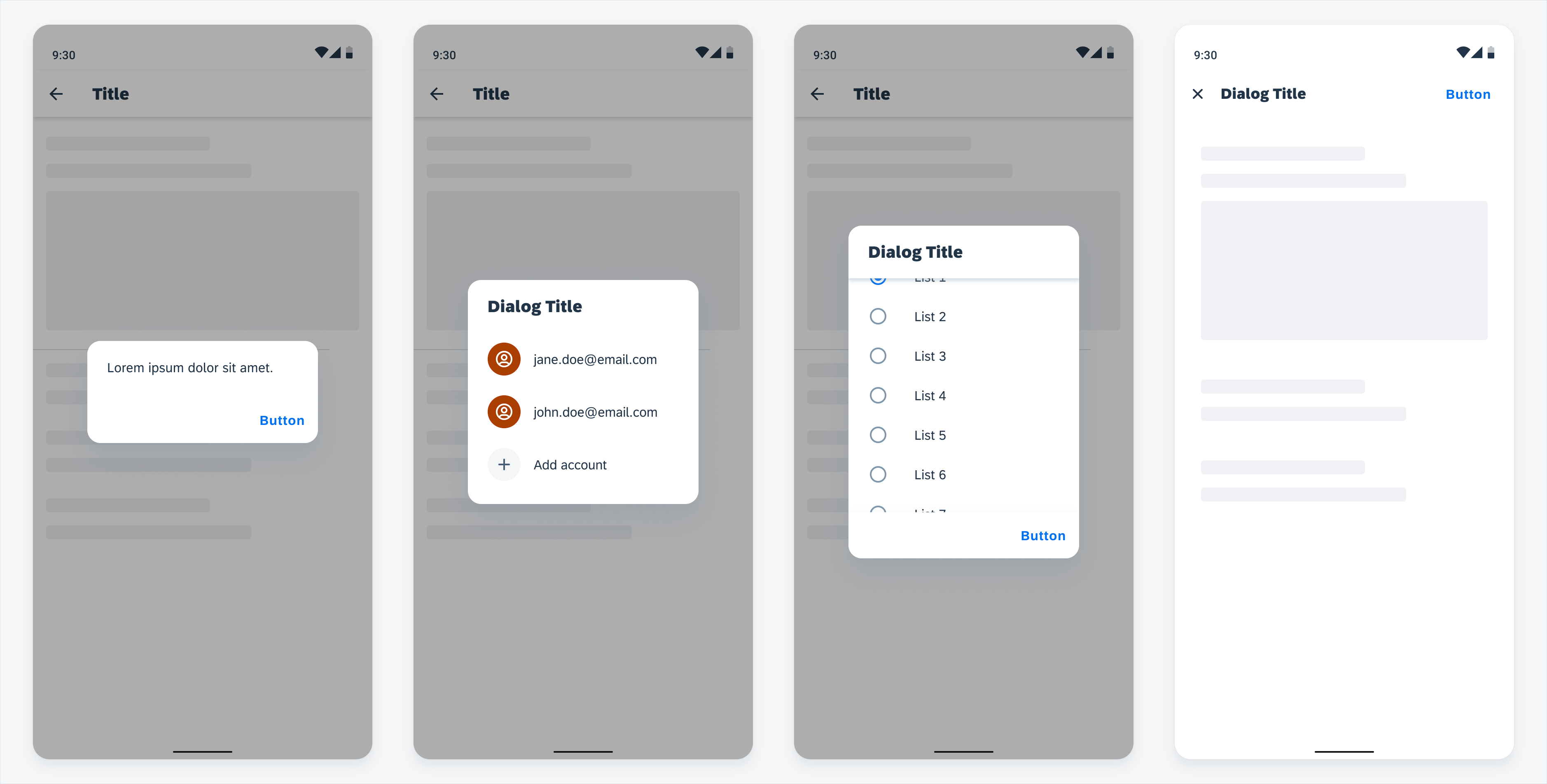
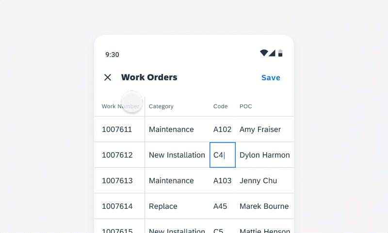
The navigation within the filter dialog is normally to drill down into a value list.
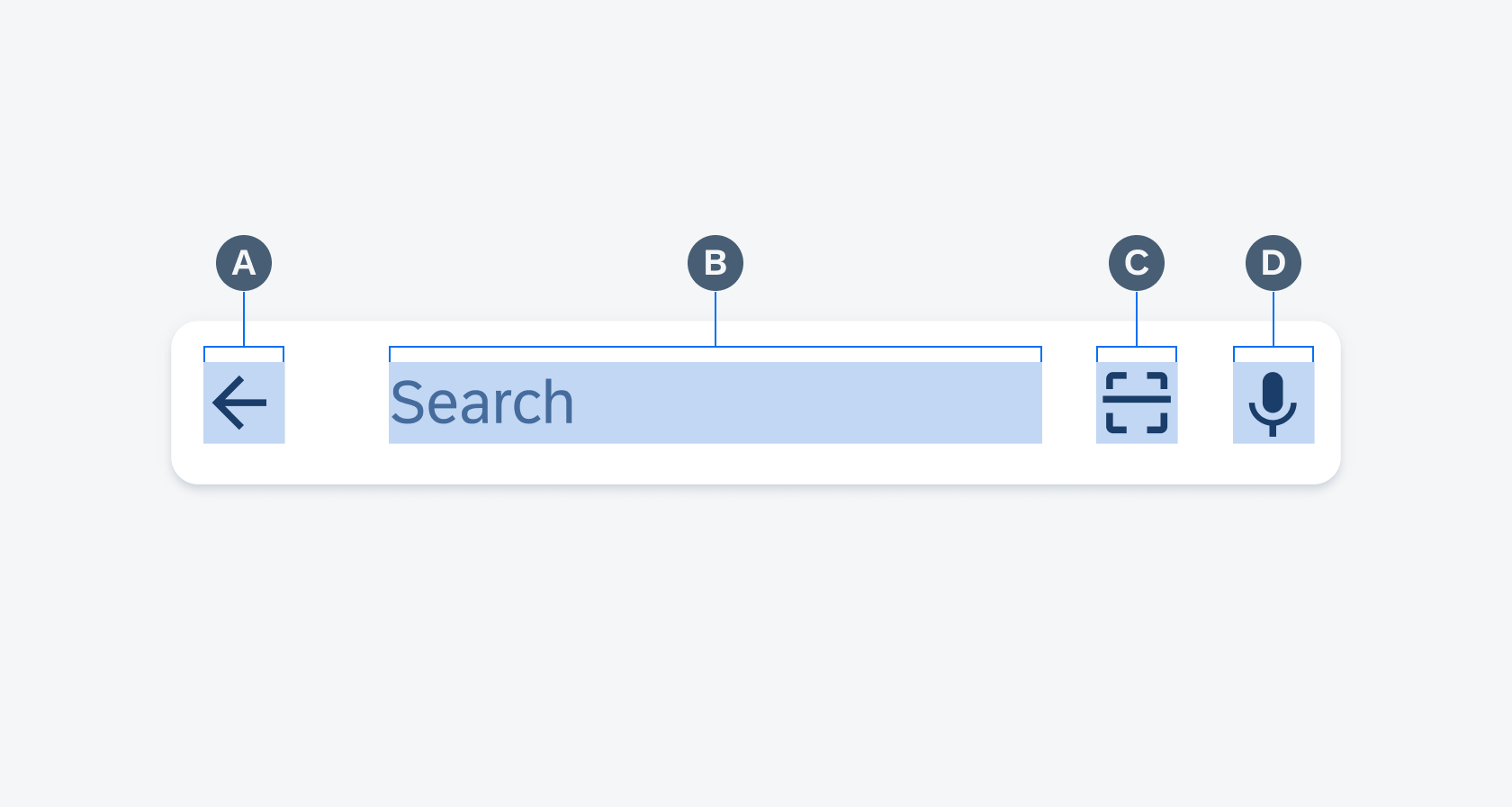
The title of the new screen should be consistent with the label in the filter cell. Replace the “Close” icon with the “Back” icon to navigate back. The drill down page has no “Apply” button, as all changes here are autosaved. If the search function is available, show the “Search” icon in the app bar.
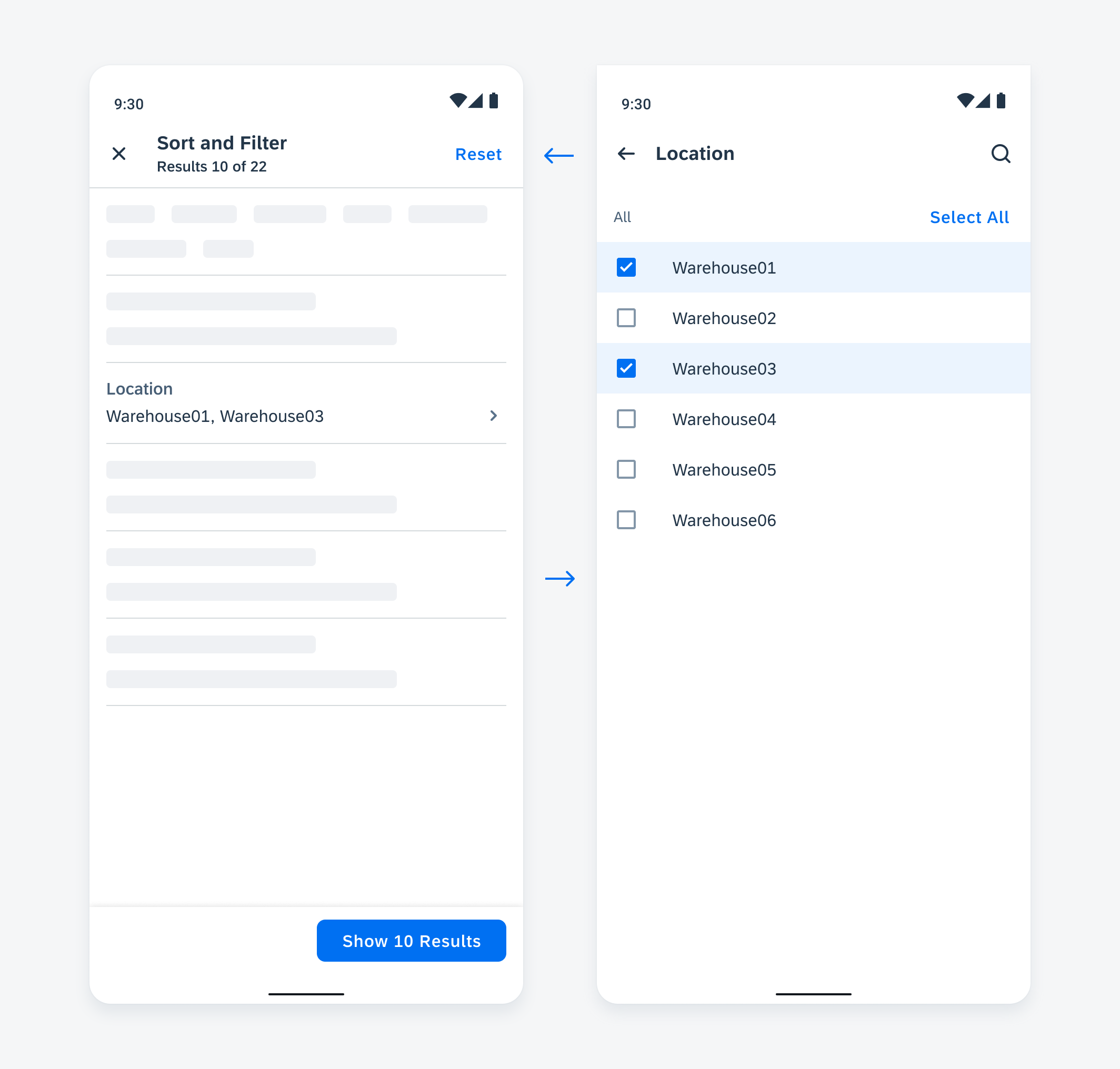
Navigation within the filter dialog
Variations
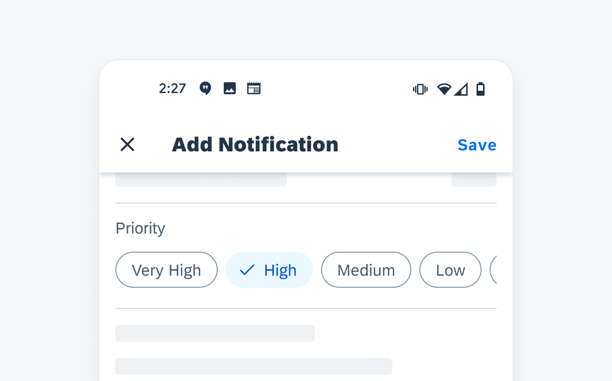
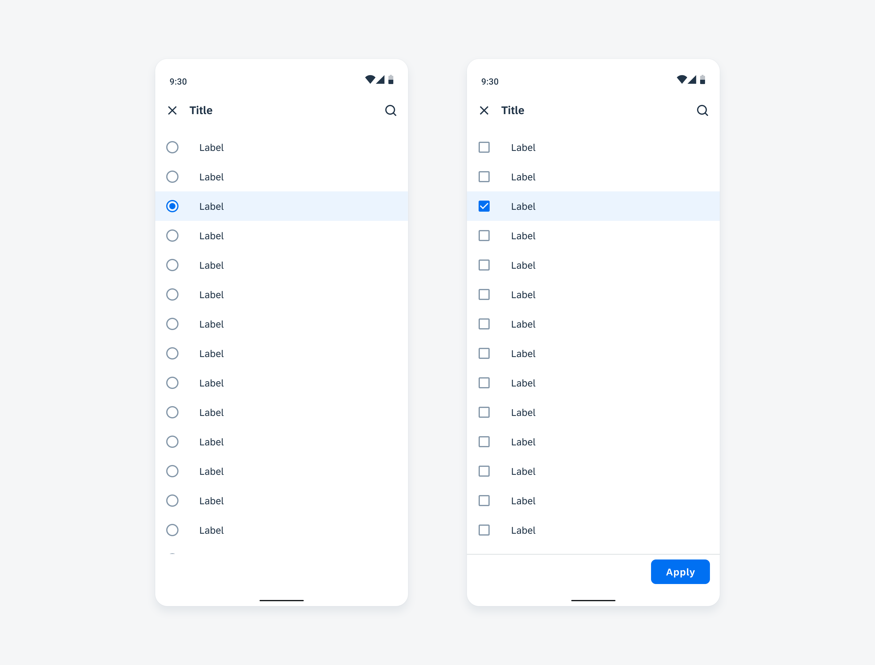
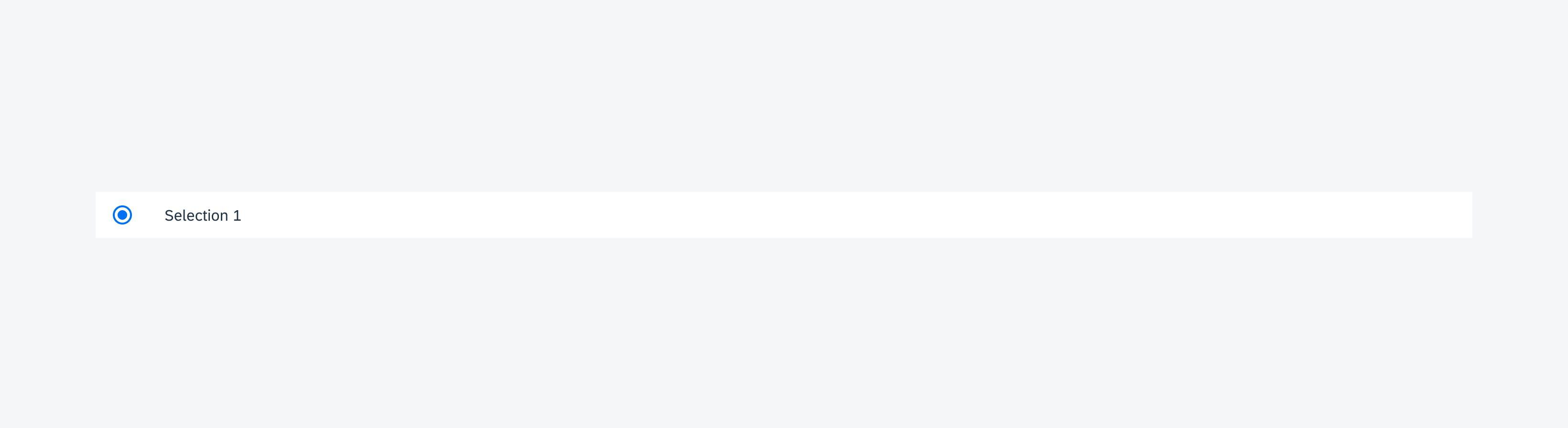
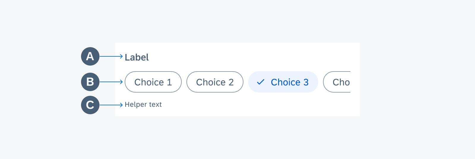
Choice Chip Form Cell – Single Selection
The choice chip form cell is recommended for single selection sort. This allows users to prioritize the list by one criterion. A default value should be selected for sort.
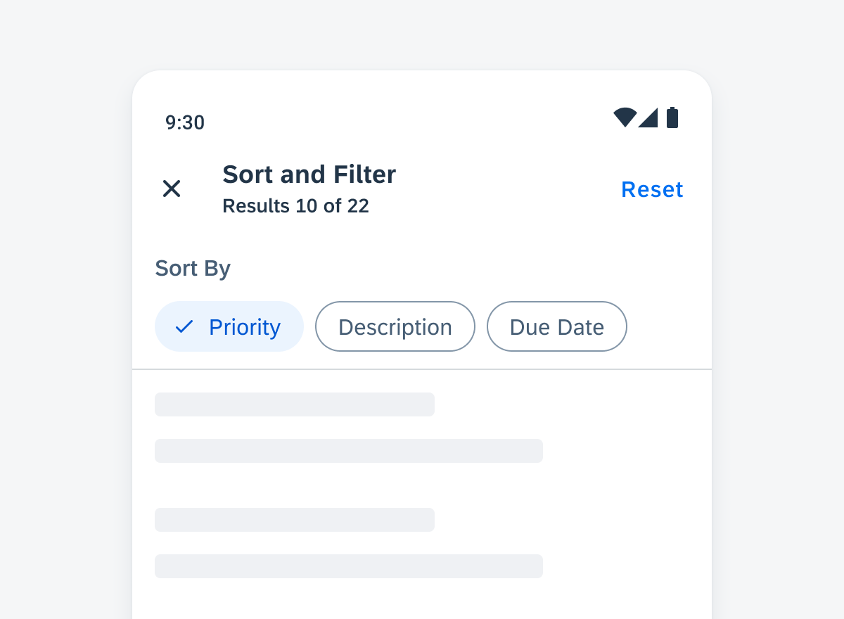
Choice chip form cell
Sort By Multiple Criteria
For more complex sorting needs, use the sort by multiple criteria control. It allows user to select multiple sorting criteria and set the order in which these criteria will be applied to a list. See sort by multiple criteria for more information.
Sort by multiple criteria
Select
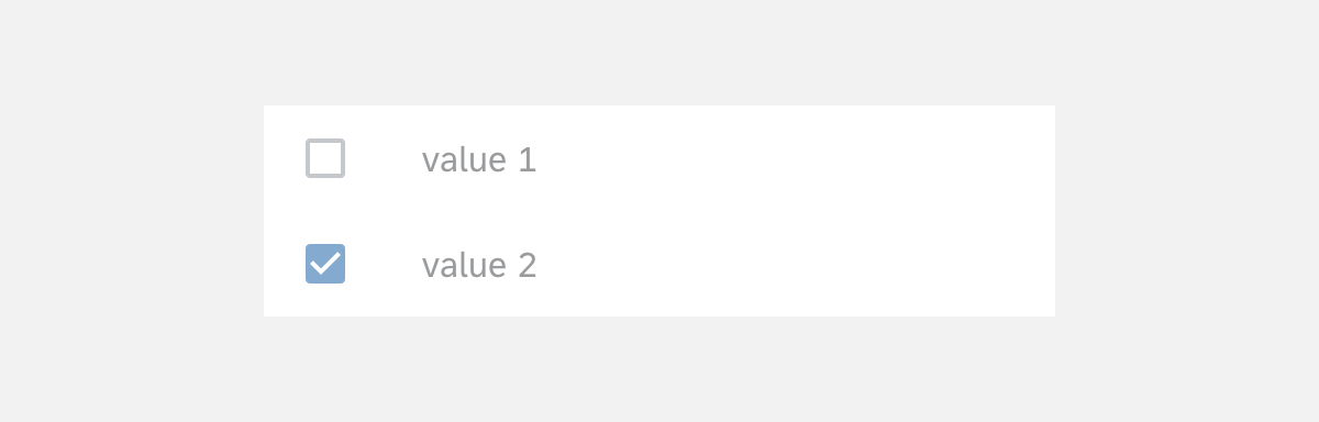
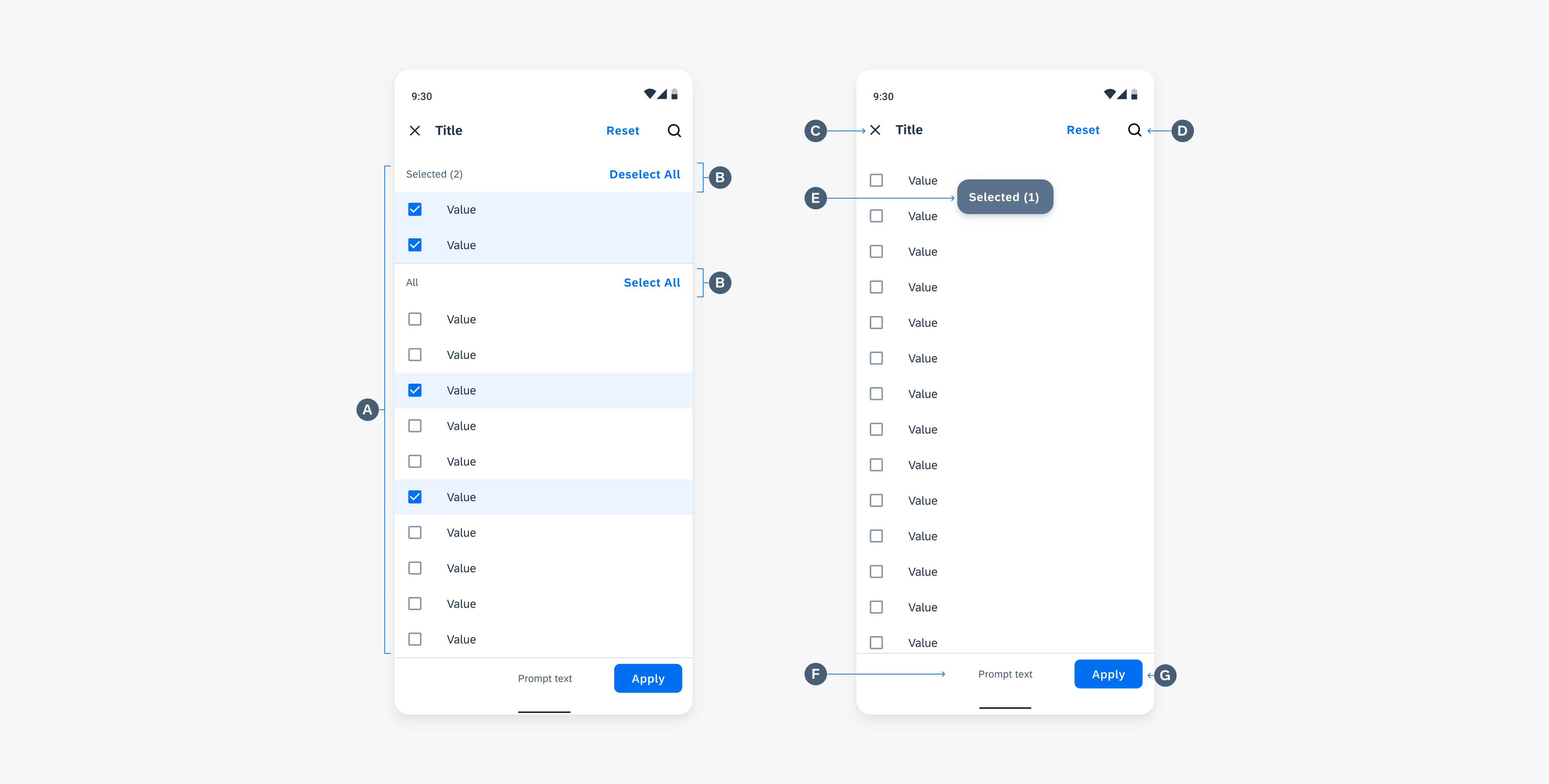
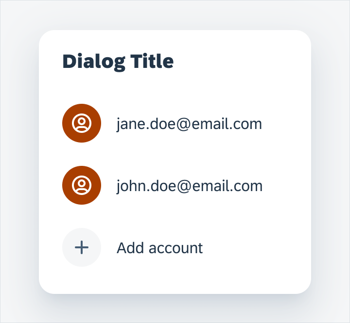
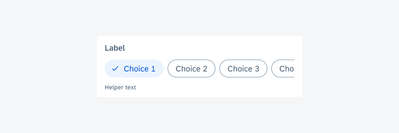
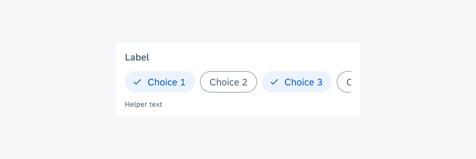
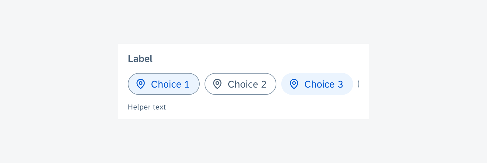
Chip Form Cell – Single or Multiple Selection
Use the chip form cell when users need to make selections from no more than eight pre-defined values. Use the choice chip form cell for a single selection. Use filter chip form cell for multiple selections. If the number of values is more than eight, or the text of the value is too long to display within the chips, use a list picker form cell instead.
Chip form cell
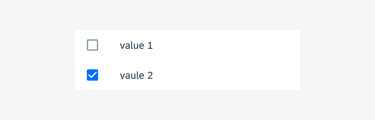
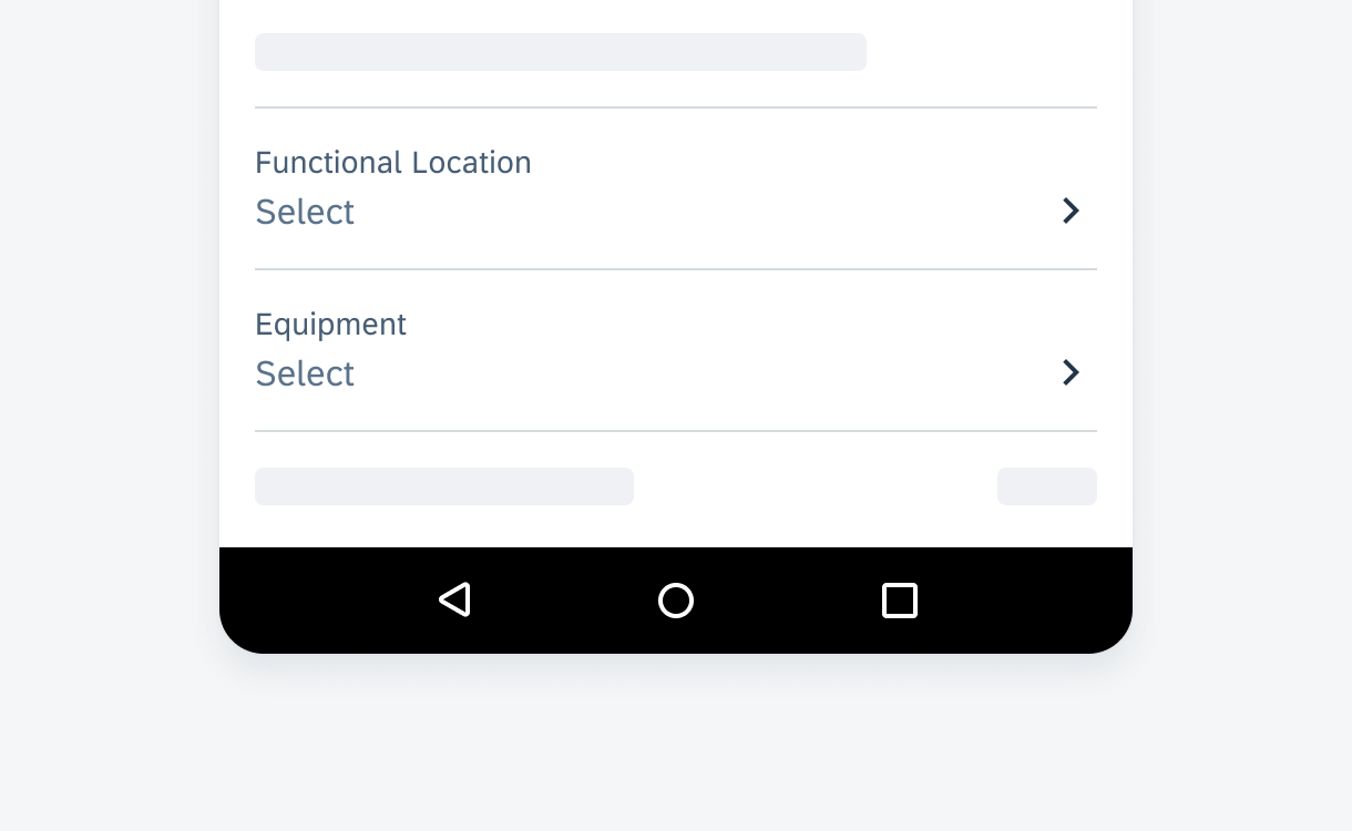
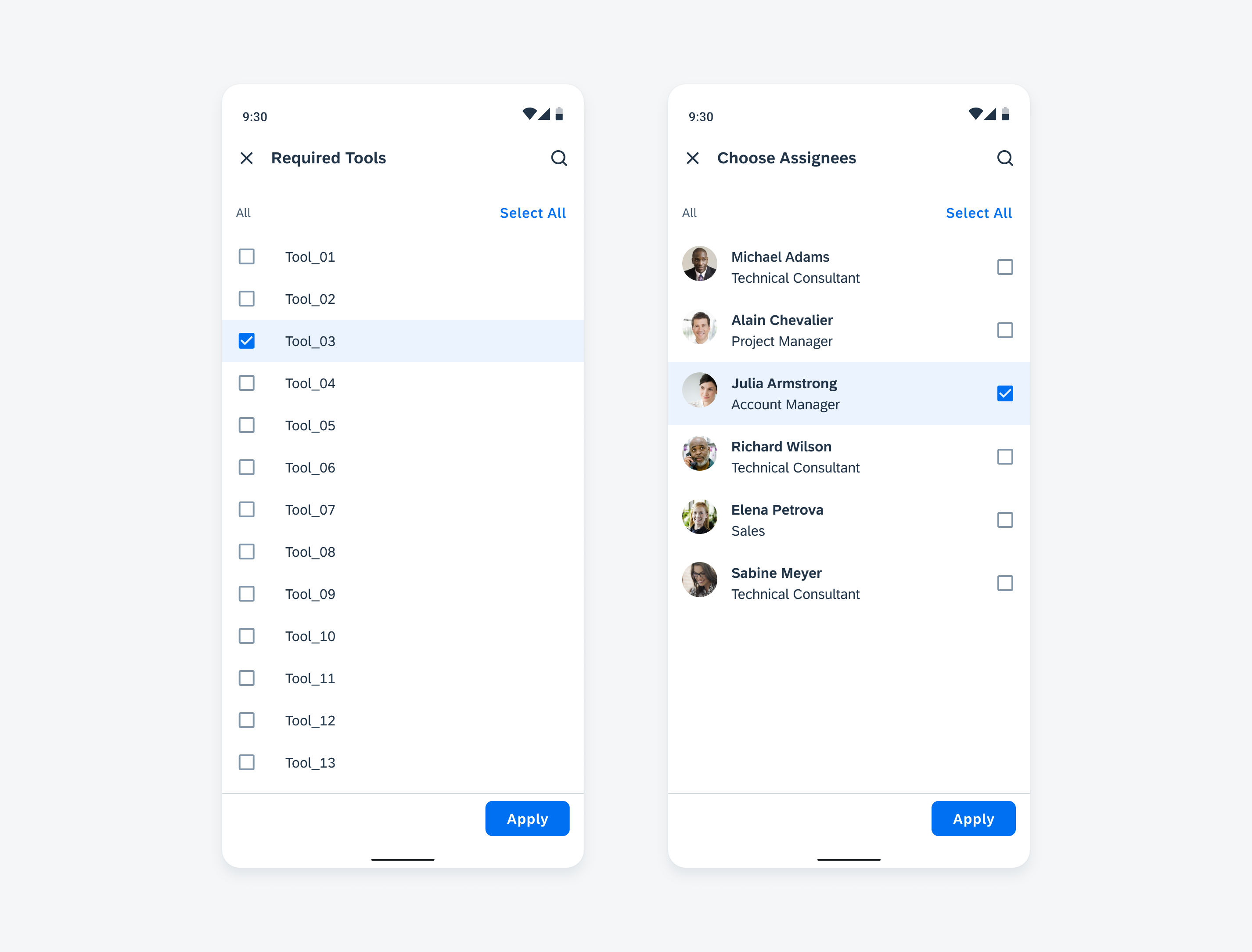
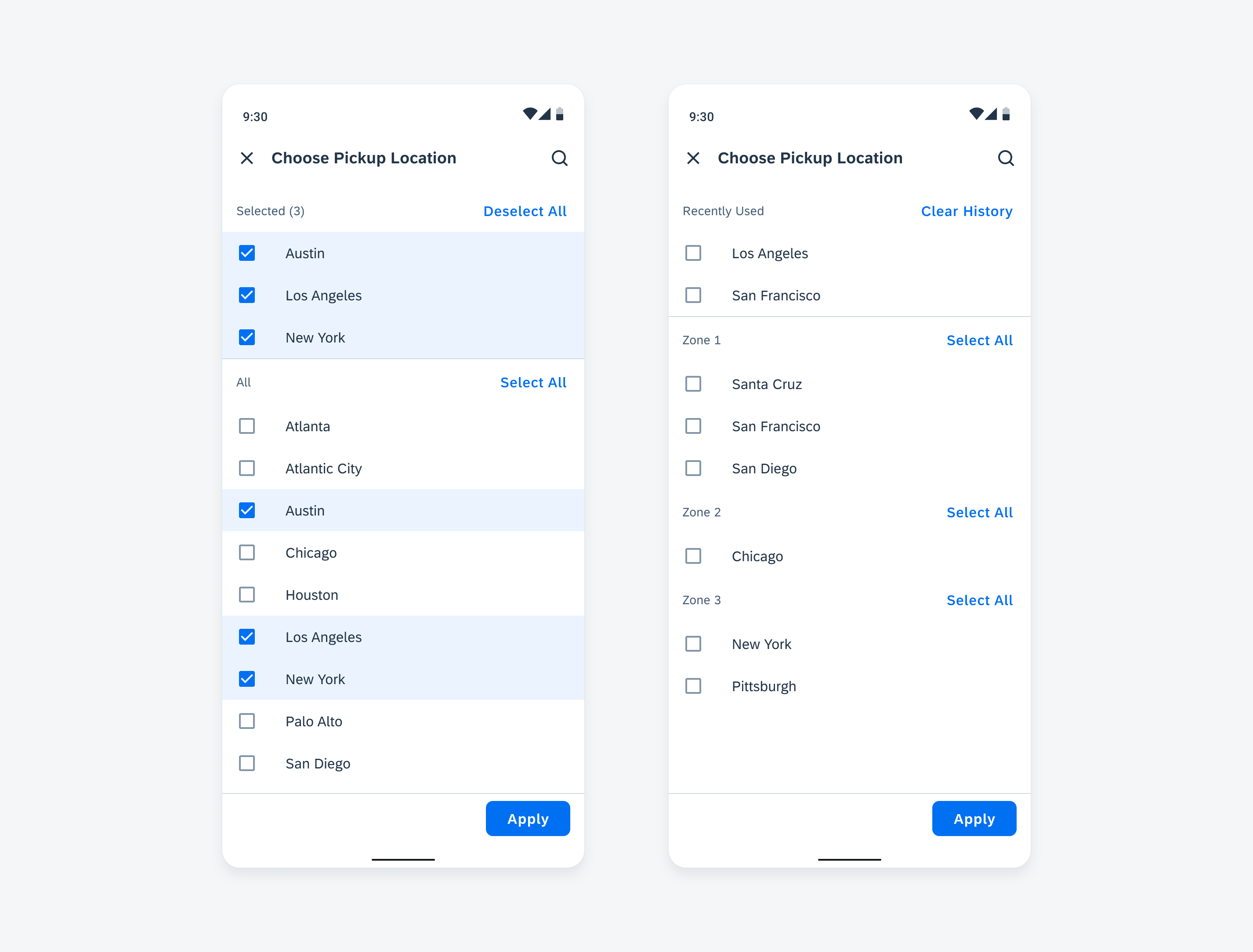
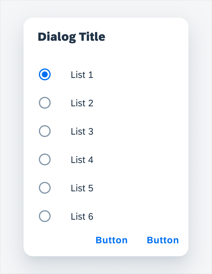
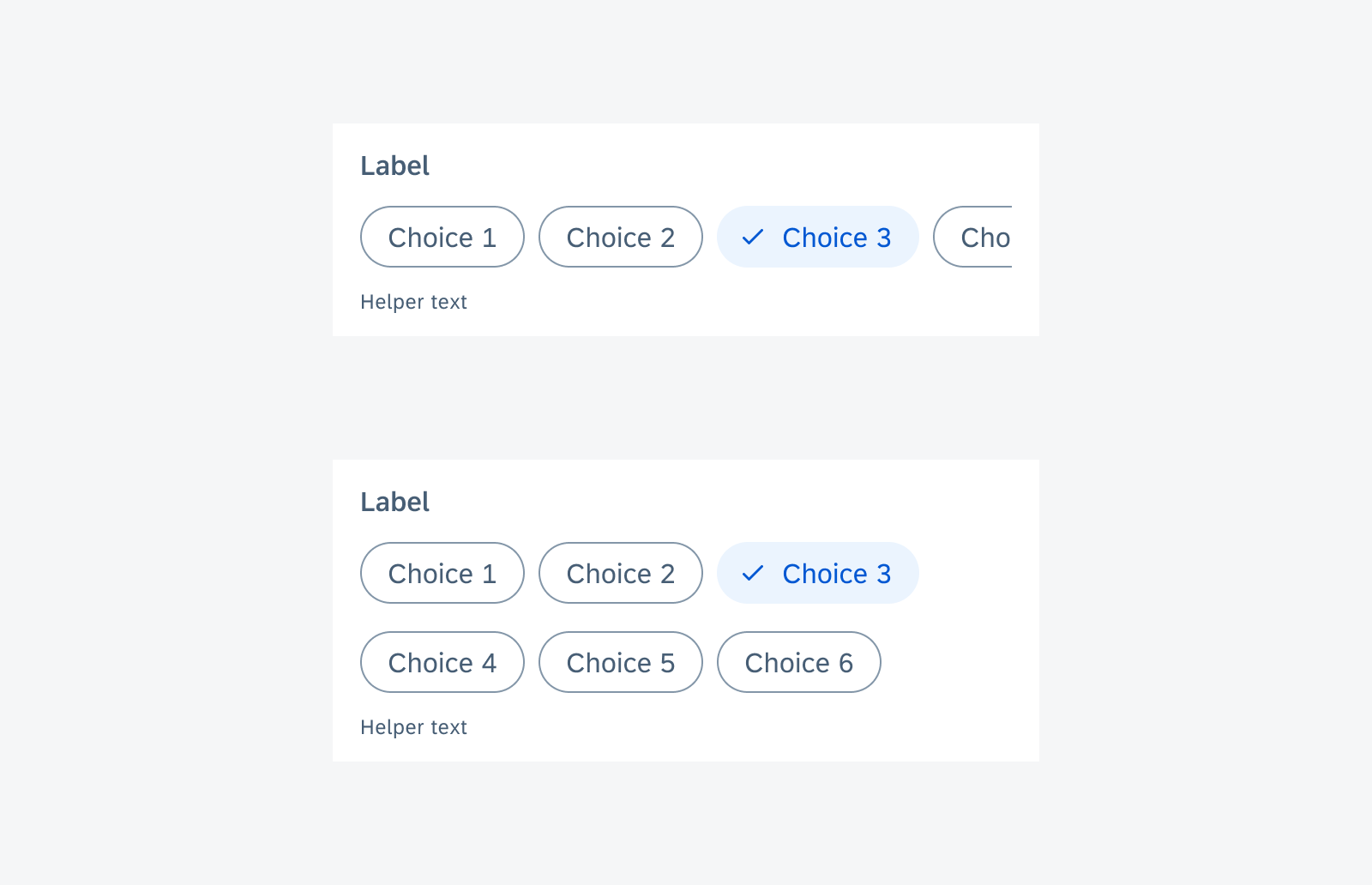
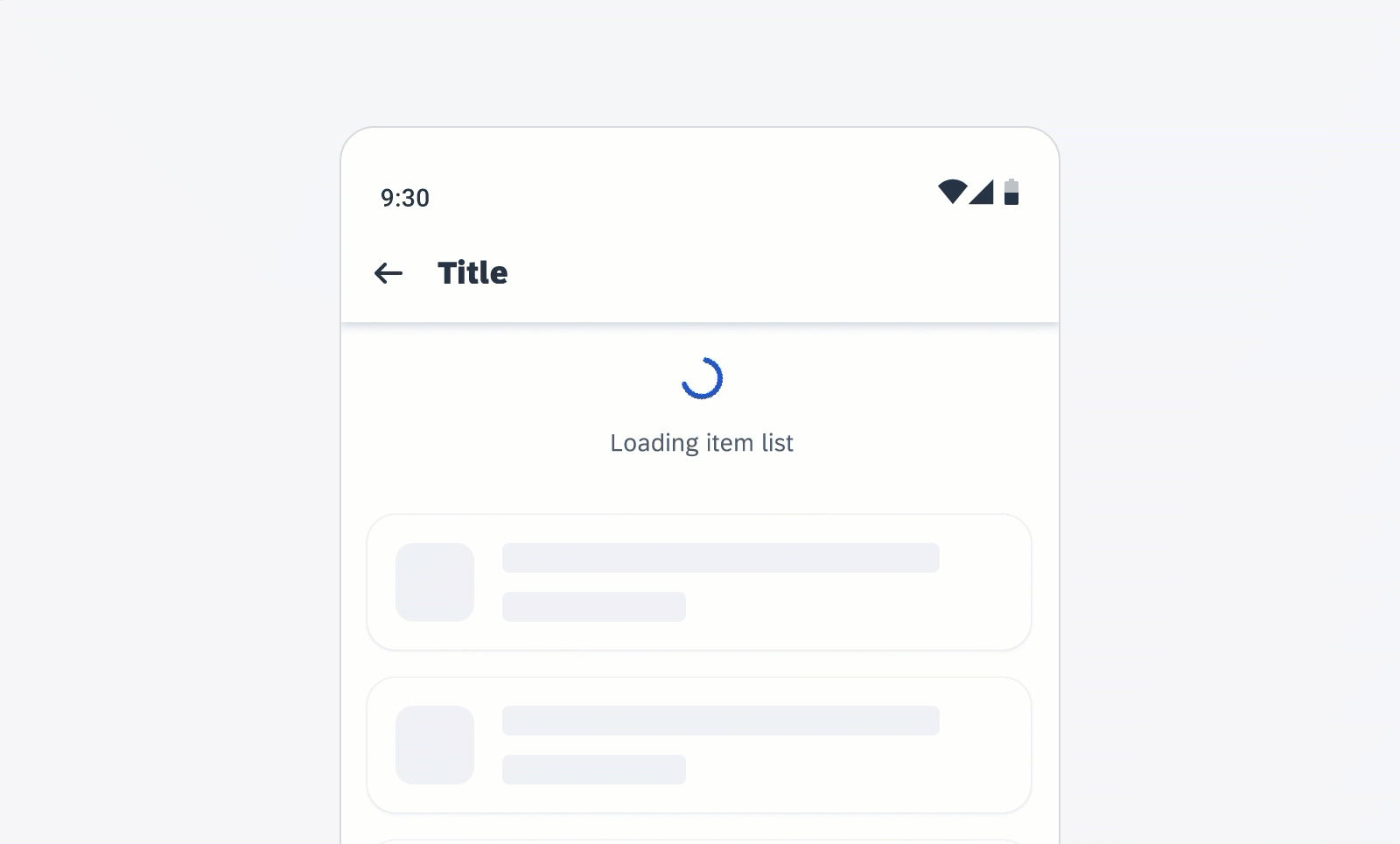
List Picker Form Cell – Single or Multiple Selection
A list picker form cell is used when the values are long text or the number of values is more than eight under one filter category. It is also used when the number of values is dynamic or unpredictable. With a list picker form cell, the user is able to search and select the data entry.
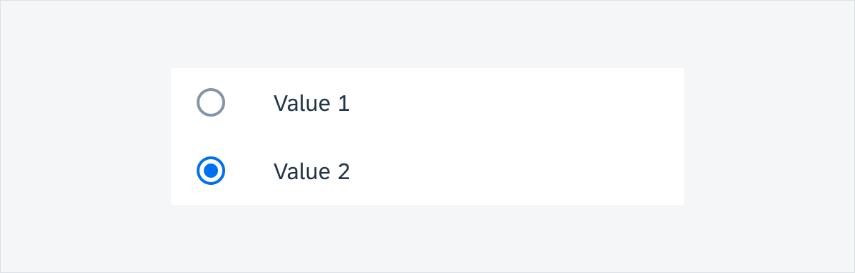
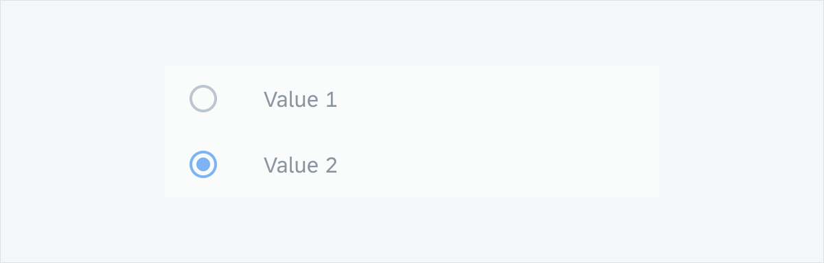
The selection on a list can be either a single selection (use radio buttons) or a multiple selection (use checkboxes).
If a list is multi selection, the selections can be grouped in a selected grouping to enable users to deselect without having to scroll down a large list.
List picker form cell
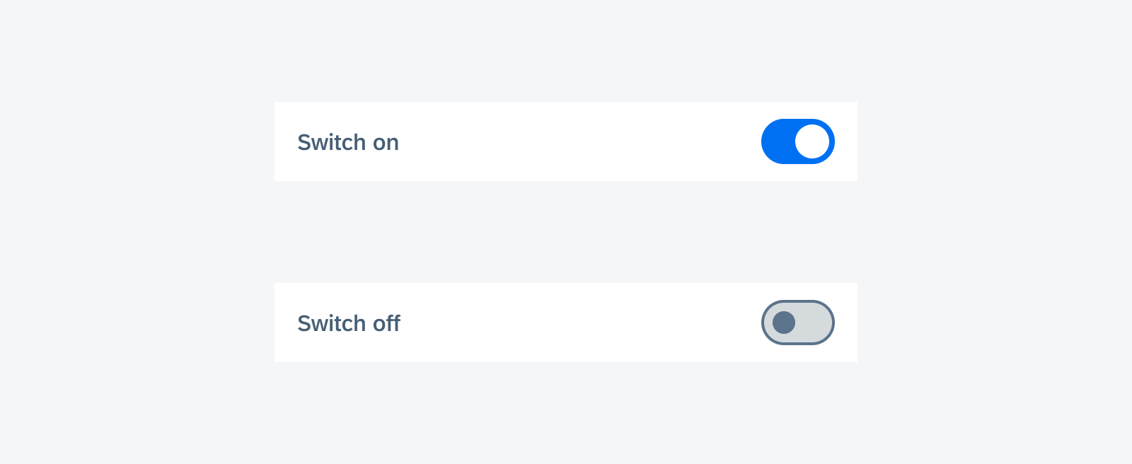
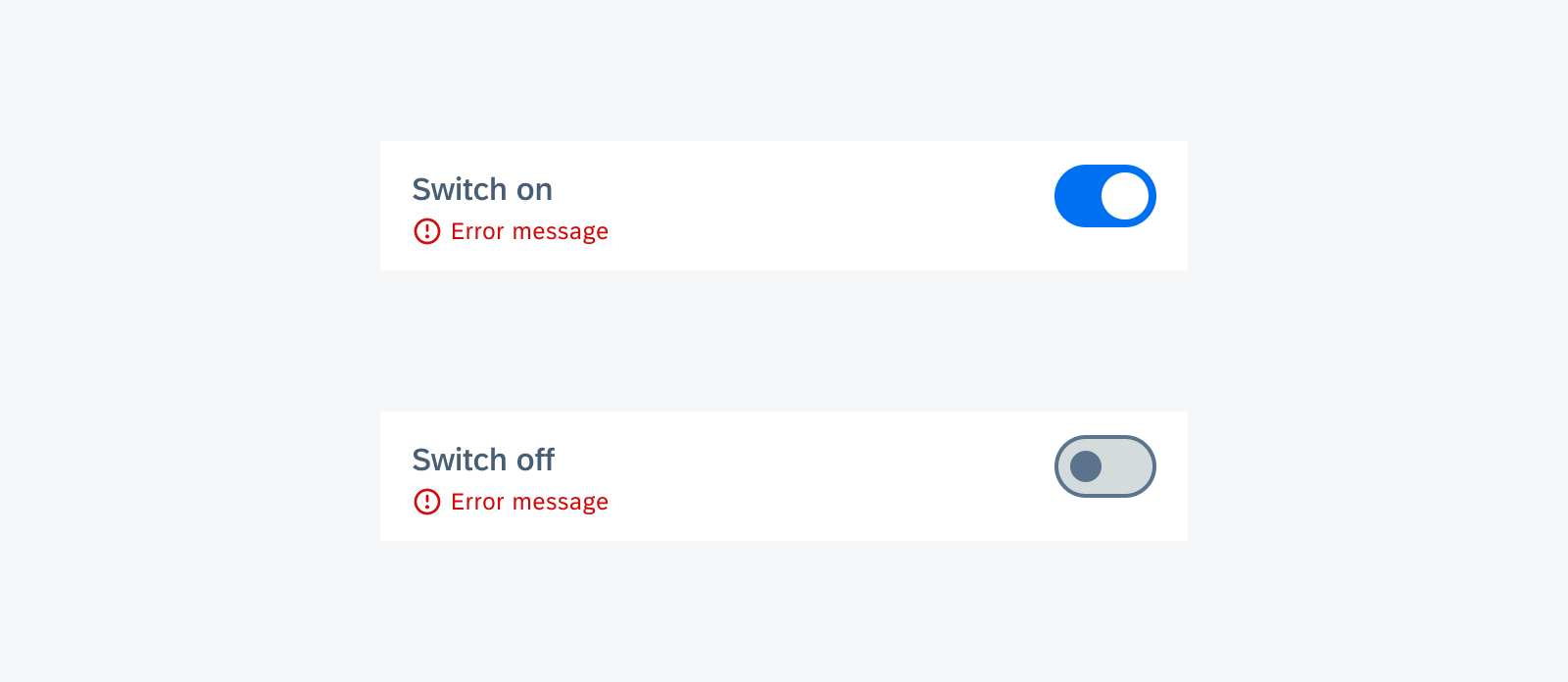
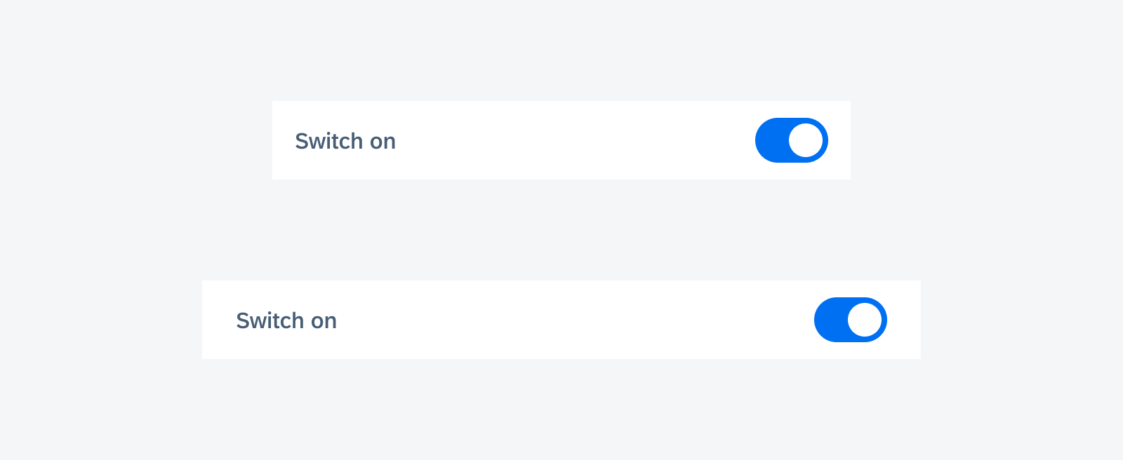
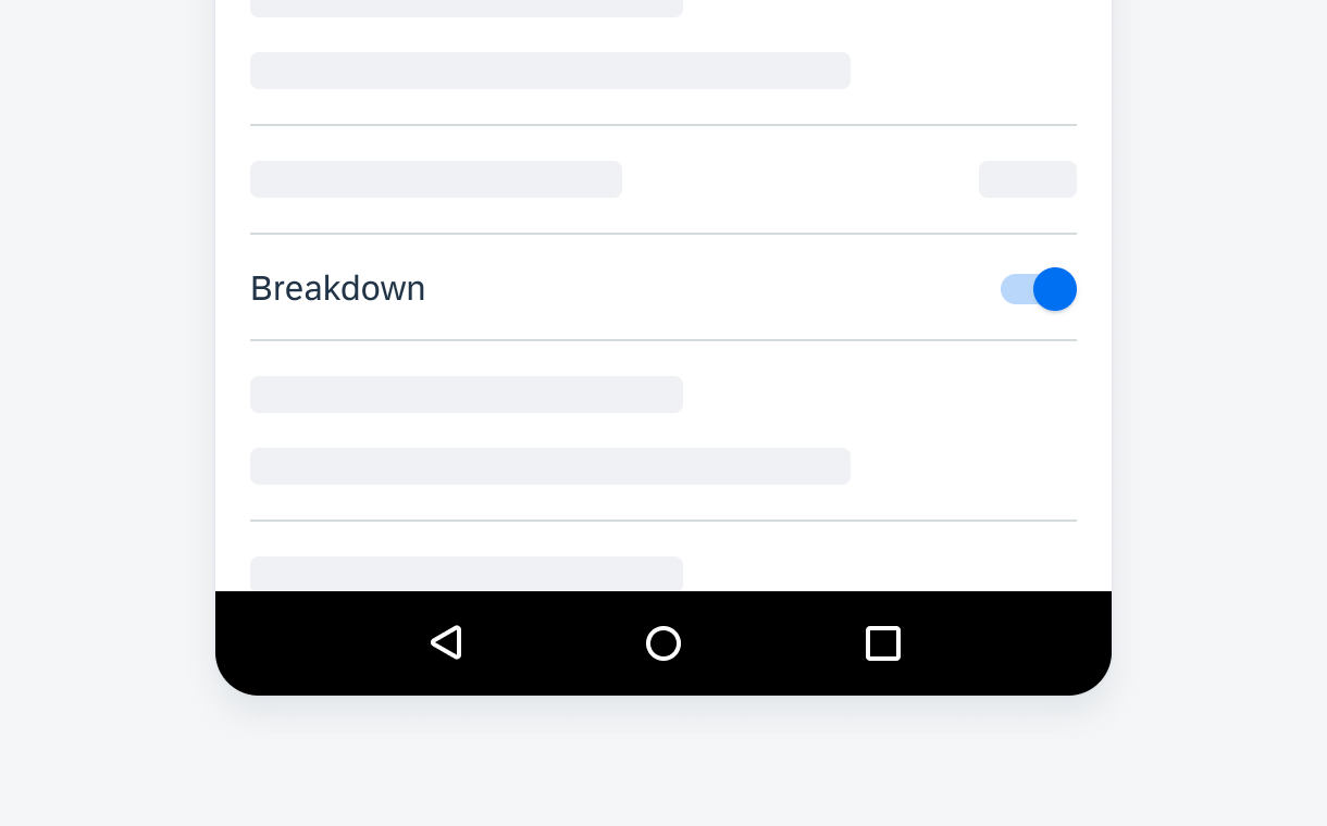
Switch Form Cell
Use a switch form cell when the property has only two mutually exclusive states: on and off.
Switch form cell
Data Range
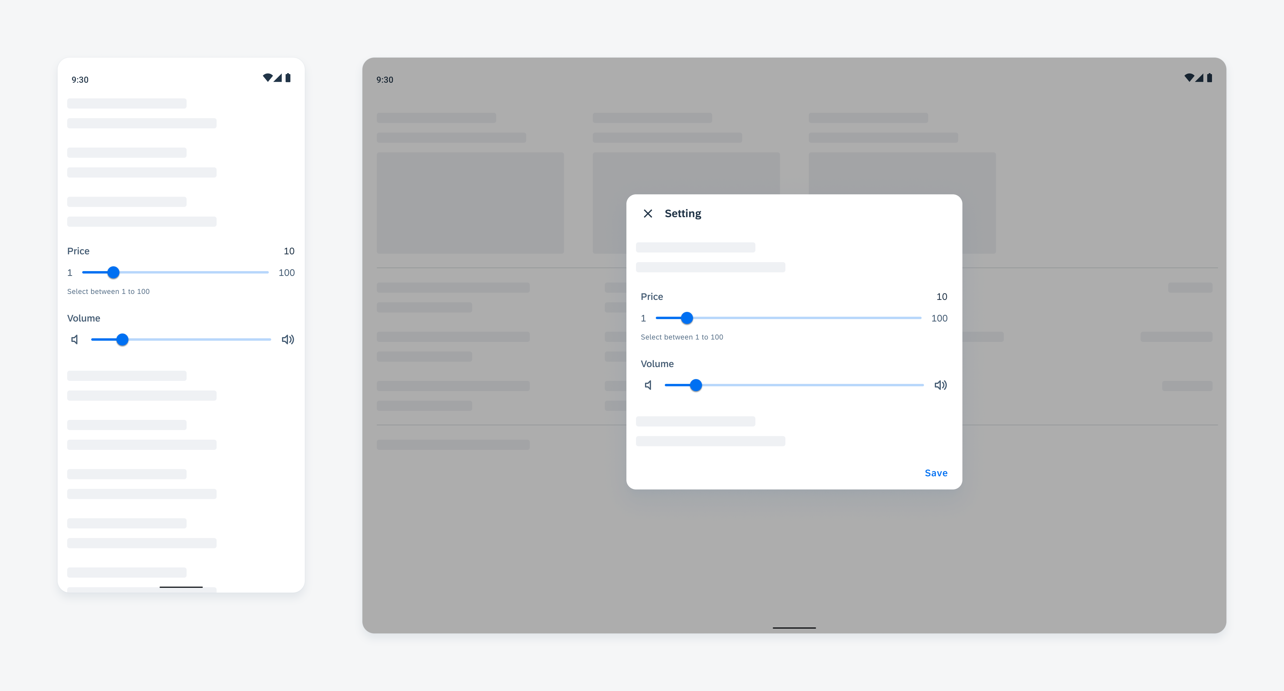
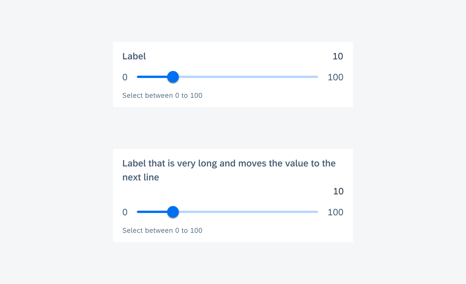
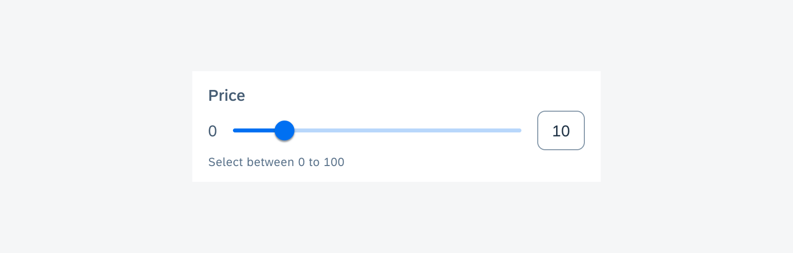
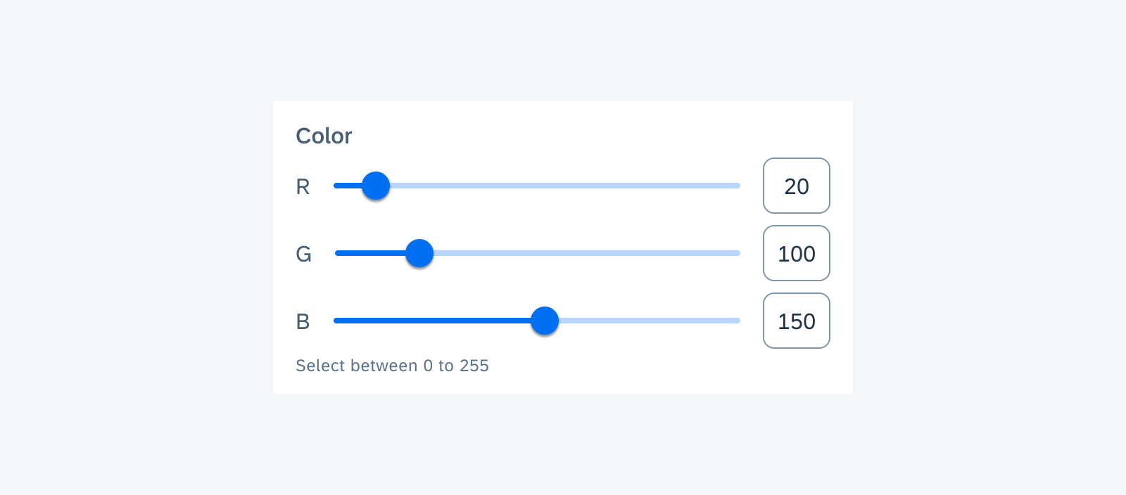
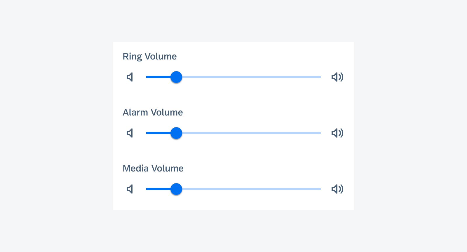
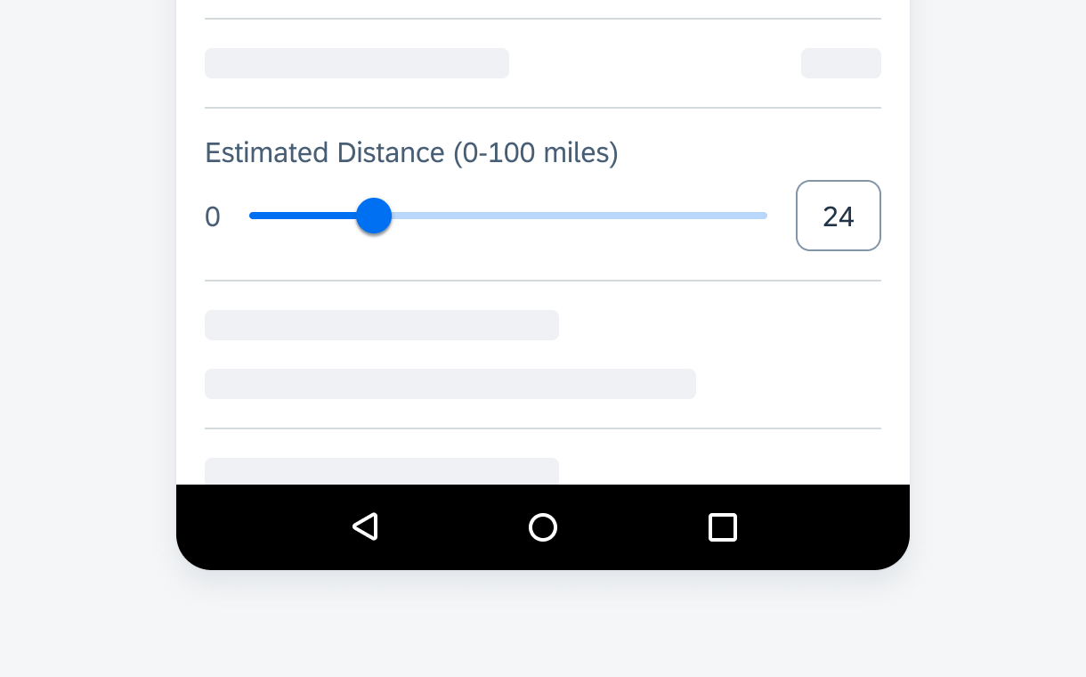
Slider Form Cell
A slider form cell enables the user to set the maximum value within a specified numerical range.
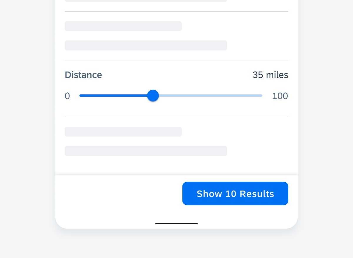
Slider form cell
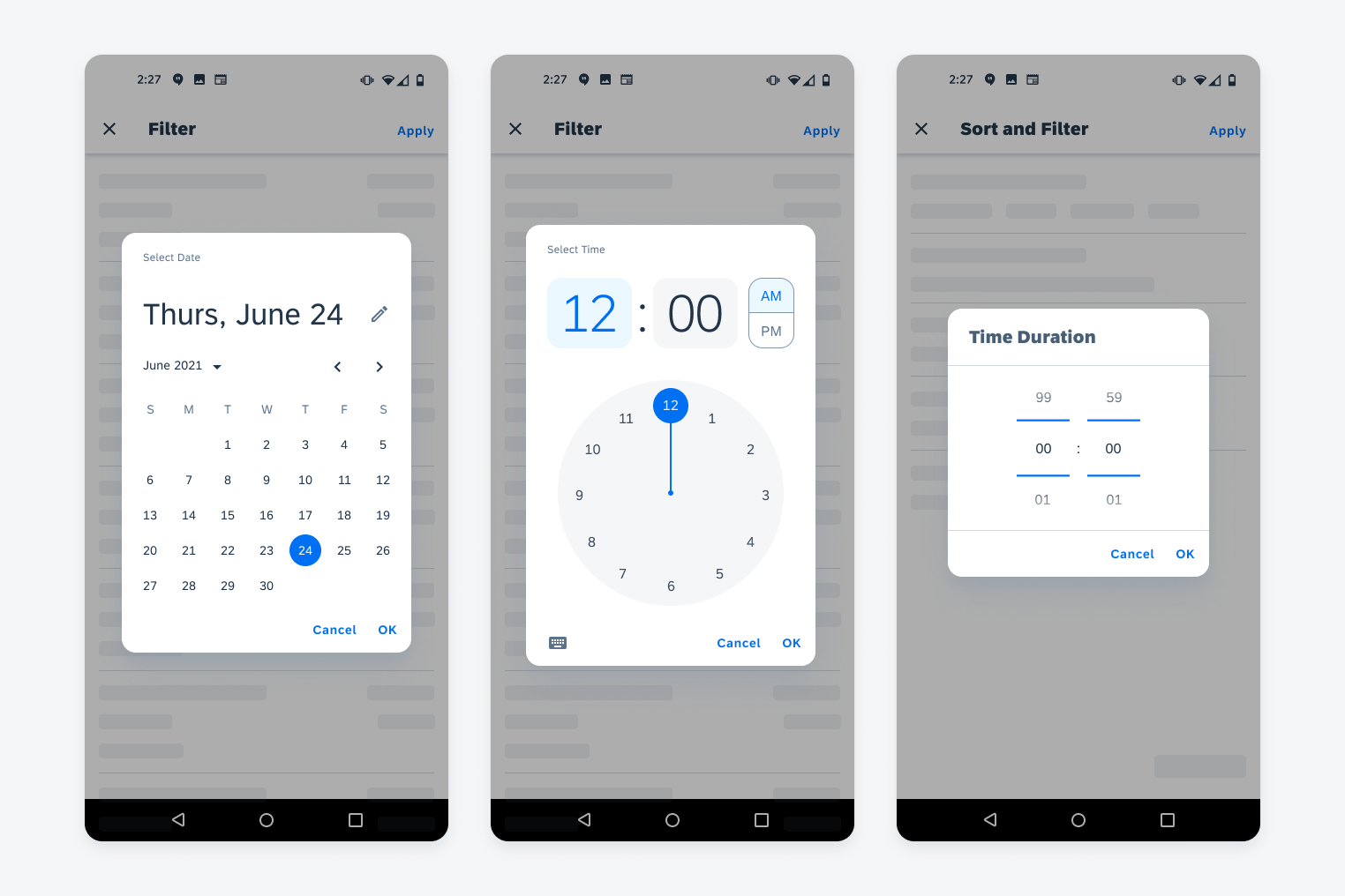
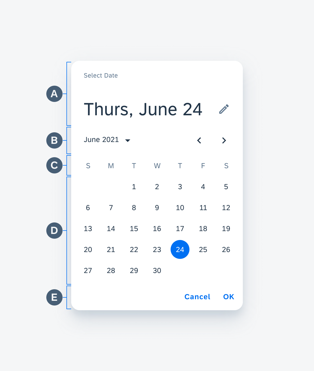
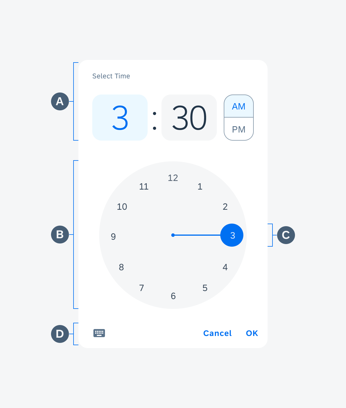
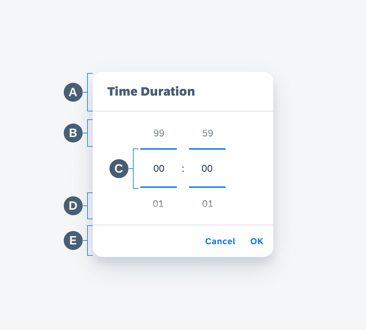
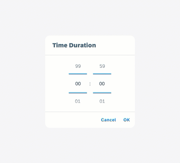
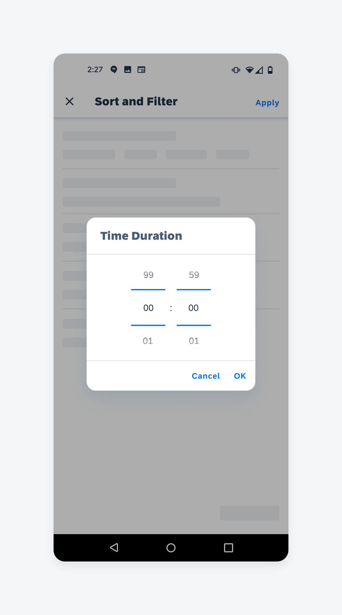
Time Picker Form Cell
A time picker form cell is used to select time based data.
A date picker is used to set a specific date or time. A time duration picker is used to set a duration.
Time picker form cell
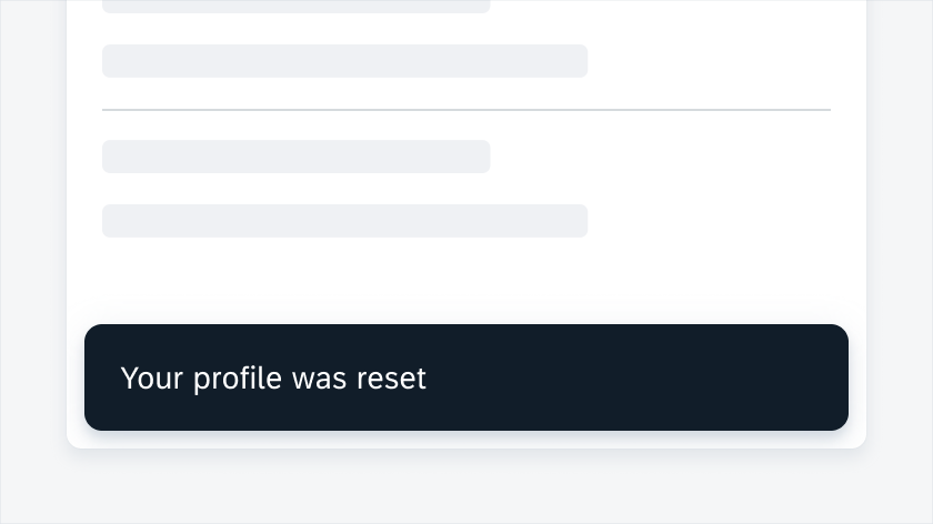
Reset
The “Reset” button is nested in the top app bar that is located at the top of the dialog. The “Reset” button clears the applied filters and restores the default value of the selected sort option.
"Reset" button in top app bar
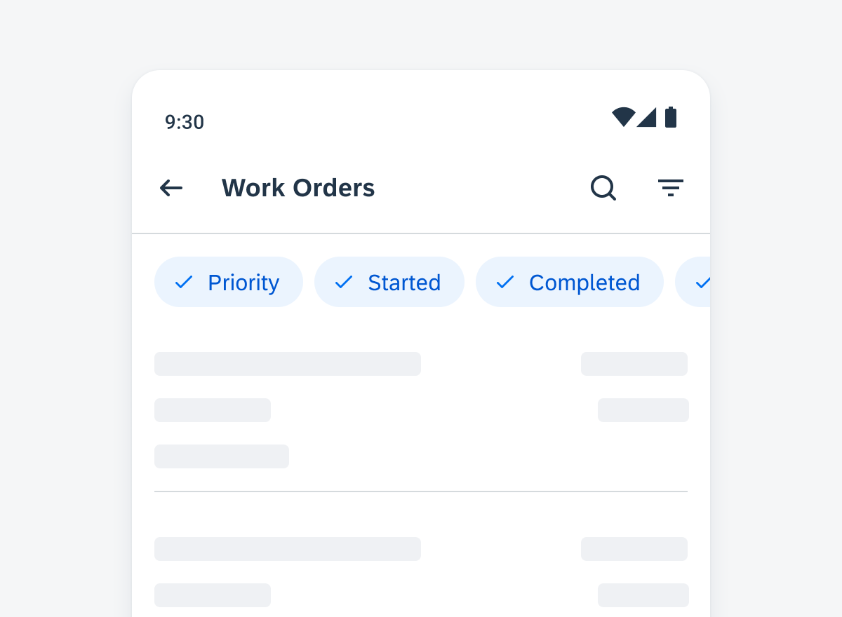
Filter Feedback
The filter feedback bar helps user understand the results of filter. Due to the complexity of the dataset or the number of values, it is recommended to give users feedback.
The filter feedback bar can be used to display the applied filter options and fast filters. This provides more detailed information. Refer to filter feedback bar to learn more about this component.
Filter feedback bar
Resources
Development: SortAndFilterDialogFragment
SAP Fiori for iOS: Sort and Filter


 Your feedback has been sent to the SAP Fiori design team.