SAP Fiori for Wear OS – Design Kit
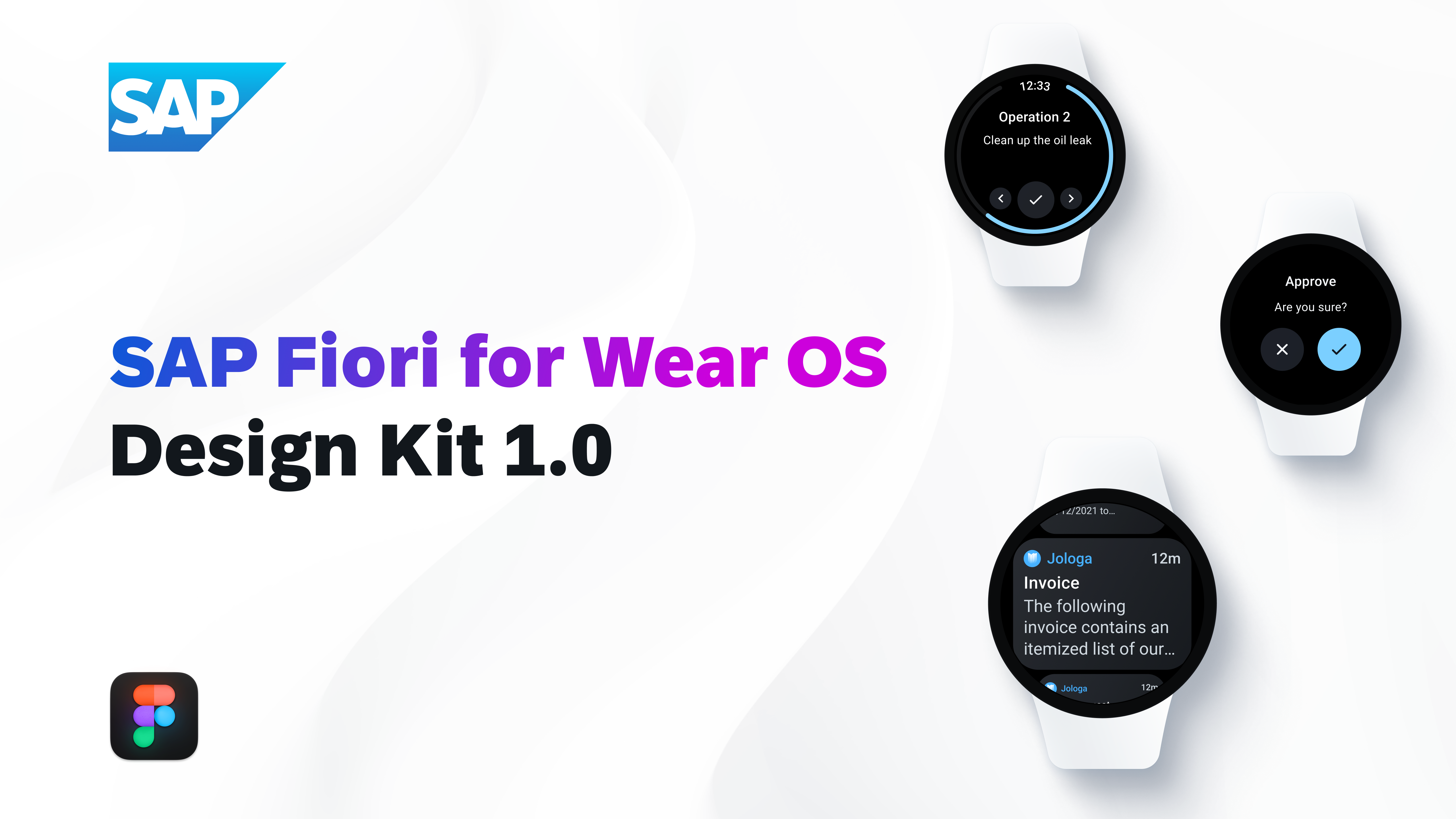
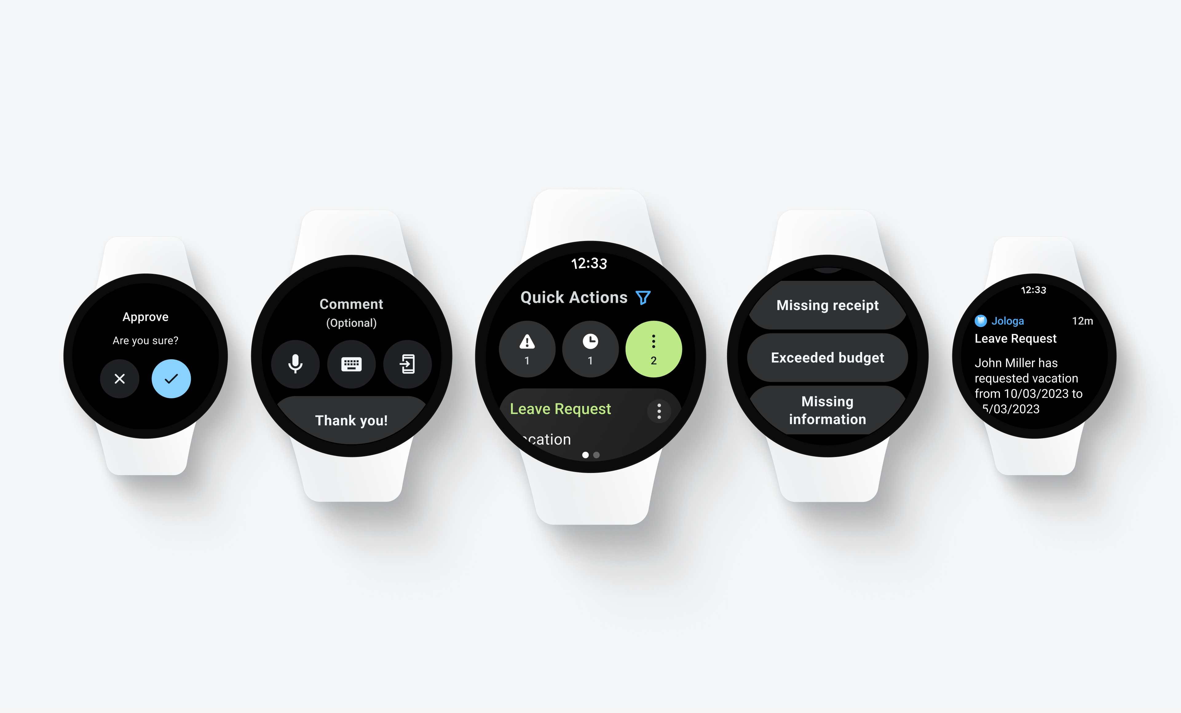
This Figma Design Kit contains SAP Fiori for Wear OS UI components, patterns, page types, and fundamental elements such as colors or typography. It helps accelerate design and development processes and encourages consistency across SAP applications.
Download the Roboto font here.
Download Material Design Icons here.

SAP Fiori for Wear OS 1.0
Figma Design Kit
SAP Fiori for Wear OS 1.0 (Link to Figma Library)


 Your feedback has been sent to the SAP Fiori design team.