
FAB
The floating action button or FAB is a button variant that displays the most prominent action on screen. It is typically placed on the bottom corner of the screen, but it can also be placed in the center and remains persistent as users scroll through content.
FAB in compact (left) and expanded (right) size classes
Usage
- Use FAB for the most important action on screen.
- Place it on an easily accessible part of the screen.
- Ensure that FAB action is clear and concise.
- Don’t use multiple FABs to display competing actions on screen.
- Don’t place FABs in hard-to-reach places on screen.
- Don’t use FAB for obscure or unclear actions.
Anatomy
FAB & Extended FAB
A. Icon
The icon is a visual glyph that is the main form of communicating the FAB’s action.
B. Container
The container is a rectangular shape that encloses the icon and optional label.
C. Label (Optional)
The label is used to supplement the icon in instances where additional context is needed in communicating the meaning of the FAB. The label is only used for the extended FAB variant.
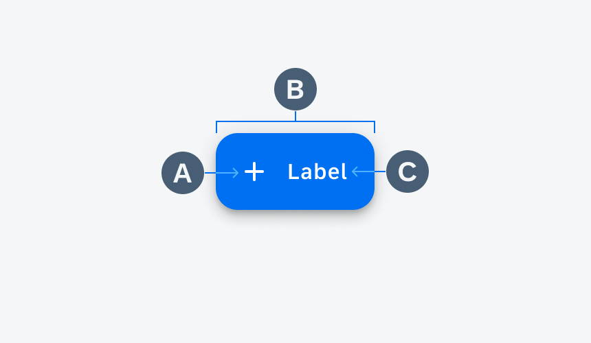
Anatomy of FAB
Behavior and Interaction
Tapping Interactions
Transform
When tapped, the FAB transforms into the intended action to draw a direct connection from the FAB to the container. A new screen is opened.
FAB transforms into a menu
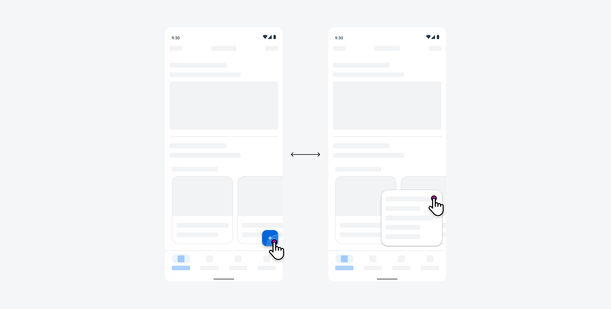
Nested Actions
If supporting actions are needed, multiple small FABs can appear when the user taps on the FAB. To hide the supporting actions, the user taps on the parent FAB.
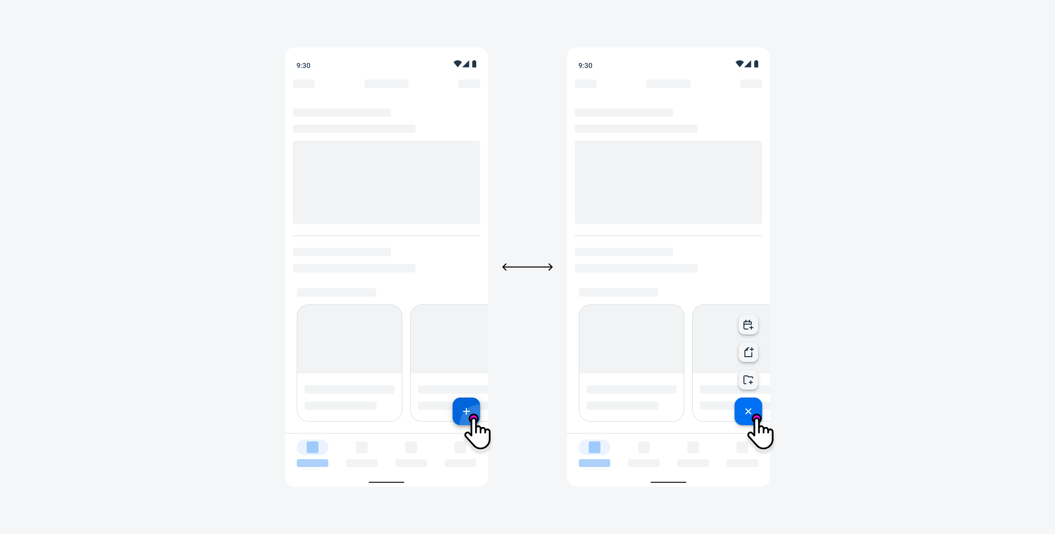
Small FABs appear when FAB is pressed
Scrolling Behaviors
Fixed Behavior
When scrolling, the most common FAB behavior is to remain fixed at the bottom of the screen. This provides a persistent accessible entry point for the user to perform an action.
FAB remains fixed when scrolling
Disappear & Reappear
Additional behaviors include appear and disappear during a scroll state. For example, the FAB appears while scrolling and disappears after the user stops scrolling, allowing for more screen real estate.
FAB disappears when scrolling up and reappears when scrolling down
Collapse & Expand
Extended FABs can collapse while scrolling and expand while the user stops scrolling.
Extended FAB collapses while scrolling
Adaptive Design
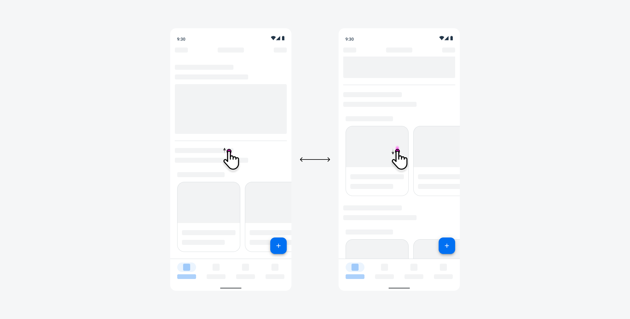
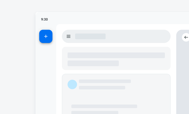
Given the difference in size and screen orientation during usage, the placement of the FAB differs between compact and expanded screen sizes.
Compact & Expanded Screen Sizes
On compact screen sizes, FABs are placed on the lower right-hand side of the screen, while FABs on expanded screens are placed on the upper left-hand side. These screen-specific placements allow for optimal reachability to the user.
On compact screens, FAB is placed on the lower right part of the screen
On expanded screens, FAB is placed on the upper left part of the screen
Variations
Size Variations
The FAB has several size variants starting with the baseline FAB variant. The additional size variations provide more flexibility for app teams to fulfill their product needs.
A. Small FAB
The small FAB is used in instances where multiple supporting actions of equal importance are needed. It may also be used where screen real estate is limited.
B. FAB
FAB is the standard size variant for FABs. It satisfies most use cases, but you may opt for other options based on specific user needs.
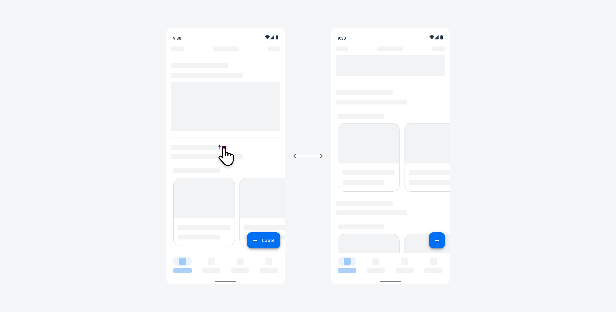
C. Extended FAB
The extended FAB contains an icon and a text label. The extended FAB can collapse into an FAB in instances where the user scrolls.
D. Large FAB
If additional size requirements are needed, use a large FAB to provide a larger touch target.
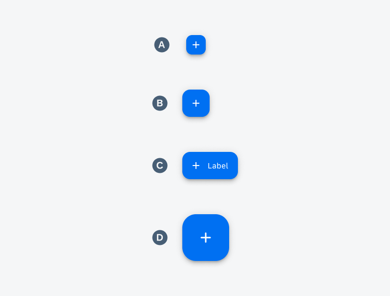
Small FAB (A), FAB (B), extended FAB (C), and large FAB (D)
FAB Styles
The FAB has two style variants, primary and secondary styles. Use these styles based on the visual hierarchy according to their visual hierarchy.
A. Primary Style
The primary style is the most visually prominent style on screen. Use this style variant as the single action on screen.
B. Secondary Style
The secondary style is the subdued variant of the primary style. Use this style in stances where a prominent action is needed without the visual prominence of a primary button.
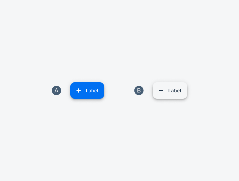
Primary style (A) and secondary style (B)
Resources
Development: Button
Material Design: FAB
Related Components/Patterns: Button, Navigation Rail
 Your feedback has been sent to the SAP Fiori design team.