Multi-Message Handling

Multi-message handling helps users manage multiple messages within an app, making it easy for users to take action.  
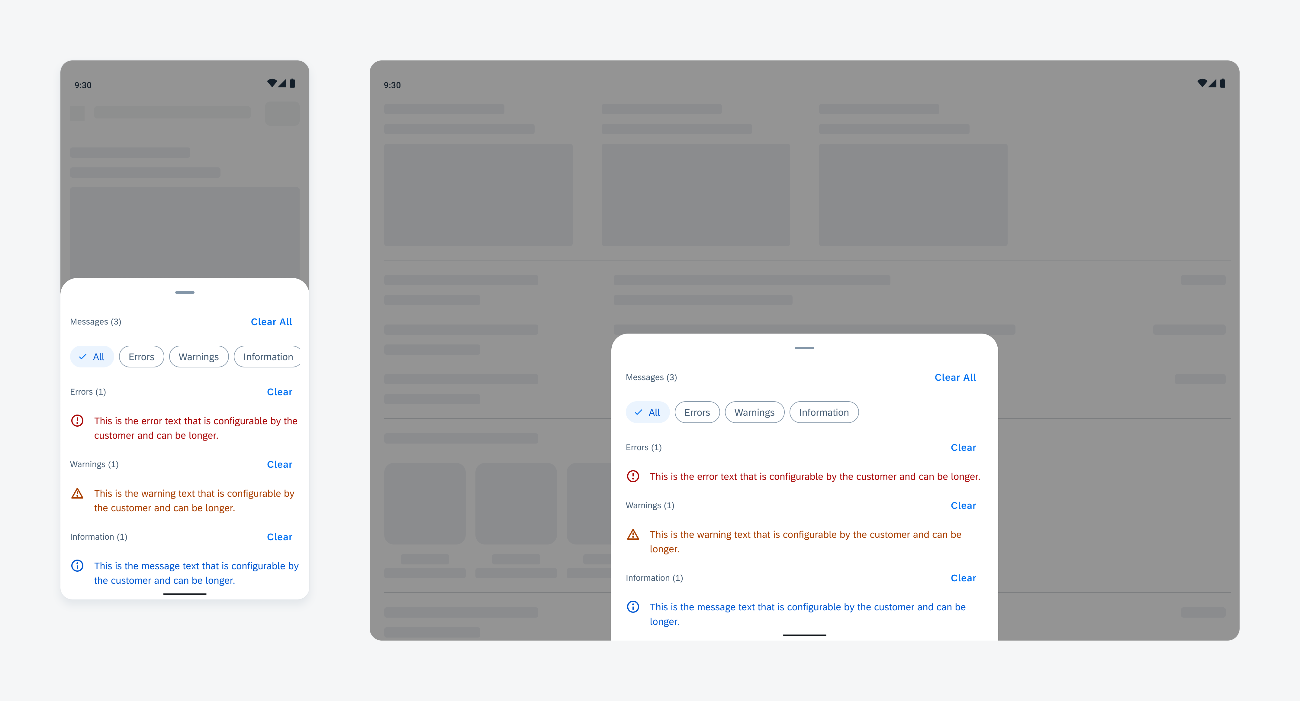
Multi-message handling on compact screen (left) and expanded screen (right)

Anatomy

Multi-message handling follows the basic structure of a bottom sheet, prioritizing message components based on their importance. Error messages should appear first to capture the user’s attention.

A. Banner

The banner contains:

  • Optional icon or image
  • Message summary
  • Button

B. Bottom Sheet

The bottom sheet displays message details.

C. Section Header (Optional)

The section header includes a title and action button for additional functions.

D. Filter Feedback Bar (Optional)

The filter feedback bar allows users to quickly filter messages.

E. Message Item

The message item includes an icon or image, message content, and an optional action button to support user interactions.

Multi-message handling anatomy

Behavior and Interaction

Trigger

The banner notifies the user of messages. Tapping the banner opens the multimessage handling bottom sheet for detailed viewing and interaction. 

Triggering multi-message handling from the banner

Tap to Scroll

When the bottom sheet is open, tapping a message item automatically scrolls to the related field or section with the error, allowing users to address the issue. 

Tapping to auto-scroll allowing users to address the error

Clear

Tapping the “Clear All” button removes all messages displayed in the bottom sheet. 

Tapping the “Clear” button in a section header removes only the messages within that specific section. 
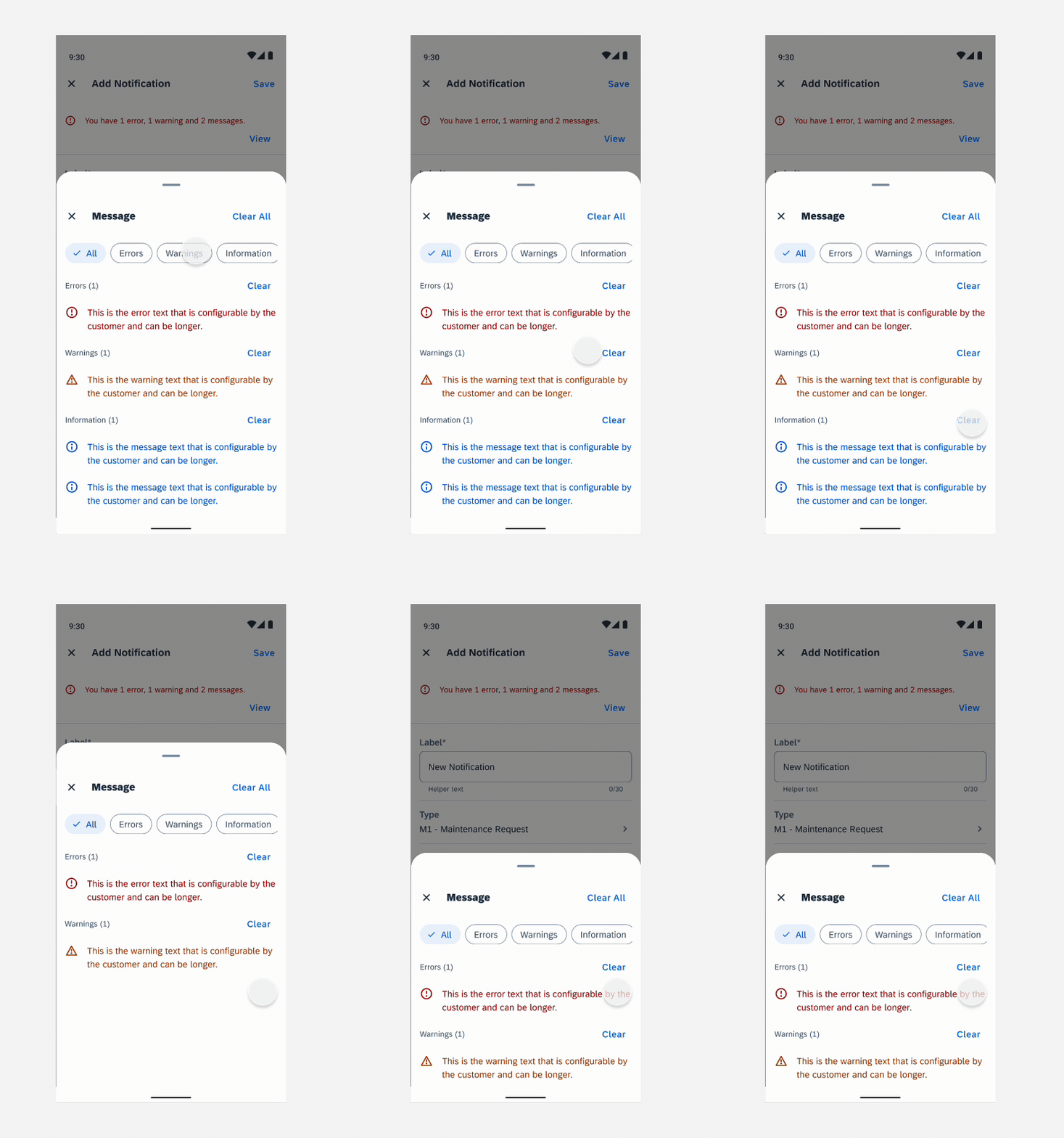
“Clear” button in a section header that removes the messages specific to that section

Resources

SAP Fiori for iOS: Error Handling 

Related Components/Patterns: Banner, Bottom Sheet, Header, Filter Feedback Bar, Object Cell 

Document Scanner

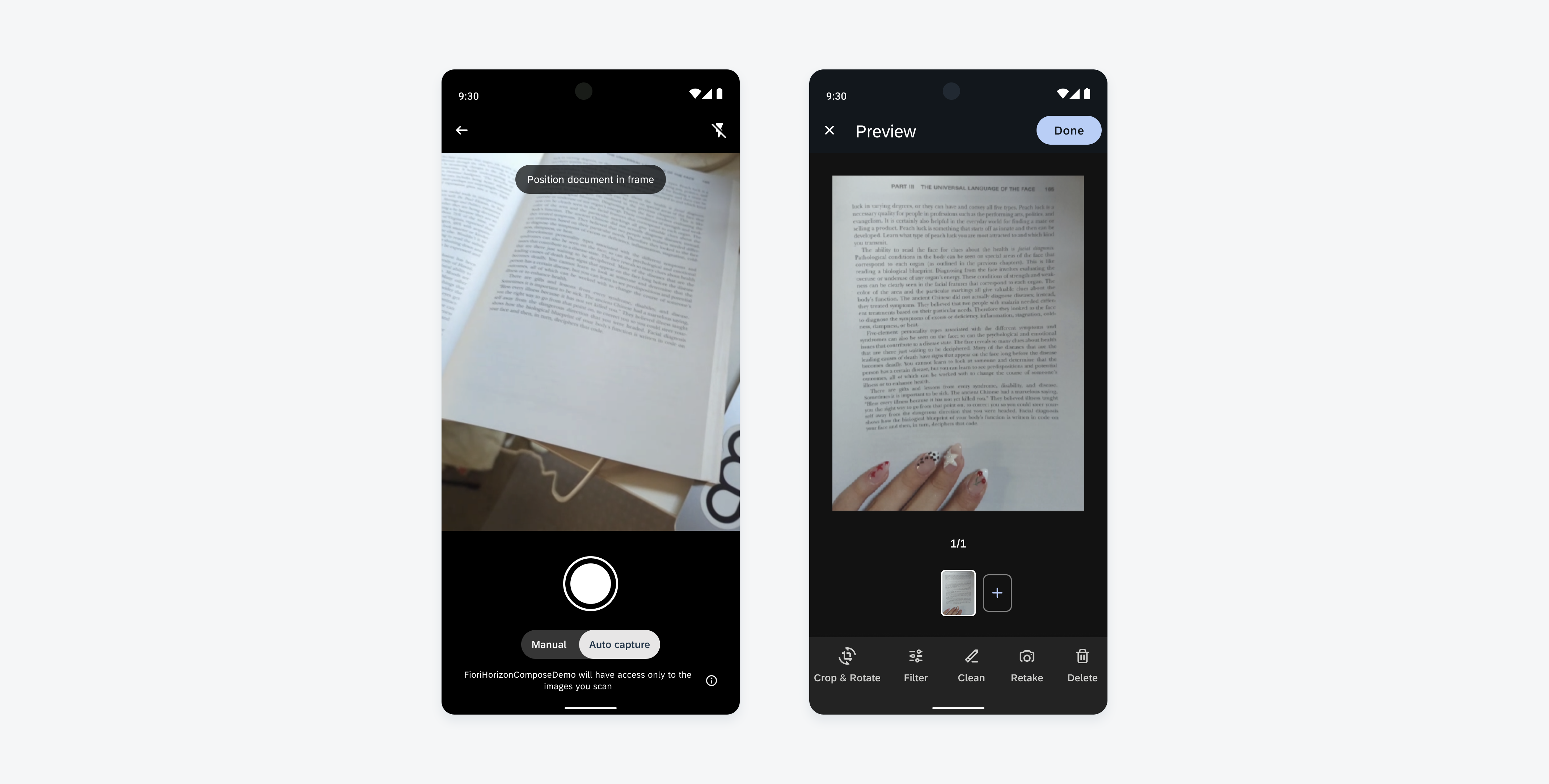
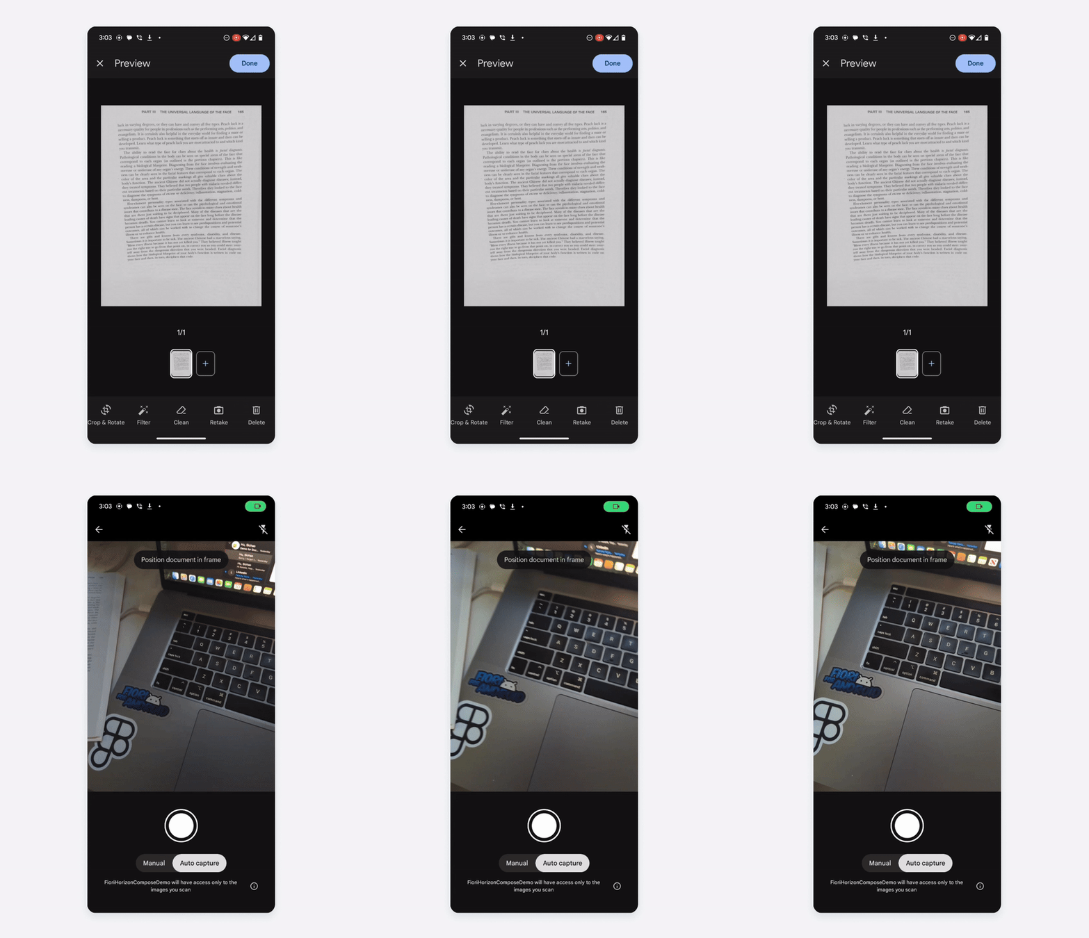
The document scanner leverages Google’s ML Kit, allowing users to digitize physical documents with an on-device flow. Users can select automatic or manual capture and easily edit, retake, or delete specific or all scanned documents. 

 Document scanner using Google’s ML Kit
Document scanner using Google’s ML Kit

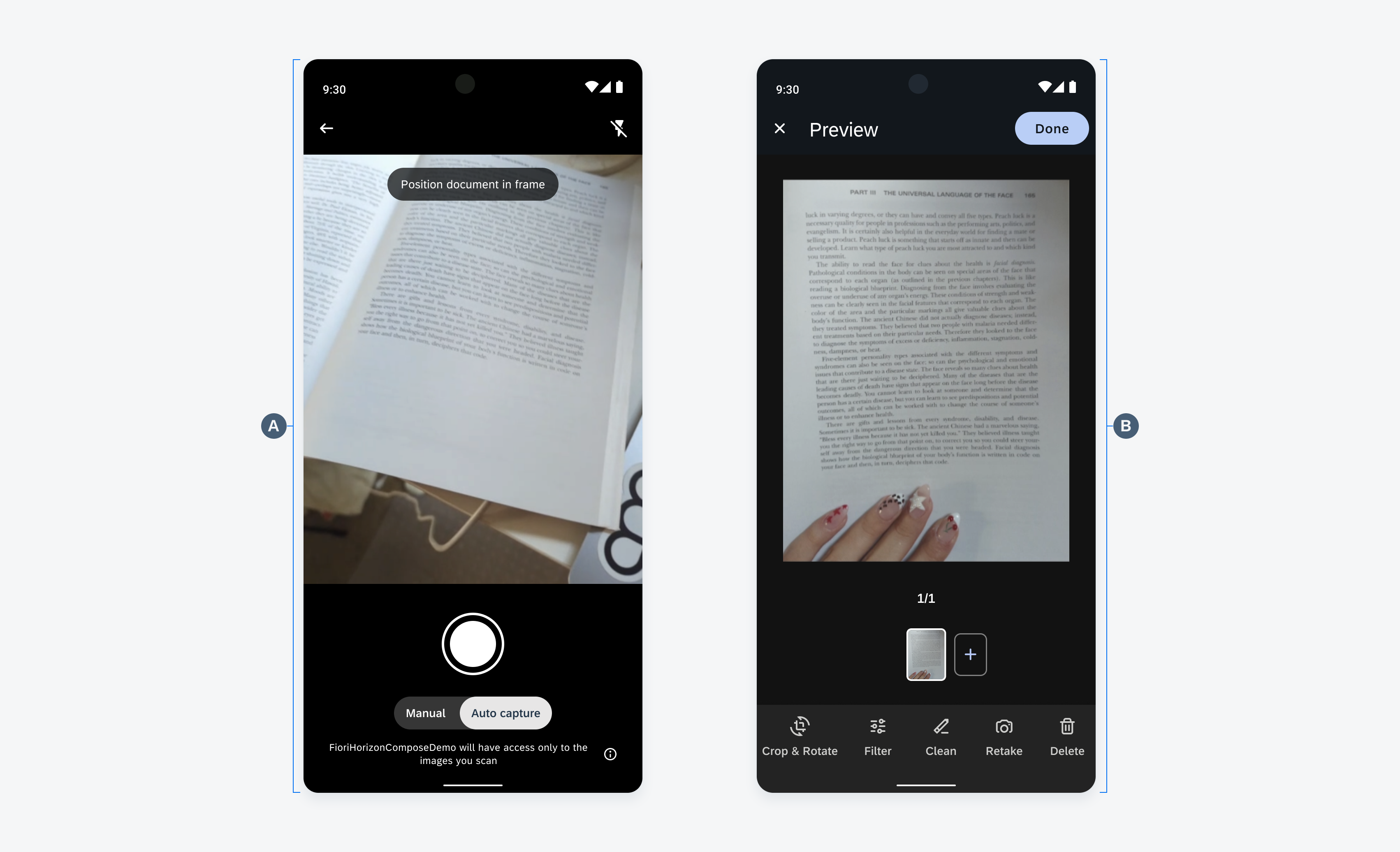
Anatomy

A. Camera View

The camera view enables users to focus on and capture their scan through either manual or auto mode. The shutter button allows users to manually capture their scans regardless of the enabled mode. The user can also utilize their phone’s flash to brighten the environment in which they are scanning.

B. Gallery View

The gallery view provides a view of all the captured scans and enables users to filter, clean, crop, rotate, retake, and delete their scans. Once the user feels the scans are sufficient, the “Done” button saves all the scans in the gallery and prompts the user to the next page in their in-app journey. 

 Anatomy of the document scanner camera view (left) and the gallery view (right)
Anatomy of the document scanner camera view (left) and the gallery view (right)

Behavior and Interaction 

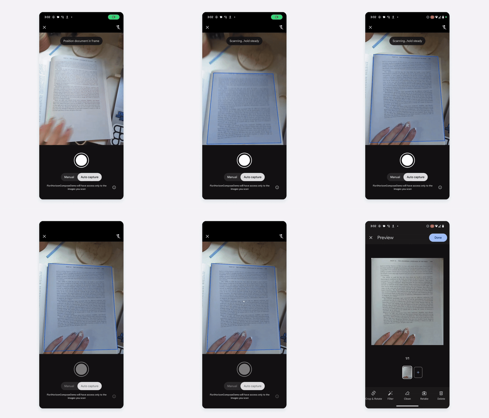
Automatic Capture 

When the user first opens the document scanner, it defaults to auto capture mode and prompts the user to position the document in the frame. As soon as a potential document is detected, a blue outline appears, instructing the user to hold the camera steady as the document is being scanned. Once the document is captured, the user is directed to the gallery view. 

 Automatically scanning a document
Automatically scanning a document

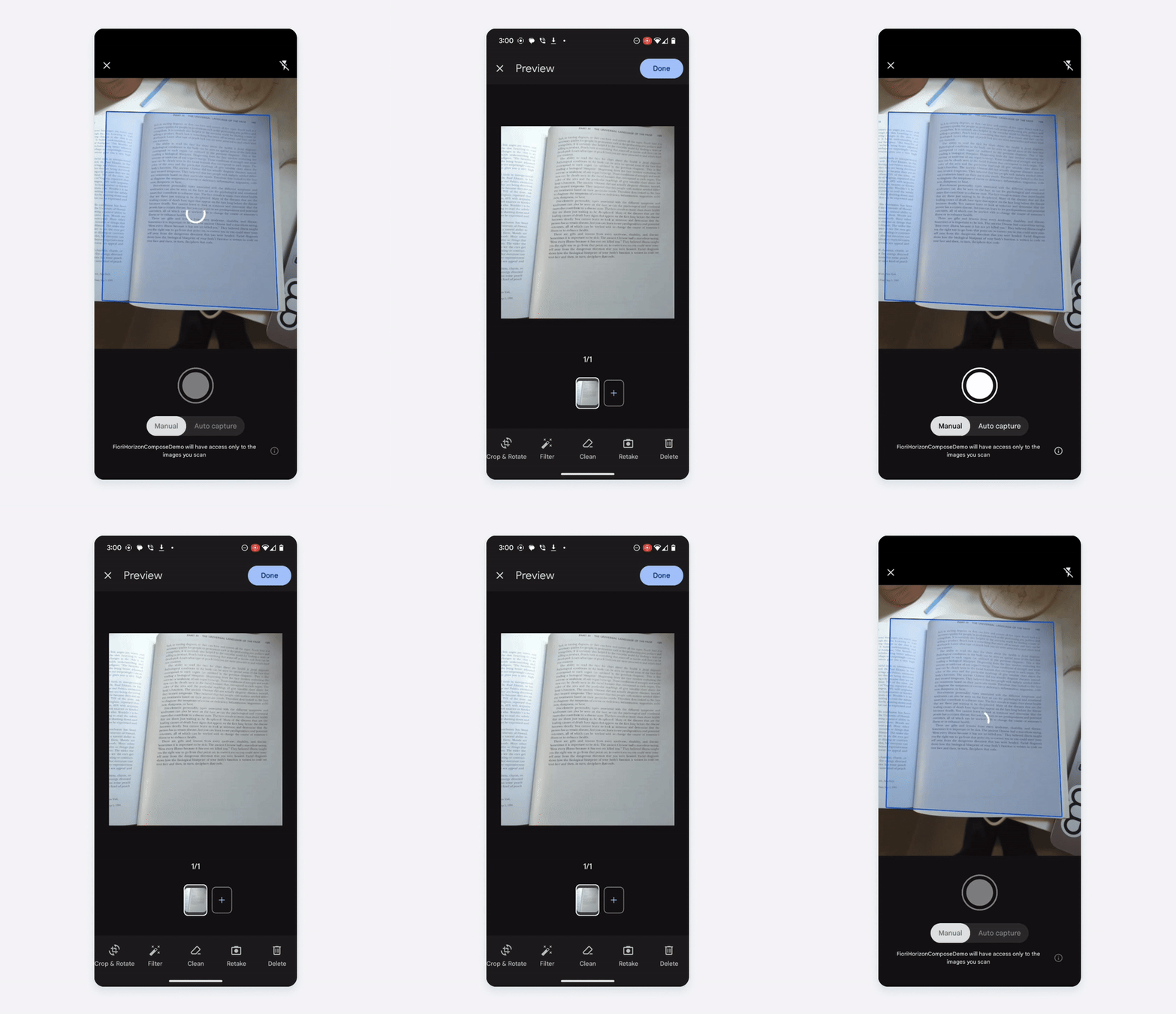
Manual Capture 

Users can switch to manual capture mode by tapping on the “Manual” section in the mode toggle. In manual mode, the user is prompted to position the document within the camera’s view. Once a potential document is detected, the blue outline appears, and the user can tap the shutter button to capture the scan. After capturing, the user is taken to the gallery view. 

 Manually scanning a document
Manually scanning a document

Add Another Scan 

The user can add another scan to their gallery view by tapping on the Plus button next to the first document’s thumbnail. Once pressed, the user returns to the camera view, allowing them to scan using either auto or manual capture mode. 

 Triggering the document scanner to add a scan
Triggering the document scanner to add a scan

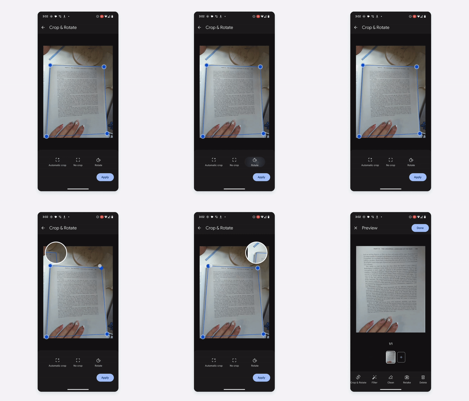
Crop and Rotate 

The crop and rotate section of the gallery view allows users to automatically crop, rotate, and adjust the edges of the scan. While adjusting the scan corners, a magnified view shows up to help with more precise cropping. 

 Cropping and rotating the scan
Cropping and rotating the scan

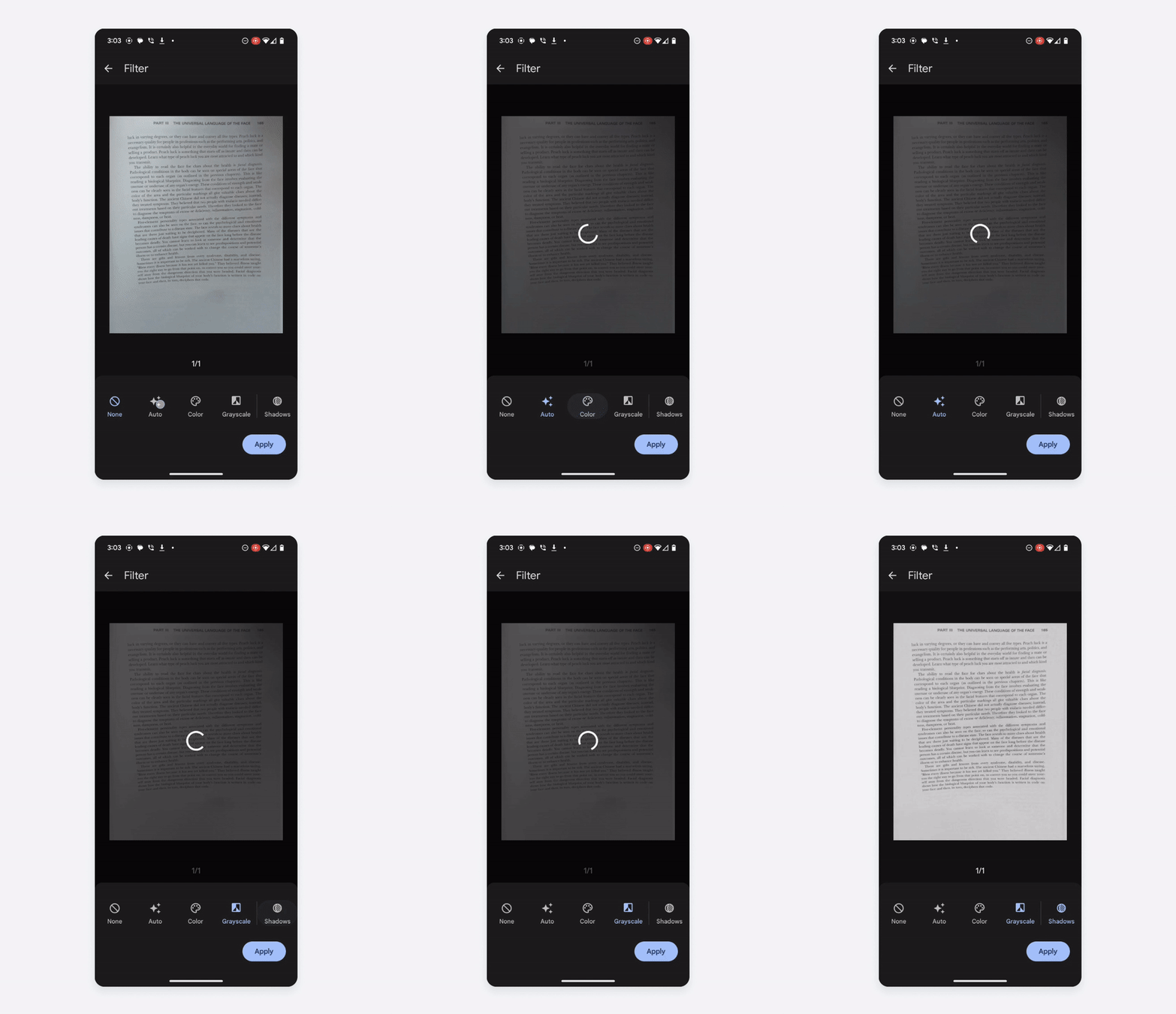
Filter

The filter section of the gallery view allows users to automatically or manually adjust shadows, amplify the color, and grayscale the scanned document. If there are multiple scans in the gallery view, the user can apply the filters to one of the scans or all the scans in the gallery. 

 Using the filter options from the gallery view
Using the filter options from the gallery view

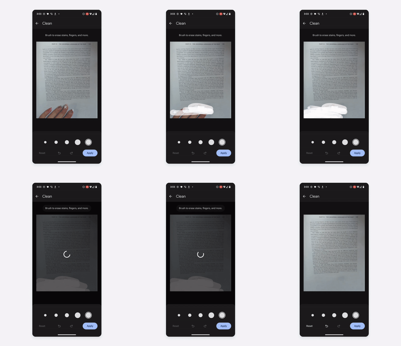
Clean

The clean section of the gallery views allows users to erase any stains, wrinkles, and fingers captured in the scan. When the Clean button is pressed, the user is guided to choose the brush size and mark the area to fix. 

 Cleaning up the document by erasing visible fingers in the scan
Cleaning up the document by erasing visible fingers in the scan

Retake & Delete 

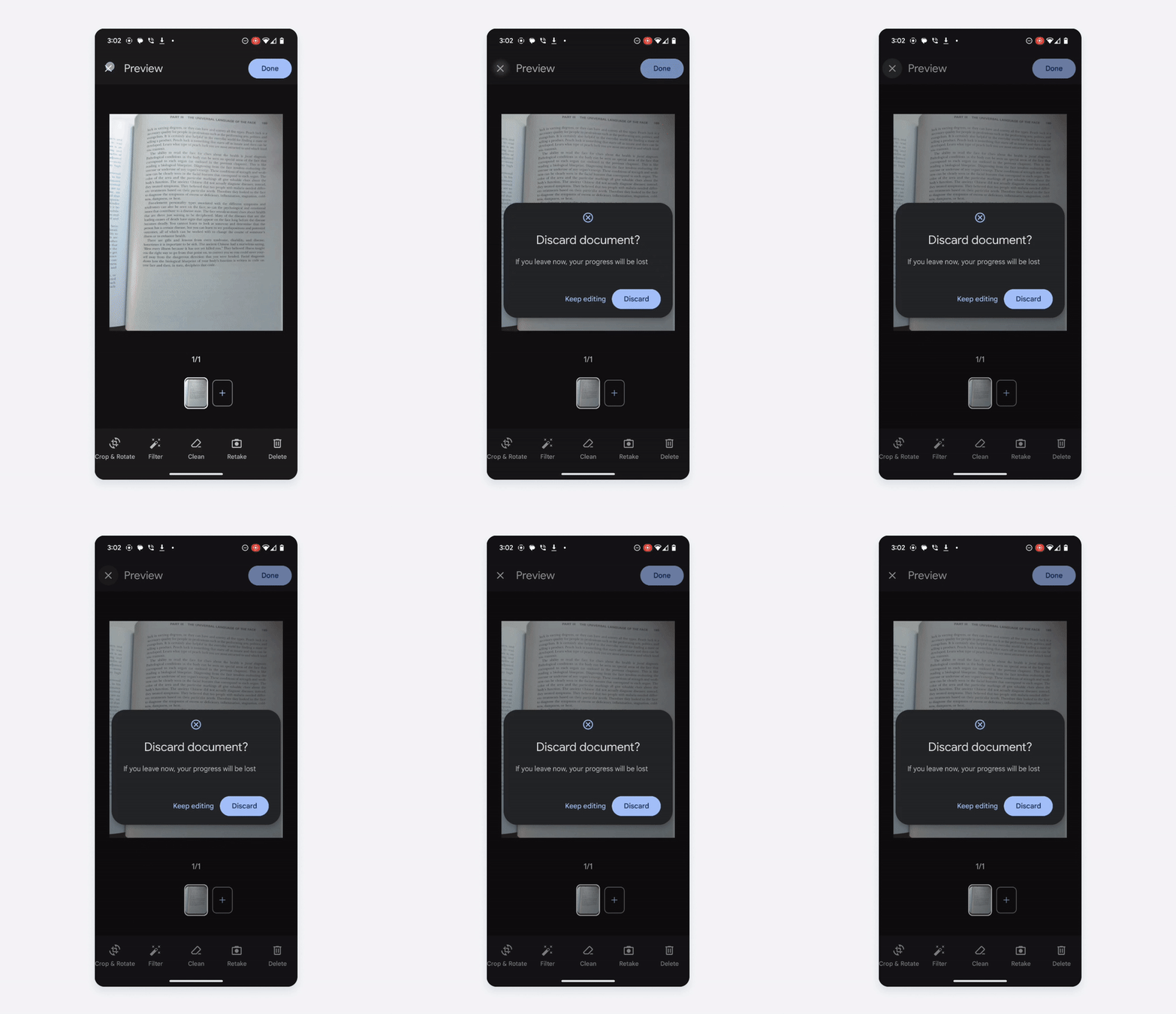
When a document thumbnail in the gallery view is selected, users can tap on the Retake button to try scanning the document again. They can also delete the scan by pressing the “Delete” button or the “Cancel” button in the top left. If there is only one scan, the screen navigates back to the previous page. If there are multiple scans, pressing the Delete button only deletes the selected scan versus all of the scans in the gallery. 

 Deleting the scan by tapping the top left “Cancel” button
Deleting the scan by tapping the top left “Cancel” button

Resources

Development: ML Kit Document Scanner 

SAP Fiori for iOS: Document Scanner 

Avatars

An avatar is a visual element used to display user profiles, initials, placeholders, icons, or business-related images, such as logos and product pictures.

Avatar and avatar group variations on compact (left) and expanded screens (right)

Usage

Do

Consider using round avatars to represent user profiles and square avatars for objects.

Don't
  • Don’t use avatars as interactive icons. Instead, use an icon button.
  • Don’t display more than one letter in an initial.

Anatomy

A. Avatar

The avatar is a round or square container that contains an image, an icon, or an initial. One alphabetical character is supported for an initial.

B. Badge (Optional)

An optional badge can be placed in the bottom right corner on top of the avatar to display a status.

C. Avatar Group

Multiple avatars can be grouped horizontally in an avatar group. To avoid clutter, we recommend displaying no more than six avatars. The last avatar can indicate the number of additional avatars when there are too many avatars to display.

The avatar group supports round avatars with a size of 16dp (default) or 24dp.

D. Label (Optional)

A short label can be displayed together with the avatar group to provide descriptive information.

Anatomy of an avatar (top) and avatar group (bottom)

Behavior and Interaction

Since an avatar is typically part of a specific component, such as an object cell, card, or object header, it is not interactive and serves a decorative or informational purpose.

Wrapping Behavior

The avatar group label should be short and concise. In cases where the label is longer than the allocated space, it wraps to a new line by default. As a nested component, the wrapping behavior can be overridden by the parent component. If the label gets truncated, the user should still be able to view the full label, for example, by navigating to a detail page or by displaying a tooltip on long press.

Variations

Size

The size of an avatar is customizable, preferably in increments of 8dp. The avatar group can display avatars with a size of 16dp or 24dp.

Shape

Depending on the context, the avatar can be round or square with rounded corners.

Color

By default, the avatar uses the SAP Fiori accent color palette. If required, the color theme can be customized or branded colors can be introduced.

Layout

Depending on the use case, one label can be placed before, after, below, or above the avatar group.

Label variations from top to bottom: trailing label, leading label, label above, and label below avatar group

Resources

Development: Avatar, Avatar Stack

SAP Fiori for iOS: Avatars and Images 

SAP Fiori for Web: Avatar

Elevation

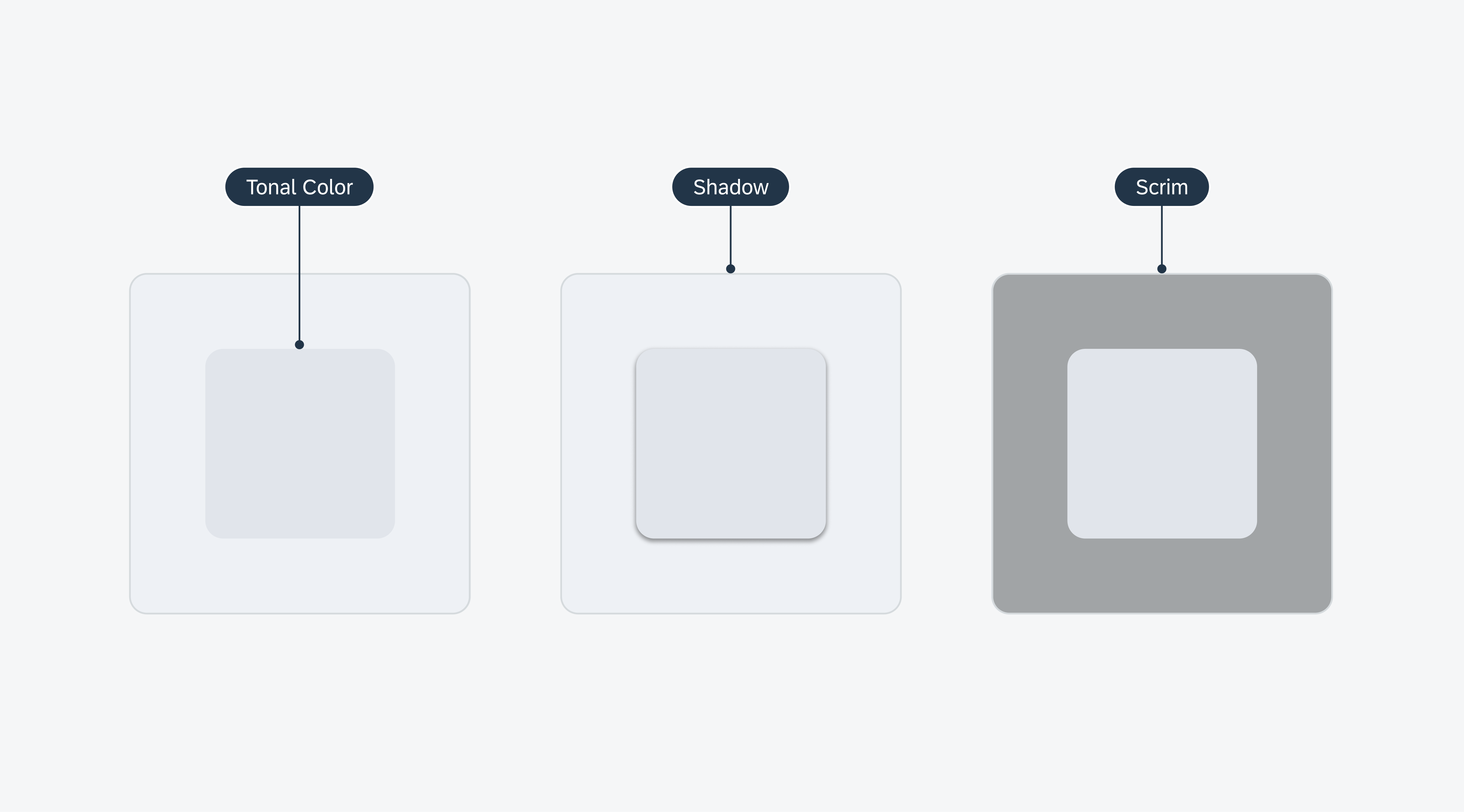
Elevation refers to the perceived virtual height or distance from the background to a component’s surface. This concept is a combination of techniques and visual cues, such as tonal color, shadows, and scrims, that allows for a layered yet cohesive visual experience. 

Examples of elevation using tonal color (left), shadow (middle), and scrim (right)

Tonal Color 

Material 3’s tonal color is essential for conveying materiality and depth using distinct shades across the UI. This approach also helps define a component’s tactile area and visual emphasis relative to other containers and surfaces, providing a visually balanced user experience. Tonal color is further defined by the surface and surface container color roles.  

Tonal color is used to define different component’s tappable area

Surface

The surface color role is the default tonal value that defines the overall background for surface containers and foreground elements. It is also used on navigational components such as the navigational rail and top app bar, which allow them to blend against the overall background. 

Tonal color is used to define different component’s tappable area

Surface Container

The surface container color role comprises five tonal colors defining the components’ elevation on the screen. The higher the surface container, the more prominent it appears on the screen. The surface container color roles can also be paired with shadows to further emphasize a container. 

Surface container color roles are used to provide contrast and definition between different containment areas

Shadows: Adding Depth and Focus 

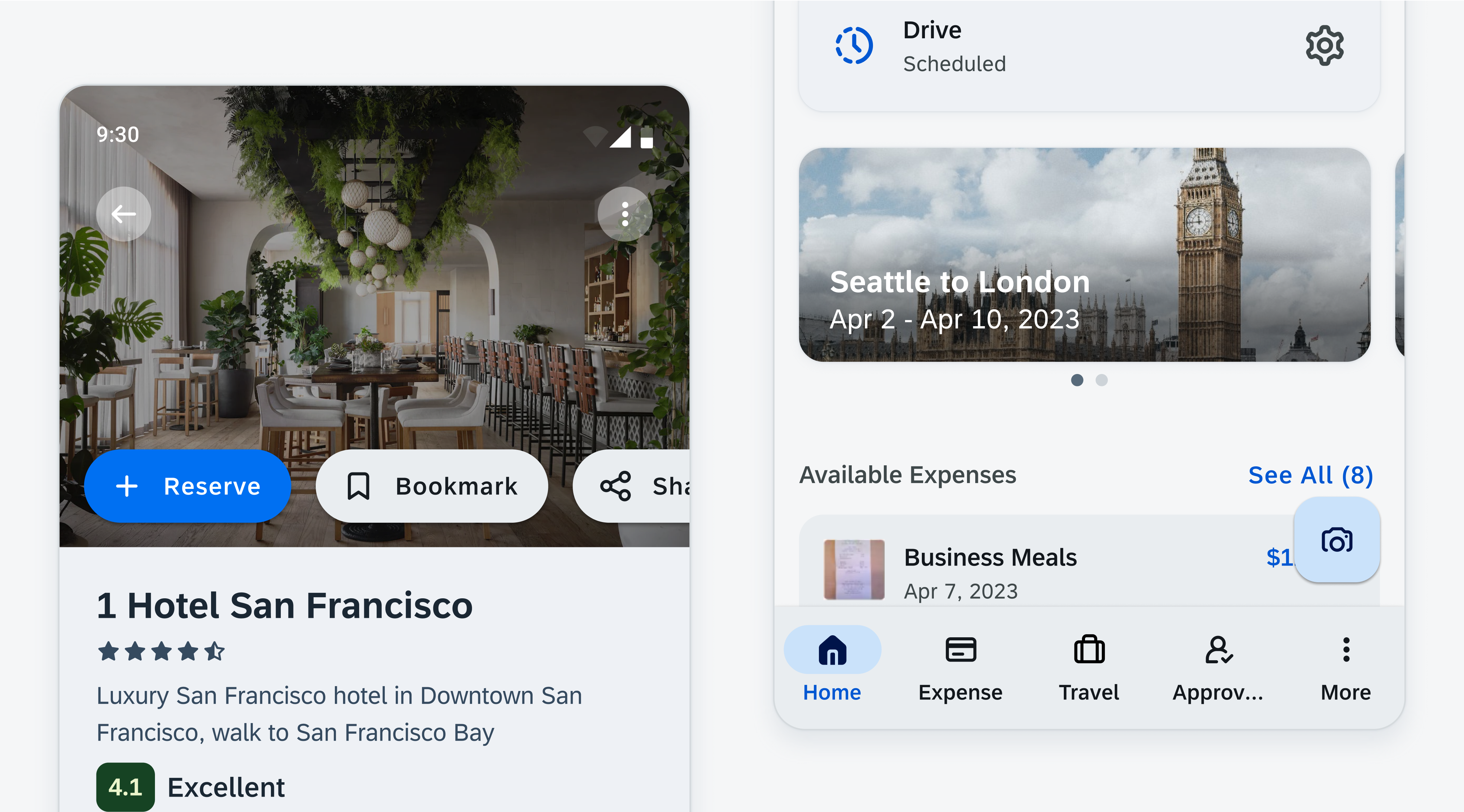
Shadows are an essential technique for making key interface elements stand out and appear interactive, such as cards, modals, and other actionable components. Shadows can also be used to add further emphasis to a component in areas that are visually busy such as against an image or a background that is using the same color role. 

Shadows can be used to supplement components in instances where contrast is not met. For example, a button over an image (left) or a button over a background with similar contrast (right)

Elevation Levels 

SAP Fiori for Android provides five distinct elevation levels (0-4) to establish visual hierarchy within the UI. Higher levels are typically used for prominent content, guiding users’ attention to the most critical interactive areas. 

Name Usage Light Mode Dark Mode
Level 0 Filter Chip (Flat) / Full-screen Dialog / List Item / Input Chip / Navigational Rail / Tabs / Side sheet (Docked) / Slider (Track) / Top App Bar
Level 1 Banner / Bottom/ Sheet (Modal) / Elevated Button / Elevated Card / Extended FAB (Lowered) / FAB (Lowered)
Level 2 Bottom App Bar / Dropdown Menu / Menu / Navigation Bar / Select Menu / Rich Tooltip / Top App Bar (Scrolled)
Level 3 FAB / Extended FAB / Modal Date Picker / Docked Date Picker / Modal Date Input / Dialog / Search Bar / Search View / Time Picker / Time Input
Level 4 (Not assigned as resting level)
Level 5 (Not assigned as resting level)

Scrim

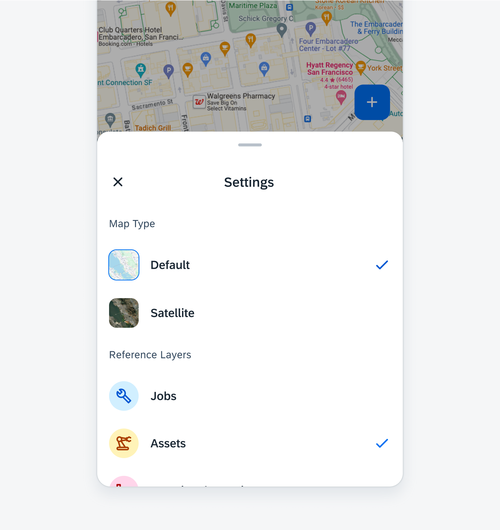
Scrims are transparent underlays that help bring focus to components. They are underlaid to create contrast between the background and the components. Examples of components that use scrims include side navigation, bottom sheet, and modals. 

Scrim provides focus and elevation for components like bottom sheet

Resources

SAP Fiori for iOS: Elevation 

Material Design (Elevation) 

Android Developers (Elevation)  

Related Components/Patterns: Color, Accessibility