
KPIs
KpiView, FioriProgressViewKpi
Intro
KPIs (key performance indicators) are metrics used to evaluate the success of an organization, an individual, a group, or an activity. They serve to highlight the current value of an object or as a summary of the object. KPIs can be displayed in a header, in the content area of an object, on a card, or in a modal window.
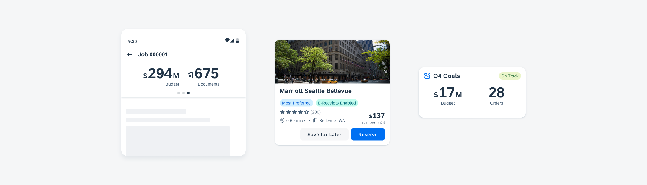
KPI header on mobile (left), in a card component (middle), and in a widget component (right)
Usage
- Use KPIs for numerical metrics.
- Use abbreviations for units of measurement in the KPI prefix and/or suffix that may be too long. For example, “m” or “mil” can be used in place of “millions”.
- Don’t use KPIs for non-numerical metrics.
- Don’t mix standard KPIs with progress view KPIs when nesting KPIs in an object. Standard KPIs should only be grouped and displayed with one another, likewise with progress view KPIs.
- Don’t write overly long or descriptive KPI labels. KPI labels should be concise while also clearly communicating the KPI meaning.
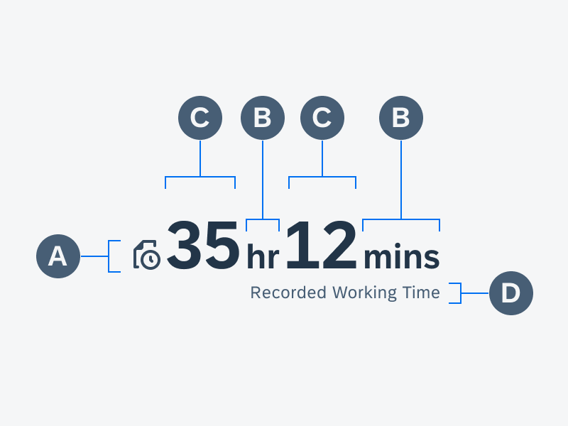
Anatomy
Standard KPIs and KPIs with Icons
A. Trend/Icon
The KPI icon is used to provide a visual representation of information related to the KPI metric. It defaults to a trend symbol for standard KPIs. With the KPI Icon variant, you can choose an icon from the Icon Explorer.
B. Prefix and Suffix
The KPI prefix and suffix are used to define units of measurement for the KPI metric and are placed right in front or after the KPI numeric value.
C. Value(s)
The KPI value is the core element of the component. It can either be a single value with one number or two values with a combination of numbers, prefixes, and suffixes, such as “15hr12mins”.
D. Label
The KPI label is used to provide additional information about the KPI.
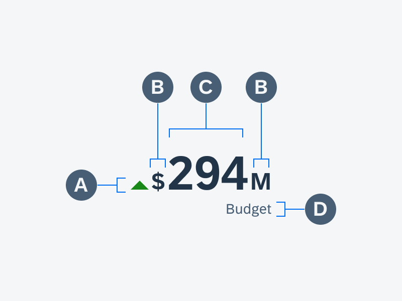
Anatomy of a standard KPI
Anatomy of a KPI with icon
KPI Progress View
A. Progress View
The progress view displays a visual representation of completeness using a circular progress track.
B. KPI
The KPI is a component nested within the progress view KPI component. See information on KPIs above for anatomy.
C. Title
The progress view title is used to provide additional information about the overall KPI progress view.
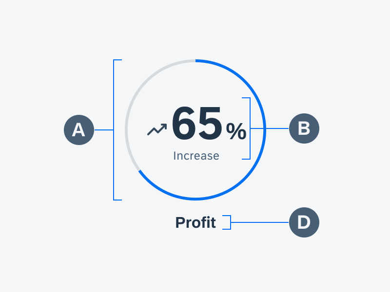
Anatomy of a KPI progress view
Behavior and Interaction
A KPI is a display-only component used to show a key figure.
Variations
KPIs
Standard KPI
The standard KPI is available in three different sizes and can be highlighted with semantic colors. Standard KPIs may be used for measurements such as meters, Celsius, percentage, etc.
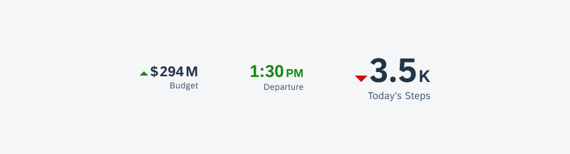
Small KPI (left), medium KPI in a semantic color (middle), and large KPI (right)
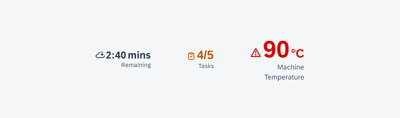
KPI with Icon
The KPI with icon is available in three sizes and can be highlighted with semantic colors. The iconography helps represents the KPI metric. For example, a document icon can be used to show there are files associated with a KPI.
Small KPI with icon (left), medium KPI with icon (middle), and large KPI with icon in a semantic color (right)
KPI Progress View
The KPI progress view utilizes a circular form that represents the progress of its KPI metric. It can be used to show the step progress of a goal, percentage of completion of a task, and more.
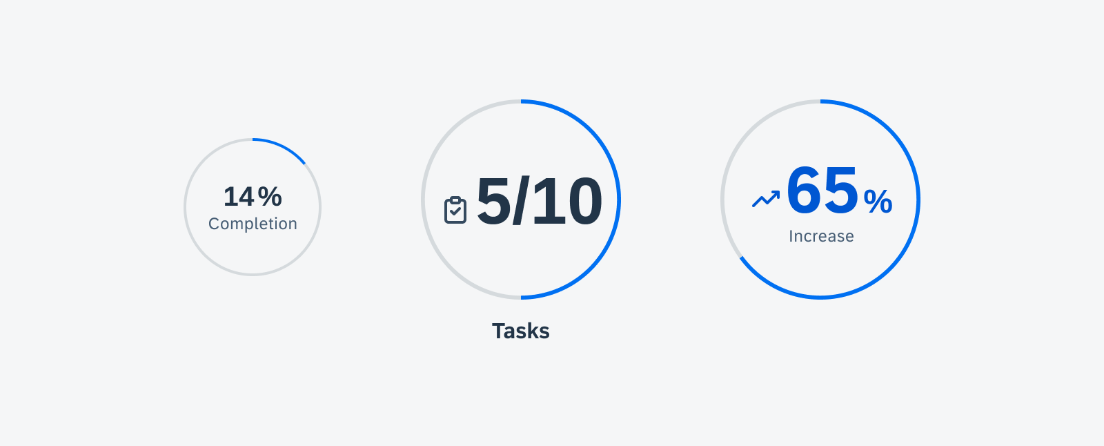
Small KPI progress view with a KPI in a semantic color (left), medium KPI progress view (middle), and large KPI progress view with a KPI with icon (right)
Resources
Development: FioriNumericKpi, FioriProgressViewKpi
SAP Fiori for iOS: KPIs
Related Components/Patterns: Cards Overview, Card Header, Card Body
 Your feedback has been sent to the SAP Fiori design team.