
Bottom Sheet
Bottom sheets are containers with supplementary content that is located at the bottom of the screen.
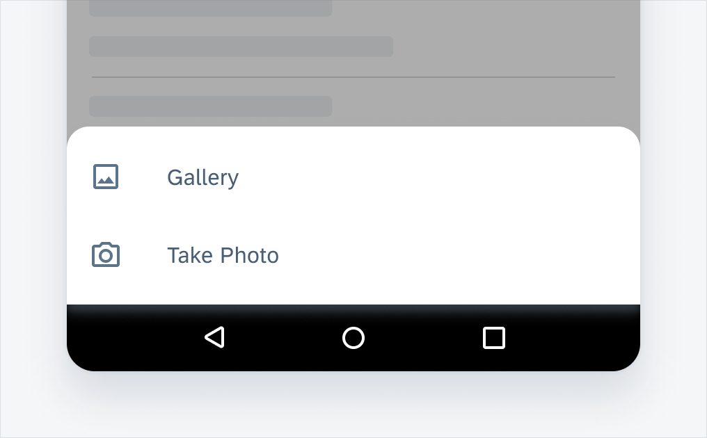
Bottom sheet list view
Usage
- Use bottom sheets to show deep-linked content that supplements the screen’s primary UI region.
- Use bottom sheets when representing actions in a list as opposed to menus or simple dialog.
- Use bottom sheets when you need to allow for a wide variety of content and layouts.
- Use bottom sheets when easy access is needed.
- Don’t use bottom sheets for complex information.
- Don’t use bottom sheets to notify a user to take action.
Anatomy
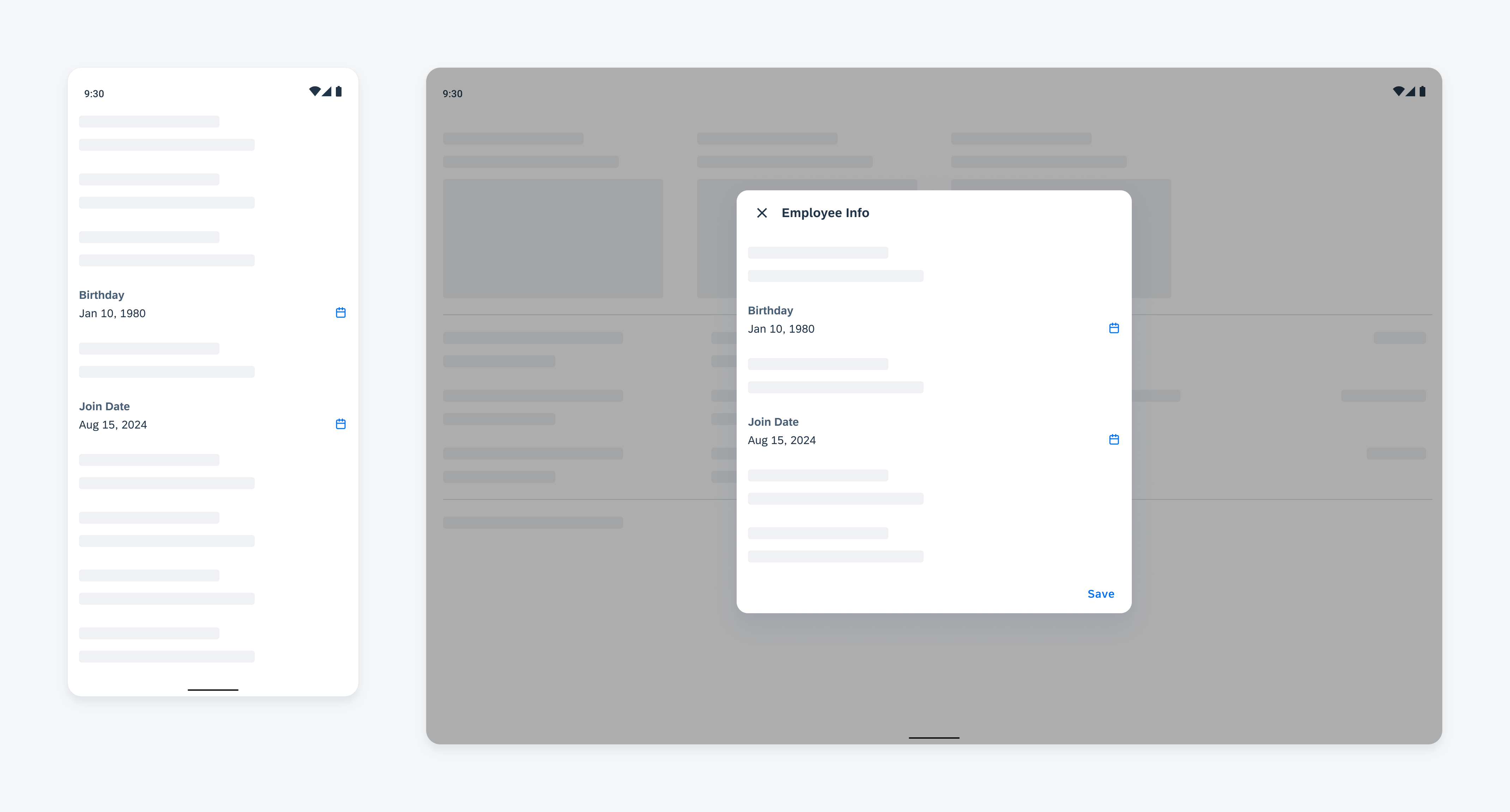
Modal Bottom Sheet – List View
Modal bottom sheets are alternatives to inline menus or simple dialogs on mobile, providing room for additional items, longer descriptions, and iconography. They must be dismissed to interact with the underlying content.
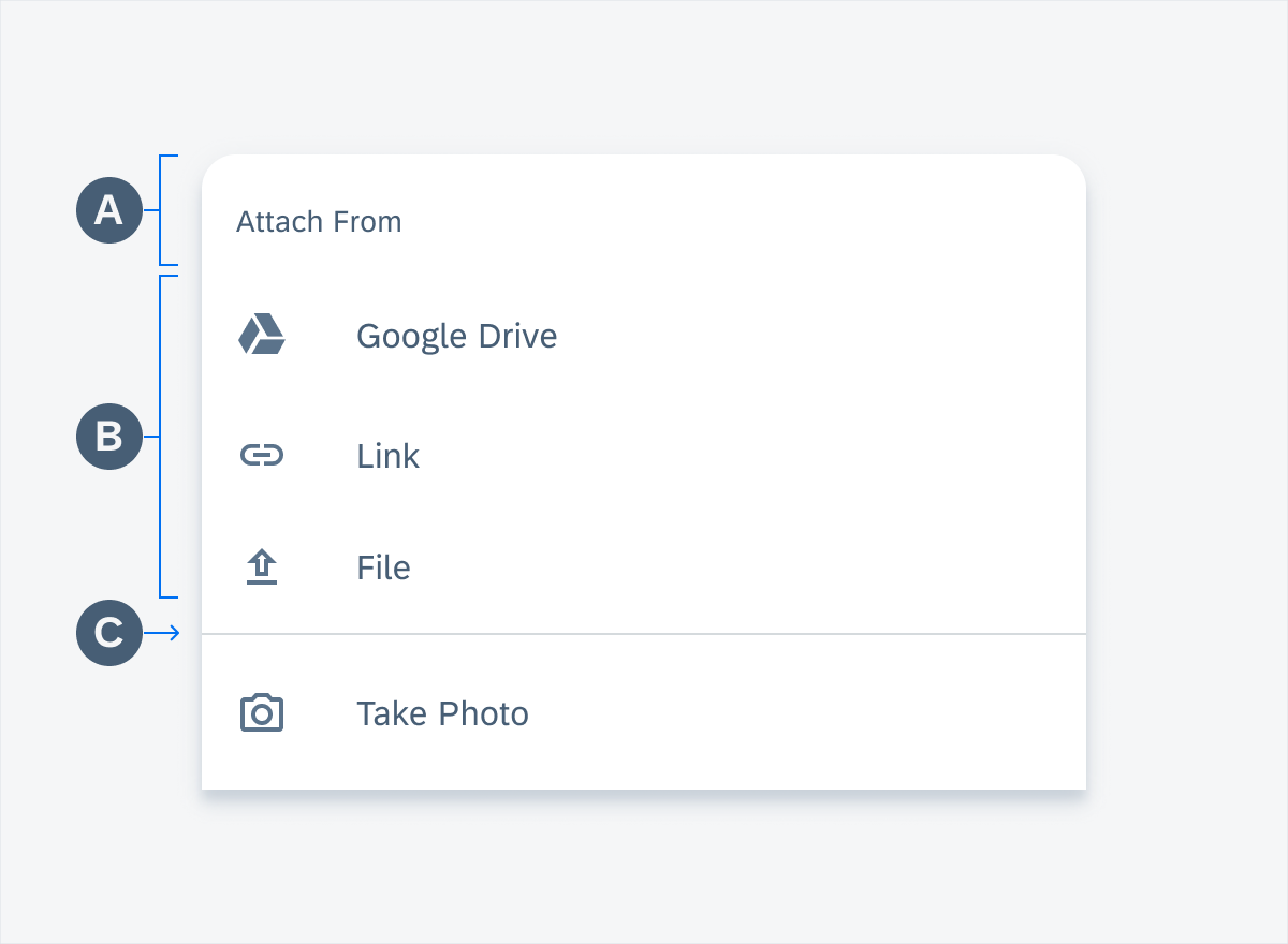
Bottom sheet list view anatomy
A. Header
B. List of Actions
C. Divider Line
User interaction with bottom sheet list view
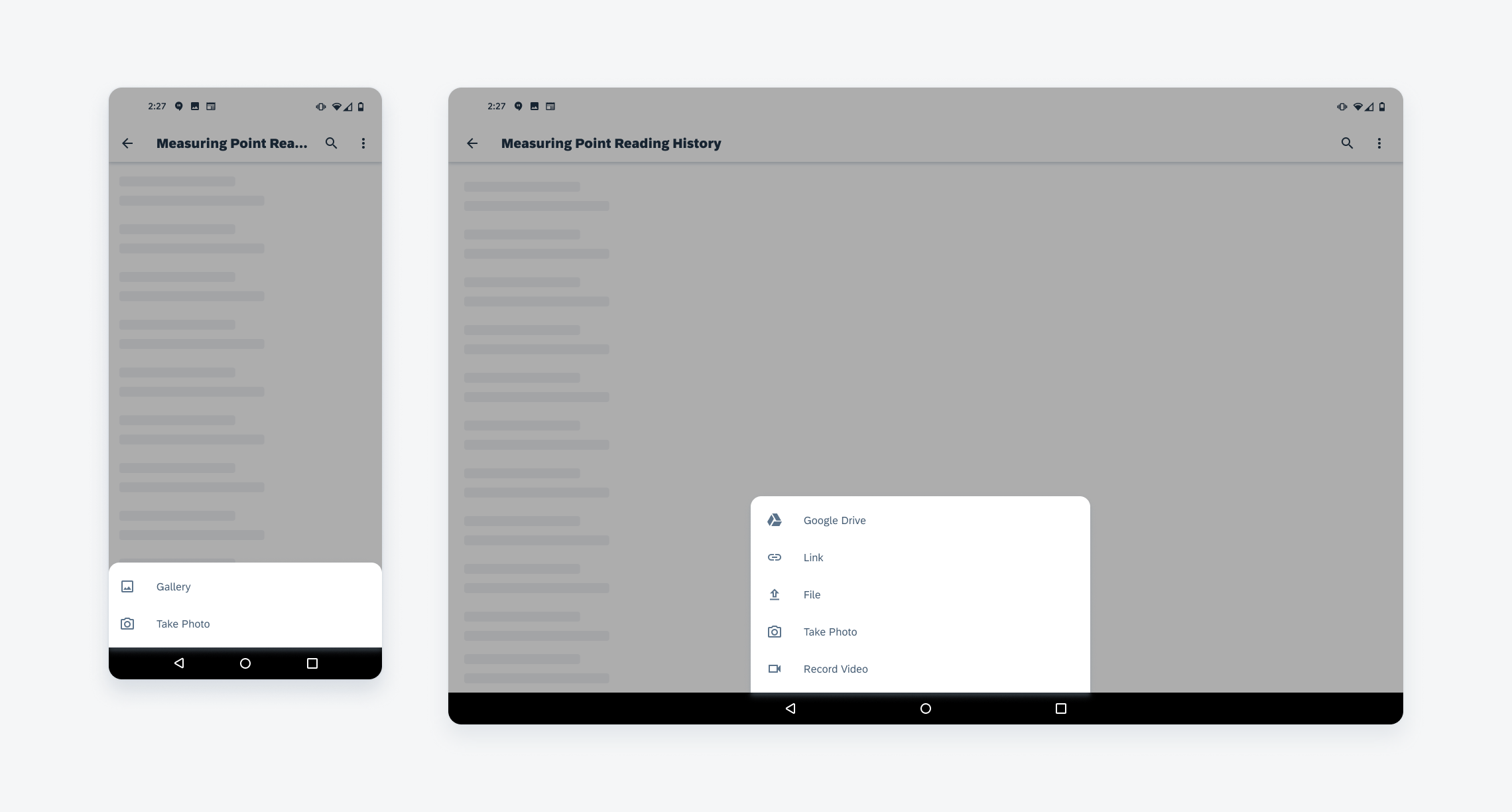
Modal bottom sheet list view on mobile (left) and tablet (right)
Behavior and Interaction
Modal bottom sheets present a set of choices while blocking interaction with the rest of the screen. The modal bottom sheets have a default elevation of 16dp, which helps users focus on their available choices.
Adaptive Design
Modal bottom sheets are primarily used on mobile. However, there is also a bottom sheet solution on tablet.
Resources
Development: ButtomSheetScaffold, ModalButtomSheet, ModalButtomSheet
Material Design: Bottom Sheet


 Your feedback has been sent to the SAP Fiori design team.