
Updated: June 21, 2023
Latest Version 2.2
Introduction
Intro
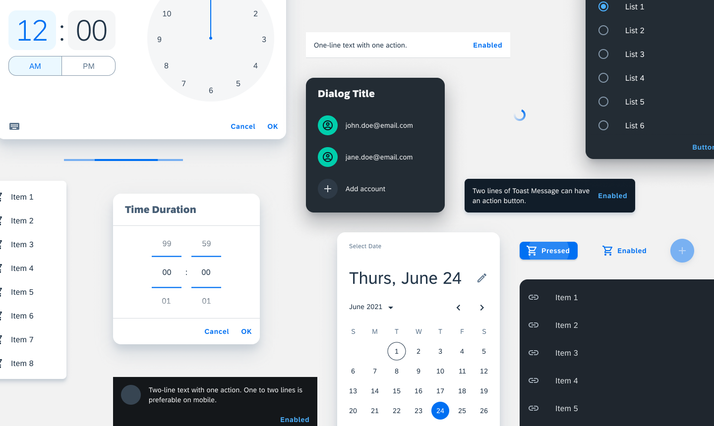
Basic components are a group of components that follow exactly how Material Design defines them as they are integral to the Android UX.
Visual
The only UI changes made for basic components in SAP Fiori for Android are color and typography.
Behavior
Basic components are components that are essential to Android UX. They remain structurally identical with how Material Design defines these components in order to maintain familiarity for Android users.
Components List
Resources
Material Design: Banners, Bottom Sheet, Buttons, Date Pickers, Dialogs, Menus, Progress Indicators, Snackbars
 Your feedback has been sent to the SAP Fiori design team.