
Collection View
Fiori: CollectionView
Intro
Collection view previews a sample of content and presents it in a highly visual layout. It is an alternative view of object cells. The information is displayed in a grid format instead of list with an emphasis on images.
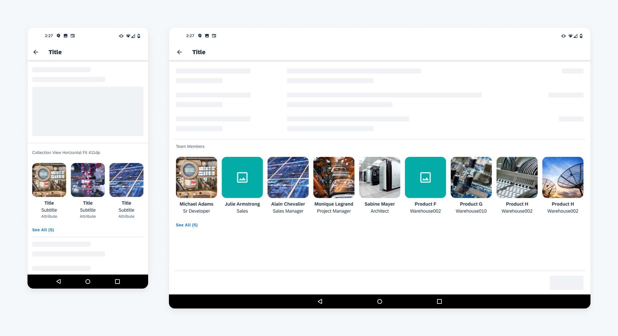
Collection view of products on mobile (left), collection view of contacts on tablet (right)
Usage
- Use a collection view when you want to display data in a grid.
- Use a collection view when the image is the preferred element to identify each item.
- Use a collection view as an entry point to a full list of all the items or to a detailed view of each of those items.
- Don’t use a collection view to display only text.
- Don’t use a collection view if an image is not a good identifier of the item or the majority of items do not have images in the data set. Use object cells instead.
- Don’t mix different types of objects in one collection view.
Anatomy
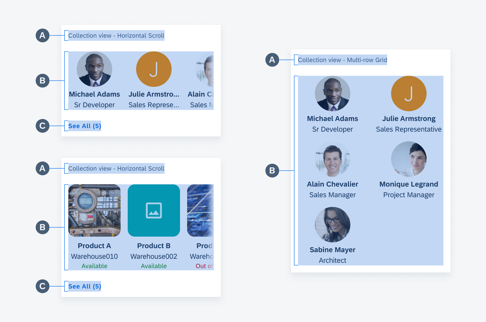
Basic Anatomy
A. Header (Mandatory)
At the top left of the collection view is the header, which describes what the content in the view represents.
B. Collection Cells
This area displays the cells in this collection view. Each collection cell represents one item. It can be an object or a person/account. Collection cells can be displayed in one row with horizontal scroll or in a multi-row grid.
C. Footer
The footer is placed below the collection cells with a See All button and a total number of items in that collection. Users can tap the See All button to view all of the items in this collection as a list of object cells. The footer is only used in a horizontal scroll collection view and is not available in a multi-row grid collection view.
Collection view anatomy
Collection Cell Anatomy
A collection cell consists of a mix of image and text labels. The container (A) holds all content. The type of content displayed in each cell should be consistent within one collection view. The container height depends on the height of the elements being displayed. The container width is defined by the sizing rules based on screen size (see specifications for more detail).
An image (B) is required for a collection view. If the item does not have an image, use a placeholder image. See instructions for placeholder images in the placeholder image section.
The title (C), subtitle (D), and attribute (E) labels are optional and may be used to display additional information. All cells in one collection consist of the same type of texts, reserve the space when the value is empty. Though all texts are optional, we strongly recommend to always display names as a title for people or accounts.
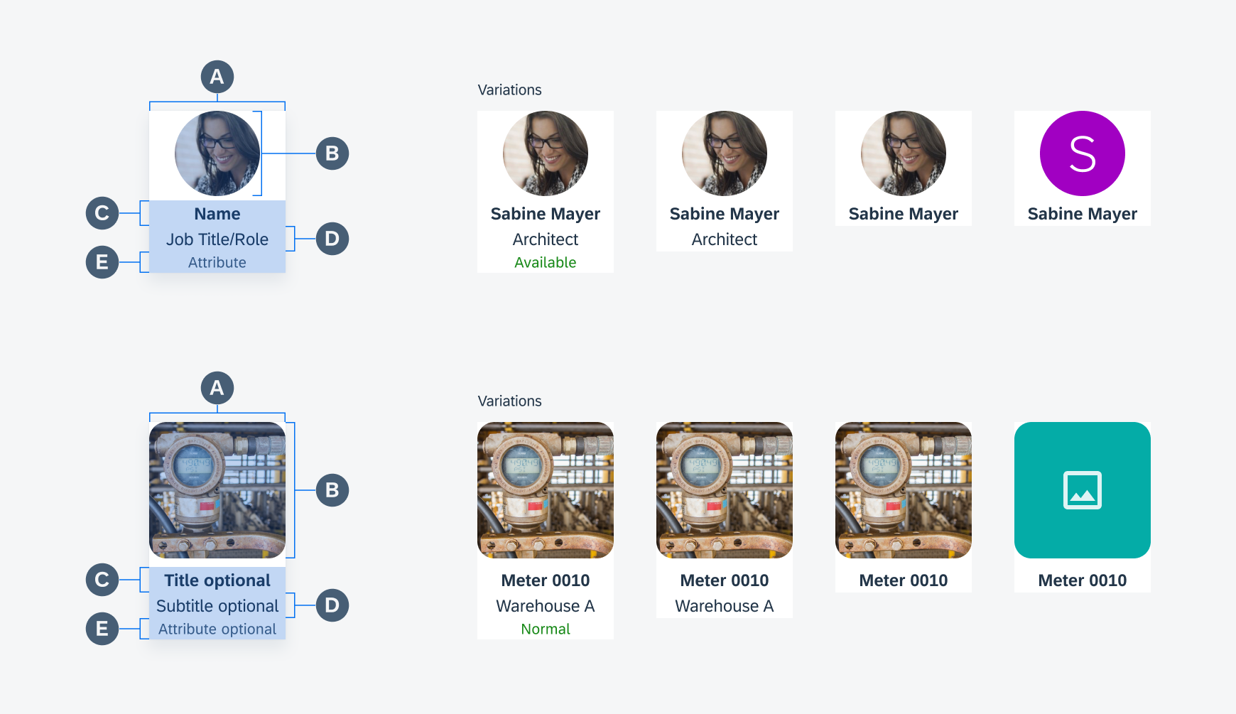
Collection cell anatomy: contacts (top), products (bottom)
Variations
Collection View with Horizontal Scoll
The horizontal scroll collection view displays collection cells in a single horizontal line. Users can scroll left and right to see items in this collection. It provides a preview of the collection without taking a lot of screen space. Users can use the See All button to view the complete collection in list view.
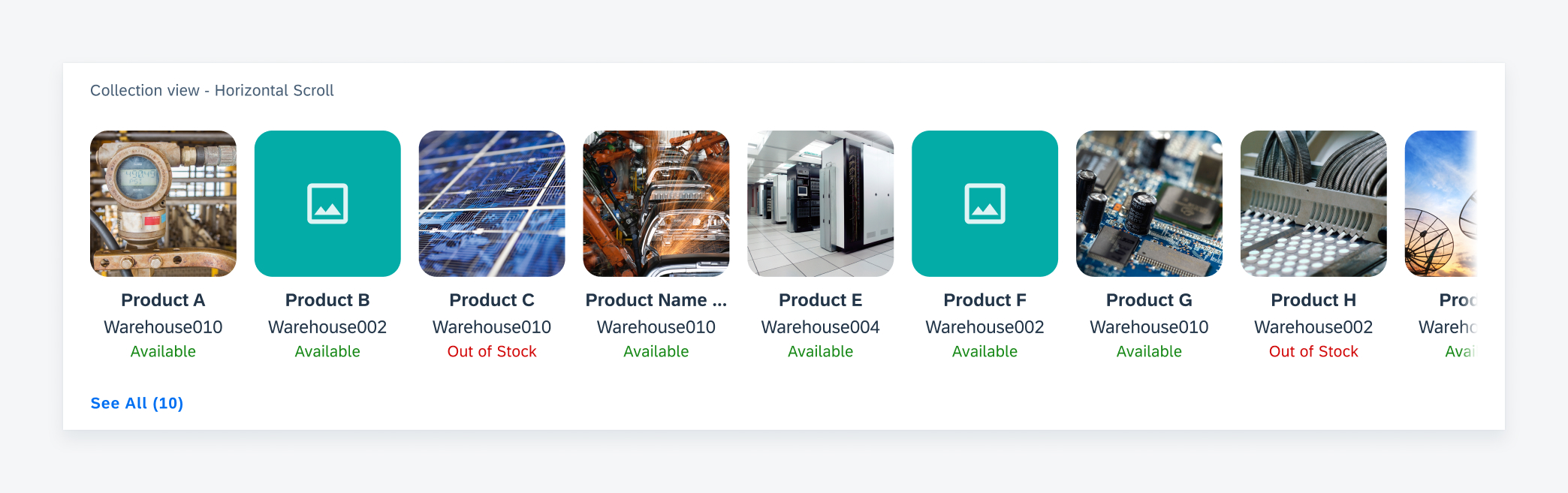
Horizontal scroll collection view sample
Collection View in Multi-Row Grid
The multi-row grid layout allows the collection cells to stack vertically. All items in the collection should be displayed, so a “See All” button is not used. Users can scroll vertically to view items in the page.

Collection view grid on mobile
Behavior and Interaction
Horizontal Scroll
Users can scroll horizontally to view more cells. Upon scroll, the collection cell is cut off at both ends of the view. Due to the vast range of device sizes, the size of a collection cell is dynamic to ensure the cut off. A gradient is added to the edge to hint at there being more content.

Horizontal scroll behavior of collection cells
When there are not enough items in the collection to scroll, left align the cells with 16dp paddings in between each cell.
To disable the horizontal scroll, display the first several items in a row in the same way horizontal scroll cells are positioned until there is not enough space for a full cell or there are no more items to be displayed.

Sample collection view of contacts on tablet
Navigation
In the horizontal scroll collection view, the “See All” button shows the entire set of data which is displayed as a list of object cells.

Tapping "See All" to view all collection view items in a list
In all types of collection views, tapping on a single collection cell will navigate to a detailed view of the item. The actual destination depends on the context and type of data represented by the cell. For example, a collection cell of a team member may open up an employee’s profile page.

Tap one collection cell to drill down
Resources
Development: CollectionView
SAP Fiori for iOS: Collection View
 Your feedback has been sent to the SAP Fiori design team.