
Accessibility
Intro
The iOS design system is designed to be compliant with accessibility standards. Our components are flexible, readable, and adaptable for usage by a wide range of users, providing an optimal and user-friendly experience for everyone, including individuals with special needs due to visual, motor, auditory, speech, or cognitive impairments.
To ensure that your users can easily read and make out the text and visual elements in your app, you need to employ sufficient color contrast. Color contrast is the ratio measuring the difference between the color of the foreground element against the color of the background. Achieving the minimum contrast ratio ensures that all text and visual elements in our design system are legible to all users including those who may be visually impaired and/or color-blind. If the color appears faint against the background, it may be a sign that the color has insufficient color contrast. First, determine its current contrast ratio, second, determine the target contrast ratio of the UI element (e.g., 3:1, 4.5:1, 7:1), and lastly, follow our color pairing system. To validate this, use a color contrast calculator.
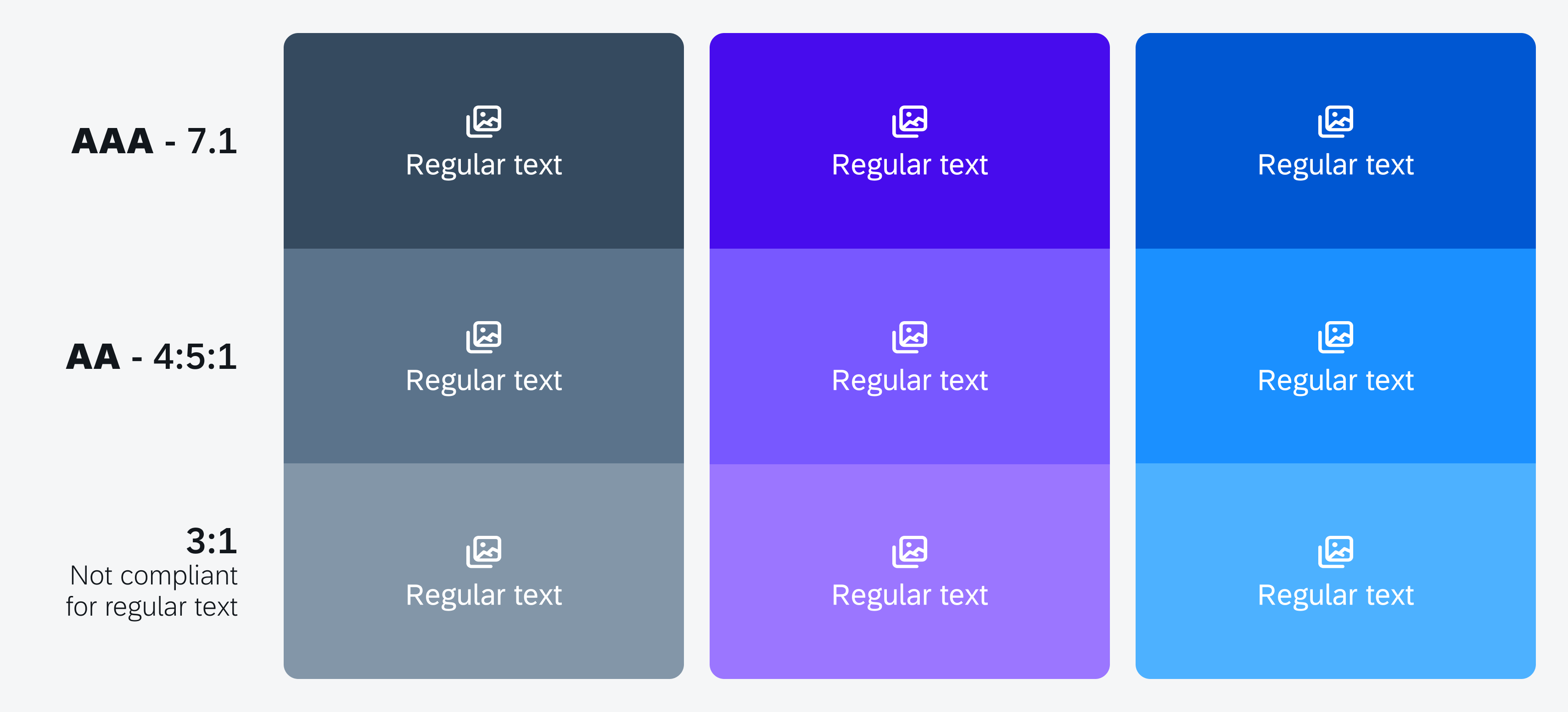
Color contrast ratio examples
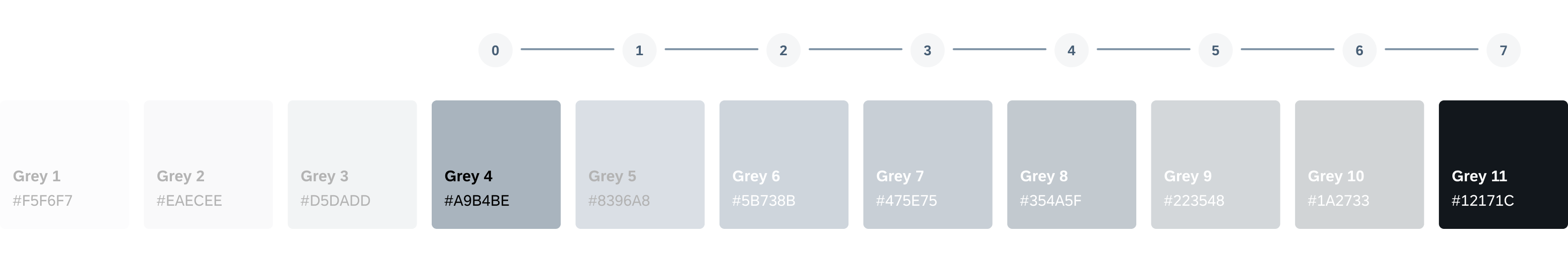
Color Pairings [Methodology]
The Horizon color palette has been designed to comply with WCAG accessibility standards with a color pairing system that allows you to easily pair color combinations and achieve your desired color contrast.
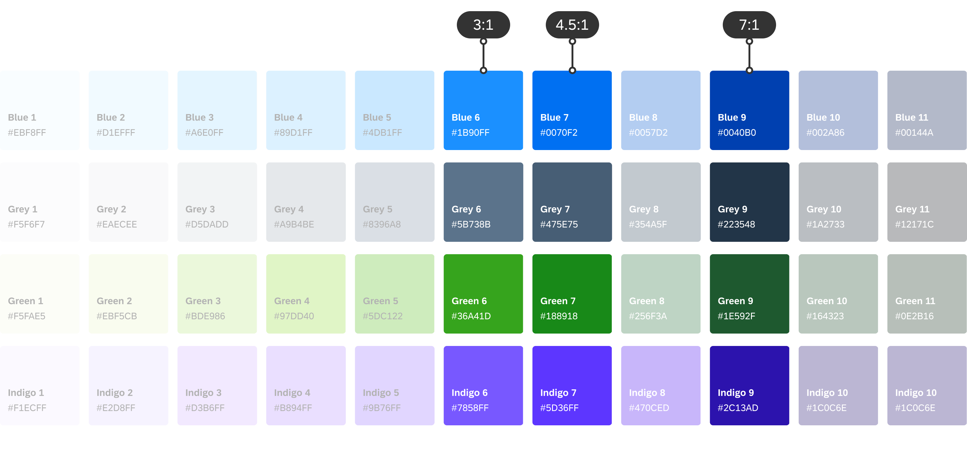
Example of color pairings for 3:1, 4.5:1 and 7:1 color contrast ratios
Color Pairing for 4.5:1 Contrast (Default)
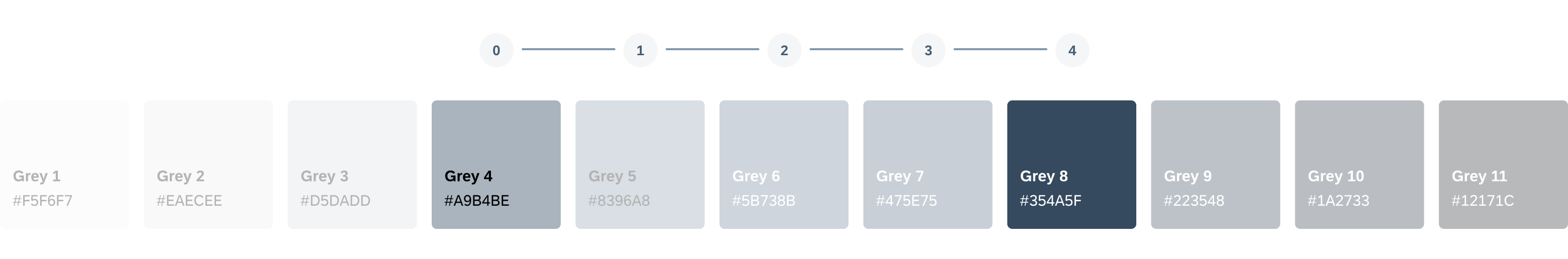
To ensure the minimum color contrast ratio of 4.5:1 for small text (below 18 point regular or 14 point bold) is met, pairing any color that is five steps apart will achieve this. For example, pairing the fourth color with the ninth color ensures that the minimum color contrast for normal text is met. For a minimum color contrast ratio for text and content, we recommend a 4.5:1 color contrast ratio.
Achieving 4.5:1 color contrast
Color Pairing for 3:1 Contrast
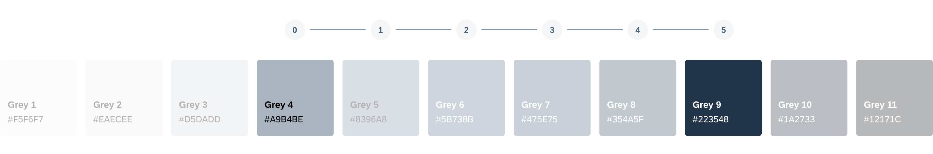
To ensure a minimum of 3:1 color contrast ratio for large text (18 point and above regular or 14 point and above bold) and decorative elements are met, pairing any color that is four steps apart will achieve this. For example, pairing the fourth color with the eighth color in the spectrum ensures that the minimum color contrast ratio for large text, bold text, graphical objects, and user interface components is met. For graphical elements, we recommend a 3:1 color contrast ratio.
Achieving 3:1 color contrast
Color Pairing for 7:1 Contrast
To ensure the minimum color contrast ratio of 7:1 is met, pairing any color that is seven steps apart will achieve this. For example, pairing the fourth color with the eleventh color ensures that the minimum color contrast for a high-contrast theme is met.
Achieving 7:1 color contrast
Comparing Light mode with Increase Contrast Light mode
Built-In Text Styles
Applying iOS built-in text styles allows your app to take advantage of accessibility features, such as dynamic type, which provides users the flexibility of choosing their preferred text size. It also automatically adjusts tracking and leading for every font size.
SAP Fiori for iOS uses SAP 72 font, and supports dynamic type to enable accessibility features. Learn more in Typography.
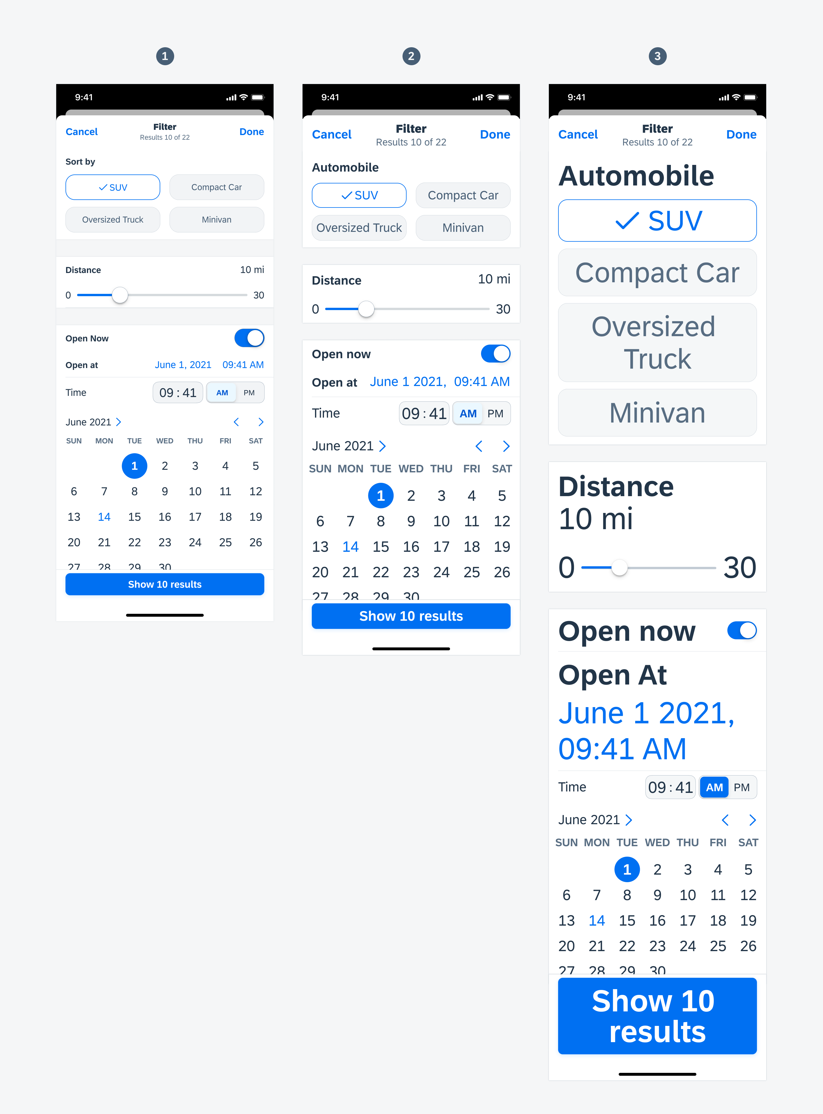
Here are some examples of our components adapting to larger text sizes, and a few tips when designing a custom component.
Prioritizing Content
In this example, the description of the object cell is hidden in larger text size settings. Since object cells are typically used for previewing an object, it is reasonable to remove secondary information temporarily in order to help the user to focus on more important content.
- Text size Large (default)
- Text size xxxLarge
- Text size AX5: The description of the object cell is hidden
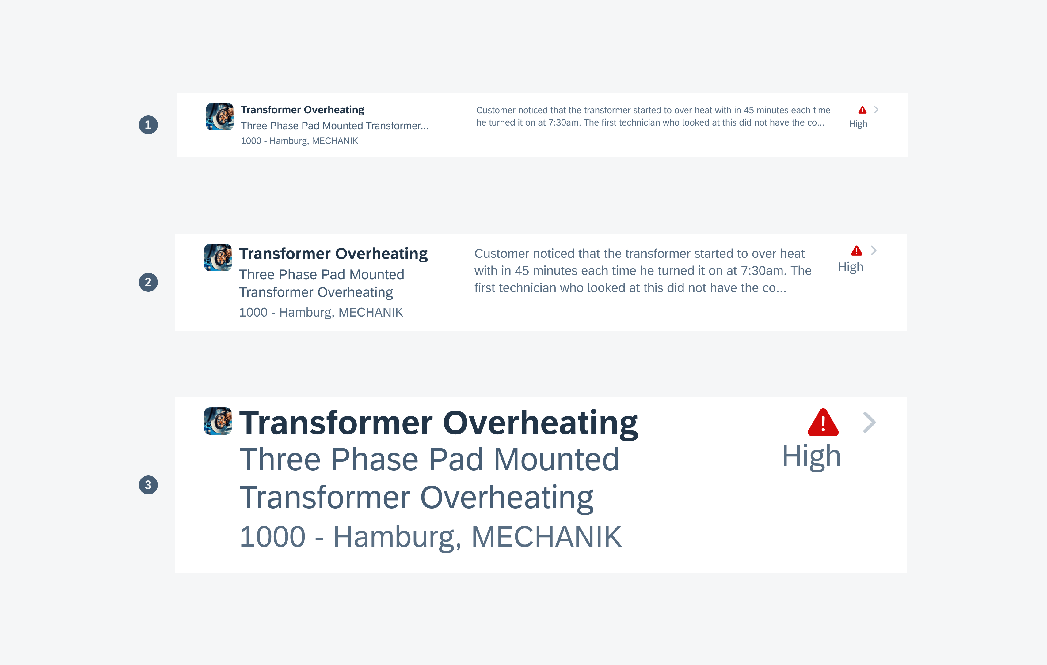
Object cells showing type scaling and prioritizing content
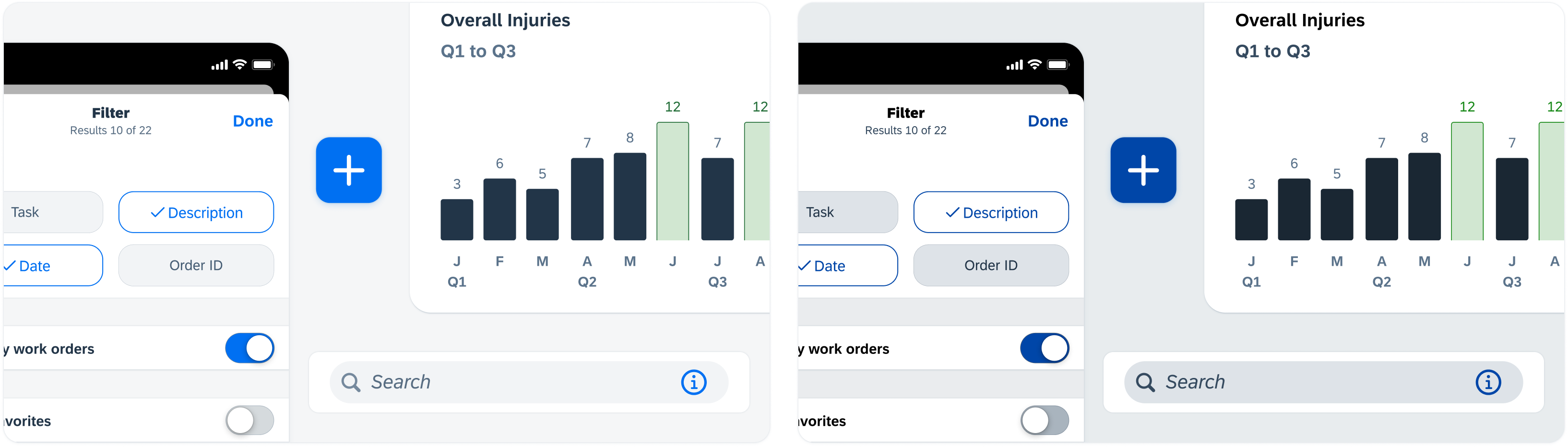
Rearranging Layouts
Sometimes it is necessary for a component to rearrange its layout in larger text size settings. The image and status of the object header move to the top of the component, allowing text labels below them to have more space to grow.
- Text size Large (default)
- Text size xxxLarge
- Text size AX5: Components are rearranged
Object headers showing type scaling and adjusting content
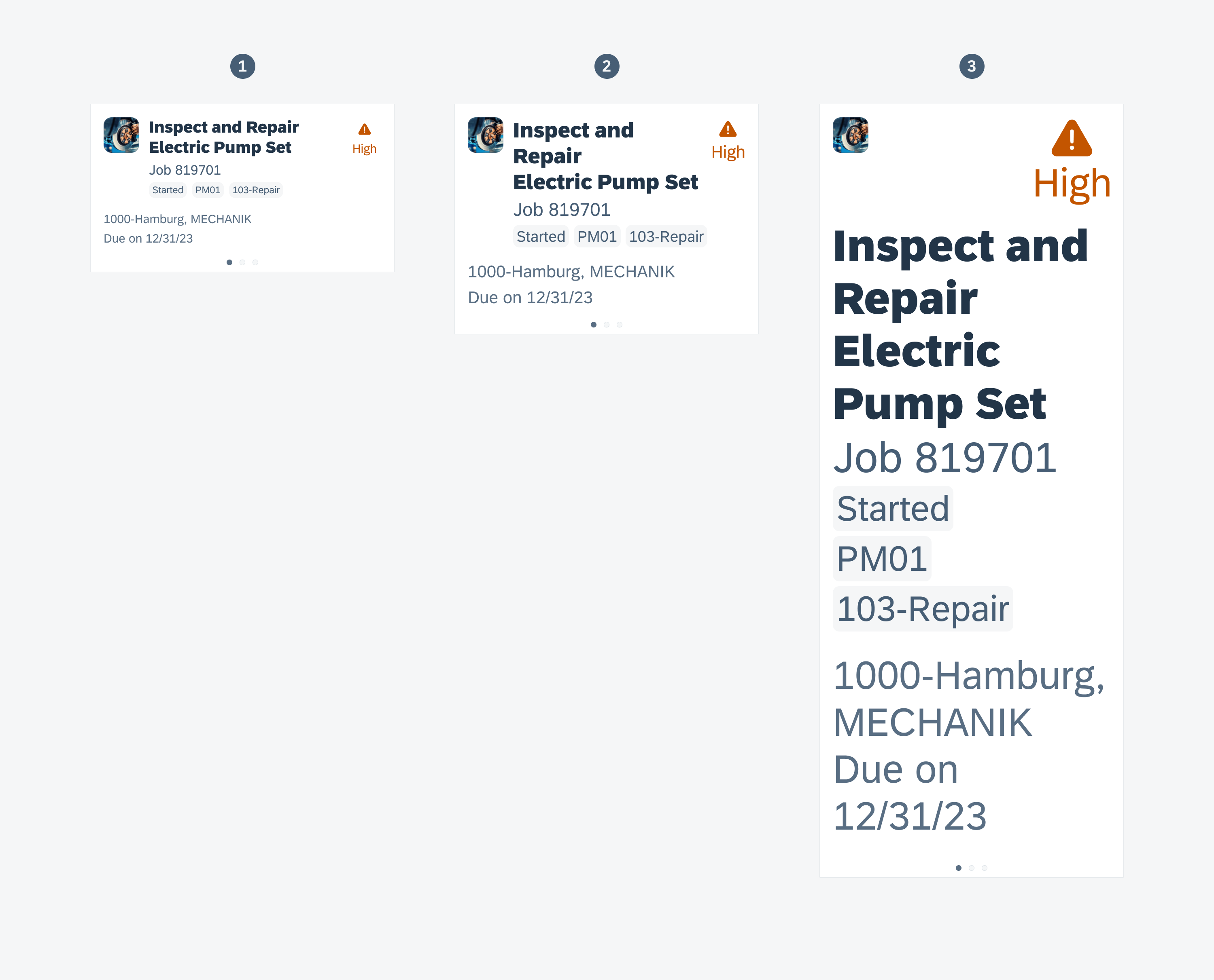
Stacking Text Labels
Form cells adapt to larger text sizes by vertically stacking the key label and value. In this case, it is crucial to allow text labels to display more content instead of truncating them.
- Text size Large (default)
- Text size xxxLarge
- Text size AX5: Form cells adapt to larger text size
Sort & Filter Form showing inline text scaling and wrapping
In addition to color contrast ratio, the “Increase Contrast” feature, and dynamic type, there are more ways to ensure that your app is accessible to everyone. iOS provides guidance on how to enable accessibility features such as voice-over, reading support, switch control, dictation, and much more. See Accessibility on iOS for more information.
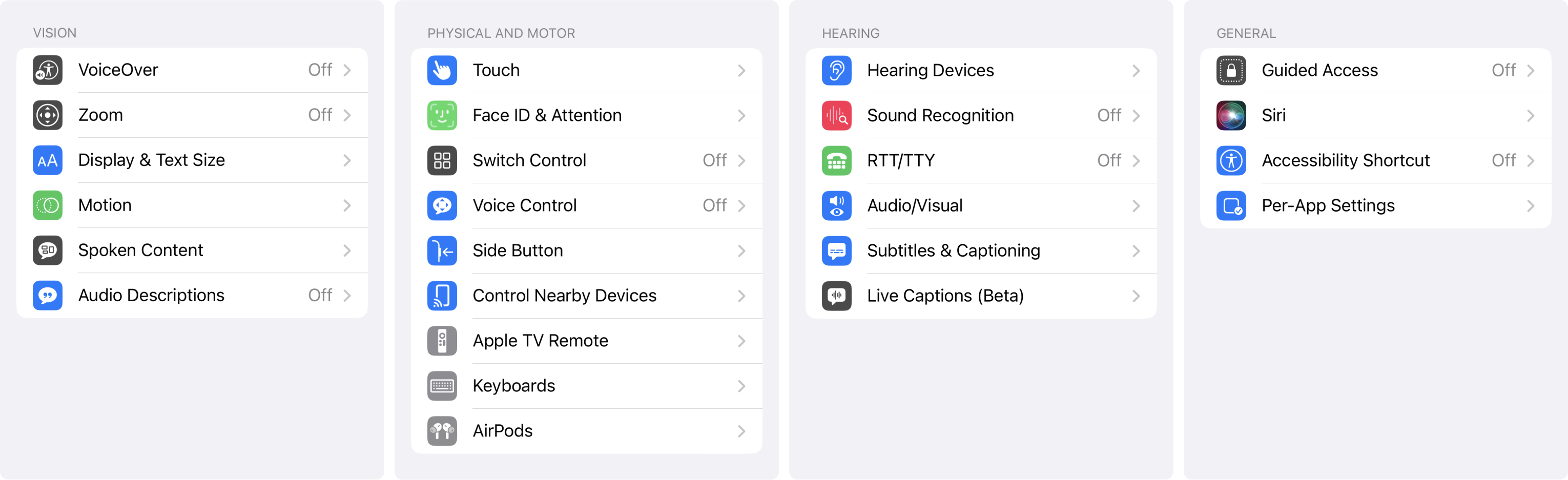
iOS native accessibility settings
 Your feedback has been sent to the SAP Fiori design team.