
Banners
FUIBannerMessageView, FUIOfflineBannerMessageView, FUIProgressBannerMessageView
Intro
A banner is a notification that appears on the screen to inform the user about a certain event or a change in system status. It contains a short notification text and optionally a button to allow the user to take a recommended action
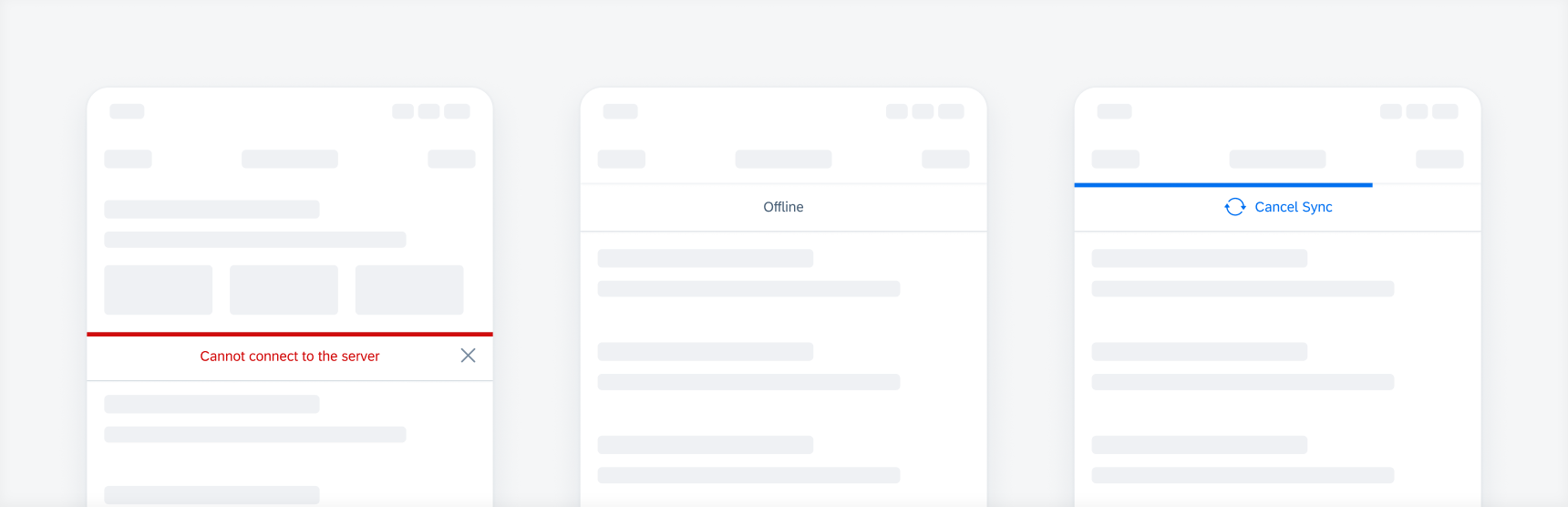
Banner examples: an error, an offline, and a syncing banner
Use a banner when the user needs to be informed about a certain event or a change in system status. Keep the text of the notification message short and concise to avoid blocking other important content on the screen.
- Keep the text short and concise.
- Ensure that the user can still interact with the device.
- Don’t allow the text to be longer than 1 or 2 lines.
- Don’t let the banner text cover up other important information on the screen.

Example of a short banner text
A. Banner Text (Mandatory)
Contains a clear message and, optionally, a recommended action for the user.
B. Icon (Optional)
Indicates sync in progress status.
C. Dismiss Button (Optional)
Allows the user to dismiss the banner.
D. Action Button (Optional)
Allows the user to take a recommended action.
E. Indicator Track (Optional)
Appears above the banner in a semantic color to indicate a progress or the banner type.
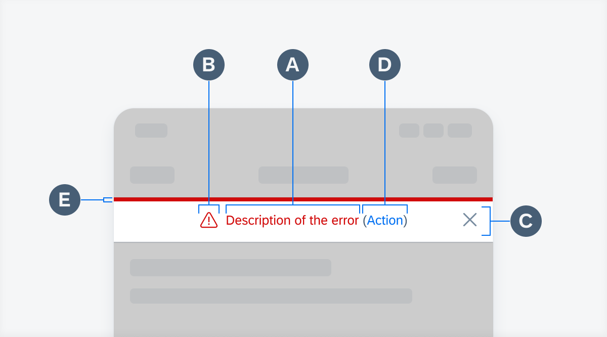
Banner anatomy
Touch Targets
The banner contains three possible touch targets: the bar, a dismiss button and an action button.
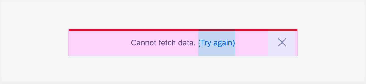
Possible touch targets on a banner
Banner Position
The banner appears by sliding down from underneath the navigation bar, or a header component, if it is present. It slides up the same way to disappear. By default, it covers parts of the content below. The banner can also be customized to appear between the content and push it down without covering it up.
Position of the banner when appearing
Scrolling
The banner sticks to the navigation bar when the user scrolls up or down. If there is a header component between the navigation bar and the banner, the banner sticks to the navigation once the user scrolls up while the header component disappears.
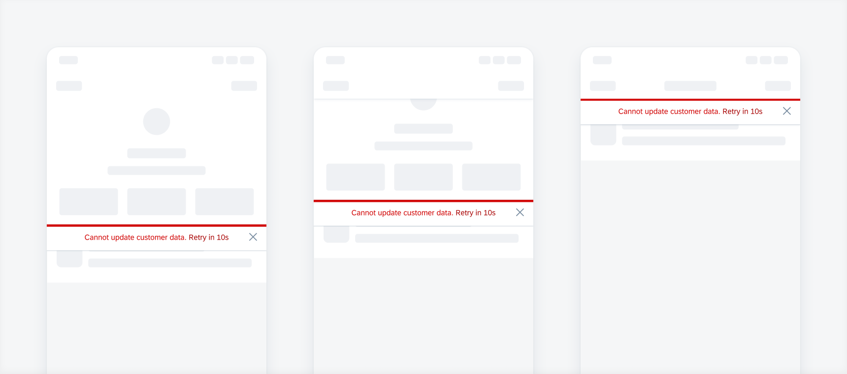
The screens from the left to right show how the banner sticks to the navigation bar
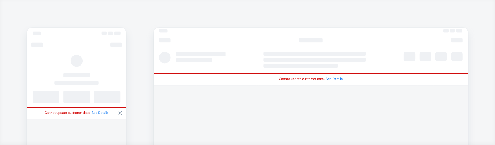
Content Underneath a Banner
By default, the banner slides down without impacting the content scroll position. If the user scrolls to the top, content that is hidden underneath might show up.
Example where content is hidden underneath a banner
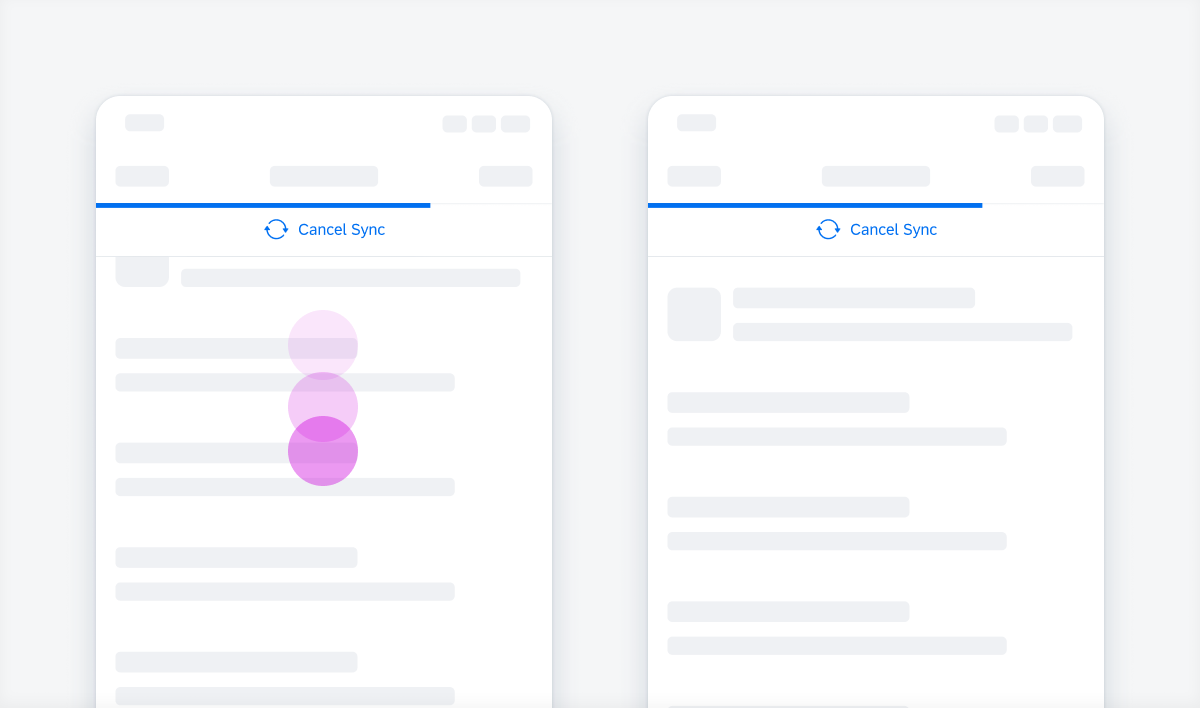
Progress Banner
A progress banner is used to indicate a loading process or an in-progress state. Users can be enabled to pause or stop the progress by tapping on the bar.

Example of a progress banner
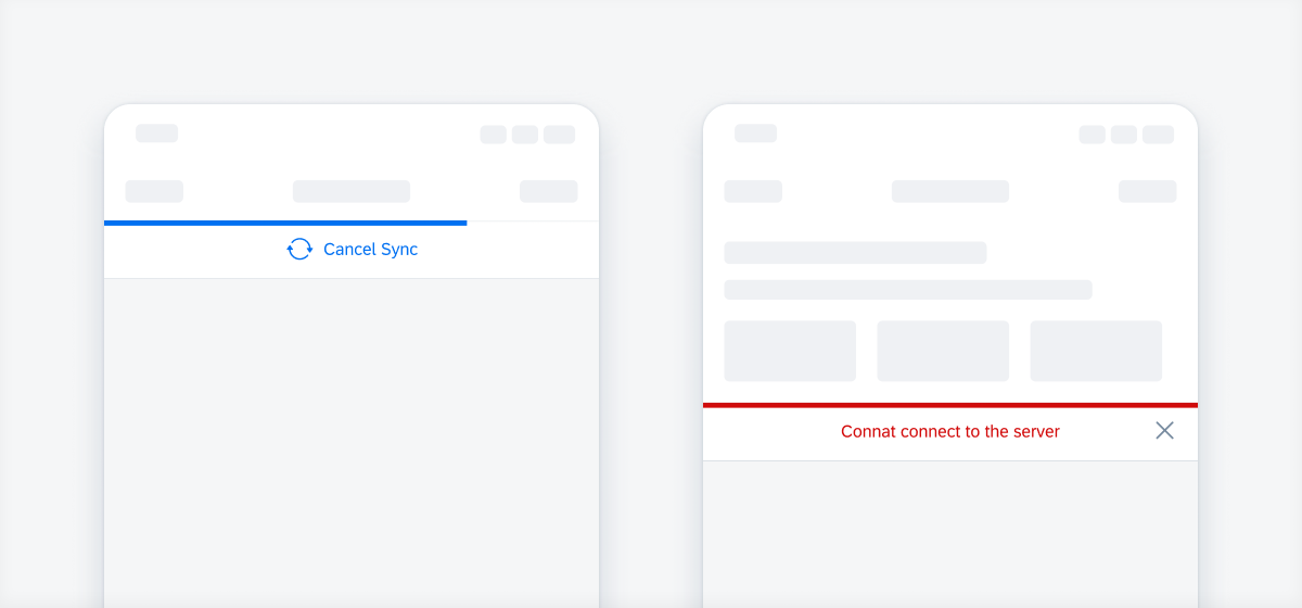
Persistence
A banner is, by default, persistent and won’t disappear unless the system status or condition described in the banner text changes. If you want a banner to disappear after a certain time, you can set a timer or provide an option for the user to dismiss it.
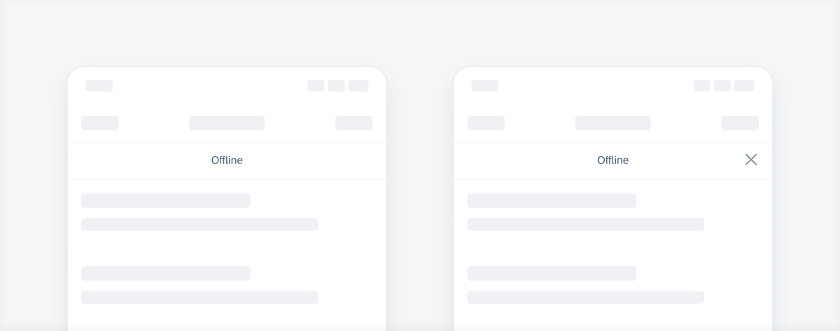
Persistent banner (left) and dismissible banner (right)
Development: FUIBannerMessageView, FUIOfflineBannerMessageView, FUIProgressBannerMessageView
SAP Fiori for Android: Banners
Related Components/Patterns: Feedback, Error Handling, Offline
 Your feedback has been sent to the SAP Fiori design team.