
Card Body
FUICardBaseContainer
Intro
The card body is the central part of the card that is used to display additional information alongside the content shown in the card header. By using the card body, several components from the SAP BTP SDK for iOS can be integrated into a card, enabling the recreation of card types such as chart cards, list cards, object cards and many more.
Card body examples
While the card body is optional, it can be used for different use cases. To improve user comprehension, we recommend including only additional details that are important for the context of the card.
Avoid using the card body for complex tasks; instead, provide additional functionality and detailed information on a subsequent details page that users can access by pressing the card.
To maintain compact card sizes, be mindful of not overcrowding the card body with too many components. Additionally, consider the following aspects when adding components to the body:
- Limit the number of components in the card body.
- Use components in the card body that are relevant to the context of the card.
- Make sure that the placement of the components within the card body is consistent throughout your app. For example, if a KPI is placed in the body and centered aligned, other cards in your app should follow the same pattern.
- Don’t overcrowd the card body with too many elements.
- Don’t add additional components such as a status or tags to the card body. Use the card header for that.
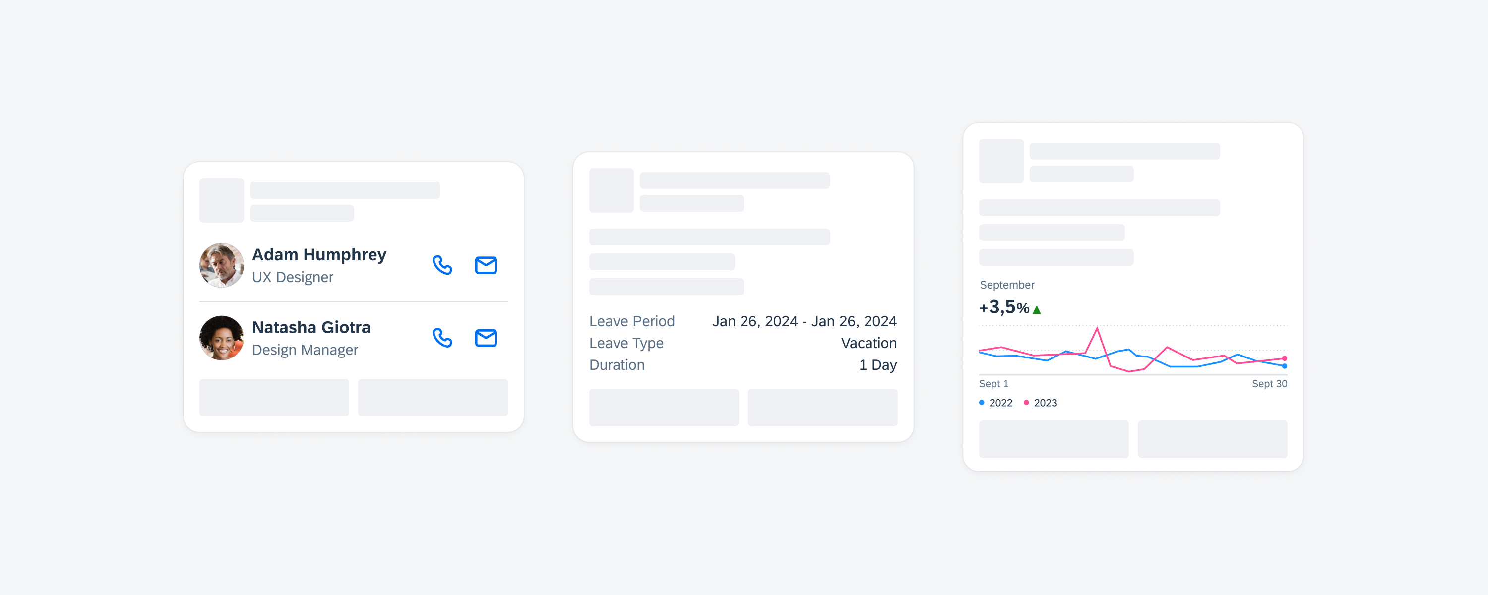
Card body with two different components
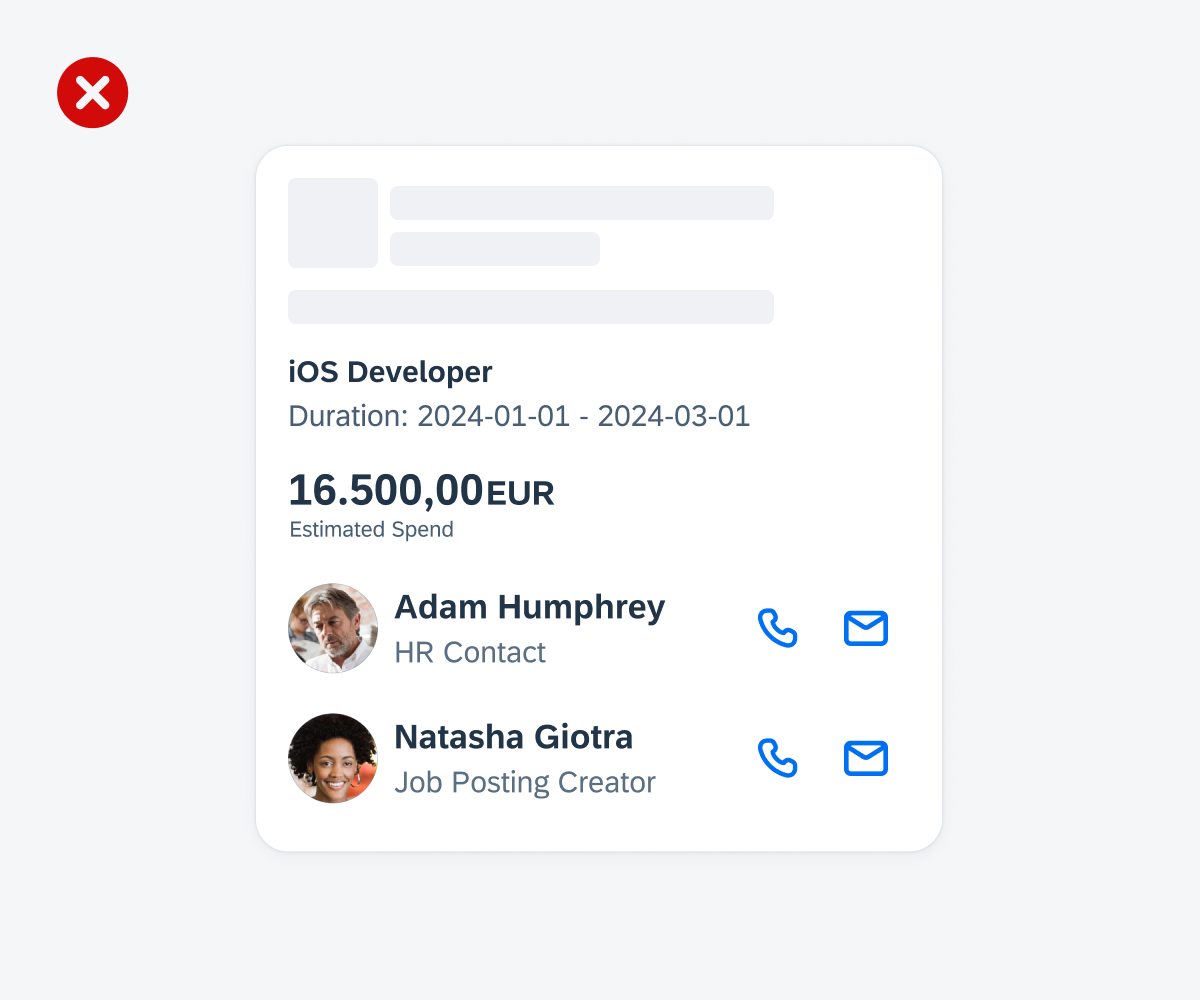
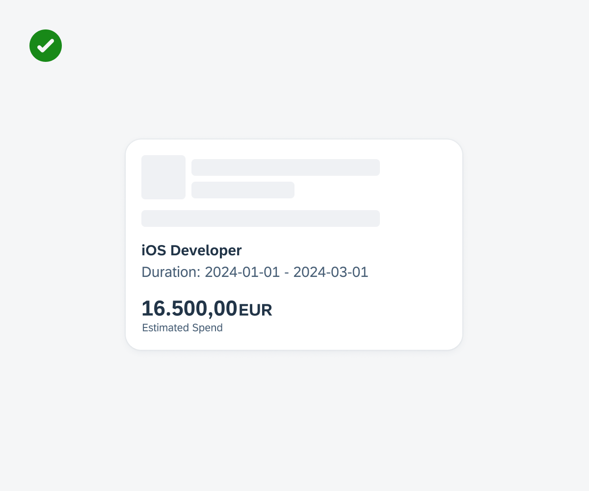
Don’t put too many components into the card body
In addition to the existing SAP Fiori for iOS components that can be added to the card body, the card system also offers variants. These variants are specifically tailored for cards with reduced horizontal and vertical spacing compared to the default components, ensuring a concise card design.
Existing Components
We recommend the following existing components for the card body:
A. Avatar row
B. Calendar
C. Text
D. Illustrated message
E. Map
F. KPI
G. KPI with progress chart
H. Label bar
I. Tag bar
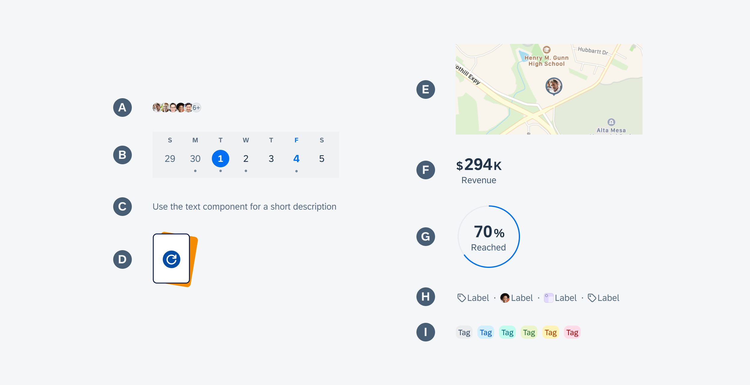
Existing components that can be used within card body
Variants for Cards
The following component variants are specifically tailored for cards:
A. Additional Spacing
Additional spacing creates an additional space between elements to better separate them visually.
B. Chart
The chart for cards is a simplified version of the chart, featuring a title, subtitle, KPI, chart visualization with lines or bars and a legend.
C. Contact Cell
The contact cell for cards is a simplified version of the contact cell, featuring left accessories, title, subtitle, footnote, and right accessories. The left accessory can include a thumbnail or an avatar image. The right accessory can be one to two buttons, labels, or statuses.
D. Data Table
The data table for cards is a simplified version of the data table, featuring two columns with up to three entries. To accommodate various use cases, you can configure entries by adjusting the text color, adding icons or images, and changing its placement.
E. Hairline (Separator)
Hairline for cards creates an additional separator between body elements to better separate them visually.
F. Image
Image (also called “media”) within cards can be used to display an image matching the content of the card.
G. Object Cell
The object cell for cards is a simplified version of the object cell, featuring left accessories, a title, subtitle, footnote, and right accessories. The left accessory can include a thumbnail, avatar image, or an icon stack. The right accessory can be a button, KPI, labels, or statuses.
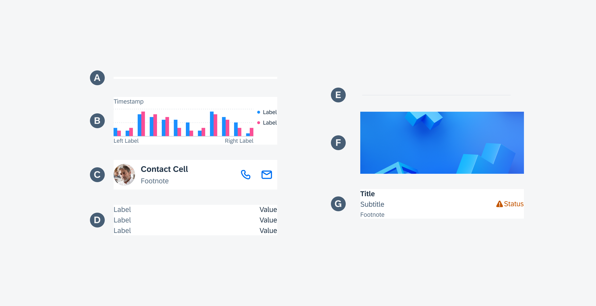
Card variants
General
If interactive components are used in the card body, they impact the interaction and navigation behavior of the card. For example, if a contact cell is placed in the body, it takes over the interaction behavior from the original component and can, for example, redirect to a details page after tapping on it and/or trigger a specific action.

Contact cell with icon buttons
States
Use a suitable illustrated message to communicate a certain state of the card body.
For example, when there is no data to be displayed in the body, include an empty state indicator. This indicator serves as an informational message for users, notifying them that there is currently no information or data available, or that new data or information needs to be generated.
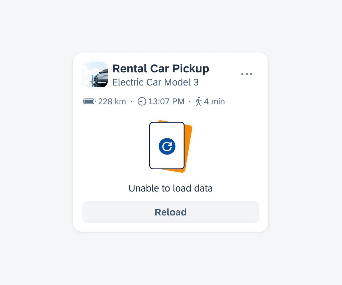
Card body with an empty list
Development: FUICardBaseContainer
SAP Fiori for Android: Card Body
Related Components/Patterns: Cards Overview, Card Header, Card Footer
 Your feedback has been sent to the SAP Fiori design team.