
Card Footer
FUICardFooterView
Intro
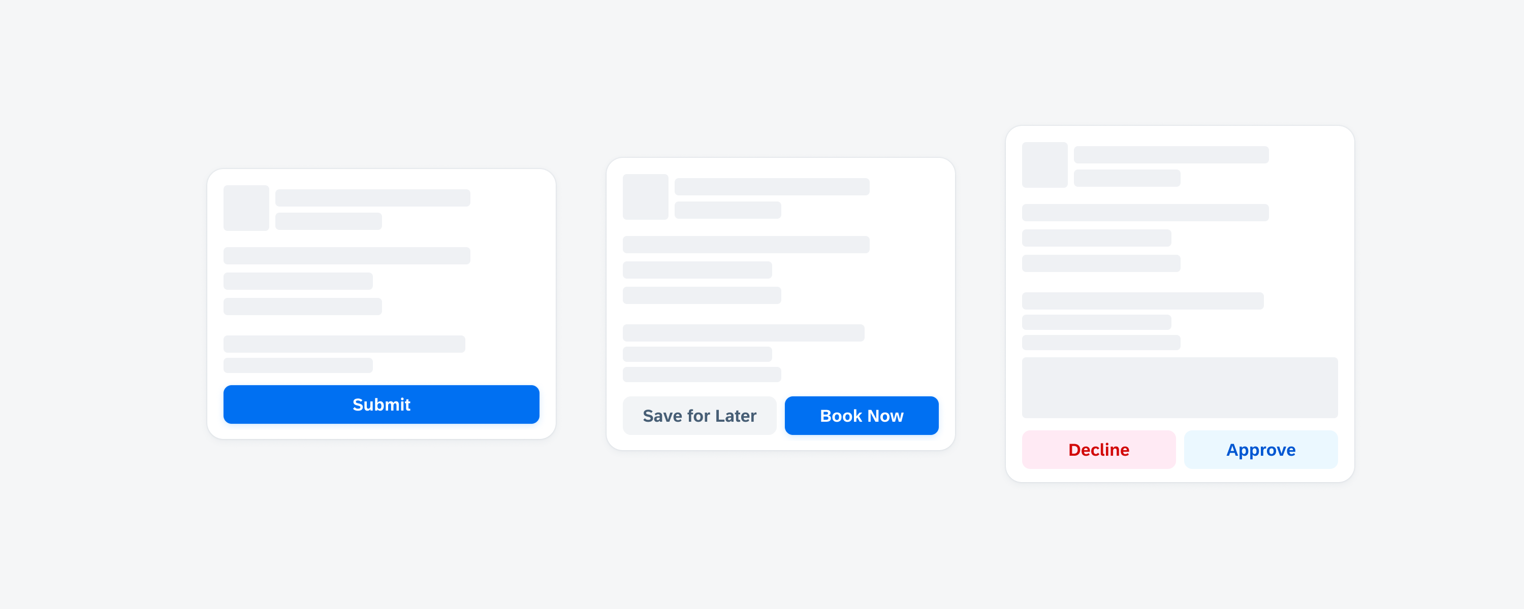
The card footer, also referred to as card toolbar, is the bottom part of a card that contains important or routine actions that directly impact the card, such as “Approve” or “Submit”. The footer can accommodate a maximum of two action buttons.
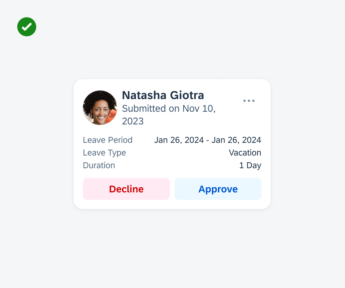
Card with a highlighted card footer
- Include only one or two of the most important and routine actions in the card footer.
- If two buttons are used, always place the primary action on the right side of the footer.
- If two buttons are used, place the less important and secondary action on the left side of the footer.
- Ensure that the button’s wording reflects the action that will be performed after tapping on the button.
- Use short and concise button labels to avoid truncation.
- Don’t include more than two buttons in the card footer.
- Don’t place an overflow button in the card footer.
- Don’t use long button labels. If the button label needs to be very long, use symbol buttons or only one button instead of two to avoid truncation.
- Don’t add an overflow button. Having overflow buttons in both the footer and header might lead to visual ambiguity, as they would look identical.
Card footer with a maximum of two buttons
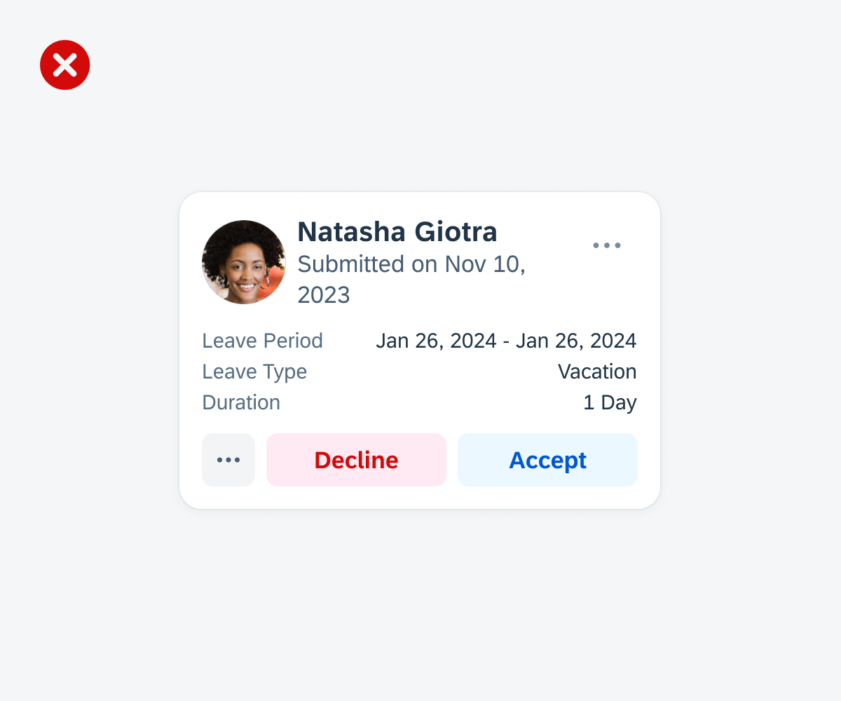
Footer with an overflow button
A. Card Footer Container
The card footer container holds one or two buttons that are evenly distributed within the container of the card footer.
B. Primary Action Button
The primary action button is used to highlight the most important action. Only use one primary action in a card. We recommend using the primary button style for actions that trigger or complete a task.
C. Secondary Action Button
The secondary action button is used for actions that are not the primary action. If the card doesn’t have a clear primary action or if the displayed actions are equally relevant, the card footer can include only secondary buttons. If the action is destructive, use the secondary negative style to warn users about taking extra precautions before performing an action.
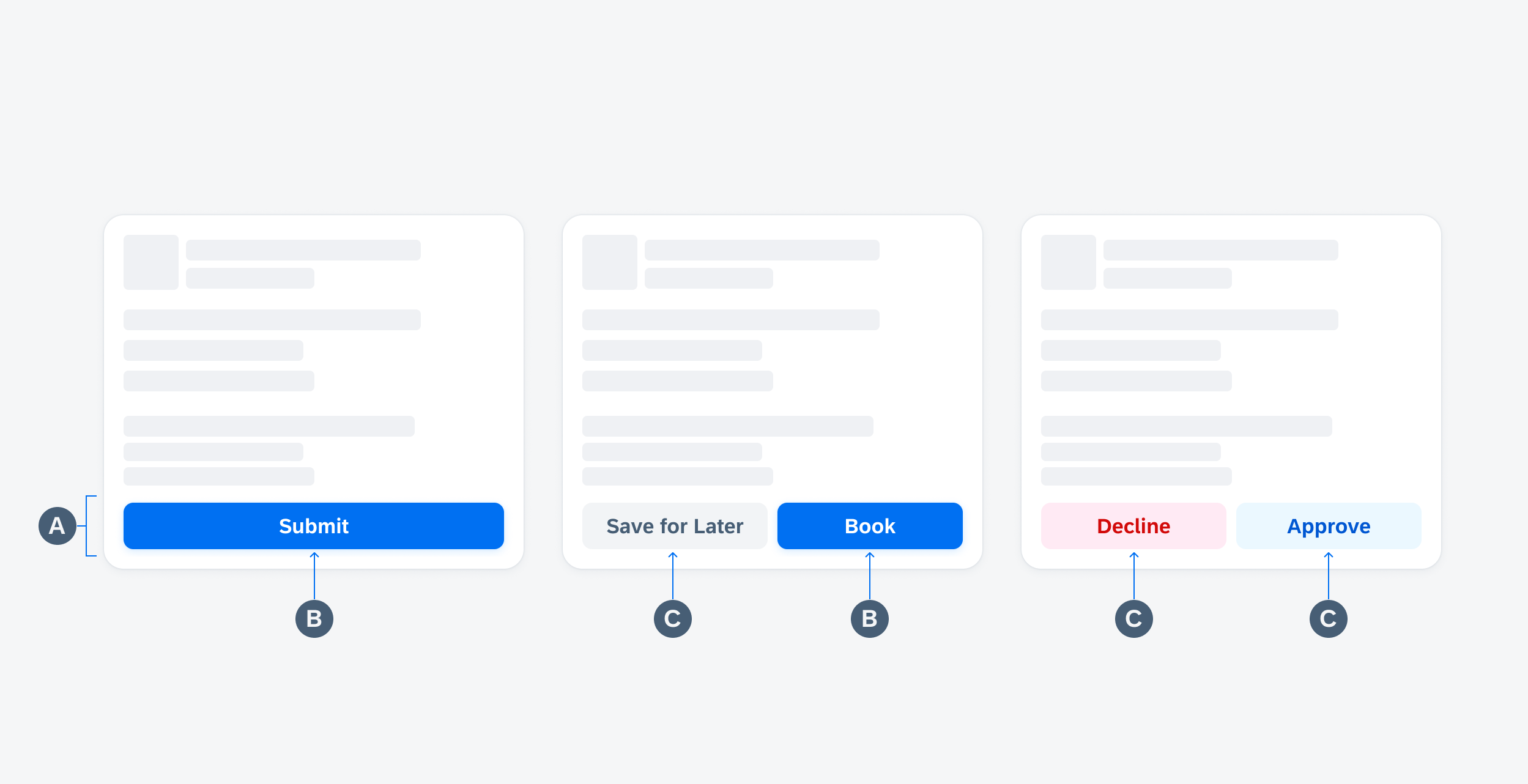
Card footer anatomy with one primary button (left), one primary and one secondary button (middle), and one secondary negative button and one secondary tint button (right)
Development: FUICardFooterView
SAP Fiori for Android: Card Footer
Related Components/Patterns: Cards Overview, Card Header, Card Body
 Your feedback has been sent to the SAP Fiori design team.