
Carousel Layout
FUICollectionViewLayout.carousel
Intro
A carousel layout is a design pattern that displays multiple cards horizontally, one after the other, with a glimpse of the next card visible on the edge of the screen. This partial visibility encourages users to swipe or scroll left or right to reveal more cards.
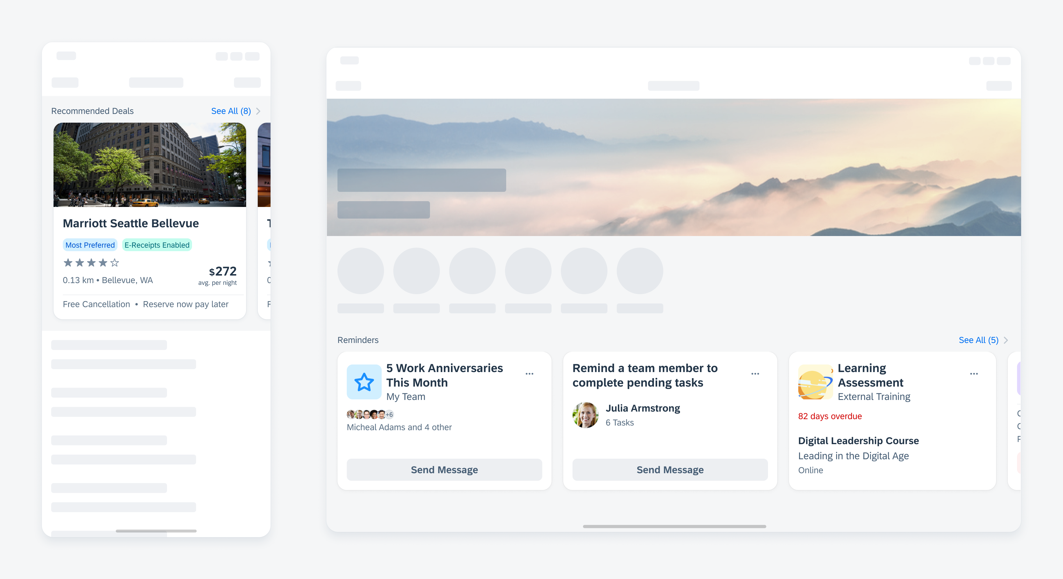
Carousel with cards in compact size class (left) and regular size class (right)
- Use a carousel layout to display a sequence of more than two related cards, allowing users to anticipate the content they will discover as they swipe through.
- Use a carousel layout to maximize the amount of information displayed and to preserve the context without making the user continuously scroll down the page.
- Use a carousel layout if you have specific content that you want to highlight, such as featured products or articles that users should browse through.
- Don’t use a carousel if it contains less than three cards. Instead, place the cards below each other.
- Don’t use a carousel if the content on the cards is critical for users to see, such as important KPIs (key performance indicators) or statuses that can change in real time.
Container with Cards
By default, all cards within the carousel have the same height. The height of the carousel container is determined by the card with the most content, which is also rendered as the tallest card. Smaller cards with less content are automatically stretched to match the height of the tallest card and align with the carousel container. This can lead to white space between the card body and the card footer. The footer of the card is always aligned to the bottom edge.
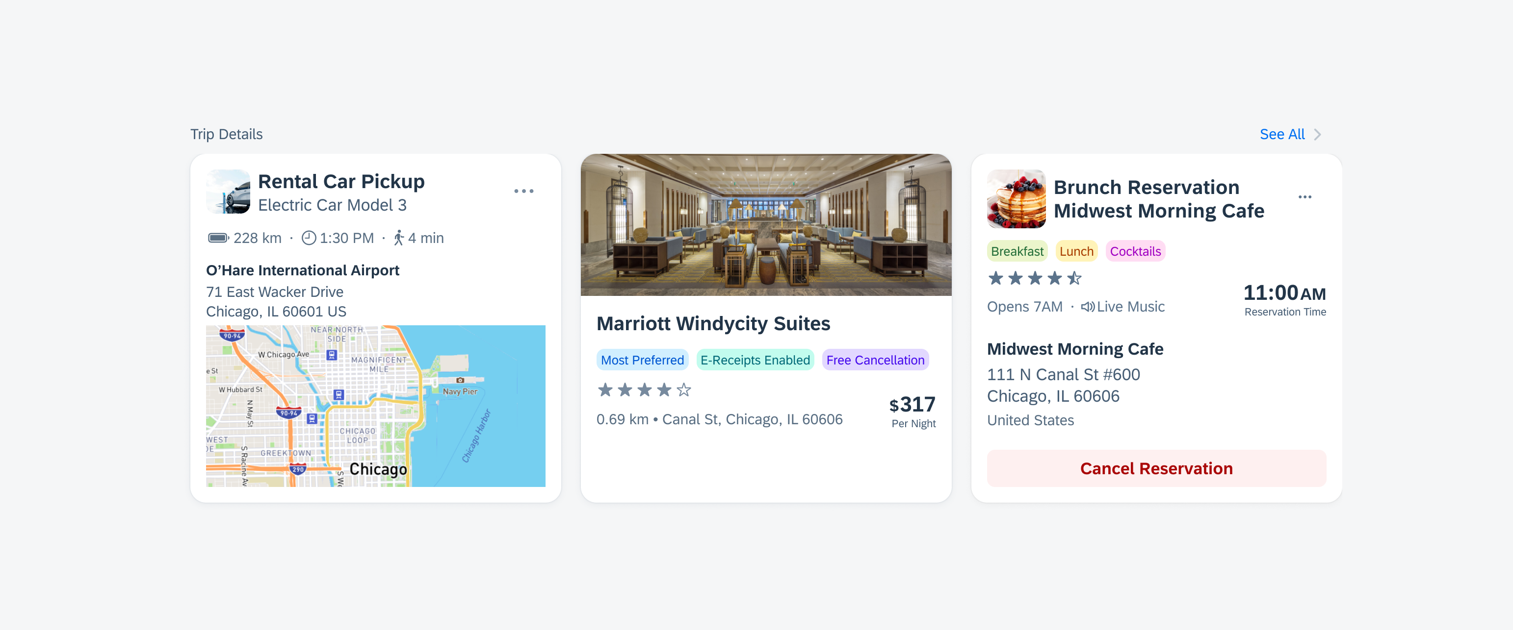
Carousel with cards that have different amounts of content
The carousel layout can also have cards of varying heights. If this option is enabled, the cards within a carousel adjust to its content. In this case, all cards within the carousel container are top-aligned. However, we recommend using a carousel layout in which all cards have the same height.
We also recommend using the carousel in combination with the header cell to give the carousel a title so that it is clear what the cards within the carousel refer to.
Swiping and Scrolling
Users can explore different cards using the carousel layout. To navigate, users have to swipe or scroll left or right on the screen. The cards in a carousel scroll horizontally, with the next card always visible at the edge of the screen.
Scroll Snapping
By default, scrolling through the cards comes with a scroll snapping behavior (also called “drag gesture”). Scroll snapping refers to the effect of cards always snapping into place at specific, predefined positions during scrolling, rather than scrolling freely. This gives the user a sense of precision and makes the scrolling experience more pleasant.
Simple Scrolling
In addition, you can also enable scrolling through the cards in a carousel without scroll snapping (also called “simple horizontal scrolling”). Depending on the number of cards and the target group of your app, you can choose to have the carousel swipe with or without scroll snapping.

Horizontal scrolling in carousel
Navigation
If there are too many cards in a carousel, you can add a header cell with a “See All” action. Tapping on “See All” navigates the user to a page that displays all cards from the carousel group in a list format where all cards are placed below each other.
For regular size class, we recommend using a masonry layout instead of displaying the cards below each other.
Empty States
If there is no card, it is important to display an empty state indicator in the carousel. This indicator serves as an informative message for users to let them know that no information or data is currently available or that some information needs to be created.
Illustrated message to indicate an empty state
Layouts can also be combined: If it makes sense for the context of the app, a carousel and a masonry layout can be used on the same page. However, note that if both layouts are used on the same page, it can create a visual imbalance due to the outer margins of the different layouts. A carousel layout has a different spacing on the right side than on the left side between the card and the outer edge of the screen, whereas a masonry layout has the same spacing on both sides.
Resources
Development: Carousel Layout
SAP Fiori for Android: Carousel Layout
SAP Fiori for Web: Carousel
Related Components/Patterns: Masonry Layout
 Your feedback has been sent to the SAP Fiori design team.