
Chart Overview
Intro
A chart is a visual representation of data. Depending on the type of data in your app and how the users will use the chart, it is important to select the appropriate chart type. Also, from a non-interactive thumbnail view to a fully interactive floorplan, charts are used in various contexts.
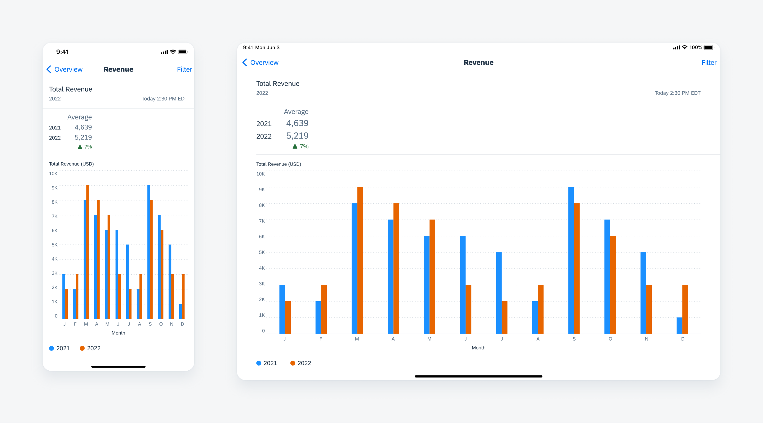
Multibar chart floorplan on compact (left) and on regular (right)
Floorplan
The floorplan is a fully interactive chart where the user can select a single or multiple data points, select a series by tapping a legend item, expand labels, as well as zoom & pan chart plot area.
Card & Header
The chart card displays a thumbnail view of a chart, with key information shown. Users can tap it to navigate to the full interactive chart view.
Table Cell
The chart table cell is a full-width view. This component is designed for when the user needs to view chart data within a workflow in the context of a business object but does not need to drill into individual chart values. This cell does support navigation so that users are able to access the chart’s features for more details when needed.
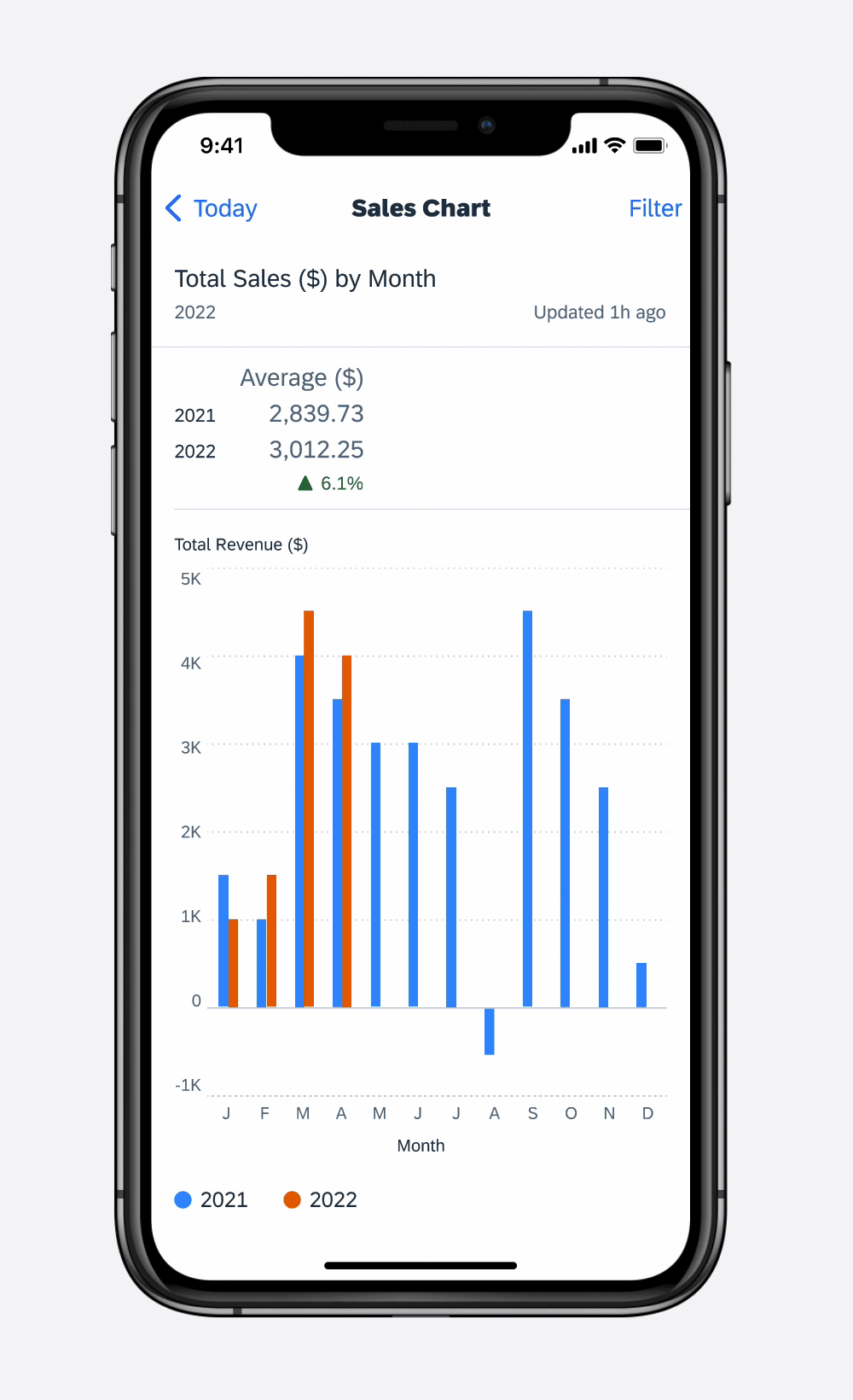
A chart floorplan is constructed with a set of common elements including a title, a summary, a chart plot, and a legend. A chart plot is a rectangular area where the data is visualized with two dimensions represented on a vertical and a horizontal axis. Depending on where the chart is displayed, the elements are changed in size or visibility.
Multibar chart floorplan in regular full width
Chart Title
The chart title should display the name of the chart, the name(s) of the series displayed, and an optional timestamp for the chart data.
A. Chart Title
The chart title should reflect the quantitative (measure) and categorical (dimension) criteria data being displayed with the chart, for example, “Total Sales ($) by Month.”
Please be sure to set the chart title to update when the user changes the options in the filter menu and when the user drills into/out of the chart plot.
B. Subtitle
The subtitle line should indicate the series currently being displayed in the chart, for example, “2016-2017.”
C. Time Stamp
The time stamp label can be included to indicate the last time the chart was updated.

Chart title
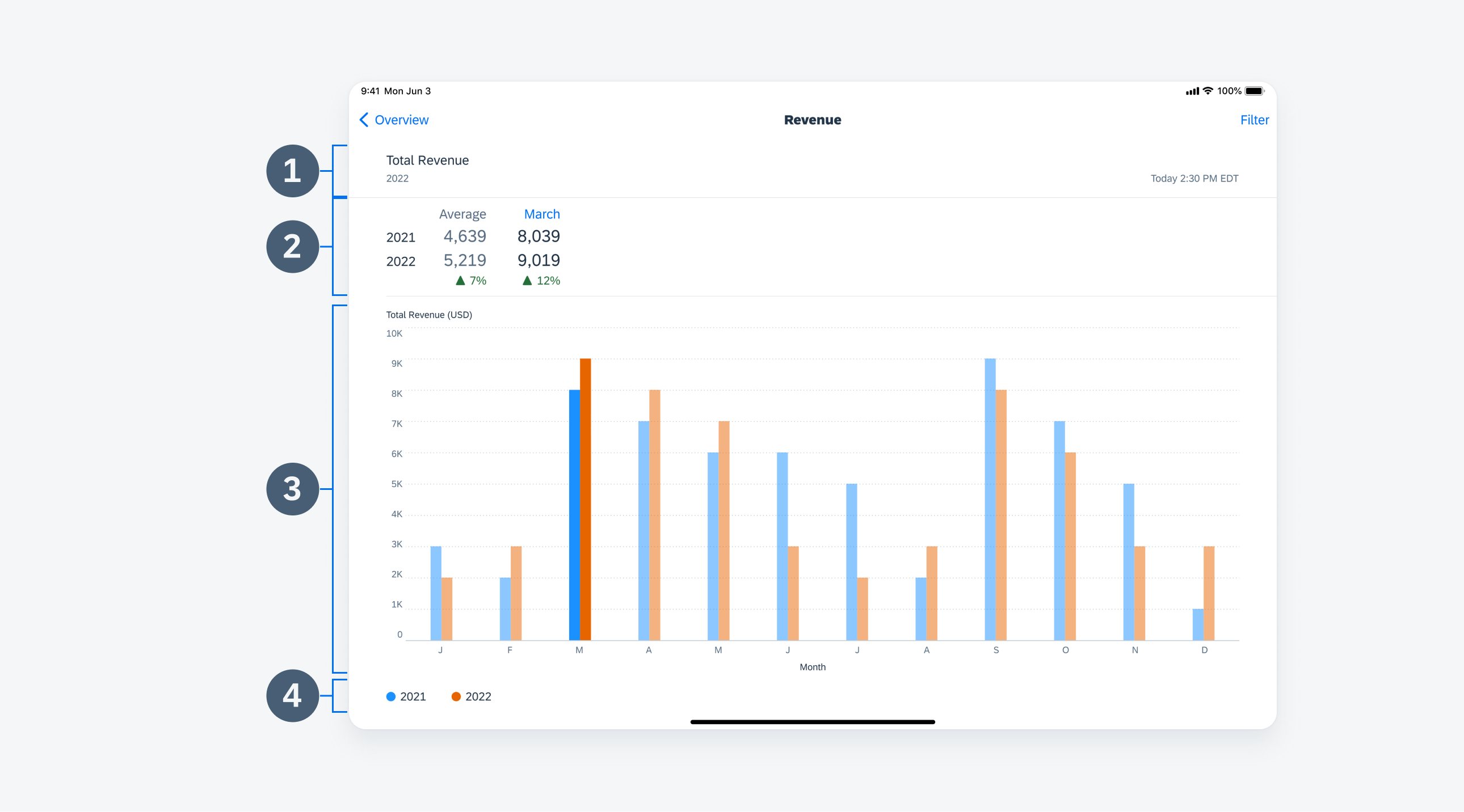
Chart Summary
By default, the chart summary provides high-level details from the chart data. Charts can display up to four data series at one time; if the data set contains more than four series, the user should be able to select which series to display using the filter menu.
A. Summary Name
The summary name should be concise yet descriptive, including the unit(s) of measure if applicable (for example, $, °C, and so on). When users drill into their data, the summary name acts as a visual reference to reinforce the user’s location within the data set. For example, if a user drills down from a 12-month view for 2018 to explore data for April, the summary section title would change from “YTD ($)” to “April Total ($).”
B. Series
When only one series is included, the series is not displayed. However, when there are two or more series, they are displayed and should be sorted in descending order from most recent to least recent where applicable.
C. Average Value
In the default view, the average value is displayed. When a data point has been selected, its values are displayed to the right of the average values.
D. Up/Down Trend Icons
When there are two series, the up/down trend icons and labels can be displayed. These should take semantic colors. When including a trend, make sure that it uses the same number of decimals as the summary values above.
E. Additional Information
You can drill into additional information on a category of the chart by tapping on the selected value label. If there is no drill down, the label should not be in tint color.

Chart summary default (top) and selected (bottom)
Chart Plot
This contains the visual representation of the chart data, including the chart items, for example, bars, columns, lines, and so on, x- and y-axes with titles, and axis labels and grid lines.
A. Y-Axis Title
B. X-Axis Title
You can select the number of gridlines to be displayed, but try to follow these guidelines:
- For column and line charts, there should be a minimum of two y-axis gridlines with labels: a baseline and a line above the max value. If the chart data extends below the baseline (for example, into negative values), there should also be a minimum y-axis gridline with a label.
- For horizontal bar charts, there are currently two x-axis gridlines with labels: a baseline and a single gridline.
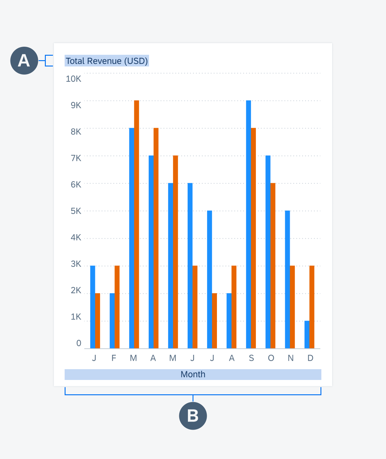
Multi bar chart plot
Legend
The legend describes which colors relate to which data series in the chart plot. For charts with only one series, the legend is not displayed.
Color Palette
The default chart colors are accessible and can be used in both light and dark modes.
For area, stock, scatter, and bubble charts, the colors have different transparency levels. See the Chart Types article for more information.
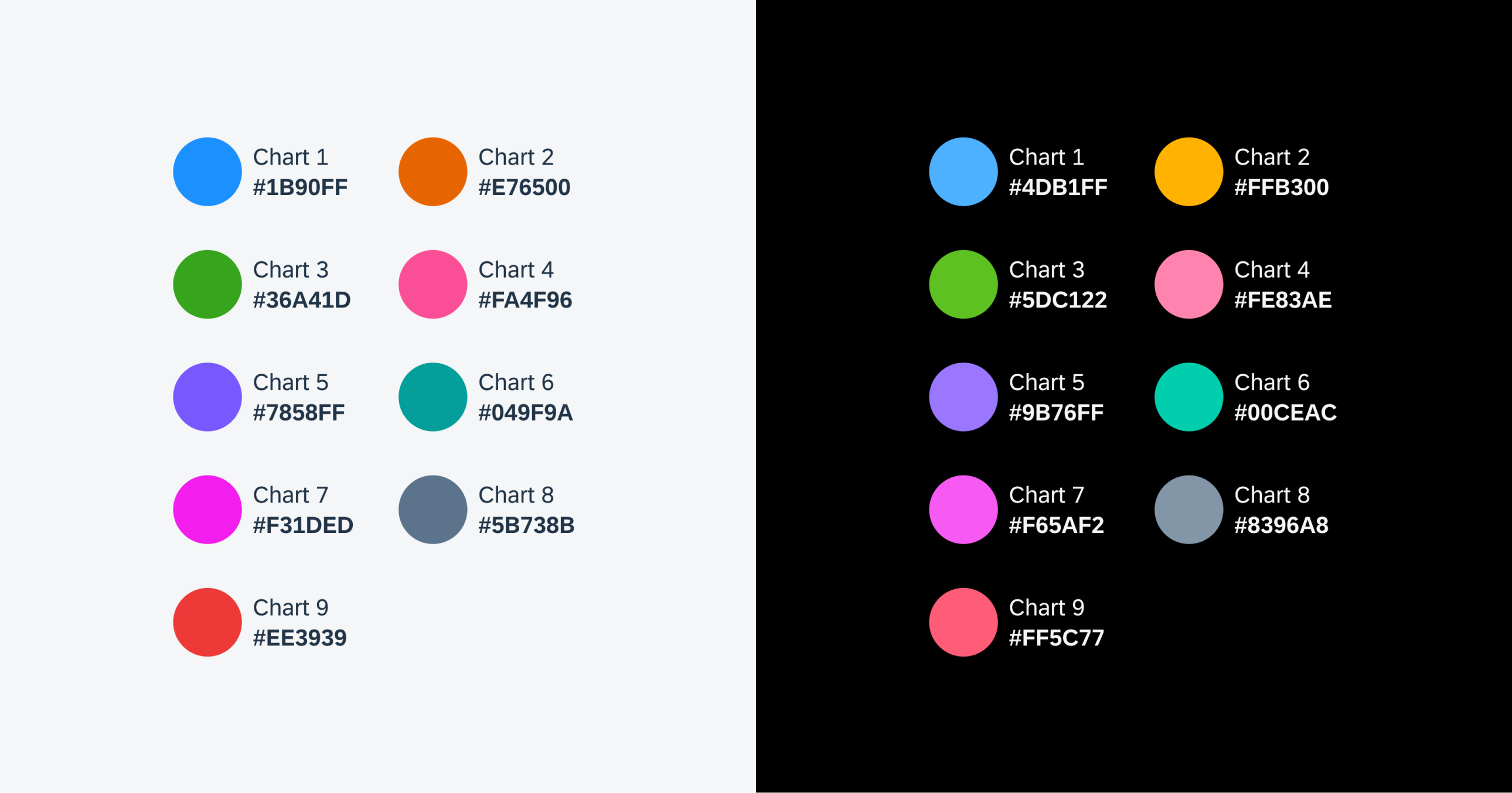
Color palette light mode (left) and dark mode (right)
Selection and Filter
To select an item in the chart plot, the user either taps that item directly or taps and slides their finger onto it to make it active.
The filter action allows the user to change the dimensions of the chart and adjust sorting.
Drill Down
When a chart item is selected, its data values appear in the chart summary section. Drill down is supported in the chart summary section, and you get to choose how the chart view is displayed on drill down. When possible, the measure (quantitative variable) should remain consistent during drill down.
Example of selection and filter
Example of drill down
Development: Chart Floorplan
SAP Fiori for Android: Chart Overview
Related Components/Patterns: Chart Types, Chart Cards, Chart Header, Chart Table Cell
 Your feedback has been sent to the SAP Fiori design team.