
Filter Form Cell
FUIFilterFormCell
Intro
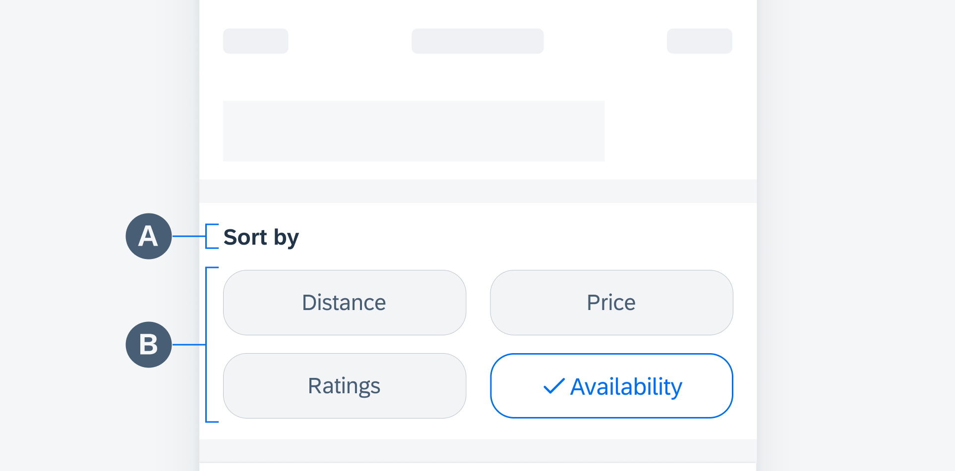
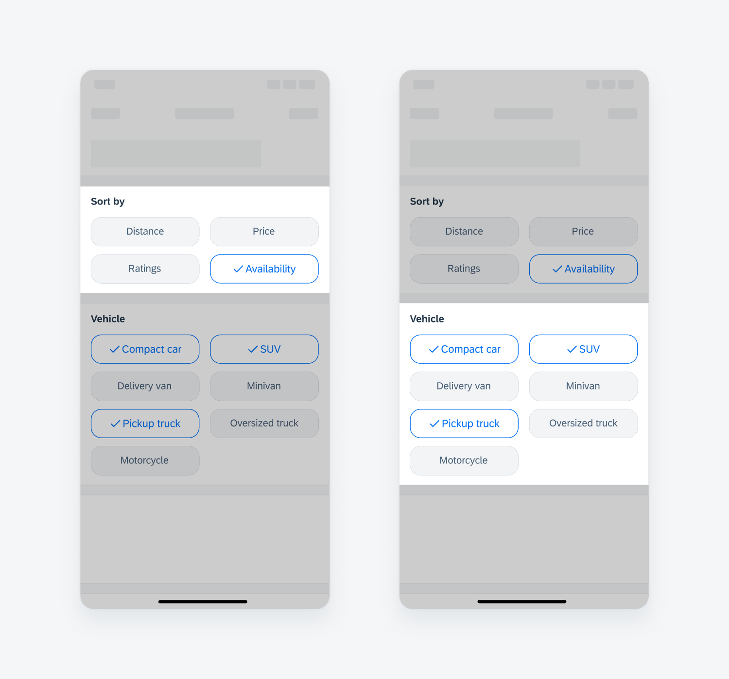
A filter form cell is used to filter one or more values under a filter category. It is commonly used in the filter pattern for sorting and grouping.
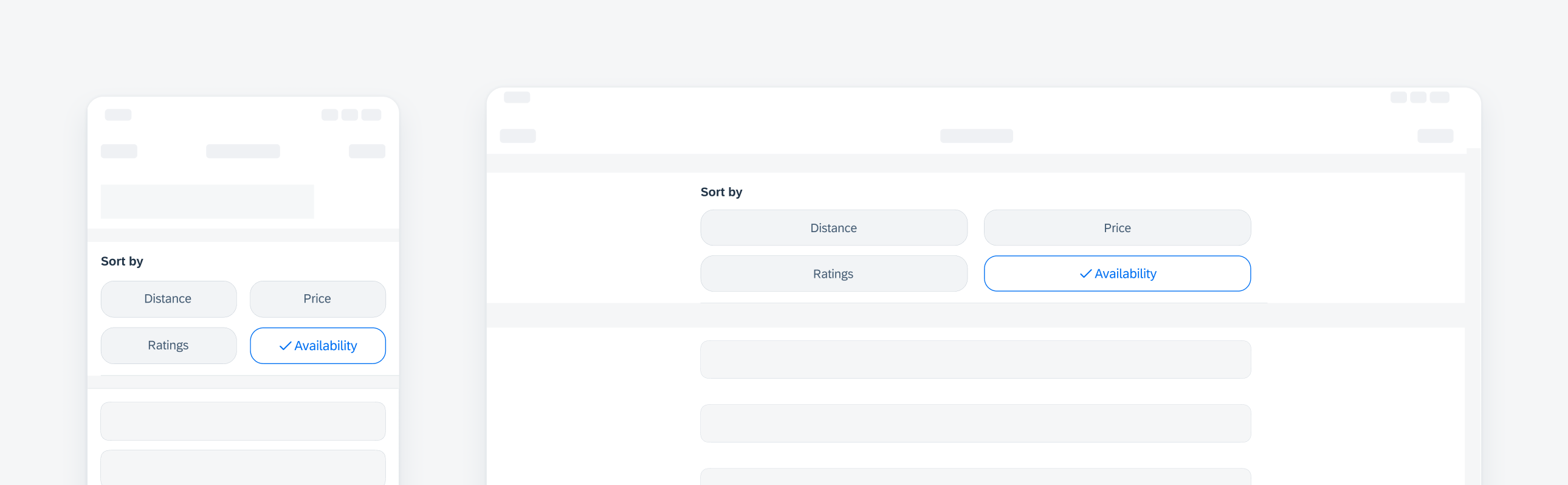
Compact width filter form cell on iPhone (left), regular-readable width on iPad (right)
Use a filter form cell for short text and if the number of values is less than eight.
Avoid using a filter form cell if the text is too long or if the number of values is more than eight. Use a list picker control for easier interaction.
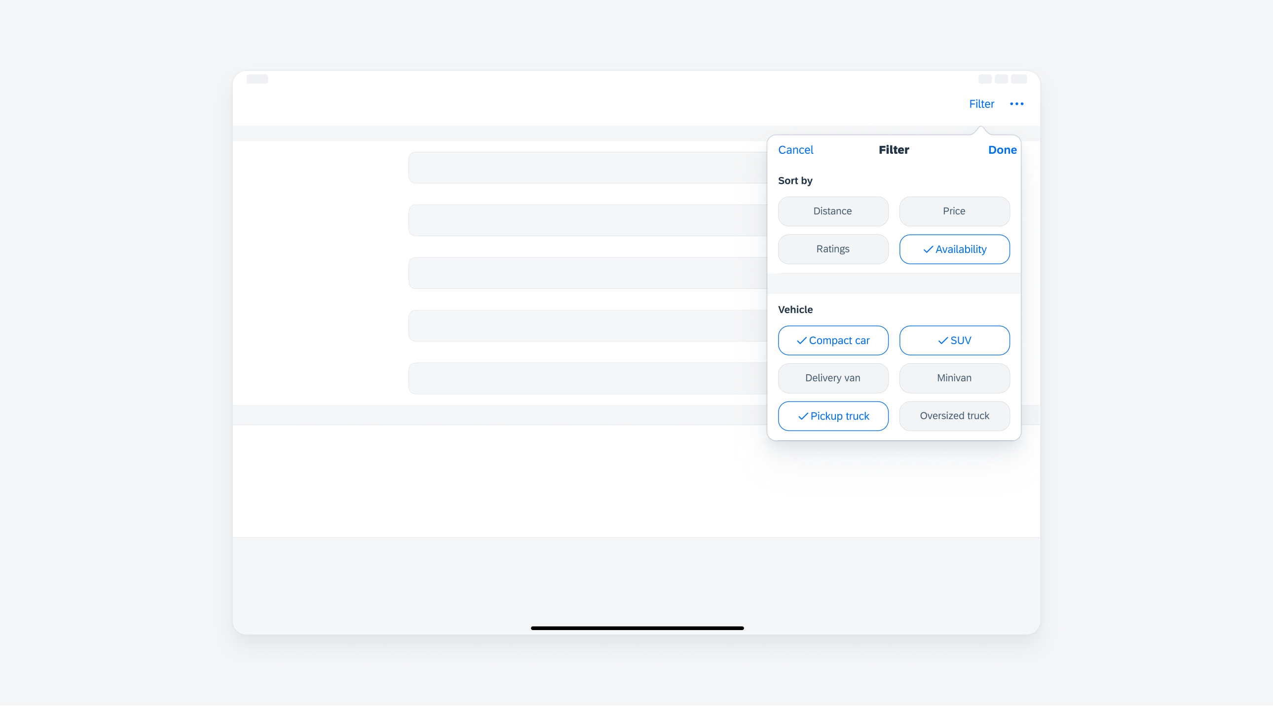
To select a value, the user taps on a filter button, which becomes highlighted and displays a blue checkmark to indicate it as a selection.
In the case of multiple selection, the user can tap on additional buttons. To deselect a selected value, the user taps again on the selection.
Filter form cell may be single selection or multi-selection. Depending on the use case, display a selected button by default or display all unselected buttons.
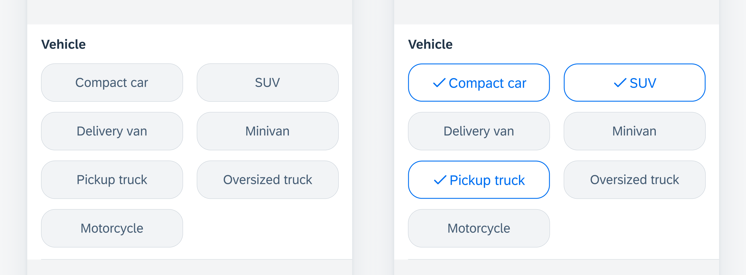
Unselected filter buttons (left) and selected (right)
Development: FUIFilterFormCell
SAP Fiori for Android: Filter Chips
 Your feedback has been sent to the SAP Fiori design team.