
Rating Control
FUIRatingControl
Intro
The rating control is used to indicate an average rating for an object. It also allows for users to set their own rating on a numeric scale from 1 (lowest) to 5 (highest).
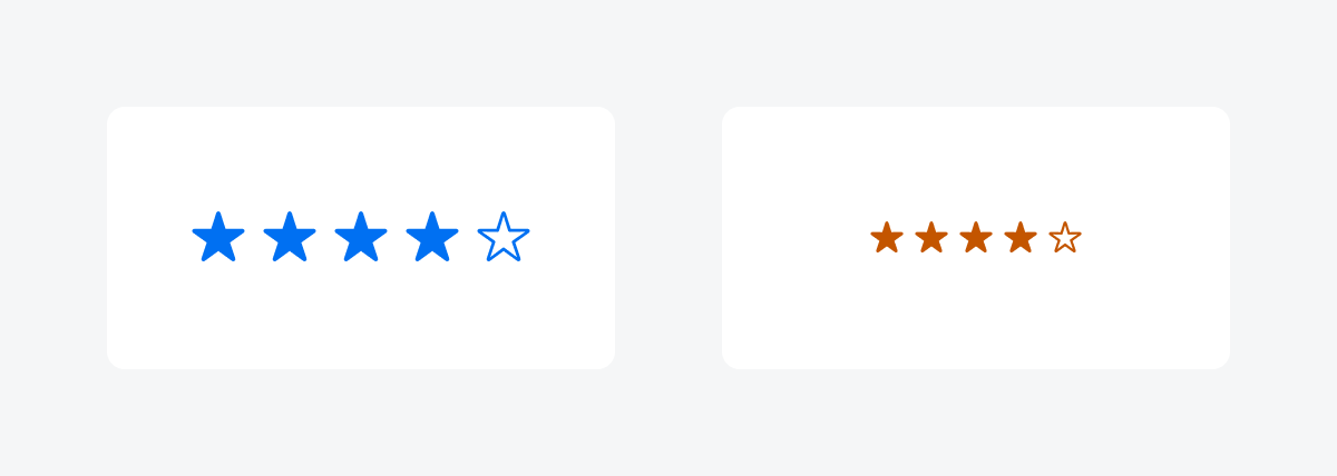
Rating controls in compact width (left) and regular width (right)
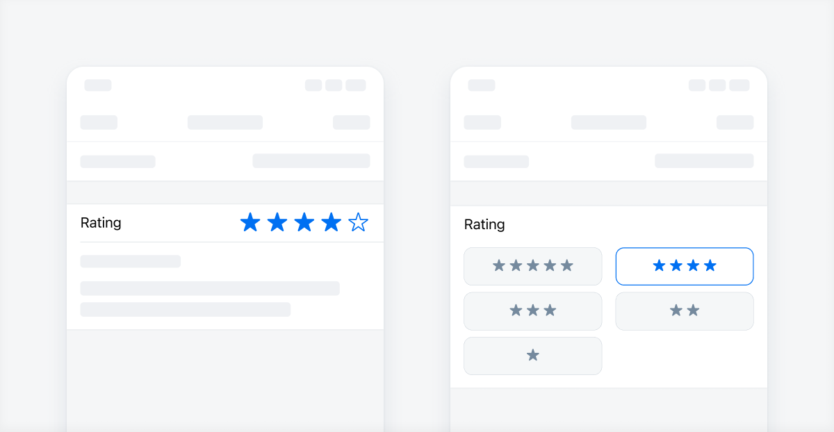
When the user is able to set a rating, the larger interactive type of the rating control should be used. Users can either tap the stars individually or tap and slide their finger horizontally along the stars to choose the desired rating.
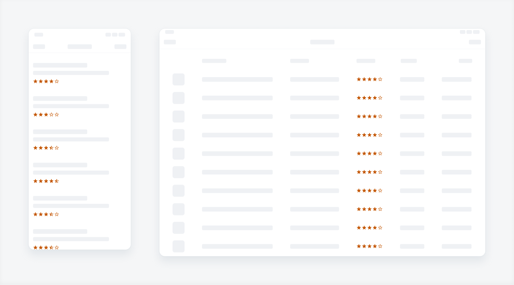
The small display type can be used in the filter form cell buttons for when the user is able to filter products or objects by rating.
Different uses of rating controls
Display
Shows the rating in a small read-only format. It is designed to be used with other components such as the data table, filter form cell, or object cell.
Interactive
This is a larger tappable variation that enables the user to set the rating of an object. It can be used in table view cells or in a create form when the user is giving a rating for an object.
Interactive rating control (left) and display-only rating control (right)
Development: FUIRatingControl
SAP Fiori for Android: Rating Control
Related Components/Patterns: Create, Filter, Modals, Object Cell
 Your feedback has been sent to the SAP Fiori design team.