
Skeleton Loading
FUIStepProgressIndicator
Intro
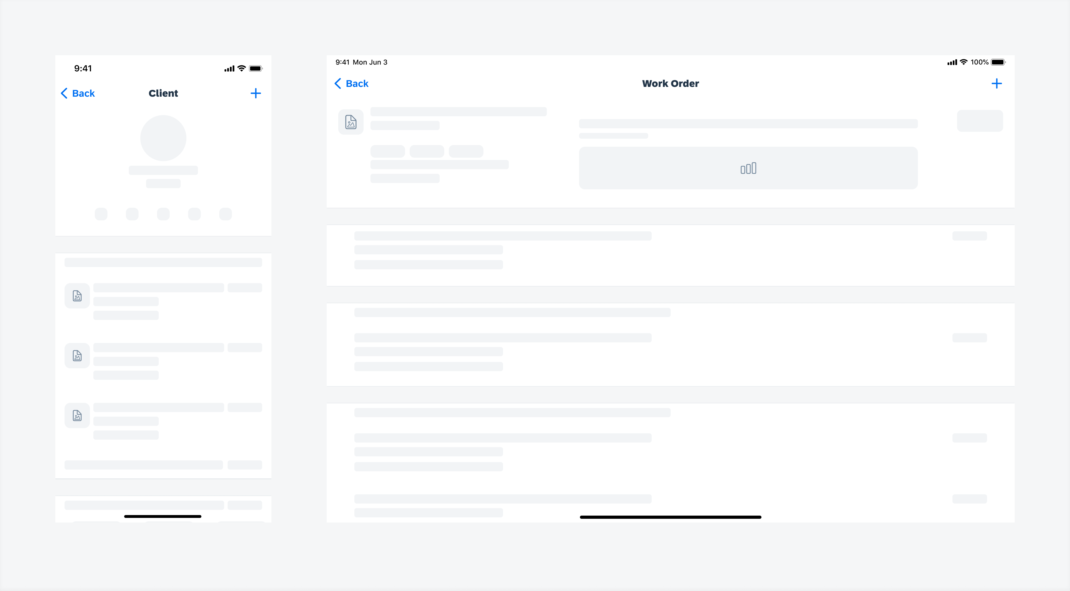
Skeleton loading is a progress indicator that is used when a screen or part of a screen is loading. It is best used when the structure and layout of a container are known, such as a page or card, and the system requires time to fetch and display the actual data.
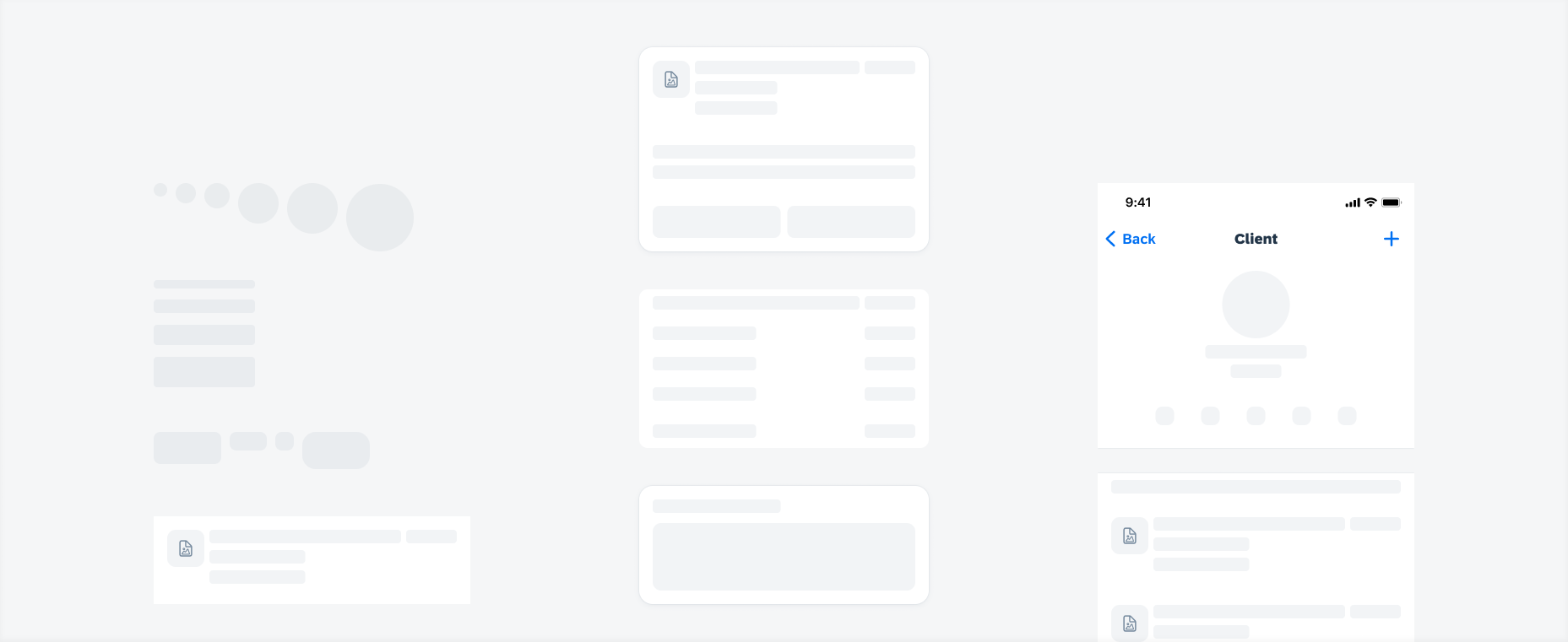
Skeleton loading of basic placeholders (left), cards (middle), and page (right)
- Only use when the target structure and layout are known.
- Use when the loading time exceeds 1 second.
- Use generic cell or card placeholders or build customized placeholders with basic placeholders if needed.
- Provide users with feedback when the loading time is longer than expected or when data retrieval fails.
- Don’t use placeholder types that don’t match the target type.
- Don’t get too detailed with customized placeholders, as it can distract the user.
- Don’t combine multiple types of progress indicators with skeleton loading.
A. Placeholder
The placeholder is used to replace the actual content during skeleton loading. Ideally, the placeholder should correspond to the content in terms of type, layout, and size. If specific details can’t be defined, make sure the type of placeholder aligns with the content.
B. Container
All cells, cards, or page placeholders should stay within a container. The container has fixed lines, paddings, and margins, so there may be variations in size between the placeholder container and the actual content container.
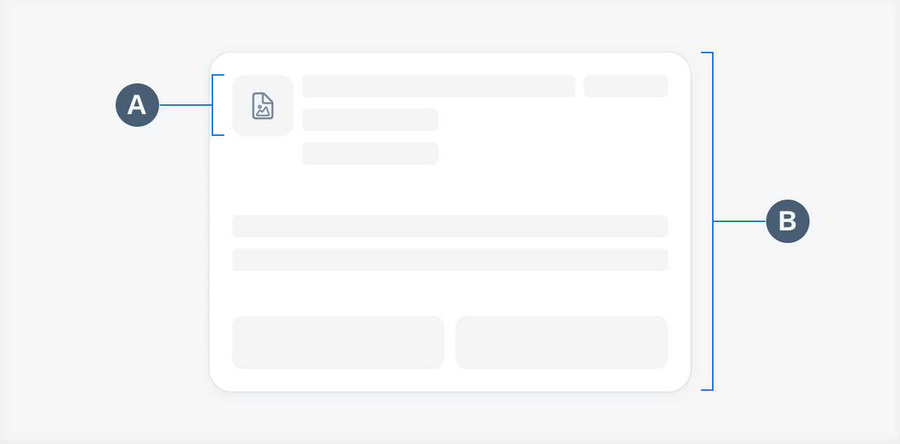
Skeleton loading anatomy
Skeleton loading is best used for loading time that exceeds 1 second. It automatically transitions to the actual content once the data fetching process is complete.
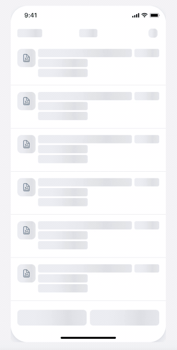
Skeleton loading transition animation
Shimmer Effect
By default, skeleton loading includes a shimmer effect animation, which consists of a black shimmer with 8% opacity that moves from left to right in a continuous loop.
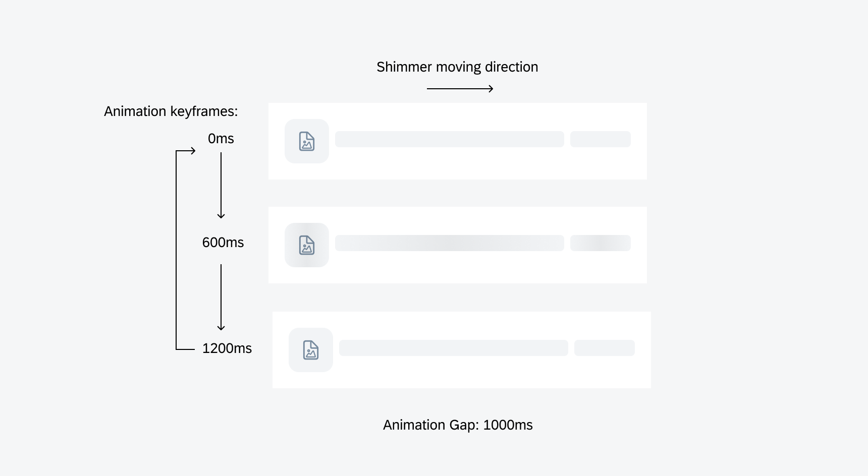
Skeleton loading shimmer effects animation keyframes
Basic Placeholders
Basic placeholders are the fundamental of skeleton loading. They can also be used to build customized placeholders.
Text Placeholders
There are five height options for text placeholders with adjustable width. We recommend using these options instead of the following font sizes:
- Foot note, Caption 1, Caption 2: 13pt
- Subhead, Callout, Body, Headline, Title 3: 20pt
- Title 2, Title 1: 28pt
- Large Title, Medium KPI: 41pt
- Large KPI: 57pt
Please refer to Typography to learn more about font sizes.
Image Placeholders
The image placeholder offers various size options. The icon is optional and can be changed to any icon according to Iconography.
Avatar Placeholders
The avatar placeholder comes with multiple fixed size options, and can be used to replace Avatars or KPI Progress Charts.
Button Placeholders
Button placeholders can be used to replace Label Buttons, symbol buttons, Filter Buttons, or tags.
Object Cell Placeholders
Object cell placeholders can be used to replace one-line or multi-line Object Cells.

Basic placeholders (text, avatar, image, button, object cell)
Card Placeholders
Card placeholders are used for skeleton loading at card level, such as one-line and multi-line Object Card, Analytic Data Table Card, List Card. If the card type can’t be defined, use the generic card placeholder.
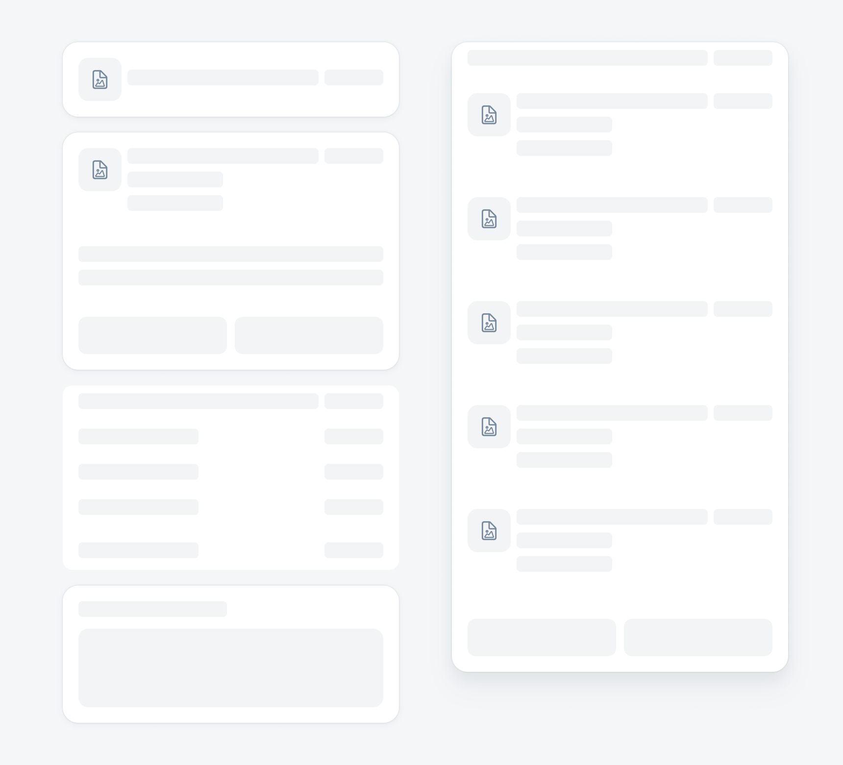
One-line and multi-line object card, analytic data table card, generic card (left) and list card placeholders (right)
SAP Fiori for Android: Skeleton Loading
SAP Fiori for Web: Placeholder Loading
Related Components/Patterns: Buttons, Object Cell, Object Card, Analytic Data Table Card, List Card
 Your feedback has been sent to the SAP Fiori design team.